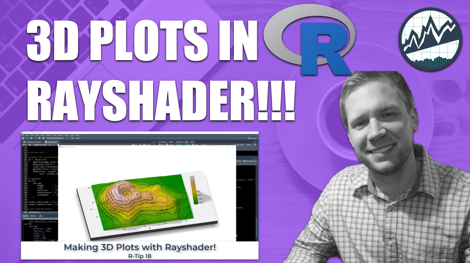
How to Make 3D Plots in R
Written by Matt Dancho
This article is part of a R-Tips Weekly, a weekly video tutorial that shows you step-by-step how to do common R coding tasks.
The RStudio IDE is amazing. You can enhance your R productivity even more with these simple keyboard shortcuts.
Here are the links to get set up. 👇

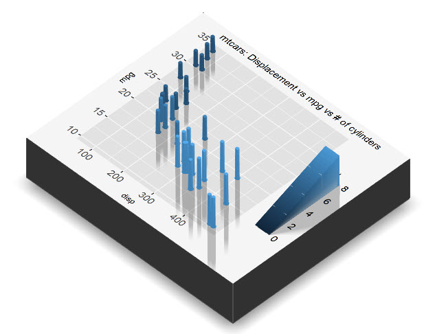
Making Your First 3D Plot
rayshader mtcars-style
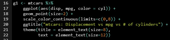
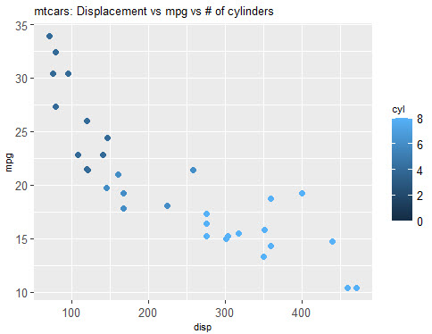
Start by making a ggplot w/ mtcars displ vs mpg
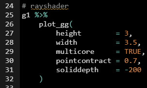
Then unleash the AWESOME POWER 🔥 of rayshader to make it 3D ⛰️
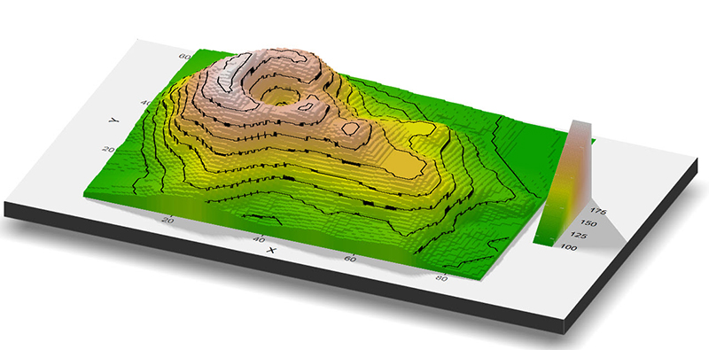
Making Elevation Plots
rayshader heatmap-style
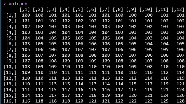
What about heatmaps and volcano plots?
Sometimes you have heatmap formatted data where you have a matrix:
- x/y-axis are the rows/columns
- depth (z-axis) is the values in the matrix.
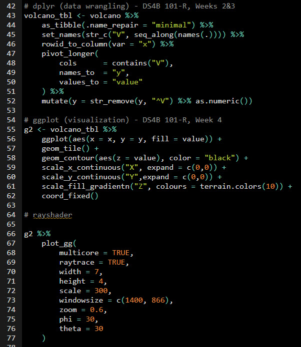
We can handle this matrix data format with:
- A little bit of data wrangling with
dplyr.
- Then make swiftly make a
ggplot.
- Then just like before, use
rayshader.
 Full code in the video Github Repository
And BOOM! We have a 3D Elevation Heat-Map Plot! ⛰️⛰️⛰️
 Full code in the video Github Repository
Your boss is loving your new data story-telling skills. 👇
 This is career acceleration
SETUP R-TIPS WEEKLY PROJECT
-
Get the Code
-
Check out the R-Tips Setup Video.
Once you take these actions, you’ll be set up to receive R-Tips with Code every week. =)