30 Year Weather Data Analysis
Written by David Lucey

Introduction
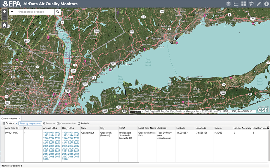
In this article, we'll use the EPA Arcgis map that contains weather data going back to 1990. This will be a quick code-based blog post showing how to load, explore and visualize the data a local EPA monitor.
# Libraries
packages <-
  c("data.table",
    "ggplot2",
    "stringr",
    "skimr",
    "janitor",
    "glue"
    )

if (length(setdiff(packages,rownames(installed.packages()))) > 0) {
  install.packages(setdiff(packages, rownames(installed.packages())))
}

invisible(lapply(packages, library, character.only = TRUE))

knitr::opts_chunk$set(
  comment = NA,
  fig.width = 12,
  fig.height = 8,
  out.width = '100%',
  cache = TRUE
)
Weather Monitor Data Extraction
Below, we show how to use glue::glue() to hit the api for our local site (“09-001-0017”) for the annual daily data sets from 1990-2020 with datatable::fread(), which took only a few minutes. See how we create an integer vector of desired years, and glue the string into each iteration of the request to create a list. We could easily change the code above and get the same for the next closest monitor in Westport, CT, or from any group of monitors in Connecticut or beyond if needed. For the actual blog post, the data we extracted below and saved to disc will be used.
# Years to retrieve
year <- c(1990:2020)
ac <-
  lapply(
    glue::glue(
      'https://www3.epa.gov/cgi-bin/broker?_service=data&_program=dataprog.Daily.sas&check=void&polname=Ozone&debug=0&year={year}&site=09-001-0017'
    ),
    fread
  )
Fortunately, the annual data sets were consistent over the period with all the same variables, so it took just a few minutes to get a clean data.table stretching back to 1990. In our experience with public data sets, this is almost always not the case. Things like variables or formatting almost always change. It seems surprising that the collected data would be exactly the same for such a long period of time, so we assume that the EPA is making an effort to clean it up and keep it consistent, which is very much appreciated. In a future post, we might look at a more complicated exploration of the EPA API, which has data going back much further for some monitors and some variables, and seems to be one of the better organized and documented government API’s we have come across.
# Bind lists to data.table
ac_dt <- rbindlist(ac)

# Clean names
ac_dt <- janitor::clean_names(ac_dt)
Exploration and Preparation
We will start off with the full 34 columns, but throw out the identifier rows where there is only one unique value. We can see that there are only 10,416 unique dates though there are 55,224 rows, so the many fields are layered in the data set. Four of the logical columns are all missing, so they will have to go. There are 14 unique values in the parameter_name field, so we will have to explore those. A majority of the pollutant standard rows are missing. We can also see “aqi”(Air Quality Index) which we consider to be a parameter is included in a separate column as a character. The two main measurements for all the other parameters are the “arithmetic_mean” and “first_maximum_value”. There are a couple of time-related variables including year, day_in_year and date_local. There are a lot of fields with only one unique value to identify the monitor, so these can all be dropped. Its pretty messy, so he best thing we can think of doing is to tidy up the data set so it is easier to work with.
    # Summarize data.table
    skimr::skim(ac_dt)
Table 1: Data summary
| Name |
ac_dt |
| Number of rows |
55224 |
| Number of columns |
34 |
| _______________________ |
|
| Column type frequency: |
|
| character |
15 |
| Date |
1 |
| logical |
4 |
| numeric |
14 |
| ________________________ |
|
| Group variables |
None |
Variable type: character
| Datum |
0 |
1 |
5 |
5 |
0 |
1 |
0 |
| Parameter Name |
0 |
1 |
5 |
26 |
0 |
14 |
0 |
| Duration Description |
0 |
1 |
6 |
23 |
0 |
6 |
0 |
| Pollutant Standard |
0 |
1 |
0 |
17 |
35497 |
6 |
0 |
| Units of Measure |
0 |
1 |
5 |
29 |
0 |
8 |
0 |
| Exceptional Data Type |
0 |
1 |
4 |
8 |
0 |
2 |
0 |
| AQI |
0 |
1 |
1 |
3 |
0 |
157 |
0 |
| Daily Criteria Indicator |
0 |
1 |
1 |
1 |
0 |
2 |
0 |
| State Name |
0 |
1 |
11 |
11 |
0 |
1 |
0 |
| County Name |
0 |
1 |
9 |
9 |
0 |
1 |
0 |
| City Name |
0 |
1 |
19 |
19 |
0 |
1 |
0 |
| Local Site Name |
0 |
1 |
20 |
20 |
0 |
1 |
0 |
| Address |
0 |
1 |
31 |
31 |
0 |
1 |
0 |
| MSA or CBSA Name |
0 |
1 |
31 |
31 |
0 |
1 |
0 |
| Data Source |
0 |
1 |
13 |
13 |
0 |
1 |
0 |
Variable type: Date
| Date (Local) |
0 |
1 |
1990-01-01 |
2020-03-31 |
2002-08-29 |
10416 |
Variable type: logical
| Nonreg Observation Count |
55224 |
0 |
NaN |
: |
| Nonreg Arithmetic Mean |
55224 |
0 |
NaN |
: |
| Nonreg First Maximum Value |
55224 |
0 |
NaN |
: |
| Tribe Name |
55224 |
0 |
NaN |
: |
Variable type: numeric
| State Code |
0 |
1 |
9.00 |
0.00 |
9.00 |
9.00 |
9.00 |
9.00 |
9.00 |
▁▁▇▁▁ |
| County Code |
0 |
1 |
1.00 |
0.00 |
1.00 |
1.00 |
1.00 |
1.00 |
1.00 |
▁▁▇▁▁ |
| Site Number |
0 |
1 |
17.00 |
0.00 |
17.00 |
17.00 |
17.00 |
17.00 |
17.00 |
▁▁▇▁▁ |
| Parameter Code |
0 |
1 |
55689.14 |
9429.11 |
42401.00 |
44201.00 |
61102.00 |
62101.00 |
82403.00 |
▅▁▇▁▁ |
| POC |
0 |
1 |
1.01 |
0.29 |
1.00 |
1.00 |
1.00 |
1.00 |
9.00 |
▇▁▁▁▁ |
| Latitude |
0 |
1 |
41.00 |
0.00 |
41.00 |
41.00 |
41.00 |
41.00 |
41.00 |
▁▁▇▁▁ |
| Longitude |
0 |
1 |
-73.59 |
0.00 |
-73.59 |
-73.59 |
-73.59 |
-73.59 |
-73.59 |
▁▁▇▁▁ |
| Year |
0 |
1 |
2002.86 |
8.22 |
1990.00 |
1996.00 |
2002.00 |
2009.00 |
2020.00 |
▇▆▇▃▃ |
| Day In Year (Local) |
0 |
1 |
181.50 |
96.44 |
1.00 |
106.00 |
181.00 |
258.00 |
366.00 |
▆▇▇▇▅ |
| Observation Count |
0 |
1 |
21.28 |
5.60 |
1.00 |
23.00 |
24.00 |
24.00 |
24.00 |
▁▁▁▁▇ |
| Observation Percent |
0 |
1 |
97.44 |
9.07 |
4.00 |
100.00 |
100.00 |
100.00 |
100.00 |
▁▁▁▁▇ |
| Arithmetic Mean |
0 |
1 |
44.42 |
75.70 |
-7.50 |
0.04 |
5.00 |
56.62 |
353.00 |
▇▁▁▁▁ |
| First Maximum Value |
0 |
1 |
65.56 |
112.18 |
-5.00 |
0.07 |
10.00 |
64.00 |
360.00 |
▇▁▁▁▁ |
| First Maximum Hour |
0 |
1 |
10.89 |
6.69 |
0.00 |
6.00 |
12.00 |
15.00 |
23.00 |
▆▅▇▇▅ |
First we will drop all of the identifier rows with only one unique value (before column 9 and after column 27), and also the “tribe” and “nonreg” columns using data.table::patterns(). We then convert the air quality index (“aqi”) column to numeric for the cases where it is not missing. We are not clear why the “aqi” is not included in the “parameter_name” variable with the other measures, but seems to be associated with rows which have “ozone” and “sulfur dioxide” (two of five variables which compose the “aqi” itself). Air Quality is also stored in by the 1-hour average and separately a single 8-hour measurements for each day, and these numbers can be significantly different.
# Drop unneeded cols
ac_dt <- ac_dt[, c(9:27)][, .SD, .SDcols = !patterns("tribe|nonreg")]

# Convert aqi to integer
ac_dt[, aqi := as.integer(str_extract(aqi, "\\d*"))]
We add the three measurement columns to value and 12 identifier columns to variable. We decided to separate the “aqi” index column from the rest of the data which is identified in the “parameter_name” column before tidying, and then bind them back together with three variables (“aqi”, “arithmetic_mean” and “first_maximum_value”).
# Separate out aqi
aqi <- ac_dt[!is.na(aqi)]

# Tidy key measures for parameters other than aqi
measures <- c("first_maximum_value", "arithmetic_mean")
ids <- setdiff(names(ac_dt), measures)
ids <- ids[!str_detect(ids, "aqi")]
ac_dt_tidy <-
  ac_dt[,
        melt(.SD,
             idcols = ids,
             measure.vars = measures),
        .SDcols = !"aqi"]

# Tidy up aqi
aqi <-
  aqi[,
      melt(.SD,
           idcols = ids,
           measure.vars = "aqi"),
      .SDcols = !measures]

# Put two tidied data sets back together
ac_dt_tidy <- rbind(ac_dt_tidy, aqi)

# Show sample rows
ac_dt_tidy
             parameter_name    duration_description pollutant_standard
     1: Outdoor Temperature                  1 HOUR
     2:      Sulfur dioxide                  1 HOUR    SO2 1-hour 2010
     3:      Sulfur dioxide            3-HR BLK AVG    SO2 3-hour 1971
     4:      Sulfur dioxide            3-HR BLK AVG    SO2 3-hour 1971
     5: Outdoor Temperature                  1 HOUR
    ---
120581:               Ozone 8-HR RUN AVG BEGIN HOUR  Ozone 8-hour 2015
120582:               Ozone 8-HR RUN AVG BEGIN HOUR  Ozone 8-hour 2015
120583:               Ozone 8-HR RUN AVG BEGIN HOUR  Ozone 8-hour 2015
120584:               Ozone 8-HR RUN AVG BEGIN HOUR  Ozone 8-hour 2015
120585:               Ozone 8-HR RUN AVG BEGIN HOUR  Ozone 8-hour 2015
        date_local year day_in_year_local   units_of_measure
     1: 1990-01-01 1990                 1 Degrees Fahrenheit
     2: 1990-01-01 1990                 1  Parts per billion
     3: 1990-01-01 1990                 1  Parts per billion
     4: 1990-01-02 1990                 2  Parts per billion
     5: 1990-01-02 1990                 2 Degrees Fahrenheit
    ---
120581: 2020-03-27 2020                87  Parts per million
120582: 2020-03-28 2020                88  Parts per million
120583: 2020-03-29 2020                89  Parts per million
120584: 2020-03-30 2020                90  Parts per million
120585: 2020-03-31 2020                91  Parts per million
        exceptional_data_type observation_count observation_percent
     1:                  None                24                 100
     2:                  None                23                  96
     3:                  None                 7                  88
     4:                  None                 7                  88
     5:                  None                24                 100
    ---
120581:                  None                17                 100
120582:                  None                17                 100
120583:                  None                17                 100
120584:                  None                17                 100
120585:                  None                12                  71
        first_maximum_hour daily_criteria_indicator            variable value
     1:                  0                        Y first_maximum_value  43.0
     2:                  8                        Y first_maximum_value  11.0
     3:                  8                        Y first_maximum_value   9.3
     4:                 23                        Y first_maximum_value  17.6
     5:                 14                        Y first_maximum_value  42.0
    ---
120581:                 10                        Y                 aqi  48.0
120582:                 22                        Y                 aqi  46.0
120583:                  8                        Y                 aqi  46.0
120584:                  7                        Y                 aqi  37.0
120585:                 16                        N                 aqi  42.0
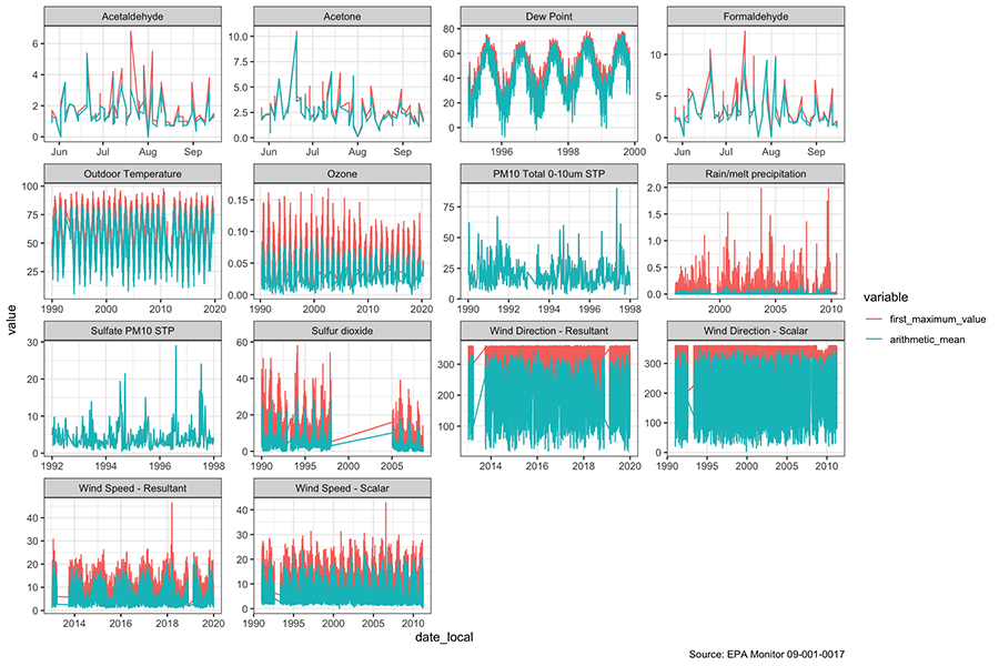
When we graph with “parameter_name” facets including separate colors for the mean and maximum values, we can see a few things. There are a few gaps in collection including a big one in sulfur dioxide from about 1997-2005. The Air Quality Index first created in the Clean Air Act has the following components: ground-level ozone, particulate matter, carbon monoxide, sulfur dioxide, and nitrogen dioxide. We are unsure how they calculate the AQI in our data set for the full period, because of the period where sulfur dioxide is missing. When we read up on AQI, we learned that there may be several ways of calculating the AQI. We will leave the details for later research.
# Look for missing periods
ac_dt_tidy[
  variable %in% c("arithmetic_mean", "first_maximum_value"),
  ggplot(.SD,
         aes(date_local,
             y = value,
             color = variable)) +
    geom_line() +
    facet_wrap( ~ parameter_name, scale = 'free') +
    theme_bw() +
    labs(caption = "Source: EPA Monitor 09-001-0017"
    )]
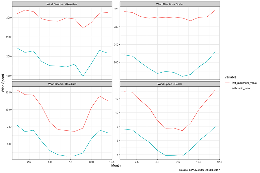
Wind is Lowest during the Summer
We had hoped to look at the wind speeds during Hurricane Sandy, which hit us hard, but apparently, the monitor was knocked out, so there are no measurements for that date or for several months subsequent, so it looks like we may not do a lot with the wind data. It is hard to find much in the charts above, so we averaged up the values by month. We might have guessed, but hadn’t thought that wind was as seasonal as it seems to be below.
ac_dt_tidy[
  str_detect(parameter_name, "Wind") &
    variable %in% c("first_maximum_value", "arithmetic_mean"),
  .(avg_speed = mean(value)), by = .(month(date_local), parameter_name, variable)][,
  ggplot(.SD, aes(month, avg_speed, color = variable)) +
    geom_line() +
    facet_wrap( ~ parameter_name, scales = "free_y") +
    theme_bw() +
    labs(
      x = "Month",
      y = "Wind Speed",
      caption = "Source: EPA Monitor 09-001-0017"
    ) ]
Air Quality Has Improved
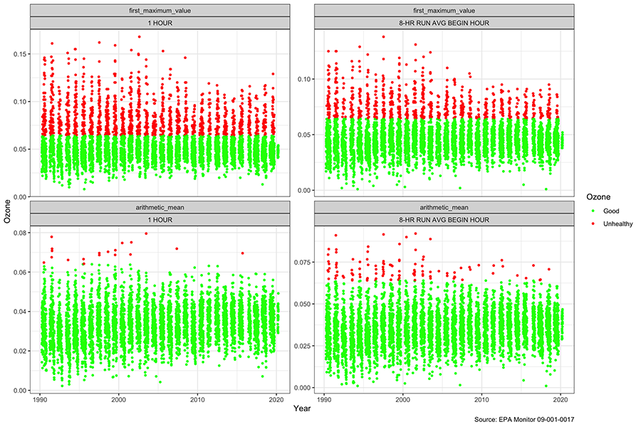
The data set actually records 4 measurements for ozone, the average and maximum values by hour, and separately, for 8-hour periods. The EPA sets a threshold for the level of Ozone to be avoided at 0.064, and days above this are shown in red. It looks like the “first_maximum_value” very often registers undesirable levels, although the hourly reading does much less so. We can see that there are clearly fewer unhealthy days over time, and only two unhealthy days based on the hourly arithmetic average since 2003. We can also see that the low end of the readings has been moving up over time, even though well in the healthy zone.
ac_dt_tidy[
  parameter_name == "Ozone" &
    variable %in% c("arithmetic_mean", "first_maximum_value")][
  ][,
    ggplot(.SD,
           aes(date_local,
               y = value)) +
      geom_point(aes(color = cut(
        value,
        breaks = c(0, 0.064, 0.3),
        labels = c("Good", "Unhealthy")
      )),
      size = 1) +
      scale_color_manual(
        name = "Ozone",
        values = c("Good" = "green1",
                   "Unhealthy" = "red1")) +
      theme_bw() +
      labs(x = "Year",
           y = "Ozone",
           caption = "Source: EPA Monitor 09-001-0017") +
      facet_wrap(~ variable + duration_description, scales = "free_y")]
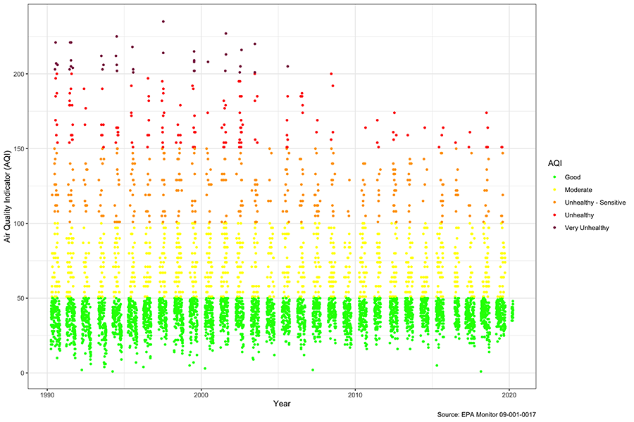
We can see in the chart looking at Air Quality based on the “Ozone 8-hour 2015” parameter below, that if the EPA calculates it, it doesn’t report AQI during the winter months, which probably makes sense because people are not out and air quality appears to be worst in the summer. Sometimes we get the iPhone messages about Air Quality and naturally worry, but when we look at the AQI daily over the last 30 years, we can see that the number of “Unhealthy” days has been declining similar two what we saw above with Ozone, and the last “Very Unhealthy” day was in 2006. The same trend with the low end of the AQI rising a little over time is apparent.
ac_dt_tidy[
  variable == "aqi" &
    pollutant_standard == "Ozone 8-hour 2015"][
  ][,
     ggplot(.SD,
            aes(date_local,
                y = value)) +
       geom_point(aes(color = cut(
         value,
         breaks = c(0, 50, 100, 150, 200, 300),
         labels = c(
           "Good",
           "Moderate",
           "Unhealthy - Sensitive",
           "Unhealthy",
           "Very Unhealthy"
         )
       )),
       size = 1) +
       scale_color_manual(
         name = "AQI",
         values = c(
           "Good" = "green1",
           "Moderate" = "yellow",
           "Unhealthy - Sensitive" = "orange",
           "Unhealthy" = "red",
           "Very Unhealthy" = "violetred4"
         )
       ) +
       theme_bw() +
       labs(x = "Year",
            y = "Air Quality Indicator (AQI)",
            caption = "Source: EPA Monitor 09-001-0017"
            )]
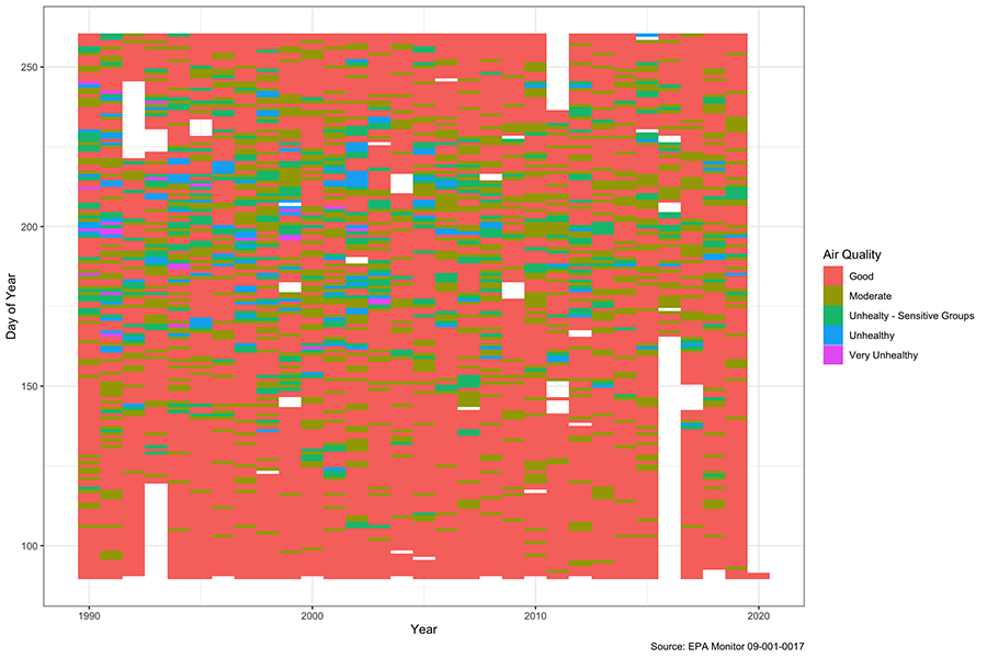
A heatmap is another way to look at the Ozone which better shows the time dimension. The y-axis shows the day of the year, so the most unhealthy air quality is between days 175-225, or the end of June through the first half of August. We can also see that “Unhealthy” days might even have outnumbered healthy days back in the early 1990s, but we rarely see above “moderate” now.
breaks <- c(0, 50, 100, 150,200, 300, 1000)
labels <- c("Good", "Moderate", "Unhealty - Sensitive Groups", "Unhealthy", "Very Unhealthy", "Hazardous")
ac_dt[parameter_name == "Ozone" &
        exceptional_data_type == "None", .(
          year,
          day_in_year_local,
          observation_count,
          duration_description,
          date_local,
          aqi= as.integer(str_extract(aqi, "\\d*")),
          parameter_name,
          `Air Quality` = cut(
            as.integer(str_extract(aqi, "\\d*")),
            breaks = breaks,
            labels = labels
          )
        )][!is.na(`Air Quality`) &
             day_in_year_local %in% c(90:260),
           ggplot(.SD, aes(year, day_in_year_local, fill = `Air Quality`)) +
             geom_tile() +
             theme_bw() +
             labs(
               x = "Year",
               y = "Day of Year",
               caption = "Source: EPA Monitor 09-001-0017"
             )]
Temperature
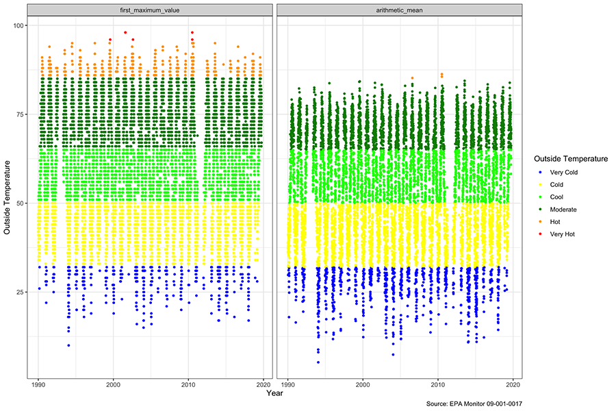
We can see above the dot plot of the Outside Temperature over the period. Hot days are defined as above 85, and very hot above 95, while cold are below 32. There isn’t much of a trend visible in the middle of the graphs. As might be expected the daily first maximum highs and lows tend to be significantly above the daily average levels. All in all, if there is change, it is less definitive than the air quality data looking at it this way.
ac_dt_tidy[
  parameter_name == "Outdoor Temperature" &
    variable %in% c("arithmetic_mean", "first_maximum_value")][
  ][,
  ggplot(.SD,
         aes(date_local,
             y = value)) +
    geom_point(aes(
      color = cut(value,
                  breaks = c(-20, 32, 50, 65, 85, 95, 120),
                  labels = c("Very Cold", "Cold", "Cool", "Moderate", "Hot", "Very Hot"))),
             size = 1) +
    scale_color_manual(
        name = "Outside Temperature",
        values = c(
          "Very Cold" = "blue",
          "Cold" = "yellow",
          "Cool" = "green1",
          "Moderate" = "green4",
          "Hot" = "orange",
          "Very Hot" = "red"
          )
      ) +
    theme_bw() +
    labs(
      x = "Year",
      y = "Outside Temperature",
      caption = "Source: EPA Monitor 09-001-0017"
    ) +
    facet_wrap(~ variable)]
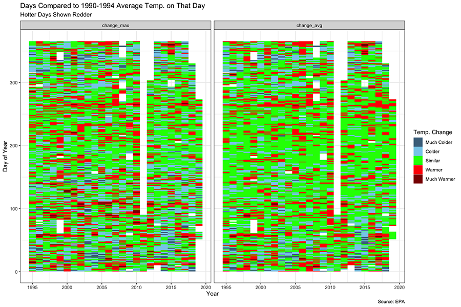
We also tried to look at the change in temperature over the period versus the first five years (1990-1995). By doing this, we probably learned more about heat maps than about the temperature. It does look like the bigger changes in temperature have probably happened more at the beginning and the end of the year. Movements in the maximum temperatures seem more pronounced than the averages, but again it makes sense that this would be the case.
temperature <-
  ac_dt[parameter_name == "Outdoor Temperature",
        c("year",
          "day_in_year_local",
          "arithmetic_mean",
          "first_maximum_value")]

baseline <-
  temperature[year < 1995,
              .(base_mean = mean(arithmetic_mean),
                base_max = mean(first_maximum_value)), day_in_year_local]

temperature <-
  baseline[temperature[year > 1994], on = c("day_in_year_local")][,
    `:=`(change_avg = arithmetic_mean - base_mean,
         change_max = first_maximum_value - base_max)]

temperature <-
  temperature[, melt(
    .SD,
    id.vars = c("day_in_year_local", "year"),
    measure.vars = c("change_max", "change_avg")
  )]

temperature[
  year %in% c(1995:2019) &
    !is.na(value),
  ggplot(.SD,
         aes(year,
             day_in_year_local,
             fill = cut(
               value,
               breaks = c(-100, -15, -5, 5, 15, 100),
               labels = c("Much Colder", "Colder", "Similar", "Warmer", "Much Warmer")
             ))) +
    geom_tile() +
    scale_fill_manual(name = "Temp. Change",
                      values = c("skyblue4", "skyblue", "green", "red", "red4")) +
    theme_bw() +
    labs(
      title = "Days Compared to 1990-1994 Average Temp. on That Day",
      subtitle = "Hotter Days Shown Redder",
      x = "Year",
      y = "Day of Year",
      caption = "Source: EPA"
    ) +
    facet_wrap(~ variable)
]
Thoughts on Heatmaps
The interesting thing we learned about heat maps is how much we could control the perception of the chart based on our decisions about the size of the groupings and the color choices. Dark colors on the days with the biggest temperature increases could flood the chart with red. If we chose equal equal sized groups for the cut-offs, there would be a lot more days for the average which were colder (as shown below), but a lot more for the max which were hotter. It made us more wary of heat maps.
# Uneven hand selected cutoffs to find more balanced counts
lapply(list(cut(temperature[variable == "change_avg" &
                    !is.na(value)]$value, c(-100,-15,-5, 5, 15, 100)),
cut(temperature[variable == "change_max" &
                    !is.na(value)]$value, c(-100,-15,-5, 5, 15, 100))), summary)
[[1]]
(-100,-15]   (-15,-5]     (-5,5]     (5,15]   (15,100]
       169       1489       4929       1786         65

[[2]]
(-100,-15]   (-15,-5]     (-5,5]     (5,15]   (15,100]
       286       2016       4155       1821        160
# Even range limits with less even counts
lapply(list(cut(temperature[variable == "change_avg" &
                    !is.na(value)]$value, 5),
cut(temperature[variable == "change_max" &
                    !is.na(value)]$value, 5)), summary)
[[1]]
    (-38,-25]   (-25,-12.1] (-12.1,0.827]  (0.827,13.8]   (13.8,26.8]
            5           305          4253          3767           108

[[2]]
(-28.8,-15.8] (-15.8,-2.95]  (-2.95,9.95]   (9.95,22.9]   (22.9,35.8]
          215          2858          4659           686            20
Conclusion
That wraps up this quick exploration of an EPA monitor in Connecticut. We still have many questions about air quality, temperature and wind speed. We wonder why the EPA chose to put the monitor down by the edge of the water away from the heavy traffic of I-95 and Route 1 and the bulk of the population. We didn’t have a lot of time to spend, and acknowledge that we may have misread or misinterpreted some of the data, but now we at least know what to look for.
The purpose of this blog is to explore, learn and get better, faster and more accurate in data analysis. If you are interested in learning R and would like to see what it takes to learn R, we invite you to download our free data science cheat sheet and join our free R webinar on January 20, 2021.
Author: David Lucey, Founder of Redwall Analytics
David spent 25 years working with institutional global equity research with several top investment banking firms.