ggside: A new R package for plotting distributions in side-plots
Written by Matt Dancho
I fell in love with a new ggplot2 extension. It made my life much simpler to help me uncover relationships in my complex business data. ggside is a new R package uses “marginal distribution plots”, which are the density side-plot panels to the top and right of scatter (made popular by the Python Seaborn package). Let’s get you up and running with ggside in under 5-minutes with this quick R-Tip.
SPECIAL ANNOUNCEMENT: AI for Data Scientists Workshop on December 18th
Inside the workshop I’ll share how I built a SQL-Writing Business Intelligence Agent with Generative AI:
What: GenAI for Data Scientists
When: Wednesday December 18th, 2pm EST
How It Will Help You: Whether you are new to data science or are an expert, Generative AI is changing the game. There’s a ton of hype. But how can Generative AI actually help you become a better data scientist and help you stand out in your career? I’ll show you inside my free Generative AI for Data Scientists workshop.
Price: Does Free sound good?
How To Join: 👉 Register Here
R-Tips Weekly Newsletter
This article is part of R-Tips Weekly, a weekly video tutorial that shows you step-by-step how to do common R coding tasks one R-tip at a time.
Here are the links to get set up. 👇
This Tutorial Is Available In Video
I have a companion video tutorial that shows even more secrets (plus mistakes to avoid). And, I’m finding that a lot of my students prefer the dialogue that goes along with coding. So check out this video to see me running the code in this tutorial. 👇
Watch my 5-minute tutorial on YouTube
What are Marginal Distributions?
Marginal Distribution (Density) plots are a way to extend your numeric data with side plots that highlight the density (histogram or boxplots work too).
 Linear Regression Marginal Distribution Side Plots.
One of two plots we're making today.
Marginal Distribution Plots were made popular with the seaborn jointplot() side-panels in Python. These add side plots that highlight distributions.
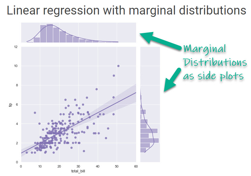 Seaborn's jointplot() makes a Linear Regression with Marginal Distributions.
Side-Plot Tutorial with ggside
Marginal distributions can now be made in R using ggside, a new ggplot2 extension. You can make linear regression with marginal distributions using histograms, densities, box plots, and more. Bonus - The side panels are super customizable for uncovering complex relationships.
Here are two examples of what you will do in this tutorial! 👇
Plot 1: Linear Regression with Marginal Distribution (Density) Side-Plots (Top and Left)
The first plot you’ll make…
Plot 2: Facet-Plot with Marginal Box Plots (Top)
The second plot you’ll make…
Thank You Developers
I want to thank jtlandis for his amazing software contribution. JT is a data scientist at the University of North Carolina at Chapel Hill and and R Developer who created ggside. Thank you for all you do!
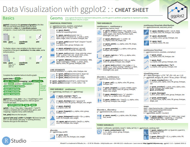
Before we get started, get the Cheat Sheet
ggside is great for making marginal distribution side plots. But, you'll still need to learn how to visualize data with ggplot2. For those topics, I'll use the Ultimate R Cheat Sheet to refer to ggplot2 code in my workflow.
Quick Example:
Download the Ultimate R Cheat Sheet. Then Click the "CS" next to "ggplot2" which opens the Data Visualization with Dplyr Cheat Sheet.
Now you're ready to quickly reference ggplot2 functions.
Start By Loading The Libraries & Data
The libraries we'll need today are patchwork, ggridges, ggrepel, maps, tidyverse, and lubridate. All packages are available on CRAN and can be installed with install.packages(). Note - I'm using the development version of ggside, which is what I recommend in the YouTube Video .
Get the Code
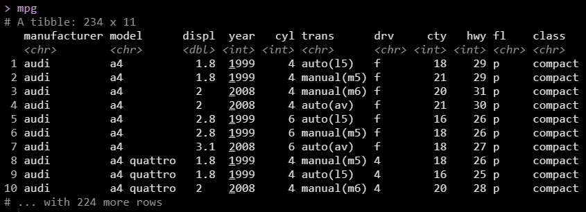
The dataset is the mpg data that comes with ggplot2.
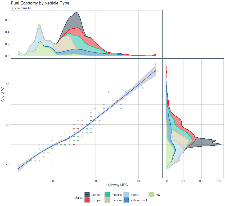
Plot 1: Linear Regression with Marginal Distribution Plot
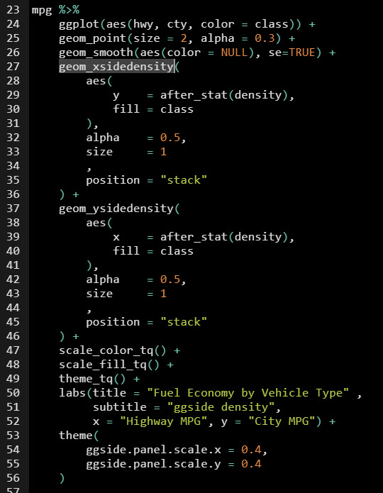
We'll start by replicating what you can do in Python's Seaborn jointdist() Plot. We'll accomplish this with ggside::geom_xsidedensity()
We set up the plot just like a normal ggplot.
Refer to the Ultimate R Cheat Sheet for:
ggplot()geom_point()geom_smooth()
Next we add from ggside:
geom_xsidedensity() - Adds a side density panel (top panel).geom_ysidedensity() - Adds a side density panel (right panel).
The trick is using the after_stat(density), which makes an awesome looking marginal density side panel plot. I increased the size of the marginal density panels with the theme(ggside.panel.scale.x).
 Get the Code
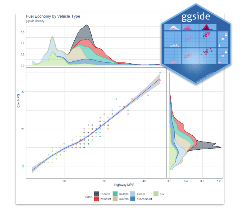
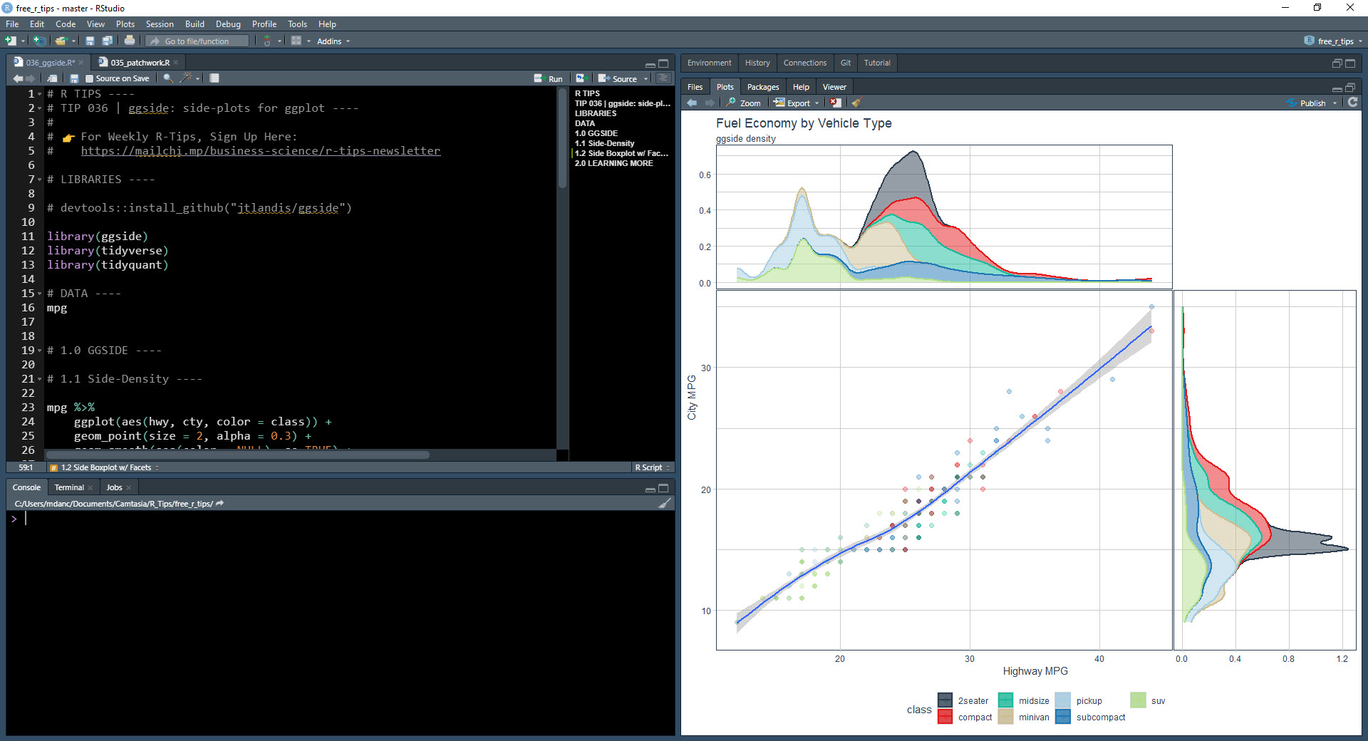
Loess Regression w/ Marginal Density
We generate the regression plot with marginal distributions (density) to highlight key differences between the automobile classes. We can see:
- Pickup, SUV - Have the lowest Highway Fuel Economy (MPG)
- 2seater, Compact, Midsize, Subcompact - Have the highest Highway Fuel Economy

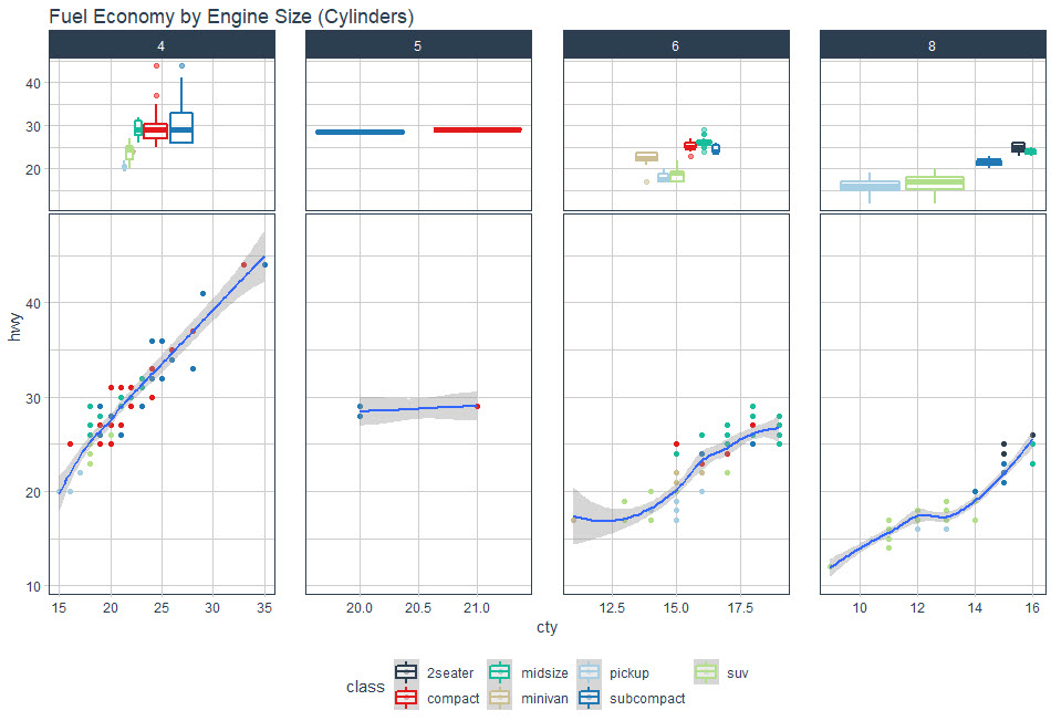
Plot 2. Faceted Side-Panels
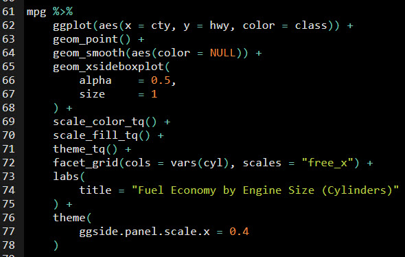
Next, let's try out some advanced functionality. I want to see how ggside handles faceted plots, which are subplots that vary based on a categorical feature. We'll use the "cyl" column to facet, which is for engine size (number of cylinders).
 Get the Code
Faceted Side Panels? No problem.
Awesome! I have included facets by "cyl", which creates four plots based on the engine size. ggside picked up on the facets and has made 4 side-panel plots.

💡 Conclusions
You learned how to use ggside. Great work! But, there’s a lot more to becoming a Business Scientist (my term for an incredibly valuable data scientist that has business problem-solving skills).
If you’d like to become a Business Scientist…
With an awesome 6-figure data science career, improved quality of life, a fulfilling job that helps your business, and all the fun that comes along with a career that gives you the freedom to be creative and a problem solver in industry, then I would love to help you.
Need to advance your business data science skills?
I’ve helped 6,107+ students learn data science for business from an elite business consultant’s perspective.
I’ve worked with Fortune 500 companies like S&P Global, Apple, MRM McCann, and more.
And I built a training program that gets my students life-changing data science careers (don’t believe me? see my testimonials here):
6-Figure Data Science Job at CVS Health ($125K)
Senior VP Of Analytics At JP Morgan ($200K)
50%+ Raises & Promotions ($150K)
Lead Data Scientist at Northwestern Mutual ($175K)
2X-ed Salary (From $60K to $120K)
2 Competing ML Job Offers ($150K)
Promotion to Lead Data Scientist ($175K)
Data Scientist Job at Verizon ($125K+)
Data Scientist Job at CitiBank ($100K + Bonus)
Whenever you are ready, here’s the system they are taking:
Here’s the system that has gotten aspiring data scientists, career transitioners, and life long learners data science jobs and promotions…
Join My 5-Course R-Track Program Now!
(And Become The Data Scientist You Were Meant To Be...)
P.S. - Samantha landed her NEW Data Science R Developer job at CVS Health (Fortune 500). This could be you.