How To Make Geographic Map Visualizations In R
Written by Matt Dancho
This article is part of a R-Tips Weekly, a weekly video tutorial that shows you step-by-step how to do common R coding tasks.
If you are explaining data related to geography or just want to visualize by latitude / longitude location, you need to know ggplot2 & the tidyverse for making maps.
This tutorial will show you how to make a publication-quality visualization! Here are the links to get set up. 👇
SPECIAL ANNOUNCEMENT: AI for Data Scientists Workshop on December 18th
Inside the workshop I’ll share how I built a SQL-Writing Business Intelligence Agent with Generative AI:
What: GenAI for Data Scientists
When: Wednesday December 18th, 2pm EST
How It Will Help You: Whether you are new to data science or are an expert, Generative AI is changing the game. There’s a ton of hype. But how can Generative AI actually help you become a better data scientist and help you stand out in your career? I’ll show you inside my free Generative AI for Data Scientists workshop.
Price: Does Free sound good?
How To Join: 👉 Register Here
Video Tutorial
Learn how to make geospatial maps using the ggplot2 package in my 10-minute YouTube video tutorial.
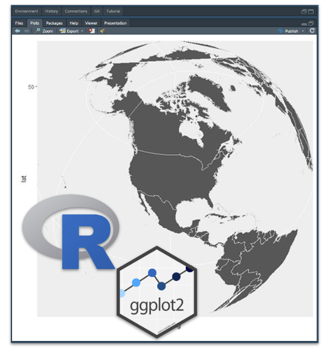
Working with Map Data
The first thing we need when creating a map is data that represents the latitude and longitude. We need to use a function called map_data() to collect the data in the right structure for a ggplot2 map.
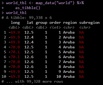
Map Data
Using the map_data() function to collect lat/long data for the entire World.
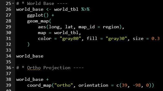
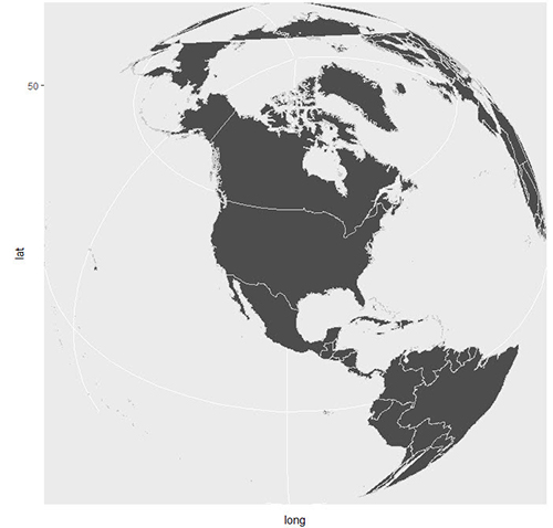
Plotting the Map Data with ggplot2
We can use the geom_map() & coord_map() functions to plot the world.
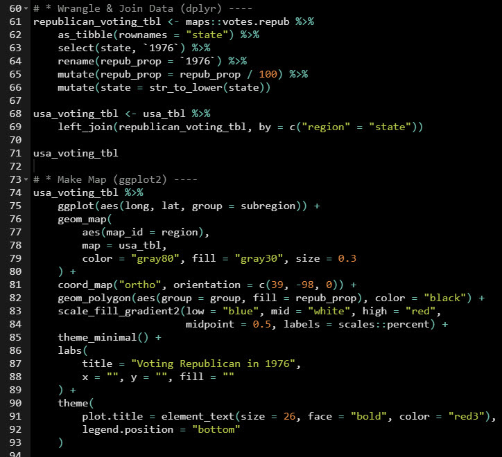
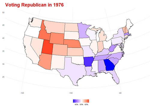
Visualizing Republican Voting
So what can we do with Map Data + ggplot2? How about visualizing how the US voted in 1976?!
Conclusions
We learned how to make geospatial maps with ggplot2. Great work! But, there’s a lot more to becoming a data scientist.
If you’d like to become a data scientist (and have an awesome career, improve your quality of life, enjoy your job, and all the fun that comes along), then I can help with that.
Need to advance your business data science skills?
I’ve helped 6,107+ students learn data science for business from an elite business consultant’s perspective.
I’ve worked with Fortune 500 companies like S&P Global, Apple, MRM McCann, and more.
And I built a training program that gets my students life-changing data science careers (don’t believe me? see my testimonials here):
6-Figure Data Science Job at CVS Health ($125K)
Senior VP Of Analytics At JP Morgan ($200K)
50%+ Raises & Promotions ($150K)
Lead Data Scientist at Northwestern Mutual ($175K)
2X-ed Salary (From $60K to $120K)
2 Competing ML Job Offers ($150K)
Promotion to Lead Data Scientist ($175K)
Data Scientist Job at Verizon ($125K+)
Data Scientist Job at CitiBank ($100K + Bonus)
Whenever you are ready, here’s the system they are taking:
Here’s the system that has gotten aspiring data scientists, career transitioners, and life long learners data science jobs and promotions…

Join My 5-Course R-Track Program Now!
(And Become The Data Scientist You Were Meant To Be...)
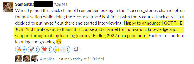
P.S. - Samantha landed her NEW Data Science R Developer job at CVS Health (Fortune 500). This could be you.