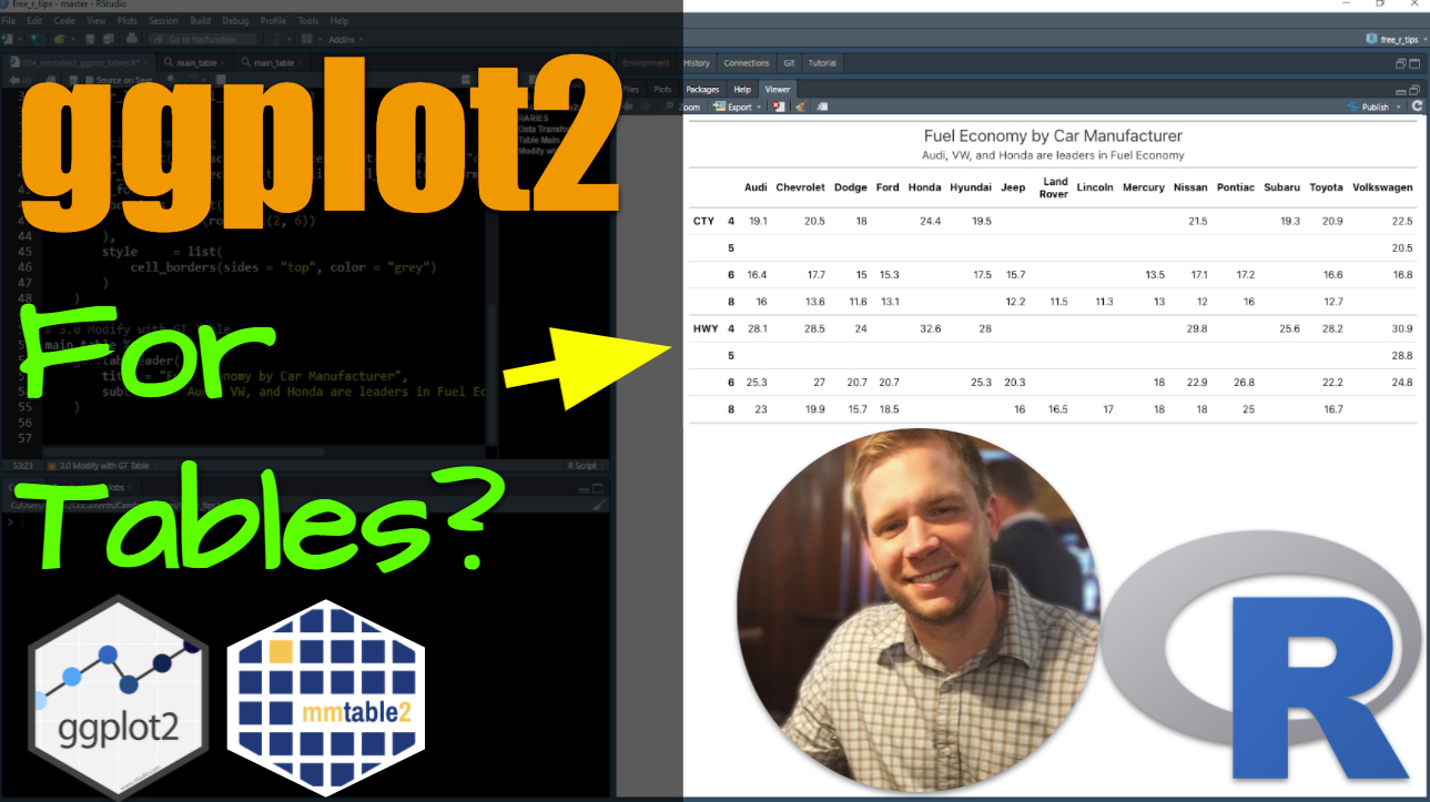
mmtable2: ggplot2 for tables
Written by Matt Dancho
ggplot2… for tables?! Holy cow 🐮 - when I saw mmtable2 I couldn’t believe my eyes. Someone figured out how to make creating tables just like creating plots with ggplots, using a grammar of graphics… err, I mean tables.
My initial thought is how VALUABLE you are going to be to your organization when you can make professional reports that highlight key insights AND look super professional. I mean, just send a report to a customer with one of these tables in it. Dang! You are getting BONUS POINTS for sure.
Now, for the record, saying “ggplot2 for tables” is a bold statement. So let’s figure out what making professional tables with mmtable2 looks like in this 5-minute tutorial.
- Learn how to make a basic table with
mmtable2.
- BONUS: Learn how to customize the basic table beyond
mmtable2 defaults so you can wow your customers, your boss, and executives in your company.
This article was last updated on: March 8th, 2022
R-Tips Weekly
This article is part of R-Tips Weekly, a weekly video tutorial that shows you step-by-step how to do common R coding tasks.
Here are the links to get set up. 👇
Video Tutorial
Learn how to use the mmtable2 package in our 8-minute YouTube video tutorial.
What you make in this R-Tip
By the end of this tutorial, you’ll make the 4 most helpful plots for explaining machine learning models.
Thank You Developers.
Before we move on, please recognize that mmtable2 was developed by Ian Moran. Ian has put a ton of work into the mmtable2 documentation.
AND, I’d be remiss if I didn’t also credit Richard Iannone who created and manages the gt package, which mmtable2 leverages heavily. (And yes, I have another tutorial in the works on the amazing gt package).
Thank you both for everything you do!
mmtable2 Tutorial
Let’s get up and running with mmtable2 so we can make a killer table that impresses your bosses and helps you make reports that get you promoted.
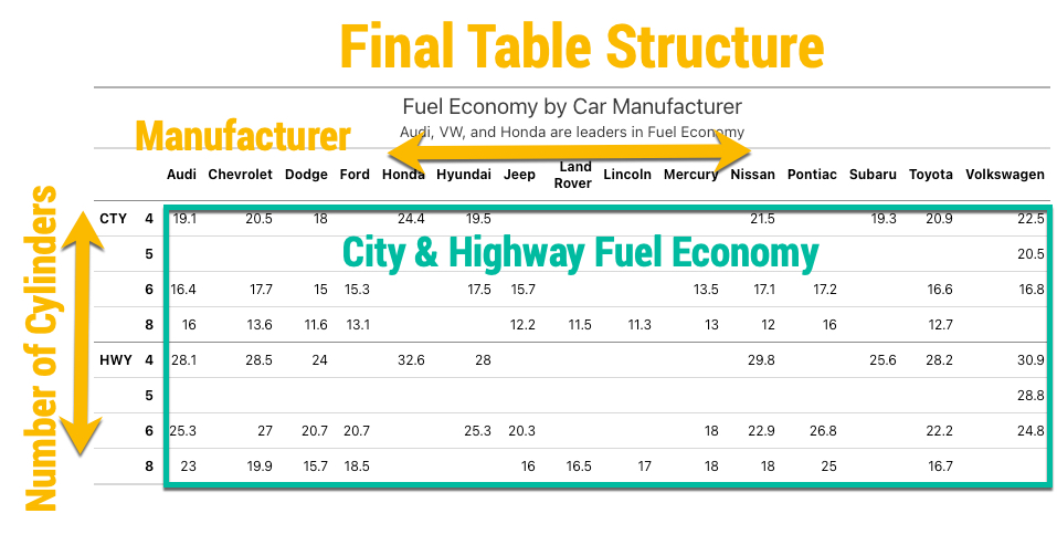
Goal for our table
Our goal is to analyze the mpg dataset (fuel economy of vehicles by important vehicle attributes like manufacturer, number of cylinders, etc). The table we put to into our report:
- Summarizes the average fuel econmony (City and Highway)
- By two categories: Car Manufacturer and Number of Engine Cylinders
Our final table structure looks like this:
Step 1: Load the Libraries and Data
First, run this code to:
- Load Libraries: Load
mmtable2 , gt, and tidyverse.
- Import Data: We’re using the
mpg dataset that comes with ggplot2.
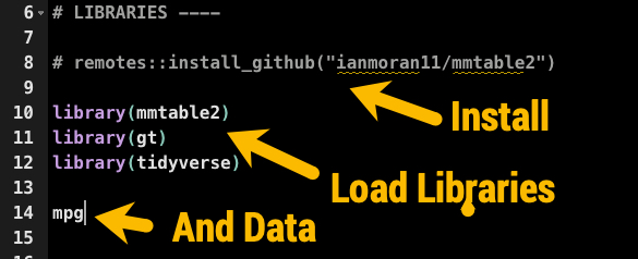
Get the code.
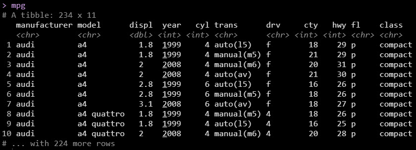
Our data looks like this.
Step 2: Tidy the Data
Our next step is to use dplyr and tidyr to get the data into the right format for the table. We’ll use 4 important data wrangling operations:
group_by(): Groups by our grouping columns: Manufacturer and Number of Engine Cylinders.summarise(): We’ll calculate the average fuel economy for both City and Highway. We combine with the across() function which makes it easy to summarize multiple columns. We use the mean() function to calculate the averages by group.ungroup(): Ungrouping is needed to remove any leftover groups.pivot_longer(): Used to convert from a “wide” to a “long” data frame, which stacks the City and Highway average fuel economy on top of each other. If you’re familiar with ggplot2 the “long” format is critical to plotting.
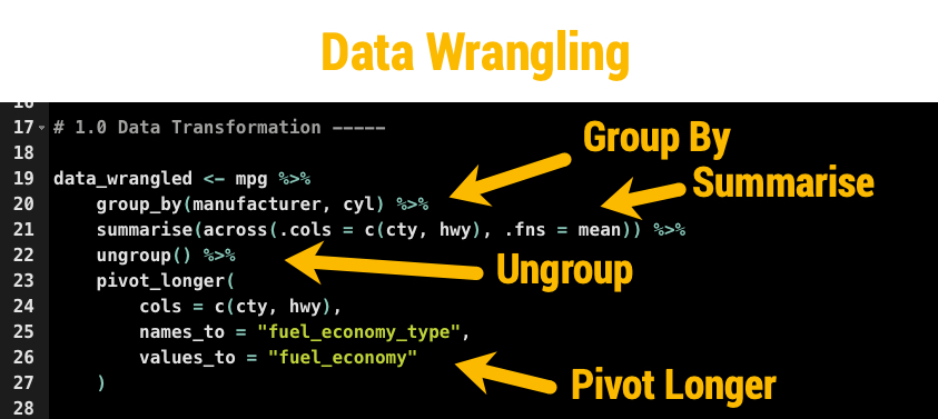
Get the code.
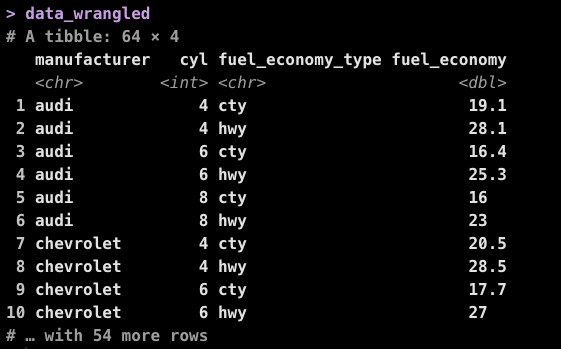
The resulting data (post data wrangle) looks like this.
Step 3: Make the basic table
With the mpg data summarized and in the long format, we can now use mmtable2 to make a table, just like we would use ggplot2 to make a plot. We perform 3 actions:
- Setup the
mmtable(): This is just like ggplot() function in ggplot2.
- Specify the headers locations: This tells the location for each header needed to organize the table.
- Format the header and table cells: This adds the lines that help to differentiate groups in our data.
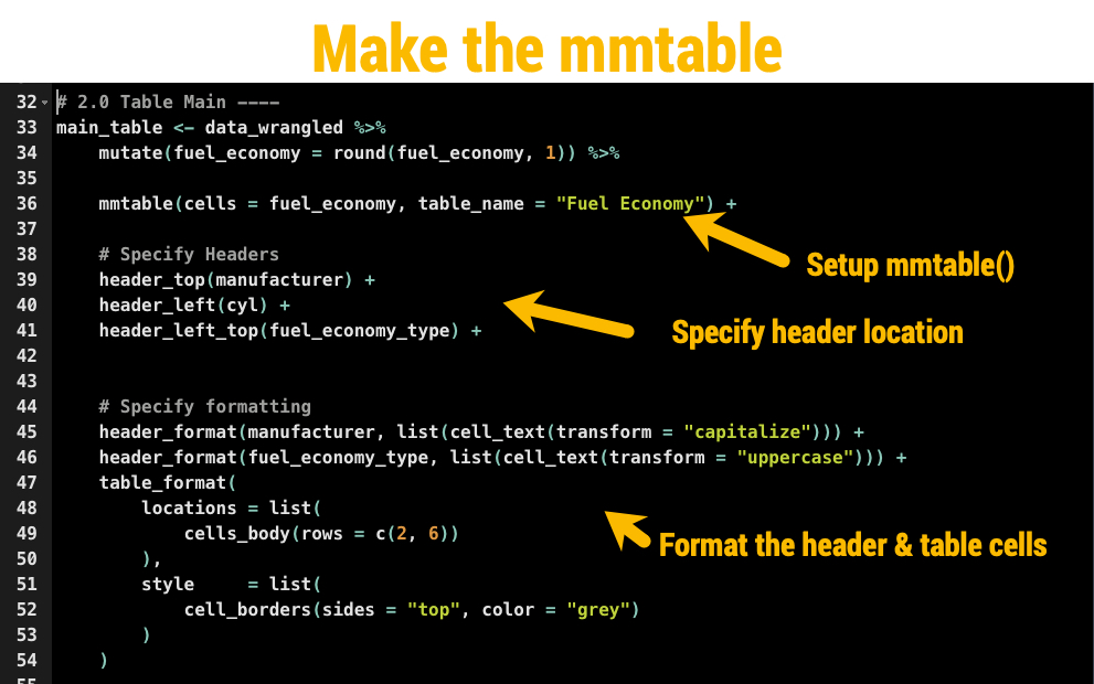
Get the code.
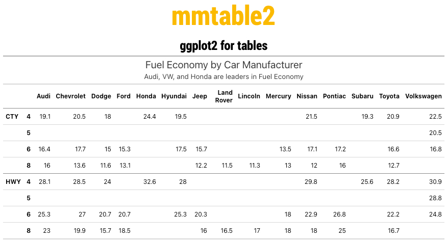
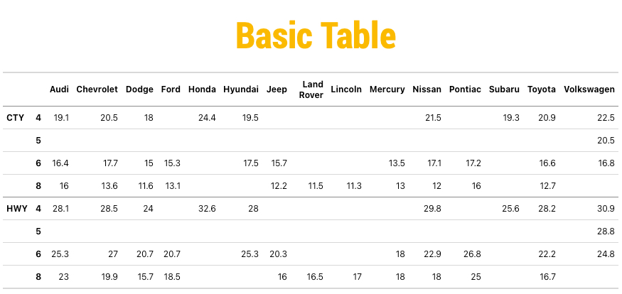
The output of the basic table looks like this. Excellent work so far.
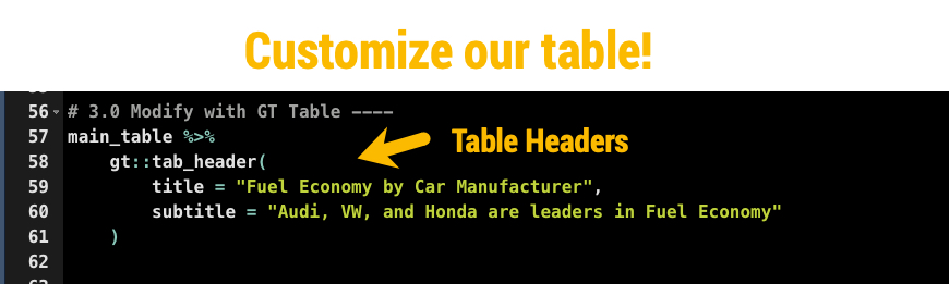
BONUS: Customize the table with gt
The magic of mmtable2 is that it actually uses another awesome package called gt, which is what allows mmtable2 to produce awesome-looking tables.
So, if we know how to use gt, we can customize our basic table!
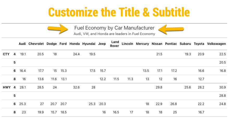
Let’s give it a go by adding some gt headers, which give the table a title and subtitle.
And boom! Now we have a nice title and subtitle that describe what our report readers will be looking at.
Conclusions
We learned how to use the mmtable2 to not only create basic tables using ggplot2-style grammar of tables, but we showed how to customize the table using the gt package. Great work! But, there’s a lot more to becoming a data scientist.
If you’d like to become a data scientist (and have an awesome career, improve your quality of life, enjoy your job, and all the fun that comes along), then I can help with that.
Need to advance your business data science skills?
I’ve helped 6,107+ students learn data science for business from an elite business consultant’s perspective.
I’ve worked with Fortune 500 companies like S&P Global, Apple, MRM McCann, and more.
And I built a training program that gets my students life-changing data science careers (don’t believe me? see my testimonials here):
6-Figure Data Science Job at CVS Health ($125K)
Senior VP Of Analytics At JP Morgan ($200K)
50%+ Raises & Promotions ($150K)
Lead Data Scientist at Northwestern Mutual ($175K)
2X-ed Salary (From $60K to $120K)
2 Competing ML Job Offers ($150K)
Promotion to Lead Data Scientist ($175K)
Data Scientist Job at Verizon ($125K+)
Data Scientist Job at CitiBank ($100K + Bonus)
Whenever you are ready, here’s the system they are taking:
Here’s the system that has gotten aspiring data scientists, career transitioners, and life long learners data science jobs and promotions…

Join My 5-Course R-Track Program Now!
(And Become The Data Scientist You Were Meant To Be...)
P.S. - Samantha landed her NEW Data Science R Developer job at CVS Health (Fortune 500). This could be you.