gghalves: Make Half Boxplot | Half Dotplot Visualizations with ggplot2
Written by Matt Dancho
This article is part of R-Tips Weekly, a weekly video tutorial that shows you step-by-step how to do common R coding tasks.
Here are the links to get set up. 👇
What is gghalves?
gghalves is a new R package that makes it easy to compose your own half-plots using ggplot2.
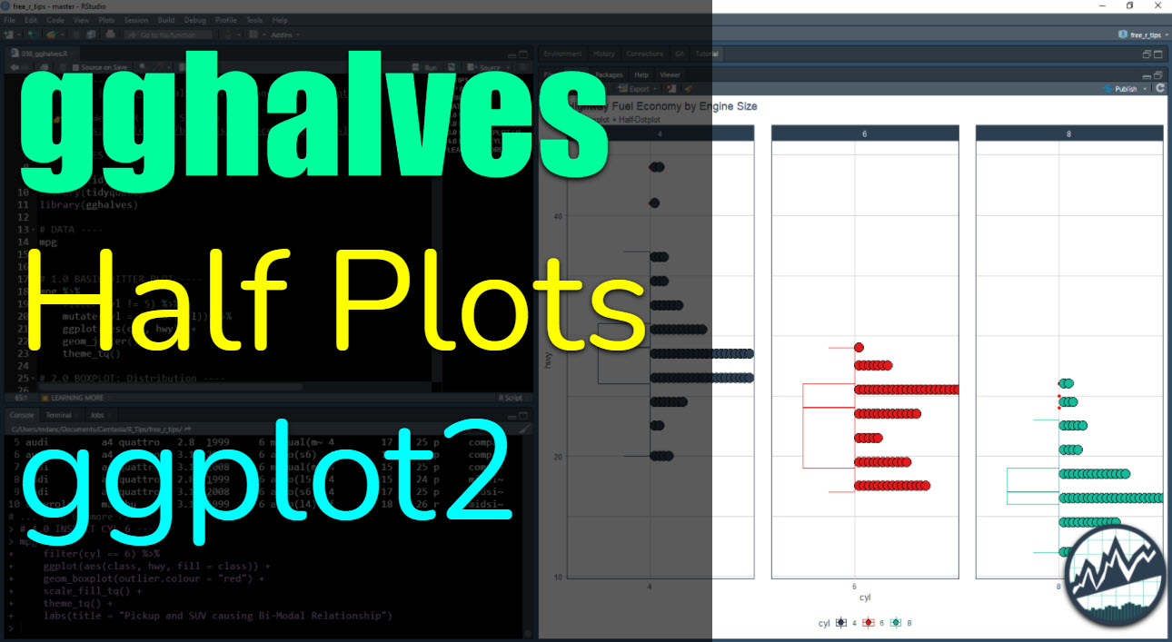
gghalves Video Tutorial
For those that prefer Full YouTube Video Tutorials.
Learn how to use gghalves in our free 8-minute YouTube video.
 (Click image to play tutorial)
Watch our full YouTube Tutorial
What are Half Plots?
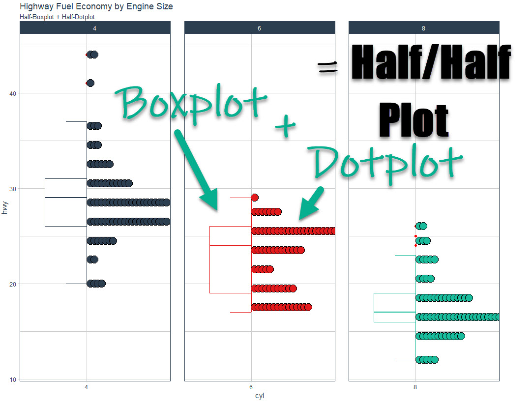
Combining two plots side-by-side.
Half/Half Plots are a way to showcase two plots side-by-side. Here’s a common example:
- Showing a Boxplot to identify outliers and quantiles
- Showing a Dotplot to identify distribution
We can easily do this with a half-plot thanks to gghalves.
Before we get started, get the R Cheat Sheet
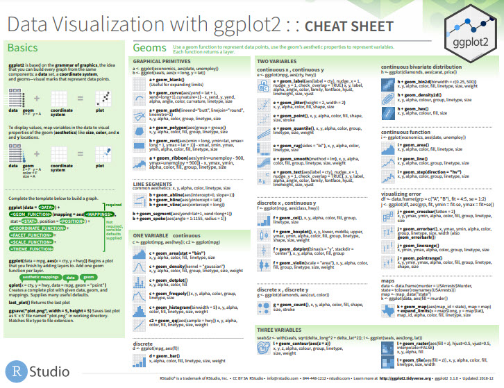
gghalves is great for making customized ggplot2 plots. But, you’ll still need to learn how to wrangle data with dplyr and visualize data with ggplot2. For those topics, I’ll use the Ultimate R Cheat Sheet to refer to dplyr and ggplot2 code in my workflow.
Quick Example:
Download the Ultimate R Cheat Sheet Then Click the “CS” next to “ggplot2” opens the Data Visualization with GGplot2 Cheat Sheet.
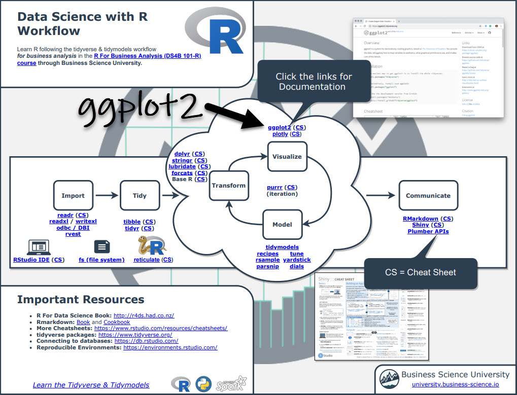
Now you’re ready to quickly reference ggplot2 functions.
Onto the tutorial.
How gghalves works
The gghalves package extends ggplot2 by adding several new “geoms” (ggplot geometries) that allow us to add half plots. In this tutorial, we’ll cover:
geom_half_boxplot(): For creating half-boxplotsgeom_half_dotplot(): For creating half-dotplots
Pro Tip:
Simply type "geom_half" in your R console and hit Tab to show all of the half plotting geoms available.
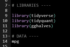
Load the Libraries and Data
First, run this code to:
- Load Libraries: Load
gghalves, tidyverse and tidyquant.
- Import Data: We’re using the
mpg dataset that comes with ggplot2.
Get the code.
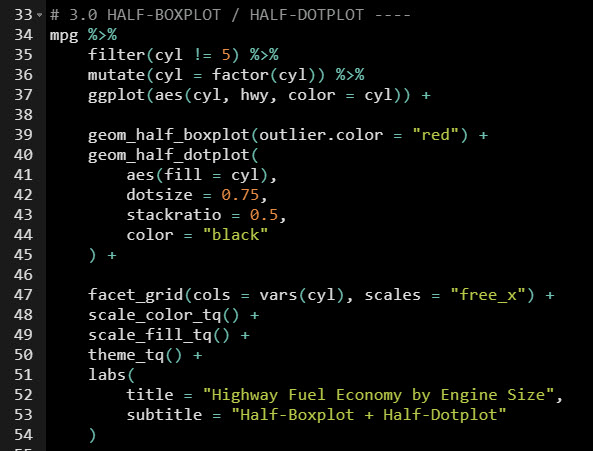
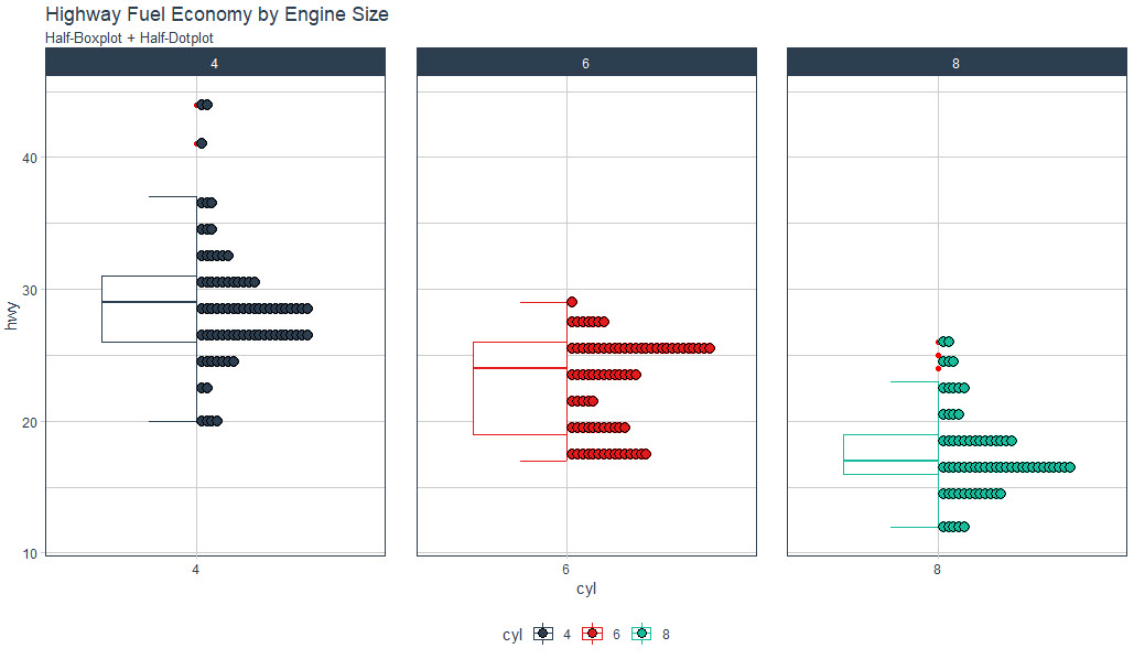
Make the Half-Boxplot / Half-Dotplot
Next, we can combine a half-boxplot and half-dotplot. This has the advantage of showing:
- Quantiles and Outliers (Boxplot)
- Distribution (Dotplot)
Business Goal
Suppose we have a question:
What effect does Engine Size (number of Cylinders) have on Vehicle Highway Fuel Economy (Highway MPG)?
We can visualize this with gghalves by making half-plots of Cylinder vs Highway.
Half-Plot Visualization Code
Using the Ultimate R Cheat Sheet, we can make a ggplot from the ggplot2 data visualization cheat sheet. We’ll add geom_half_boxplot() and geom_half_dotplot() to make the half-plots of Cylinder vs Highway.
Get the code.
Half-Plot Visualization
Here is the visualization. We can explore to find an interesting relationship between Engine Size and Fuel Economy.
Get the code.
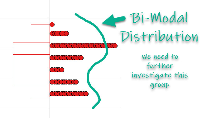
Insights: Bimodal Distribution of 6-Cylinder Engine Class
Generally speaking, fuel economy goes down as engine size increases. But, the 6-Cylinder engine has something unique going on that has been uncovered by the gghalves::geom_half_dotplot().
The 6-Cylinder Engine class of car has a bimodal distribution, which is when there are two peaks. This generally indicates that there are two different populations within the group. We need to investigate with ggplot2.
Get the code.
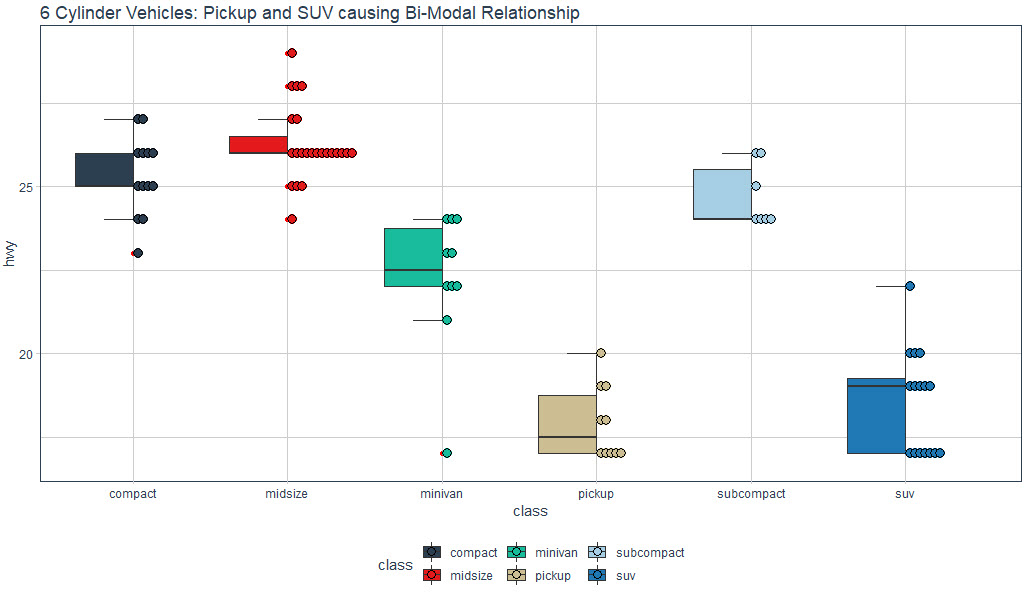
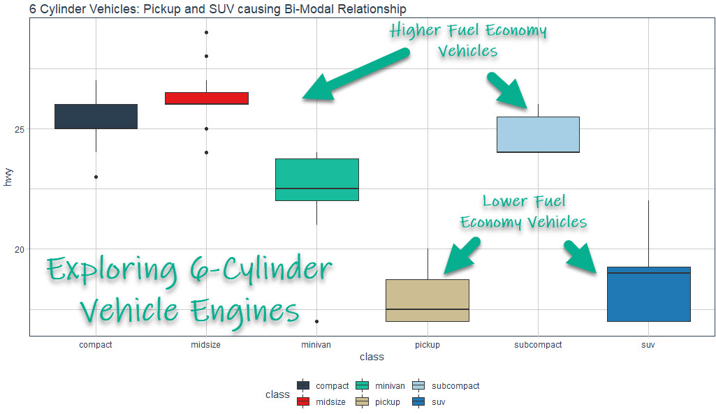
Exploring the Bimodal Relationship
We can explore the 6 Cylinder Vehicle Class a bit further to identify the cause of the Bimodal Distribution. It looks like:
- SUV and Pickup classes have much lower fuel economy
- Compact, Midsize, Minivan, and Subcompact have much higher fuel economy
Get the code.
Why Learning ggplot2 is essential
I wouldn’t be nearly as effective as a data scientist without knowing ggplot2. In fact, data visualization has been one of two skills that have been critical to my career (with the other one being data transformation).
Case Study: This tutorial showcases exactly why visualization is important
Get the code.
Let’s just take this tutorial as a case study. Without being able to visualize with ggplot2:
- We wouldn’t be able to visually identify the Bimodal Distribution. We needed to see that to know to explore the 6-Cylinder Engine Class.
- We wouldn’t have been able to explore the 6-Cylinder Engine Class. This showed us the importance of the Vehicle Class (e.g. SUV, Pickups being lower and Compact, Subcompact being higher in fuel economy).
Career Tip: Learn ggplot2
If I had one piece of advice, it would be to start learning ggplot2. Let me explain.
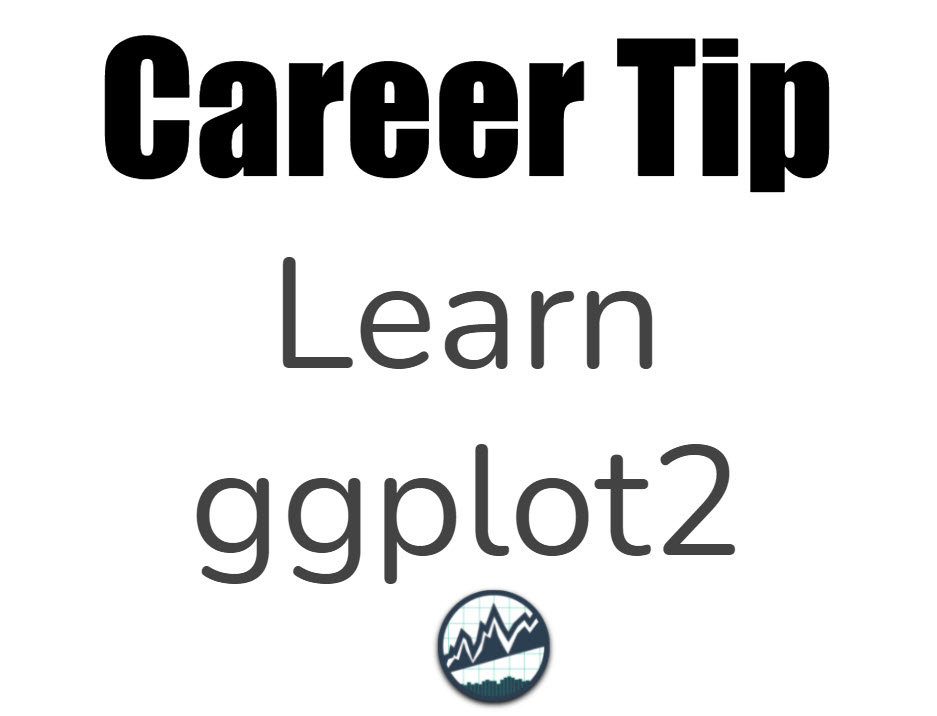
Learning ggplot2 helped me to:
- Explain complex topics to non-technical people
- Develop good reports that showcased important points visually
- Make persuasive arguments that got the attention of Senior Management and even my CEO
So, yes, learning ggplot2 was absolutely essential to my career. I received many promotions and got the attention of my CEO using ggplot2 effectively.
If you’d like to learn ggplot2 and data science for business, then read on. 👇
Need to advance your business data science skills?
I’ve helped 6,107+ students learn data science for business from an elite business consultant’s perspective.
I’ve worked with Fortune 500 companies like S&P Global, Apple, MRM McCann, and more.
And I built a training program that gets my students life-changing data science careers (don’t believe me? see my testimonials here):
6-Figure Data Science Job at CVS Health ($125K)
Senior VP Of Analytics At JP Morgan ($200K)
50%+ Raises & Promotions ($150K)
Lead Data Scientist at Northwestern Mutual ($175K)
2X-ed Salary (From $60K to $120K)
2 Competing ML Job Offers ($150K)
Promotion to Lead Data Scientist ($175K)
Data Scientist Job at Verizon ($125K+)
Data Scientist Job at CitiBank ($100K + Bonus)
Whenever you are ready, here’s the system they are taking:
Here’s the system that has gotten aspiring data scientists, career transitioners, and life long learners data science jobs and promotions…
Join My 5-Course R-Track Program Now!
(And Become The Data Scientist You Were Meant To Be...)
P.S. - Samantha landed her NEW Data Science R Developer job at CVS Health (Fortune 500). This could be you.