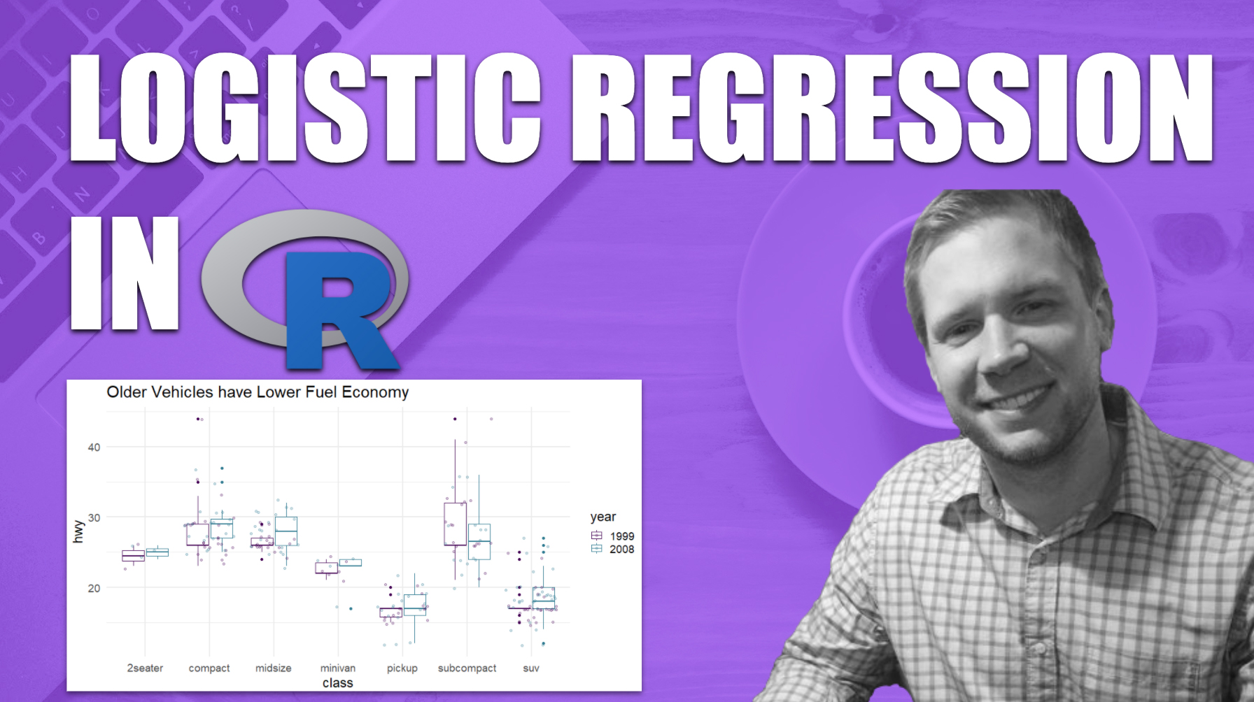
Build and Evaluate A Logistic Regression Classifier
Written by Matt Dancho
This article is part of a R-Tips Weekly, a weekly video tutorial that shows you step-by-step how to do common R coding tasks.
Logistic regression is a simple, yet powerful classification model. In this tutorial, learn how to build a predictive classifier that classifies the age of a vehicle. Then use ggplot to tell the story!
Here are the links to get set up. 👇
The Story
In this analysis we learn that newer vehicles are MORE EFFICIENT, and we’ll make a data visualization that tells the story.
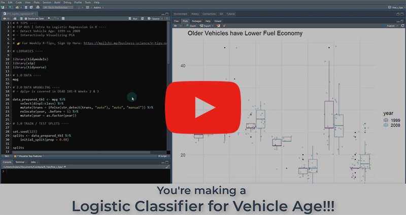 (Click image to play tutorial)
How did we make this plot?
- Our logistic regression classifier modeled the data
- We used
VIP to find the most important features
- We visualized with ggplot 💥
Making a Logistic Regression Classifier
Logistic regression is a must-know tool in your data science arsenal.
- Logistic Regression is easy to explain
- The classifier has no tuning parameters (no knobs that need adjusted)
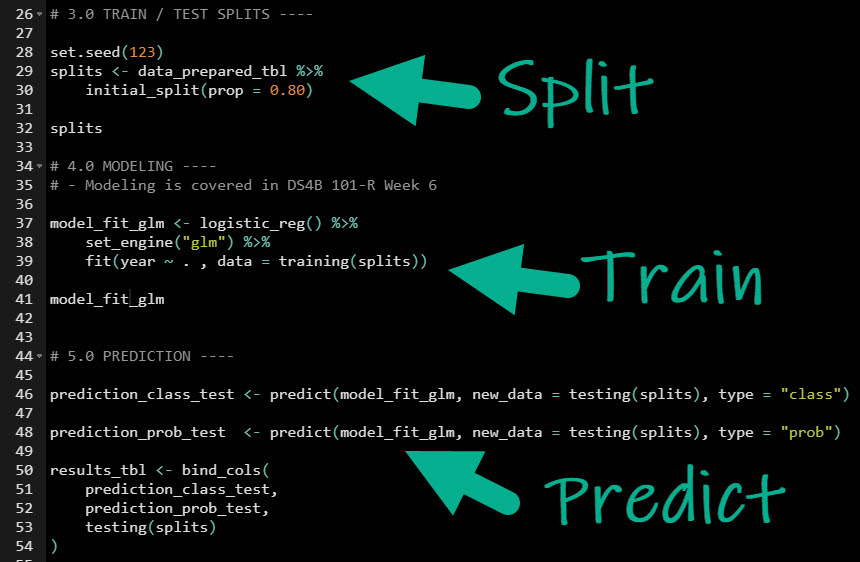
Simply split our dataset, train on the training set, evaluate on the testing set.
Folks, it’s that simple. 👏
 Full code in the video Github Repository
Evaluating Our Classification Model
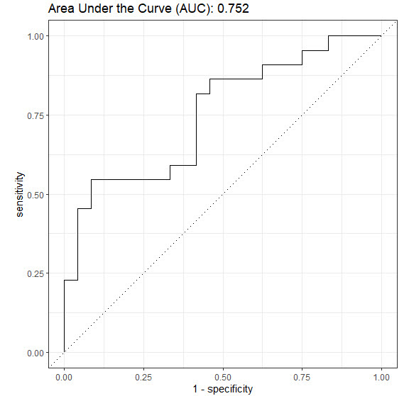
Question: How do we know our if our model is good?
Answer: Area Under the Curve (AUC)!
About AUC:
- Simple measure.
- We want greater than 0.5.
- Closer to 1.0, the better our model is.
- Bonus: ROC Plot - A way to visualize the AUC.
 Full code in the video Github Repository
Telling the Story
What can we do with a Logistic Regression Classifier? Let’s develop a story to communicate our insight!
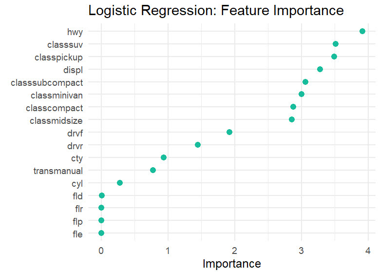
1. First, find the most important features (predictors) using vip().
 Full code in the video Github Repository
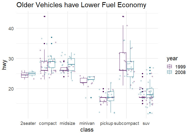
2. Next, use ggplot() to make a visualization that focuses on the top features:
- HWY: The highway fuel economy (miles per gallon)
- CLASS: The Vehicle Class (e.g. pickup, subcompact, SUV)
 Full code in the video Github Repository
What did we learn using Logistic Regression?
It’s clear now:
- Vehicles have become more efficient over time.
- Highway fuel economy has gone up for every single class of vehicle.
Your story-telling skills are amazing. Santa approves. 👇

But if you really want to improve your productivity…
Here’s how to master R programming and become powered by R. 👇
What happens after you learn R for Business.

Your Job Performance Review after you’ve launched your first Shiny App. 👇

This is career acceleration.
SETUP R-TIPS WEEKLY PROJECT
-
Get the Code
-
Check out the R-Tips Setup Video.
Once you take these actions, you’ll be set up to receive R-Tips with Code every week. =)