Interactive Principal Component Analysis in R
Written by Matt Dancho
This article is part of a R-Tips Weekly, a weekly video tutorial that shows you step-by-step how to do common R coding tasks.
Identify Clusters in your Data:
We’ll make an Interactive PCA visualization to investigate clusters and learn why observations are similar to each other. Here are the links to get set up. 👇
 (Click image to play tutorial)
PCA is all about data wrangling
PCA is a great tool for mining your data for clusters. But, most beginners get a few things wrong:
- PCA only works with numeric data
- Categorical data must be encoded as numeric data (e.g. one-hot)
- Numeric data must be scaled (otherwise your PCA will be misleading)
Data Wrangling is SUPER Critical
We need to use dplyr to encode categorical features as numeric.
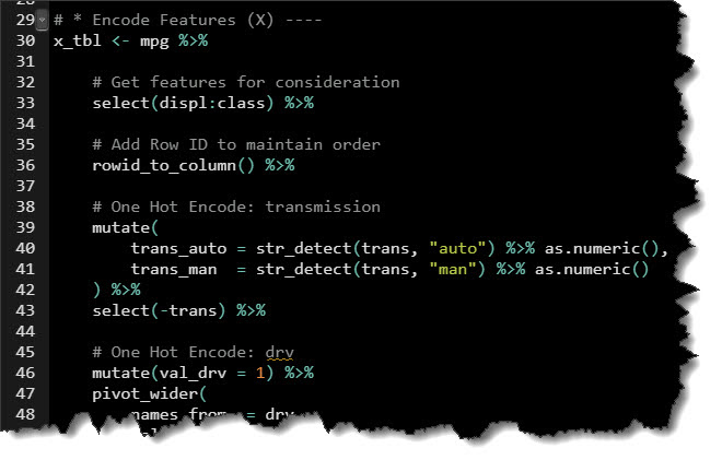
Full code in the video Github Repository
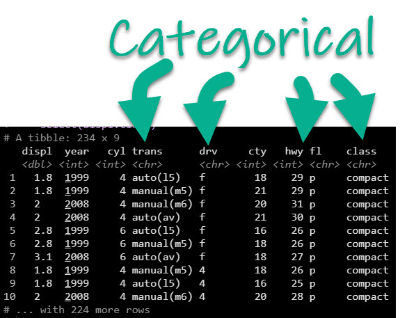
Before Encoding
PCA will not work with Categorical Data
(You'll get a nice error message)
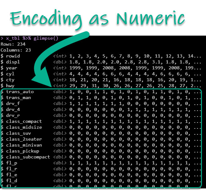
After Encoding
PCA likes data in this format 😊
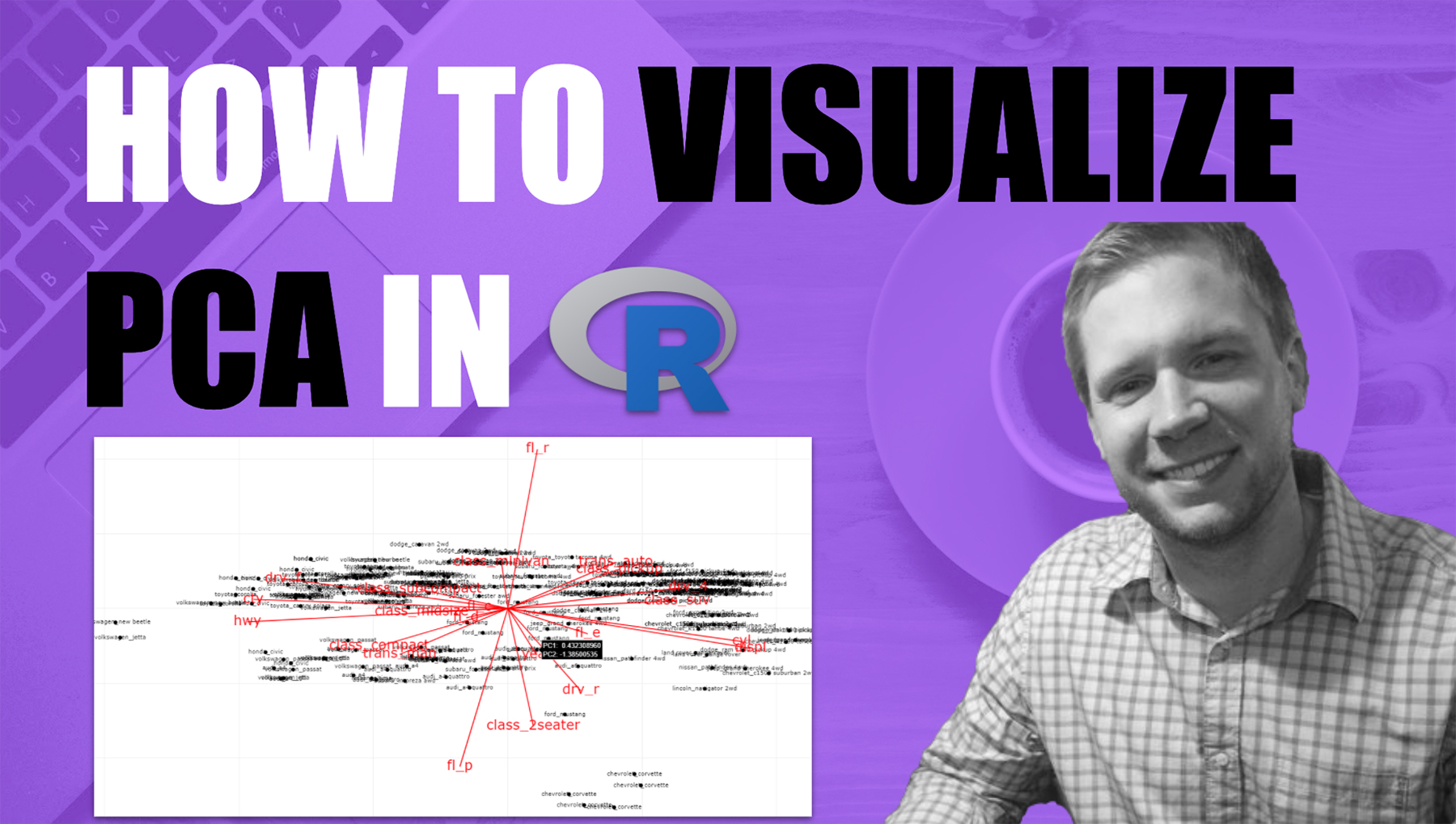
Visualizing Clusters
What can we do with PCA + ggplot2? Let’s visualize clusters in our data!
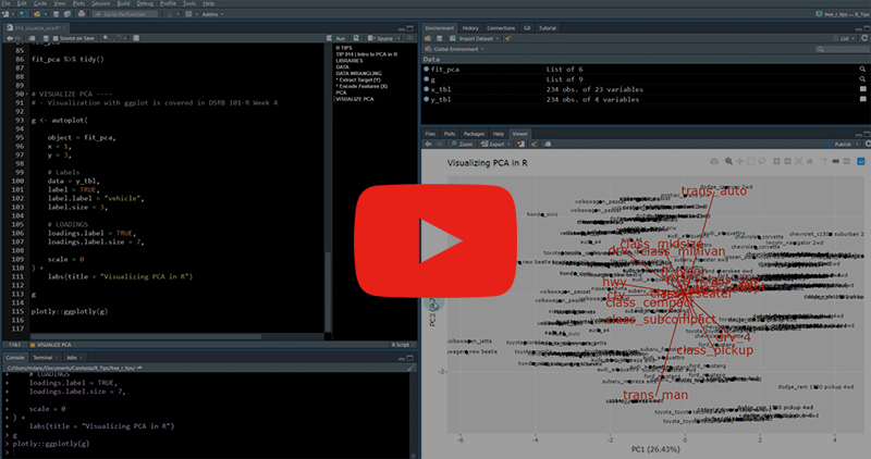
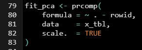
First, fit a PCA using prcomp().
Next, use autoplot() from the ggfortify package.
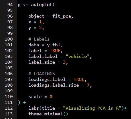
Then visualize. As an added bonus, we can make it interactive with ggplotly()!
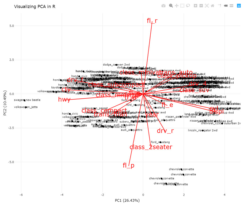
That's some XMAS magic. Santa approves. 👇

But if you really want to improve your productivity…
Here’s how to master R programming and become powered by R. 👇
What happens after you learn R for Business.

Your Job Performance Review after you’ve launched your first Shiny App. 👇

This is career acceleration.
SETUP R-TIPS WEEKLY PROJECT
-
Get the Code
-
Check out the R-Tips Setup Video.
Once you take these actions, you’ll be set up to receive R-Tips with Code every week. =)