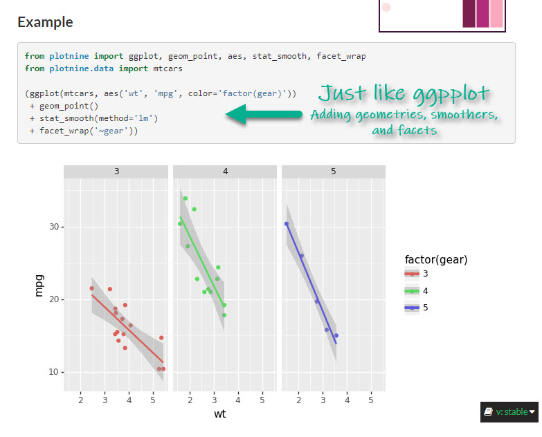
plotnine: Make great-looking correlation plots in Python
Written by Matt Dancho
The plotnine library is a powerful python visualization library based on R’s ggplot2 package. In this tutorial, we show you how to make a great-looking correlation plot using pandas and plotnine.
This article is part of Python-Tips Weekly, a bi-weekly video tutorial that shows you step-by-step how to do common Python coding tasks.
Here are the links to get set up. 👇
Plotnine Correlation Plot Video Tutorial
For those that prefer Full YouTube Video Tutorials.
Learn how to use plotnine for correlation plots in our free 10-minute YouTube video.
(Click image to play tutorial)
Watch our full YouTube Tutorial
What is Plotnine?
The plotnine python library brings the power of R’s ggplot2 to Python. Gain access to functions like:
-
ggplot() - Make the plot canvas (layout).
-
aes() - Map pandas DataFrame columns to the plot aesthetics (x, y, color, fill, etc).
-
Geometries - Add geometry layers including geom_point(), geom_smooth().
-
And more!
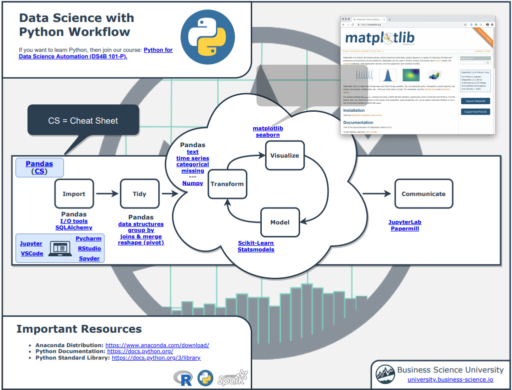
Before we get started, get the Python Cheat Sheet
Plotnine is great for data visualization in Python if you are coming from an R background. But, you might want to explore documentation for the entire Python Ecosystem (pandas, plotnine, plotly, and many more libraries). I’ll use the Ultimate Python Cheat Sheet.
Ultimate Python Cheat Sheet:
First, Download the Ultimate Python Cheat Sheet. This gives you access to the entire Python Ecosystem at your fingertips via hyperlinked documenation and cheat sheets.
(Click image to download)
If you’re coming from R, navigate to “Coming From R?” Section
Next, go to the section, “Coming from R?”. You can quickly get to the Plotnine Documentation.
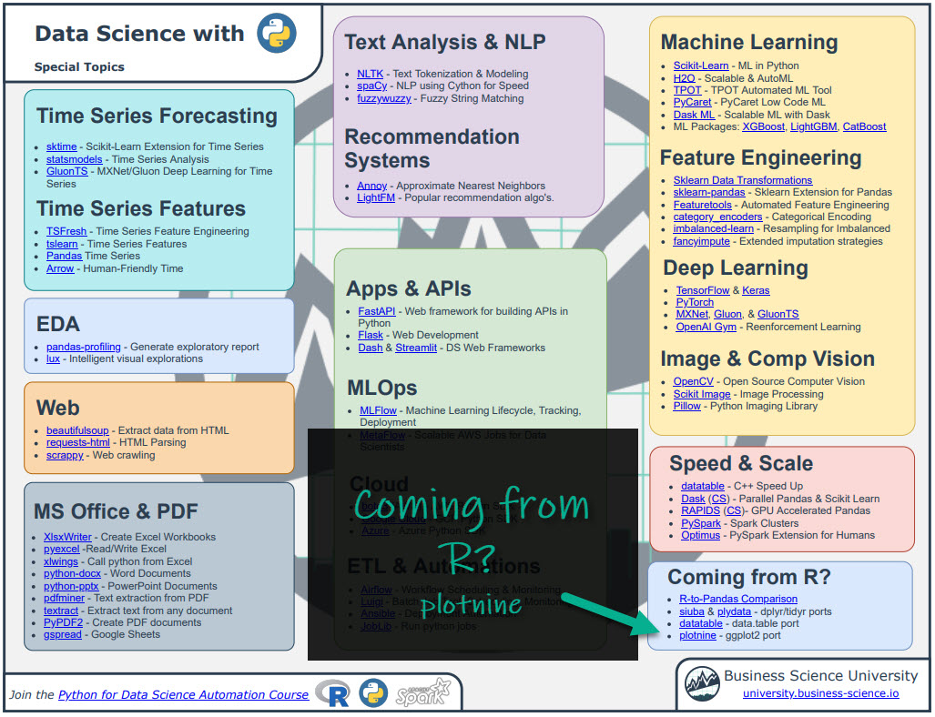
(Click image to download)
Explore Plotnine
You have access to the Plotnine Documentation at your fingertips.
Onto the tutorial.
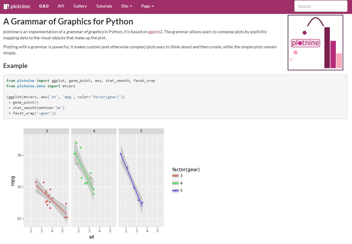
How Plotnine Works
From the Plotnine Documentation, you can see that the grammar of graphics from ggplot is used to add layers that control geometries, facets, themes, and more.
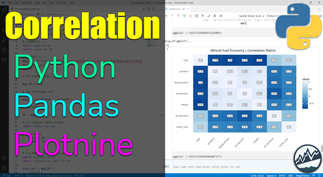
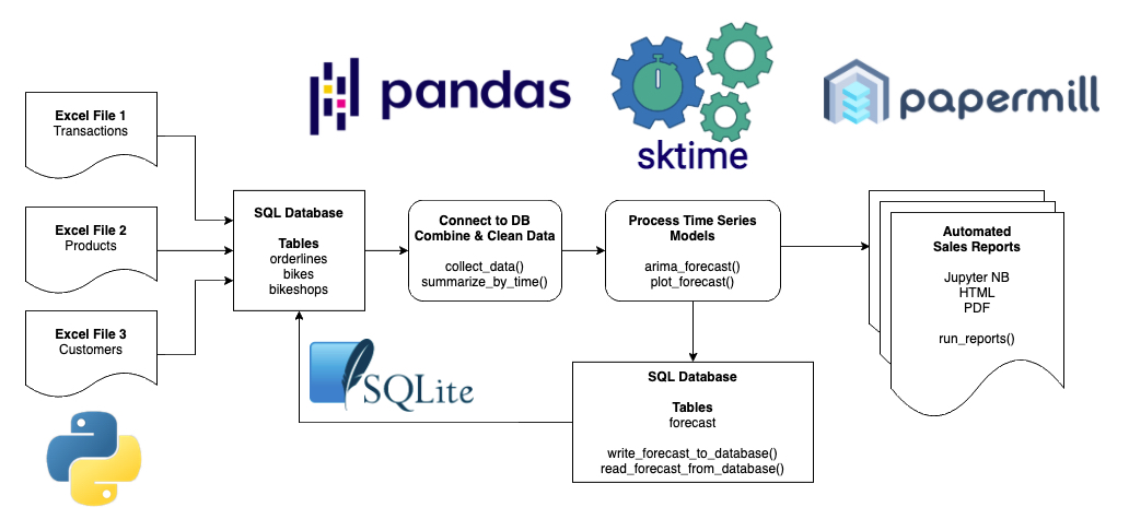
Making a Correlation Matrix Plot
Let’s check out how to make a professional correlation matrix plot with plotnine.
Get the code.
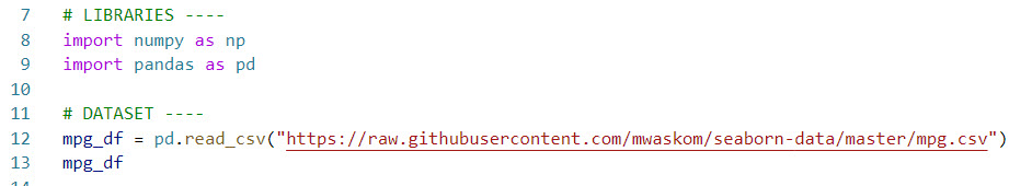
Step 1: Load Libraries and Data
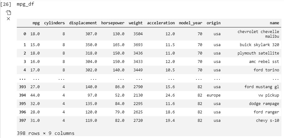
First, let’s load the libraries and data. From the libraries, we’ll import numpy and pandas to start out. We’ll also load the mpg dataset.
Get the code.
We’ll also load the mpg_df data set.
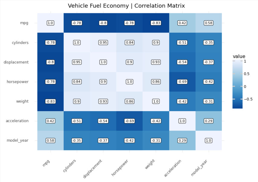
Step 2: Expose Relationships with Correlation
Goal: Understand Relationships to Fuel Economy (mpg) versus vehicle attributes like weight, cylinders, and model year.
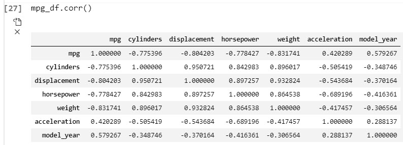
The correlation matrix is a square (n-by-n) matrix that shows the relationships between each feature. The correlation values range from -1 to +1 indicating both the strength (magnitude) and direction (positive/negative) of the relationship.
Code
We’ll use the corr() method from Pandas to make a correlation matrix as a Pandas DataFrame.
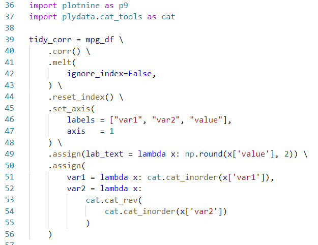
Goal: Prepare the data for visualization with plotnine by formatting in “long” (“tidy”) format
The plotnine data visualization API requires data to be in the “tidy” or long format where each row is an observation. In this case, we need each row to contain the first variable, the second variable, and the value of the correlation. We can do this with pandas. Pandas can be a challenge for beginners. I teach pandas in-depth with 5-hours of data wrangling training in Module 3 of my Python for Data Science Automation Course.
Get the code.
The trick here is to use:
-
Import plotnine and plydate.cat_tools to use ggplot functionality next and to more easily work with categorical data
-
melt() to pivot the data longer
-
assign() to add label text columns for the heatmap labels
-
assign() and cat_inorder() to organize the categorical columns as categories in the correct order.
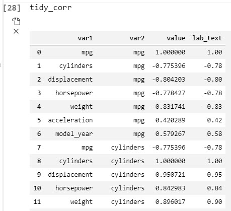
This outputs the data in Tidy format.
Step 4: Make the correlation visualization with plotnine
Goal: Make a professional-looking correlation plot that could be used in a business report to highlight key relationships to management.
Correlation visualizations are very powerful for business reporting as they can highlight key relationships for management. The problem is that many data scientists don’t know how to make them look professional, which can detract from your message to business stakeholders. Thankfully, plotnine solves this challenge. I teach plotnine in-depth with 4-hours of data visualization training in Module 7 of my Python for Data Science Automation Course.
First, here’s the correlation matrix heatmap visualization. We can clearly see that as cylinders increase (bigger engine) and weight increases (larger vehicles), fuel economy (mpg) tends to decrease. Conversely, as acceleration increases (possibly due to lower weight) and model year increases (newer vehicles), fuel economy tends to increase.
Next, here’s the code used to generate the visual.
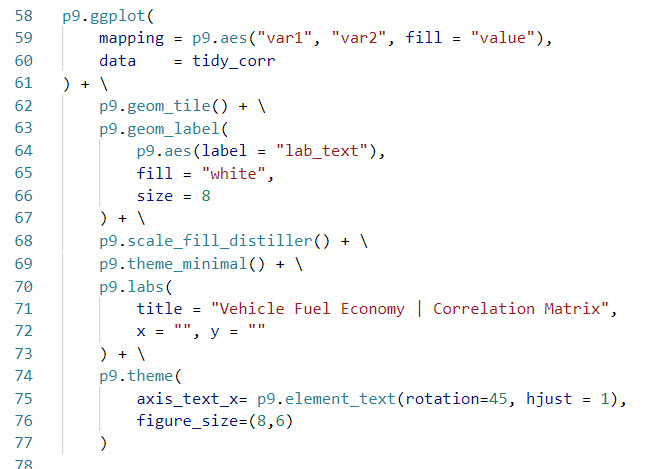
The trick here is to use:
-
geom_tile() to make the heat map.
-
geom_label() to add label text for the correlation values.
-
scale_fill_distiller() to add a nice fill to the tile to give a professional appearance.
Summary
This was a short introduction to plotnine, which brings ggplot2 to python. If you’re coming from R, plotnine is a great package to make professional plots in Python.
With that said, you’re eventually going to want to learn pandas, the most widely used data wrangling tool in Python. Why?
-
Our data wrangling code was written in Pandas
-
Most data science teams use Pandas
-
Pandas plays nicely with Plotnine
So, it makes sense to eventually learn Pandas and Plotnine to help with communication and working on R/Python teams.
If you’d like to learn data science for business with Python, Pandas, and Plotnine from an R-programmers guidance, then read on. 👇
My Journey Learning R and Python
Everyone knows me as the R guy. With the launch of my new Python course, I’m reflecting on my journey.
I started learning R in 2013 after Excel let me down (many many times with the dreaded blue screen of death). I had it. My data was too big, and I needed new tools that I could count on.
I turned to R for it’s statistical and reporting capabilities. The combination of dplyr and ggplot2 were like thunder & lightning. Add on Rmarkdown for reporting, and game over. Then I found out about shiny, and I was in heaven.
Why Python then?
It’s been an amazing learning experience, but now I recognize it was one dimensional.
Over the past 12 months I’ve been learning Python. I started by building my first R/Python Integration: Modeltime GluonTS, which ports into R the AWS GluonTS library written in Python.
This was my first realization that R and Python can work in harmony. Seeing the deep learning forecasts from GluonTS being shared in R was beautiful.
So I decided 12-months ago it was time to begin teaching Python. And I began working on a course plan.
My course philosophy
It’s my belief that Data Science Teams are changing. They now need to:
This is why I built Python for Data Science Automation.
So learners like me can begin learning Python in a project-focused way that shows the beauty of the language for data science + software engineering. It’s a beginner course too.
How I can help
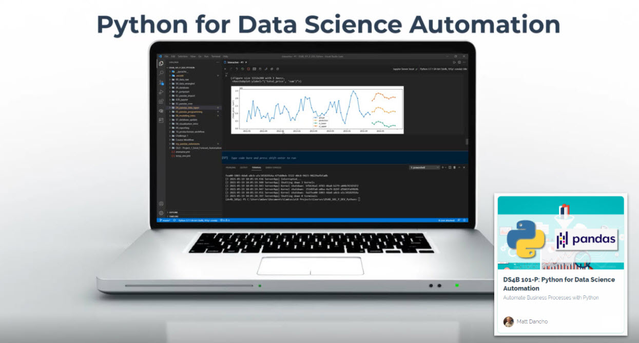
If you are interested in learning Python and the ecosystem of tools at a deeper level, then I have a streamlined program that will get you past your struggles and improve your career in the process.
It’s called the Python for Data Science Automation. It’s an integrated course that teaches you Python by integrating tools and solving real business problems.

The result is that you break through previous struggles, learning from my experience & our community of 2000+ data scientists that are ready to help you succeed. You’ll learn a ton going through our Business Process Automation project.
Best of All: I am an R-Programmer that has Learned Python
My background is R-programming. Yet, I’ve found that learning to use both R and Python is absolutely the future of data science.
Ready to take the next step?
Then let’s get started.
 (Click image to go to course)