ggplot2 Extension: corrmorrant for Flexible Correlation Plots in R
Written by Matt Dancho
This article is part of R-Tips Weekly, a weekly video tutorial that shows you step-by-step how to do common R coding tasks.
Here are the links to get set up. 👇
Correlation Matrix Plots with corrmorrant
A ggplot2 correlation plot extension
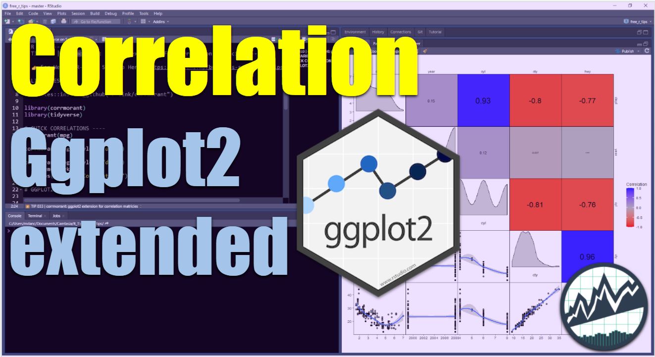
 (Click image to play tutorial)
corrmorrant
This R package makes Correlation Plots in no-time
The corrmorrant ggplot2 extension makes it easy to make Correlation Plots in R, a critical skill for exploratory data analysis (EDA). We'll use corrmorrant to:
- Make quick correlation plots in 1 line of code
- Extend ggplot with the grammar for correlation plotting
Make Correlation Plots in 1 Line of Code
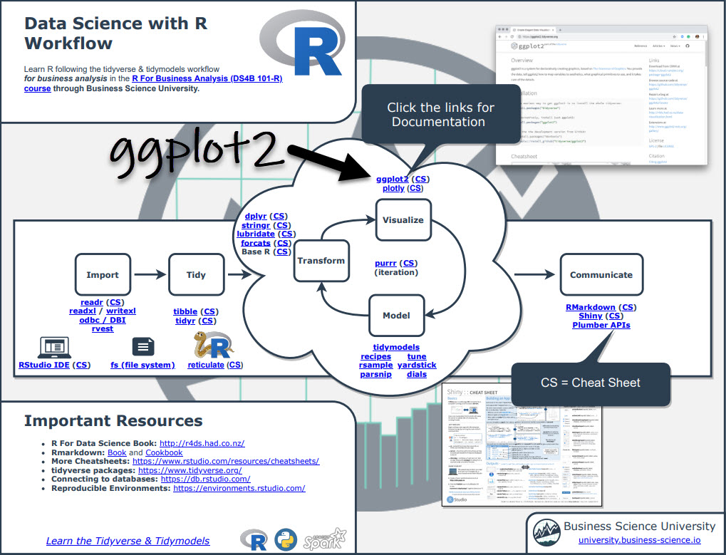
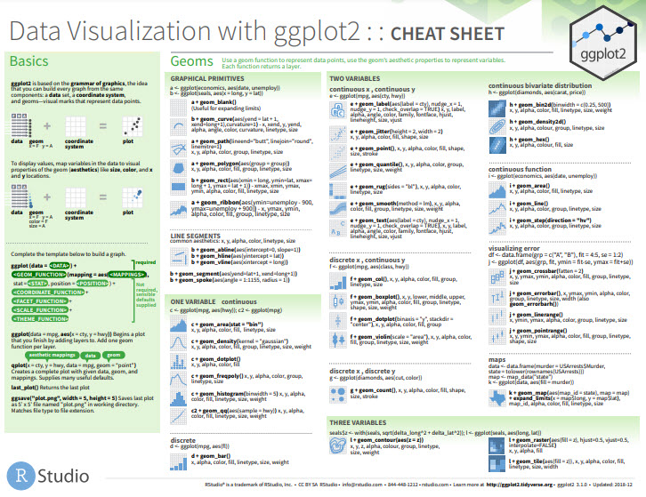
Before we get started, get the Cheat Sheet
Corrmorrant is great for making correlation plots fast. But, you'll still need to learn how to customize the plots and produce high-quality visualizations. For those topics, I'll use the Ultimate R Cheat Sheet to refer to ggplot2 code in my workflow.
Quick example - Clicking the "CS" next to "ggplot2" opens the Data Transformation with Dplyr Cheat Sheet.
Now you're ready to quickly reference ggplot2 functions. Ok, onto the tutorial.
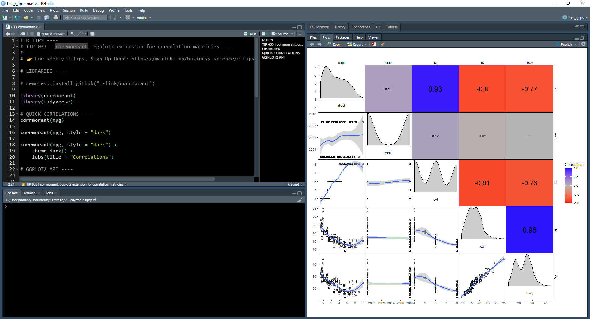
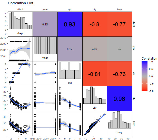
Make correlation plots in 1 line of code
Productivity is essential in data science. Businesses need value quickly so they can make decisions. So, naturally I'm a big fan of the 1-line of code to do something great. Corrmorrant gets this.
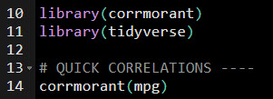
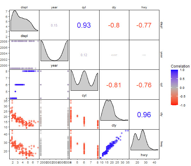
Using the corrmorrant::corrmorrant() function, we generate a correlation plot in 1 line of code.
The correlation plot includes:
- Lower Triangle: Scatter plot,
ggplot2::geom_scatter()
- Upper Triangle: Correlation strength as text labels,
ggplot2::geom_text()
- Diagonal: Density plot,
ggplot2::geom_density()
Correlation Plot Customization
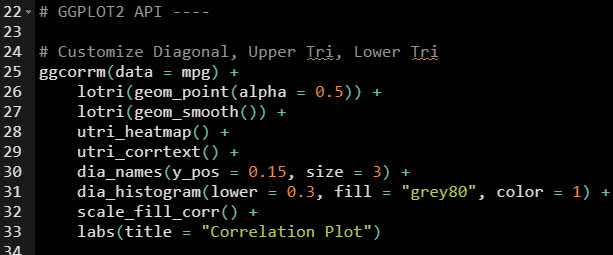
It gets better - corrmorrant has a ggplot2 API that provides a grammar for correlation graphics.
ggcorrm()- Creates a correlation ggplot.lotri()- Applies a ggplot2 geometry to the lower triangle.utri()- Applies a ggplot2 geometry to the lower triangle.- And there are special Ggplot Helpers like
utri_heatmap(), dia_historgram(), and scale_fill_corr() that apply quick geoms to parts of the plot.
 Get the Code
The correlation plot has now been customized with a smoother in the lower triangle, histogram on the diagonal, and heatmap on the upper triangle. This is why it pays dividends to learn ggplot2. Using the ultimate R cheat sheet for documentation on ggplot2 helps bigtime.
 Code available in our Free R-Tips Github Repository
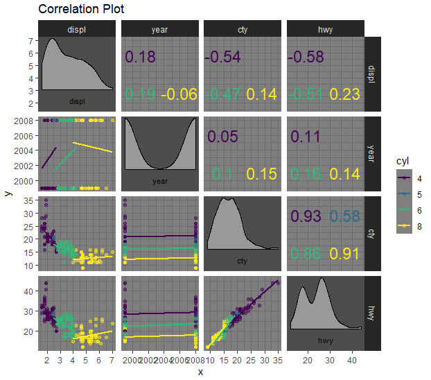
Challenge: Grouped Correlations and Dark Theme
This is really cool.
Here's a test if you've been following along and want to test your ggplot2 skills. Make this plot that applies "cyl" column as groups to the geoms. Note that you'll need to do a trick to get the grouped correlations in the upper triangle. Solution is available in our Free R-Tips Github Repository.
 Code available in our Free R-Tips Github Repository
In Summary
You just quickly made custom correlation plots using the ggplot2 extension, corrmorrant. This is an amazing productivity boost!!
You should be proud.
This article is part of R-Tips Weekly, a weekly video tutorial that shows you step-by-step how to do common R coding tasks. Join today.