Webscraping Tables in R: Datapasta Copy-and-Paster
Written by Matt Dancho
This article is part of R-Tips Weekly, a weekly video tutorial that shows you step-by-step how to do common R coding tasks.
Here are the links to get set up. 👇
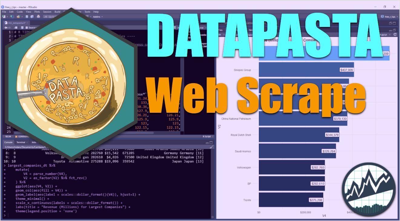
 (Click image to play tutorial)
I wish I knew about Datapasta sooner
This R package saves so much time.
Datapasta is an amazing package that allows us to copy-and-paste any HTML or Excel Tables into R. I only wish I knew about it sooner. We'll use Datapasta to:
- Copy Stock Data from Yahoo! Finance
- Copy Revenue Data on the Largest Companies in the World from Wikipedia
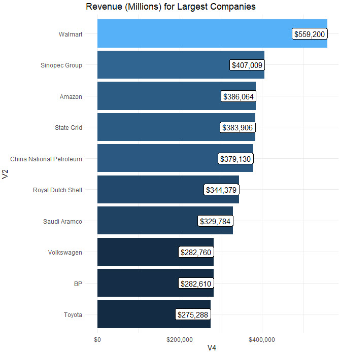
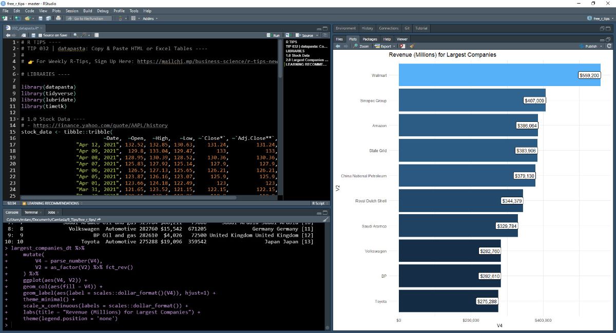 Visualize Revenue Data from the 10 Largest Companies in the World
Source: Wikipedia
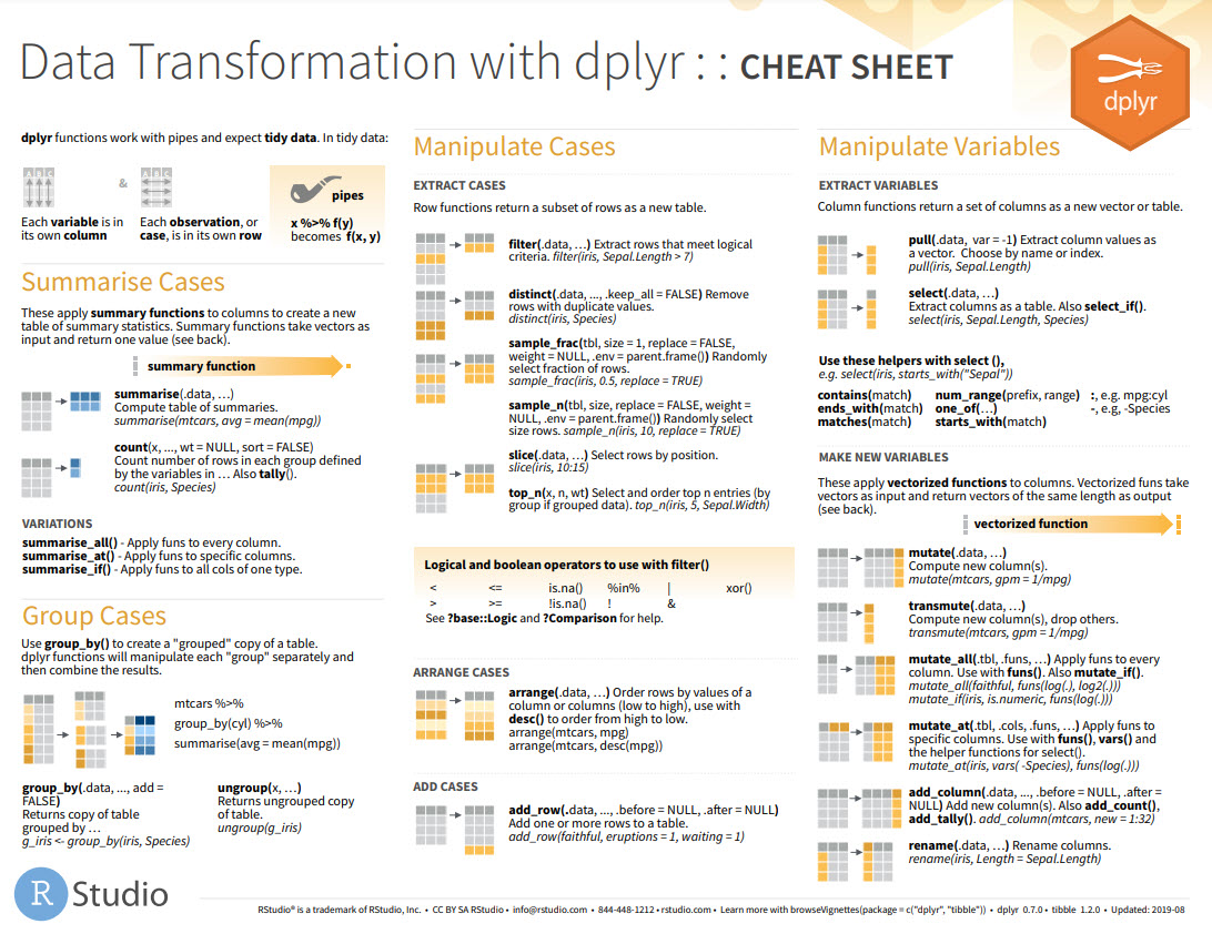
Before we get started, get the Cheat Sheet
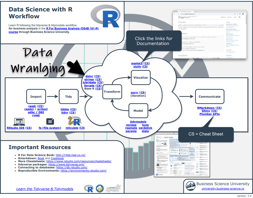
Datapasta is great for importing raw data from HTML tables on the web. But, you'll still need to learn how to transform / wrangle the data and produce visualizations. For those topics, I'll use the Ultimate R Cheat Sheet to refer to dplyr and ggplot2 code in my workflow.
Quick example - Clicking the "CS" next to "dplyr" opens the Data Transformation with Dplyr Cheat Sheet.
Now you're ready to quickly reference dplyr functions. Ok, onto the tutorial.
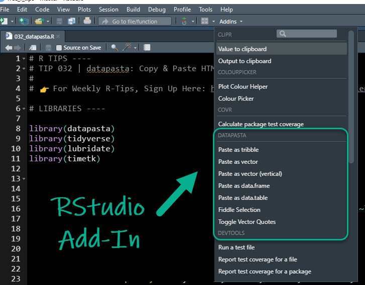
Datapasta RStudio Addin
Datapasta contains an RStudio Add-In for Pasting web-tables stored in your "clipboard" (what happens when you "copy" something).
Example 1: Copying Stock Data from Yahoo! Finance
Let's go through a quick example. We can navigate to Yahoo! Finance and search for a ticker symbol like AAPL.
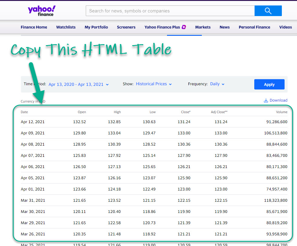 Source: Yahoo! Finance
Next, use the Datapasta Addin to "paste as tribble". This pastes our data into our R script file.
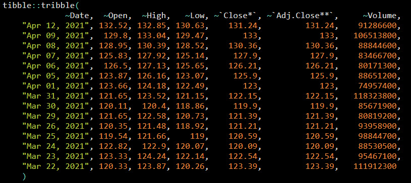
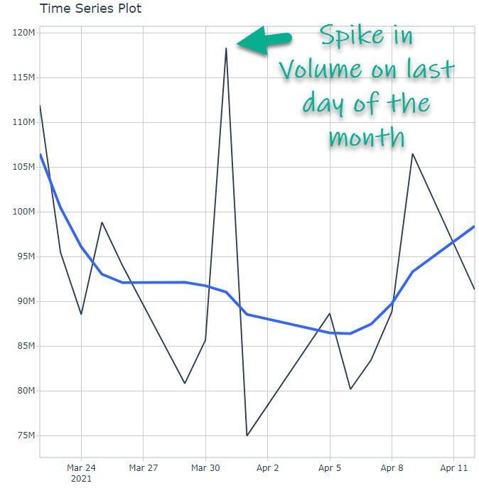
Next, use dplyr and timetk to wrangle and visualize the data. (Refer to the ultimate R cheat sheet for documentation on dplyr and timetk). We can see a spike in volume on last day of the month.
 Code available in our Free R-Tips Github Repository
Example 2: Getting Revenue Data for World Largest Companies
From Wikipedia
First, head over to Wikipedia and search for the "list of largest companies".
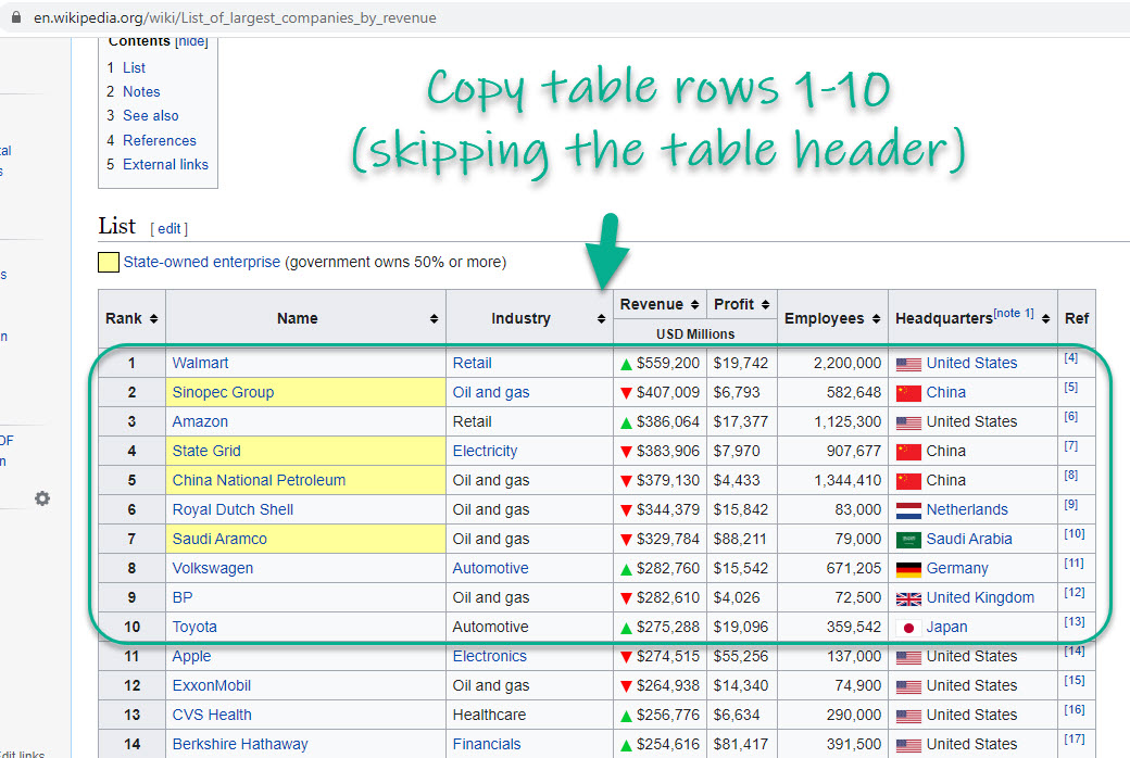 Source: Wikipedia
Use datapasta to "paste as data.table". Then do some data wrangling with dplyr. Then visualize with ggplot2. And in a few lines of code you can create this chart showing that Walmart is dominating in Revenue. (Refer to the ultimate R cheat sheet for documentation on dplyr and ggplot2).
 Code available in our Free R-Tips Github Repository
In Summary
You just quickly scraped HTML tables using the copy-and-paster Rstudio Add-In known as datapasta . This is an amazing productivity boost!!
This article is part of R-Tips Weekly, a weekly video tutorial that shows you step-by-step how to do common R coding tasks. Join today.