Make PDF Data Analysis Reports with R | Rmarkdown Visual Editor
Written by Matt Dancho
This article is part of a R-Tips Weekly, a weekly video tutorial that shows you step-by-step how to do common R coding tasks.
Let’s make a professional business report in 5 minutes in HTML and PDF formats, and incorporates your data analysis in R. Reporting used to take me much longer and is now faster with the new Rmarkdown Visual Editor.
Here are the links to get set up. 👇
 (Click image to play tutorial)
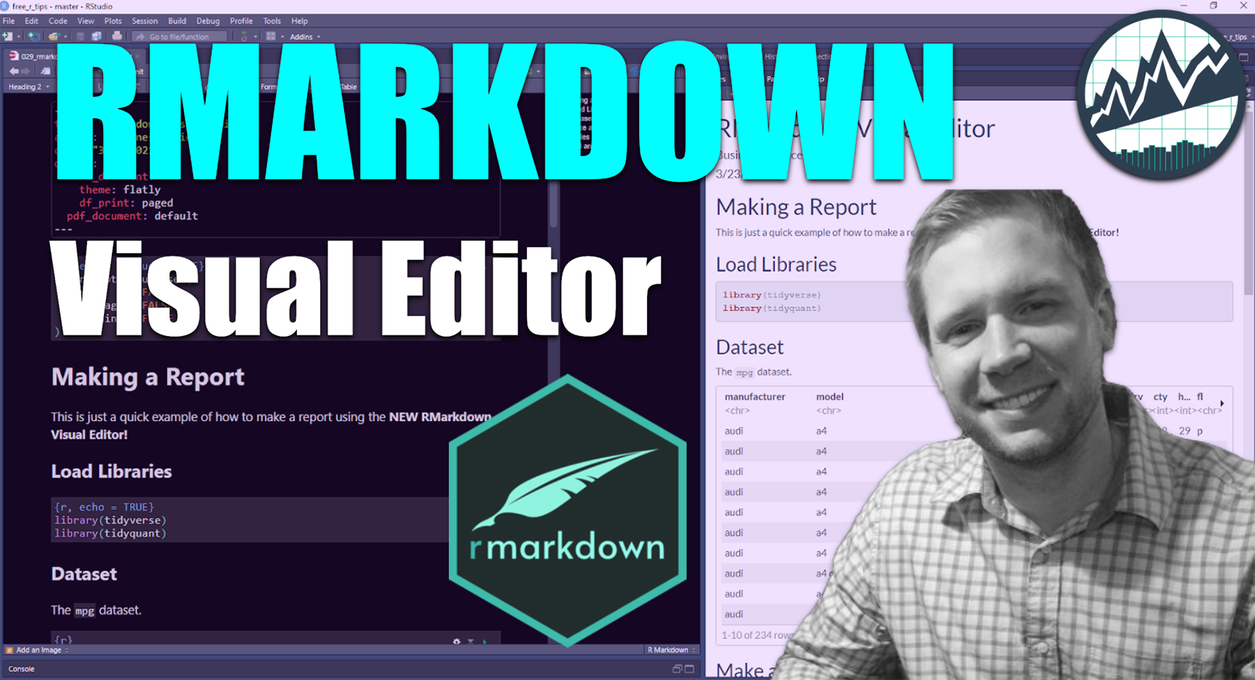
RMarkdown Visual Editor
The RMarkdown visual editor is a massive productivity enhancer. I easily get a 3X speed-boost when making PDF reports. In this R-Tip, you’ll learn how to do all of this in 5-minutes:
- Make a PDF Report (and HTML too)
- Add datasets to your report
- Add ggplot visualizations
- Add Tables
- Add Images
And you’ll do it the easy way with RMarkdown’s new Visual Editor.
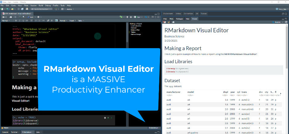 R Markdown Visual Editor is a Massive Productivity Enhancer
Helps us make this PDF report in minutes.
How to get started with Visual Editor
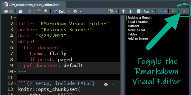
It’s simple to turn on the Rmarkdown Visual Editor. Just click this button.
Exploring the Visual Editor
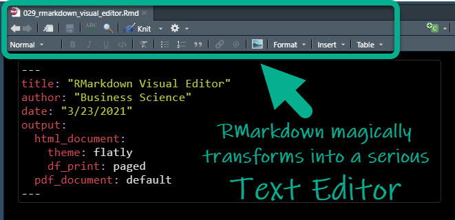
When you click the “Visual Editor Toggle Button”, your Rmarkdown options transform into an amazing Text Editor.
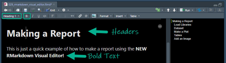
Format Headers and Text Faster
No need to remember how to make text bold or add headers. Just click the Heading 1 or the Bold buttons. The formatting in the Rmarkdown changes to show that your text formatting worked.
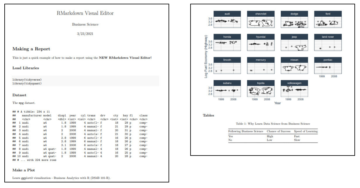
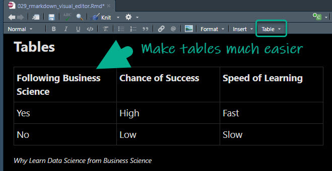
Make Tables Faster
Tables in R Markdown used to be a huge pain. That goes away with the convenient table editor.
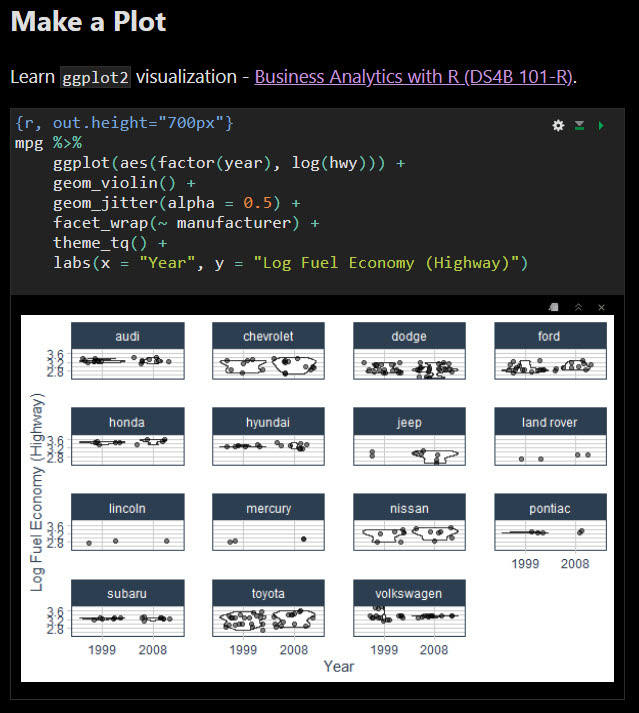
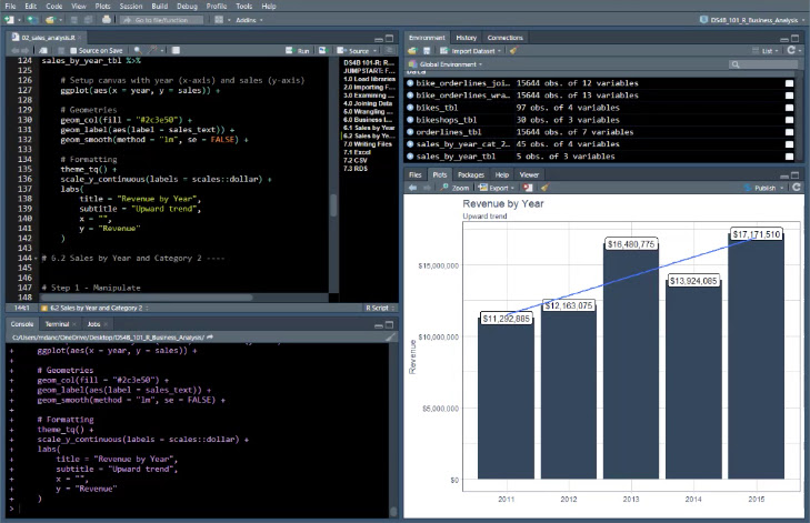
Add a ggplot to your report
We can even add ggplot2 visualizations.
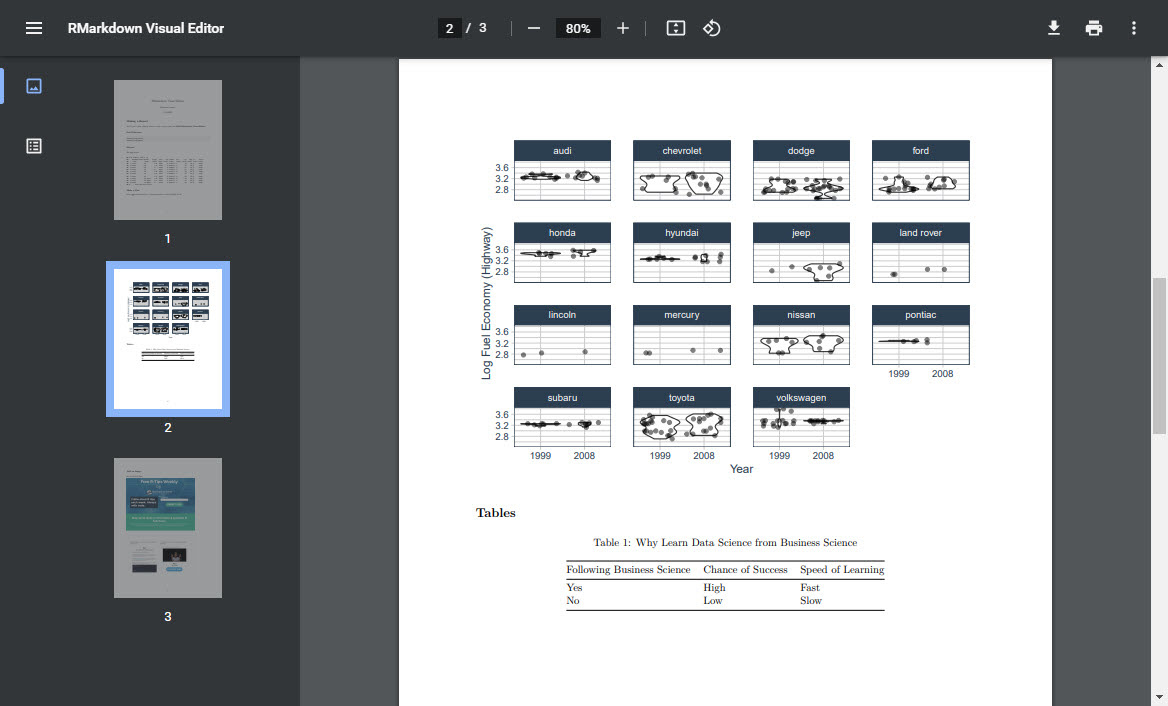
Create a PDF report
Just knit to PDF.
Learning ggplot2
To make powerful PDF Reports showcasing data science, you’ll need to learn ggplot2. Here are a few learning tips:
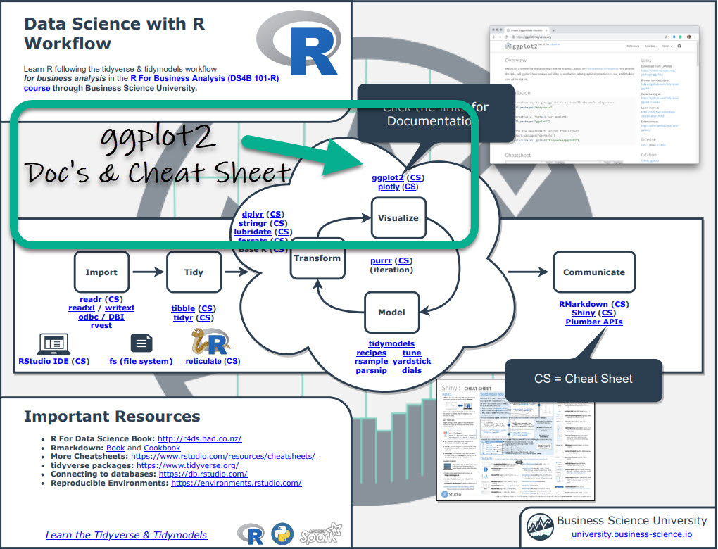
PRO TIP 1 - Use my Cheat Sheet
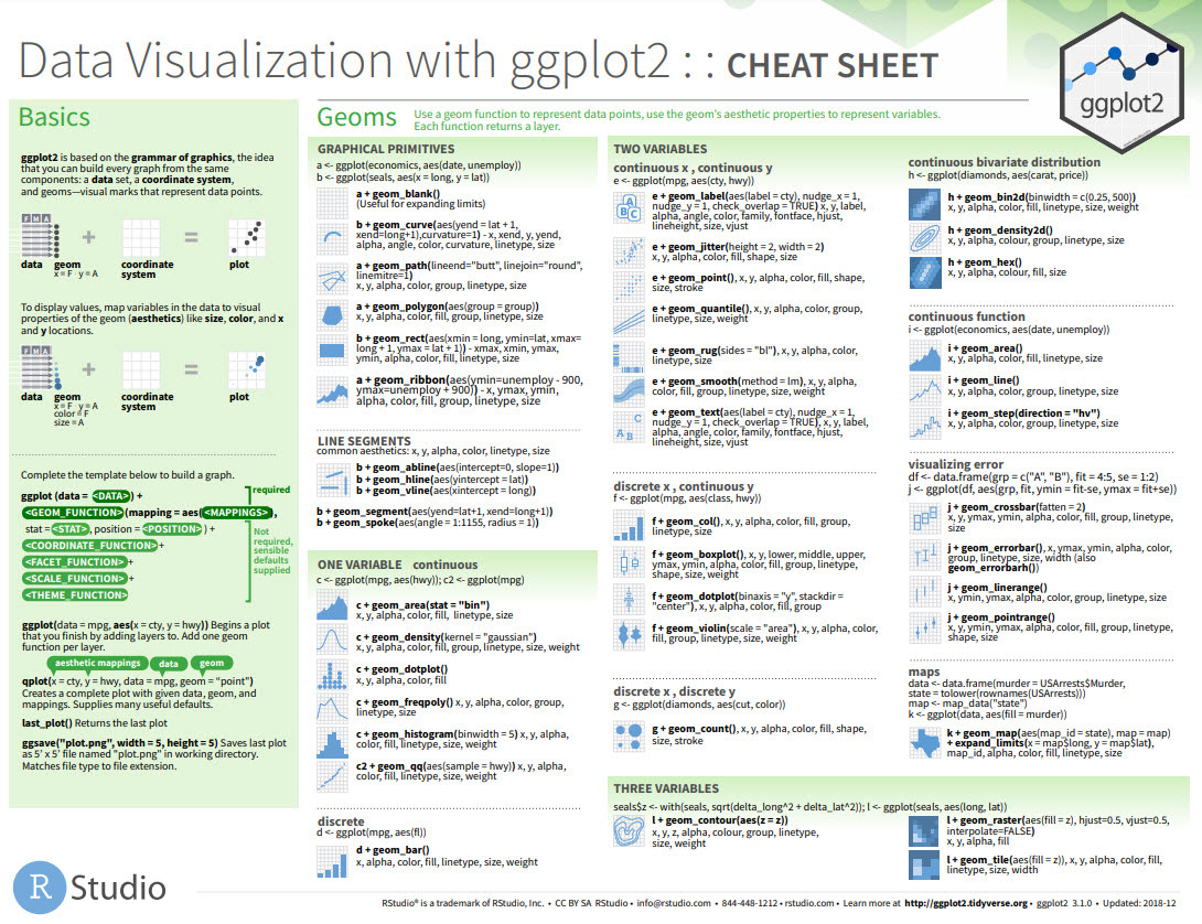
I’ve added the “Tidyverse” to my Ultimate R Cheatsheet (see page 1). Click the “CS” next to ggplot to get the ggplot2 Cheat Sheet.
This downloads the “Data Visualization with ggplot2” Cheat Sheet with all of the ggplot2 functions. It’s a great way to get a 1000-foot view of ggplot2. But, it can be a lot to take in.
PRO TIP 2 - Try my Jumpstart with R Course
Jumpstart with R the 1st week of my R-Track program. You’ll make a Sales Analysis with dplyr and ggplot2. You’ll see how several of those functions from the ggplot cheat sheet work as you make your sales analysis plots.
In Summary
You just built an amazing PDF Report with ggplot code all thanks to RMarkdown Visual Editor!!
But, what if you want to build more powerful analysis and web applications?
This could be a challenge. You’ll need to learn a ton, and this will take a long time. Plus, you might struggle and quit.
What if there was a program that took the guess-work out of learning data science and made it impossible to fail?