Make Awesome Statistical Plots in R
Written by Matt Dancho
This article is part of a R-Tips Weekly, a weekly video tutorial that shows you step-by-step how to do common R coding tasks.
Here are the links to get set up. 👇
 (Click image to play tutorial)
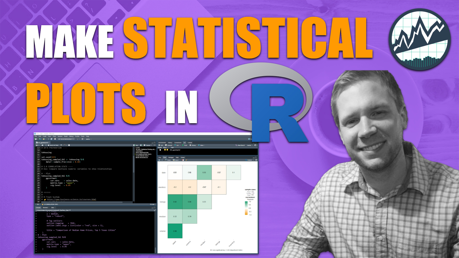
Making Statistical Plots Is Easy With ggstatsplot
I never thought I’d be able to make publication-ready statistical plots so easily. Seriously - thank you ggstatsplot.
We’re going to kick the tires on 2 of the many awesome ggstatsplot functions:
ggcorrmat() - For making correlation matrix that exposes relationships between multiple numeric variables.ggbetweenstats() - For comparing similarities / differences between groups.
As you follow along, you can use my Ultimate R Cheatsheet. It consolidates the most important R packages (ones I use every day) into 1 cheatsheet.
Plot 1: Correlation Matrix Plot
Make beautiful correlation plot that's great for reports
Correlation plots are must-know plots. Everyone understands correlations (even non-technical people). Correlation plots great for explaining insights in simple terms:
- Magnitude (between zero in one): two features have a higher degree of relationship the closer the magnitude gets to one.
- Sign (Positive/Negative): A positive sign indicates a positive relationship (both go up). A negative sign indicates an inverse relationship (as one goes up, the other goes down).
Here's how easy it is to make an AWESOME Correlation Plot with 1 line of code.
Plot 2: Between Stats Plot
Between stats are used to compare categories to show differences between groups
Comparing groups helps tell the story by showing differences in means, distributions, and by highlighting outliers. There’s no faster way than to use ggbetweenstats().
We need to do a little bit of data wrangling first to isolate the top 5 cities in the data. (Check out my Ultimate R Cheatsheet for getting data wrangling down).
Once we isolate the top 5 cities, we can make an awesome visualization (again in 1 line of code)!
The ggbetweenstats() function makes it super easy to compare groups and identify outliers.
Give yourself a high-five. You just made 2 advanced plots in a few lines of code.

But if you really want to improve your productivity...
Here's how to master R. 👇
What happens after you learn R for Business.

This is career acceleration.
SETUP R-TIPS WEEKLY PROJECT
-
Get the Code
-
Check out the R-Tips Setup Video.
Once you take these actions, you’ll be set up to receive R-Tips with Code every week. =)