How to Make Publication-Quality Excel Pivot Tables with R
Written by Matt Dancho

This article is part of a R-Tips Weekly, a weekly video tutorial that shows you step-by-step how to do common R coding tasks.
Let’s learn how to make Excel pivot tables with R.
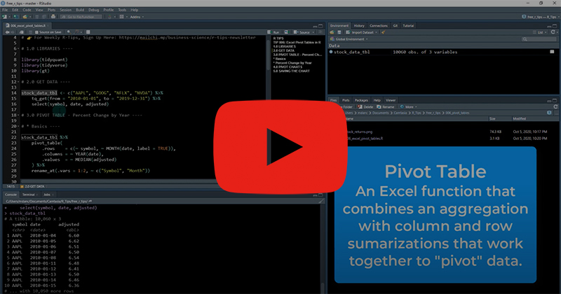 (Click image to play tutorial)
Excel Pivot Tables with R Tutorial
The biggest thing I missed when I transititioned from Excel to R was…
PIVOT TABLES!
Seriously - Pivot Tables are so useful. You can summarize and reshape (aka Pivot) data so easily with them in Excel. Why not in R???
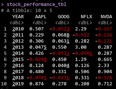
Here’s the Publication-Quality Pivot Table that we are going to make today. 👇

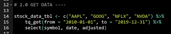
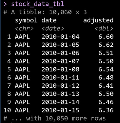
First, collect your data using tidyquant, an awesome package I created for importing & working with Financial Data.
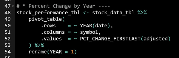
Next, make a pivot_table() from the stock data. The resulting data summarized using a percentage change from 1st to last in each pivot cell.
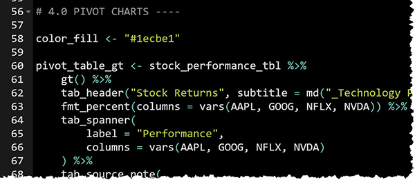
And with the GT Package, we can make the pivoted data into a PUBLICATION-QUALITY Pivot Table with conditional formatting applied to highlight years with positive stock returns. (Table code partially shown. Get the GitHub code to reproduce the table.)
And, now you have a publication-quality stock performance report! 👇
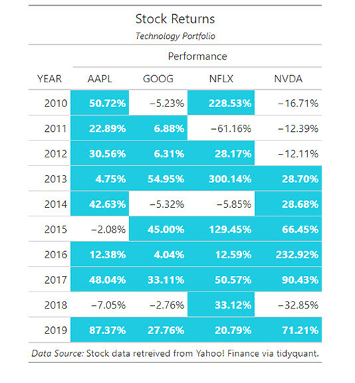
You’ve just made a publication-quality Pivot Table in R.
Boom! 💥💥💥

Learn something? Awesome!
But you need to learn a TON to become an R Samurai Master.

SETUP R-TIPS WEEKLY PROJECT
-
Get the Code
-
Check out the R-Tips Setup Video.
Once you take these actions, you’ll be set up to receive R-Tips with Code every week. =)