Data Science With R Course Series - Week 6
Written by David Curry
Welcome to week 6 of the Data Science with R Course Series.
This week’s curriculum is an extension of week 5, where we started analyzing model performance.
This week will cover the following:
- Learn techniques to communicate and measure model performance
- Learn how to analyze individual machine learning model metrics
- Learn how to visually compare multiple models based on metrics
- Learn how to communicate model performance to different stakeholders
Here is a recap of our trajectory and the course overview:
Recap: Data Science With R Course Series
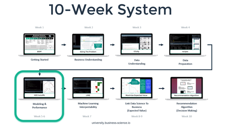
You’re in the Week 6: H2O Model Performance. Here’s our game-plan over the 10 articles in this series. We’ll cover how to apply data science for business with R following our systematic process.
Week 6: H2O Model Performance

Student Feedback
Week 6: H2O Model Performance
The Performance Overview & Setup module summarizes this week’s course material and reviews the required code, such as extracted H2O machine learning models and utility script files.
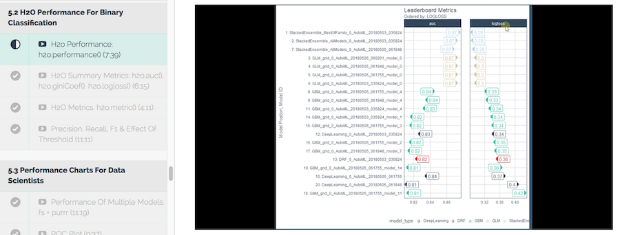
Learn how to create an H2O performance object to retrieve model metrics, such as AUC and logloss. Each H2O auto-generated machine learning model can be extracted and saved to memory.
Once the machine learning models are saved, you will learn how to:
- Compare two competing metrics in binary classification
- Compare top performing models using the AUC metric
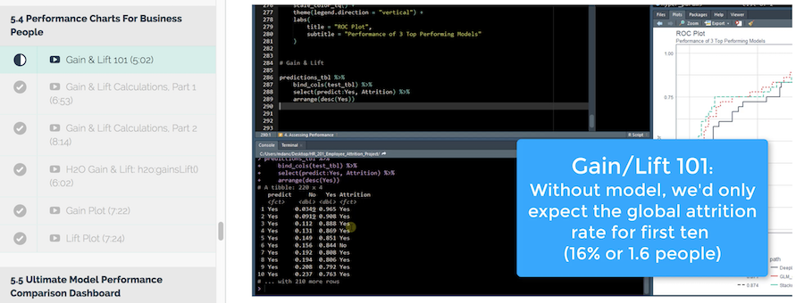
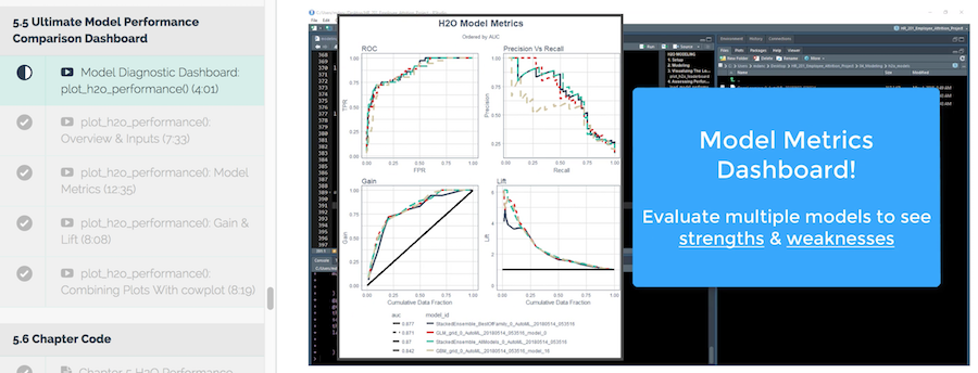
In Performance Charts For Data Scientists, take your knowledge on how to measure the performance of a single classifier and create a plot that will measure the performance of multiple models.
Performance charting is a great way for data scientists to evaluate model performance using different metrics.
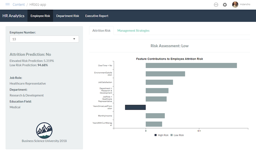
All your efforts to this point have been to create a high-performance model that accurately predicts employee churn. However, business people will not be receptive to the language of data science.
In this module, learn how to create a chart for business people to understand how much a model will improve results. The performance chart for business people will help communicate what can be done to solve the problem and understand how serious the problem is.
In this lecture, you will create a model metrics dashboard that combines the performance chart for data scientists and performance chart for business people into one visualization. Combining the charts assist in evaluating the strengths and weaknesses of multiple models in one view.
You Need To Learn R For Business

To be efficient as a data scientist, you need to learn R. Take the course that has cut data science projects in half (see this testimonial from a leading data science consultant) and has progressed data scientists more than anything they have tried before. Over 10-weeks you learn what it has taken data scientists 10-years to learn:
- Our systematic data science for business framework
- R and H2O for Machine Learning
- How to produce Return-On-Investment from data science
- And much more.
Start Learning Today!
Next Up
The next article in the Data Science With R Series covers Modeling Churn: Explaining Black-Box Models With LIME.
Week 7 will cover feature explanation using a the R library Lime. Prediction explanation is important as a data scientist in order to communicate model results. Using Lime, you will learn how to explain your machine learning model and empower business people to make better decisions.
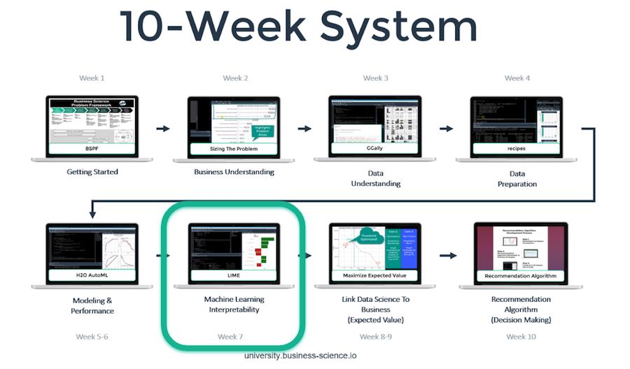
Week 7: Modeling Churn: Explaining Black-Box Models With LIME
New Course Coming Soon: Build A Shiny Web App!
You’re experiencing the magic of creating a high performance employee turnover risk prediction algorithm in DS4B 201-R. Why not put it to good use in an Interactive Web Dashboard?
In our new course, Build A Shiny Web App (DS4B 301-R), you’ll learn how to integrate the H2O model, LIME results, and recommendation algorithm building in the 201 course into an ML-Powered R + Shiny Web App!
Shiny Apps Course Coming in October 2018!!! Sign up for Business Science University Now!
Building an R + Shiny Web App, DS4B 301-R
Get Started Today!