Data Science With R Course Series - Week 3
Written by Matt Dancho
Data Science and Machine Learning in business begins with R. Why? R is the premier language that enables rapid exploration, modeling, and communication in a way that no other programming language can match: SPEED! This is why you need to learn R. Time is money, and, in a world where you are measured on productivity and skill, R is your machine-learning powered productivity booster.
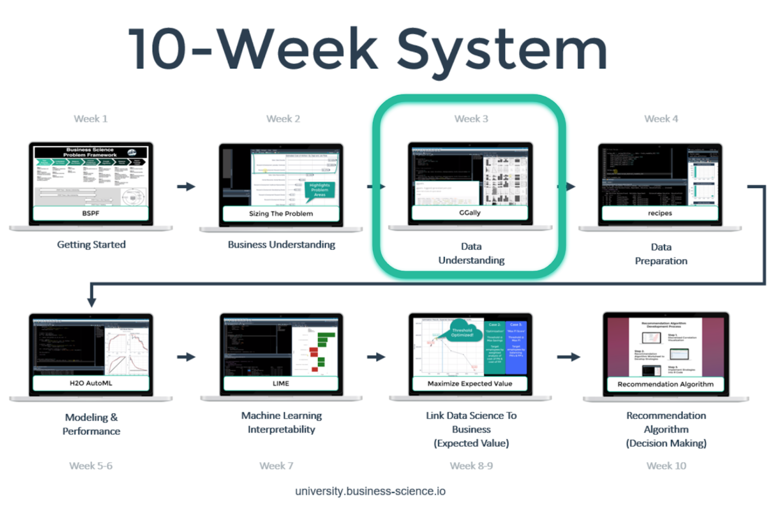
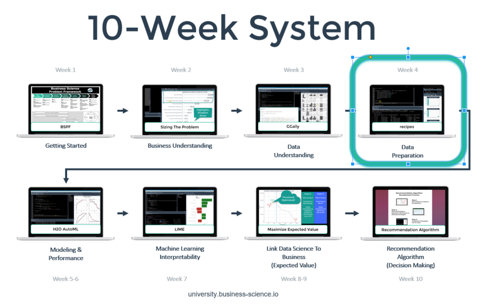
In this Data Science With R Course Series, we’ll cover what life is like in our ground-breaking, enterprise-grade course called Data Science For Business With R (DS4B 201-R). The objective is to experience the qualities that make R great for business by following a real-world data science project. We review the course that will take you to advanced in 10 weeks.
In this article, we’ll cover Week 3: Data Understanding, which is where we expand our exploratory techniques with the goal of exposing key characteristics of the features in our data set.
But, first, a quick recap of our trajectory and the course overview.
Data Science With R Course Series
You’re in the Week 3: Data Understanding. Here’s our game-plan over the 10 articles in this series. We’ll cover how to apply data science for business with R following our systematic process.
Week 3: Data Understanding
Week 3: Data Understanding
In data understanding, you’ll learn two key packages that can help identify characteristics of your data:
- `skimr`: For efficiently exploring data by data type (e.g. numeric, character, etc)
- `GGally`: For visualizing pair plots for many features within the data
Let’s take a peek at the course.
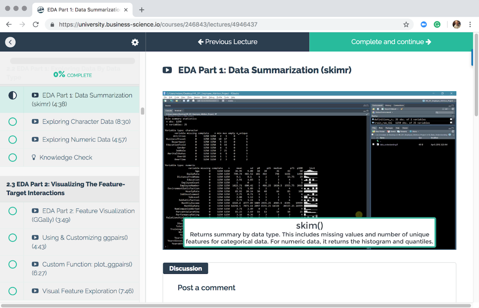
EDA with skimr
We kick week 3 off with skimr, a package for quickly skimming data by data type. In the course you’ll review both numeric data and character data. This is important to identify quickly what issues may be present such as missing values, numeric data that should be categorical, and so on.
Here’s a snapshot of our first use of the skim() function.
EDA with GGally
Next, we build our knowledge of the data by making use of the GGally package for visually identifying relationships in the data. We focus on identifying relationships between the target (employee attrition) and various features in the data set. We make use of the ggpairs() function that enables us to visualize the complex relationships.
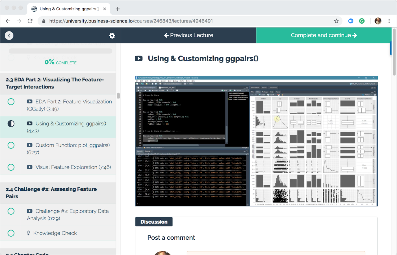
Next, you’ll build a custom plotting function with Tidy Eval (learned in Week 2) to extend the functionality of ggpairs() and enable honing in on the relationship between each feature and its interaction with attrition.
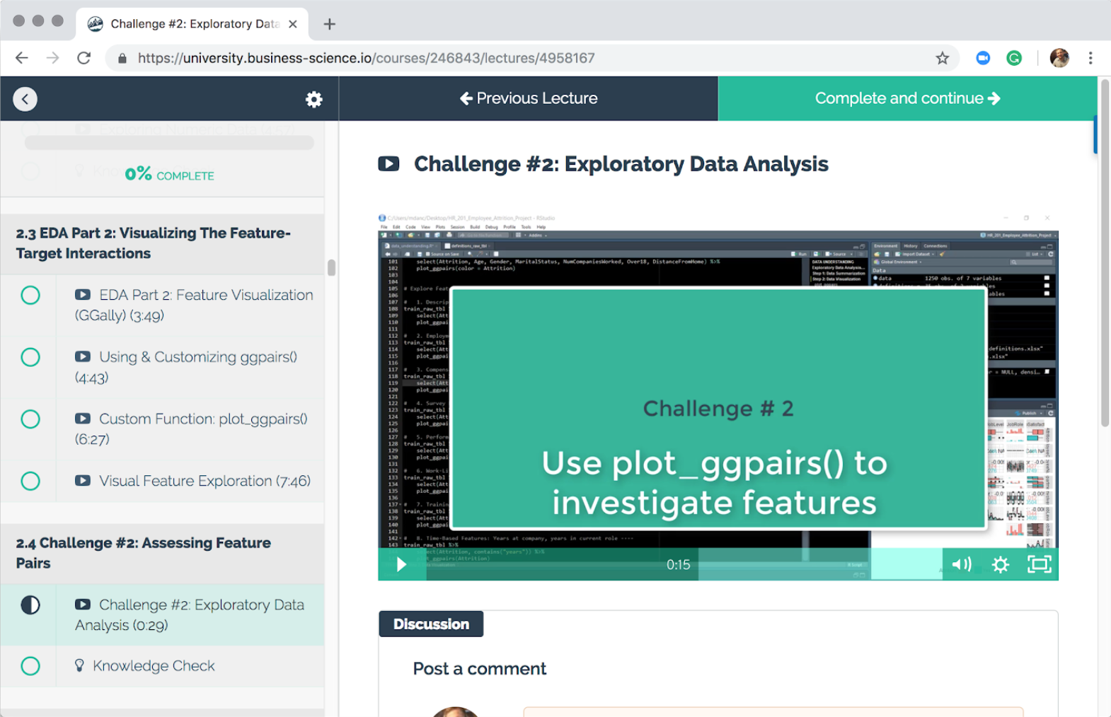
We end Week 3 with the second Challenge.
Challenge #2
In Challenge 2, you’ll use your custom plotting function plot_ggpairs() to investigate many complex relationships. You’ll combine features into logical groups based on business knowledge and then visualize the grouped features together to explore their complex relationships to attrition.
Next Up
The next article in the Data Science With R Series covers Data Preprocessing. We’ll learn about an awesome package called recipes that enables preprocessing workflows. We’ll focus on two aspects of data preparation:
- Preparing data for people
- Preparing data for machines
Week 4: Data Preprocessing
New Course Coming Soon: Build A Shiny Web App!
You’re experiencing the magic of creating a high performance employee turnover risk prediction algorithm in DS4B 201-R. Why not put it to good use in an Interactive Web Dashboard?
In our new course, Build A Shiny Web App (DS4B 301-R), you’ll learn how to integrate the H2O model, LIME results, and recommendation algorithm building in the 201 course into an ML-Powered R + Shiny Web App!
Shiny Apps Course Coming in October 2019!!! Sign up for Business Science University Now!
Building an R + Shiny Web App, DS4B 301-R