Time Series in 5-Minutes, Part 3: Autocorrelation and Cross Correlation
Written by Matt Dancho
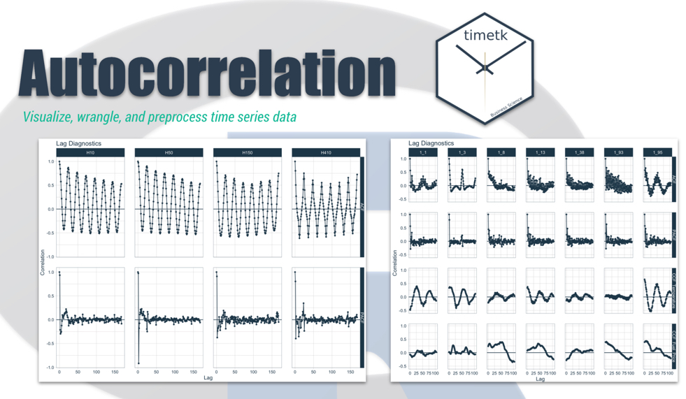
Have 5-minutes? Then let’s learn time series. In this short articles series, I highlight how you can get up to speed quickly on important aspects of time series analysis. Today we are focusing on a critical visualization technique: Autocorrelation and Cross Correlation. Learn how to make interactive (plotly) and static (ggplot2) visualizations easily with timetk.
Updates
This article has been updated. View the updated Time Series in 5-Minutes article at Business Science.
Time Series in 5-Mintues
Articles in this Series

The ACF Plot - A fundamental tool in your arsenal
I just released timetk 2.0.0 (read the release announcement). A ton of new functionality has been added. We’ll discuss some of the key pieces in this article series:
👉 Register for our blog to get new articles as we release them.
Have 5-Minutes?
Then let’s learn Autocorrelation
This tutorial focuses on, plot_acf_diagnostics(), a workhorse time-series plotting function that makes interactive:
- ACF and PACF Plots (Autocorrelation and Partial Autocorrelation)
- CCF Plots (Cross Correlation)
in interactive (plotly) and static (ggplot2) visualization formats.
Libraries
Load the following libraries. For the purposes of this tutorial, I’m setting all plots to static ggplot2 using interactive <- FALSE, but I encourage you to switch this to TRUE to see how easy it is to make interactive plotly plots.
library(tidyverse)
library(lubridate)
library(timetk)

# Setup for the plotly charts (# FALSE returns ggplots)
interactive <- FALSE
Part 1: Autocorrelation
Autocorrelation is the presence of correlation that is connected to lagged versions of a time series. In laymen’s terms, this means that past history is related to future history. We can visualize this relationship with an ACF plot.
First, plot the time series we’ll be looking at taylor_30_min using plot_time_series(). We learned how to plot time series with the Time Plot in Part 1 of this series.
taylor_30_min %>%
    plot_time_series(date, value, .interactive = interactive)
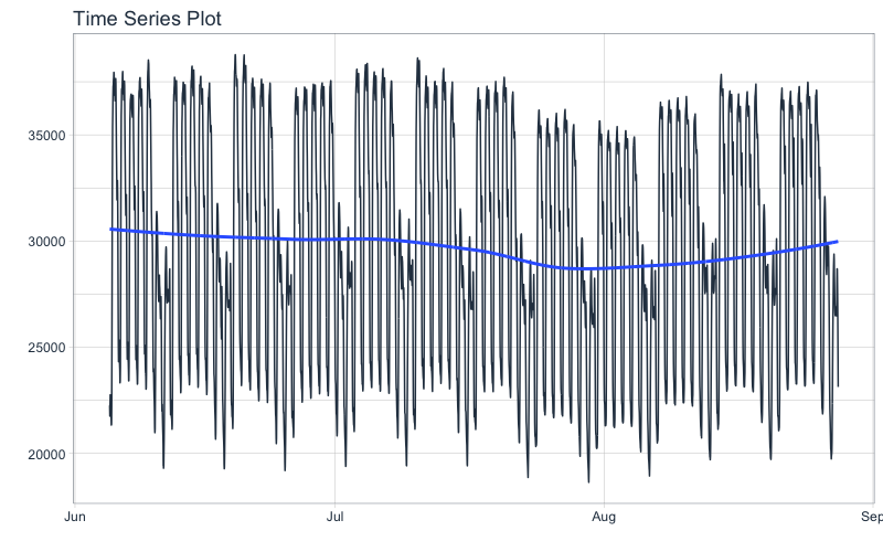
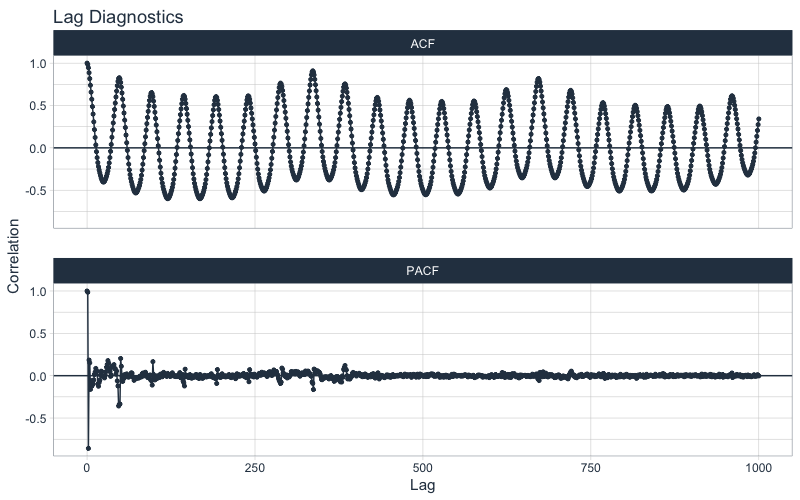
This series represents hourly electricity demand taken at 30-min intervals for about 3-months. We can visualize the autocorrelation in the series using a new function, plot_acf_diagnostics().
taylor_30_min %>%
    plot_acf_diagnostics(date, value, .interactive = interactive)
Why are ACF and PACF important?
From the plot_acf_diagnostics() we get:
-
ACF Plot: The autocorrleation (y-axis), which is the relationship between the series and each progressive lag (x-axis) with the series.
-
PACF Plot: The partial-autocorrelation vs lags. The Partial Autocorrelation shows how much each progressive ACF adds to the predictability. In other words, lags that are correlated with each other are de-weighted so the most important lags are present.
These 2 visualizations help us model relationships and develop predictive forecasts:
- Seasonality: Possible Fourier Series we can use to model a relationship
- Lags as Predictors: We can find important lags to include in our models
If you want to learn Time Series Forecasting for Business, it’s a no-brainer - Join my Time Series Course Waitlist (It’s coming, it’s really insane).
Grouped ACF and PACFs
Often in time series we are dealing with more than one series - these are called groups. Let’s switch to a different hourly dataset, m4_hourly, that contains 4-groups.
m4_hourly %>%
    group_by(id) %>%
    plot_time_series(date, value,
                     .facet_ncol = 2,
                     .facet_scale = "free",
                     .interactive = interactive)
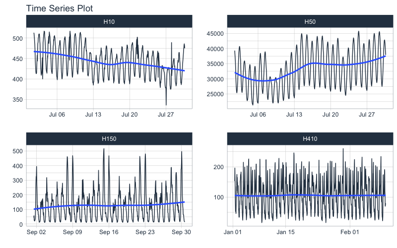
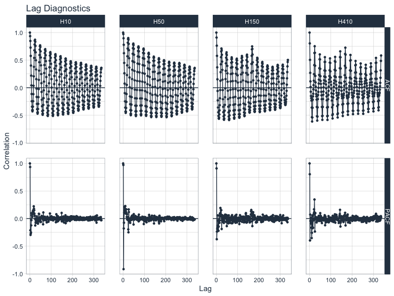
We can get the ACF and PACF plots easily using plot_acf_diagnostics(). We can isolate 14-days of lags using the .lags = "14 days".
m4_hourly %>%
    group_by(id) %>%
    plot_acf_diagnostics(
        date, value,               # ACF & PACF
        .lags = "14 days",         # 14-Days of hourly lags
        .interactive = interactive
    )
Why use time series groups?
-
Using groups helps us to evaluate time series much faster than analyzing every time series individually. We’re able to quickly evaluate 4 time series.
-
Grouped analysis can highlight similarities and differences between time series. We can see H150 and H410 have spikes at 1-week in addition to the daily frequency.
Part 2: Cross Correlation
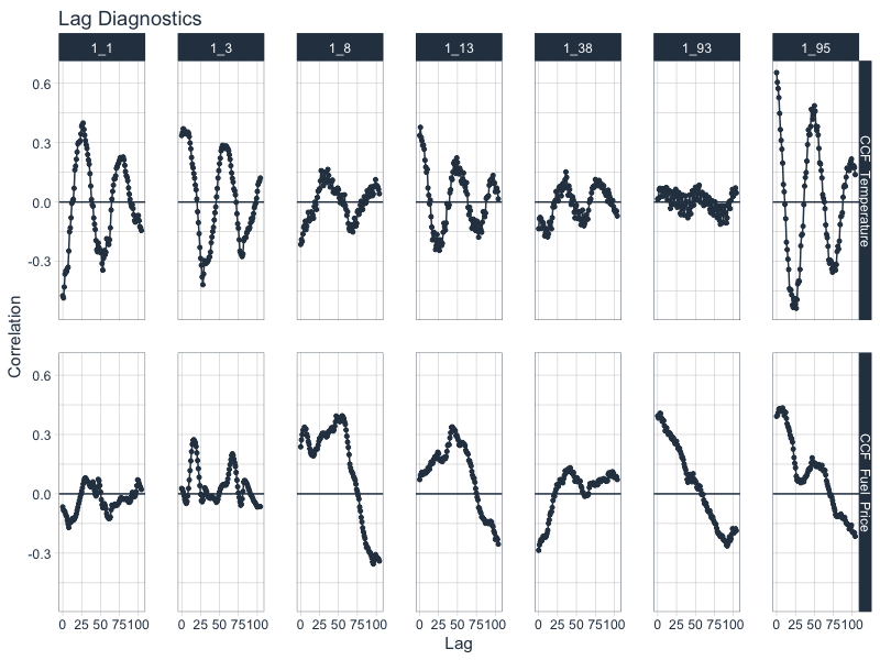
The last example here is Cross Correlation, an important technique for finding external predictors. We start with a new time series, walmart_sales_weekly, which contains weekly sales for walmart, time series groups consisting of various departments, and several (potential) predictors including temperature and fuel price.
Note that you will need to the development version of timetk for this functionality until timetk 2.0.1 is released. You can upgrade using devtools::install_github("business-science/timetk").
walmart_sales_weekly
## # A tibble: 1,001 x 17
##    id    Store  Dept Date       Weekly_Sales IsHoliday Type    Size Temperature
##    <fct> <dbl> <dbl> <date>            <dbl> <lgl>     <chr>  <dbl>       <dbl>
##  1 1_1       1     1 2010-02-05       24924. FALSE     A     151315        42.3
##  2 1_1       1     1 2010-02-12       46039. TRUE      A     151315        38.5
##  3 1_1       1     1 2010-02-19       41596. FALSE     A     151315        39.9
##  4 1_1       1     1 2010-02-26       19404. FALSE     A     151315        46.6
##  5 1_1       1     1 2010-03-05       21828. FALSE     A     151315        46.5
##  6 1_1       1     1 2010-03-12       21043. FALSE     A     151315        57.8
##  7 1_1       1     1 2010-03-19       22137. FALSE     A     151315        54.6
##  8 1_1       1     1 2010-03-26       26229. FALSE     A     151315        51.4
##  9 1_1       1     1 2010-04-02       57258. FALSE     A     151315        62.3
## 10 1_1       1     1 2010-04-09       42961. FALSE     A     151315        65.9
## # … with 991 more rows, and 8 more variables: Fuel_Price <dbl>,
## #   MarkDown1 <dbl>, MarkDown2 <dbl>, MarkDown3 <dbl>, MarkDown4 <dbl>,
## #   MarkDown5 <dbl>, CPI <dbl>, Unemployment <dbl>
We can visualize Cross Correlations using the .ccf_vars between Weekly Sales and Temperature and Fuel Price.
walmart_sales_weekly %>%
    select(id, Date, Weekly_Sales, Temperature, Fuel_Price) %>%
    group_by(id) %>%
    plot_acf_diagnostics(
        Date, Weekly_Sales,        # ACF & PACF
        .ccf_vars           = c(Temperature, Fuel_Price),   # CCFs
        .show_ccf_vars_only = TRUE,                         # Toggle just CCFs?
        .lags               = "2 years",                    # Lags
        .interactive        = interactive
    )
Have questions on using Timetk for time series?
Make a comment in the chat below. 👇
And, if you plan on using timetk for your business, it’s a no-brainer - Join the Time Series Course.