Time Series in 5-Minutes, Part 2: Visualization with the Time Plot
Written by Matt Dancho
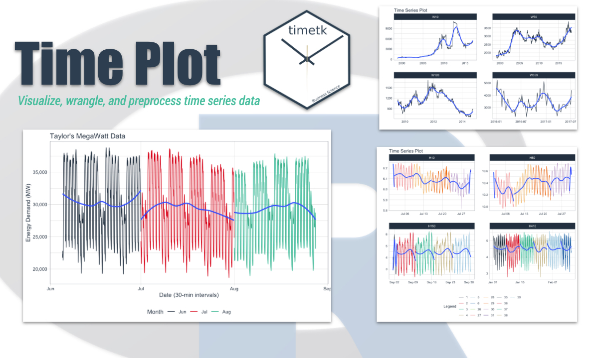
Have 5-minutes? Then let’s learn time series. In this short articles series, I highlight how you can get up to speed quickly on important aspects of time series analysis. Today we are focusing on the most fundamental tool, the time plot. Learn how to make interactive (plotly) and static (ggplot2) visualizations easily with timetk.
Updates
This article has been updated. View the updated Time Series in 5-Minutes article at Business Science.
Time Series in 5-Mintues
Articles in this Series

The time plot - A fundamental tool in your arsenal
I just released timetk 2.0.0 (read the release announcement). A ton of new functionality has been added. We’ll discuss some of the key pieces in this article series:
👉 Register for our blog to get new articles as we release them.
Have 5-Minutes?
Then let’s learn the Time Plot
This tutorial focuses on, plot_time_series(), a workhorse time-series plotting function that:
- Generates interactive
plotly plots (great for exploring & shiny apps)
- Consolidates 20+ lines of
ggplot2 & plotly code
- Scales well to many time series
- Can be converted from interactive
plotly to static ggplot2 plots
Load the following libraries. For the purposes of this tutorial, I’m setting all plots to static ggplot2 using interactive <- FALSE, but I encourage you to switch this to TRUE to see how easy it is to make interactive plotly plots.
library(tidyverse)
library(lubridate)
library(timetk)

# Setup for the plotly charts (# FALSE returns ggplots)
interactive <- FALSE
Plotting a Single Time Series
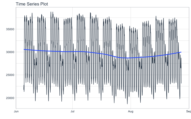
Let’s start with a popular time series, taylor_30_min, which includes energy demand in megawatts at a sampling interval of 30-minutes. This is a single time series.
taylor_30_min
## # A tibble: 4,032 x 2
##    date                value
##    <dttm>              <dbl>
##  1 2000-06-05 00:00:00 22262
##  2 2000-06-05 00:30:00 21756
##  3 2000-06-05 01:00:00 22247
##  4 2000-06-05 01:30:00 22759
##  5 2000-06-05 02:00:00 22549
##  6 2000-06-05 02:30:00 22313
##  7 2000-06-05 03:00:00 22128
##  8 2000-06-05 03:30:00 21860
##  9 2000-06-05 04:00:00 21751
## 10 2000-06-05 04:30:00 21336
## # … with 4,022 more rows
The plot_time_series() function generates an interactive plotly chart by default.
- Simply provide the date variable (time-based column,
.date_var) and the numeric variable (.value) that changes over time as the first 2 arguments
- When
.interactive = TRUE, the .plotly_slider = TRUE adds a date slider to the bottom of the chart.
taylor_30_min %>%
  plot_time_series(date, value,
                   .interactive = interactive, # <- Toggle this TRUE/FALSE
                   .plotly_slider = TRUE)
Plotting Groups
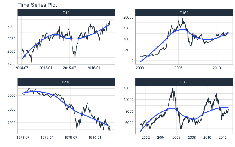
Next, let’s move on to a dataset with time series groups, m4_daily, which is a sample of 4 time series from the M4 competition that are sampled at a daily frequency.
Visualizing grouped data is as simple as grouping the data set with group_by() prior to piping into the plot_time_series() function. Key points:
- Groups can be added in 2 ways: by
group_by() or by using the ... to add groups.
- Groups are then converted to facets.
.facet_ncol = 2 returns a 2-column faceted plot.facet_scales = "free" allows the x and y-axis of each plot to scale independently of the other plots
m4_daily %>%
  group_by(id) %>%
  plot_time_series(date, value,
                   .facet_ncol = 2, .facet_scales = "free",
                   .interactive = interactive)
Visualizing Trend with the Smoother
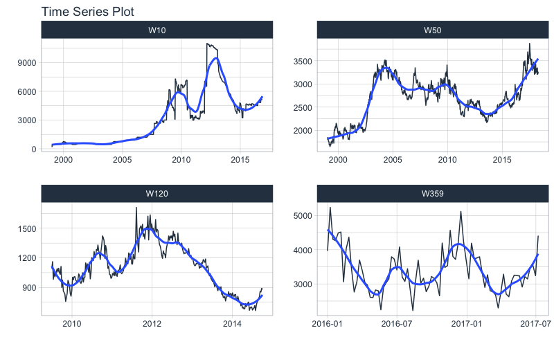
You may be wondering, what is that blue line that keeps showing up on all of our plots. It’s called a smoother, and it’s a really awesome way to visualize trend through the noise in a time series.
We can adjust the smoother using:
- Toggle on/off:
.smooth = TRUE/FALSE
- Change the flexibility of the line: Try
.smooth_period = "52 weeks" (30-days of data) or .smooth_span = 0.25 (25% of data). By default, .smooth_span gets priority.
Here I’m changing the smooth_span = 0.25 to increase the flexibility by using 25% of the data in the smoother. Not that the time series I’m using is a weekly series, m4_weekly.
m4_weekly %>%
  group_by(id) %>%
  plot_time_series(date, value,

                   # Smoother
                   .smooth = TRUE,
                   .smooth_span = 0.25,           # <- Uses % of data
                   # .smooth_period = "52 weeks", # <- Uses windows of data

                   .facet_ncol = 2, .facet_scales = "free",
                   .interactive = interactive)
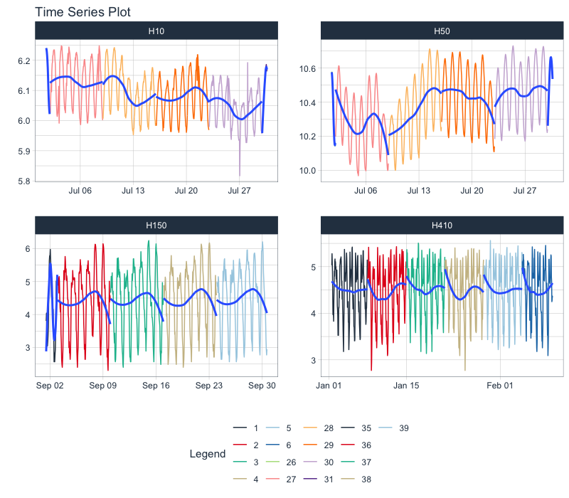
Let’s switch to an hourly dataset with multiple groups. We can showcase:
- Log transformation to the
.value
- Use of
.color_var to highlight sub-groups.
The intent is to showcase the groups in faceted plots, but to highlight weekly windows (weekly sub-groups, using week()) within the data while simultaneously doing a log() transformation to the value. This is simple to do:
.value = log(value) Applies the Log Transformation- The data is ungrouped, so we can add facets internally using the
... to supply one or more facet columns.
.color_var = week(date) The date column is transformed to a lubridate::week() number. The color is applied to each of the week numbers.
m4_hourly %>%
  group_by(id) %>%
  plot_time_series(date, log(value),             # Apply a Log Transformation
                   .color_var = week(date),      # Color applied to Week transformation
                   # Facet formatting
                   .facet_ncol = 2,
                   .facet_scales = "free",
                   .interactive = interactive)
Static ggplot2 Visualizations & Customizations
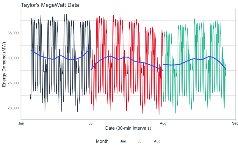
All of the visualizations can be converted from interactive plotly (great for exploring and shiny apps) to static ggplot2 visualizations (great for reports).
- Toggle Interactive/Static:
.interactive = TRUE/FALSE
- Add title, legend, x & y-axis labels:
.title, .color_lab, .x_lab and .y_lab
taylor_30_min %>%
  plot_time_series(date, value,
                   .color_var = month(date, label = TRUE),

                   .interactive = FALSE,   # <- Returns static ggplot

                   # Customization
                   .title = "Taylor's MegaWatt Data",
                   .x_lab = "Date (30-min intervals)",
                   .y_lab = "Energy Demand (MW)",
                   .color_lab = "Month") +
  scale_y_continuous(labels = scales::comma_format())
Have questions on using Timetk for time series?
Make a comment in the chat below. 👇
And, if you plan on using timetk for your business, it’s a no-brainer - Join the Time Series Course.