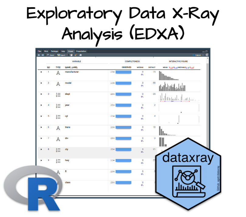
Exploratory DataXray Analysis (EDXA)
Written by Matt Dancho
Do you know how long EDA (exploratory data analysis) used to take me? Not hours, not days… A full week! Listen, you don’t know how good you have it. With this new R package I’m about to show you (plus one BONUS hack), you’ll cut your EDA time into 5 minutes. Here’s how.
Table of Contents
Today I’m going to show you how to use dataxray. Here’s what you’re learning today:
- Tutorial: How to use
dataxray to effortlessly produce and evaluate statistical summaries on your new datasets
- Bonus: The next step in my EDA process (that uncovers hidden insights that I use to give quick wins to business leadership)
SPECIAL ANNOUNCEMENT: AI for Data Scientists Workshop on December 18th
Inside the workshop I’ll share how I built a SQL-Writing Business Intelligence Agent with Generative AI:
What: GenAI for Data Scientists
When: Wednesday December 18th, 2pm EST
How It Will Help You: Whether you are new to data science or are an expert, Generative AI is changing the game. There’s a ton of hype. But how can Generative AI actually help you become a better data scientist and help you stand out in your career? I’ll show you inside my free Generative AI for Data Scientists workshop.
Price: Does Free sound good?
How To Join: 👉 Register Here
R-Tips Weekly
This article is part of R-Tips Weekly, a weekly video tutorial that shows you step-by-step how to do common R coding tasks. Pretty cool, right?
Here are the links to get set up. 👇
This Tutorial is Available in Video
I have a companion video tutorial that shows even more secrets (plus mistakes to avoid). And, I’m finding that a lot of my students prefer the dialogue that goes along with coding. So check out this video to see me running the code in this tutorial. 👇
What Is Exploratory Data Analysis?
Exploratory Data Analysis (EDA) is how data scientists and data analysts find meaningful information in the form of relationships in the data. EDA is absolutely critical as a first step before machine learning and to explain business insights to non-technical stakeholders like executives and business leadership.
What do I make in this R-Tip?
I’m so excited right now. If you follow me, you probably know one of my favorite R packages is the skimr library for quick exploratory statistical summaries (the first thing I run when I get a new dataset). Well, I just stumbled upon the interactive version of skimr. And it’s insane!
I’m referring to dataxray, a new R package that provides quick statistical summaries in an interactive table inside of the Rstudio Viewer Pane. Here’s the interactive dataxray table you’re going to make in this tutorial from R. 👇
Dataxray Interactive Exploratory Summaries
Thank You to the Developer.
Before we do our deep-dive into dataxray, I want to take a brief moment to thank the developer, Agustin Calatroni, Senior Director of Biostatistics at Rho, Inc. Please connect and follow Augustin. His work is on GitHub here.

My 3-Step Exploratory Data Analysis Process
It can be confusing to know which EDA R packages to use. To help, I’ve recently covered my top R packages for exploratory data analysis here. In short, here’s my process:
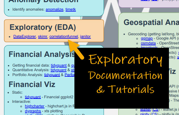
- DataExplorer (and Skimr): For collecting a report on the dataset that I’m unfamiliar with. I focus on which feature I’m interested in (called a “target”) and the surrounding data to identify any data issues. I cover my DataExplorer process here. And, I show off how I use skimr here.
- Correlation Funnel: I then use this to get a quick understanding (full disclosure - I am the creator of this package, but make no mistake it’s probably the most powerful package for getting quick insights in your arsenal). I cover how I use Correlation Funnel here.
- Explore: If I want to further understand complex relationships, I’ll use the explore package’s shiny app to expose bivariate relationships and drill in. I explain how to use explore here.
With all these great EDA packages, why use dataxray?
What I like about dataxray is its emphasis on an interactive exploration of the exploratory summaries. This goes beyond what skimr offers (the gold standard) by adding an interactive exploration element to feature summaries. So if you like interactivity, then try dataxray.
I’m going to give you a free gift right now to help with (and after you are done with) this tutorial…
Free Gift: Cheat Sheet for my Top 100 R Packages (EDA included)
Even I forget which R packages to use from time to time. And this cheat sheet saves me so much time. Instead of googling to filter through 20,000 R packages to find a needle in a haystack. I keep my cheat sheet handy so I know which to use and when to use them. Seriously. This cheat sheet is my bible.
Once you download it, head over to page 3 and you’ll see several R packages I use frequently just for Exploratory Data Analysis.
And you get the same guidance which is important when you want to work in these fields:
- Machine Learning
- Time Series
- Financial Analysis
- Geospatial Analysis
- Text Analysis and NLP
- Shiny Web App Development
So steal my cheat sheet. It will save you a ton of time.
Tutorial: Interactive exploratory summaries with dataxray
Here’s how to use dataxray to start your exploratory data analysis on the right foot.
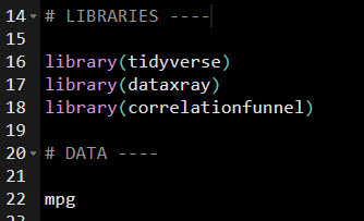
Step 1: Load the libraries and data
First, load libraries tidyverse , dataxray, and (optionally) correlationfunnel for the bonus code.
Get the code.
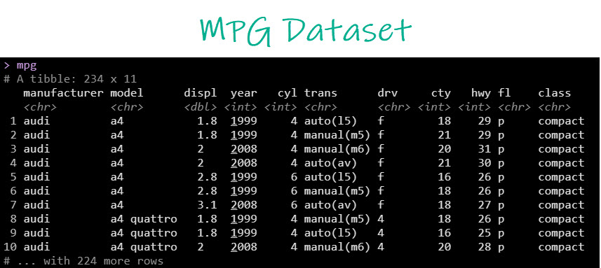
We’ll use the mpg dataset, which has data on 234 vehicle models.
Step 2: Make the Dataxray Table
Next, just use two functions:
make_xray() to convert the raw data to preformatted data for the reactable interactive tableview_xray() to display the interactive exploratory table using the underlying reactable library.
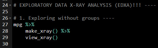
Get the code.
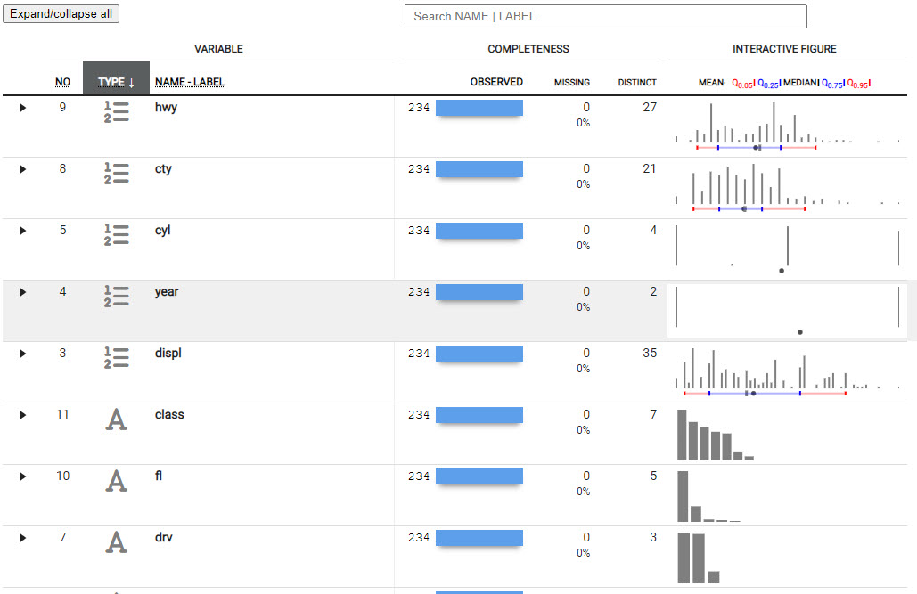
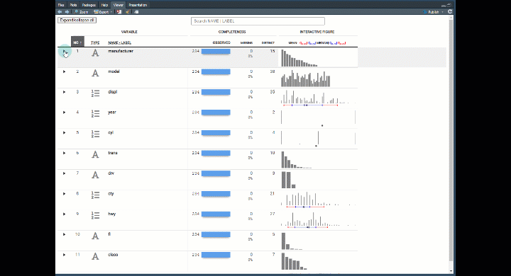
The result is an amazing reactable table that allows us to drill into each feature.
Exploratory Data Analysis Dataxray
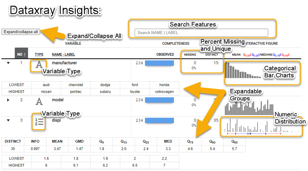
Now you can explore each feature (column in your data) to see:
- Count and Percent Missing - How many
NA values
- Number of Distinct - How many unique observations
- Categorical Data - Bar charts for frequency by category
- Numeric Data - Distribution with histogram and quantiles
- Expandable Groups - I love this feature. You can expand the groups to find out more information about the features.
- Search Features - Use regex to search the name. Great if you have a lot of features (columns).
Bonus: Correlation Funnel
The next step in my 3-step process is to immediately move to business insights. I can’t tell you how important it is to get a quick win for your stakeholders. Whether it’s your boss, a business executive in the C-suite, or your client if you are a consultant. You need to get insights fast.
So here’s how I do it.
Step 1: Run correlation funnel
Here’s the code (make sure you have correlationfunnel loaded).
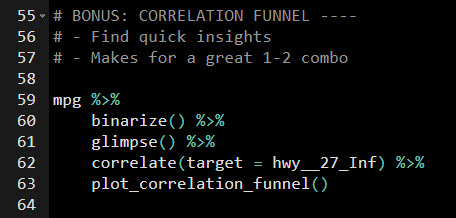
Get the code.
The only trick is to pick which target to hone in on.
Here’s how.
- The
binarize() function bins the data, which converts everything to 1 and 0.
- The
glimpse() function is used to see all of the column names, which have been expanded from the binning operation.
- The
correlate() function creates the raw insights. The only trick is to pick which target.
- How to pick a target? For numeric features like
hwy, it gets binned. So I’m going to hone in on the bin hwy__27_Inf, which is basically like saying, “I want to know which features in my data are related to greater fuel economy (fuel efficiency)
- Then run
plot_correlation_funnel() a to expose the key relationships in a visualization.
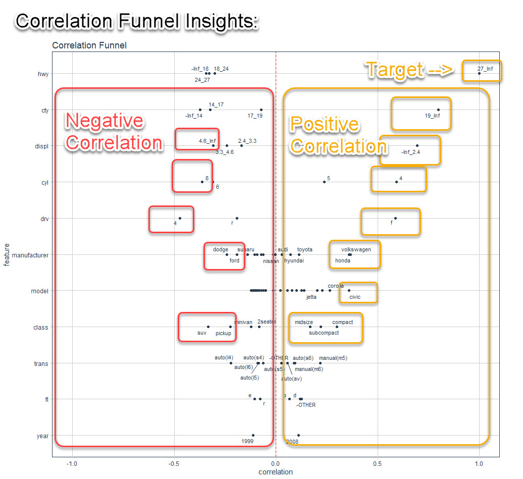
Step 2: Review the Correlation Funnel Plot
The resulting visualization looks like this. And you can quickly expose the insights in your data.
I can easily see that:
- Positive Correlation to Highway Fuel Economy: If the vehicle has high city fuel economy, low engine displacement (smaller engine size), 4 cylinders, front-wheel drive, is a Volkswagen or Honda, is a Civic or Corolla Model, and is a Compact, Subcompact, or Midsize.
- Negative Correlation to Highway Fuel Economy: When engine size is 4.6Liter or lager, 8 cylinder, 4-wheel drive, Dodge or Ford Manufacturers, and SUV and Pickup class
Not bad for 5 minutes of effort.
💡 Conclusions
You learned how to use the dataxray library to create an interactive exploratory summary report AND perform exploratory analysis the fast way with correlationfunnel. Great work! But, there’s a lot more to becoming a data scientist.
If you’d like to become a Business Scientist (and have an awesome career, improve your quality of life, enjoy your job, and all the fun that comes along), then I can help with that.
Need to advance your business data science skills?
I’ve helped 6,107+ students learn data science for business from an elite business consultant’s perspective.
I’ve worked with Fortune 500 companies like S&P Global, Apple, MRM McCann, and more.
And I built a training program that gets my students life-changing data science careers (don’t believe me? see my testimonials here):
6-Figure Data Science Job at CVS Health ($125K)
Senior VP Of Analytics At JP Morgan ($200K)
50%+ Raises & Promotions ($150K)
Lead Data Scientist at Northwestern Mutual ($175K)
2X-ed Salary (From $60K to $120K)
2 Competing ML Job Offers ($150K)
Promotion to Lead Data Scientist ($175K)
Data Scientist Job at Verizon ($125K+)
Data Scientist Job at CitiBank ($100K + Bonus)
Whenever you are ready, here’s the system they are taking:
Here’s the system that has gotten aspiring data scientists, career transitioners, and life long learners data science jobs and promotions…
Join My 5-Course R-Track Program Now!
(And Become The Data Scientist You Were Meant To Be...)
P.S. - Samantha landed her NEW Data Science R Developer job at CVS Health (Fortune 500). This could be you.