How to make a plot with two different y-axis in R with ggplot2? (a secret ggplot2 hack)
Written by Matt Dancho
I can’t tell you how painful it is to be better at something in Excel than in R. And one of the gripes I still have (10 years after making the switch from Excel to R) is that it’s still tough to make dual-axis plots in R.
Guess what, today is the day. I’m going to show you how to make more professional dual-axis plots in R than what I could do in Excel in my prime. Here’s what you’re learning today:
- How to make a dual-axis plot in R (my secret dual-plotting hack)
- Bonus: My 3 steps to dual-axis plot customizations (that will make your boss squeal with excitement)
Dual Axis Plots
SPECIAL ANNOUNCEMENT: AI for Data Scientists Workshop on December 18th
Inside the workshop I’ll share how I built a SQL-Writing Business Intelligence Agent with Generative AI:
What: GenAI for Data Scientists
When: Wednesday December 18th, 2pm EST
How It Will Help You: Whether you are new to data science or are an expert, Generative AI is changing the game. There’s a ton of hype. But how can Generative AI actually help you become a better data scientist and help you stand out in your career? I’ll show you inside my free Generative AI for Data Scientists workshop.
Price: Does Free sound good?
How To Join: 👉 Register Here
R-Tips Weekly
This article is part of R-Tips Weekly, a weekly video tutorial that shows you step-by-step how to do common R coding tasks. Pretty cool, right?
Here are the links to get set up. 👇
Video Tutorial
I have a companion video tutorial that shows even more cool automation stuff (plus mistakes to avoid). You can check it out here.
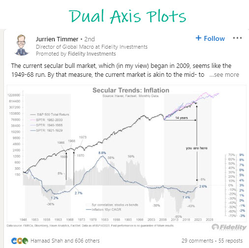
Real Life Example: Fidelity’s Inflation Trends Chart
This example is one that Fidelity Investments has been promoting on LinkedIn. It’s a classic example of what business and financial people love! The dual axis plot. Learn how to make them, and increase your business value. It’s as simple as that.
When do you need a dual-axis plot?
You might not know when to use a dual-axis plot. I used these all the time for presentations to leadership. Here’s when I use dual-axis plots most commonly:
- When I want to compare two variables (Like Sales measured in dollars $ and Profit Margin measured in percentage %)
- The two variables are on different scales (commonly one might be a percentage and the other is a dollar value or quantity in units)
How to Make a dual-axis plot in R
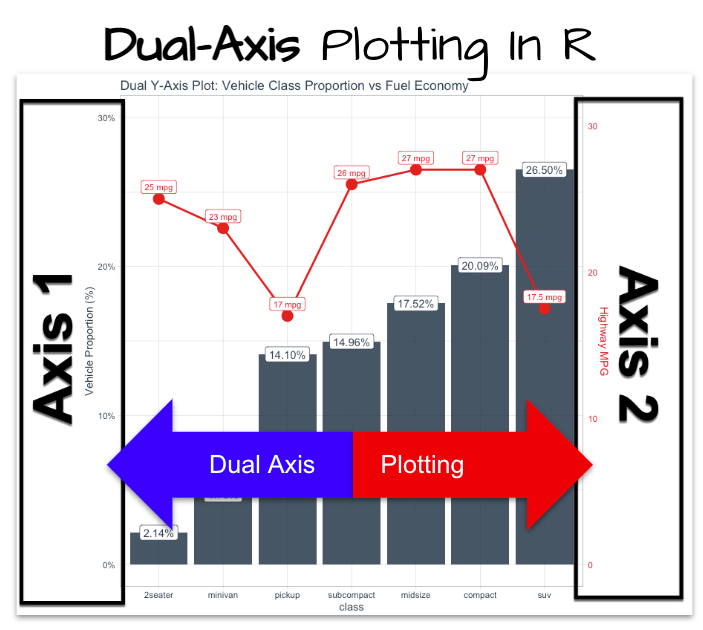
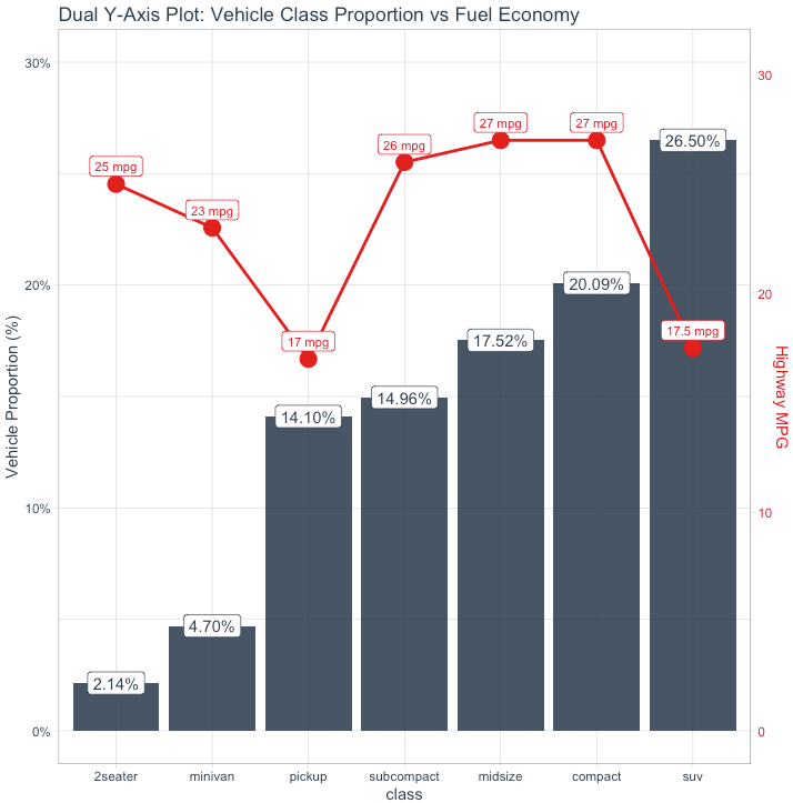
Here’s the dual-axis plot you’re going to make in this tutorial from R. 👇
Before we get started, get the R Cheat Sheet
You’ll need to learn ggplot2 to take full advantage of this tutorial. For these topics, I’ll use the Ultimate R Cheat Sheet to refer to ggplot2 code in my workflow.
Step 2: Click the “CS” hyperlink to “ggplot2”.
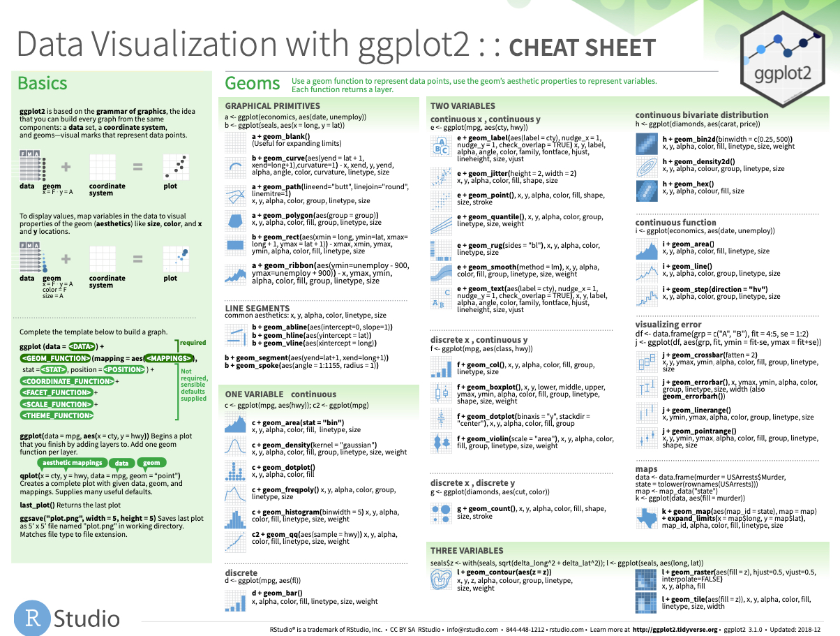
Now you’re ready to quickly reference the ggplot2 cheat sheet. This shows you the core plotting functions available in the ggplot library.
Onto the tutorial.
How to make a dual-axis plot in R? (full tutorial)
Here’s how to make your first dual-axis plot in R.
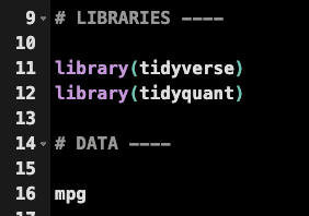
First, load libraries tidyverse and tidyquant. Then get the mpg data set.
Get the code.
I want to compare the median highway fuel economy and the proportion of vehicles in this list. To do so I need to take my raw data, which is 234 vehicles, and apply the median, count, and get a proportion of counts to show the vehicle representation.
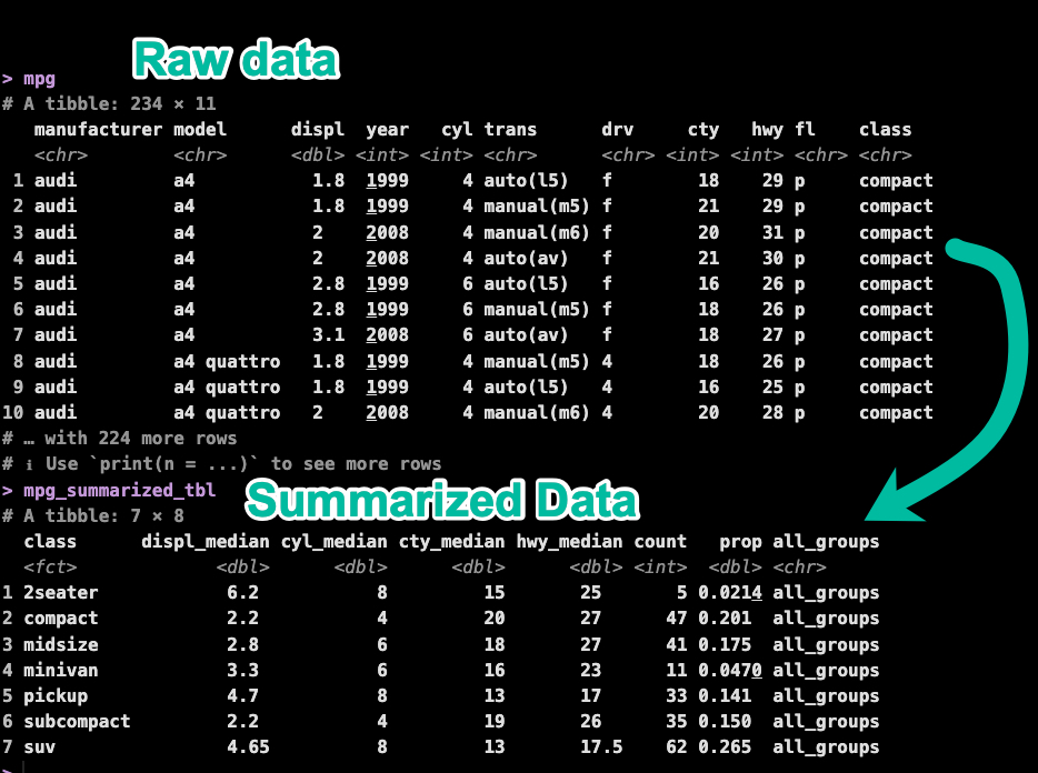
Here’s the code to do this transformation.
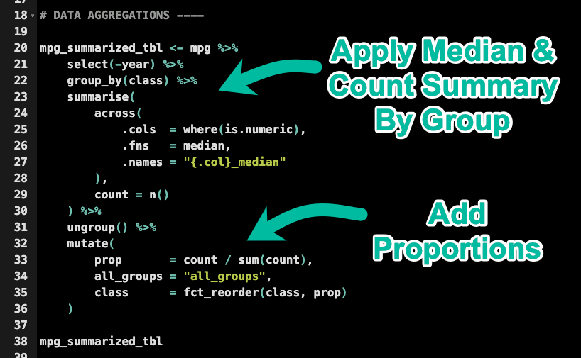
Get the code.
Now that the data has been transformed, let’s see how to make this plot in 3 steps.
Problem: Different scales
I have a problem. If I try to plot the two variables (prop and hwy_median) on a ggplot, then my plot looks like crap.
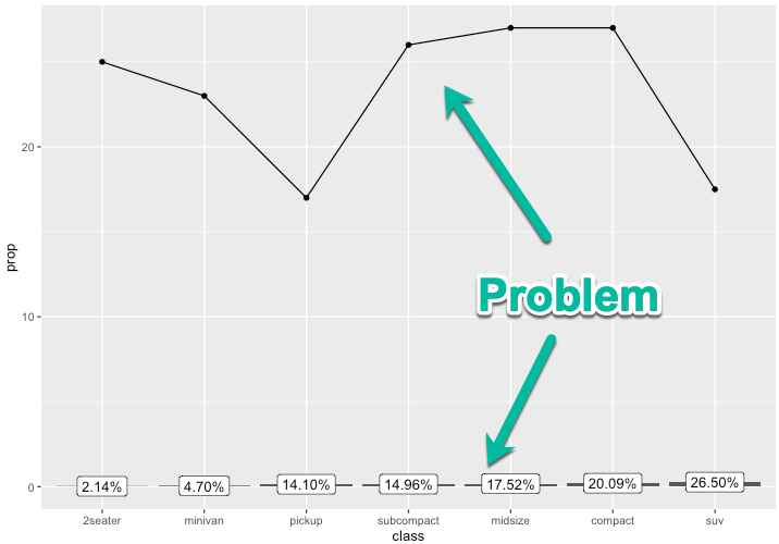
This happens because the two variables are on different scales.
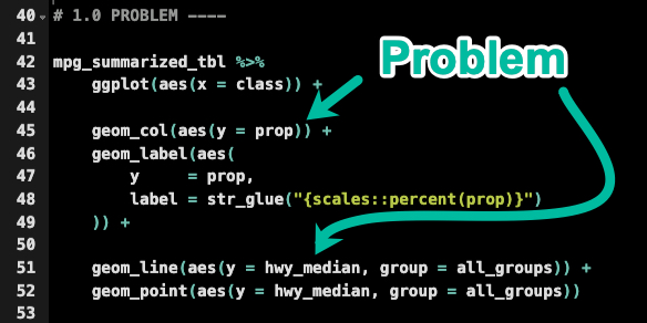
Get the code.
The solution is just to copy my transformer code and we can use this to make a secondary axis that is re-scaled to the first axis.
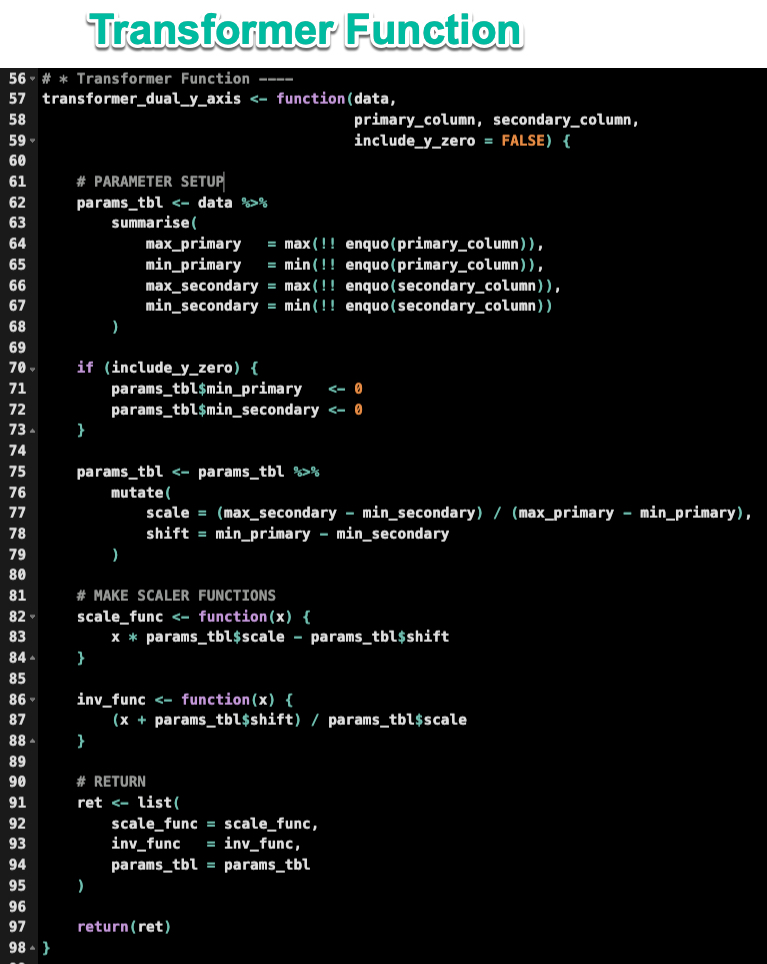
Get the code.
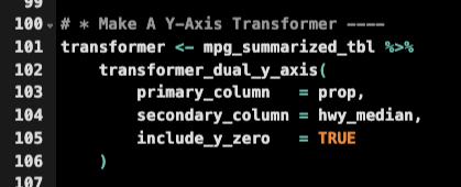
Next, apply the transformer_dual_y_axis() function to the data. Set the primary column as prop and the secondary column as hwy_median. The include_y_zero = TRUE makes sure both y-axis include zero.
Get the code.
3-steps to dual-axis plots
Ok, now we are ready to rock and roll. Let’s make the dual axis plot.
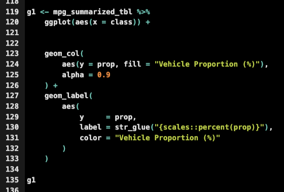
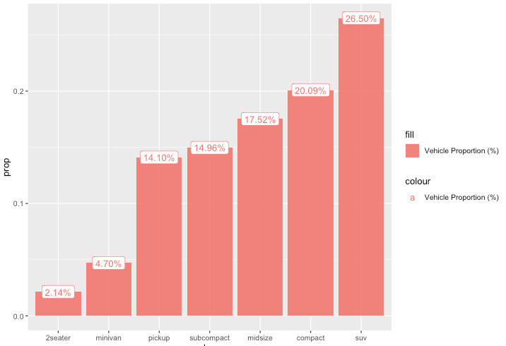
Step 1: Set up the primary y-axis
Run this code to set up the primary y-axis. This creates the first plot (g1).
Get the code.
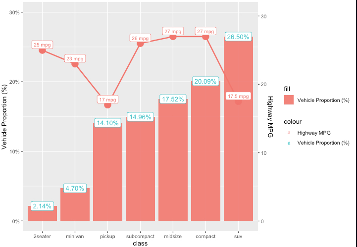
This returns a salmon-colored plot with the proportions. (Don’t worry, we’ll fix the color in a minute)
Next, I’m creating a 2nd plot (g2) that extends the first plot (g1).
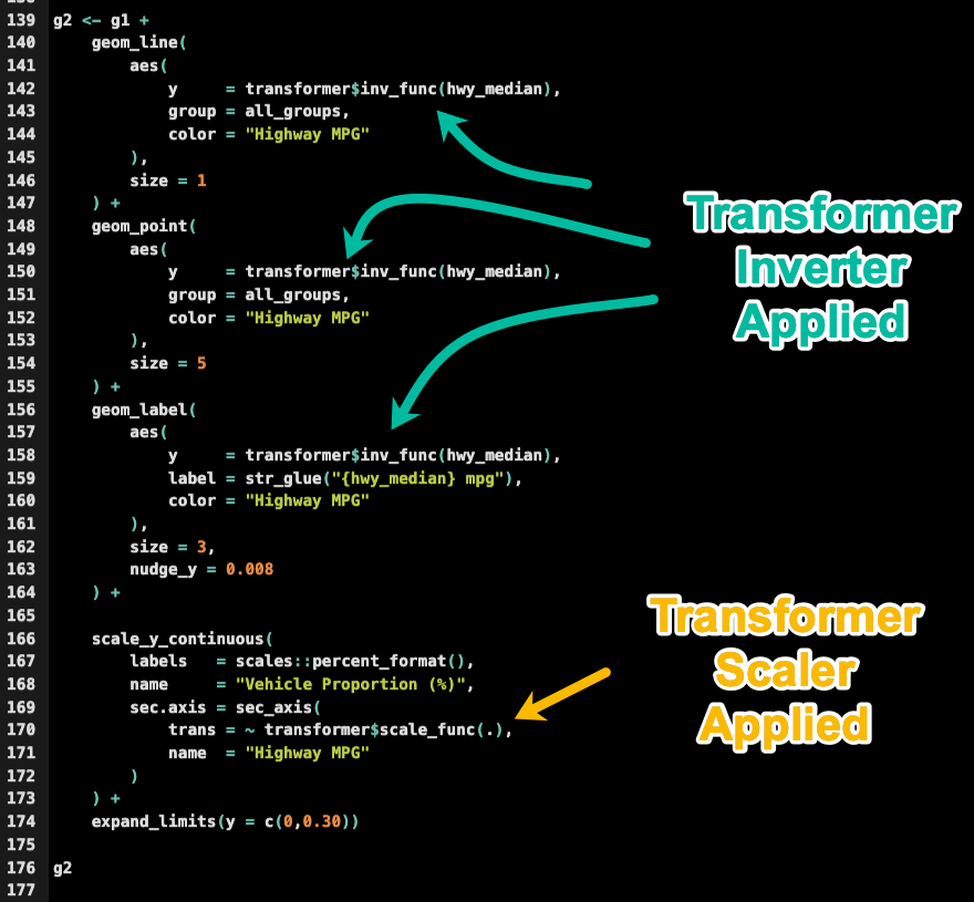
Get the code.
We now have the dual y-axis set up. It still looks too salmon-ey. But we’re onto something.
Now, let’s make it look like a professional plot.
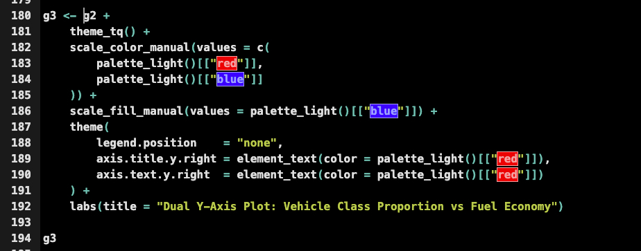
Step 3: Pro-customizations (that’ll make your boss squeal)
Next, run this code to upgrade the appearance of the g2 plot (returning g3, the plot you’ll want to show your boss).
Get the code.

💡 Conclusions
You learned how to create a dual-axis plot that is about 100X better than anything I can create in Excel. Great work! But, there’s a lot more to becoming a Business Scientist (a highly saught-after data scientist that knows the secrets to generating business value).
If you’d like to become a Business Scientist (and have an awesome career, improve your quality of life, enjoy your job, and all the fun that comes along), then I can help with that.
Need to advance your business data science skills?
I’ve helped 6,107+ students learn data science for business from an elite business consultant’s perspective.
I’ve worked with Fortune 500 companies like S&P Global, Apple, MRM McCann, and more.
And I built a training program that gets my students life-changing data science careers (don’t believe me? see my testimonials here):
6-Figure Data Science Job at CVS Health ($125K)
Senior VP Of Analytics At JP Morgan ($200K)
50%+ Raises & Promotions ($150K)
Lead Data Scientist at Northwestern Mutual ($175K)
2X-ed Salary (From $60K to $120K)
2 Competing ML Job Offers ($150K)
Promotion to Lead Data Scientist ($175K)
Data Scientist Job at Verizon ($125K+)
Data Scientist Job at CitiBank ($100K + Bonus)
Whenever you are ready, here’s the system they are taking:
Here’s the system that has gotten aspiring data scientists, career transitioners, and life long learners data science jobs and promotions…

Join My 5-Course R-Track Program Now!
(And Become The Data Scientist You Were Meant To Be...)
P.S. - Samantha landed her NEW Data Science R Developer job at CVS Health (Fortune 500). This could be you.