Excel to R, Part 2 - Speed Up Exploratory Data Analysis 100X (R Code!)
Written by Matt Dancho

You’re a Business Analyst - well versed in tools like Tableau, PowerBI, and maybe even SQL, but you want to take your data analytics abilities to the next level, by improving productivity and making predictive business insights with data science (rather than just descriptive insights). Then R is the language for you. In this article, you’ll learn how to perform Exploratory Data Analysis (EDA) 100X FASTER using R!!!
Don’t believe me? This is one of the techniques that one of my Business Science University students used to place 3rd in a time-sensitive Tableau competition… without knowing Tableau! He used R and Correlation Analysis to understand his data and develop the best story delivering critical business insights fast. You’ll learn one of the tools he used in this article.
Bonus! - I’m demonstrating a new R package that’s under developement: correlationfunnel. You’ll see how I use it to get business insights fast!
Article Series Overview
This is the 2nd Article in a series on why you should learn R if you’re coming from a Business Analytics background.
Articles in Series
What You Learn Today: Correlation Funnel for 100X EDA Speedup
I am going to show you one of the simplest and fastest ways to analyze your data. In this article, I’m going to introduce you to a concept called Correlation Analysis using my new correlationfunnel R package. First, we’ll see why Exploratory Data Analysis (EDA) in Excel (with Pivot Tables) is painfully slow and easy to miss important aspects of your data. Then, we’ll show you how to create a Correlation Funnel Visualization that brings out the best features FAST!
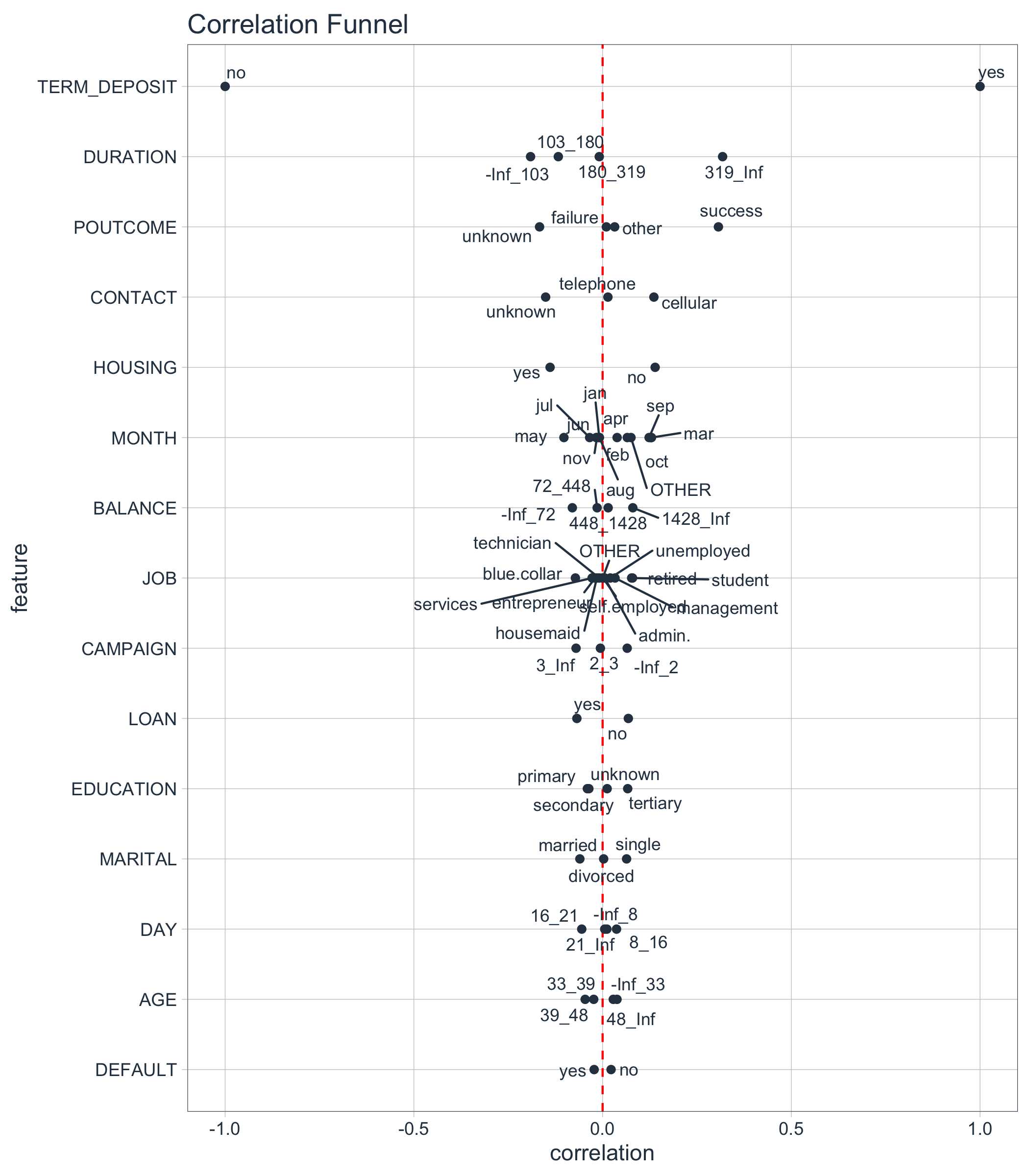
Here’s what the Correlation Funnel looks like for the bank marketing campaign dataset we will use. High correlation features go to the top. From the data visualization, we can quickly see that DURATION (319_Inf) and POUTCOME (success) are the top positive correlations to TERM DEPOSIT (yes). I’ll explain what this means later. For now just realize its (1) really important business insights, and (2) we can do this FAST!
Correlation Funnel - Fast EDA
Table of Contents
Bank Marketing Campaign Data
This 3-Part series follows a real-world study that companies like Bank of America an others that provide Certificates of Deposit (CDs) (Term Deposits) would go through to analyze customer purchasing behavior.

The bank is interested in contacting customers that are likely to enroll in a Term Deposit (CD for a fixed term). The banks love these products because they can earn interest on the customers money. More enrollments means more revenue for the bank.
The dataset we’ll use is a modified version of the “Bank Marketing Data Set” provided by the UCI Machine Learning Repository. The version we will use is in an Excel file with multiple tabs covering the business process.
You can get the Bank Marketing Campaign data set here in Excel here.
The Problem with Pivot Tables
The normal approach to Exploratory Data Analysis (EDA) is to investigate each feature, mining for relationships to some goal or target. In our case, enrollment in the TERM DEPOSIT (financial product).
In Excel, we use Pivot Tables to do this. The Marketing Campaign has a 16 Dependent Features (excluding the target and the ID field). This would involve making at least 16 Plots (one for each comparison to the target). There are 2 problems with this approach:
-
Pivot Tables are not systematic - It’s easy to miss one of the features or to get side tracked in the analysis project.
-
Pivot Tables are time consuming to make - Each Pivot Table can take 10+ minutes to make and format
Here’s an example of one pivot table. It took me about 10 minutes to make and format. It looks great, but it’s going to be a long day if I have to do 15 more of these just to investigate relationships.
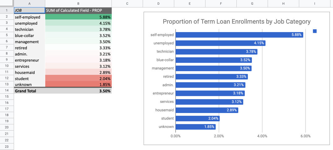
Pivot Table - Takes 10 Minutes Per Plot x 16 Plots = 160 Minutes (~ 3hrs of nonstop visualization = Long Day)
The Solution - Use Correlation Analysis
Let’s see how we can get straight to business insights.
1.0 Libraries
R packages we’ll need:
correlationfunnel - Install from GitHubtidyversereadxltidyquantknitr
You’ll need to install my new R package, correlationfunnel, from GitHub (I’ll most likely be adding to CRAN in the near future).
devtools::install_github("business-science/correlationfunnel")
The tidyverse, readxl, tidyquant, knitr packages can be installed from CRAN using install.packages().
Load the libraries.
library(correlationfunnel) # Correlation Analysis
library(tidyverse)         # Core packages (dplyr, ggplot2, purrr)
library(readxl)            # Reading Excel files
library(tidyquant)         # Used for ggplot2 theme
library(knitr)             # Pretty tables
2.0 Read Data
We can quickly load the marketing data and join the appropriate excel sheets (4 through 7) using the code from the Previous Article in the Excel to R series.
path_to_excel_file <- "2019-02-20-excel-to-r/bank_term_deposit_marketing_analysis.xlsx"

# Get sheet names of excel file
sheets <- excel_sheets(path_to_excel_file)

# Iterate through sheet names 4 through 7 reading the data
# Iteratively join using left_join() + reduce()
marketing_campaign_tbl <- sheets[4:7] %>%
    map(~ read_excel(path = path_to_excel_file, sheet = .)) %>%
    reduce(left_join, by = "ID")

# Resulting output in "glimpse" format.
marketing_campaign_tbl %>% glimpse()
## Observations: 45,211
## Variables: 18
## $ ID           <chr> "2836", "2837", "2838", "2839", "2840", "2841"…
## $ AGE          <dbl> 58, 44, 33, 47, 33, 35, 28, 42, 58, 43, 41, 29…
## $ JOB          <chr> "management", "technician", "entrepreneur", "b…
## $ MARITAL      <chr> "married", "single", "married", "married", "si…
## $ EDUCATION    <chr> "tertiary", "secondary", "secondary", "unknown…
## $ DEFAULT      <chr> "no", "no", "no", "no", "no", "no", "no", "yes…
## $ BALANCE      <dbl> 2143, 29, 2, 1506, 1, 231, 447, 2, 121, 593, 2…
## $ HOUSING      <chr> "yes", "yes", "yes", "yes", "no", "yes", "yes"…
## $ LOAN         <chr> "no", "no", "yes", "no", "no", "no", "yes", "n…
## $ CONTACT      <chr> "unknown", "unknown", "unknown", "unknown", "u…
## $ DAY          <dbl> 5, 5, 5, 5, 5, 5, 5, 5, 5, 5, 5, 5, 5, 5, 5, 5…
## $ MONTH        <chr> "may", "may", "may", "may", "may", "may", "may…
## $ DURATION     <dbl> 261, 151, 76, 92, 198, 139, 217, 380, 50, 55, …
## $ CAMPAIGN     <dbl> 1, 1, 1, 1, 1, 1, 1, 1, 1, 1, 1, 1, 1, 1, 1, 1…
## $ PDAYS        <dbl> -1, -1, -1, -1, -1, -1, -1, -1, -1, -1, -1, -1…
## $ PREVIOUS     <dbl> 0, 0, 0, 0, 0, 0, 0, 0, 0, 0, 0, 0, 0, 0, 0, 0…
## $ POUTCOME     <chr> "unknown", "unknown", "unknown", "unknown", "u…
## $ TERM_DEPOSIT <chr> "no", "no", "no", "no", "no", "no", "no", "no"…
Key Points:
- Data from the 4 tables in the Excel Sheets (4 - 7) were joined by “ID” column
- Target is TERM_DEPOSIT
- Data has 16 Predictors (AGE:POUTCOME Columns)
- ID is a unique identifier, and will not provide predictive value
- No “date” or “date-time” features. DAY and MONTH are already “feature engineered”. We could add Day of Week if we new what year this data set was from, but we’ll leave that for another day.
- Data is formatted as either numeric continuous features (e.g. AGE is
double format) or Categorical features (e.g. JOB is chr format)
- We still need to check for missing values, which will throw a correlation analysis off
3.0 Check Data for Missing Values
I’m going to do a quick check for missing values. The following code does a quick count of NA values by column using the combo of map_df() and gather().
marketing_campaign_tbl %>%
    map_df(~ sum(is.na(.))) %>%
    gather(key = "feature", value = "na_count") %>%
    arrange(desc(na_count))
## # A tibble: 18 x 2
##    feature      na_count
##    <chr>           <int>
##  1 ID                  0
##  2 AGE                 0
##  3 JOB                 0
##  4 MARITAL             0
##  5 EDUCATION           0
##  6 DEFAULT             0
##  7 BALANCE             0
##  8 HOUSING             0
##  9 LOAN                0
## 10 CONTACT             0
## 11 DAY                 0
## 12 MONTH               0
## 13 DURATION            0
## 14 CAMPAIGN            0
## 15 PDAYS               0
## 16 PREVIOUS            0
## 17 POUTCOME            0
## 18 TERM_DEPOSIT        0
Key Points:
- We can see that no missing values are present, so we are OK to move onto Correlation Analysis.
4.0 Correlation Analysis
I made a 3-step process to make performing a Correlation Analysis super simple.
We will first convert the features into a binary format using a function called binarize(). The data is feature engineered:
- Numeric data are binned into 4 quantiles (categories) using
n_bins.
- Then all data are categorical and the categories are converted to a one-hot encoded binary format. You can use the
thresh_infreq parameter to prevent categories with 100s of infrequent categories from adding additional columns.
Don’t worry if the “binarization” step sounds like gibberish. It’s just a step we need to do to tease out correlations.
marketing_campaign_binary_tbl <- marketing_campaign_tbl %>%
    # Drop ID because this is not a predictive feature
    select(-ID) %>%
    # Convert remaining columns to binary format
    binarize(n_bins = 4, thresh_infreq = 0.0001)

# Here's the first 10 rows
marketing_campaign_binary_tbl %>%
    head(10) %>%
    kable()
| AGE__-Inf_33 |
AGE__33_39 |
AGE__39_48 |
AGE__48_Inf |
JOB__admin. |
JOB__blue.collar |
JOB__entrepreneur |
JOB__housemaid |
JOB__management |
JOB__retired |
JOB__self.employed |
JOB__services |
JOB__student |
JOB__technician |
JOB__unemployed |
JOB__unknown |
MARITAL__divorced |
MARITAL__married |
MARITAL__single |
EDUCATION__primary |
EDUCATION__secondary |
EDUCATION__tertiary |
EDUCATION__unknown |
DEFAULT__no |
DEFAULT__yes |
BALANCE__-Inf_72 |
BALANCE__72_448 |
BALANCE__448_1428 |
BALANCE__1428_Inf |
HOUSING__no |
HOUSING__yes |
LOAN__no |
LOAN__yes |
CONTACT__cellular |
CONTACT__telephone |
CONTACT__unknown |
DAY__-Inf_8 |
DAY__8_16 |
DAY__16_21 |
DAY__21_Inf |
MONTH__apr |
MONTH__aug |
MONTH__dec |
MONTH__feb |
MONTH__jan |
MONTH__jul |
MONTH__jun |
MONTH__mar |
MONTH__may |
MONTH__nov |
MONTH__oct |
MONTH__sep |
DURATION__-Inf_103 |
DURATION__103_180 |
DURATION__180_319 |
DURATION__319_Inf |
CAMPAIGN__-Inf_2 |
CAMPAIGN__2_3 |
CAMPAIGN__3_Inf |
POUTCOME__failure |
POUTCOME__other |
POUTCOME__success |
POUTCOME__unknown |
TERM_DEPOSIT__no |
TERM_DEPOSIT__yes |
| 0 |
0 |
0 |
1 |
0 |
0 |
0 |
0 |
1 |
0 |
0 |
0 |
0 |
0 |
0 |
0 |
0 |
1 |
0 |
0 |
0 |
1 |
0 |
1 |
0 |
0 |
0 |
0 |
1 |
0 |
1 |
1 |
0 |
0 |
0 |
1 |
1 |
0 |
0 |
0 |
0 |
0 |
0 |
0 |
0 |
0 |
0 |
0 |
1 |
0 |
0 |
0 |
0 |
0 |
1 |
0 |
1 |
0 |
0 |
0 |
0 |
0 |
1 |
1 |
0 |
| 0 |
0 |
1 |
0 |
0 |
0 |
0 |
0 |
0 |
0 |
0 |
0 |
0 |
1 |
0 |
0 |
0 |
0 |
1 |
0 |
1 |
0 |
0 |
1 |
0 |
1 |
0 |
0 |
0 |
0 |
1 |
1 |
0 |
0 |
0 |
1 |
1 |
0 |
0 |
0 |
0 |
0 |
0 |
0 |
0 |
0 |
0 |
0 |
1 |
0 |
0 |
0 |
0 |
1 |
0 |
0 |
1 |
0 |
0 |
0 |
0 |
0 |
1 |
1 |
0 |
| 1 |
0 |
0 |
0 |
0 |
0 |
1 |
0 |
0 |
0 |
0 |
0 |
0 |
0 |
0 |
0 |
0 |
1 |
0 |
0 |
1 |
0 |
0 |
1 |
0 |
1 |
0 |
0 |
0 |
0 |
1 |
0 |
1 |
0 |
0 |
1 |
1 |
0 |
0 |
0 |
0 |
0 |
0 |
0 |
0 |
0 |
0 |
0 |
1 |
0 |
0 |
0 |
1 |
0 |
0 |
0 |
1 |
0 |
0 |
0 |
0 |
0 |
1 |
1 |
0 |
| 0 |
0 |
1 |
0 |
0 |
1 |
0 |
0 |
0 |
0 |
0 |
0 |
0 |
0 |
0 |
0 |
0 |
1 |
0 |
0 |
0 |
0 |
1 |
1 |
0 |
0 |
0 |
0 |
1 |
0 |
1 |
1 |
0 |
0 |
0 |
1 |
1 |
0 |
0 |
0 |
0 |
0 |
0 |
0 |
0 |
0 |
0 |
0 |
1 |
0 |
0 |
0 |
1 |
0 |
0 |
0 |
1 |
0 |
0 |
0 |
0 |
0 |
1 |
1 |
0 |
| 1 |
0 |
0 |
0 |
0 |
0 |
0 |
0 |
0 |
0 |
0 |
0 |
0 |
0 |
0 |
1 |
0 |
0 |
1 |
0 |
0 |
0 |
1 |
1 |
0 |
1 |
0 |
0 |
0 |
1 |
0 |
1 |
0 |
0 |
0 |
1 |
1 |
0 |
0 |
0 |
0 |
0 |
0 |
0 |
0 |
0 |
0 |
0 |
1 |
0 |
0 |
0 |
0 |
0 |
1 |
0 |
1 |
0 |
0 |
0 |
0 |
0 |
1 |
1 |
0 |
| 0 |
1 |
0 |
0 |
0 |
0 |
0 |
0 |
1 |
0 |
0 |
0 |
0 |
0 |
0 |
0 |
0 |
1 |
0 |
0 |
0 |
1 |
0 |
1 |
0 |
0 |
1 |
0 |
0 |
0 |
1 |
1 |
0 |
0 |
0 |
1 |
1 |
0 |
0 |
0 |
0 |
0 |
0 |
0 |
0 |
0 |
0 |
0 |
1 |
0 |
0 |
0 |
0 |
1 |
0 |
0 |
1 |
0 |
0 |
0 |
0 |
0 |
1 |
1 |
0 |
| 1 |
0 |
0 |
0 |
0 |
0 |
0 |
0 |
1 |
0 |
0 |
0 |
0 |
0 |
0 |
0 |
0 |
0 |
1 |
0 |
0 |
1 |
0 |
1 |
0 |
0 |
1 |
0 |
0 |
0 |
1 |
0 |
1 |
0 |
0 |
1 |
1 |
0 |
0 |
0 |
0 |
0 |
0 |
0 |
0 |
0 |
0 |
0 |
1 |
0 |
0 |
0 |
0 |
0 |
1 |
0 |
1 |
0 |
0 |
0 |
0 |
0 |
1 |
1 |
0 |
| 0 |
0 |
1 |
0 |
0 |
0 |
1 |
0 |
0 |
0 |
0 |
0 |
0 |
0 |
0 |
0 |
1 |
0 |
0 |
0 |
0 |
1 |
0 |
0 |
1 |
1 |
0 |
0 |
0 |
0 |
1 |
1 |
0 |
0 |
0 |
1 |
1 |
0 |
0 |
0 |
0 |
0 |
0 |
0 |
0 |
0 |
0 |
0 |
1 |
0 |
0 |
0 |
0 |
0 |
0 |
1 |
1 |
0 |
0 |
0 |
0 |
0 |
1 |
1 |
0 |
| 0 |
0 |
0 |
1 |
0 |
0 |
0 |
0 |
0 |
1 |
0 |
0 |
0 |
0 |
0 |
0 |
0 |
1 |
0 |
1 |
0 |
0 |
0 |
1 |
0 |
0 |
1 |
0 |
0 |
0 |
1 |
1 |
0 |
0 |
0 |
1 |
1 |
0 |
0 |
0 |
0 |
0 |
0 |
0 |
0 |
0 |
0 |
0 |
1 |
0 |
0 |
0 |
1 |
0 |
0 |
0 |
1 |
0 |
0 |
0 |
0 |
0 |
1 |
1 |
0 |
| 0 |
0 |
1 |
0 |
0 |
0 |
0 |
0 |
0 |
0 |
0 |
0 |
0 |
1 |
0 |
0 |
0 |
0 |
1 |
0 |
1 |
0 |
0 |
1 |
0 |
0 |
0 |
1 |
0 |
0 |
1 |
1 |
0 |
0 |
0 |
1 |
1 |
0 |
0 |
0 |
0 |
0 |
0 |
0 |
0 |
0 |
0 |
0 |
1 |
0 |
0 |
0 |
1 |
0 |
0 |
0 |
1 |
0 |
0 |
0 |
0 |
0 |
1 |
1 |
0 |
Key Points:
- All data is binary
- Numeric data was made categorical. The continuous features were binned into ranges.
- All categorical data (including binned numeric data) were one-hot encoded. This just means they were converted into binary features (0’s and 1’s)
Step 2 - Correlate the Data to the Target
Next, we need to correlate() our “binarized” features to the target. Our target (our goal) is whether or not the customers enroll in the “TERM DEPOSIT”. However, we need to be aware that our TERM_DEPOSIT column is now 2 columns (binarized):
- TERM_DEPOSIT__yes
- TERM_DEPOSIT__no (opposite of TERM_DEPOSIT__yes)
This is perfectly fine because we can just correlate all columns to “TERM_DEPOSIT__yes”, which contains 1’s if the customer enrolled.
marketing_campaign_corr_tbl <- marketing_campaign_binary_tbl %>%
    correlate(TERM_DEPOSIT__yes)

# First 10 rows
marketing_campaign_corr_tbl %>%
    head(10) %>%
    kable()
| feature |
bin |
correlation |
| TERM_DEPOSIT |
no |
-1.0000000 |
| TERM_DEPOSIT |
yes |
1.0000000 |
| DURATION |
319_Inf |
0.3178767 |
| POUTCOME |
success |
0.3067882 |
| DURATION |
-Inf_103 |
-0.1908996 |
| POUTCOME |
unknown |
-0.1670507 |
| CONTACT |
unknown |
-0.1509350 |
| HOUSING |
no |
0.1391727 |
| HOUSING |
yes |
-0.1391727 |
| CONTACT |
cellular |
0.1358729 |
Key Points:
-
The resulting data contains the feature bin correlation to the TERM_DEPOSIT__yes column. This is our measure of relationship to the target (goal).
-
The format is a the format needed for the Correlation Funnel (next)
Step 3 - Make a Correlation Funnel!
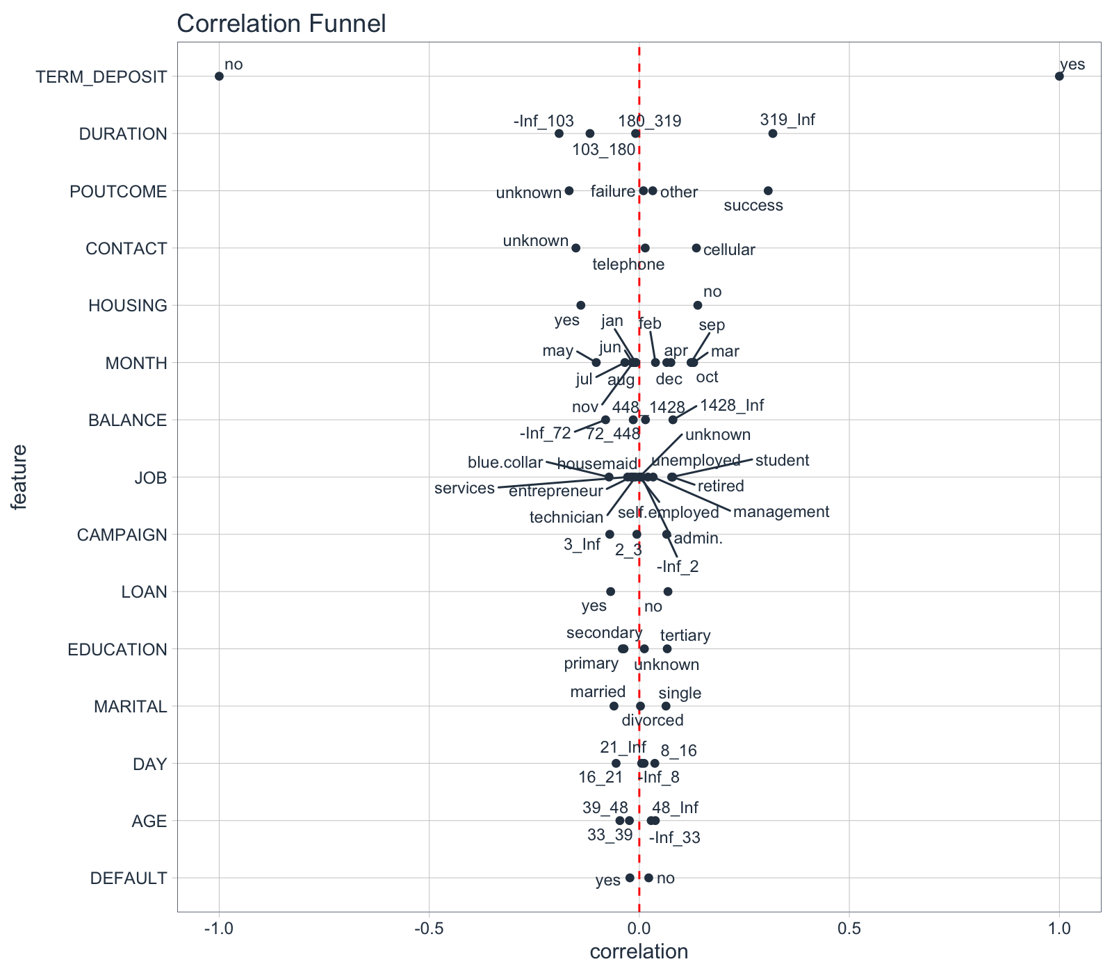
The final step is to make a correlation funnel. We can correlation data from the previous step, piping (%>%) into the plot_correlation_funnel() function.
marketing_campaign_corr_tbl %>%
    plot_correlation_funnel()
5.0 Business Insights
Insights are critical to business. Here’s how we can use the Correlation Funnel to develop a Customer Story.
Insights from the Correlation Funnel
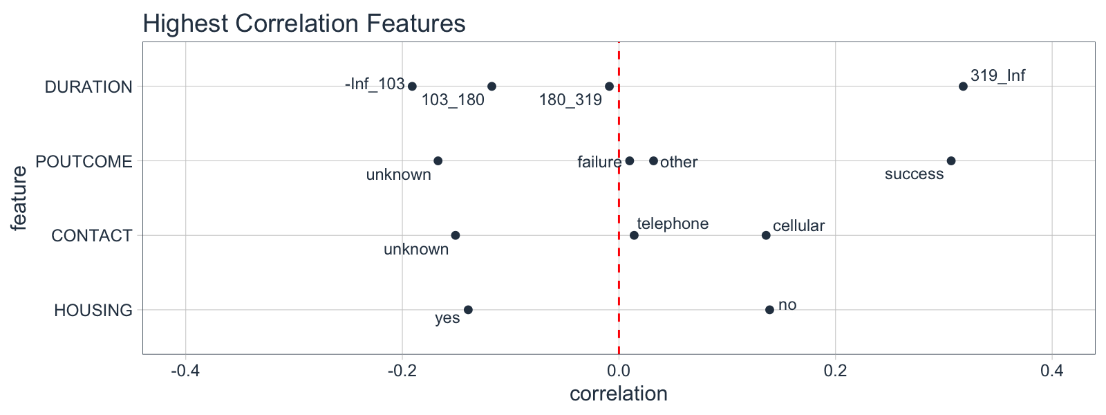
From the Correlation Funnel, we can see that the following groups of customers have a much greater correlation with enrollment in the TERM DEPOSIT product.
-
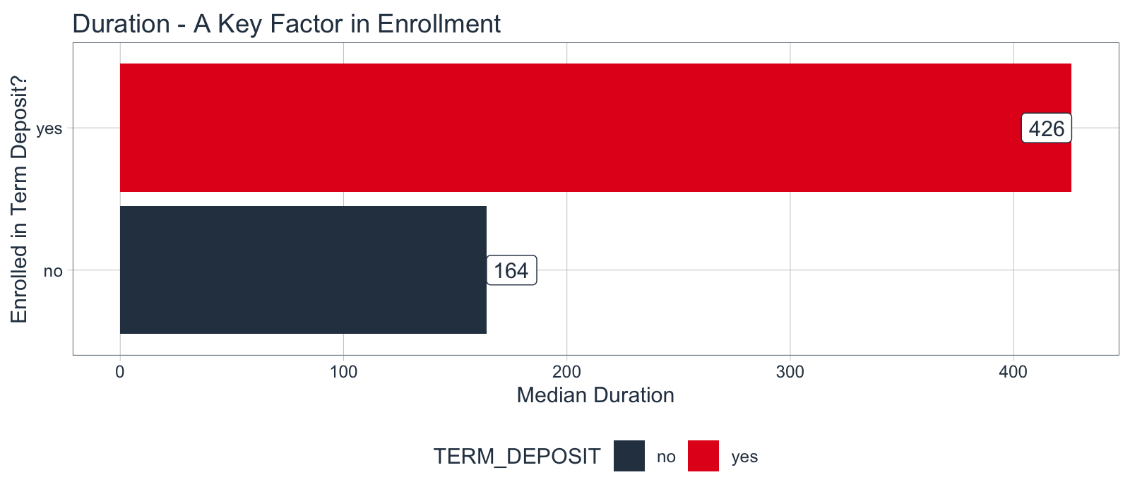
When the DURATION, the amount of time a prospect is engaged in marketing campaign material, is 319 seconds or longer.
-
When POUTCOME, whether or not a prospect has previously enrolled in a product, is “success”.
-
When CONTACT, the medium used to contact the person, is “cellular”
-
When HOUSING, whether or not the contact has a HOME LOAN is “no”
We can then focus our time on exploring the high correlation features rather than plotting 16 different plots (or more if we have many features in our dataset).
Develop the Customer Story
Here’s an example of how we can quickly investigate DURATION, the top correlation feature, which is critical to us being able to develop a customer story. We’ll make a visualization with ggplot2 that shows the median engagement duration for the marketing campaign. Those enrolling in the TERM DEPOSIT product are spending 3X more time engaging with the campaign.
marketing_campaign_tbl %>%

    # Calculate Median by Term Deposit Enrollment (Yes/No)
    select(TERM_DEPOSIT, DURATION) %>%
    group_by(TERM_DEPOSIT) %>%
    summarize(DURATION_MEDIAN = median(DURATION)) %>%

    # Make a Bar Plot
    ggplot(aes(TERM_DEPOSIT, DURATION_MEDIAN, fill = TERM_DEPOSIT)) +
    geom_col() +
    geom_label(aes(label = DURATION_MEDIAN), color = "#2c3e50",
               fill = "white", hjust = "inward") +
    coord_flip() +
    theme_tq() +
    scale_fill_tq() +
    labs(title = "Duration - A Key Factor in Enrollment",
         y = "Median Duration", x = "Enrolled in Term Deposit?")
Conclusion
R can dramatically speed up the exploratory data analysis process - All we need is a few new tactics. Rather than searching through features, we can use Correlation Analysis to point us in the right direction.
We saw how to implement Correlation Analysis using the new correlationfunnel R package. This pointed us right to the high correlation features in the data set.
The best part is that the Correlation Analysis is only 5 lines of code. We can quickly correlation analysis pipeline by piping (%>%) using our 3 functions: binarize(), correlate(), and plot_correlation_funnel().
marketing_campaign_tbl %>%
    select(-ID) %>%
    binarize(n_bins = 4, thresh_infreq = 0.0001) %>%
    correlate(TERM_DEPOSIT__yes) %>%
    plot_correlation_funnel()
This is a lot better than using Excel Pivot Tables. I estimated about 160 Minutes (almost 3 hours of non-stop Pivot Table visualizations, not including possibly missing information or getting sidetracked. Correlation analysis in 5 lines of code is an easy win.
More Awesome EDA Packages
Want to go even further with Exploratory Data Analysis? Here are several great EDA packages that can help you understand data issues (cleanliness) and get data prepared for Correlation Analysis!
-
correlationfunnel - My new correlation analysis R package
-
Data Explorer - Automates Exploration and Data Treatment. Amazing for investigating features quickly and efficiently including by data type, missing data, feature engineering, and identifying relationships.
-
naniar - For understanding missing data.
-
UpSetR - For generating upset plots
-
GGally - The ggpairs() function is one of my all-time favorites for visualizing many features quickly.
Correlation Analysis Success Story
Stephen Lung is my student at Business Science University. Stephen recently placed 3rd in a Tableau competition. Here’s the AMAZING part - Stephen did NOT know Tableau.

How did Stephen win 3rd place without knowing Tableau?
Stephen beat out peers with 2+ years of Tableau skills. How is this possible? Stephen used R and Correlation Analysis to rapidly iterate through the business dataset, finding features that were critical to the story. The final data product was in Tableau, but R was the real workhorse.
How did Stephen learn R?
Stephen learned R through Business Science University. Stephen is taking the following courses:
-
Business Analysis with R (DS4B 101-R) - A 7-Week course where you learn the foundations of data science for business using R, the tidyverse, parsnip (Machine Learning), dplyr (data wrangling), ggplot2 (visualization), rmarkdown (reporting), and more!
-
Advanced Machine Learning & Business Consulting (DS4B 201-R) - A 10-Week program where you learn a framework for solving business problems with data science, and you apply cutting-edge tools including H2O Automatic Machine Learning, LIME Local Feature Explanation, Correlation Analysis, and ROI Analysis.
-
Learning Labs PRO - A continuous learning system where students receive new 1-hour courses every 2-weeks on advanced topics like wrangling large data sets, creating API’s, and more!
References