Tidy Time Series Analysis, Part 3: The Rolling Correlation
Written by Matt Dancho

In the third part in a series on Tidy Time Series Analysis, we’ll use the runCor function from TTR to investigate rolling (dynamic) correlations. We’ll again use tidyquant to investigate CRAN downloads. This time we’ll also get some help from the corrr package to investigate correlations over specific timespans, and the cowplot package for multi-plot visualizations. We’ll end by reviewing the changes in rolling correlations to show how to detect events and shifts in trend. If you like what you read, please follow us on social media to stay up on the latest Business Science news, events and information! As always, we are interested in both expanding our network of data scientists and seeking new clients interested in applying data science to business and finance. If interested, contact us.
If you haven’t checked out the previous two tidy time series posts, you may want to review them to get up to speed.
An example of the visualization we can create using the runCor function with tq_mutate_xy() in combination with the corrr and cowplot packages:
Libraries Needed
We’ll need to load four libraries today.
library(tidyquant)  # Loads tidyverse, tidyquant, financial pkgs, xts/zoo
library(cranlogs)   # For inspecting package downloads over time
library(corrr)      # Tidy correlation tables and correlation plotting
library(cowplot)    # Multiple plots with plot_grid()
CRAN tidyverse Downloads
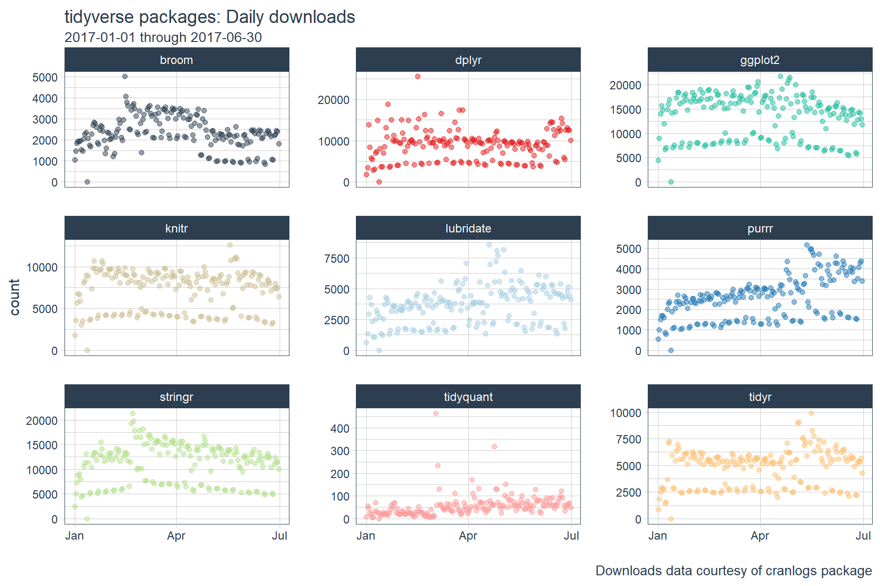
We’ll be using the same “tidyverse” dataset as the last two posts. The script below gets the package downloads for the first half of 2017.
# tidyverse packages (see my laptop stickers from first post) ;)
pkgs <- c(
    "tidyr", "lubridate", "dplyr",
    "broom", "tidyquant", "ggplot2", "purrr",
    "stringr", "knitr"
)

# Get the downloads for the individual packages
tidyverse_downloads <- cran_downloads(
    packages = pkgs,
    from     = "2017-01-01",
    to       = "2017-06-30") %>%
    tibble::as_tibble() %>%
    group_by(package)

# Visualize the package downloads
tidyverse_downloads %>%
    ggplot(aes(x = date, y = count, color = package)) +
    # Data
    geom_point(alpha = 0.5) +
    facet_wrap(~ package, ncol = 3, scale = "free_y") +
    # Aesthetics
    labs(title = "tidyverse packages: Daily downloads", x = "",
         subtitle = "2017-01-01 through 2017-06-30",
         caption = "Downloads data courtesy of cranlogs package") +
    scale_color_tq() +
    theme_tq() +
    theme(legend.position="none")
We’ll also investigate correlations to the “broader market” meaning the total CRAN dowloads over time. To do this, we need to get the total downloads using cran_downloads() and leaving the package argument NULL, which is the default.
# Get data for total CRAN downloads
all_downloads <- cran_downloads(from = "2017-01-01", to = "2017-06-30") %>%
    tibble::as_tibble()

# Visualize the downloads
all_downloads %>%
    ggplot(aes(x = date, y = count)) +
    # Data
    geom_point(alpha = 0.5, color = palette_light()[[1]], size = 2) +
    # Aesthetics
    labs(title = "Total CRAN Packages: Daily downloads", x = "",
         subtitle = "2017-01-01 through 2017-06-30",
         caption = "Downloads data courtesy of cranlogs package") +
    scale_y_continuous(labels = scales::comma) +
    theme_tq() +
    theme(legend.position="none")

Rolling Correlations
Correlations in time series are very useful because if a relationship exists, you can actually model/predict/forecast using the correlation. However, there’s one issue: a correlation is NOT static! It changes over time. Even the best models can be rendered useless during periods when correlation is low.
One of the most important calculations in time series analysis is the rolling correlation. Rolling correlations are simply applying a correlation between two time series (say sales of product x and product y) as a rolling window calculation.
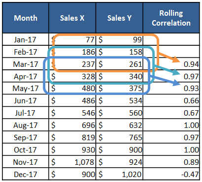
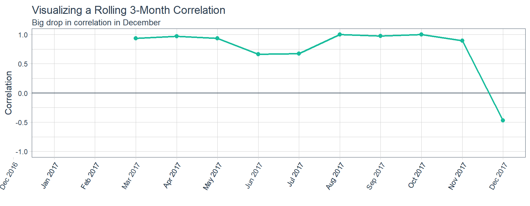
One major benefit of a rolling correlation is that we can visualize the change in correlation over time. The sample data (above) is charted (below). As shown, there’s a relatively high correlation between Sales of Product X and Y until a big shift in December. The question is, “What happened in December?” Just being able to ask this question can be critical to an organization.
In addition to visualizations, the rolling correlation is great for a number of reasons. First, changes in correlation can signal events that have occurred causing two correlated time series to deviate from each other. Second, when modeling, timespans of low correlation can help in determining whether or not to trust a forecast model. Third, you can detect shifts in trend as time series become more or less correlated over time.
Time Series Functions
The xts, zoo, and TTR packages have some great functions that enable working with time series. Today, we’ll take a look at the runCor() function from the TTR package. You can see which TTR functions are integrated into tidyquant package below:
# "run" functions from TTR
tq_mutate_fun_options()$TTR %>%
    stringr::str_subset("^run")
##  [1] "runCor"         "runCov"         "runMAD"
##  [4] "runMax"         "runMean"        "runMedian"
##  [7] "runMin"         "runPercentRank" "runSD"
## [10] "runSum"         "runVar"
Tidy Implementation of Time Series Functions
We’ll use the tq_mutate_xy() function to apply time series functions in a “tidy” way. Similar to tq_mutate() used in the last post, the tq_mutate_xy() function always adds columns to the existing data frame (rather than returning a new data frame like tq_transmute()). It’s well suited for tasks that result in column-wise dimension changes (not row-wise such as periodicity changes, use tq_transmute for those!).
Most running statistic functions only take one data argument, x. In these cases you can use tq_mutate(), which has an argument, select. See how runSD only takes x.
# If first arg is x (and no y) --> us tq_mutate()
args(runSD)
## function (x, n = 10, sample = TRUE, cumulative = FALSE)
## NULL
However, functions like runCor and runCov are setup to take in two data arguments, x and y. In these cases, use tq_mutate_xy(), which takes two arguments, x and y (as opposed to select from tq_mutate()). This makes it well suited for functions that have the first two arguments being x and y. See how runCor has two arguments x and y.
# If first two arguments are x and y --> use tq_mutate_xy()
args(runCor)
## function (x, y, n = 10, use = "all.obs", sample = TRUE, cumulative = FALSE)
## NULL
Static Correlations
Before we jump into rolling correlations, let’s examine the static correlations of our package downloads. This gives us an idea of how in sync the various packages are with each other over the entire timespan.
We’ll use the correlate() and shave() functions from the corrr package to output a tidy correlation table. We’ll hone in on the last column “all_cran”, which measures the correlation between individual packages and the broader market (i.e. total CRAN downloads).
# Correlation table
tidyverse_static_correlations <- tidyverse_downloads %>%
    # Data wrangling
    spread(key = package, value = count) %>%
    left_join(all_downloads, by = "date") %>%
    rename(all_cran = count) %>%
    select(-date) %>%
    # Correlation and formating
    correlate()

# Pretty printing
tidyverse_static_correlations %>%
    shave(upper = F)
| rowname |
broom |
dplyr |
ggplot2 |
knitr |
lubridate |
purrr |
stringr |
tidyquant |
tidyr |
all_cran |
| broom |
|
0.63 |
0.78 |
0.67 |
0.52 |
0.40 |
0.81 |
0.17 |
0.53 |
0.74 |
| dplyr |
|
|
0.73 |
0.71 |
0.59 |
0.58 |
0.71 |
0.14 |
0.64 |
0.76 |
| ggplot2 |
|
|
|
0.91 |
0.82 |
0.67 |
0.91 |
0.20 |
0.82 |
0.94 |
| knitr |
|
|
|
|
0.72 |
0.74 |
0.88 |
0.21 |
0.89 |
0.92 |
| lubridate |
|
|
|
|
|
0.79 |
0.72 |
0.29 |
0.73 |
0.82 |
| purrr |
|
|
|
|
|
|
0.66 |
0.35 |
0.82 |
0.80 |
| stringr |
|
|
|
|
|
|
|
0.23 |
0.81 |
0.91 |
| tidyquant |
|
|
|
|
|
|
|
|
0.26 |
0.31 |
| tidyr |
|
|
|
|
|
|
|
|
|
0.87 |
| all_cran |
|
|
|
|
|
|
|
|
|
|
The correlation table is nice, but the outliers don’t exactly jump out. For instance, it’s difficult to see that tidyquant is low compared to the other packages withing the “all_cran” column.
Fortunately, the corrr package has a nice visualization called a network_plot(). It helps to identify strength of correlation. Similar to a “kmeans” analysis, we are looking for association by distance (or in this case by correlation). How well the packages correlate with each other is akin to how associated they are with each other. The network plot shows us exactly this association!
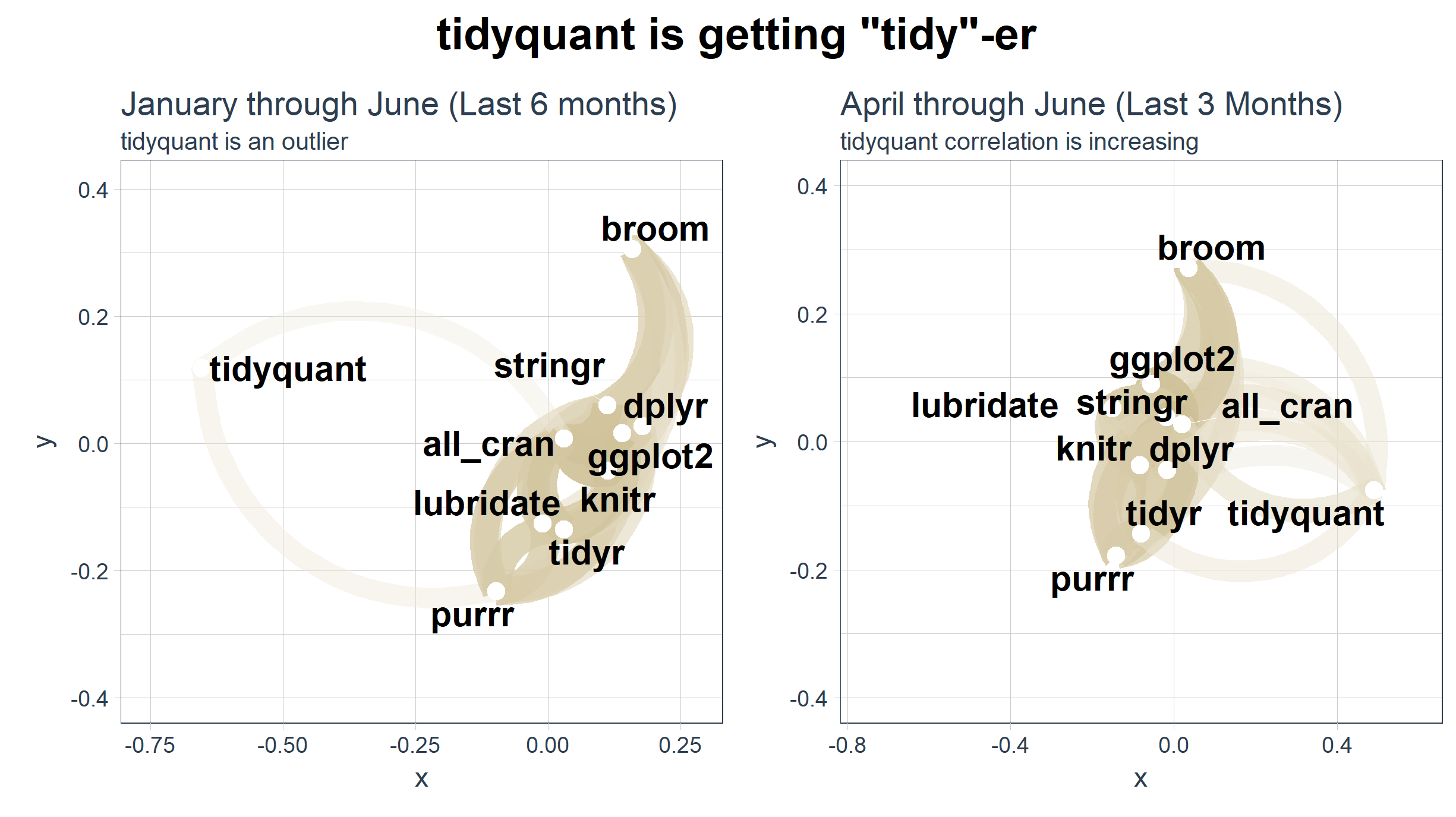
# Network plot
gg_all <- tidyverse_static_correlations %>%
    network_plot(colours = c(palette_light()[[2]], "white", palette_light()[[4]]), legend = TRUE) +
    labs(
        title = "Correlations of tidyverse Package Downloads to Total CRAN Downloads",
        subtitle = "Looking at January through June, tidyquant is a clear outlier"
        ) +
    expand_limits(x = c(-0.75, 0.25), y = c(-0.4, 0.4)) +
    theme_tq() +
    theme(legend.position = "bottom")
gg_all
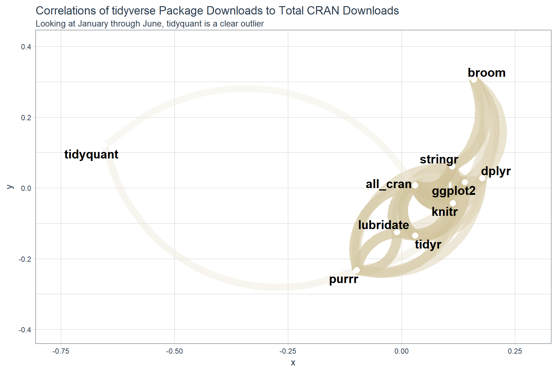
We can see that tidyquant has a very low correlation to “all_cran” and the rest of the “tidyverse” packages. This would lead us to believe that tidyquant is trending abnormally with respect to the rest, and thus is possibly not as associated as we think. Is this really the case?
Rolling Correlations
Let’s see what happens when we incorporate time using a rolling correlation. The script below uses the runCor function from the TTR package. We apply it using tq_mutate_xy(), which is useful for applying functions such has runCor that have both an x and y input.
# Get rolling correlations
tidyverse_rolling_corr <- tidyverse_downloads %>%
    # Data wrangling
    left_join(all_downloads, by = "date") %>%
    select(date, package, count.x, count.y) %>%
    # Mutation
    tq_mutate_xy(
        x          = count.x,
        y          = count.y,
        mutate_fun = runCor,
        # runCor args
        n          = 30,
        use        = "pairwise.complete.obs",
        # tq_mutate args
        col_rename = "rolling_corr"
    )

# Join static correlations with rolling correlations
tidyverse_static_correlations <- tidyverse_static_correlations %>%
    select(rowname, all_cran) %>%
    rename(package = rowname)

tidyverse_rolling_corr <- tidyverse_rolling_corr %>%
    left_join(tidyverse_static_correlations, by = "package") %>%
    rename(static_corr = all_cran)

# Plot
tidyverse_rolling_corr %>%
    ggplot(aes(x = date, color = package)) +
    # Data
    geom_line(aes(y = static_corr), color = "red") +
    geom_point(aes(y = rolling_corr), alpha = 0.5) +
    facet_wrap(~ package, ncol = 3, scales = "free_y") +
    # Aesthetics
    scale_color_tq() +
    labs(
        title = "tidyverse: 30-Day Rolling Download Correlations, Package vs Total CRAN",
        subtitle = "Relationships are dynamic vs static correlation (red line)",
        x = "", y = "Correlation"
    ) +
    theme_tq() +
    theme(legend.position="none")
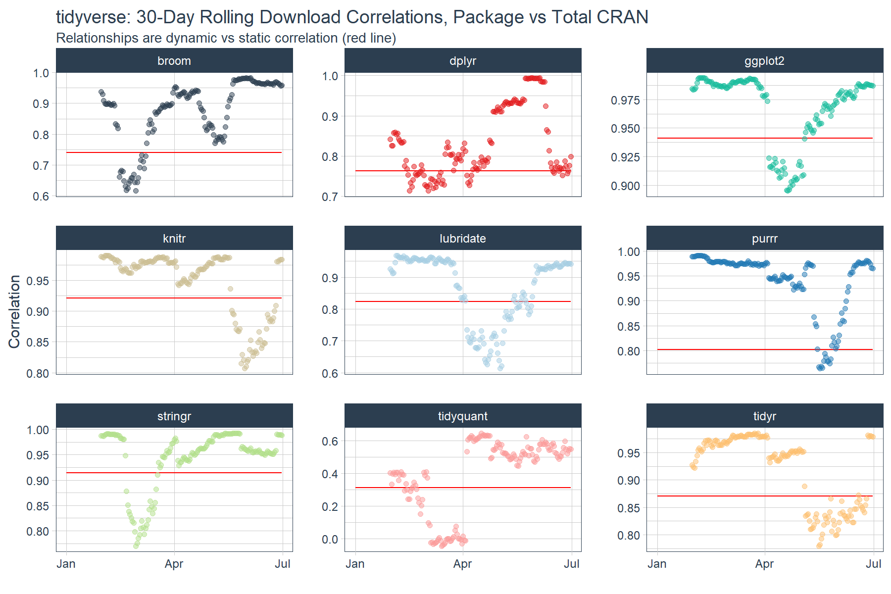
The rolling correlation shows the dynamic nature of the relationship. If we just went by the static correlation over the full timespan (red line), we’d be misled about the dynamic nature of these time series. Further, we can see that most packages are highly correlated with the broader market (total CRAN downloads) with the exception of various periods where the correlations dropped. The drops could indicate events or changes in user behavior that resulted in shocks to the download patterns.
Focusing on the main outlier tidyquant, we can see that once April hit tidyquant is trending closer to a 0.60 correlation meaning that the 0.31 relationship (red line) is likely too low going forward.
Last, we can redraw the network plot from April through June to investigate the shift in relationship. We can use the cowplot package to plot two ggplots (or corrr network plots) side-by-side.
# Redrawing Network Plot from April through June
gg_subset <- tidyverse_downloads %>%
    # Filter by date >= April 1, 2017
    filter(date >= ymd("2017-04-01")) %>%
    # Data wrangling
    spread(key = package, value = count) %>%
    left_join(all_downloads, by = "date") %>%
    rename(all_cran = count) %>%
    select(-date) %>%
    # Correlation and formating
    correlate() %>%
    # Network Plot
    network_plot(colours = c(palette_light()[[2]], "white", palette_light()[[4]]), legend = TRUE) +
    labs(
        title = "April through June (Last 3 Months)",
        subtitle = "tidyquant correlation is increasing"
        ) +
    expand_limits(x = c(-0.75, 0.25), y = c(-0.4, 0.4)) +
    theme_tq() +
    theme(legend.position = "bottom")

# Modify the January through June network plot (previous plot)
gg_all <- gg_all +
    labs(
        title = "January through June (Last 6 months)",
        subtitle = "tidyquant is an outlier"
        )

# Format cowplot
cow_net_plots <- plot_grid(gg_all, gg_subset, ncol = 2)
title <- ggdraw() +
    draw_label(label = 'tidyquant is getting "tidy"-er',
               fontface = 'bold', size = 18)
cow_out <- plot_grid(title, cow_net_plots, ncol=1, rel_heights=c(0.1, 1))
cow_out

Conclusions
The tq_mutate_xy() function from tidyquant enables efficient and “tidy” application of TTR::runCor() and other functions with x and y arguments. The corrr package is useful for computing the correlations and visualizing relationships, and it fits nicely into the “tidy” framework. The cowplot package helps with arranging multiple ggplots to create compeling stories. In this case, it appears that tidyquant is becoming “tidy”-er, not to be confused with the package tidyr. ;)
Business Science University
Enjoy data science for business? We do too. This is why we created Business Science University where we teach you how to do Data Science For Busines (#DS4B) just like us!
Our first DS4B course (HR 201) is now available!
Who is this course for?
Anyone that is interested in applying data science in a business context (we call this DS4B). All you need is basic R, dplyr, and ggplot2 experience. If you understood this article, you are qualified.
What do you get it out of it?
You learn everything you need to know about how to apply data science in a business context:
-
Using ROI-driven data science taught from consulting experience!
-
Solve high-impact problems (e.g. $15M Employee Attrition Problem)
-
Use advanced, bleeding-edge machine learning algorithms (e.g. H2O, LIME)
-
Apply systematic data science frameworks (e.g. Business Science Problem Framework)
“If you’ve been looking for a program like this, I’m happy to say it’s finally here! This is what I needed when I first began data science years ago. It’s why I created Business Science University.”
Matt Dancho, Founder of Business Science