Demo Week: Time Series Machine Learning with h2o and timetk
Written by Matt Dancho
We’re at the final day of Business Science Demo Week. Today we are demo-ing the h2o package for machine learning on time series data. What’s demo week? Every day this week we are demoing an R package: tidyquant (Monday), timetk (Tuesday), sweep (Wednesday), tibbletime (Thursday) and h2o (Friday)! That’s five packages in five days! We’ll give you intel on what you need to know about these packages to go from zero to hero. Today you’ll see how we can use timetk + h2o to get really accurate time series forecasts. Here we go!
Demo Week Demos:
Get The Best Resources In Data Science. Every Friday!
Sign up for our free "5 Topic Friday" Newsletter. Every week, I'll send you the five coolest topics in data science for business that I've found that week. These could be new R packages, free books, or just some fun to end the week on.
Sign Up For Five-Topic-Friday!
h2o: What’s It Used For?
The h2o package is a product offered by H2O.ai that contains a number of cutting edge machine learning algorithms, performance metrics, and auxiliary functions to make machine learning both powerful and easy. One of the main benefits of H2O is that it can be deployed on a cluster (this will not be discussed today). From the R perspective, there are four main uses:
-
Data Manipulation: Merging, grouping, pivoting, imputing, splitting into training/test/validation sets, etc.
-
Machine Learning Algorithms: Very sophisiticated algorithms in both supervised and unsupervised categories. Supervised include deep learning (neural networks), random forest, generalized linear model, gradient boosting machine, naive bayes, stacked ensembles, and xgboost. Unsupervised include generalized low rank models, k-means and PCA. There’s also Word2vec for text analysis. The latest stable release also has AutoML: automatic machine learning, which is really cool as we’ll see in this post!
-
Auxiliary ML Functionality Performance analysis and grid hyperparameter search
-
Production, Map/Reduce and Cloud: Capabilities for productionizing into Java environments, cluster deployment with Hadoop / Spark (Sparkling Water), deploying in cloud environments (Azure, AWS, Databricks, etc)
Sticking with the theme for the week, we’ll go over how h2o can be used for time series machine learning as an advanced algorithm. We’ll use h2o locally to develop a high accuracy time series model on the same data set (beer_sales_tbl) from the timetk and sweep posts. This is a supervised regression problem.
Load Libraries
We’ll need three libraries today:
h2o: Awesome machine learning librarytidyquant: For getting data and loading the tidyverse behind the scenestimetk: Toolkit for working with time series in R
IMPORTANT FOR INSTALLING H2O
For h2o, you must install the latest stable release. Select H2O » Latest Stable Release » Install in R. Then follow the instructions exactly.
Installing Other Packages
If you haven’t done so already, install the timetk and tidyquant packages:
# Install packages
install.packages("timetk")
install.packages("tidyquant")
Loading Libraries
Load the libraries.
# Load libraries
library(h2o)        # Awesome ML Library
library(timetk)     # Toolkit for working with time series in R
library(tidyquant)  # Loads tidyverse, financial pkgs, used to get data
Data
We’ll get data using the tq_get() function from tidyquant. The data comes from FRED: Beer, Wine, and Distilled Alcoholic Beverages Sales.
# Beer, Wine, Distilled Alcoholic Beverages, in Millions USD
beer_sales_tbl <- tq_get("S4248SM144NCEN", get = "economic.data", from = "2010-01-01", to = "2017-10-27")

beer_sales_tbl
## # A tibble: 92 x 2
##          date price
##        <date> <int>
##  1 2010-01-01  6558
##  2 2010-02-01  7481
##  3 2010-03-01  9475
##  4 2010-04-01  9424
##  5 2010-05-01  9351
##  6 2010-06-01 10552
##  7 2010-07-01  9077
##  8 2010-08-01  9273
##  9 2010-09-01  9420
## 10 2010-10-01  9413
## # ... with 82 more rows
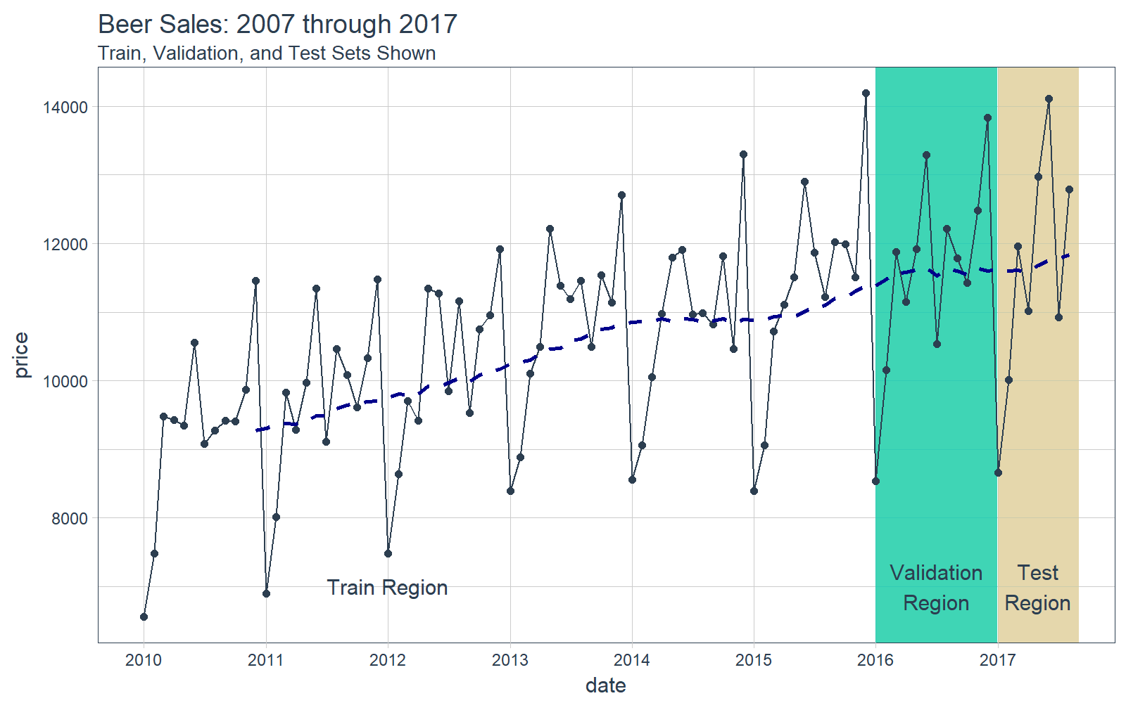
It’s a good idea to visualize the data so we know what we’re working with. Visualization is particularly important for time series analysis and forecasting, and it’s a good idea to identify spots where we will split the data into training, test and validation sets.
# Plot Beer Sales with train, validation, and test sets shown
beer_sales_tbl %>%
    ggplot(aes(date, price)) +
    # Train Region
    annotate("text", x = ymd("2012-01-01"), y = 7000,
             color = palette_light()[[1]], label = "Train Region") +
    # Validation Region
    geom_rect(xmin = as.numeric(ymd("2016-01-01")),
              xmax = as.numeric(ymd("2016-12-31")),
              ymin = 0, ymax = Inf, alpha = 0.02,
              fill = palette_light()[[3]]) +
    annotate("text", x = ymd("2016-07-01"), y = 7000,
             color = palette_light()[[1]], label = "Validation\nRegion") +
    # Test Region
    geom_rect(xmin = as.numeric(ymd("2017-01-01")),
              xmax = as.numeric(ymd("2017-08-31")),
              ymin = 0, ymax = Inf, alpha = 0.02,
              fill = palette_light()[[4]]) +
    annotate("text", x = ymd("2017-05-01"), y = 7000,
             color = palette_light()[[1]], label = "Test\nRegion") +
    # Data
    geom_line(col = palette_light()[1]) +
    geom_point(col = palette_light()[1]) +
    geom_ma(ma_fun = SMA, n = 12, size = 1) +
    # Aesthetics
    theme_tq() +
    scale_x_date(date_breaks = "1 year", date_labels = "%Y") +
    labs(title = "Beer Sales: 2007 through 2017",
         subtitle = "Train, Validation, and Test Sets Shown")
Now that you have a feel for the time series we’ll be working with today, let’s move onto the demo!
DEMO: h2o + timetk, Time Series Machine Learning
We’ll follow a similar workflow for time series machine learning from the timetk + linear regression post on Tuesday. However, this time we’ll swap out the lm() function for h2o.autoML() to get superior accuracy!
Time Series Machine Learning
Time series machine learning is a great way to forecast time series data, but before we get started here are a couple pointers for this demo:
-
Key Insight: The time series signature ~ timestamp information expanded column-wise into a feature set ~ is used to perform machine learning.
-
Objective: We’ll predict the next 8 months of data for 2017 using the time series signature. We’ll then compare the results to the two prior demos that predicted the same data using different methods: timetk + lm() (linear regression) and sweep + auto.arima() (ARIMA).
We’ll go through a workflow that can be used to perform time series machine learning.
Step 0: Review data
Just to show our starting point, let’s print out our beer_sales_tbl. We use glimpse() to take a quick peek at the data.
# Starting point
beer_sales_tbl %>% glimpse()
## Observations: 92
## Variables: 2
## $ date  <date> 2010-01-01, 2010-02-01, 2010-03-01, 2010-04-01, 20...
## $ price <int> 6558, 7481, 9475, 9424, 9351, 10552, 9077, 9273, 94...
Step 1: Augment Time Series Signature
The tk_augment_timeseries_signature() function expands out the timestamp information column-wise into a machine learning feature set, adding columns of time series information to the original data frame. We’ll again use glimpse() for quick inspection. See how there are now 30 features. Not all will be important, but some will.
# Augment (adds data frame columns)
beer_sales_tbl_aug <- beer_sales_tbl %>%
    tk_augment_timeseries_signature()

beer_sales_tbl_aug %>% glimpse()
## Observations: 92
## Variables: 30
## $ date      <date> 2010-01-01, 2010-02-01, 2010-03-01, 2010-04-01...
## $ price     <int> 6558, 7481, 9475, 9424, 9351, 10552, 9077, 9273...
## $ index.num <int> 1262304000, 1264982400, 1267401600, 1270080000,...
## $ diff      <int> NA, 2678400, 2419200, 2678400, 2592000, 2678400...
## $ year      <int> 2010, 2010, 2010, 2010, 2010, 2010, 2010, 2010,...
## $ year.iso  <int> 2009, 2010, 2010, 2010, 2010, 2010, 2010, 2010,...
## $ half      <int> 1, 1, 1, 1, 1, 1, 2, 2, 2, 2, 2, 2, 1, 1, 1, 1,...
## $ quarter   <int> 1, 1, 1, 2, 2, 2, 3, 3, 3, 4, 4, 4, 1, 1, 1, 2,...
## $ month     <int> 1, 2, 3, 4, 5, 6, 7, 8, 9, 10, 11, 12, 1, 2, 3,...
## $ month.xts <int> 0, 1, 2, 3, 4, 5, 6, 7, 8, 9, 10, 11, 0, 1, 2, ...
## $ month.lbl <ord> January, February, March, April, May, June, Jul...
## $ day       <int> 1, 1, 1, 1, 1, 1, 1, 1, 1, 1, 1, 1, 1, 1, 1, 1,...
## $ hour      <int> 0, 0, 0, 0, 0, 0, 0, 0, 0, 0, 0, 0, 0, 0, 0, 0,...
## $ minute    <int> 0, 0, 0, 0, 0, 0, 0, 0, 0, 0, 0, 0, 0, 0, 0, 0,...
## $ second    <int> 0, 0, 0, 0, 0, 0, 0, 0, 0, 0, 0, 0, 0, 0, 0, 0,...
## $ hour12    <int> 0, 0, 0, 0, 0, 0, 0, 0, 0, 0, 0, 0, 0, 0, 0, 0,...
## $ am.pm     <int> 1, 1, 1, 1, 1, 1, 1, 1, 1, 1, 1, 1, 1, 1, 1, 1,...
## $ wday      <int> 6, 2, 2, 5, 7, 3, 5, 1, 4, 6, 2, 4, 7, 3, 3, 6,...
## $ wday.xts  <int> 5, 1, 1, 4, 6, 2, 4, 0, 3, 5, 1, 3, 6, 2, 2, 5,...
## $ wday.lbl  <ord> Friday, Monday, Monday, Thursday, Saturday, Tue...
## $ mday      <int> 1, 1, 1, 1, 1, 1, 1, 1, 1, 1, 1, 1, 1, 1, 1, 1,...
## $ qday      <int> 1, 32, 60, 1, 31, 62, 1, 32, 63, 1, 32, 62, 1, ...
## $ yday      <int> 1, 32, 60, 91, 121, 152, 182, 213, 244, 274, 30...
## $ mweek     <int> 5, 6, 5, 5, 5, 6, 5, 5, 5, 5, 6, 5, 5, 6, 5, 5,...
## $ week      <int> 1, 5, 9, 13, 18, 22, 26, 31, 35, 40, 44, 48, 1,...
## $ week.iso  <int> 53, 5, 9, 13, 17, 22, 26, 30, 35, 39, 44, 48, 5...
## $ week2     <int> 1, 1, 1, 1, 0, 0, 0, 1, 1, 0, 0, 0, 1, 1, 1, 1,...
## $ week3     <int> 1, 2, 0, 1, 0, 1, 2, 1, 2, 1, 2, 0, 1, 2, 0, 1,...
## $ week4     <int> 1, 1, 1, 1, 2, 2, 2, 3, 3, 0, 0, 0, 1, 1, 1, 1,...
## $ mday7     <int> 1, 1, 1, 1, 1, 1, 1, 1, 1, 1, 1, 1, 1, 1, 1, 1,...
Step 2: Prep the Data for H2O
We need to prepare the data in a format for H2O. First, let’s remove any unnecessary columns such as dates or those with missing values, and change the ordered classes to plain factors. We prefer dplyr operations for these steps.
beer_sales_tbl_clean <- beer_sales_tbl_aug %>%
    select_if(~ !is.Date(.)) %>%
    select_if(~ !any(is.na(.))) %>%
    mutate_if(is.ordered, ~ as.character(.) %>% as.factor)

beer_sales_tbl_clean %>% glimpse()
## Observations: 92
## Variables: 28
## $ price     <int> 6558, 7481, 9475, 9424, 9351, 10552, 9077, 9273...
## $ index.num <int> 1262304000, 1264982400, 1267401600, 1270080000,...
## $ year      <int> 2010, 2010, 2010, 2010, 2010, 2010, 2010, 2010,...
## $ year.iso  <int> 2009, 2010, 2010, 2010, 2010, 2010, 2010, 2010,...
## $ half      <int> 1, 1, 1, 1, 1, 1, 2, 2, 2, 2, 2, 2, 1, 1, 1, 1,...
## $ quarter   <int> 1, 1, 1, 2, 2, 2, 3, 3, 3, 4, 4, 4, 1, 1, 1, 2,...
## $ month     <int> 1, 2, 3, 4, 5, 6, 7, 8, 9, 10, 11, 12, 1, 2, 3,...
## $ month.xts <int> 0, 1, 2, 3, 4, 5, 6, 7, 8, 9, 10, 11, 0, 1, 2, ...
## $ month.lbl <fctr> January, February, March, April, May, June, Ju...
## $ day       <int> 1, 1, 1, 1, 1, 1, 1, 1, 1, 1, 1, 1, 1, 1, 1, 1,...
## $ hour      <int> 0, 0, 0, 0, 0, 0, 0, 0, 0, 0, 0, 0, 0, 0, 0, 0,...
## $ minute    <int> 0, 0, 0, 0, 0, 0, 0, 0, 0, 0, 0, 0, 0, 0, 0, 0,...
## $ second    <int> 0, 0, 0, 0, 0, 0, 0, 0, 0, 0, 0, 0, 0, 0, 0, 0,...
## $ hour12    <int> 0, 0, 0, 0, 0, 0, 0, 0, 0, 0, 0, 0, 0, 0, 0, 0,...
## $ am.pm     <int> 1, 1, 1, 1, 1, 1, 1, 1, 1, 1, 1, 1, 1, 1, 1, 1,...
## $ wday      <int> 6, 2, 2, 5, 7, 3, 5, 1, 4, 6, 2, 4, 7, 3, 3, 6,...
## $ wday.xts  <int> 5, 1, 1, 4, 6, 2, 4, 0, 3, 5, 1, 3, 6, 2, 2, 5,...
## $ wday.lbl  <fctr> Friday, Monday, Monday, Thursday, Saturday, Tu...
## $ mday      <int> 1, 1, 1, 1, 1, 1, 1, 1, 1, 1, 1, 1, 1, 1, 1, 1,...
## $ qday      <int> 1, 32, 60, 1, 31, 62, 1, 32, 63, 1, 32, 62, 1, ...
## $ yday      <int> 1, 32, 60, 91, 121, 152, 182, 213, 244, 274, 30...
## $ mweek     <int> 5, 6, 5, 5, 5, 6, 5, 5, 5, 5, 6, 5, 5, 6, 5, 5,...
## $ week      <int> 1, 5, 9, 13, 18, 22, 26, 31, 35, 40, 44, 48, 1,...
## $ week.iso  <int> 53, 5, 9, 13, 17, 22, 26, 30, 35, 39, 44, 48, 5...
## $ week2     <int> 1, 1, 1, 1, 0, 0, 0, 1, 1, 0, 0, 0, 1, 1, 1, 1,...
## $ week3     <int> 1, 2, 0, 1, 0, 1, 2, 1, 2, 1, 2, 0, 1, 2, 0, 1,...
## $ week4     <int> 1, 1, 1, 1, 2, 2, 2, 3, 3, 0, 0, 0, 1, 1, 1, 1,...
## $ mday7     <int> 1, 1, 1, 1, 1, 1, 1, 1, 1, 1, 1, 1, 1, 1, 1, 1,...
Let’s split into a training, validation and test sets following the time ranges in the visualization above.
# Split into training, validation and test sets
train_tbl <- beer_sales_tbl_clean %>% filter(year < 2016)
valid_tbl <- beer_sales_tbl_clean %>% filter(year == 2016)
test_tbl  <- beer_sales_tbl_clean %>% filter(year == 2017)
Step 3: Model with H2O
First, fire up h2o. This will initialize the Java Virtual Machine (JVM) that H2O uses locally.
h2o.init() # Fire up h2o
##  Connection successful!
##
## R is connected to the H2O cluster:
##     H2O cluster uptime:         46 minutes 4 seconds
##     H2O cluster version:        3.14.0.3
##     H2O cluster version age:    1 month and 5 days
##     H2O cluster name:           H2O_started_from_R_mdancho_pcs046
##     H2O cluster total nodes:    1
##     H2O cluster total memory:   3.51 GB
##     H2O cluster total cores:    4
##     H2O cluster allowed cores:  4
##     H2O cluster healthy:        TRUE
##     H2O Connection ip:          localhost
##     H2O Connection port:        54321
##     H2O Connection proxy:       NA
##     H2O Internal Security:      FALSE
##     H2O API Extensions:         Algos, AutoML, Core V3, Core V4
##     R Version:                  R version 3.4.1 (2017-06-30)
h2o.no_progress() # Turn off progress bars
We change our data to an H2OFrame object that can be interpreted by the h2o package.
# Convert to H2OFrame objects
train_h2o <- as.h2o(train_tbl)
valid_h2o <- as.h2o(valid_tbl)
test_h2o  <- as.h2o(test_tbl)
Set the names that h2o will use as the target and predictor variables.
# Set names for h2o
y <- "price"
x <- setdiff(names(train_h2o), y)
Apply any regression model to the data. We’ll use h2o.automl.
x = x: The names of our feature columns.y = y: The name of our target column.training_frame = train_h2o: Our training set consisting of data from 2010 to start of 2016.validation_frame = valid_h2o: Our validation set consisting of data in the year 2016. H2O uses this to ensure the model does not overfit the data.leaderboard_frame = test_h2o: The models get ranked based on MAE performance against this set.max_runtime_secs = 60: We supply this to speed up H2O’s modeling. The algorithm has a large number of complex models so we want to keep things moving at the expense of some accuracy.stopping_metric = "deviance": Use deviance as the stopping metric, which provides very good results for MAPE.
# linear regression model used, but can use any model
automl_models_h2o <- h2o.automl(
    x = x,
    y = y,
    training_frame = train_h2o,
    validation_frame = valid_h2o,
    leaderboard_frame = test_h2o,
    max_runtime_secs = 60,
    stopping_metric = "deviance")
Next we extract the leader model.
# Extract leader model
automl_leader <- automl_models_h2o@leader
Step 4: Predict
Generate predictions using h2o.predict() on the test data.
pred_h2o <- h2o.predict(automl_leader, newdata = test_h2o)
There are a few ways to evaluate performance. We’ll go through the easy way, which is h2o.performance(). This yields a preset values that are commonly used to compare regression models including root mean squared error (RMSE) and mean absolute error (MAE).
h2o.performance(automl_leader, newdata = test_h2o)
## H2ORegressionMetrics: gbm
##
## MSE:  340918.3
## RMSE:  583.8821
## MAE:  467.8388
## RMSLE:  0.04844583
## Mean Residual Deviance :  340918.3
Our preference for this is assessment is mean absolute percentage error (MAPE), which is not included above. However, we can easily calculate. We can investigate the error on our test set (actuals vs predictions).
# Investigate test error
error_tbl <- beer_sales_tbl %>%
    filter(lubridate::year(date) == 2017) %>%
    add_column(pred = pred_h2o %>% as.tibble() %>% pull(predict)) %>%
    rename(actual = price) %>%
    mutate(
        error     = actual - pred,
        error_pct = error / actual
        )
error_tbl
## # A tibble: 8 x 5
##         date actual      pred     error    error_pct
##       <date>  <int>     <dbl>     <dbl>        <dbl>
## 1 2017-01-01   8664  8241.261  422.7386  0.048792541
## 2 2017-02-01  10017  9495.047  521.9534  0.052106763
## 3 2017-03-01  11960 11631.327  328.6726  0.027480989
## 4 2017-04-01  11019 10716.038  302.9619  0.027494498
## 5 2017-05-01  12971 13081.857 -110.8568 -0.008546509
## 6 2017-06-01  14113 12796.170 1316.8296  0.093306142
## 7 2017-07-01  10928 10727.804  200.1962  0.018319563
## 8 2017-08-01  12788 12249.498  538.5016  0.042109915
For comparison sake, we can calculate a few residuals metrics.
error_tbl %>%
    summarise(
        me   = mean(error),
        rmse = mean(error^2)^0.5,
        mae  = mean(abs(error)),
        mape = mean(abs(error_pct)),
        mpe  = mean(error_pct)
    ) %>%
    glimpse()
## Observations: 1
## Variables: 5
## $ me   <dbl> 440.1246
## $ rmse <dbl> 583.8821
## $ mae  <dbl> 467.8388
## $ mape <dbl> 0.03976961
## $ mpe  <dbl> 0.03763299
And The Winner of Demo Week Is…
The MAPE for the combination of h2o + timetk is superior to the two prior demos:
- timetk + h2o: MAPE = 3.9% (This demo)
- timetk + linear regression: MAPE = 4.3% (timetk demo)
- sweep + ARIMA: MAPE = 4.3%, (sweep demo)
A question for the interested reader to figure out: What happens to the accuracy when you average the predictions of all three different methods? Try it to find out.
Note that the accuracy of time series machine learning may not always be superior to ARIMA and other forecast techniques including those implemented by prophet and GARCH methods. The data scientist has a responsibility to test different methods and to select the right tool for the job.
HaLLowEen TRick oR TrEat BoNuS!
We are going to visualize the forecast compared to the actual values, but this time taking a cue from @lenkiefer’s theme_spooky described in one of his recent posts, Mortgage Rates are Low!
We’re going to need to load a few libraries to get setup. The biggest challenge is the fonts, but there’s a really cool package called extrafont that we can use. We’ll use extrafont to load the Chiller fontset. Load the bonus library.
# Libraries needed for bonus material
library(extrafont) # More fonts!! We'll use Chiller
Next, you’ll need to setup the Chiller font. Revolutions Analytics has a great article, How to Use Your Favorite Fonts in R Charts, which will get you up and running with extrafont. IMPORTANT: Make sure you go throught the process of loading your system fonts with font_import().
Once fonts are imported, you can load fonts using.
# Loads Chiller and a bunch of system fonts
# Note - Your fontset may differ if you are using Mac / Linux
loadfonts(device="win")
We’ll use Len’s script for theme_spooky(). I highly encourage you to use theme_spooky() all month of October around the office. Very spooky, and surprisingly engaging. :)
# Create spooky dark theme:
theme_spooky = function(base_size = 10, base_family = "Chiller") {

    theme_grey(base_size = base_size, base_family = base_family) %+replace%

        theme(
            # Specify axis options
            axis.line = element_blank(),
            axis.text.x = element_text(size = base_size*0.8, color = "white", lineheight = 0.9),
            axis.text.y = element_text(size = base_size*0.8, color = "white", lineheight = 0.9),
            axis.ticks = element_line(color = "white", size  =  0.2),
            axis.title.x = element_text(size = base_size, color = "white", margin = margin(0, 10, 0, 0)),
            axis.title.y = element_text(size = base_size, color = "white", angle = 90, margin = margin(0, 10, 0, 0)),
            axis.ticks.length = unit(0.3, "lines"),
            # Specify legend options
            legend.background = element_rect(color = NA, fill = " gray10"),
            legend.key = element_rect(color = "white",  fill = " gray10"),
            legend.key.size = unit(1.2, "lines"),
            legend.key.height = NULL,
            legend.key.width = NULL,
            legend.text = element_text(size = base_size*0.8, color = "white"),
            legend.title = element_text(size = base_size*0.8, face = "bold", hjust = 0, color = "white"),
            legend.position = "none",
            legend.text.align = NULL,
            legend.title.align = NULL,
            legend.direction = "vertical",
            legend.box = NULL,
            # Specify panel options
            panel.background = element_rect(fill = " gray10", color  =  NA),
            #panel.border = element_rect(fill = NA, color = "white"),
            panel.border = element_blank(),
            panel.grid.major = element_line(color = "grey35"),
            panel.grid.minor = element_line(color = "grey20"),
            panel.spacing = unit(0.5, "lines"),
            # Specify facetting options
            strip.background = element_rect(fill = "grey30", color = "grey10"),
            strip.text.x = element_text(size = base_size*0.8, color = "white"),
            strip.text.y = element_text(size = base_size*0.8, color = "white",angle = -90),
            # Specify plot options
            plot.background = element_rect(color = " gray10", fill = " gray10"),
            plot.title = element_text(size = base_size*1.2, color = "white",hjust=0,lineheight=1.25,
                                      margin=margin(2,2,2,2)),
            plot.subtitle = element_text(size = base_size*1, color = "white",hjust=0,  margin=margin(2,2,2,2)),
            plot.caption = element_text(size = base_size*0.8, color = "white",hjust=0),
            plot.margin = unit(rep(1, 4), "lines")

        )

}
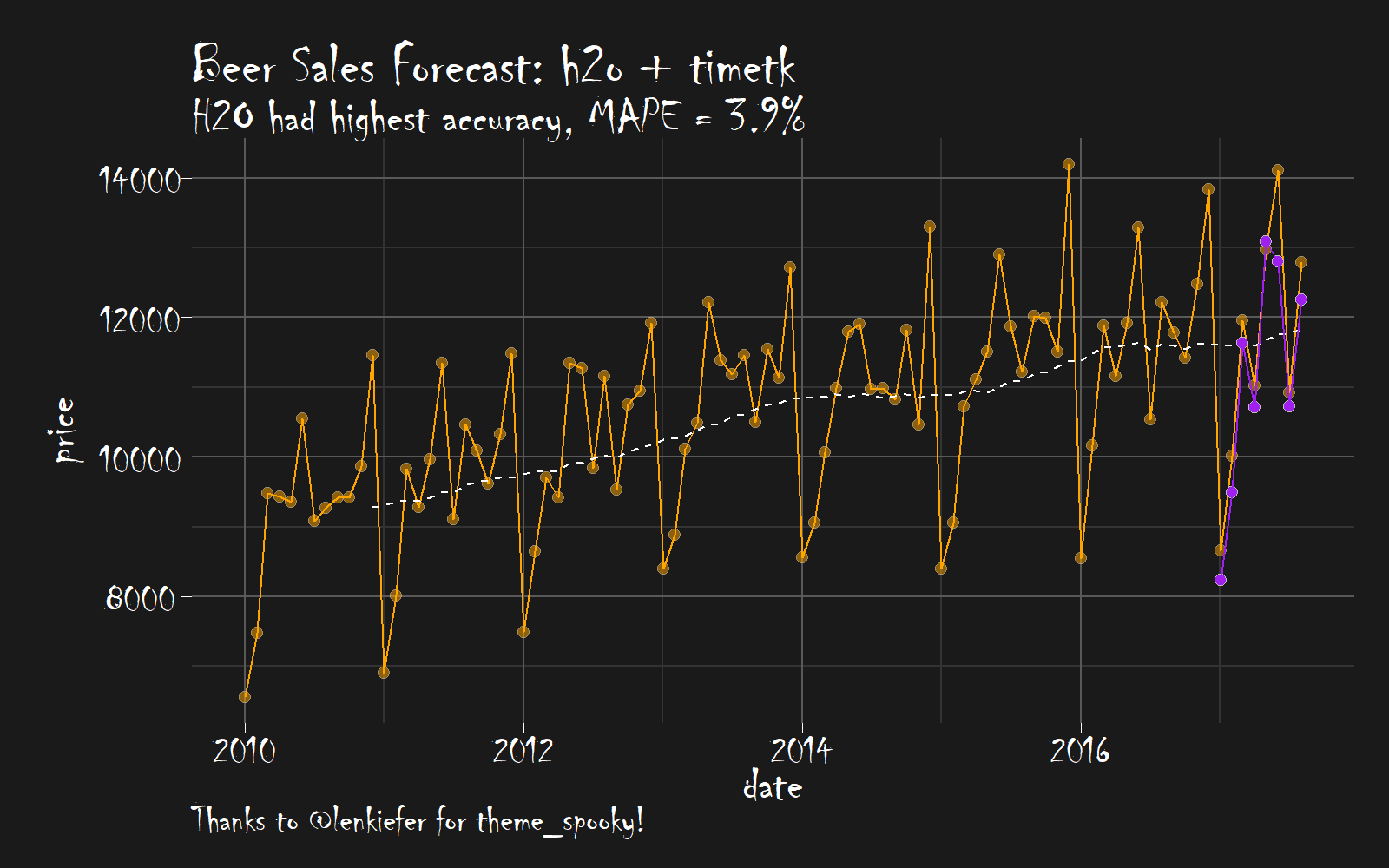
Now let’s create the final visualization so we can see our spooky forecast… Conclusion from the plot: It’s scary how accurate h2o is.
beer_sales_tbl %>%
    ggplot(aes(x = date, y = price)) +
    # Data - Spooky Orange
    geom_point(size = 2, color = "gray", alpha = 0.5, shape = 21, fill = "orange") +
    geom_line(color = "orange", size = 0.5) +
    geom_ma(n = 12, color = "white") +
    # Predictions - Spooky Purple
    geom_point(aes(y = pred), size = 2, color = "gray", alpha = 1, shape = 21, fill = "purple", data = error_tbl) +
    geom_line(aes(y = pred), color = "purple", size = 0.5, data = error_tbl) +
    # Aesthetics
    theme_spooky(base_size = 20) +
    labs(
        title = "Beer Sales Forecast: h2o + timetk",
        subtitle = "H2O had highest accuracy, MAPE = 3.9%",
        caption = "Thanks to @lenkiefer for theme_spooky!"
    )
Next Steps
We’ve only scratched the surface of h2o. There’s more to learn including working classifiers and unsupervised learning. Here are a few resources to help you along the way:
Announcements
We have a busy couple of weeks. In addition to Demo Week, we have:
Facebook LIVE DataTalk
Matt was recently hosted on Experian DataLabs live webcast, #DataTalk, where he spoke about Machine Learning in Human Resources. The talk already has 80K+ views and is growing!! Check it out if you are interested in #rstats, #hranalytics and #MachineLearning.
EARL
On Friday, November 3rd, Matt will be presenting at the EARL Conference on HR Analytics: Using Machine Learning to Predict Employee Turnover.
Courses
Based on recent demand, we are considering offering application-specific machine learning courses for Data Scientists. The content will be business problems similar to our popular articles:
The student will learn from Business Science how to implement cutting edge data science to solve business problems. Please let us know if you are interested. You can leave comments as to what you would like to see at the bottom of the post in Disqus.
About Business Science
Business Science specializes in “ROI-driven data science”. Our focus is machine learning and data science in business applications. We help businesses that seek to add this competitive advantage but may not have the resources currently to implement predictive analytics. Business Science works with clients primarily in small to medium size businesses, guiding these organizations in expanding predictive analytics while executing on ROI generating projects. Visit the Business Science website or contact us to learn more!