Demo Week: Tidy Time Series Analysis with tibbletime
Written by Matt Dancho

We’re into the fourth day of Business Science Demo Week. We have a really cool one in store today: tibbletime, which uses a new tbl_time class that is time-aware!! For those that may have missed it, every day this week we are demo-ing an R package: tidyquant (Monday), timetk (Tuesday), sweep (Wednesday), tibbletime (Thursday) and h2o (Friday)! That’s five packages in five days! We’ll give you intel on what you need to know about these packages to go from zero to hero. Let’s take tibbletime for a spin!
Demo Week Demos:
Get The Best Resources In Data Science. Every Friday!
Sign up for our free "5 Topic Friday" Newsletter. Every week, I'll send you the five coolest topics in data science for business that I've found that week. These could be new R packages, free books, or just some fun to end the week on.
Sign Up For Five-Topic-Friday!
tibbletime: What’s It Used For?
-
The future of “tidy” time series analysis: New class tbl_time rests on top of tbl and makes tibbles time aware.
-
Time Series Functions: Can use a series of “tidy” time series functions designed specifically for tbl_time objects. Some of them are:
-
time_filter(): Succinctly filter a tbl_time object by date.
-
time_summarise(): Similar to dplyr::summarise but with the added benefit of being able to summarise by a time period such as “yearly” or “monthly”.
-
tmap(): The family of tmap functions transform a tbl_time input by applying a function to each column at a specified time interval.
-
as_period(): Convert a tbl_time object from daily to monthly, from minute data to hourly, and more. This allows the user to easily aggregate data to a less granular level.
-
time_collapse(): When time_collapse is used, the index of a tbl_time object is altered so that all dates that fall in a period share a common date.
-
rollify(): Modify a function so that it calculates a value (or a set of values) at specific time intervals. This can be used for rolling averages and other rolling calculations inside the tidyverse framework.
-
create_series(): Use shorthand notation to quickly initialize a tbl_time object containing a date column with a regularly spaced time series.

Load Libraries
The tibbletime package is under active development, and because of this we recommend downloading the package from GitHub using devtools. You’ll get the latest functionality with all of the features demo-ed in this article.
# Get tibbletime version with latest features
devtools::install_github("business-science/tibbletime")
Once installed, load the following libraries:
tibbletime: Enables creation of time-aware tibbles. Can use new tbl_time functions.tidyquant: Loads tidyverse, and is used to get data with tq_get().
# Load libraries
library(tibbletime) # Future of tidy time series analysis
library(tidyquant)  # Loads tidyverse, tq_get()
Data
We’ll download the daily stock prices for the FANG stocks (FB, AMZN, NFLX, GOOG) using tq_get().
# Stock Prices from Yahoo! Finance
FANG_symbols <- c("FB", "AMZN", "NFLX", "GOOG")

FANG_tbl_d <- FANG_symbols %>%
    tq_get(get = "stock.prices", from = "2014-01-01", to = "2016-12-31")

FANG_tbl_d <- FANG_tbl_d %>%
    group_by(symbol)

FANG_tbl_d
## # A tibble: 3,024 x 8
## # Groups:   symbol [4]
##    symbol       date  open  high   low close   volume adjusted
##     <chr>     <date> <dbl> <dbl> <dbl> <dbl>    <dbl>    <dbl>
##  1     FB 2014-01-02 54.83 55.22 54.19 54.71 43195500    54.71
##  2     FB 2014-01-03 55.02 55.65 54.53 54.56 38246200    54.56
##  3     FB 2014-01-06 54.42 57.26 54.05 57.20 68852600    57.20
##  4     FB 2014-01-07 57.70 58.55 57.22 57.92 77207400    57.92
##  5     FB 2014-01-08 57.60 58.41 57.23 58.23 56682400    58.23
##  6     FB 2014-01-09 58.65 58.96 56.65 57.22 92253300    57.22
##  7     FB 2014-01-10 57.13 58.30 57.06 57.94 42449500    57.94
##  8     FB 2014-01-13 57.91 58.25 55.38 55.91 63010900    55.91
##  9     FB 2014-01-14 56.46 57.78 56.10 57.74 37503600    57.74
## 10     FB 2014-01-15 57.98 58.57 57.27 57.60 33663400    57.60
## # ... with 3,014 more rows
We setup a function to plot facets by symbol that can be reused throughout this article. For those unfamiliar with the rlang package and tidyeval framework, it’s not necessary to understand for this article. Just recognize that we are creating a ggplot2 function that creates plots that are faceted by “symbol” by specifying the data frame, x, y, and group (if present).
# Setup plotting function that can be reused later
ggplot_facet_by_symbol <- function(data, x, y, group = NULL) {

    # Setup expressions
    x_expr     <- rlang::enquo(x)
    y_expr     <- rlang::enquo(y)
    group_expr <- rlang::enquo(group)

    if (group_expr == ~NULL) {
        # No groups
        g <- data %>%
            ggplot(aes(x = rlang::eval_tidy(rlang::`!!`(x_expr)),
                       y = rlang::eval_tidy(rlang::`!!`(y_expr)),
                       color = symbol)) +
            labs(x = quo_name(x_expr),
                 y = quo_name(y_expr))
    } else {
        # Deal with groups
        g <- data %>%
            ggplot(aes(x = rlang::eval_tidy(rlang::`!!`(x_expr)),
                       y = rlang::eval_tidy(rlang::`!!`(y_expr)),
                       color = symbol,
                       group = rlang::eval_tidy(rlang::`!!`(group_expr))
                       )
                   )  +
            labs(x = quo_name(x_expr),
                 y = quo_name(y_expr),
                 group = quo_name(group_expr))
    }

    # Add faceting and theme
    g <- g +
        geom_line() +
        facet_wrap(~ symbol, ncol = 2, scales = "free_y") +
        scale_color_tq() +
        theme_tq()

    return(g)
}
We can quickly visualize our data with our plotting function, ggplot_facet_by_symbol. Let’s have a look at the “adjusted” stock prices by “date”.
# Plot adjusted vs date
FANG_tbl_d %>%
    ggplot_facet_by_symbol(date, adjusted) +
    labs(title = "FANG Stocks: Adjusted Prices 2014 through 2016")

Now that we see what data we are dealing with, let’s move onto the tibbletime demo.
DEMO: tibbletime
We’ll test out the following functions today:
Initialize a Tibble-Time Object
Before we can use these new functions, we need to create a tbl_time object. The new class operates almost identically to a normal tibble object. However, under the hood it tracks the time information.
Use the as_tbl_time() function to initialize the object. Specify index = date, which tells the tbl_time object which index to track.
# Convert to tbl_time
FANG_tbl_time_d <- FANG_tbl_d %>%
    as_tbl_time(index = date)
We can print the tbl_time object. Looks almost identical to a grouped tibble. Note that “Index: date” informs us that the”time tibble” is initialized properly.
# Show the tbl_time object we created
FANG_tbl_time_d
## # A time tibble: 3,024 x 8
## # Index:  date
## # Groups: symbol [4]
##    symbol       date  open  high   low close   volume adjusted
##     <chr>     <date> <dbl> <dbl> <dbl> <dbl>    <dbl>    <dbl>
##  1     FB 2014-01-02 54.83 55.22 54.19 54.71 43195500    54.71
##  2     FB 2014-01-03 55.02 55.65 54.53 54.56 38246200    54.56
##  3     FB 2014-01-06 54.42 57.26 54.05 57.20 68852600    57.20
##  4     FB 2014-01-07 57.70 58.55 57.22 57.92 77207400    57.92
##  5     FB 2014-01-08 57.60 58.41 57.23 58.23 56682400    58.23
##  6     FB 2014-01-09 58.65 58.96 56.65 57.22 92253300    57.22
##  7     FB 2014-01-10 57.13 58.30 57.06 57.94 42449500    57.94
##  8     FB 2014-01-13 57.91 58.25 55.38 55.91 63010900    55.91
##  9     FB 2014-01-14 56.46 57.78 56.10 57.74 37503600    57.74
## 10     FB 2014-01-15 57.98 58.57 57.27 57.60 33663400    57.60
## # ... with 3,014 more rows
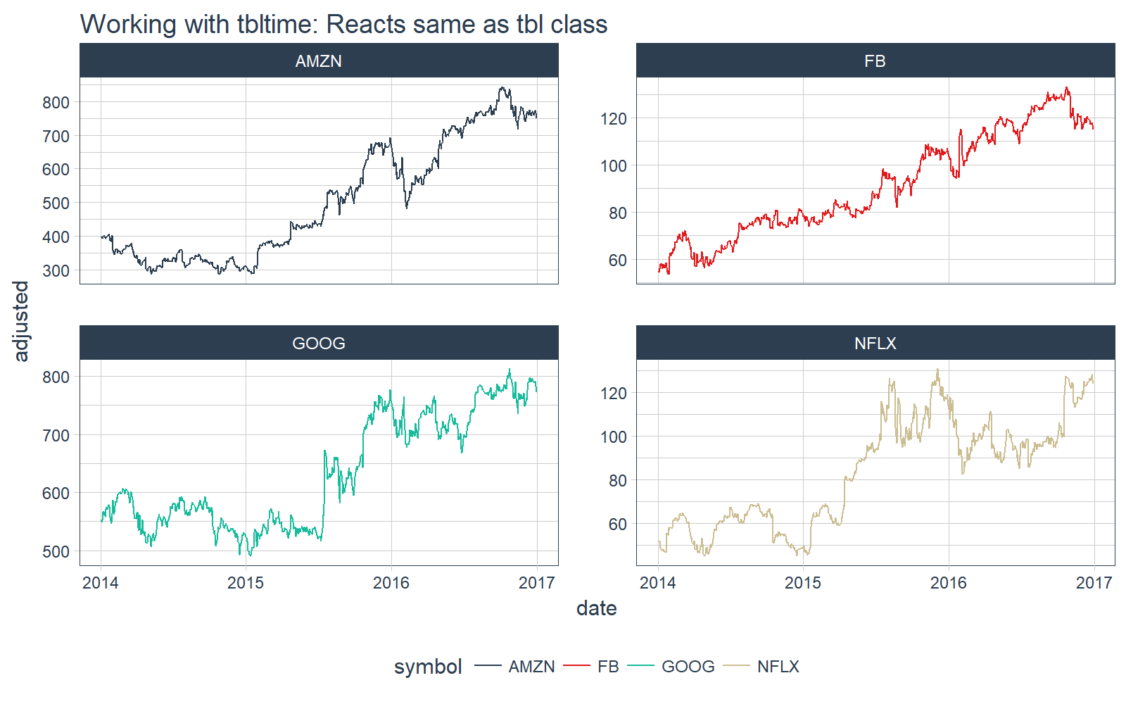
We can plot it with our plotting function, ggplot_facet_by_symbol(), and we see the tbl_time object reacts the same as the tbl object.
# Plot the tbl_time object
FANG_tbl_time_d %>%
    ggplot_facet_by_symbol(date, adjusted) +
    labs(title = "Working with tbltime: Reacts same as tbl class")
Special Time Series Functions
Let’s see what we can do with the new tbl_time object.
time_filter
The time_filter() function is used to succinctly filter a tbl_time object by date. It uses a function format (e.g. “date_operator_start ~ date_operator_end”). We specify the date operators in normal YYYY-MM-DD + HH:MM:SS, but there is also powerful shorthand to more efficiently subset by date.
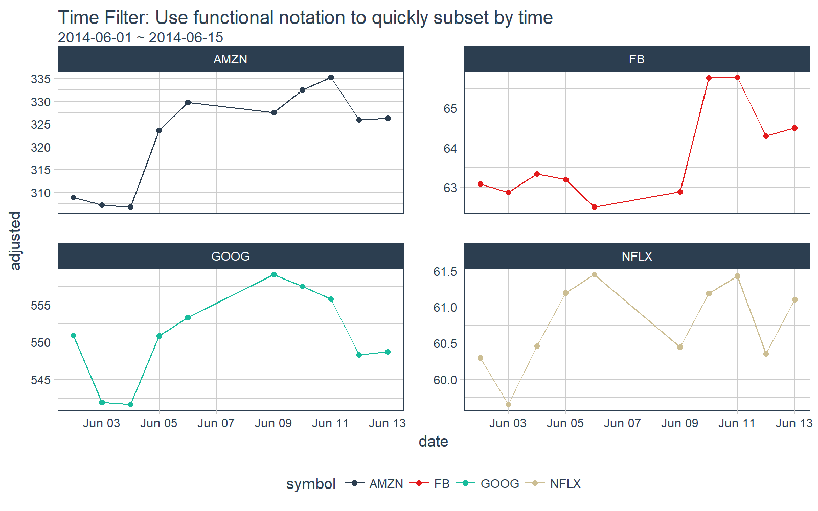
Suppose we’d like to filter all observations inclusive of “2014-06-01” and “2014-06-15”. We can do this using the function notation, time_filter(2014-06-01 ~ 2014-06-15).
# time_filter by day
FANG_tbl_time_d %>%
    time_filter(2014-06-01 ~ 2014-06-15) %>%
    # Plotting
    ggplot_facet_by_symbol(date, adjusted) +
    geom_point() +
    labs(title = "Time Filter: Use functional notation to quickly subset by time",
         subtitle = "2014-06-01 ~ 2014-06-15")
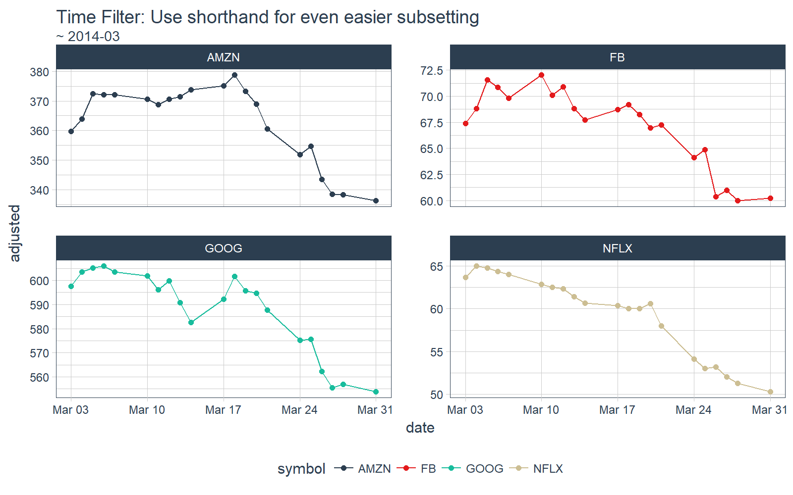
We can do the same by month. Suppose we just want observations in March, 2014. Use the shorthand functional notation “~ 2014-03”.
# time_filter by month
FANG_tbl_time_d %>%
    time_filter(~ 2014-03) %>%
    # Plotting
    ggplot_facet_by_symbol(date, adjusted) +
    geom_point() +
    labs(title = "Time Filter: Use shorthand for even easier subsetting",
         subtitle = "~ 2014-03")
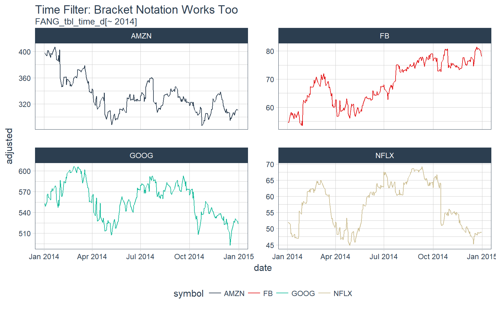
The tbl_time object also responds to bracket notation [. Here we collect all dates in 2014 for each of the groups.
# time filter bracket [] notation
FANG_tbl_time_d[~ 2014] %>%
    # Plotting
    ggplot_facet_by_symbol(date, adjusted) +
    labs(title = "Time Filter: Bracket Notation Works Too",
         subtitle = "FANG_tbl_time_d[~ 2014]")
The time_filter() has a lot of capability and useful shorthand. Those interested should check out the time_filter vignette and the time_filter function documentation.
time_summarise
The time_summarise() function is similar to dplyr::summarise but with the added benefit of being able to summarise by a time period such as “yearly” or “monthly”
# Summarize functions over time periods such as weekly, monthly, etc
FANG_tbl_time_d %>%
    time_summarise(period = "yearly",
        adj_min   = min(adjusted),
        adj_max   = max(adjusted),
        adj_range = adj_max - adj_min
        )
## # A time tibble: 12 x 5
## # Index:  date
## # Groups: symbol [4]
##    symbol       date   adj_min   adj_max adj_range
##  *  <chr>     <date>     <dbl>     <dbl>     <dbl>
##  1   AMZN 2014-12-31 287.06000 407.04999 119.98999
##  2   AMZN 2015-12-31 286.95001 693.96997 407.01996
##  3   AMZN 2016-12-30 482.07001 844.35999 362.28998
##  4     FB 2014-12-31  53.53000  81.45000  27.92000
##  5     FB 2015-12-31  74.05000 109.01000  34.96000
##  6     FB 2016-12-30  94.16000 133.28000  39.12000
##  7   GOOG 2014-12-31 492.68097 606.14264 113.46167
##  8   GOOG 2015-12-31 489.85431 776.59998 286.74567
##  9   GOOG 2016-12-30 668.26001 813.10999 144.84998
## 10   NFLX 2014-12-31  44.88714  69.19857  24.31143
## 11   NFLX 2015-12-31  45.54714 130.92999  85.38285
## 12   NFLX 2016-12-30  82.79000 128.35001  45.56001
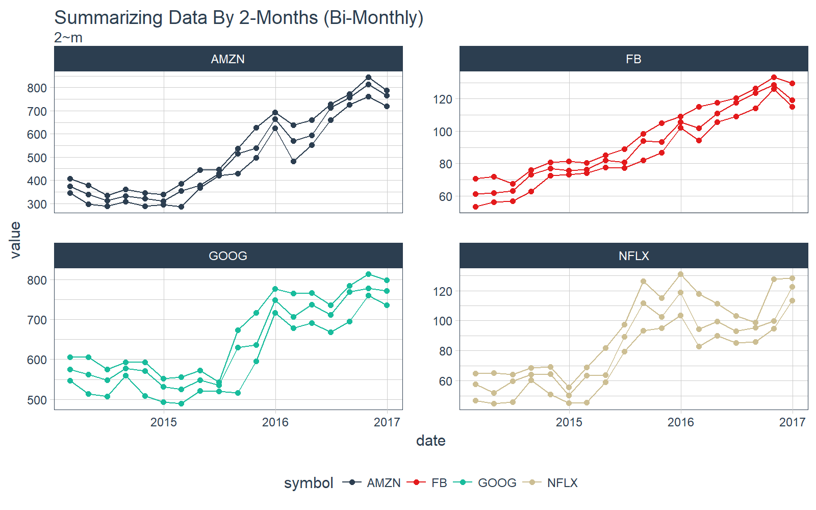
The really cool thing about time_summarise() is that we can use the functional notation to define the period to summarize over. For example if we want bimonthly, or every two months, we can use the notation 2 Months: “2~m”. Similarly we could do every 20 days as “20~d”. The summarization options are endless.
Let’s plot the min, max, and median on a Bi-Monthly frequency (2~m) with time_summarise(). This is really cool!!
# Summarize by 2-Month periods
FANG_min_max_by_2m <- FANG_tbl_time_d %>%
    time_summarise(period = 2 ~ m,
        adj_min   = min(adjusted),
        adj_max   = max(adjusted),
        adj_med   = median(adjusted)
        ) %>%
    gather(key = key, value = value, adj_min, adj_max, adj_med)

# Plot using our plotting function, grouping by key (min, max, and median)
FANG_min_max_by_2m %>%
    ggplot_facet_by_symbol(date, value, group = key) +
    geom_point() +
    labs(title = "Summarizing Data By 2-Months (Bi-Monthly)",
         subtitle = "2~m")
Those interested in furthering their understanding of time_summarise() can check out the time_summarise function documentation.
as_period
The next function, as_period(), enables changing the period of a tbl_time object. Two advantages to using this method over traditional approaches:
- The functions are flexible: “yearly” == “y” == “1~y”
-
The functional notation allows for endless periodicity change combinations, for example:
- “15~d” to change to 15-day periodicity
- “2~m” to change to bi-monthly periodicity
- “4~m” to change to tri-annual (semesters or trimesters)
- “6~m” to change to bi-annual
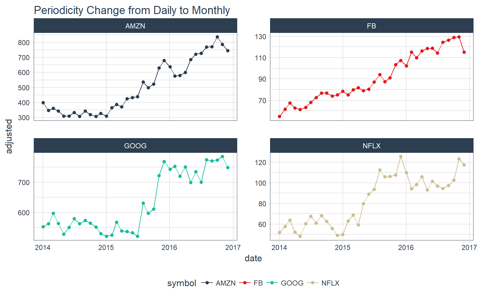
To start off, let’s do a simple monthly periodicity change.
# Convert from daily to monthly periodicity
FANG_tbl_time_d %>%
    as_period(period = "month") %>%
    # Plotting
    ggplot_facet_by_symbol(date, adjusted) +
    labs(title = "Periodicity Change from Daily to Monthly") +
    geom_point()
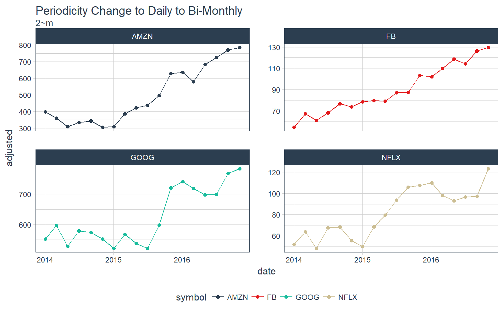
Let’s step it up a notch. What about bi-monthly? Just use the functional notation, “2~m”.
# Convert from daily to bi-monthly periodicity
FANG_tbl_time_d %>%
    as_period(period = 2~m) %>%
    # Plotting
    ggplot_facet_by_symbol(date, adjusted) +
    labs(title = "Periodicity Change to Daily to Bi-Monthly",
         subtitle = "2~m") +
    geom_point()
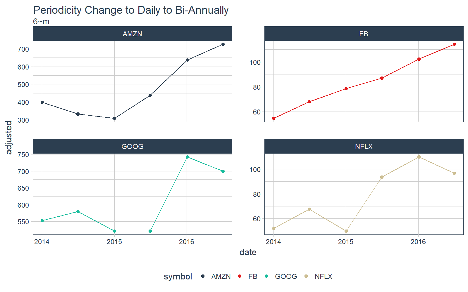
Let’s keep going. What about bi-annually? Just use “6~m”.
# Convert from daily to bi-monthly periodicity
FANG_tbl_time_d %>%
    as_period(period = 6~m) %>%
    # Plotting
    ggplot_facet_by_symbol(date, adjusted) +
    labs(title = "Periodicity Change to Daily to Bi-Annually",
         subtitle = "6~m") +
    geom_point()
The possibilities are endless with the functional notation. Interested learners can check out the vignette on periodicity change with tibbletime.
rollify
The rollify() function is an adverb (a special type of function in the tidyverse that modifies another function). What rollify() does is turn any function into a rolling version of itself.
# Rolling 60-day mean
roll_mean_60 <- rollify(mean, window = 60)

FANG_tbl_time_d %>%
    mutate(mean_60 = roll_mean_60(adjusted)) %>%
    select(-c(open:volume)) %>%
    # Plot
    ggplot_facet_by_symbol(date, adjusted) +
    geom_line(aes(y = mean_60), color = palette_light()[[6]]) +
    labs(title = "Rolling 60-Day Mean with rollify")
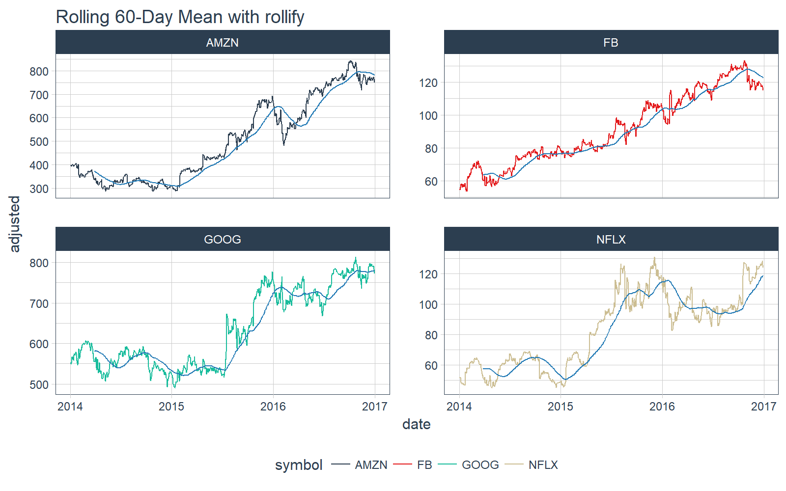
We can even do more complicated rolling functions such as correlations. We use the functional form .f = ~ fun(.x, .y, ...) within rollify().
# Rolling correlation
roll_corr_60 <- rollify(~ cor(.x, .y, use = "pairwise.complete.obs"), window = 60)

FANG_tbl_time_d %>%
    mutate(cor_60 = roll_corr_60(open, close)) %>%
    select(-c(open:adjusted)) %>%
    # Plot
    ggplot_facet_by_symbol(date, cor_60) +
    labs(title = "Rollify: 60-Day Rolling Correlation Between Open and Close Prices")
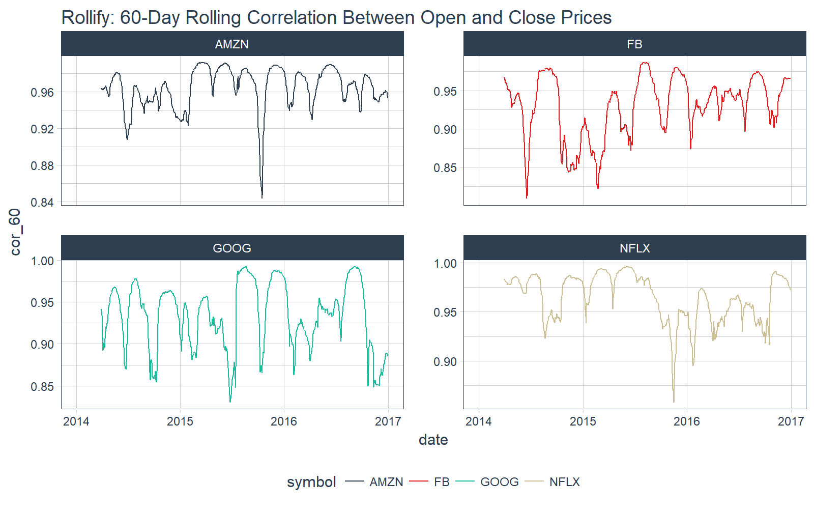
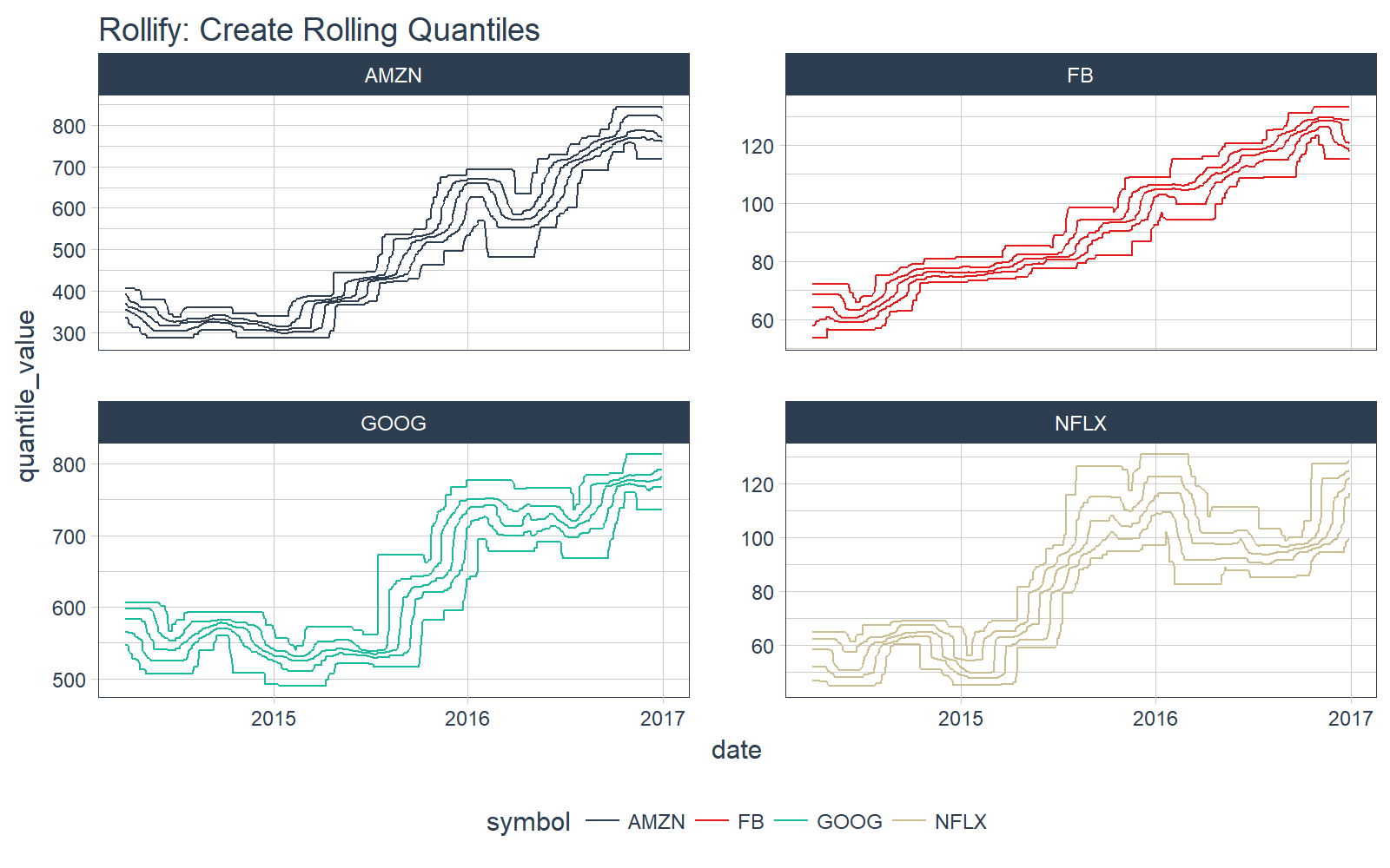
We can even return multiple results. For example, we can create a rolling quantile.
First, create a function that returns a tibble of quantiles.
# Quantile tbl function
quantile_tbl <- function(x) {
    q <- quantile(x)
    tibble(
        quantile_name  = names(q),
        quantile_value = q
    )
}

# Test the function
quantile_tbl(1:100)
## # A tibble: 5 x 2
##   quantile_name quantile_value
##           <chr>          <dbl>
## 1            0%           1.00
## 2           25%          25.75
## 3           50%          50.50
## 4           75%          75.25
## 5          100%         100.00
Great, it works. Next, use rollify to create a rolling version. We set unlist = FALSE to return a list-column.
# Rollified quantile function
roll_quantile_60 <- rollify(quantile_tbl, window = 60, unlist = FALSE)
Next, apply the rolling quantile function within mutate() to get a rolling quantile. Make sure you select(), filter() and unnest() to remove unnecessary columns, filter NA values, and unnest the list-column (“rolling_quantile”). Each date now has five values for each quantile.
# Apply rolling quantile
FANG_quantile_60 <- FANG_tbl_time_d %>%
    mutate(rolling_quantile = roll_quantile_60(adjusted)) %>%
    select(-c(open:adjusted)) %>%
    filter(!is.na(rolling_quantile)) %>%
    unnest()
FANG_quantile_60
## # A time tibble: 13,940 x 4
## # Index:  date
## # Groups: symbol [4]
##    symbol       date quantile_name quantile_value
##  *  <chr>     <date>         <chr>          <dbl>
##  1     FB 2014-03-28            0%        53.5300
##  2     FB 2014-03-28           25%        57.8750
##  3     FB 2014-03-28           50%        64.2100
##  4     FB 2014-03-28           75%        68.6275
##  5     FB 2014-03-28          100%        72.0300
##  6     FB 2014-03-31            0%        53.5300
##  7     FB 2014-03-31           25%        57.9350
##  8     FB 2014-03-31           50%        64.2100
##  9     FB 2014-03-31           75%        68.6275
## 10     FB 2014-03-31          100%        72.0300
## # ... with 13,930 more rows
Finally, we can plot the results.
FANG_quantile_60 %>%
    ggplot_facet_by_symbol(date, quantile_value, group = quantile_name) +
    labs(title = "Rollify: Create Rolling Quantiles")
Interested learners can continue exploring rollify by checking out our vignette on rolling functions with rollify.
Changes Coming
This package is currently under active development. Don’t be shocked if the functionality increases soon… Davis Vaughan is working hard to expand the capability of tibbletime. Reproducible bug reports are welcome!
Next Steps
Interested learners can check out the following links to further understanding of tibbletime:
Announcements
We have a busy couple of weeks. In addition to Demo Week, we have:
DataTalk
!!TONIGHT!! Thursday, October 26 at 7PM EST, Matt will be giving a FREE LIVE #DataTalk on Machine Learning for Recruitment and Reducing Employee Attrition. You can sign up for a reminder at the Experian Data Lab website.
EARL
On Friday, November 3rd, Matt will be presenting at the EARL Conference on HR Analytics: Using Machine Learning to Predict Employee Turnover.
Courses
Based on recent demand, we are considering offering application-specific machine learning courses for Data Scientists. The content will be business problems similar to our popular articles:
The student will learn from Business Science how to implement cutting edge data science to solve business problems. Please let us know if you are interested. You can leave comments as to what you would like to see at the bottom of the post in Disqus.
About Business Science
Business Science specializes in “ROI-driven data science”. Our focus is machine learning and data science in business applications. We help businesses that seek to add this competitive advantage but may not have the resources currently to implement predictive analytics. Business Science works with clients primarily in small to medium size businesses, guiding these organizations in expanding predictive analytics while executing on ROI generating projects. Visit the Business Science website or contact us to learn more!