ggforce: Make a Hull Plot to Visualize Clusters in ggplot2
Written by Matt Dancho
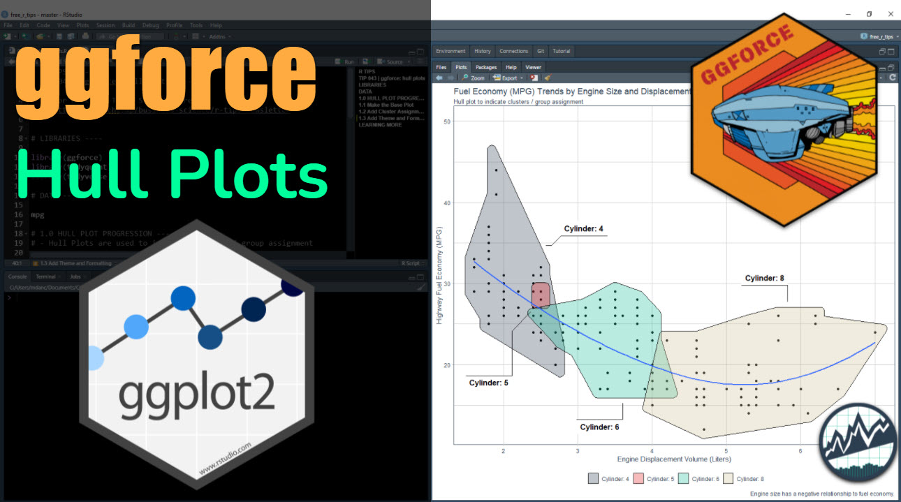
The ggforce package is a ggplot2 extension that adds many exploratory data analysis features. In this tutorial, we’ll learn how to make hull plots for visualizing clusters or groups within our data.
SPECIAL ANNOUNCEMENT: AI for Data Scientists Workshop on December 18th
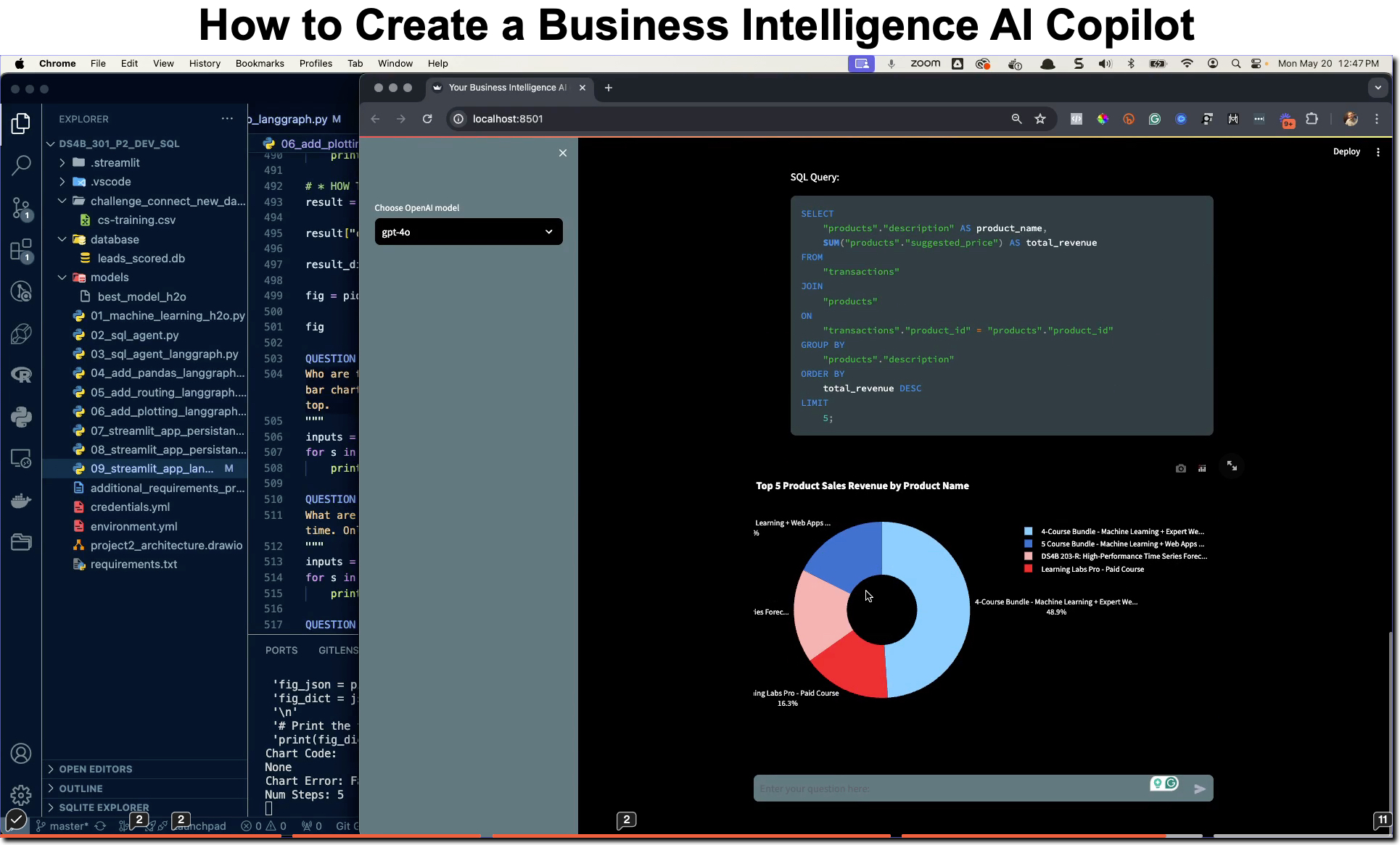
Inside the workshop I’ll share how I built a SQL-Writing Business Intelligence Agent with Generative AI:
What: GenAI for Data Scientists
When: Wednesday December 18th, 2pm EST
How It Will Help You: Whether you are new to data science or are an expert, Generative AI is changing the game. There’s a ton of hype. But how can Generative AI actually help you become a better data scientist and help you stand out in your career? I’ll show you inside my free Generative AI for Data Scientists workshop.
Price: Does Free sound good?
How To Join: 👉 Register Here
R-Tips Weekly
This article is part of R-Tips Weekly, a weekly video tutorial that shows you step-by-step how to do common R coding tasks.
Here are the links to get set up. 👇
Video Tutorial
Follow along with our Full YouTube Video Tutorial.
Learn how to use ggforce in our 7-minute YouTube video tutorial.
(Click image to play tutorial)
What is a Hull Plot?
The Hull Plot is a visualization that produces a shaded areas around clusters (groups) within our data. It gets the name because of the Convex Hull shape. It’s a great way to show customer segments, group membership, and clusters on a Scatter Plot.
Hull Plot (We'll make in this tutorial)
We’ll go through a short tutorial to get you up and running with ggforce to make a hull plot.
Hull plots with ggforce [Tutorial]
This tutorial showcases the awesome power of ggforce for visualizing distributions.
Tutorial Credits
This tutorial wouldn’t be possible without the excellent work of Thomas Lin Pedersen, creator of ggforce. Check out the ggforce package here.
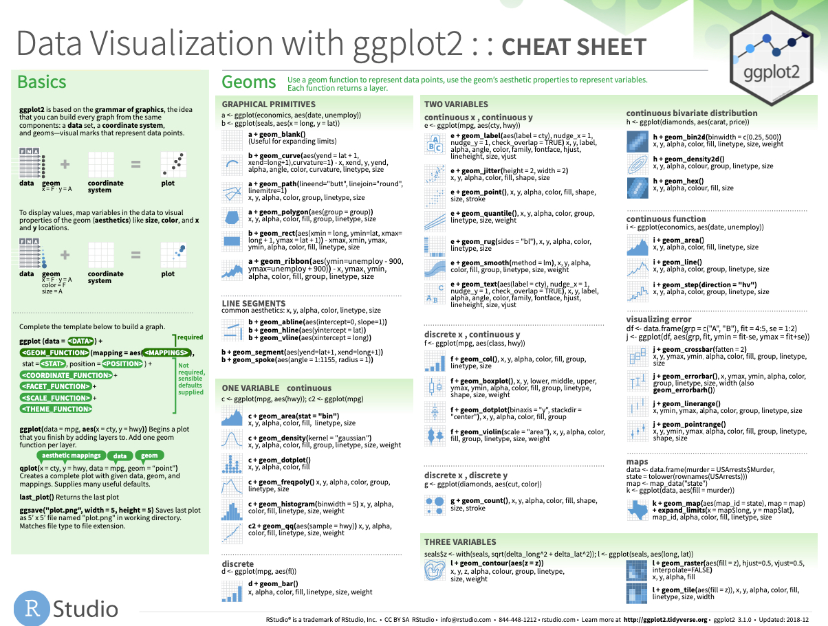
Before we get started, get the R Cheat Sheet
ggforce is great for extending ggplot2 with advanced features. But, you’ll need to learn ggplot2 to take full advantage. For these topics, I’ll use the Ultimate R Cheat Sheet to refer to ggplot2 code in my workflow.
Quick Example:
Download the Ultimate R Cheat Sheet. Then Click the “CS” hyperlink to “ggplot2”.
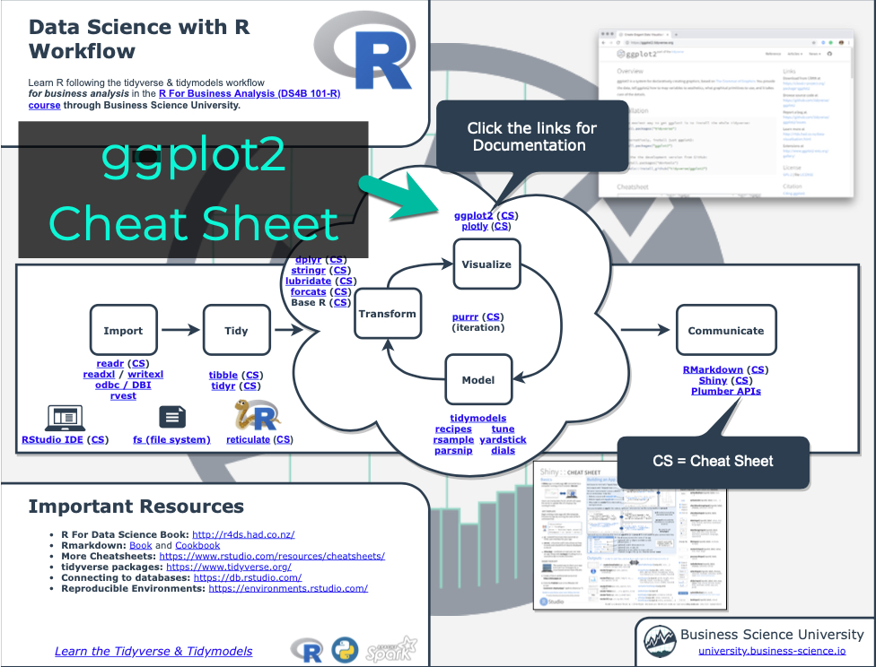
Now you’re ready to quickly reference the ggplot2 cheat sheet. This shows you the core plotting functions available in the ggplot library.
Onto the tutorial.
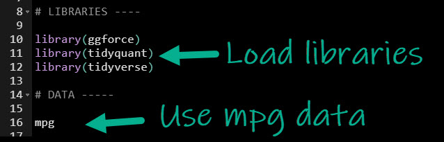
Load the Libraries and Data
First, run this code to:
- Load Libraries: Load
ggforce, tidyquant, and tidyverse.
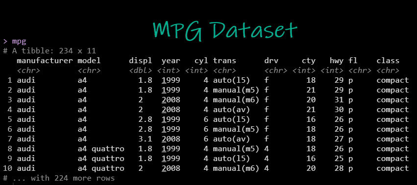
- Import Data: We’re using the
mpg dataset that comes with ggplot2.
Get the code.
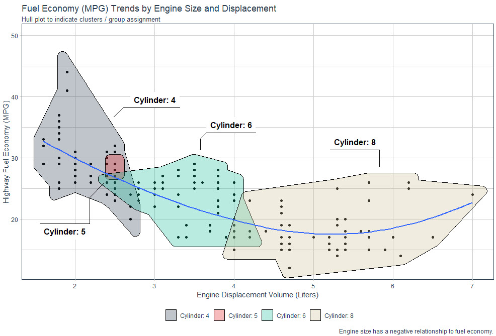
Here’s the mpg dataset. We’ll focus on “hwy” (fuel economy in Miles Per Gallon), “displ” (engine displacement volume in liters), and “cyl” (number of engine cylinders).
hull plot: Using ggplot
Next, we’ll make a hull plot that highlights the Vehicle Fuel Economy (MPG) for Engine Size (Number of Cylinders and Engine Displacement). It helps if you have ggplot2 visualization experience. If you are interested in learning ggplot2 in-depth, check out our R for Business Analysis Course (DS4B 101-R) that contains over 30-hours of video lessons on learning R for data analysis.
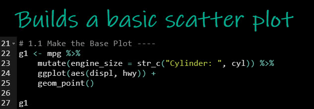
Step 1: Make the Base Scatter Plot
The first step is to make the scatter plot using ggplot2. We:
- Prep the Data: Using
mutate() to add a descriptive Engine Size column that will display the Number of Cylinders.
- Map the columns: Using
ggplot(), we map the displ and hwy column.
- Make the scatter points: Using
geom_point(), we add scatter plot points to our base plot. Refer to the Ultimate R Cheat Sheet and ggplot2 “CS” for more geoms.
Get the code.
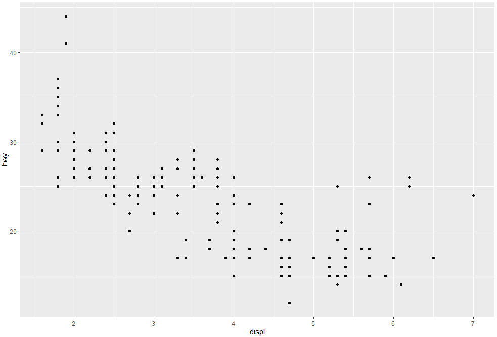
This produces our base plot, which is a scatter plot of displacement vs highway fuel economy.
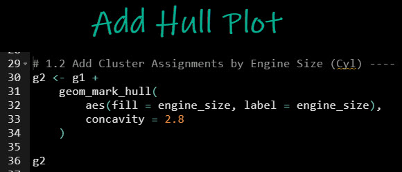
Step 2: Add the Hull Plot with geom_mark_hull()
Next, we add our hull plot geometry layer using ggforce::geom_mark_hull(). This produces the hull plot shaded regions indicating the groups. We map the descriptive engine size column to the fill and label aesthetics. We adjust the concavity to smooth out the concavity.
Get the code.
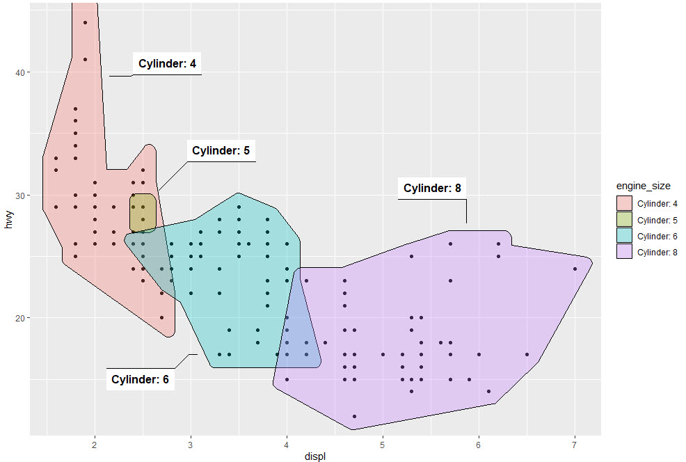
And here’s the output. We can see that the hull plot shows the cylinder class membership for the vehicles scatter points.
Step 3: Make the plot look professional
It’s a good idea to spruce up our plot, especially if we are going to present to business stakeholders in a presentation or report. We’ll leverage tidyquant and ggplot for theme customization. Refer to the Ultimate R Cheat Sheet and ggplot2 documentation for more customizations.
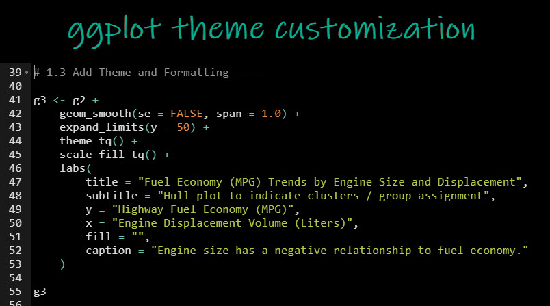
Get the code.
And here’s the output. We have our final plot that tells the story of how highway fuel economy varies with the vehicle’s number of cylinders and engine displacement volume.
Conclusions
You learned how to make hull plots with ggforce. But, there’s a lot more to becoming a data scientist.
If you’d like to have an exciting career making 6-figures as a data scientist (or over $150,000+ as a senior data scientist), then read on.👇
Need to advance your business data science skills?
I’ve helped 6,107+ students learn data science for business from an elite business consultant’s perspective.
I’ve worked with Fortune 500 companies like S&P Global, Apple, MRM McCann, and more.
And I built a training program that gets my students life-changing data science careers (don’t believe me? see my testimonials here):
6-Figure Data Science Job at CVS Health ($125K)
Senior VP Of Analytics At JP Morgan ($200K)
50%+ Raises & Promotions ($150K)
Lead Data Scientist at Northwestern Mutual ($175K)
2X-ed Salary (From $60K to $120K)
2 Competing ML Job Offers ($150K)
Promotion to Lead Data Scientist ($175K)
Data Scientist Job at Verizon ($125K+)
Data Scientist Job at CitiBank ($100K + Bonus)
Whenever you are ready, here’s the system they are taking:
Here’s the system that has gotten aspiring data scientists, career transitioners, and life long learners data science jobs and promotions…
Join My 5-Course R-Track Program Now!
(And Become The Data Scientist You Were Meant To Be...)
P.S. - Samantha landed her NEW Data Science R Developer job at CVS Health (Fortune 500). This could be you.