grafify: Make 5 powerful ggplot2 graphs quickly with R
Written by Matt Dancho
The grafify package is a new R package that makes it easy to make 19-powerful ggplot2 graphs, ANOVAs, and comparison plots. I’ve been really enjoying it! In the next 10-minutes, we’ll learn how to make my 5 favorite grafify plots (with one line of code!):
- Scatter-Bar (1), Scatter-Box (2), and Scatter-Violin (3) plots for plotting 2-variables
- Scatter-Box 3D plots (4) for plotting 3-variables
- BONUS: Before-and-After Plots (5) for showing State Change
This article was last updated on: February 15th, 2022.
R-Tips Weekly
This article is part of R-Tips Weekly, a weekly video tutorial that shows you step-by-step how to do common R coding tasks.
Here are the links to get set up. 👇
Video Tutorial
Learn how to use the grafify package in our 7-minute YouTube video tutorial.
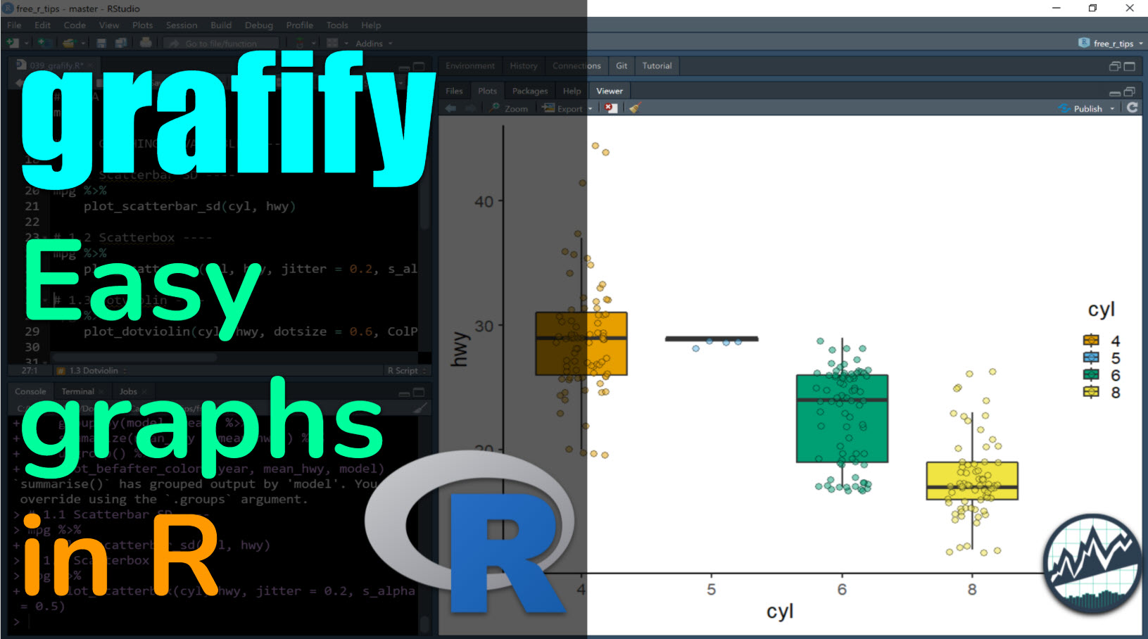
What you make in this R-Tip
grafify is a new R package for making great-looking ggplot2 graphs quickly in R. It has 19 plotting functions that simplify common ggplot graphs and provide color-blind friendly themes. By the end of the tutorial, you’ll make:
- Scatter Bar SD
- Scatter Box SD
- Scatter Violin SD
- Scatter Box 3D
- BONUS: Before and After Plots!!!
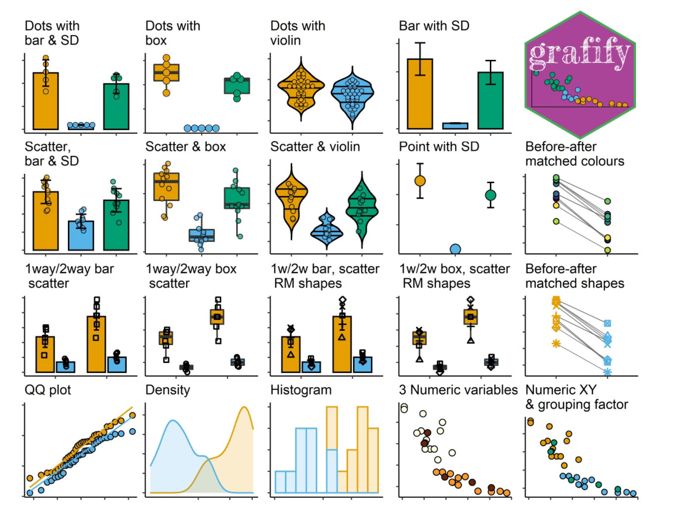
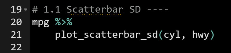
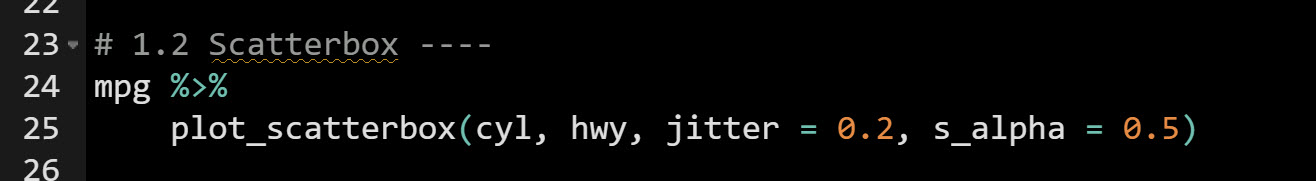
Image Credit: grafify package
Thank You Developers.
Before we move on, please recognize that the grafify package was generously built and maintained with many hours of work by Avinash R. Shenoy. Thank you for all that you do!
The grafify Tutorial
The grafify package extends ggplot2 by adding several simplified plotting functions. Let’s explore the package by making 5 powerful plots (with one line of code)!
Load the Libraries and Data
First, run this code to:
- Load Libraries: Load
grafify and tidyverse.
- Import Data: We’re using the
mpg dataset that comes with ggplot2.
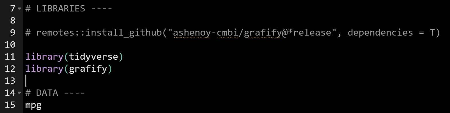
Get the code.
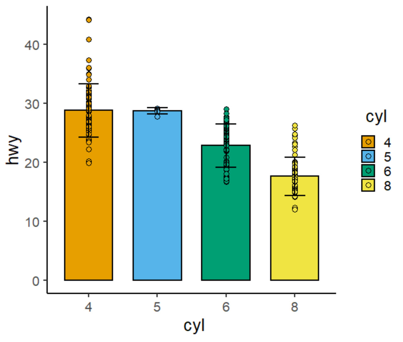
Plot 1: Scatterbar SD Plot
First, we can make a Scatterbar Plot that shows the data points along with error bars at a standard deviation. Simply use plot_scatterbar_sd().
Get the code.
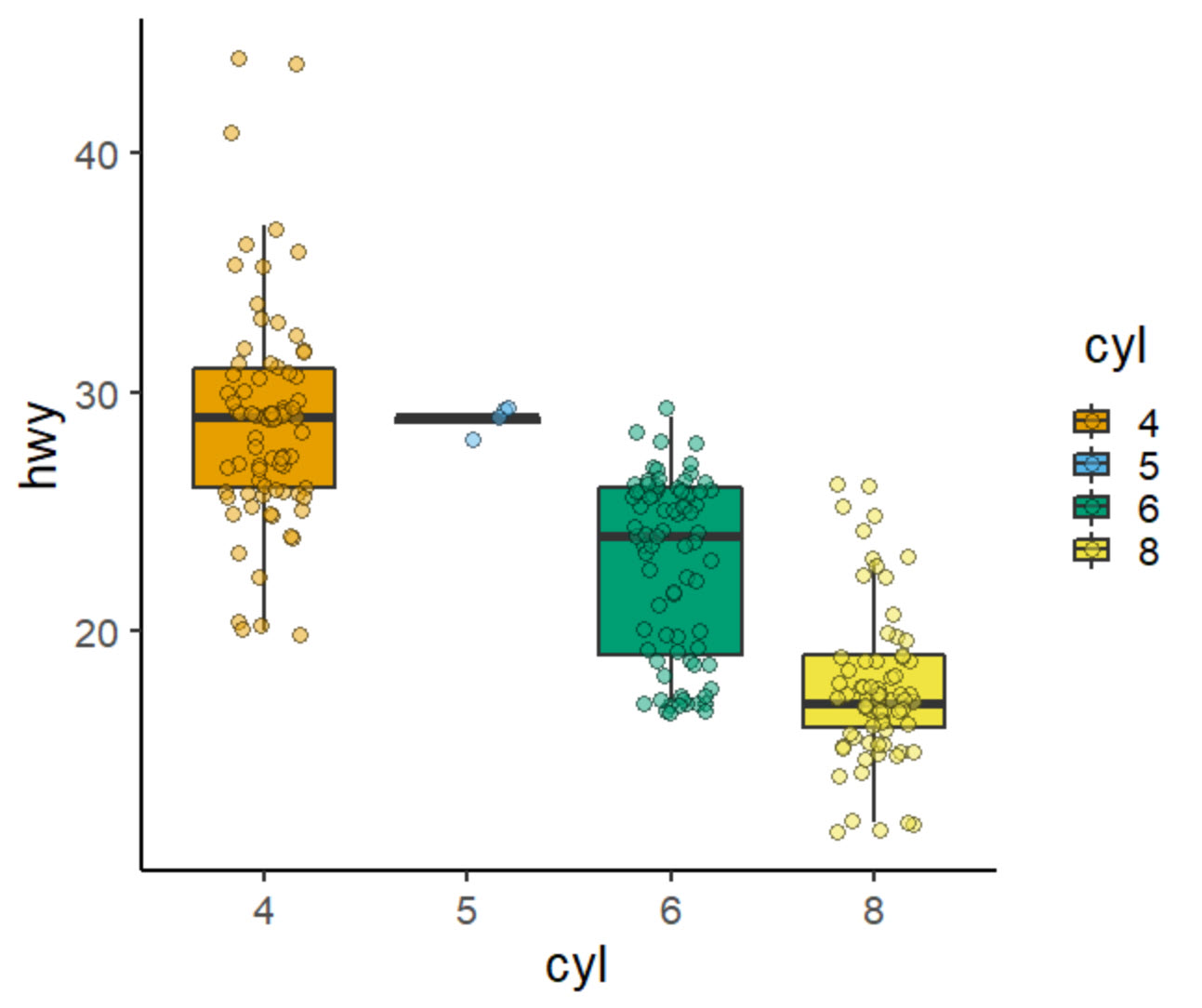
Plot 2: Scatterbox Plot
Next, we can make a Scatterbox Plot that shows a custom boxplot / jitter plot combination. I’ve added a jitter point to show the distribution. Simply use plot_scatterbox().
Get the code.
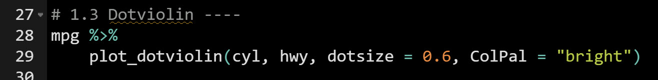
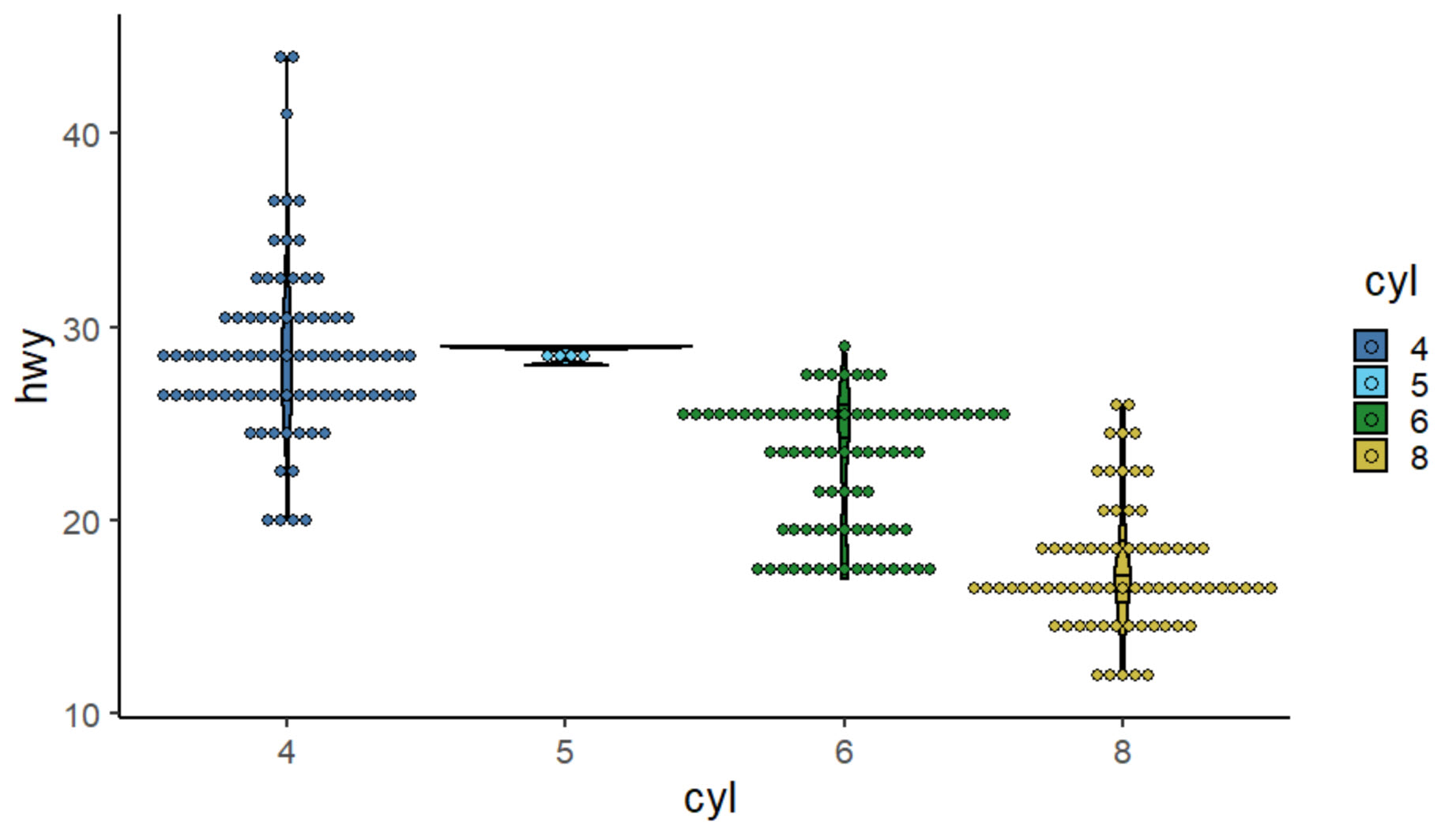
Plot 3: Dotviolin Plot
Next, we can make a Dotviolin Plot that shows a custom violin plot / dotplot combination. Simply use plot_dotviolin().
Get the code.
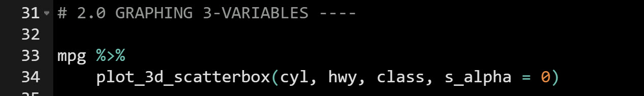
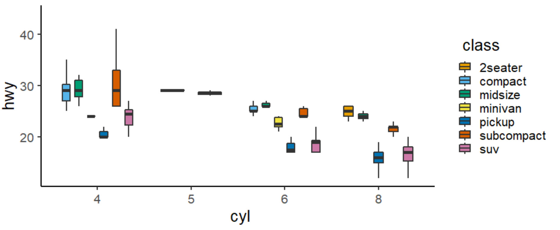
Plot 4: Scatterbox 3D Plot
Next, we can make a 3D Scatterbox Plot that shows three variables using boxplot / jitter plot combination. This is great for drilling into multiple categories. Simply use plot_3d_scatterbox().
Get the code.
BONUS: Plot 5 - Before-After Plot
As a super cool bonus, we can make a Before-After Plot that shows changes between two states (in this case how various models changed in MPG Fuel Efficiency from 1999 to 2008). This is great for comparing two states. Simply use plot_befafter_colors().
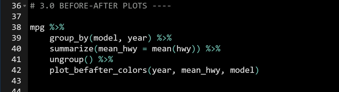
Get the code.
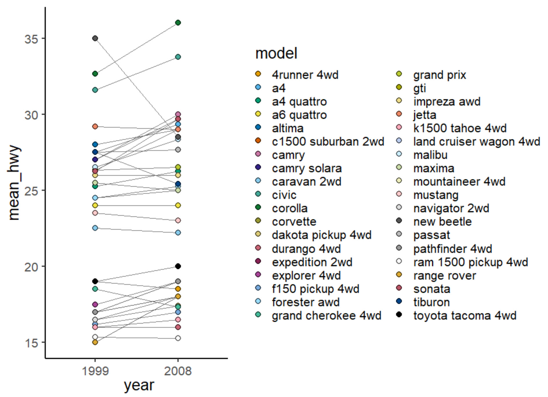
We can see that most vehicles are improving in MPG from 1999 to 2008. However, there are a few that are going down. Most notably is the New Beetle going from 35MPG to about 27MPG, a decline of -23%.
Conclusions
We learned how to make 5 powerful plots using the grafify package. But, there’s a lot more to becoming a data scientist.
If you’d like to become a data scientist (and have an awesome career, improve your quality of life, enjoy your job, and all the fun that comes along), then I can help with that.
Need to advance your business data science skills?
I’ve helped 6,107+ students learn data science for business from an elite business consultant’s perspective.
I’ve worked with Fortune 500 companies like S&P Global, Apple, MRM McCann, and more.
And I built a training program that gets my students life-changing data science careers (don’t believe me? see my testimonials here):
6-Figure Data Science Job at CVS Health ($125K)
Senior VP Of Analytics At JP Morgan ($200K)
50%+ Raises & Promotions ($150K)
Lead Data Scientist at Northwestern Mutual ($175K)
2X-ed Salary (From $60K to $120K)
2 Competing ML Job Offers ($150K)
Promotion to Lead Data Scientist ($175K)
Data Scientist Job at Verizon ($125K+)
Data Scientist Job at CitiBank ($100K + Bonus)
Whenever you are ready, here’s the system they are taking:
Here’s the system that has gotten aspiring data scientists, career transitioners, and life long learners data science jobs and promotions…
Join My 5-Course R-Track Program Now!
(And Become The Data Scientist You Were Meant To Be...)
P.S. - Samantha landed her NEW Data Science R Developer job at CVS Health (Fortune 500). This could be you.