ggradar: radar plots with ggplot in R
Written by Matt Dancho
Businesses have tons of data. But 90% have no clue how to use it. Here’s what they are overlooking…
Within-Group Analysis. Groups are important (think customer segments). But group-wise comparisons can be tricky. Thankfully an R package exists to help us compare within groups using a visualization called a Radar Plot.
What R package is it? It’s called ggradar. And I want to share it with you so you can do business comparisons (like customers with RFM Analysis) in under 10-minutes. Here’s what you learn in this R-Tip:
- How to use Radar Plots in Business (Customer Segments, Avatars, & RFM Analysis)
- How to make Radar plots with
ggradar
- BONUS: How to sort the radar plots using similarity (important for identifying similar customers and products)
R-Tips Weekly
This article is part of R-Tips Weekly, a weekly video tutorial that shows you step-by-step how to do common R coding tasks.
Here are the links to get set up. 👇
This Tutorial Is Available In Video
I have a companion video tutorial that shows even more secrets (plus mistakes to avoid). And, I’m finding that a lot of my students prefer the dialogue that goes along with coding. So check out this video to see me running the code in this tutorial. 👇
What Do I Make In This R-Tip?
By the end of this R-Tip, you’ll make this radar plot comparing multiple products. Perfect for impressing your boss and coworkers! (Nice Plotting skills)
Don't forget to get the code.
Thank You Developers.
Before we dive into ggradar, I want to take a moment to thank the data scientist and developer of ggradar, Ricardo Bion. Thank you for making this great R package!
Why Use Radar Plots For Business?
In business, we need a way to visually compare multiple things like customer segments (or customer avatars). Here’s why…
RFM Analysis, Customer Segments & Customer Avatars.
One of the things I do when analyzing customers is to compare them by different measures like frequency of purchases, monetary value purchased in past year, time since last purchase.
- It’s called RFM Analysis (or Recency-Frequency-Monetary Analysis), when we group customers by spending habits such as how many days since last transaction, how many times they have transacted, and the total amount the customer has spent.
- A big mistake many business analysts (and data scientists) make is not including customer features like Age and for a weight-loss company how much the customer weighs. This helps us further create Customer Segments.
- If done properly, we can develop Customer Avatars, that describe the unique groups within our data (i.e. the unique customer segments). Then we can develop marketing that speaks to those Customer Avatars. And by targeting them, we can increase sales.
Why do I bring up RFM Analysis, Customer Segments, and Customer Avatars?
Well, it’s the perfect thing for a radar chart.
Example. Weight-Loss Supplement Company
Here’s an example of how a business can use a radar plot for RFM Analysis. This hypothetical company sells weight loss supplements. What can you see from the radar plot?
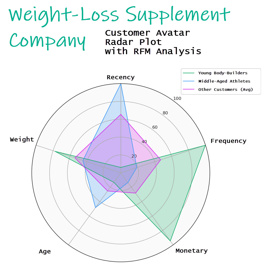
Example of a radar plot for a company that sells weight-loss products
(Useful for customer avatars, customer segments, & RFM Analysis)
We can visually see that “Young Bodybuilders” are our target market. They are making lots of purchases and possibly taking the supplements to cut weight before a competition.
We can also see that “Middle-Aged Athletes” seem to be a newer market or possibly had more recent sales demand due to promotions. However they seem to spend less money and less frequency than the other customers (the average).
Radar plots can help us visualize within-group analysis
The brilliant thing is that radar plots are a powerful way to visualize our customer groups. And they work really well for this task.
Ok, now that we know what a radar plot is and why it’s useful for business analysis, now we need to help you understand how to visualize data. To help, I want to get you set up with data visualization guidance (using the premier data visualization library in R).
To help you learn data visualization faster, you’re going to need…
My Cheat Sheet For My Top 100 R Packages
The next thing you’re going to need is to have access to all of the R packages that I use regularly in my data analysis projects.
Why?
Even I forget which R packages to use from time to time. And this cheat sheet saves me so much time. Instead of googling to filter through 20,000 R packages to find a needle in a haystack. I keep my cheat sheet handy so I know which to use and when to use them. Seriously. This cheat sheet is my bible.
Once you download it, head to page 1 and you’ll see the ggplot2 package I use for Data Visualization.
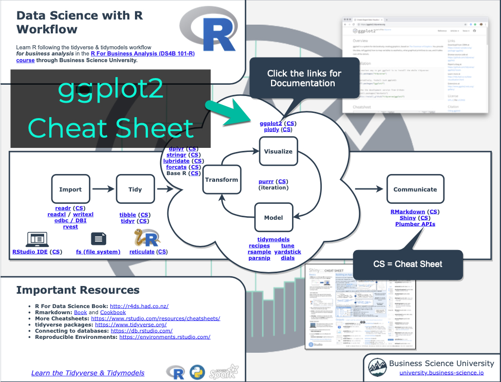
Beyond ggplot2, you’ll be able to learn even more R packages. You get 100 R packages broken down by category, which is important when you want to work in these fields:
- Machine Learning
- Time Series
- Financial Analysis
- Geospatial Analysis
- Text Analysis and NLP
- Shiny Web App Development
So steal my cheat sheet. It will save you a ton of time.
Tutorial: Radar Plots with ggradar
I want to show off how quickly you can make radar plots in this tutorial with the ggradar package, which extends ggplot2 for radar plots. I’ve seen tutorials in Python where it takes 50 to 100 lines of code with matplotlib. So ggradar is a massive productivity enhancer. We’ll make some awesome radar plots in 1 line of code.
Making radar plots for within-group analysis (e.g. comparing customer segments)
I’m constantly doing within-group analysis. So that’s what I’m focusing on here. In the YouTube Video I show off the correlation and similarity which can help you find similar groups within your data.
Step 1: Load the libraries and data
To get set up, all we need to do is load the following libraries and data.
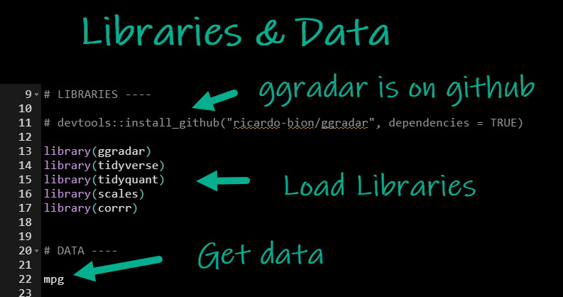
Get the code.
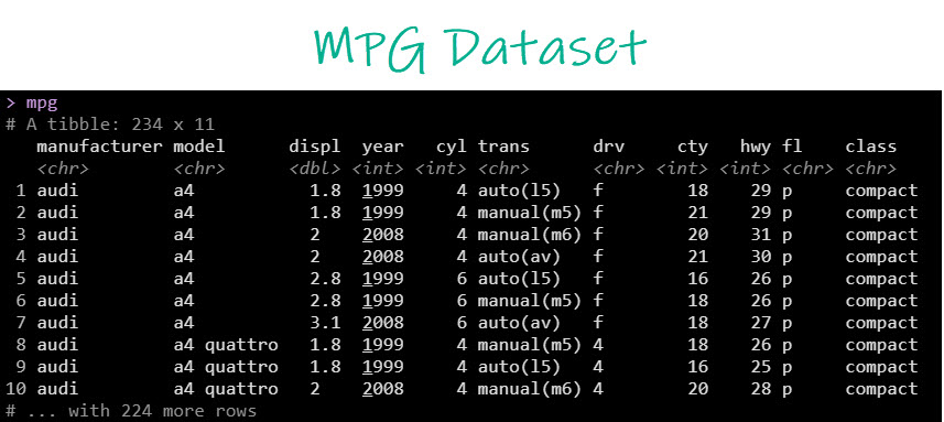
We’ll use the mpg dataset, which has data on 234 vehicle models.
With data in hand, we are ready to create the automatic EDA report. Let’s explore!
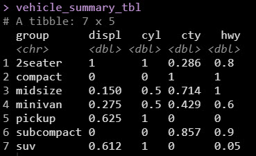
Step 2: Data Wrangling
We’re going to do within-group analysis. So we just need to summarize by group.
- Vehicle Class is the group in our data set
- The summary metric is going to be the median displacement, highway fuel economy, city fuel economy, and number of cylinders
- We’ll need to rescale each of the numeric variable to be between 0 and 1 (so they appear correctly on the radar chart)
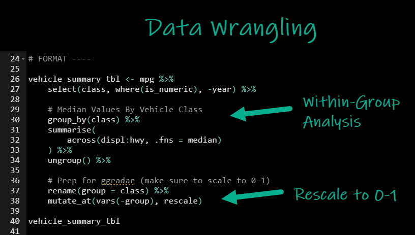
Get the code.
This produces the within-group data that has been rescaled and is ready for ggradar
Step 3. Make a Radar Plot
Radar plots make within-group analysis a visual experience.
Simple Radar Plot
Making a radar plot is as simple as 1 line of code.
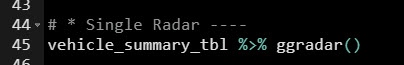
Get the code.
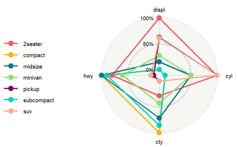
Here’s the default data visualization. It’s not going to win any data-viz awards, but we’re on the right track.
Customizing the Simple Radar Plot
With just a few tweaks, I can upgrade my within-group analysis and begin to get some business insights.

Get the code.
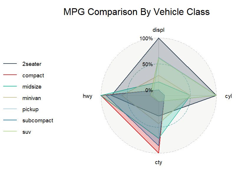
…which produces this data visualization.
Great, now I can see that there are key business insights based on their similarities:
- SUV and Pickup are similar
- Compact, Subcompact, and Midsize are similar
- 2-Seater and Minivans are outliers
Next, I want to break these out so I can really expose their trends.
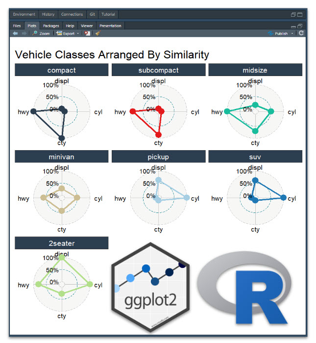
Faceted Radar
The faceted radar plot is a bit more code because of the formatting. Again, I recommend using the ggplot2 links in my R Cheat Sheet… These are a savior for remembering the ggplot theme options.
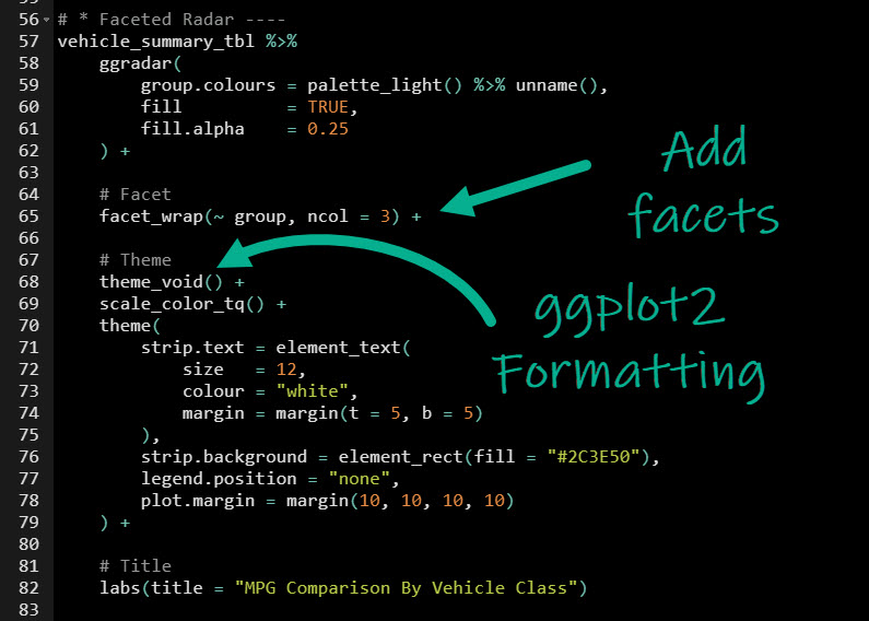
Get the code.
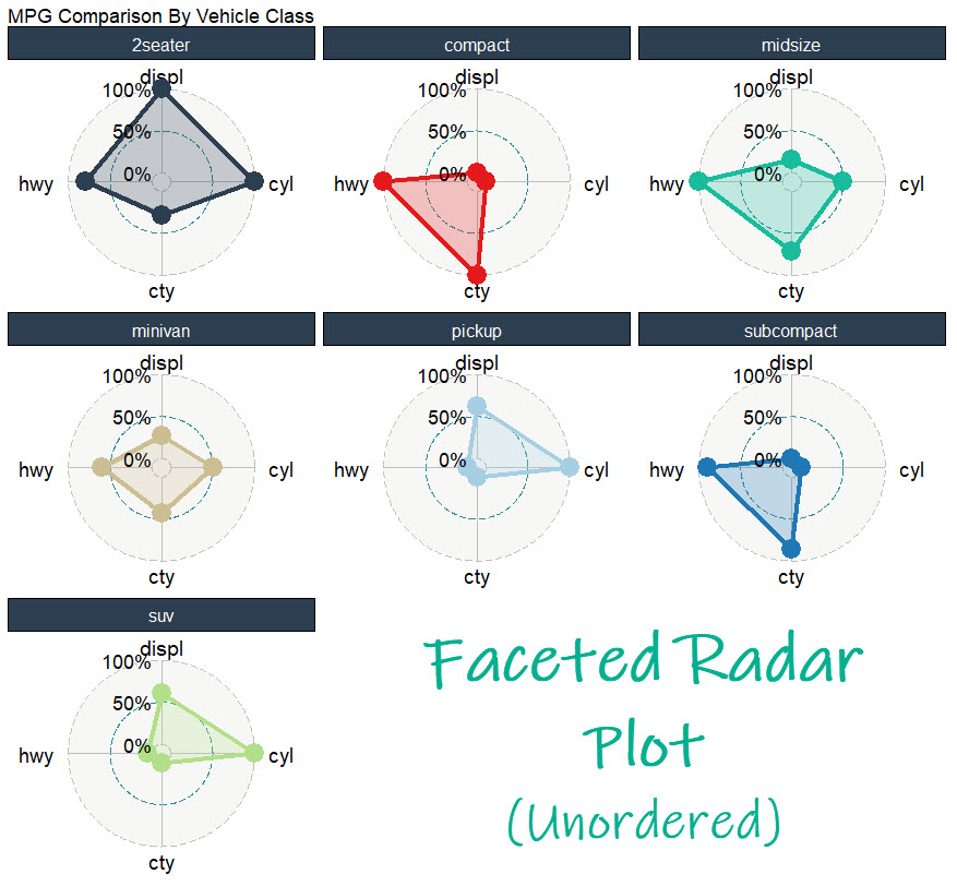
…which produces this data visualization
BONUS: Ordering The Faceted Radar Plot By Similarity
As a YouTube Bonus, I show you how to order the faceted radar plot by the similarity of groups. Ordering by similarity makes it much easier to compare groups in the data. Here are the links to reproduce:
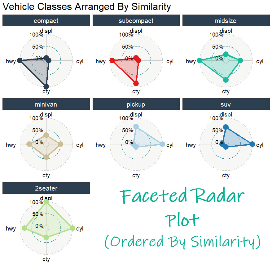
I can now see that:
- Compact, Subcompact, and Midsize are similar
- Pickup and SUV are similar
- 2 Seater is Different, and so is Minivan
Conclusion
You learned how to use the ggradar library to make radar plots. Great work! But, there’s a lot more to becoming a data scientist.
If you’d like to become a data scientist (and have an awesome career, improve your quality of life, enjoy your job, and all the fun that comes along), then I can help with that.
Need to advance your business data science skills?
I’ve helped 6,107+ students learn data science for business from an elite business consultant’s perspective.
I’ve worked with Fortune 500 companies like S&P Global, Apple, MRM McCann, and more.
And I built a training program that gets my students life-changing data science careers (don’t believe me? see my testimonials here):
6-Figure Data Science Job at CVS Health ($125K)
Senior VP Of Analytics At JP Morgan ($200K)
50%+ Raises & Promotions ($150K)
Lead Data Scientist at Northwestern Mutual ($175K)
2X-ed Salary (From $60K to $120K)
2 Competing ML Job Offers ($150K)
Promotion to Lead Data Scientist ($175K)
Data Scientist Job at Verizon ($125K+)
Data Scientist Job at CitiBank ($100K + Bonus)
Whenever you are ready, here’s the system they are taking:
Here’s the system that has gotten aspiring data scientists, career transitioners, and life long learners data science jobs and promotions…
Join My 5-Course R-Track Program Now!
(And Become The Data Scientist You Were Meant To Be...)
P.S. - Samantha landed her NEW Data Science R Developer job at CVS Health (Fortune 500). This could be you.