ggdensity: A new R package for plotting high-density regions
Written by Matt Dancho
As data scientists, it can be downright impossible to drill into messy data. Fortunately, there’s a new R package that helps us focus on a “high-density region”, which is simply an area in a scatter plot defined by a high percentage of the data points. It’s called ggdensity.
High Density Regions on a Scatter Plot
In this R-tip, I’m going to show you how to hone in on high-density regions under 5-minutes:
- Learn how to make high-density scatter plots with
ggdensity
- BONUS: Make faceted density plots to drill into over-plotted high-density region data
R-Tips Weekly
This article is part of R-Tips Weekly, a weekly video tutorial that shows you step-by-step how to do common R coding tasks. Pretty cool, right?
Here are the links to get set up. 👇
Video Tutorial
I have a companion video tutorial that shows even more secrets (plus mistakes to avoid).
What you make in this R-Tip
By the end of this tutorial, you’ll use of high density regions to make insights from groups within your data. For example, here we can see where each Class of Vehicle compares in terms of engine displacement (displ) and highway fuel economy (hwy), answering questions like:
- Is vehicle class a good way to describe vehicle clusters?
- Which vehicle classes have the greatest variation in highway fuel economy versus displacement?
- Which vehicle classes have the highest / lowest highway fuel economy?
Do you see how powerful ggdensity is?
Uncover insights with ggdensity
Thank You Developers.
Before we move on, please recognize that ggdensity was developed by James Otto, Doctoral Candidate at the Department of Statistical Science, Baylor University. Thank you for everything you do! Also, the full documentation for ggdensity can be accessed here.
Before we get started, get the R Cheat Sheet
ggdensity is great for extending ggplot2 with advanced features. But, you’ll need to learn ggplot2 to take full advantage. For these topics, I’ll use the Ultimate R Cheat Sheet to refer to ggplot2 code in my workflow.
Quick Example:
Download the Ultimate R Cheat Sheet. Then Click the “CS” hyperlink to “ggplot2”.
Now you’re ready to quickly reference the ggplot2 cheat sheet. This shows you the core plotting functions available in the ggplot library.
Onto the tutorial.
ggdensity Tutorial
Let’s dive into using ggdensity so we can show you how to make high-density regions on your scatter plots.
Important: All of the data and code shown can be accessed through our Business Science R-Tips Project.
Plus I have a surprise at the end (for everyone)!
💡 Step 1: Load the Libraries and Data
First, run this code to load the R libraries:
Load tidyverse , tidyquant, and ggdensity.
Get the code.
Next, run this code to pull in the data.
We’ll read in the mpg data set that was comes with ggplot2.
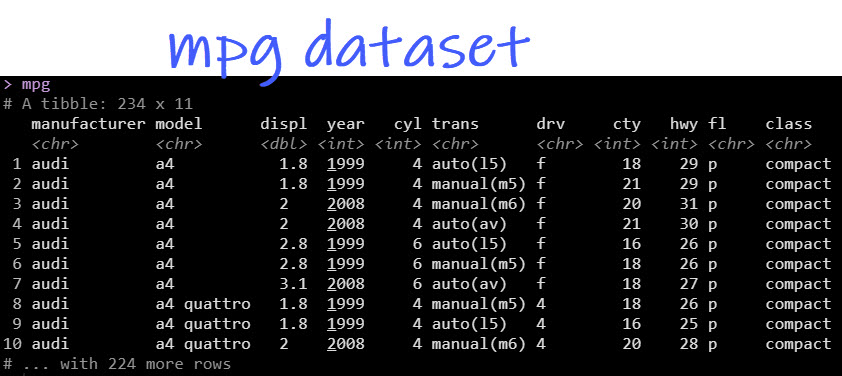
Get the Data.
We want to understand how highway fuel economy relates to engine size (displacement) and to see if there are clusters by vehicle class.
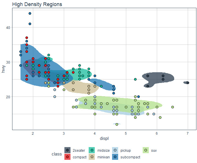
💡 Step 2: Make a basic ggplot
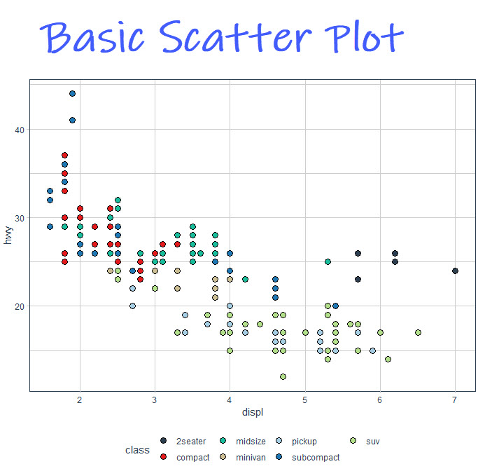
Next, make a basic ggplot using the following code. This creates a scatter plot with the colors that change by vehicle class. I won’t go into all of the mechanics, but you can download my R cheat sheet to learn more about ggplot and the grammar of graphics.
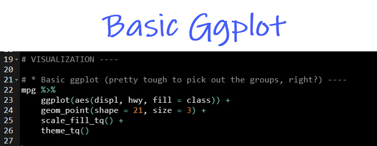
Get the code.
Here’s what the plot looks like. Do you see how it’s really tough to pull out the clusters in there? Each of the points overlap which makes understanding the group structure in the data very tough.
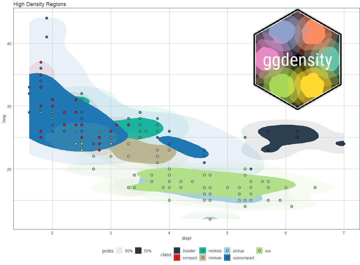
Step 3: Add High Density Regions
Ok, now that we have a basic scatter plot, we can make a quick alteration by adding high density regions that capture 90% and 50% of the data. We use geom_hdr(probs = c(0.9, 0.5, alpha = 0.35) to accomplish the next plot.
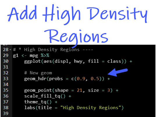
Get the code.
Let’s see what we have here.
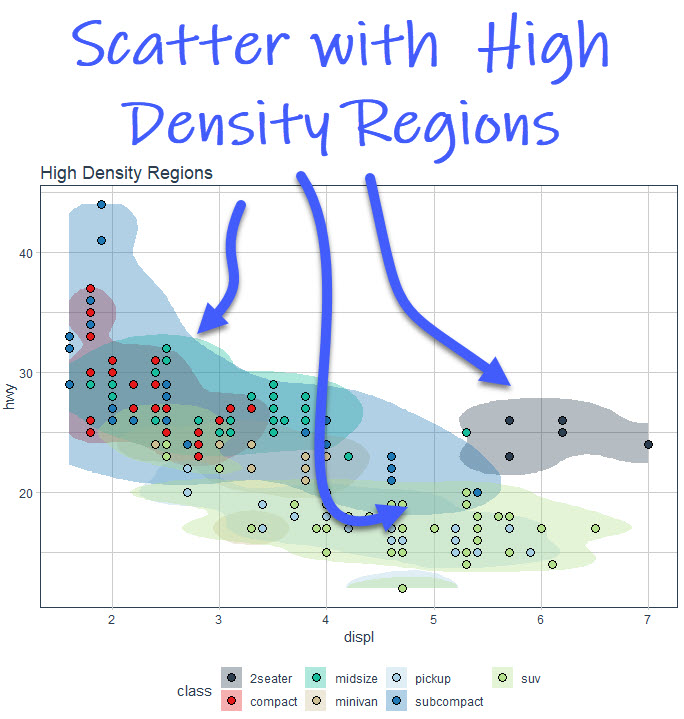
We can now see where the clusters have the highest density. But there’s still a problem called “overplotting”, which is when too many graphics get plot on top of each other.
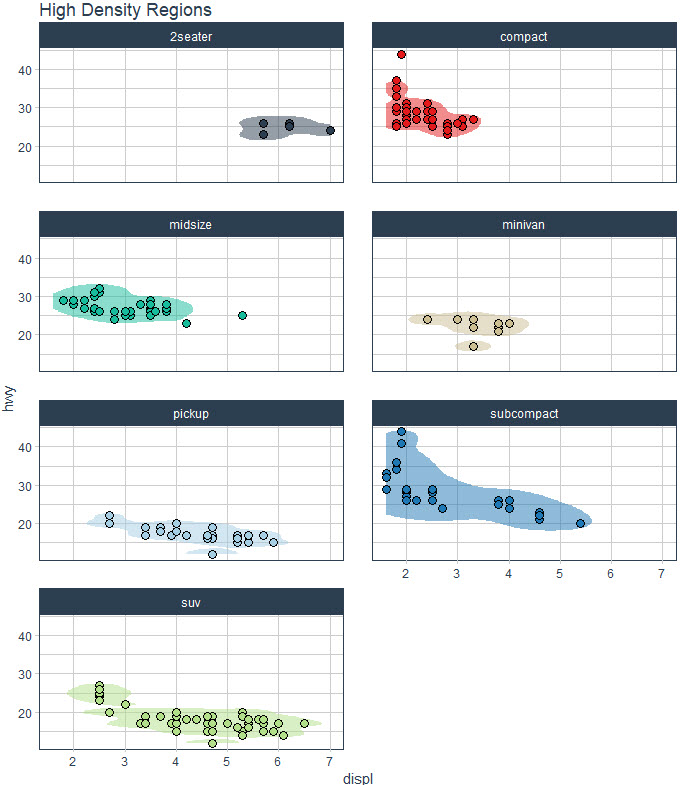
💡 BONUS: Overplotting solved!
Here’s the problem we’re facing: overplotting. We simply have too many groups that are too close together. Let’s see how to fix this.
The fix is pretty simple. Just use facetting from ggplot2.

Get the code.
And, voila! We can easily inspect the clusters by vehicle class.

💡 Conclusions
You learned how to use the ggdensity library to create high-density regions that help us understand the clusters within our data. Great work! But, there’s a lot more to becoming a Business Scientist.
If you’d like to become a Business Scientist (and have an awesome career, improve your quality of life, enjoy your job, and all the fun that comes along), then I can help with that.
Need to advance your business data science skills?
I’ve helped 6,107+ students learn data science for business from an elite business consultant’s perspective.
I’ve worked with Fortune 500 companies like S&P Global, Apple, MRM McCann, and more.
And I built a training program that gets my students life-changing data science careers (don’t believe me? see my testimonials here):
6-Figure Data Science Job at CVS Health ($125K)
Senior VP Of Analytics At JP Morgan ($200K)
50%+ Raises & Promotions ($150K)
Lead Data Scientist at Northwestern Mutual ($175K)
2X-ed Salary (From $60K to $120K)
2 Competing ML Job Offers ($150K)
Promotion to Lead Data Scientist ($175K)
Data Scientist Job at Verizon ($125K+)
Data Scientist Job at CitiBank ($100K + Bonus)
Whenever you are ready, here’s the system they are taking:
Here’s the system that has gotten aspiring data scientists, career transitioners, and life long learners data science jobs and promotions…
Join My 5-Course R-Track Program Now!
(And Become The Data Scientist You Were Meant To Be...)
P.S. - Samantha landed her NEW Data Science R Developer job at CVS Health (Fortune 500). This could be you.