DataEditR: The GUI for Interactive Dataframe Editing in R
Written by Matt Dancho
This article is part of R-Tips Weekly, a weekly video tutorial that shows you step-by-step how to do common R coding tasks.
Here are the links to get set up. 👇
SPECIAL ANNOUNCEMENT: AI for Data Scientists Workshop on December 18th
Inside the workshop I’ll share how I built a SQL-Writing Business Intelligence Agent with Generative AI:
What: GenAI for Data Scientists
When: Wednesday December 18th, 2pm EST
How It Will Help You: Whether you are new to data science or are an expert, Generative AI is changing the game. There’s a ton of hype. But how can Generative AI actually help you become a better data scientist and help you stand out in your career? I’ll show you inside my free Generative AI for Data Scientists workshop.
Price: Does Free sound good?
How To Join: 👉 Register Here
DataEditR Video Tutorial
For those that prefer Full YouTube Video Tutorials.
Learn how to use DataEditR in our free YouTube video.
Watch our full YouTube Tutorial
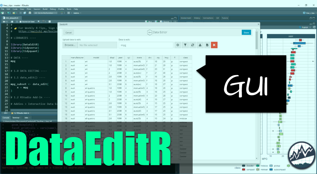
GUI for Editing Dataframes in R
Edit dataframes as if they were Excel tables.
DataEditR is a great addition to the R package ecosystem. I see it being immediately useful for beginners coming from Excel where they are used to being able to edit data interactively in an Excel Worksheet.
Find out how easy it is to edit data with the DataEditR GUI (Graphical User Interface).
BONUS:
I have an extra ggplot2 code showing boxplots of the Fuel Economy at the end of the tutorial (a vision of where you can go once you learn R beyond the GUI).
One of my biggest challenges when I moved from Excel to R was the transition from an interactive worksheet where I could edit data using point-click-edit to a data frame that requires code to edit. This was a serious hurdle. I wish I had a tool like DataEditR when I was first starting out.
Fast-forward to 2021, and here we are: DataEditR, the GUI I never had. Today, you’ll learn how to use this Excel-style dataframe editing tool.
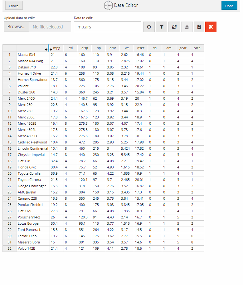
Image Source:
DataEditR GitHub
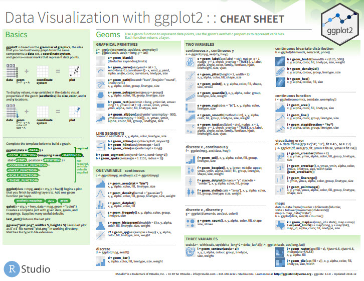
Before we get started, get the R Cheat Sheet
DataEditR is great for making simple edits. But, you’ll still need to learn how to wrangle data with dplyr and visualize data with ggplot2. For those topics, I’ll use the Ultimate R Cheat Sheet to refer to dplyr and ggplot2 code in my workflow.
Quick Example:
Download the Ultimate R Cheat Sheet Then Click the “CS” next to “ggplot2” opens the Data Visualization with GGplot2 Cheat Sheet.
Now you’re ready to quickly reference ggplot2 functions.
Onto the tutorial.
How DataEditR works
It’s super-simple. Just run this code to:
- Load Libraries: Load
DataEditR , tidyverse and tidyquant.
- Import Data: We’re using the
mpg dataset that comes with ggplot2.
- Start Data Editing: Use the
data_edit() function.
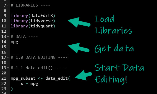
Get the code.
This launches the Data Editor.
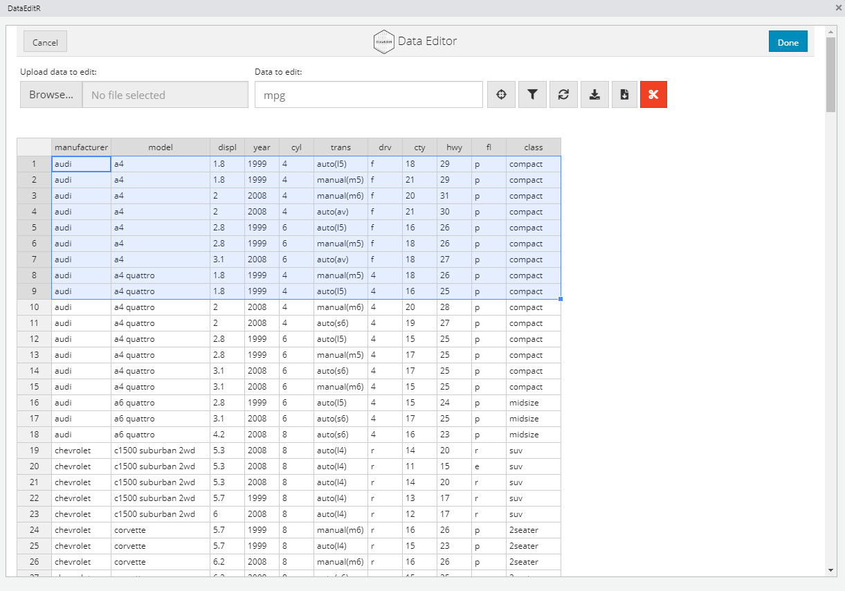
The Data Editor
Try Editing Cells
Click on a cell and make any edits.
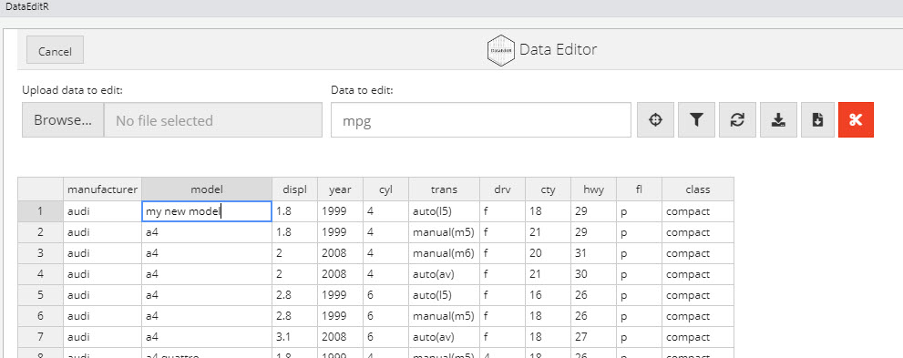
Editing Cells
Try Selecting Columns
Click the target icon. Then select columns you are interested in.
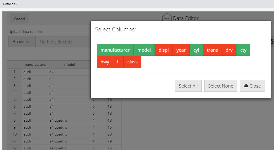
Selecting Columns
When you’re done, save a CSV
After you’ve made your edits, you can optionally save a CSV File. Alternatively, you can return a data frame in your active R Session.
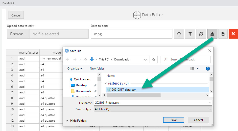
Save as CSV File
Going Further
with dplyr and ggplot2
DataEditR is great for making simple edits. But, eventually you’re going to need to go further by using code to wrangle data and prepare visualizations. For this, I’ll circle back to dplyr and ggplot2, and my Ultimate R Cheat Sheet.
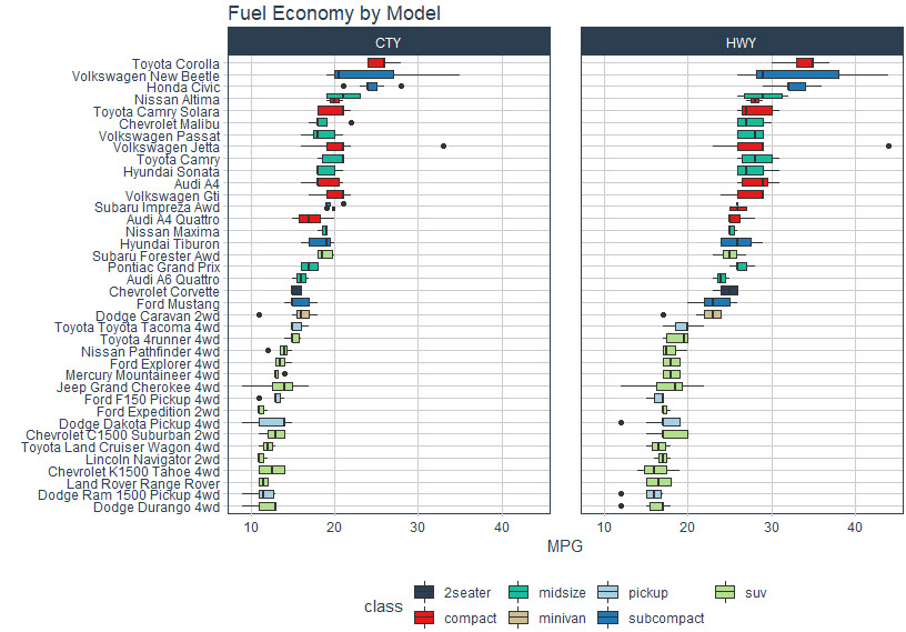
Fuel Economy by Vehicle Model
Say that you wanted to make a visualization that shows the differences in vehicle models and their fuel economy measured as miles per gallon (MPG). We can do this with dplyr and ggplot2.
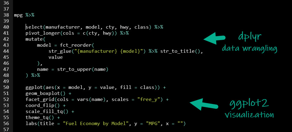
Get the code.
Visualization and Insights
The code makes a stunning ggplot2 visualization that highlights the differences in fuel economy by vehicle model and class. We can see:
- SUV’s clearly have the lowest fuel economy although the Subaru Forester AWD seems to be an outlier.
- Toyota Corolla is leading the pack with Highway MPG in the mid-30s.
In Summary
You’ve seen how DataEditR can be used for making simple edits inside of R. You’ve also seen that learning dplyr and ggplot2 can generate insights through visualizations.
What if you want to go further? Read on.
Need to advance your business data science skills?
I’ve helped 6,107+ students learn data science for business from an elite business consultant’s perspective.
I’ve worked with Fortune 500 companies like S&P Global, Apple, MRM McCann, and more.
And I built a training program that gets my students life-changing data science careers (don’t believe me? see my testimonials here):
6-Figure Data Science Job at CVS Health ($125K)
Senior VP Of Analytics At JP Morgan ($200K)
50%+ Raises & Promotions ($150K)
Lead Data Scientist at Northwestern Mutual ($175K)
2X-ed Salary (From $60K to $120K)
2 Competing ML Job Offers ($150K)
Promotion to Lead Data Scientist ($175K)
Data Scientist Job at Verizon ($125K+)
Data Scientist Job at CitiBank ($100K + Bonus)
Whenever you are ready, here’s the system they are taking:
Here’s the system that has gotten aspiring data scientists, career transitioners, and life long learners data science jobs and promotions…
Join My 5-Course R-Track Program Now!
(And Become The Data Scientist You Were Meant To Be...)
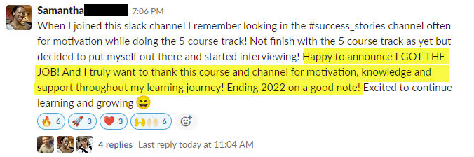
P.S. - Samantha landed her NEW Data Science R Developer job at CVS Health (Fortune 500). This could be you.