My 4 most important explainable AI visualizations (modelStudio)
Written by Matt Dancho
Machine learning is great, until you have to explain it. Thank god for modelStudio.
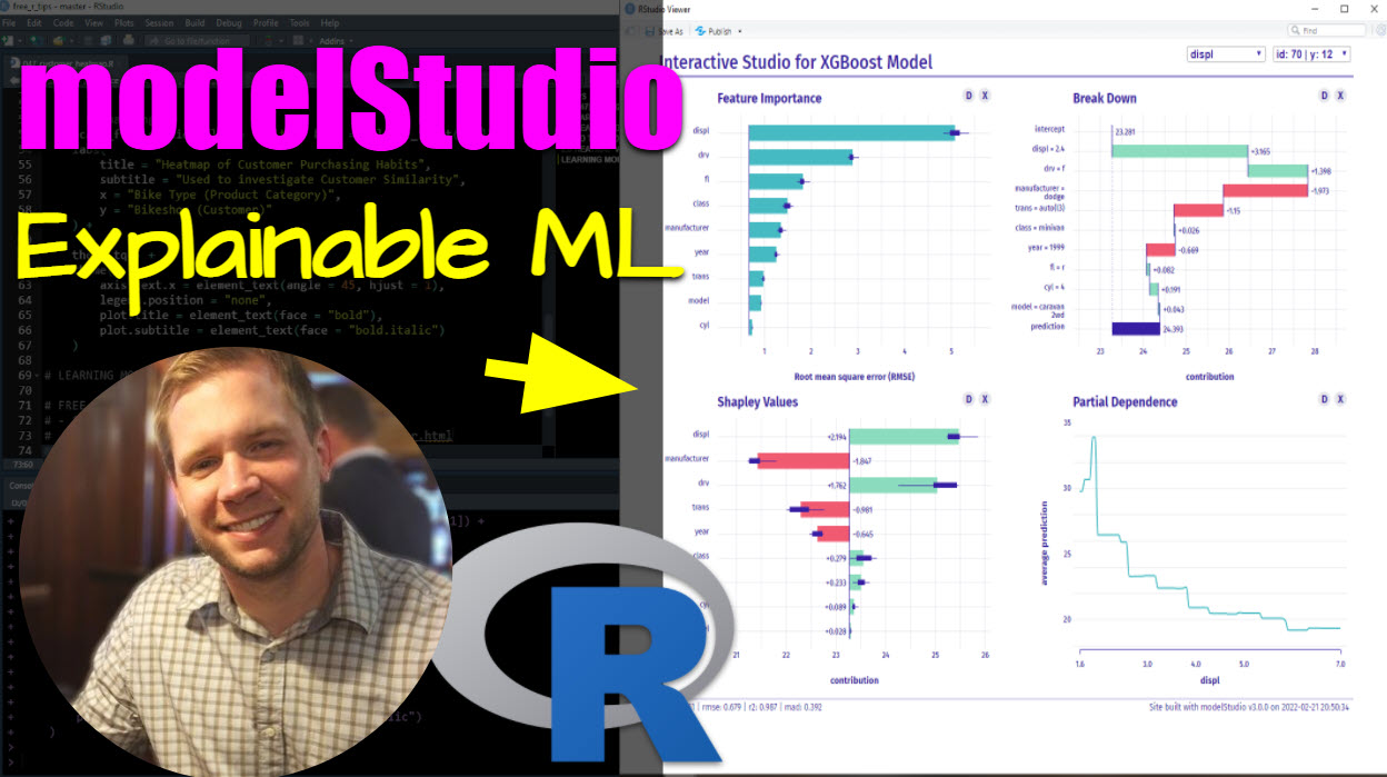
modelStudio is a new R package that makes it easy to interactively explain machine learning models using state-of-the-art techniques like Shapley Values, Break Down plots, and Partial Dependence. I was shocked at how quickly I could get up and running!
In the next 10-minutes, we’ll learn how to make my 4 most important Explainable AI plots:
- 1: Feature Importance
- 2: Break Down Plot
- 3: Shapley Values
- 4: Partial Dependence
- BONUS: I’ll not only show you how to make the plots in under 10-minutes, but I’ll explain exactly how to discover insights from each plot!
SPECIAL ANNOUNCEMENT: AI for Data Scientists Workshop on December 18th
Inside the workshop I’ll share how I built a SQL-Writing Business Intelligence Agent with Generative AI:
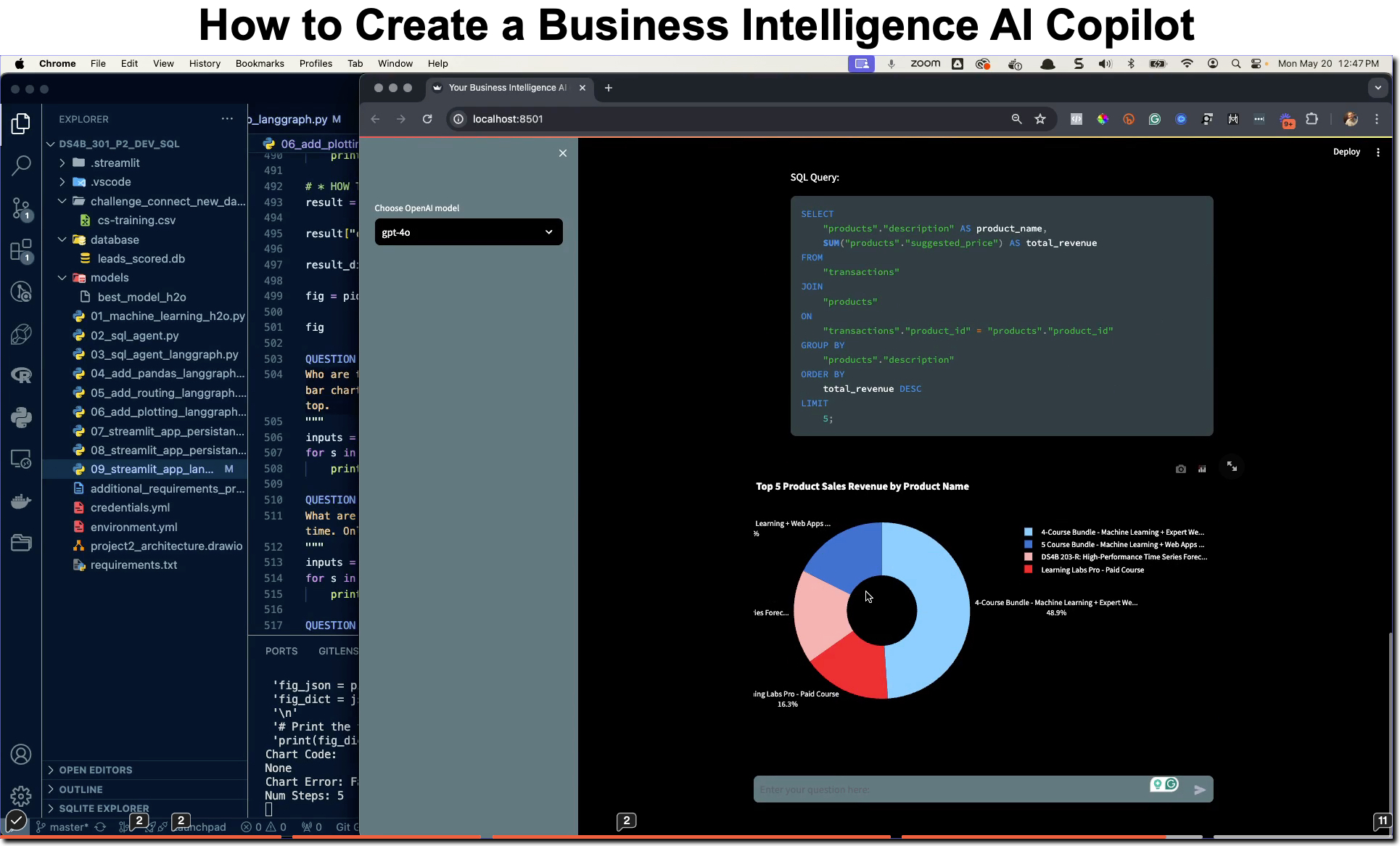
What: GenAI for Data Scientists
When: Wednesday December 18th, 2pm EST
How It Will Help You: Whether you are new to data science or are an expert, Generative AI is changing the game. There’s a ton of hype. But how can Generative AI actually help you become a better data scientist and help you stand out in your career? I’ll show you inside my free Generative AI for Data Scientists workshop.
Price: Does Free sound good?
How To Join: 👉 Register Here
R-Tips Weekly
This article is part of R-Tips Weekly, a weekly video tutorial that shows you step-by-step how to do common R coding tasks.
Here are the links to get set up. 👇
Video Tutorial
Learn how to use the modelStudio package in our 10-minute YouTube video tutorial.
What you make in this R-Tip
By the end of this tutorial, you’ll make the 4 most helpful plots for explaining machine learning models.
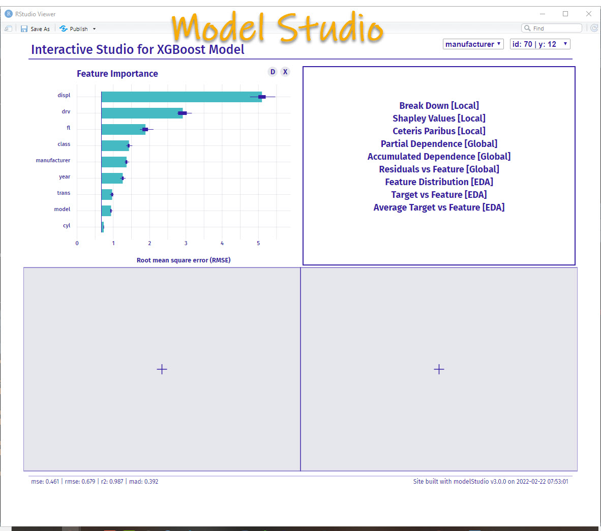
Explain your machine learning models (made with modelStudio)
Thank You Developers.
Before we move on, please recognize that modelStudio was developed by Hubert Baniecki and Przemyslaw Biecek, and is part of the Dr. Why ecosystem of R packages, which are a collection of tools for Visual Exploration, Explanation and Debugging of Predictive Models. Thank you for everything you do!
modelStudio Tutorial
Let’s get up and running with modelStudio so we can interactively explain a predictive model.
Step 1: Load the Libraries and Data
First, run this code to:
- Load Libraries: Load
modelStudio , DALEX, tidyverse and tidymodels.
- Import Data: We’re using the
mpg dataset that comes with ggplot2.
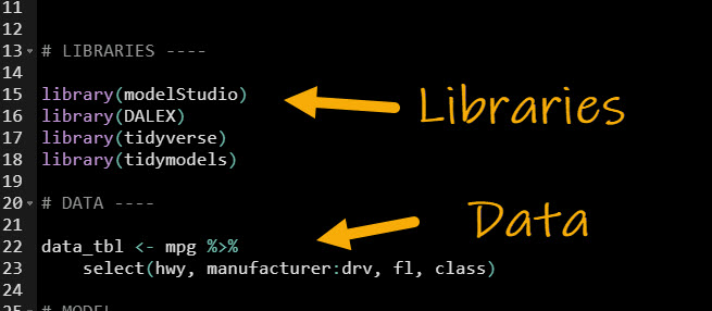
Get the code.
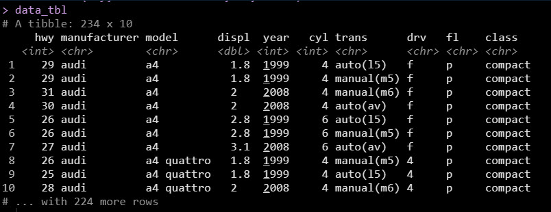
Our data looks like this. We want to understand how Highway Fuel Economy (miles per gallon, hwy) can be estimated based on the remaining 9 columns manufacturer:class.
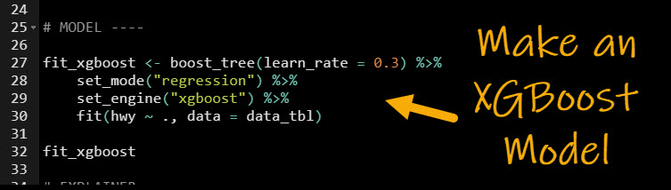
Step 2: Make a Predictive Model
The best way to understand what affects hwy is to build a predictive model (and then explain it). Let’s build an xgboost model using the tidymodels ecosystem. If you’ve never heard of Tidymodels, it’s like Scikit Learn for R (and easier to use if I may be so bold).
- Select Model Type: We use the
boost_tree() function to establish that we are making a Boosted Tree
- Set the Mode: Using
set_mode() we select “regression” because we are predicting a numeric value hwy.
- Set the Engine: Next we use
set_engine() to tell Tidymodels to use the “xgboost” library.
- Fit the Model: This performs a simple training of the model to fit each of the 9 predictors to the target
hwy. Note that we did not perform cross-validation, hyperparameter tuning, or any advanced concepts as they are beyond the scope of this tutorial.
Get the code.
Step 3: Make an Explainer
With a predictive model in hand, we are ready to create an explainer. In basic terms, an explainer is a consistent and unified way to explain predictive models. The explainer can accept many different model types like:
- Tidymodels
- mlr3
- H2O
- Python Scikit Learn Models
And it returns the explanation results from the model in a consistent format for investigation.
OK, here’s the code to create the explainer.
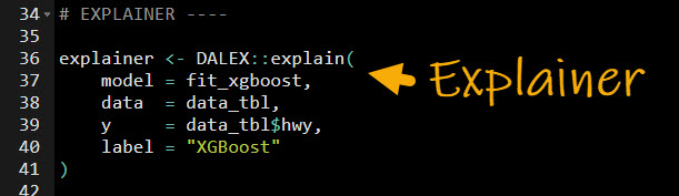
Get the code.
Step 4: Run modelStudio
The last step is to run modelStudio. Now you are ready to explore your predictive model.
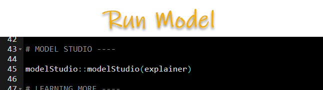
This opens up the modelStudio app - an interactive tool for exploring predictive models!
BONUS: My 4 Most Important Explainable AI Plots
OK, it would be pretty silly to end the tutorial here.
Well… I mean, you can pull up the tool.
BUT, you can’t use it to generate anything meaningful (yet).
The good news is I’m going to keep going with a MEGA-BONUS.
I’m going to show you which 4 plots I use the most, and explain them in detail so you can use them (and understand them) to generate MASSIVE INSIGHTS for your business.
Alright, let’s go.
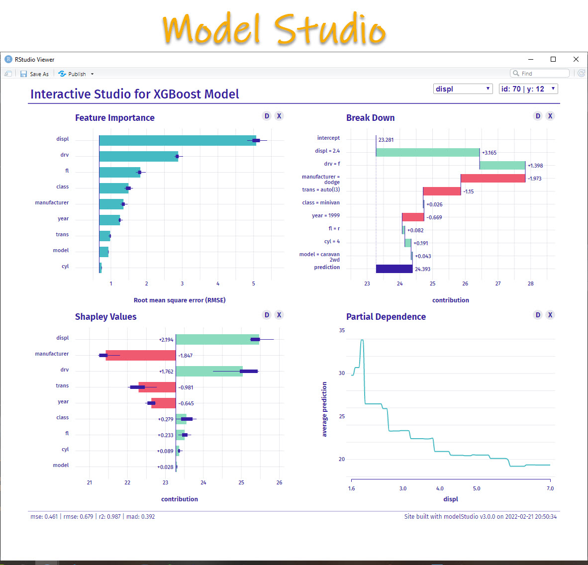
Plot 1: Feature Importance
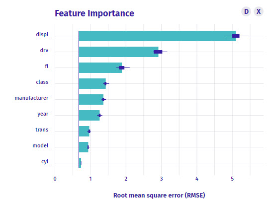
What is it?
The feature importance plot is a global representation. This means that it looks all of your observations and tells you which features (columns that help you predict) have in-general the most predictive value for your model.
How do I interpret it?
So here’s how I read this plot:
displ - The Engine Displacement (Volume) has the most predictive value in general for this dataset. It’s an important feature. In fact, it’s 5X more important than the model feature. And 100X more important than cyl. So I should DEFINITELY investigate it more.drv is the second most important feature. Definitely want to review the Drive Train too.- Other features - The Feature importance plot shows the the other features have some importance, but the 80/20 rule tells me to focus on
displ and drv.
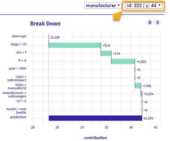
Plot 2: Break Down Plot
Next, an incredibly valuable plot is the Break Down Plot.
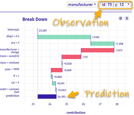
What is it?
The Breakdown plot is a local representation that explains one specific observation. The plot then shows a intercept (starting value) and the positive or negative contribution that each feature has to developing the prediction.
How do I interpret it?
So here’s how I read this breakdown plot:
- For Observation ID 70 (Dodge Caravan), that has an actual
hwy of 12 Miles Per Gallon (MPG)
- The starting point (intercept) for all observations is 23.281 MPG.
- The
displ = 2.4 which boosts the model’s prediction by +3.165 MPG.
- The
drv = 'f' which increases the model’s prediction another +1.398 MPG
- The
manufacturer = 'dodge' which decreases the MPG prediction by -1.973
- And we keep going until we reach the prediction. Notice that the first features tend to be the most important because they move the prediction the most.
Careful: Global vs Local Explanations
Important Note: Global Versus Local Explanations
I can select a different observation, and we get a completely different Break Down plot. This is what happens with local explainers. They change telling us different insights by each observation.
When I switch to ID = 222, I get a totally different vehicle (VW New Beetle). Accordingly the Local Break Down Plot changes (but the global Feature Importance Plot does not!)
Plot 3: Shapley Values
The third most important plot I look at is the shapley values.
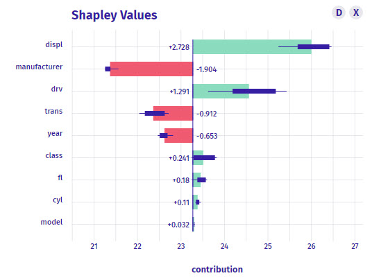
What is it?
Shapley values are a local representation of the feature importance. Instead of being global, the shapley values will change by observation telling you again the contribution.
The shapley values are related closely to the Breakdown plot, however you may seem slight differences in the feature contributions. The order of the shapley plot is always in the most important magnitude contribution. We also get positive and negative indicating if the feature decreases or increases the prediction.
How do I interpret it?
- The centerline is again the intercept (23.28 MPG)
- The
displ feature is the most important for the observation (ID = 38). The displ increases the prediction by 2.728 MPG.
- We can keep going for the rest of the features.
Plot 4: Partial Dependence Plot
The last plot is super powerful!
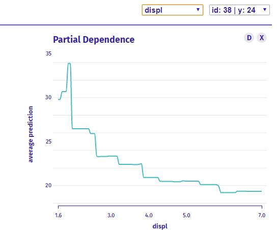
What is it?
The partial dependence plot helps us examine one feature at a time. Above we are only looking at Displacement. The partial dependence is a global representation, meaning it will not change by observation, but rather helps us see how the model predicts over a range of values for the feature being examined.
How do I interpret it?
We are investigating only displ. As values go from low (smaller engines are 1.6 liter) to high (larger engines are 7 liter), the average prediction for highway fuel becomes lower going from 30-ish Highway MPG to under 20 Highway MPG.
Conclusions
You learned how to use the modelStudio to not only create explainable models but also interpret the plots. Great work! But, there’s a lot more to becoming a data scientist.
If you’d like to become a data scientist (and have an awesome career, improve your quality of life, enjoy your job, and all the fun that comes along), then I can help with that.
Need to advance your business data science skills?
I’ve helped 6,107+ students learn data science for business from an elite business consultant’s perspective.
I’ve worked with Fortune 500 companies like S&P Global, Apple, MRM McCann, and more.
And I built a training program that gets my students life-changing data science careers (don’t believe me? see my testimonials here):
6-Figure Data Science Job at CVS Health ($125K)
Senior VP Of Analytics At JP Morgan ($200K)
50%+ Raises & Promotions ($150K)
Lead Data Scientist at Northwestern Mutual ($175K)
2X-ed Salary (From $60K to $120K)
2 Competing ML Job Offers ($150K)
Promotion to Lead Data Scientist ($175K)
Data Scientist Job at Verizon ($125K+)
Data Scientist Job at CitiBank ($100K + Bonus)
Whenever you are ready, here’s the system they are taking:
Here’s the system that has gotten aspiring data scientists, career transitioners, and life long learners data science jobs and promotions…
Join My 5-Course R-Track Program Now!
(And Become The Data Scientist You Were Meant To Be...)
P.S. - Samantha landed her NEW Data Science R Developer job at CVS Health (Fortune 500). This could be you.