How to Make a Heatmap in R
Written by Matt Dancho
The ggplot2 package is an essential tool in every data scientists toolkit. Today we show you how to use ggplot2 to make a professional heatmap.
Table of Contents:
We’ll tackle one of my first business problems:
- Making a Heatmap of Customer Buying Habits.
- BONUS (Pro-Tip): How to explain your heatmap to business executives.
R-Tips Weekly
This article is part of R-Tips Weekly, a weekly video tutorial that shows you step-by-step how to do common R coding tasks.
Here are the links to get set up. 👇
Video Tutorial
Watch this video to learn how to make a Customer Heatmap in ggplot2. Click the image to play the tutorial.
(Click image to play tutorial)
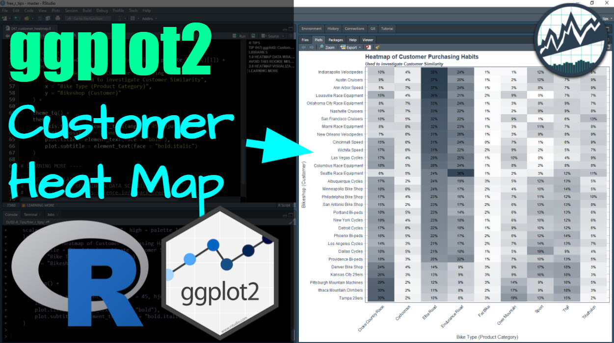
What You Make in this R-Tip
By the end of this tutorial, you will have created this Customer Heatmap showing purchasing preferences.
R-Tips Weekly
This article is part of R-Tips Weekly, a weekly video tutorial that shows you step-by-step how to do common R coding tasks.
Here are the links to get set up. 👇
Video Tutorial
Watch this video to learn how to make a Customer Heatmap in ggplot2. Click the image to play the tutorial.
(Click image to play tutorial)
Why Visualizing Heatmaps is important
Executives hate anything they don’t understand. So if you can’t explain it, they are going to say,* “Yeah, uh huh.”…* And never use what you are pitching them.
Heatmaps are a great way to story tell (so you can persuade those tricky-to-understand exec’s to use your business solution).
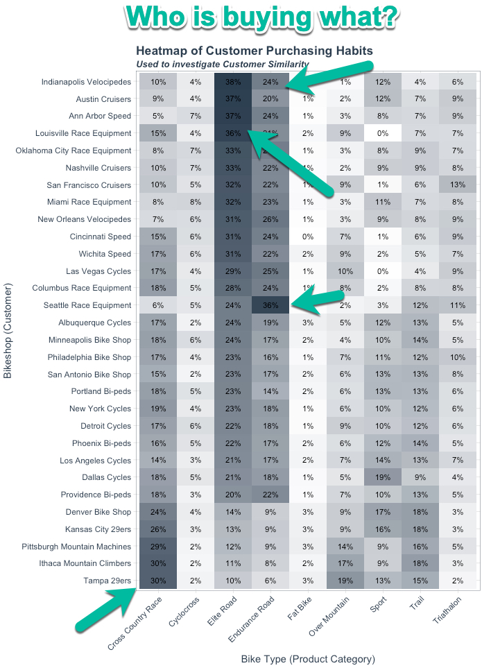
So when you put a heatmap visualization in front of them, and you can say that Indianapolis Velocipedes are buying the majority of Elite Road Bicycles. They get that. And they can see why it logically makes sense to group them into a bucket of customers (i.e. a segment) that gets special offers on Road Bicycles.
Free Gift: Cheat Sheet for my Top 100 R Packages (Special Data Analysis Topics Included)
Before we dive in…
You’re going to need R packages to complete the analysis that goes in your MS Word reports. So why not speed up the process?
To help, I’m going to share my secret weapon…
Even I forget which R packages to use from time to time. And this cheat sheet saves me so much time. Instead of googling to filter through 20,000 R packages to find a needle in a haystack. I keep my cheat sheet handy so I know which to use and when to use them. Seriously. This cheat sheet is my bible.
Once you download it, head over to page 3 and you’ll see several R packages I use frequently just for Data Analysis.
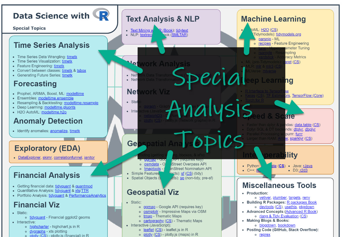
Which is important when you want to work in these fields:
- Machine Learning
- Time Series
- Financial Analysis
- Geospatial Analysis
- Text Analysis and NLP
- Shiny Web App Development
So steal my cheat sheet. It will save you a ton of time.
Tutorial: How to Make A Heatmap (Customer Segmentation Example)
Here’s how to make a customer heat map (using a database of customers and their purchasing history).
Step 1: Load the libraries and data
First, load the following libraries and data.
Get the code.
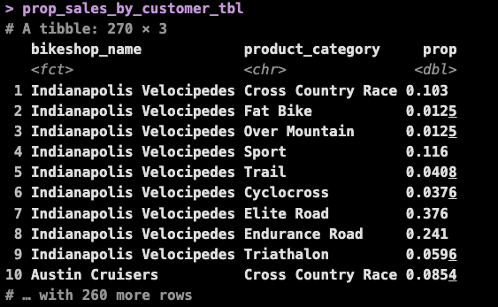
The dataset looks like this:
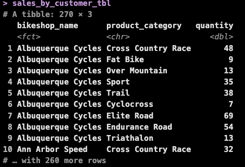
Get the data.
Next, we need to get the data into the right format for a comparison. To do this, we’ll convert to a proportion of sales by bikeshop. Then we sort by the top product, which in this case is Elite Road (this hack is needed for the heatmap to have the customers that purchase similar products grouped together).
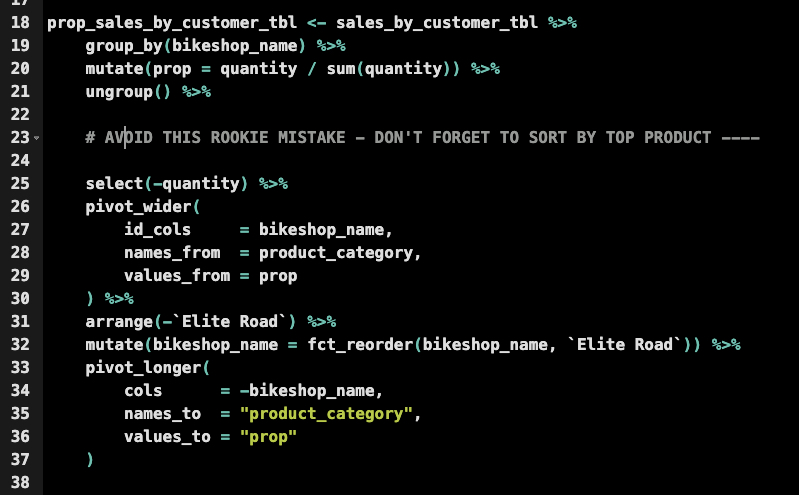
Get the code.
Here’s what the data now looks like. We now have a proportion of sales that each bikeshop is spending in each category. And it’s sorted by the top category (this is )
Step 3: Make the Heat Map
The last step is to take the formatted data from Step 2 and visualize it with ggplot2. We’ll leverage geom_tile() for the heat map and use geom_text() to add the proportions formatted as text to the heat map tiles.
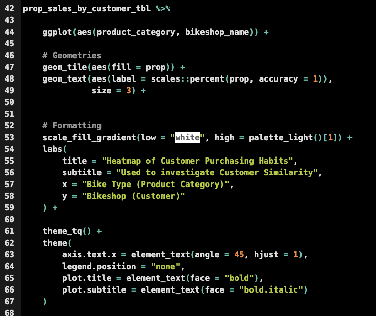
Get the code.
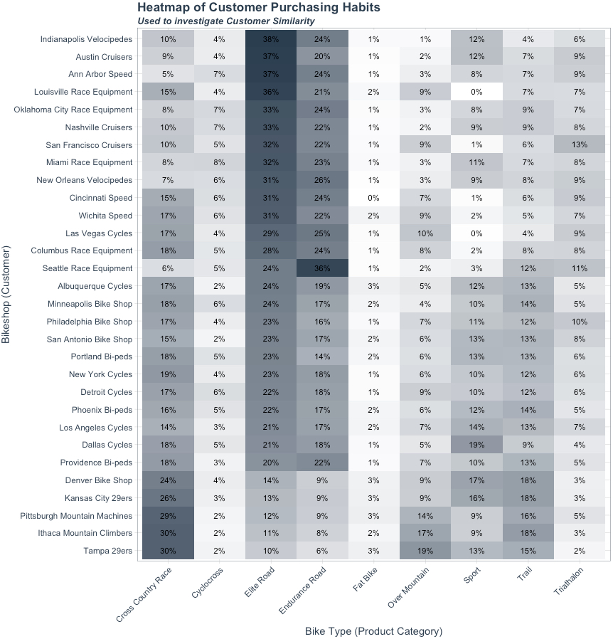
…And here’s the final visualization.
BONUS: Explaining to Executives
Having a heatmap is great, but it doesn’t guarantee success with your business. To get the desired result, you need to learn how to pitch your data viz.
Here’s how (Quick Pro-Tip for Pitching Executives).
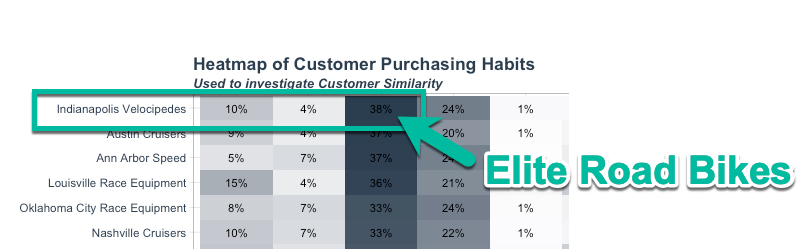
My goto is to talk in specifics. This means talk about what this chart means by focusing on 1 specific customer and 1 specific product-line.
Here’s an example: Indianpolis Velocipedes
I’d say something like:
“Let’s take a look at our customer, Indianpolis Velocipedes. 38% of the products they are purchasing are Elite Road Bicycles. And there’s other customers like Austin Cruisers, Ann Arbor Speed, and Louisville Race Equipment that are doing the exact same thing… With this information in hand, we can target them for offers. What do you think would happen if we gave them a flash sale on Elite Road bikes? Do you want to try it out?”
More often than not, they are going to agree and try the simple test.
And if it shows positive results (brings in some additional sales), then you’ve just impacted the business through improved decision making.
Do this a few times and you’ll get a promotion. And if you make your company a lot of money with these techniques…
…Your career will take off like mine did. I went from making $75,000 to $150,000+ in about 2 years doing this stuff.
Summary
You just created a Customer Heatmap using ggplot2. This is great, but there’s a lot more to learning data science.
If you’d like to learn data visualizations, data wrangling, shiny apps, and data science for business with R, then read on. 👇
Need to advance your business data science skills?
I’ve helped 6,107+ students learn data science for business from an elite business consultant’s perspective.
I’ve worked with Fortune 500 companies like S&P Global, Apple, MRM McCann, and more.
And I built a training program that gets my students life-changing data science careers (don’t believe me? see my testimonials here):
6-Figure Data Science Job at CVS Health ($125K)
Senior VP Of Analytics At JP Morgan ($200K)
50%+ Raises & Promotions ($150K)
Lead Data Scientist at Northwestern Mutual ($175K)
2X-ed Salary (From $60K to $120K)
2 Competing ML Job Offers ($150K)
Promotion to Lead Data Scientist ($175K)
Data Scientist Job at Verizon ($125K+)
Data Scientist Job at CitiBank ($100K + Bonus)
Whenever you are ready, here’s the system they are taking:
Here’s the system that has gotten aspiring data scientists, career transitioners, and life long learners data science jobs and promotions…
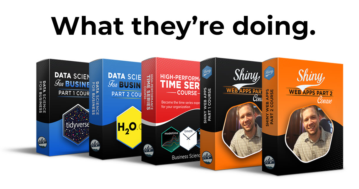
Join My 5-Course R-Track Program Now!
(And Become The Data Scientist You Were Meant To Be...)
P.S. - Samantha landed her NEW Data Science R Developer job at CVS Health (Fortune 500). This could be you.