ggalt: Make a Dumbbell Plot to Visualize Change in ggplot2
Written by Matt Dancho
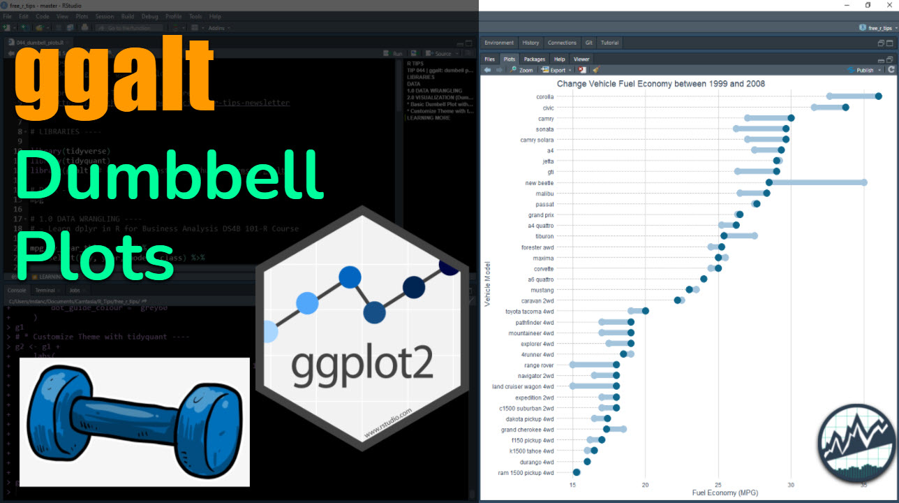
ggalt is a ggplot2 extension that adds many new ggplot geometries. In this tutorial, we’ll learn how to make dumbbell plots for visualizing change within our data using geom_dumbbell().
SPECIAL ANNOUNCEMENT: AI for Data Scientists Workshop on December 18th
Inside the workshop I’ll share how I built a SQL-Writing Business Intelligence Agent with Generative AI:
What: GenAI for Data Scientists
When: Wednesday December 18th, 2pm EST
How It Will Help You: Whether you are new to data science or are an expert, Generative AI is changing the game. There’s a ton of hype. But how can Generative AI actually help you become a better data scientist and help you stand out in your career? I’ll show you inside my free Generative AI for Data Scientists workshop.
Price: Does Free sound good?
How To Join: 👉 Register Here
R-Tips Weekly
This article is part of R-Tips Weekly, a weekly video tutorial that shows you step-by-step how to do common R coding tasks.
Here are the links to get set up. 👇
Video Tutorial
Follow along with our Full YouTube Video Tutorial.
Learn how to use ggalt in our 6-minute YouTube video tutorial.
(Click image to play tutorial)
What is a Dumbbell Plot?
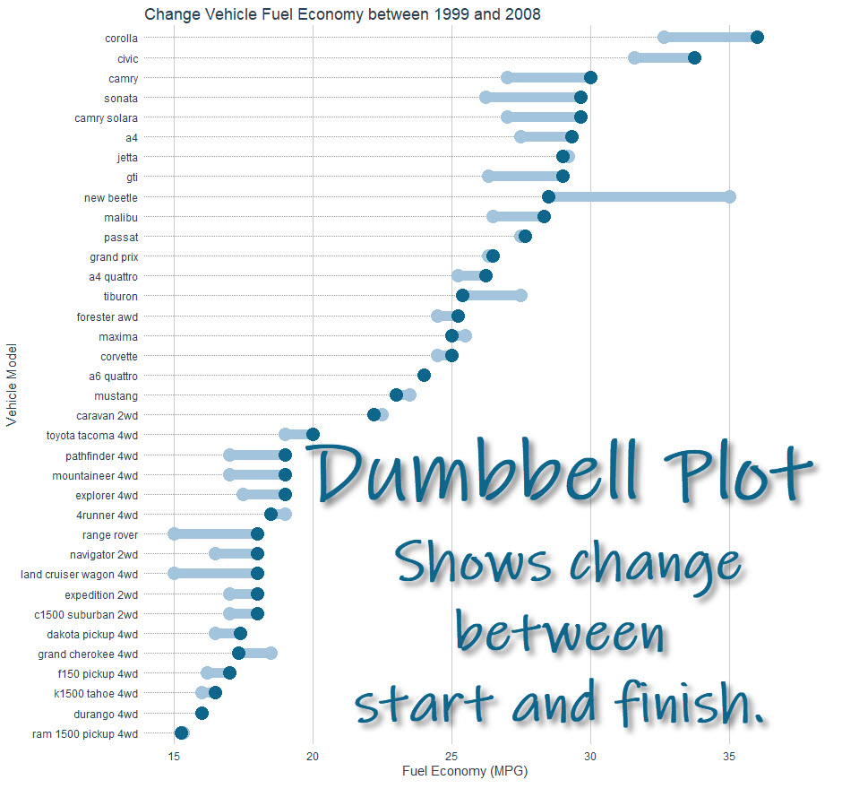
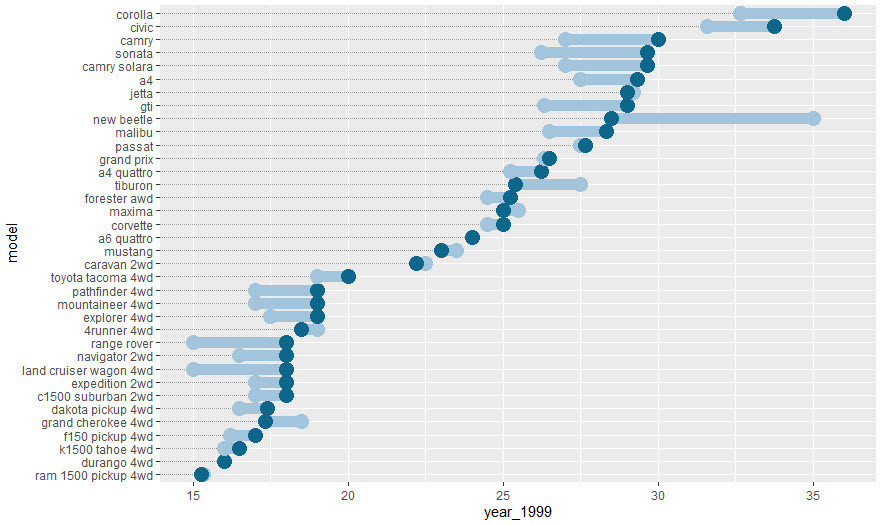
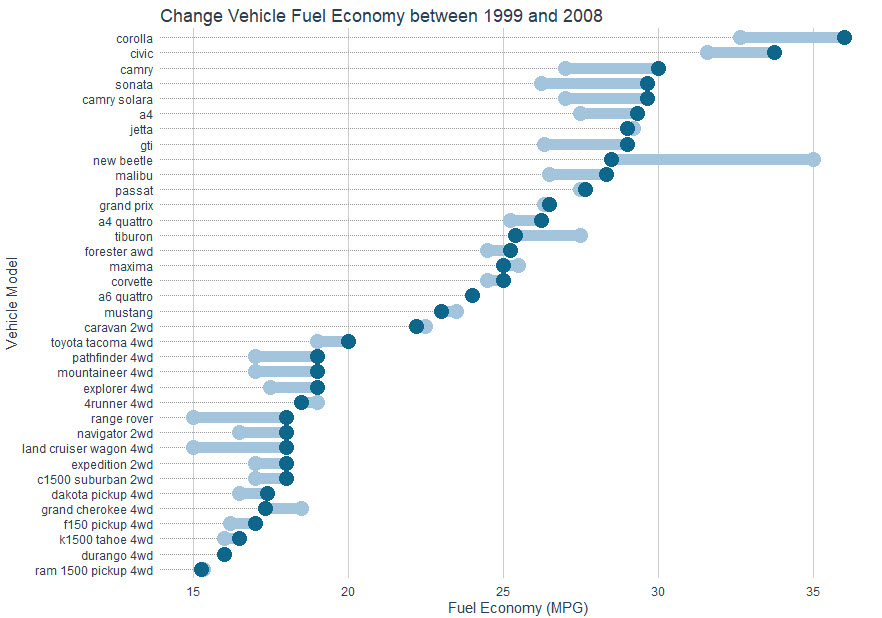
The Dumbbell Plot is a visualization that shows change between two points in our data. It gets the name because of the Dumbbell shape. It’s a great way to show changing data between two points (think start and finish). Here we can see the improvement in vehicle fuel economy over time (between 1999 and 2008). The Dumbbell shows the starting point (MPG in 1999) and the ending point (MPG in 2008).
Dumbbell Plot (We'll make in this tutorial)
We’ll go through a short tutorial to get you up and running with ggalt to make a dumbbell plot.
Dumbbell plots [ggalt Tutorial]
This tutorial showcases the awesome power of ggalt for visualizing dumbbell plots.
R Package Author Credits
This tutorial wouldn’t be possible without the excellent work of Bob Rudis, creator of ggalt. Check out the ggalt package here.
Before we get started, get the R Cheat Sheet
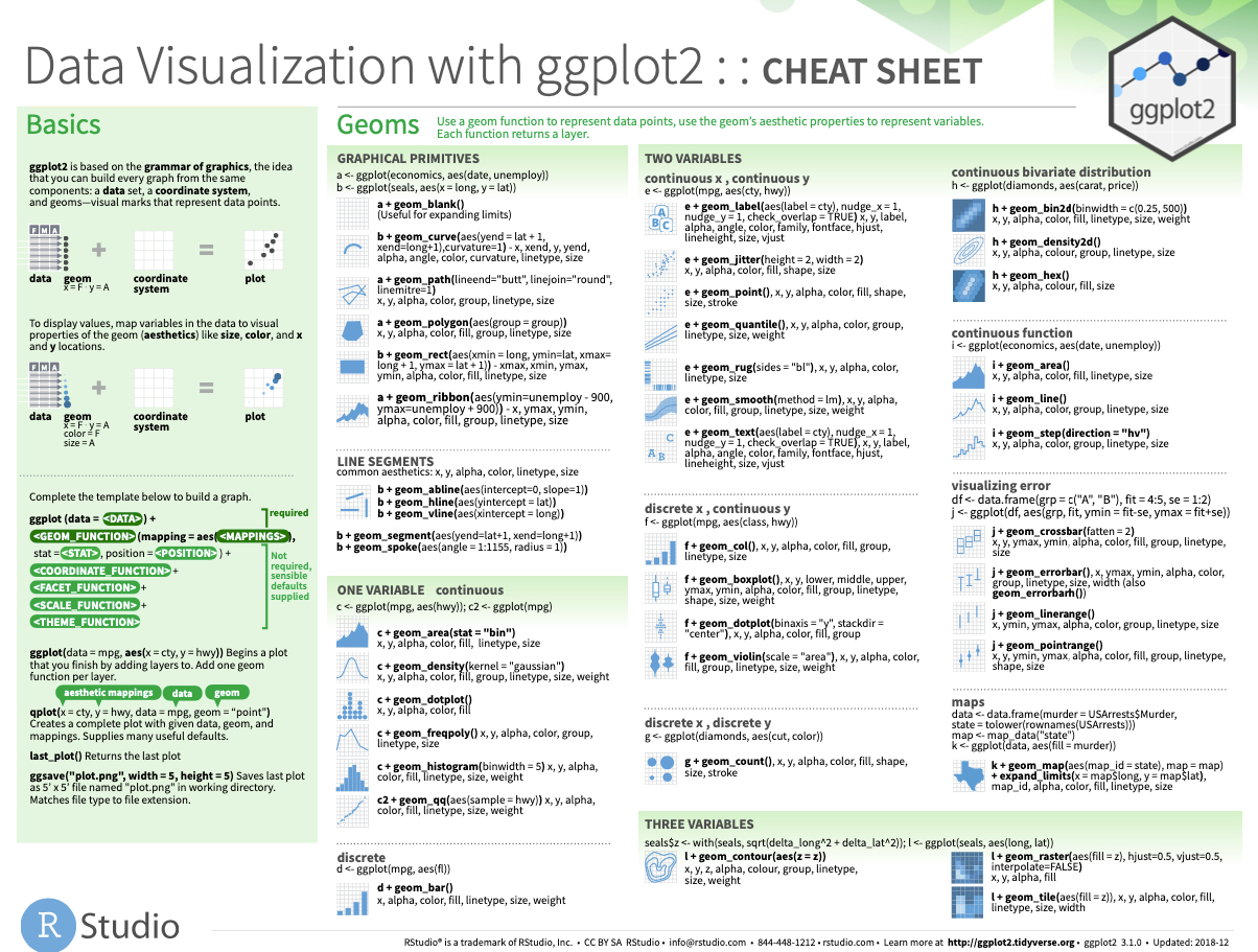
ggalt is great for extending ggplot2 with advanced features. But, you’ll need to learn ggplot2 to take full advantage. For these topics, I’ll use the Ultimate R Cheat Sheet to refer to ggplot2 code in my workflow.
Quick Example:
Download the Ultimate R Cheat Sheet. Then Click the “CS” hyperlink to “ggplot2”.
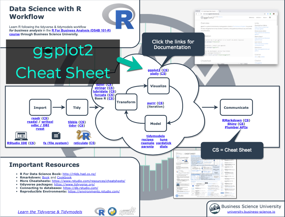
Now you’re ready to quickly reference the ggplot2 cheat sheet. This shows you the core plotting functions available in the ggplot library.
Onto the tutorial.
Load the Libraries and Data
First, run this code to:
- Load Libraries: Load
ggalt, tidyquant, and tidyverse.
- Import Data: We’re using the
mpg dataset that comes with ggplot2.
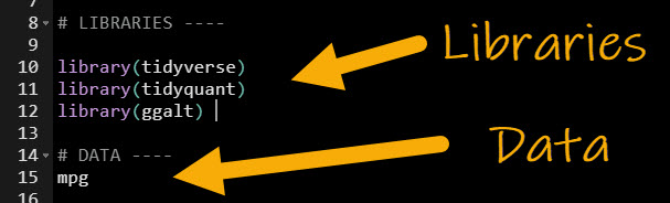
Get the code.
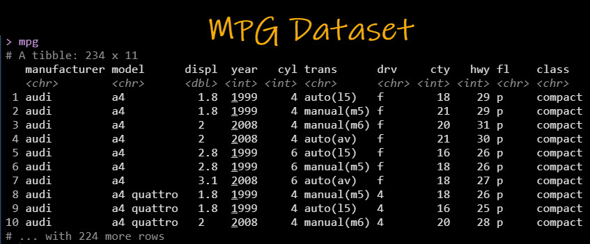
Here’s the mpg dataset. We’ll focus on “hwy” (fuel economy in Miles Per Gallon), “year” (the vehicle model year), and “model” (the manufacturer’s vehicle description).
Dumbbell plot: Using ggplot
Next, we’ll make a Dumbbell plot that highlights the change in Vehicle Fuel Economy (MPG) for each Model from 1999 to 2008. It helps if you have dplyr (data wrangling) and ggplot2 (data visualization) experience.
Pro-Tip 1: Definitely use the cheat sheet to refer to ggplot and dplyr functions.
Pro-Tip 2: I have a course that can help. It’s called R for Business Analysis Course. Check it out if you want to master dplyr and ggplot2.
Step 1: Prepare the Data
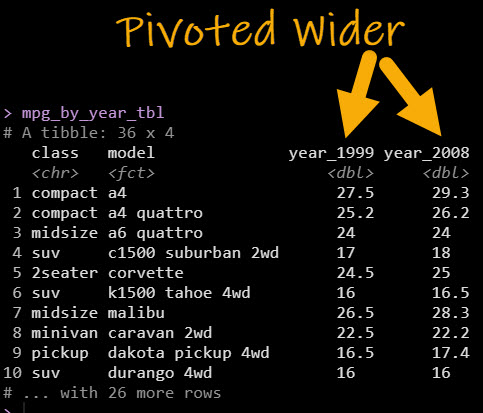
To make a Dumbbell Plot with geom_dumbbell(), we need to first get the data into the correct format for the visualization. The trick is to use pivot_wider() to pivot the data using an aggregation (mean()) to get the vehicle fuel economy (hwy) into two columns separated by year (1999 vs 2008).
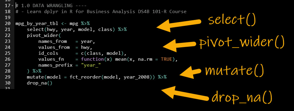
Get the code.
The resulting data is now formatted correctly for the Dumbbell Plot.
Data wrangling can be a bit tricky. If you’d like to learn data wrangling with dplyr (a critical skill), I teach dplyr in my R for Business Analysis Course.
Now we can make the dumbbell plot.
Step 2: Make the Base Dumbbell Plot with geom_dumbbell()
We start by making a basic dumbbell plot with geom_dumbbell(). The trick is to use x and xend to specify the start and end points of the dumbbell plot.
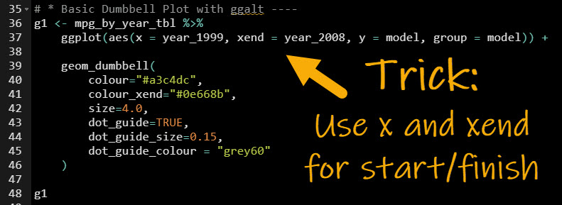
Get the code.
This produces our base plot, which is a dumbbell plot of highway fuel economy for each vehicle model.
Data Visualization is a key skill that beginners often struggle with. If you are interested in learning ggplot2 in-depth, check out our R for Business Analysis Course (DS4B 101-R) that contains over 30-hours of video lessons on learning R for data analysis.
Now, we can make the plot awesome with themes and tidyquant.
Step 3: Customize the ggplot theme
It’s a good idea to adjust our plot theme(), especially if we are going to present to business stakeholders in a presentation or report (you’ll likely want to match your organization’s colors). We’ll leverage tidyquant and ggplot for theme customization to match Business Science colors. Refer to the Ultimate R Cheat Sheet and ggplot2 documentation for more customization.
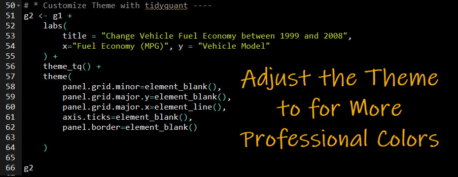
Get the code.
And here’s the output. We have our final plot that tells the story of how highway fuel economy varies with the vehicle’s number of cylinders and engine displacement volume.
Summary
We learned how to make dumbbell plots with ggalt. But, there’s a lot more to visualization.
It’s critical to learn how to visualize with ggplot2, which is the premier framework for data visualization in R.
If you’d like to learn ggplot2, data visualizations, data wrangling, and data science for business with R, then read on. 👇
Need to advance your business data science skills?
I’ve helped 6,107+ students learn data science for business from an elite business consultant’s perspective.
I’ve worked with Fortune 500 companies like S&P Global, Apple, MRM McCann, and more.
And I built a training program that gets my students life-changing data science careers (don’t believe me? see my testimonials here):
6-Figure Data Science Job at CVS Health ($125K)
Senior VP Of Analytics At JP Morgan ($200K)
50%+ Raises & Promotions ($150K)
Lead Data Scientist at Northwestern Mutual ($175K)
2X-ed Salary (From $60K to $120K)
2 Competing ML Job Offers ($150K)
Promotion to Lead Data Scientist ($175K)
Data Scientist Job at Verizon ($125K+)
Data Scientist Job at CitiBank ($100K + Bonus)
Whenever you are ready, here’s the system they are taking:
Here’s the system that has gotten aspiring data scientists, career transitioners, and life long learners data science jobs and promotions…
Join My 5-Course R-Track Program Now!
(And Become The Data Scientist You Were Meant To Be...)
P.S. - Samantha landed her NEW Data Science R Developer job at CVS Health (Fortune 500). This could be you.