easystats: Quickly investigate model performance
Written by Matt Dancho
Easystats performance is an R package that makes it easy to investigate the relevant assumptions for regression models. I’m super impressed with it! In the next 10-minutes, we’ll:
- Learn how to investigate performance with
performance::check_model()
- Check out the
Tidymodels integration with check_model()
- [BIG BONUS] Step through each of the 6 Model Performance Plots so you know how to use them.
This article was last updated on: February 11th, 2022.
R-Tips Weekly
This article is part of R-Tips Weekly, a weekly video tutorial that shows you step-by-step how to do common R coding tasks.
Here are the links to get set up. 👇
Video Tutorial
Learn how to use easystats’s performance package in our 7-minute YouTube video tutorial.
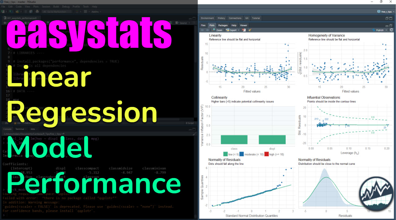
What you make in this R-Tip
By the end of this tutorial, you’ll make a helpful plot for analyzing the model quality of regression models.
Model Performance Plot (made with easystats)
Thank You Developers.
Before we move on, please recognize that the easystats-verse of R packages is developed by Daniel Lüdecke, Dominique Makowski, Mattan S. Ben-Shachar, Indrajeet Patil, and Brenton M. Wiernik. Thank you for all that you do!
Let’s get up and running with the performance package so we can assess Model Performance.
Step 1: Load the Libraries and Data
First, run this code to:
- Load Libraries: Load
performance and tidyverse.
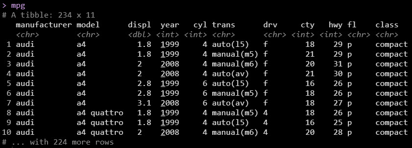
- Import Data: We’re using the
mpg dataset that comes with ggplot2.
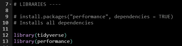
Get the code.
Load the data. We’re using the mpg dataset.
Step 2: Make & Check a Linear Regression Model
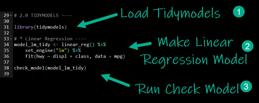
Next, we’ll quickly make a Linear Regression model with tidymodels. Then I’ll cover more specifics on what we are doing. Here’s the code. We follow 3-Steps:
- Load Tidymodels: This loads
parsnip (the modeling package in the tidymodels ecosystem)
- Make Linear Regression Model: We set up a model specification using
linear_reg().
- We then select an engine with
set_engine(). In our case we want “lm”, which connects to stats::lm().
- We then
fit() the model. We use a formula hwy ~ displ + class to make highway fuel economy our target and displacement and vehicle class our predictors. This creates a trained model.
- Run Check Model: With a fitted model in hand, we can run
performance::check_model(), which generates the Model Performance Plot.
Get the code.
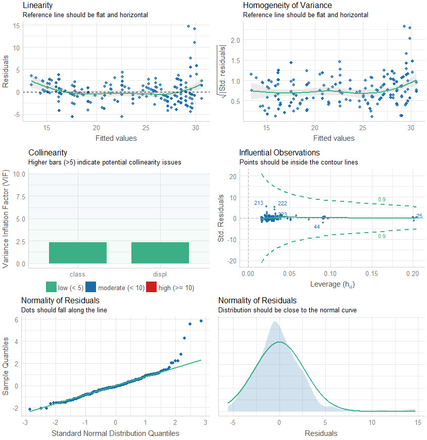
Here is the output of check_model(), which returns a Model Performance Plot. This is actually 6-plots in one. We’ll go through them next.
Let’s go through the plots, analyzing our model performance.
Let’s step through the 6-plots that were returned.
Plots 1 & 2: Residual Linearity
The first two plots analyze the linearity of the residuals (in-sample model error) versus the fitted values. We want to make sure that our model is error is relatively flat.
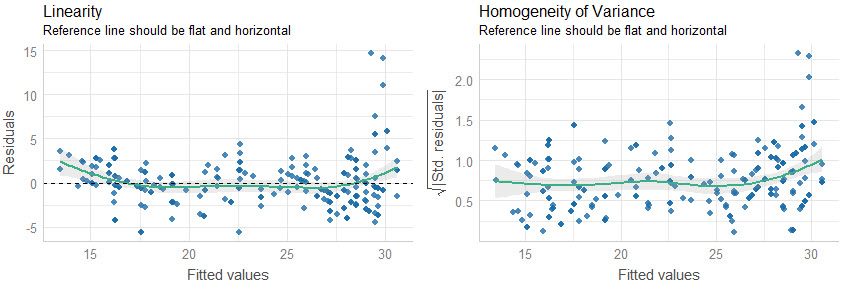
Quick Assessment:
- We can see that when our model predictions are around 30, our model has larger error compared to below 30. We may want to inspect these points to see what could be contributing to the lower predictions than actuals.
Plots 3 & 4: Collinearity and High Leverage Points
The next two plots analyze for collinearity and high leverage points.
- Collinearity is when features are highly correlated, which can throw off simple regression models (more advanced models use a concept called regularization and hyperparameter tuning to control for collinearity).
- High Leverage Points are observations that deviate far from the average. These can skew the predictions for linear models, and removal or model adjustment may be necessary to control model performance.
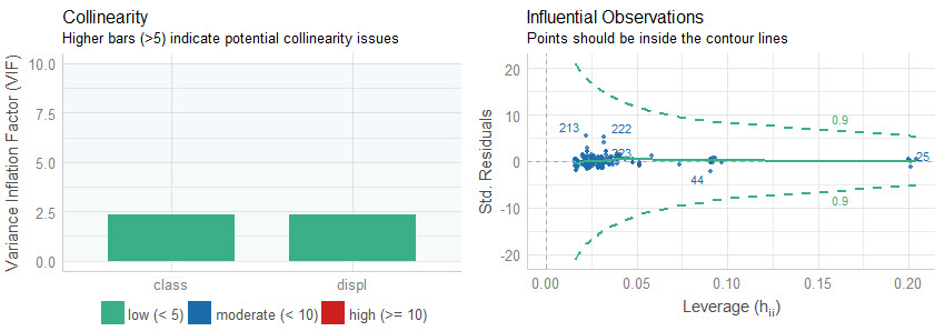
Quick Assessment:
- Collinearity: We can see that both of the features have low collinearity (green bars). No model adjustments are necessary.
- Influential Observations: None of the predictins are outside of the contour lines indicating we don’t have high leverage points. No model adjustments are necessary.
Plots 5& 6: Normality of Residuals
The last two plots analyze for the normality of residuals, which is how the model error is distributed. If the distributions are skewed, this can indicate problems with the model.
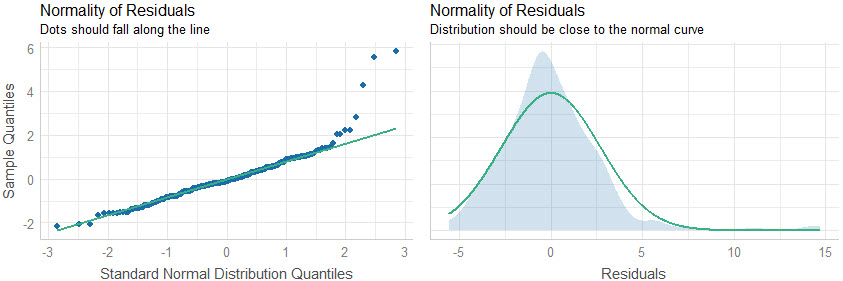
Quick Assessment:
- Quantile-Quantile Plot: We can see that several points towards the end of the quantile plot do fall along the straight-line. This indicates that the model is not predicting well for these points. Further inspection is required.
- Normal Density Plot: We can see there is a slight increase in density around 15, which looks to shift the distribution to the left of zero. This means that the high-error predictions should be investigated further to see why the model is far off on this subset of the data.
Conclusions
You learned how to use the check_model() function from the performance package, which makes it easy to quickly analyze regression models for model performance. But, there’s a lot more to becoming a data scientist.
If you’d like to become a data scientist (and have an awesome career, improve your quality of life, enjoy your job, and all the fun that comes along), then I can help with that.
Need to advance your business data science skills?
I’ve helped 6,107+ students learn data science for business from an elite business consultant’s perspective.
I’ve worked with Fortune 500 companies like S&P Global, Apple, MRM McCann, and more.
And I built a training program that gets my students life-changing data science careers (don’t believe me? see my testimonials here):
6-Figure Data Science Job at CVS Health ($125K)
Senior VP Of Analytics At JP Morgan ($200K)
50%+ Raises & Promotions ($150K)
Lead Data Scientist at Northwestern Mutual ($175K)
2X-ed Salary (From $60K to $120K)
2 Competing ML Job Offers ($150K)
Promotion to Lead Data Scientist ($175K)
Data Scientist Job at Verizon ($125K+)
Data Scientist Job at CitiBank ($100K + Bonus)
Whenever you are ready, here’s the system they are taking:
Here’s the system that has gotten aspiring data scientists, career transitioners, and life long learners data science jobs and promotions…

Join My 5-Course R-Track Program Now!
(And Become The Data Scientist You Were Meant To Be...)
P.S. - Samantha landed her NEW Data Science R Developer job at CVS Health (Fortune 500). This could be you.