Quantitative Stock Analysis Tutorial: Screening the Returns for Every S&P500 Stock in Less than 5 Minutes
Written
Quantitative trading strategies are easy to develop in R if you can manage the data workflow. In this post, I analyze every stock in the S&P500 to screen in terms of risk versus reward. I’ll show you how to use quantmod to collect daily stock prices and calculate log returns, rvest to web scrape the S&P500 list of stocks from Wikipedia, purrr to map functions and perform calculations on nested tibbles (tidyverse data frames), and plotly to visualize risk versus reward and extract actionable information for use in your trading strategies. At the end, you will have a visualization that compares the entire set of S&P500 stocks, and we’ll screen them to find those with the best future prospects on a quantitative basis. As a bonus we’ll investigate correlations to add diversification to your portfolio. Finally, the code that generates the plotly and corrplot visualizations is made available on GitHub for future stock screening. Whether you are a veteran trader or a newbie stock enthusiast, you’ll learn a useful workflow for modeling and managing massive data sets using the tidyverse packages. And, the entire script runs in less than five minutes so you can begin screening stocks quickly.
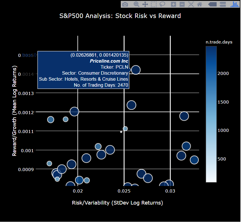
Here’s a sneak peek at the interactive S&P500 stock screening visualization that compares stocks based on growth (reward), variability (risk), and number of samples (risk). The tool can be used to visualize stocks with good characteristics: High growth (large mean log returns), low variability (low standard deviation), and high number of samples (lots of days traded). Make sure you zoom in on sections of interest and hover over the dots to gain insights.
Here’s a sneak peek at the correlation analysis, which is useful in determining which pairs of stocks to select to minimize risk. These are the top 30 stocks according to high growth and low risk. The key here is to select a portfolio that minimizes the correlations between stocks, thus further minimizing risk. Select stocks with low correlation (i.e. small light blue dots indicate pairs have low correlation (good); large dark blue combinations indicate high correlation (bad)).
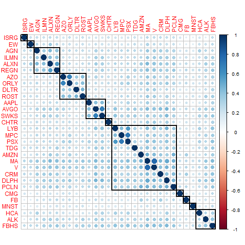
Table of Contents
Update
- 2016-10-29: An issue was uncovered due to stock splits. Stock splits cause a large decline in the stock performance, which penalizes the stocks that split by increasing the standard deviation of the daily returns. The fix is to use the adjusted stock prices. In addition to the fix, I expanded on the correlation section to include the top 30 stocks with high growth, low variability and high samples. Based on feedback, I also expanded the introduction to better explain the goals of the analysis and to include the key visualizations.
Prerequisites
For those following along in R, you’ll need to load the following packages:
library(quantmod)   # get stock prices; useful stock analysis functions
library(xts)        # working with extensible time series
library(rvest)      # web scraping
library(tidyverse)  # ggplot2, purrr, dplyr, tidyr, readr, tibble
library(stringr)    # working with strings
library(forcats)    # working with factors
library(lubridate)  # working with dates in tibbles / data frames
library(plotly)     # Interactive plots
library(corrplot)   # Visuazlize correlation plots
If you don’t have these installed, run install.packages(pkg_names) with the package names as a character vector (pkg_names <- c("quantmod", "xts", ...)).
Stock Analysis: An Individual Stock
Before we extrapolate to a full-blown S&P 500 Analysis, we need to understand how to analyze a single stock. We’ll walk through three steps to quickly get you up to speed on quantitatively analyzing stock returns:
- Exploring the Quantmod Package
- Simulating Stock Prices
- Understanding Drivers of the Simulation
Exploring the Quantmod Package
We’ll use the quantmod package to retrieve and manipulate stock information. There’s a lot of details behind quantmod and extensible timeseries (xts) objects, much of which is beyond the scope of this post. We’ll skim the surface to get you to a proficient level. If you want to get to expert, a good resource is the University of Washington’s R Programming for Quantitative Finance. We’ll use MasterCard, ticker symbol “MA”, for the example.
Quantmod Fundamentals
First, load the quantmod package and use the getSymbols() function to retrieve stock prices. I use the optional from and to arguments to limit the range of prices.
getSymbols("MA", from = "2007-01-01", to = "2016-10-23")
The getSymbols() function adds a variable to R’s Global Environment with the stock ticker as the variable name. If you are using RStudio, check your Environment tab, and you should see MA. What is MA? Informally, it’s the daily stock prices and volumes. We need to understand it more formally. Send MA to the class() function using the pipe operator (%>%):
MA %>% class()
## [1] "xts" "zoo"
xts Objects for Time Series
It turns out that MA is an xts object, which is a format conducive to manipulating timeseries. It plays nicely with and is an extension of the zoo package. The xts vignette elaborates on the details, and another nice resource is the R/Finance Workshop Presentation: Working with xts and quantmod. Our priority is to understand the structure of the data. Pipe MA to the str() and head() functions to inspect.
MA %>% str()
## An 'xts' object on 2007-01-03/2016-10-21 containing:
##   Data: num [1:2470, 1:6] 99.5 96.9 101 99 101.1 ...
##  - attr(*, "dimnames")=List of 2
##   ..$ : NULL
##   ..$ : chr [1:6] "MA.Open" "MA.High" "MA.Low" "MA.Close" ...
##   Indexed by objects of class: [Date] TZ: UTC
##   xts Attributes:
## List of 2
##  $ src    : chr "yahoo"
##  $ updated: POSIXct[1:1], format: "2016-10-30 09:53:43"
MA %>% head()
##            MA.Open MA.High MA.Low MA.Close MA.Volume MA.Adjusted
## 2007-01-03   99.55   99.68  95.63    96.41  26289000    9.241188
## 2007-01-04   96.90  101.85  95.30   101.14  27024000    9.694573
## 2007-01-05  100.99  102.20  99.00   101.06  29632000    9.686904
## 2007-01-08   99.01  102.25  99.00   101.08  16006000    9.688821
## 2007-01-09  101.10  105.75 100.60   105.74  36952000   10.135497
## 2007-01-10  105.62  106.50 103.00   104.74  35099000   10.048196
A couple observations:
- The index is a column of dates. This is different from data frames, which generally do not have row names and indicies are a sequence from
1:nrow.
- The values are prices and volumes. We’ll be working primarily the adjusted price when graphing, since this removes the effect of stock splits.
quantmod + xts
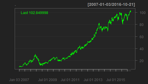
The quantmod package plays nicely with xts formatted objects. We can plot using the quantmod::chartSeries() function. Because of stock splits, I changed to use the adjusted prices with the Ad() function. For workflow purposes, I use the pipe (%>%) to get the adjusted prices first, and then send the adjusted prices to the chart function. I do this because it is easier to read and it makes complex actions simple to understand. You can also use chartSeries(Ad(MA)), but this is more difficult to understand.
MA %>%
    Ad() %>%
    chartSeries()
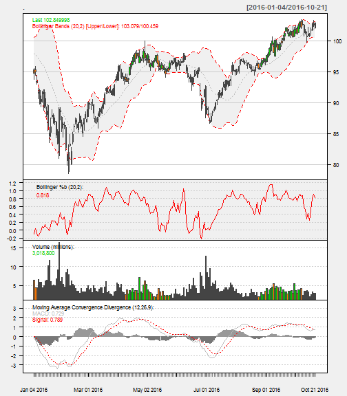
The chartSeries() function has a number of options help visualize the stock performance. A few that I’ve added are:
subset: Isolated the year to 2015. This takes dates and ranges in xts subset format. Here’s some tricks from StackOverflow.TA: Added Bollinger Bands, Volume, and Moving Average Convergence Divergence (MACD) plots. These can also be added after the fact with add___() functions (e.g addMACD()).theme: Changed to a white theme.
MA %>%
    chartSeries(TA='addBBands();
                    addBBands(draw="p");
                    addVo();
                    addMACD()',
                subset='2016',
                theme="white"
                )
The quantmod package includes functions to get daily, weekly, monthly, quarterly, and annual returns. We’ll use dailyReturn() to get a xts object of daily returns (see ?periodReturn, which is the base function). The default is an arithmetic return. Specify type = "log" if a logarithmic return is needed. We’ll be dealing with log returns for structural reasons.
MA %>%
    Ad() %>%
    dailyReturn(type = 'log') %>%
    head()
##            daily.returns
## 2007-01-03  0.0000000000
## 2007-01-04  0.0478957956
## 2007-01-05 -0.0007913742
## 2007-01-08  0.0001978765
## 2007-01-09  0.0450710700
## 2007-01-10 -0.0086507008
Although we just skim the surface of quantmod in this post, the package has a lot to offer for stock analysis (visit www.quantmod.com for more information). We’ll primarily use it to retrieve stock prices (getSymbols()) and calculate log returns (periodReturn(period = 'daily')). Just keep in mind you can do a lot more with it.
Simulating Stock Prices
The approach I use is similar to rfortraders.com’s Lecture 6 - Stochastic Processes and Monte Carlo. The fundamental idea is that stock returns, measured daily, weekly, monthly, …, are approximately normally distributed and uncorrelated. As a result, we can theoretically model the behavior of stock prices within a confidence interval based on the stock’s prior returns.
Returns are Normally Distributed
Applying the log-transformation, we can visually see that the daily returns are approximately normally distributed:
MA_log_returns <- MA %>%
    Ad() %>%
    dailyReturn(type = "log")
names(MA_log_returns) <- "MA.Log.Returns"
# Plot the log-returns
MA_log_returns %>%
    ggplot(aes(x = MA.Log.Returns)) +
    geom_histogram(bins = 100) +
    geom_density() +
    geom_rug(alpha = 0.5)
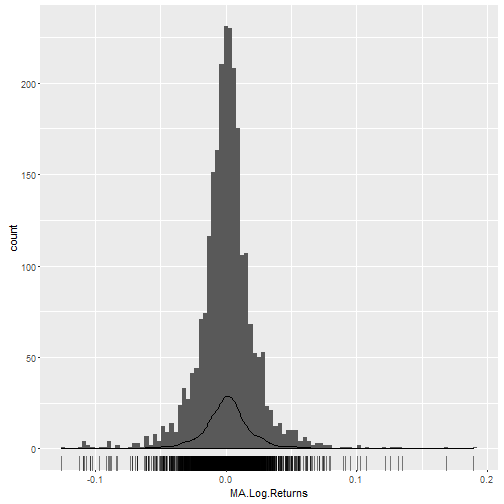
We can examine the distribution of log returns by applying the quantile() function.
probs <- c(.005, .025, .25, .5, .75, .975, .995)
dist_log_returns <- MA_log_returns %>%
    quantile(probs = probs, na.rm = TRUE)
dist_log_returns
##          0.5%          2.5%           25%           50%           75%
## -0.0889592270 -0.0447154561 -0.0090748829  0.0009946221  0.0103051583
##         97.5%         99.5%
##  0.0474521137  0.0796786908
The median daily log return is 0.001 and the 95% confidence interval is between -0.0447 and 0.0475.
The mean and standard deviation of the daily log returns are:
mean_log_returns <- mean(MA_log_returns, na.rm = TRUE)
sd_log_returns <- sd(MA_log_returns, na.rm = TRUE)
## Summary of log-returns:
##  Mean:   0.001
##  StDev:  0.0225
Finally, to get the actual returns, we need to re-transform the log returns. Pipe the mean of the log returns (mean_log_returns) to exp():
mean_log_returns %>% exp()
## [1] 1.000976
On average, the mean daily return is 0.0976% more than the previous day’s price. Doesn’t sound like much, but it compounds daily at an exponential rate.
Random Walk
Since we have a mean and a standard deviation, we can simulate using a process called a random walk. We’ll simulate prices for 1000 trading days. Keep in mind that every year has approximately 252 trading days, so this simulation spans just under four years.
The script below does the following: we start by specifying the number of random walks (N), the mean (mu), and the standard deviation (sigma). The script then simulates prices by progressively calculating a new price using a random return from the normal distribution characterized by mu and sigma, and multiplying it to the previous day’s price. We then visualize the simulation.
# Parameters
N     <- 1000
mu    <- mean_log_returns
sigma <- sd_log_returns
day <- 1:N
price_init <- MA$MA.Adjusted[[nrow(MA$MA.Adjusted)]]
# Simulate prices
set.seed(386)
price  <- c(price_init, rep(NA, N-1))
for(i in 2:N) {
    price[i] <- price[i-1] * exp(rnorm(1, mu, sigma))
}
price_sim <- cbind(day, price) %>%
    as_tibble()
# Visualize price simulation
price_sim %>%
    ggplot(aes(day, price)) +
    geom_line() +
    ggtitle(str_c("MA: Simulated Prices for ", N," Trading Days"))
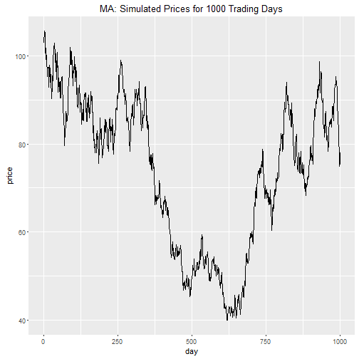
Bummer! It looks like we are going to lose money with this investment. Can we trust this simulation?
No. The single random walk is just one of the many probabilistic outcomes. We need to simulate many iterations to build confidence intervals.
Monte Carlo Simulation
Monte-Carlo simulation does just that: we repeatedly perform the random walk simulation process hundreds or thousands of times. We’ll perform 250 Monte Carlo simulations (M = 250) for one year of trading days simulations (N = 252).
# Parameters
N     <- 252 # Number of Stock Price Simulations
M     <- 250  # Number of Monte Carlo Simulations
mu    <- mean_log_returns
sigma <- sd_log_returns
day <- 1:N
price_init <- MA$MA.Adjusted[[nrow(MA$MA.Adjusted)]]
# Simulate prices
set.seed(123)
monte_carlo_mat <- matrix(nrow = N, ncol = M)
for (j in 1:M) {
    monte_carlo_mat[[1, j]] <- price_init
    for(i in 2:N) {
        monte_carlo_mat[[i, j]] <- monte_carlo_mat[[i - 1, j]] * exp(rnorm(1, mu, sigma))
    }
}
# Format and organize data frame
price_sim <- cbind(day, monte_carlo_mat) %>%
    as_tibble()
nm <- str_c("Sim.", seq(1, M))
nm <- c("Day", nm)
names(price_sim) <- nm
price_sim <- price_sim %>%
    gather(key = "Simulation", value = "Stock.Price", -(Day))
# Visualize simulation
price_sim %>%
    ggplot(aes(x = Day, y = Stock.Price, Group = Simulation)) +
    geom_line(alpha = 0.1) +
    ggtitle(str_c("MA: ", M,
                  " Monte Carlo Simulations for Prices Over ", N,
                  " Trading Days"))
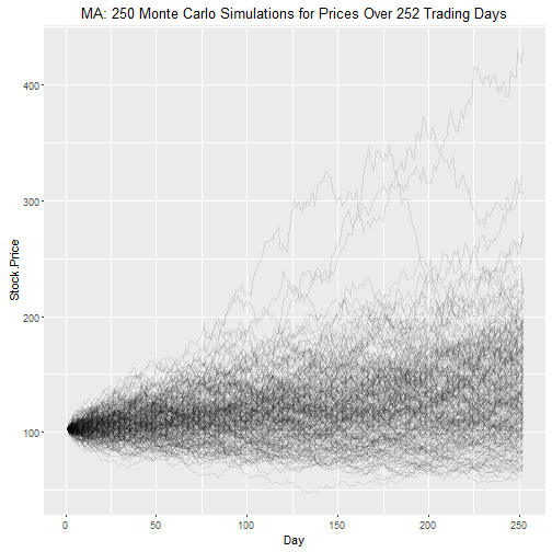
We can get confidence intervals for the stock price at the end of the simulation using the quantile() function.
end_stock_prices <- price_sim %>%
    filter(Day == max(Day))
probs <- c(.005, .025, .25, .5, .75, .975, .995)
dist_end_stock_prices <- quantile(end_stock_prices$Stock.Price, probs = probs)
dist_end_stock_prices %>% round(2)
##   0.5%   2.5%    25%    50%    75%  97.5%  99.5%
##  64.34  69.37 104.48 129.99 164.39 227.69 318.03
The 95% confidence interval is between $69.37 and $227.69, with a median (“most likely”) estimated price of $129.99.
Is this realistic? It looks close considering the simulated growth rate is very close to the historical compound annual growth rate (CAGR):
# Inputs
N_hist          <- nrow(MA) / 252
p_start_hist    <- MA$MA.Adjusted[[1]]
p_end_hist      <- MA$MA.Adjusted[[nrow(MA)]]
N_sim           <- N / 252
p_start_sim     <- p_end_hist
p_end_sim       <- dist_end_stock_prices[[4]]
# CAGR calculations
CAGR_historical <- (p_end_hist / p_start_hist) ^ (1 / N_hist) - 1
CAGR_sim        <- (p_end_sim / p_start_sim) ^ (1 / N_sim) - 1
## Summary of CAGRs:
##  CAGR Historical: 27.9%
##  CAGR Simulation: 26.4%
Understanding Drivers of the Simulation
Most importantly, the simulation gives us a baseline to compare stocks using the key drivers. The drivers of the simulation are the mean and the standard deviation of the log returns: The mean characterizes the average growth or return while the standard deviation characterizes the volatility or risk.
We now know how to analyze an individual stock using log returns, but wouldn’t it be better if we could apply this analysis to many stocks so we can review and screen them based on risk versus reward? Uh… yes! This is easy to do. Let’s get going!
Stock Analysis: Expanded to All S&P500 Stocks
We’ll expand to a full blown S&P500 Analysis following the modeling process workflow from R For Data Science, Chapter 25: Many Models. Once we have a modeling process down for an individual stock, we can map it to many stocks using a modeling workflow. Our workflow involves four steps:
- Get the list of S&P500 stocks.
- Create functions that retrieve needed data from a single stock. We’ll need to get stock prices, and compute log-returns.
- Utilize
purrr to map() the functions across all stocks.
- Visualize the results.
Web Scraping: Get the List of S&P500 Stocks
We’ll use the rvest package to collect S&P500 stocks from Wikipedia. We use read_html() to collect the HTML from Wikipedia. Then, we parse the HTML to a data frame using html_node() and html_table(). At the end, I return the data as a tibble, and cleanup the column names.
library(rvest)
# Web-scrape SP500 stock list
sp_500 <- read_html("https://en.wikipedia.org/wiki/List_of_S%26P_500_companies") %>%
    html_node("table.wikitable") %>%
    html_table() %>%
    select(`Ticker symbol`, Security, `GICS Sector`, `GICS Sub Industry`) %>%
    as_tibble()
# Format names
names(sp_500) <- sp_500 %>%
    names() %>%
    str_to_lower() %>%
    make.names()
# Show results
sp_500
## # A tibble: 505 × 4
##    ticker.symbol            security            gics.sector
##            <chr>               <chr>                  <chr>
## 1            MMM          3M Company            Industrials
## 2            ABT Abbott Laboratories            Health Care
## 3           ABBV              AbbVie            Health Care
## 4            ACN       Accenture plc Information Technology
## 5           ATVI Activision Blizzard Information Technology
## 6            AYI   Acuity Brands Inc            Industrials
## 7           ADBE   Adobe Systems Inc Information Technology
## 8            AAP  Advance Auto Parts Consumer Discretionary
## 9            AES            AES Corp              Utilities
## 10           AET           Aetna Inc            Health Care
## # ... with 495 more rows, and 1 more variables:
## #   gics.sub.industry <chr>
The sp_500 data frame has four columns:
ticker.symbol: The stock tickersecurity: The company namegics.sector: The primary sector according to the GICSgics.sub.industry: The industry sub sector according to the GICS
It’s a good idea to inspect the categorical data before we start the analysis. The lapply() function below loops through each column of the data set counting the length of the unique items. The result is a count of distinct values for each column.
sp_500 %>%
    lapply(function(x) x %>% unique() %>% length()) %>%
    unlist() # show in condensed format
##     ticker.symbol          security       gics.sector
##               505               504                10
## gics.sub.industry
##               127
We have a minor problem:
Notice that we have 505 ticker symbols but only 504 securities. There must be a duplicate entry in securities. Let’s inspect any securities that are duplicated. We’ll use the dplyr functions group_by(), summarize(), and filter() to find any security that appears more than once.
sp_500 %>%
    group_by(security) %>%
    summarize(count = n()) %>%
    filter(count > 1)
## # A tibble: 1 × 2
##       security count
##          <chr> <int>
## 1 Under Armour     2
The culprit is Under Armour. Let’s check out why.
sp_500 %>%
    filter(security == "Under Armour")
## # A tibble: 2 × 4
##   ticker.symbol     security            gics.sector
##           <chr>        <chr>                  <chr>
## 1            UA Under Armour Consumer Discretionary
## 2          UA.C Under Armour Consumer Discretionary
## # ... with 1 more variables: gics.sub.industry <chr>
Under Armour has two ticker symbols: UA and UA.C. We’ll remove the UA.C from the data set.
sp_500 <- sp_500 %>%
    filter(ticker.symbol != "UA.C")
Back to inspecting the S&P500 data:
We know from the lapply() function that there are 504 securities that are in 126 sub industries and in 10 sectors. However, we might want to understand the distribution of securities by sector. I again use group_by() and summarise() to get counts. In the visualization, I use forcats::fct_reorder() to organize the gics.sector by greatest frequency (count). The forcats package makes organizing factor categories a breeze in R, which previously was a huge pain! Check out R for Data Science, Chapter 15: Factors for help working with factors.
sp_500 %>%
    # Summarise data by frequency
    group_by(gics.sector) %>%
    summarise(count = n()) %>%
    # Visualize
    ggplot(aes(x = gics.sector %>% fct_reorder(count),
               y = count
               )) +
    geom_bar(stat = "identity") +
    geom_text(aes(label = count), size = 3, nudge_y = 4, nudge_x = .1) +
    scale_y_continuous(limits = c(0,100)) +
    ggtitle(label = "Sector Frequency Among SP500 Stocks") +
    xlab(label = "GICS Sector") +
    theme(plot.title = element_text(size = 16)) +
    coord_flip()
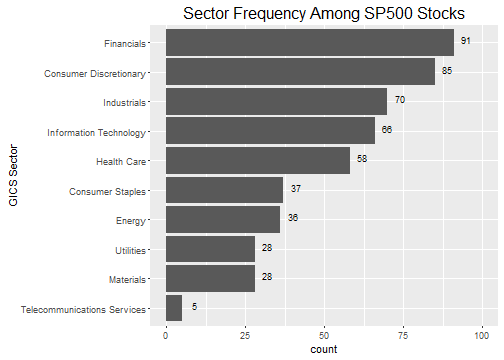
Separating the distribution of securities into industry sectors shows us our options if we were to select stocks using a diversification strategy. While diversification and portfolio optimization is outside the scope of this tutorial, it’s worth mentioning that a risk mitigation technique is to select a basket (or portfolio) of stocks that have low return correlation. Typically, selecting from different industries and sectors helps to reduce this correlation and diversify the portfolio. While I don’t go into portfolio optimization, as a bonus I’ll show how it’s possible to visualize the correlations of the best performing stocks.
Creating Functions to Map
Technical Details Ahead:
We are going to dive into some structural aspects of xts and tibble objects. Feel free to skip the details and copy the functions in this section. You will still be able to follow along.
We have a tidy data frame (tibble) of S&P500 securities stored in the variable sp_500. We want to perform some functions on the data frame such as:
- Getting the stock prices for each security using
getSymbols().
- Getting the log returns of the stock prices
periodReturn().
We need to come through an issue between xts and tibble objects before we jump into mapping the functions. We are going to create nested data frames, which basically means that the data is stored as a list in the cells of sp_500 (Don’t worry if this doesn’t make sense yet). A structural issue occurs with nesting xts objects within tibble data frames. The xts objects won’t unnest. To get around this structural issue, we need to convert these objects to tibble format.
Get Stock Prices Function
First, let’s create a function to return the stock prices. get_stock_prices() is a wrapper for quantmod::getSymbols() that takes a ticker, a return format, and any other getSymbols() arguments and returns the prices in either xts or tibble format. In this post, we’ll use the tibble format for unnesting. We set auto.assign = FALSE to return the object to the variable rather than automatically creating the variable in the Global Environment.
get_stock_prices <- function(ticker, return_format = "tibble", ...) {
    # Get stock prices
    stock_prices_xts <- getSymbols(Symbols = ticker, auto.assign = FALSE, ...)
    # Rename
    names(stock_prices_xts) <- c("Open", "High", "Low", "Close", "Volume", "Adjusted")
    # Return in xts format if tibble is not specified
    if (return_format == "tibble") {
        stock_prices <- stock_prices_xts %>%
            as_tibble() %>%
            rownames_to_column(var = "Date") %>%
            mutate(Date = ymd(Date))
    } else {
        stock_prices <- stock_prices_xts
    }
    stock_prices
}
Let’s see what happens when we try get_stock_prices() on MasterCard using ticker, “MA”.
"MA" %>%
    get_stock_prices(return_format = 'tibble')
## # A tibble: 2,475 × 7
##          Date   Open   High    Low  Close   Volume  Adjusted
##        <date>  <dbl>  <dbl>  <dbl>  <dbl>    <dbl>     <dbl>
## 1  2007-01-03  99.55  99.68  95.63  96.41 26289000  9.241188
## 2  2007-01-04  96.90 101.85  95.30 101.14 27024000  9.694573
## 3  2007-01-05 100.99 102.20  99.00 101.06 29632000  9.686904
## 4  2007-01-08  99.01 102.25  99.00 101.08 16006000  9.688821
## 5  2007-01-09 101.10 105.75 100.60 105.74 36952000 10.135497
## 6  2007-01-10 105.62 106.50 103.00 104.74 35099000 10.048196
## 7  2007-01-11 105.20 108.03 103.54 105.50 37671000 10.121106
## 8  2007-01-12 105.75 107.25 104.85 105.25 18233000 10.097122
## 9  2007-01-16 105.30 107.47 104.63 106.00 18028000 10.169074
## 10 2007-01-17 107.00 110.22 105.77 109.04 45903000 10.460715
## # ... with 2,465 more rows
A few key actions that happened:
-
Instead of creating an object MA in the Global Environment, an object was created as a local variable that we immediately output to the screen. This is important when using map(), which needs to return a local object rather than auto assign an object in the Global Environment.
-
The object returned has a consistent column name structure. This is needed if we plan to unnest() the object. More on this later.
-
We specified return_format = "tibble", which can be nested (tidyr::nest()) and unnested (tidyr::unnest()).
Get Log Returns Function
Next, we need a function to get log returns. get_log_returns() is a wrapper for quantmod::periodReturns() that takes a stock prices in xts or tibble format, a return format, and any other periodReturns() arguments and returns the log returns in either xts or tibble format.
get_log_returns <- function(x, return_format = "tibble", period = 'daily', ...) {
    # Convert tibble to xts
    if (!is.xts(x)) {
        x <- xts(x[,-1], order.by = x$Date)
    }
    # Get log returns
    log_returns_xts <- periodReturn(x = x$Adjusted, type = 'log', period = period, ...)
    # Rename
    names(log_returns_xts) <- "Log.Returns"
    # Return in xts format if tibble is not specified
    if (return_format == "tibble") {
        log_returns <- log_returns_xts %>%
            as_tibble() %>%
            rownames_to_column(var = "Date") %>%
            mutate(Date = ymd(Date))
    } else {
        log_returns <- log_returns_xts
    }
    log_returns
}
We’ll test the function to see what it returns:
"MA" %>%
    get_stock_prices(return_format = "tibble") %>%
    get_log_returns(return_format = "tibble")
## # A tibble: 2,475 × 2
##          Date   Log.Returns
##        <date>         <dbl>
## 1  2007-01-03  0.0000000000
## 2  2007-01-04  0.0478957956
## 3  2007-01-05 -0.0007913742
## 4  2007-01-08  0.0001978765
## 5  2007-01-09  0.0450710700
## 6  2007-01-10 -0.0086507008
## 7  2007-01-11  0.0072298305
## 8  2007-01-12 -0.0023725137
## 9  2007-01-16  0.0071007211
## 10 2007-01-17  0.0282756581
## # ... with 2,465 more rows
Same as before, the return format is a tibble, which is exactly what we need for mapping into nested data frames next.
Mapping the Functions
Now the fun part! We are going to use purrr::map() to build a nested data frame. If you’re not familiar with nested data frames, check out tidyr::nest() and R For Data Science, Chapter 25: Many Models. Data frames can store lists in columns, which means we can store data frames in the cells of data frames (aka nesting). The map() function allows us to map functions to the nested list-columns. The result is the ability to extend complex calculations to loop through entire data frames.
It’s OK if the script below doesn’t make sense. We’ll get a feel for what happened by exploring the results.
Warning: The following script stores the stock prices and log returns for the entire list of 504 stocks in the S&P500. It takes my laptop a minute or two to run the script.
sp_500 <- sp_500 %>%
    mutate(
        stock.prices = map(ticker.symbol,
                              function(.x) get_stock_prices(.x,
                                                            return_format = "tibble",
                                                            from = "2007-01-01",
                                                            to = "2016-10-23")
                           ),
        log.returns  = map(stock.prices,
                              function(.x) get_log_returns(.x, return_format = "tibble")),
        mean.log.returns = map_dbl(log.returns, ~ mean(.$Log.Returns)),
        sd.log.returns   = map_dbl(log.returns, ~ sd(.$Log.Returns)),
        n.trade.days = map_dbl(stock.prices, nrow)
        )
Let’s take a look at sp_500. Notice that the stock.prices and log.returns columns include tibbles within the data frame.
sp_500 %>%
    select(ticker.symbol, stock.prices:log.returns)
## # A tibble: 504 × 3
##    ticker.symbol         stock.prices          log.returns
##            <chr>               <list>               <list>
## 1            MMM <tibble [2,470 × 7]> <tibble [2,470 × 2]>
## 2            ABT <tibble [2,470 × 7]> <tibble [2,470 × 2]>
## 3           ABBV   <tibble [960 × 7]>   <tibble [960 × 2]>
## 4            ACN <tibble [2,470 × 7]> <tibble [2,470 × 2]>
## 5           ATVI <tibble [2,470 × 7]> <tibble [2,470 × 2]>
## 6            AYI <tibble [2,470 × 7]> <tibble [2,470 × 2]>
## 7           ADBE <tibble [2,470 × 7]> <tibble [2,470 × 2]>
## 8            AAP <tibble [2,470 × 7]> <tibble [2,470 × 2]>
## 9            AES <tibble [2,470 × 7]> <tibble [2,470 × 2]>
## 10           AET <tibble [2,470 × 7]> <tibble [2,470 × 2]>
## # ... with 494 more rows
Let’s peek into one of the nested tibbles:
sp_500$stock.prices[[1]]
## # A tibble: 2,470 × 7
##          Date  Open  High   Low Close  Volume Adjusted
##        <date> <dbl> <dbl> <dbl> <dbl>   <dbl>    <dbl>
## 1  2007-01-03 77.53 78.85 77.38 78.26 3781500 60.69732
## 2  2007-01-04 78.40 78.41 77.45 77.95 2968400 60.45688
## 3  2007-01-05 77.89 77.90 77.01 77.42 2765200 60.04582
## 4  2007-01-08 77.42 78.04 76.97 77.59 2434500 60.17767
## 5  2007-01-09 78.00 78.23 77.44 77.68 1896800 60.24748
## 6  2007-01-10 77.31 77.96 77.04 77.85 1787500 60.37932
## 7  2007-01-11 78.05 79.03 77.88 78.65 2372500 60.99979
## 8  2007-01-12 78.41 79.50 78.22 79.36 2582200 61.55046
## 9  2007-01-16 79.48 79.62 78.92 79.56 2526600 61.70557
## 10 2007-01-17 79.33 79.51 78.75 78.91 2711300 61.20145
## # ... with 2,460 more rows
It’s the stock prices for the first stock, 3M: all 2470 observations.
Key point on nested tibbles: The sub-data (e.g. stock prices, log returns) are all stored as data frames within the upper-level data frame (e.g. sp_500)! This means we can sort, filter, and perform calculations on all the sub-data at once with the nested tibbles, and the sub-data for each observation goes along for the ride.
The final output included mean.log.returns, sd.log.returns, and n.trade.days, which were mapped using the map_dbl() function. The map() function always returns a list, but sometimes we want a value. For scalars we can return the value using map_dbl(), map_chr(), …, depending on the return type. Let’s check out the final output.
sp_500 %>%
    select(ticker.symbol, mean.log.returns:n.trade.days)
## # A tibble: 504 × 4
##    ticker.symbol mean.log.returns sd.log.returns n.trade.days
##            <chr>            <dbl>          <dbl>        <dbl>
## 1            MMM     0.0004157706     0.01418006         2470
## 2            ABT     0.0003293410     0.01315323         2470
## 3           ABBV     0.0007218520     0.01705085          960
## 4            ACN     0.0005478048     0.01671923         2470
## 5           ATVI     0.0007007232     0.02226592         2470
## 6            AYI     0.0007297013     0.02378624         2470
## 7           ADBE     0.0004067796     0.02146303         2470
## 8            AAP     0.0005754097     0.02013329         2470
## 9            AES    -0.0002055609     0.02511122         2470
## 10           AET     0.0004174913     0.02216750         2470
## # ... with 494 more rows
To recap:
Essentially, we collected the stock prices for every S&P500 stock ticker using get_stock_prices(), then passed each set of stock prices to get_log_returns(), then sent the log returns for each stock to the mean() and sd() functions to return the values we want to compare on. Pretty cool. ;)
You may also see that I added a variable, n.trade.days, for the number of trade days (observations) for the stock. We want stocks with a large number of observations because this gives us more samples (and a longer time span) to trend the stock, thus increasing our confidence in the statistics. This will come in handy when we perform our visualization next.
Visualizing the Results with Plotly
Back to the main purpose: we want to compare all of the S&P500 stocks based on risk versus reward. As stated before, we consider:
- Rewarding stocks have a higher mean of the log returns (measure of growth).
- Riskier stocks have a higher standard deviation of the log returns (measure of volatility).
What we need is a way to visualize a scatter plot of all of the stocks, showing the stock name and it’s related information in one concise plot. The plotly library is perfect for this task. Using hover fields and color/size characteristics we can quickly get the essence of the data to screen the stocks.
The script below uses plot_ly() to create a scatter plot showing the standard deviation of log-returns (x-axis), the mean log-returns (y-axis), and the number of trade days collected (size and color aesthetics). Using the text argument, we can add information to the plot upon hover. Data exploration can be performed using the hover, zoom, and pan fetures. Try it out and develop your intuition about which stocks are the best investments.
library(plotly)
plot_ly(data = sp_500,
type = "scatter",
mode = "markers",
x = ~ sd.log.returns,
y = ~ mean.log.returns,
color = ~ n.trade.days,
colors = "Blues",
size = ~ n.trade.days,
text = ~ str_c("<em>", security, "</em><br>",
"Ticker: ", ticker.symbol, "<br>",
"Sector: ", gics.sector, "<br>",
"Sub Sector: ", gics.sub.industry, "<br>",
"No. of Trading Days: ", n.trade.days),
marker = list(opacity = 0.8,
symbol = 'circle',
sizemode = 'diameter',
sizeref = 4.0,
line = list(width = 2, color = '#FFFFFF'))
) %>%
layout(title = 'S&P500 Analysis: Stock Risk vs Reward',
xaxis = list(title = 'Risk/Variability (StDev Log Returns)',
gridcolor = 'rgb(255, 255, 255)',
zerolinewidth = 1,
ticklen = 5,
gridwidth = 2),
yaxis = list(title = 'Reward/Growth (Mean Log Returns)',
gridcolor = 'rgb(255, 255, 255)',
zerolinewidth = 1,
ticklen = 5,
gridwith = 2),
margin = list(l = 100,
t = 100,
b = 100),
font = list(color = '#FFFFFF'),
paper_bgcolor = 'rgb(0, 0, 0)',
plot_bgcolor = 'rgb(0, 0, 0)')
From the plot we can see that a number of stocks have a unique combination of high mean and low standard deviation log returns. We can isolate them:
sp_500 %>%
    filter(mean.log.returns >= 0.001,
           sd.log.returns < 0.0315) %>%
    select(ticker.symbol, mean.log.returns:n.trade.days) %>%
    arrange(mean.log.returns %>% desc())
## # A tibble: 11 × 4
##    ticker.symbol mean.log.returns sd.log.returns n.trade.days
##            <chr>            <dbl>          <dbl>        <dbl>
## 1           PCLN      0.001420135     0.02626861         2470
## 2           AVGO      0.001354038     0.02232179         1817
## 3           AMZN      0.001235722     0.02579854         2470
## 4            TDG      0.001201685     0.01963460         2470
## 5           REGN      0.001178006     0.03149429         2470
## 6           FBHS      0.001161151     0.01868111         1284
## 7           CHTR      0.001159458     0.01706527         1713
## 8             FB      0.001111849     0.02512988         1115
## 9            HPE      0.001094975     0.02468773          256
## 10           LYB      0.001018250     0.02220123         1635
## 11          ALXN      0.001000784     0.02348722         2470
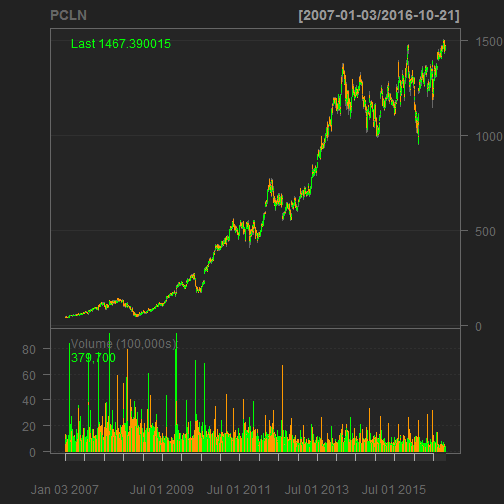
Upon inspection PCLN sports a unique combination of low volatility, high average returns, and a lot of samples. Here’s the quantmod chart:
"PCLN" %>%
    getSymbols(auto.assign = FALSE,
               from = "2007-01-01",
               to   = "2016-10-23") %>%
    chartSeries(name = "PCLN")
Questions About the Analysis
-
What can you say about the relationship between the standard deviation and mean of the log returns? Does there appear to be one? As volatility (standard deviation of returns) increases, what tends to happen to growth (mean increase of returns)?
-
The stock with the ninth highest mean is HPE. Would you use it in as an investment? Why or why not?
-
How can the investment analysis be improved to form a well-rounded strategy? (Hints: What about qualitative analysis in addition to quantitative analysis? What about dividends? What about back testing for performance?)
Bonus: Computing Correlations
Selecting a portfolio of stocks can be challenging because on the one hand you want to select those with the best performance, but on the other hand you want to diversify your investment so you don’t have all your eggs in one basket. The quantitative analysis done previously presented a method to screen stocks with high potential. To balance this, a correlation assessment can be performed to visualize which high potential stocks are least correlated.
Let’s first cut the list down to the top 30 stocks with more than four years of samples (approx 1000 trading days). We’ll add a rank column using the min_rank() function on mean.log.returns, and filter the data on the top 30 ranked means.
limit <- 30
sp_500_hp <- sp_500 %>%
    filter(n.trade.days > 1000) %>%
    filter(sd.log.returns < 0.0315) %>%
    mutate(rank = mean.log.returns %>% desc() %>% min_rank()) %>%
    filter(rank <= limit) %>%
    arrange(rank) %>%
    select(ticker.symbol, rank, mean.log.returns, sd.log.returns, log.returns)
sp_500_hp
## # A tibble: 30 × 5
##    ticker.symbol  rank mean.log.returns sd.log.returns
##            <chr> <int>            <dbl>          <dbl>
## 1           PCLN     1      0.001420135     0.02626861
## 2           AVGO     2      0.001354038     0.02232179
## 3           AMZN     3      0.001235722     0.02579854
## 4            TDG     4      0.001201685     0.01963460
## 5           REGN     5      0.001178006     0.03149429
## 6           FBHS     6      0.001161151     0.01868111
## 7           CHTR     7      0.001159458     0.01706527
## 8             FB     8      0.001111849     0.02512988
## 9            LYB     9      0.001018250     0.02220123
## 10          ALXN    10      0.001000784     0.02348722
## # ... with 20 more rows, and 1 more variables: log.returns <list>
Next, we need to unnest() the tibble: unnest() effectively ungroups the nested tibbles within the top level of the tibble (You’ll see what I mean below). We only need to keep the ticker.symbol and the unnested log.returns data.
sp_500_hp_unnest <- sp_500_hp %>%
    select(ticker.symbol, log.returns) %>%
    unnest()
sp_500_hp_unnest
## # A tibble: 64,269 × 3
##    ticker.symbol       Date  Log.Returns
##            <chr>     <date>        <dbl>
## 1           PCLN 2007-01-03  0.000000000
## 2           PCLN 2007-01-04  0.010632336
## 3           PCLN 2007-01-05 -0.012909250
## 4           PCLN 2007-01-08 -0.002510580
## 5           PCLN 2007-01-09  0.006832252
## 6           PCLN 2007-01-10  0.017548234
## 7           PCLN 2007-01-11 -0.004246246
## 8           PCLN 2007-01-12 -0.003365163
## 9           PCLN 2007-01-16  0.001122942
## 10          PCLN 2007-01-17 -0.011740934
## # ... with 64,259 more rows
The unnested tibble now contains the daily log returns for the 30 stocks. Notice that there are now 64,269 rows.
The last data manipulation task is to get the unnested tibble into the format for correlation analysis. We need to tidyr::spread() the ticker.symbols to get them into the columns. Because not all the stocks have data for the full range of dates, we need to use na.omit() to remove rows with NA values.
sp_500_hp_spread <- sp_500_hp_unnest %>%
    spread(key = ticker.symbol, value = Log.Returns) %>%
    na.omit()
sp_500_hp_spread
## # A tibble: 1,115 × 31
##          Date          AAPL          AGN          ALK         ALXN
##        <date>         <dbl>        <dbl>        <dbl>        <dbl>
## 1  2012-05-18  0.0004903026 -0.013638497  0.004338335 -0.001067505
## 2  2012-05-21  0.0566261244  0.007836401  0.012903399  0.052028840
## 3  2012-05-22 -0.0077084148  0.007634718 -0.009507738  0.041704874
## 4  2012-05-23  0.0241068595 -0.004092886 -0.006802827 -0.021517962
## 5  2012-05-24 -0.0092263231  0.028579390  0.048745879  0.027551130
## 6  2012-05-25 -0.0053742562 -0.001237764  0.003539790 -0.007330779
## 7  2012-05-29  0.0175931559  0.014074141  0.004993452 -0.003794227
## 8  2012-05-30  0.0119851837 -0.016968087 -0.015055725 -0.004135813
## 9  2012-05-31 -0.0024893776 -0.016278593  0.020024244 -0.012290311
## 10 2012-06-01 -0.0294036247 -0.021838658 -0.014388670 -0.033342057
## # ... with 1,105 more rows, and 26 more variables: AMZN <dbl>,
## #   AVGO <dbl>, AZO <dbl>, CHTR <dbl>, CMG <dbl>, CRM <dbl>,
## #   DLPH <dbl>, DLTR <dbl>, EW <dbl>, FB <dbl>, FBHS <dbl>,
## #   HCA <dbl>, ILMN <dbl>, ISRG <dbl>, LYB <dbl>, MA <dbl>,
## #   MNST <dbl>, MPC <dbl>, ORLY <dbl>, PCLN <dbl>, PSX <dbl>,
## #   REGN <dbl>, ROST <dbl>, SWKS <dbl>, TDG <dbl>, V <dbl>
Finally, we are ready to get and visualize correlations. We’ll use the corrplot package for visualizing the correlations. We remove the Date column so only values remain. Then, we send to the cor() function, which calculates the correlations.
sp_500_hp_cor <- sp_500_hp_spread %>%
    select(-Date) %>%
    cor()
sp_500_hp_cor[1:6, 1:6] # show first 6 columns and rows
##           AAPL       AGN       ALK      ALXN      AMZN      AVGO
## AAPL 1.0000000 0.1917078 0.2510943 0.2555477 0.2392050 0.4152308
## AGN  0.1917078 1.0000000 0.2859995 0.4448646 0.2625150 0.3047820
## ALK  0.2510943 0.2859995 1.0000000 0.3382148 0.2858626 0.3398582
## ALXN 0.2555477 0.4448646 0.3382148 1.0000000 0.3561274 0.3453616
## AMZN 0.2392050 0.2625150 0.2858626 0.3561274 1.0000000 0.3101303
## AVGO 0.4152308 0.3047820 0.3398582 0.3453616 0.3101303 1.0000000
We send the correlations to corrplot() to visualize the correlations. I ordered using hclust, which groups the stocks by similarity. The addrect argument adds boxes around the highly correlated groups, and by inspecting the circle colors I settled on 11 boxes.
library(corrplot)
sp_500_hp_cor %>%
    corrplot(order   = "hclust",
             addrect = 11)

The key is to choose stocks that have low correlation. For example, you might select the combination of AMZN and FB because their returns have low correlations. However, you might select only one from APPL, AVGO and SWKS because the stocks are highly correlated. The high correlations make sense because Avago (Broadcom) and Skyworks are semiconductor manufacturers that supply Apple iPhones.
Download the .R File
The .R file file is available on GitHub. The .R file has everything needed to generate the plotly and corrplot visualizations. Depending on your PC processing power, it should take just a minute or two to run.
Conclusions
The quantitative analysis is a powerful tool. Thanks to purrr and other tidyverse packages the analysis can easily be extended to many stocks to compare and screen potential investments. However, before we jump into making investment decisions, we need to recognize the strengths and weaknesses of the analysis:
-
Computing quantitative statistics (mean and standard deviation) of stock returns should be a go-to resource for evaluating stocks. It provides useful performance metrics that quantitatively characterize risk and reward.
-
Correlation analysis identifies the extent to which assets are correlated. When building a portfolio, the general rule is to select assets with a balance of high performance (i.e. quantitative statistics) and low correlation.
-
The analysis discussed herein is purely quantitative, taking into account the historical performance only. Selecting investments on statistics alone is never a good idea. Evaluation of the fundamentals (e.g. asset valuation, EPS growth, future industry prospects, level of competition, industry diversification, etc) should be investigated as a compliment to the quantitative analysis to form a well-rounded investment strategy.
Recap
We covered a lot of ground in this post: starting from a basic quantitative stock analysis, and ending on a full fleged S&P500 stock screening workflow! If you’ve read and understood the full post, congratulations! This post required an understanding of quantitative stock analysis, R programming, and many powerful R packages including:
quantmod: Retrieving stock prices (getSymbols()) and returns (periodReturns()), and visualizing stock charts (chartSeries())xts (extensible timeseries) objects: A key structure in R for timeseries datarvest: Web scraping tools in Rtidyverse: A compilation of the following packages:
tibble: The data frame format for working with tidy datapurrr: For mapping functions (map()) to tibbles (tidy data frames), and scaling the modeling workflow to many modelstidyr: For manipulating tibble form using spread(), gather(), nest() and unnest()dplyr: For manipulating tibble variables (columns) using mutate(), group_by() + summarize(), select(), and filter()ggplot2: For static visualizations using the grammar of graphics
plotly: For interactive visualizationscorrplot: For visualizing correlation plots
Probably the most important concept is that you now should have a basic understanding of a modeling workflow: Developing the analysis for a single observation (e.g. a stock ticker), and then expanding it to many observations (e.g. the entire S&P500 list of stock tickers).
Again, great job for making it this far! Happy investing. :)
Further Reading
-
R Programming for Quantitative Finance: A resource for quantmod and xts packages that is good for those looking to get up to speed quickly.
-
R/Finance 2009 Workshop: Working with xts and quantmod: A second resource for quantmod and xts packages that is good for those looking to dive into the details.
-
rfortraders.com: A useful website covering the basics of quantitative financial strategy.
-
R For Data Science, Chapter 25: Many Models: Chapter 25 covers the workflow for modeling many models using tidyverse, purrr, and modelr packages. This a very powerful resource that helps you extend a single model to many models. The entire R for Data Science book is free and online.
-
Portfolio Visualizer: This is a free web application for building and modeling portfolios. The Portfolio Visualizer provides online portfolio analysis tools for backtesting, Monte Carlo simulation, tactical asset allocation and optimization, and investment analysis tools for exploring factor regressions, correlations and efficient frontiers.