Tableau in R for $0 (Introducing GWalkR)
Written by Matt Dancho
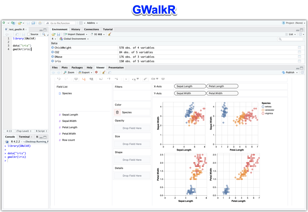
Hey guys, welcome back to my R-tips newsletter. Today I’m introducing GWalkR: An R package for Exploratory Data Analysis in 1 line of code. Just like Tableau. But Costs $0 (100% free). Let’s go!
Table of Contents
Here’s what you’re learning today:
- What is GWalkR? You’ll discover what
GWalkR is and how it makes Exploratory Data Analysis in R easier
- How I Replaced Tableau with GWalkR (A $0 Alternative): How I use GWalkR to replace Tableau
- How to use GWalkR inside of R to Make 4 Common Plots: I have prepared a full R code tutorial (get the code and data here).

Get the Code (In the R-Tip 083 Folder)
SPECIAL ANNOUNCEMENT: AI for Data Scientists Workshop on December 18th
Inside the workshop I’ll share how I built a SQL-Writing Business Intelligence Agent with Generative AI:
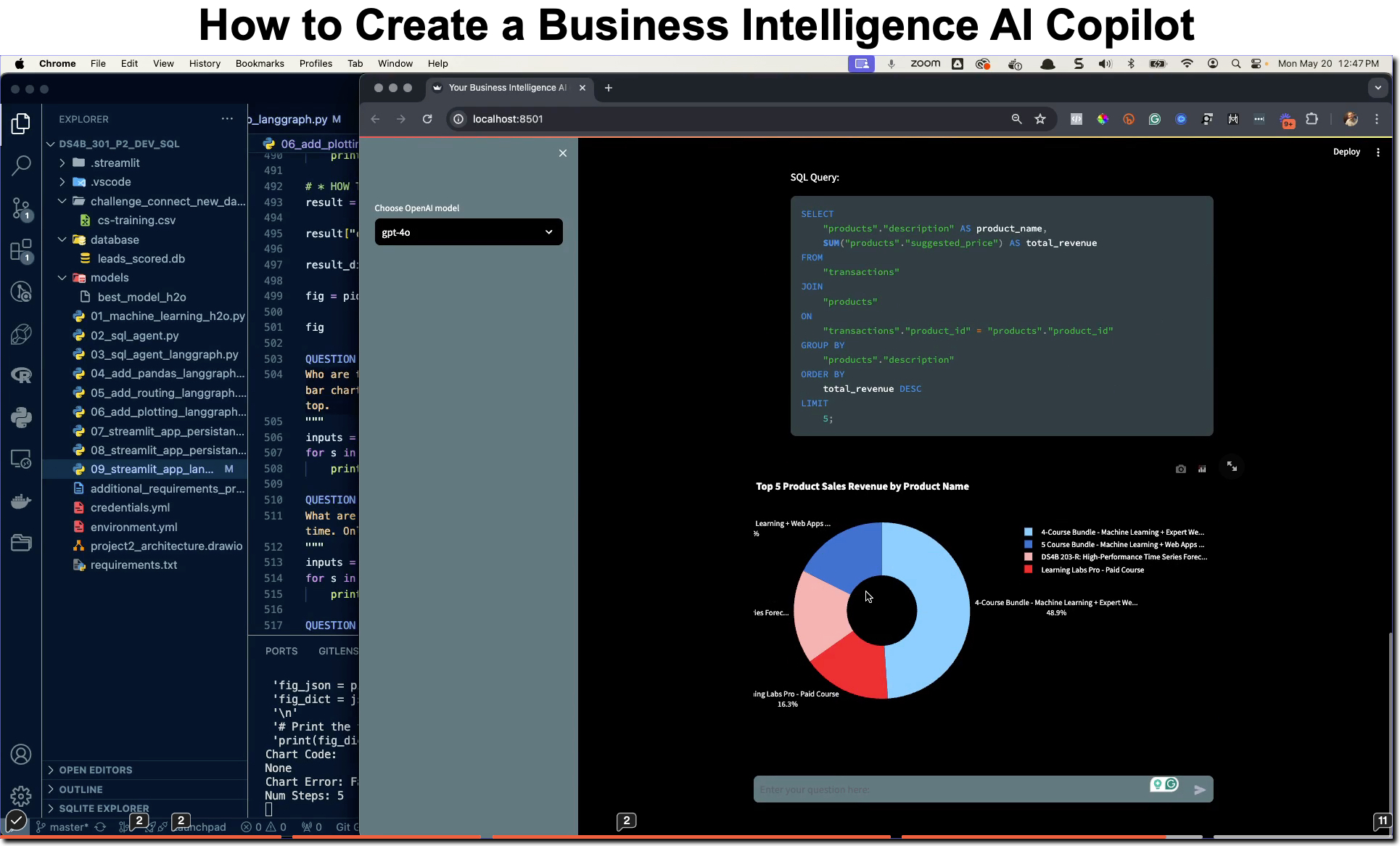
What: GenAI for Data Scientists
When: Wednesday December 18th, 2pm EST
How It Will Help You: Whether you are new to data science or are an expert, Generative AI is changing the game. There’s a ton of hype. But how can Generative AI actually help you become a better data scientist and help you stand out in your career? I’ll show you inside my free Generative AI for Data Scientists workshop.
Price: Does Free sound good?
How To Join: 👉 Register Here
R-Tips Weekly
This article is part of R-Tips Weekly, a weekly video tutorial that shows you step-by-step how to do common R coding tasks. Pretty cool, right?
Here are the links to get set up. 👇
This Tutorial is Available in Video (11-minutes)
I have an 11-minute video that walks you through setting up GWalkR in R and running your first exploratory data analysis with it. 👇
What is GWalkR?
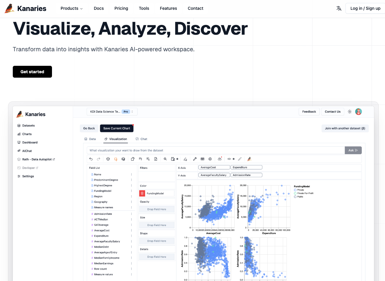
GWalkR is a Tableau alternative that is 100% freely available in R. It includes 95% of the drag-n-drop features for fast EDA that Tableau has. And you can use it right in R. Github: https://github.com/Kanaries/GWalkR
For Python users, the pygwalker library is the equivalent tool in Python. Github: https://github.com/Kanaries/pygwalker
Both GWalkR and pygwalker made by Kanaries, which offers a paid version that includes more features like cloud hosting, sharing, and AI.
How I Replaced Tableau with GWalkR (A $0 Alternative)
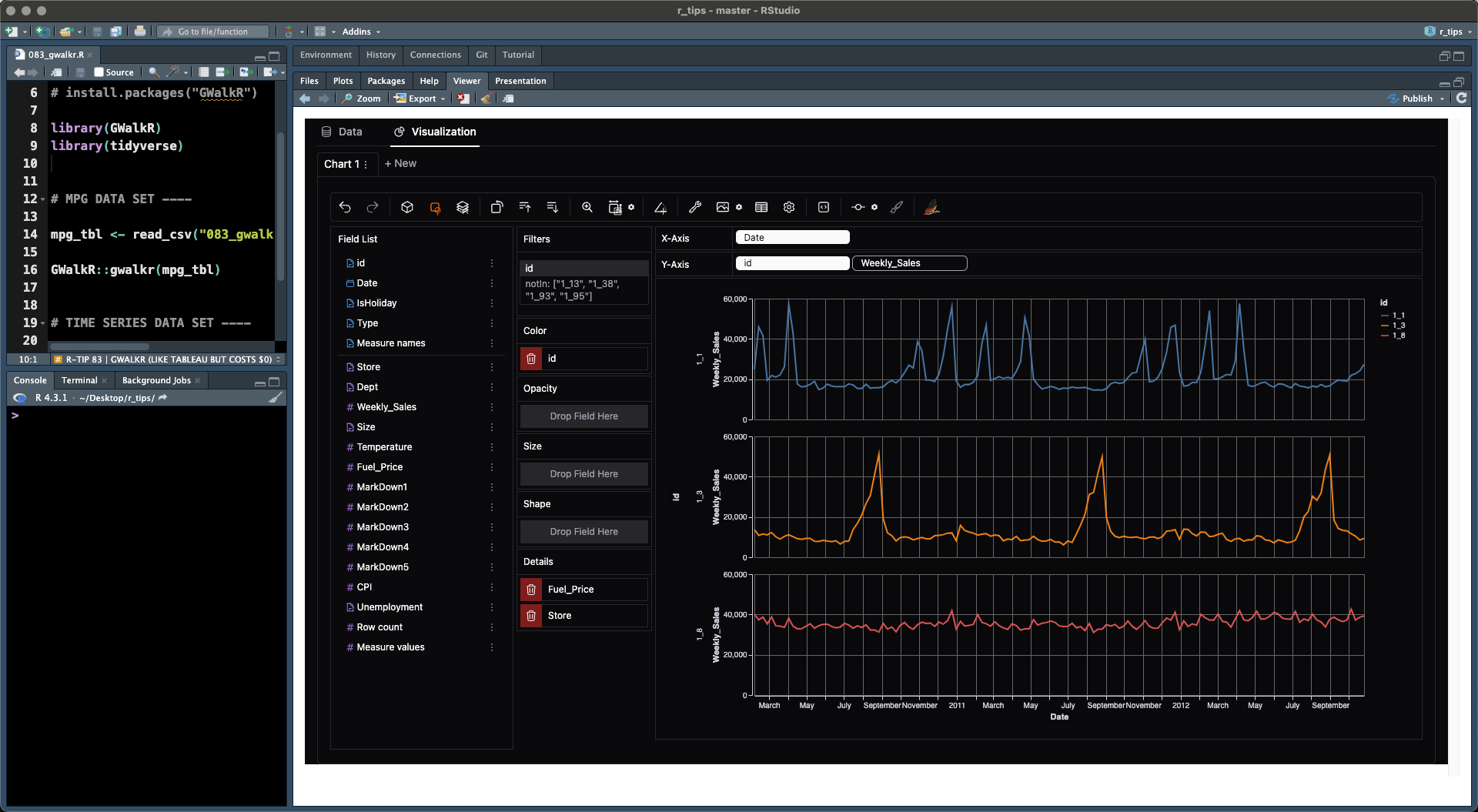
I can replace roughly 95% of Tableau with the free version of GWalkR.
What Am I Using The Free Version For?
- Quick Exploratory Analysis: This is what
GWalkR is great for
- Data Aggregations: See Aggregations below with Sum, Median, Means, Min/Max, etc
- Data Distributions: See the Data Explorer in the R Tutorial Next
- Time Series Analysis:
- Doing Box Plots
- Visualizing Common Transformations (Log)
What Can’t It Do For Free?
You’ll need to use the paid version if you want to:
- Saving Charts
- Sharing Charts and Analysis
- AI features like GPT Data Exploration and Chat Interface
- Team Collaboration
My Thoughts…
You’ll want to weigh your analytics needs. If you’re just doing analysis for yourself like I do 90% of the time. Then sharing isn’t a big deal. I’ll just make an RMarkdown with the final plots, analysis, and report when I need to share.
Tutorial: How to use GWalkR to Make 4 Common Data Visualizations
In this section, I’ll share how to make 4 common data visualiations (plots):
- Bar Plot
- Scatter Plot
- Box Plot
- Time Series Plot
It takes about 10 seconds to get GWalkR set up so you can start doing drag-n-drop exploratory data analysis (just like Tableau) inside of R. All the tutorial code and data sets shown are available in the R-Tips Newsletter folder for R-Tip 083.
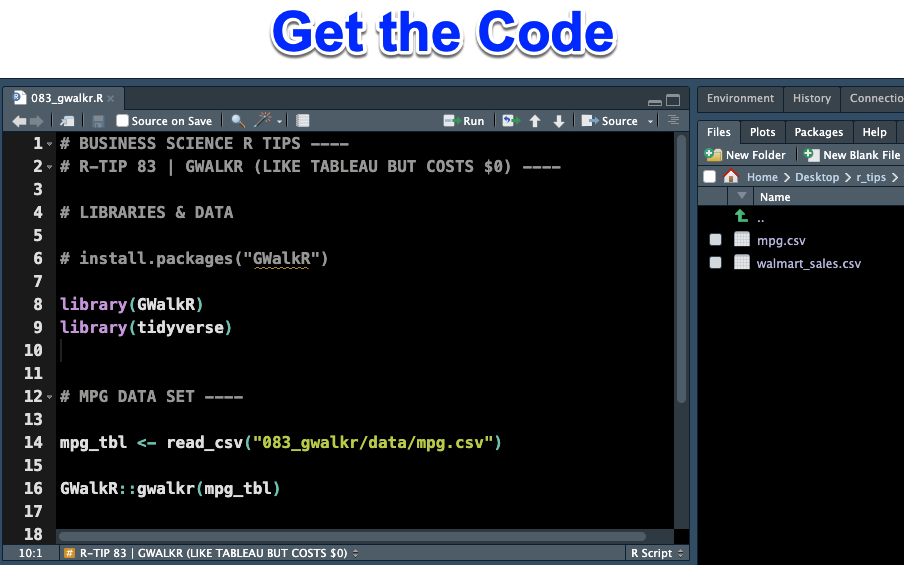
Get the Code and Datasets (In the R-Tip 083 Folder)
Step 1 - Install and Run GWalkR:
The first step is to set up GWalkR. Run this code to install GWalkR, load the key libraries, and read in the first data set (MPG Data) that will explore together.
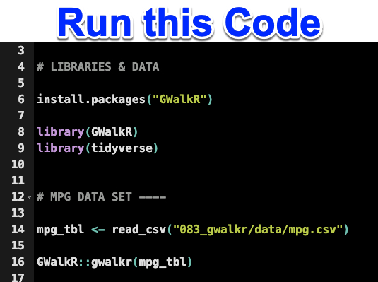
Get the Code (In the R-Tip 083 Folder)
This will produce the GWalkR in the Viewer Pane inside RStudio:
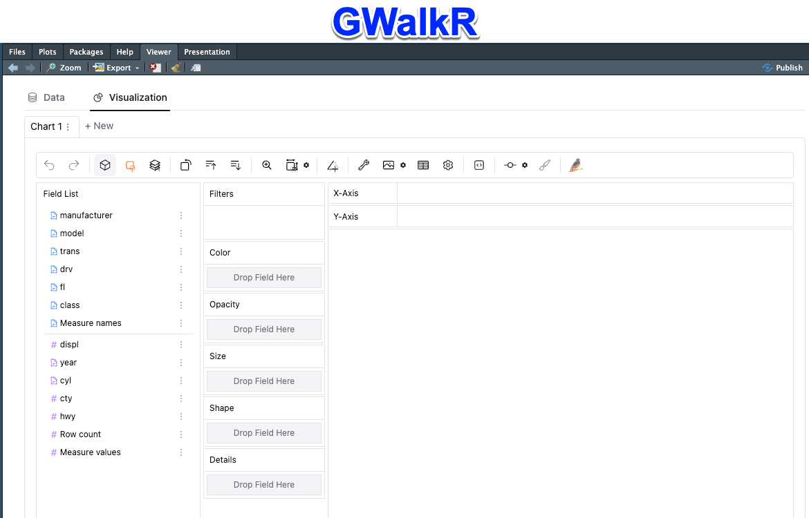
Get the Code (In the R-Tip 083 Folder)
Now you’re ready to explore and analyze the first data set.
Step 2 - Analyze the MPG Data Set
Let’s get our feet wet with some of the basic features of GWalkR. We’ll explore the “mpg” data set in the data folder of R-Tip 083.
Plot 1: Make a Bar Plot
A bar plot is the most basic plot that is an aggregation (sum, average, etc) applied to 1 numeric feature. The bars are formed by segmenting by 1 categorical feature.
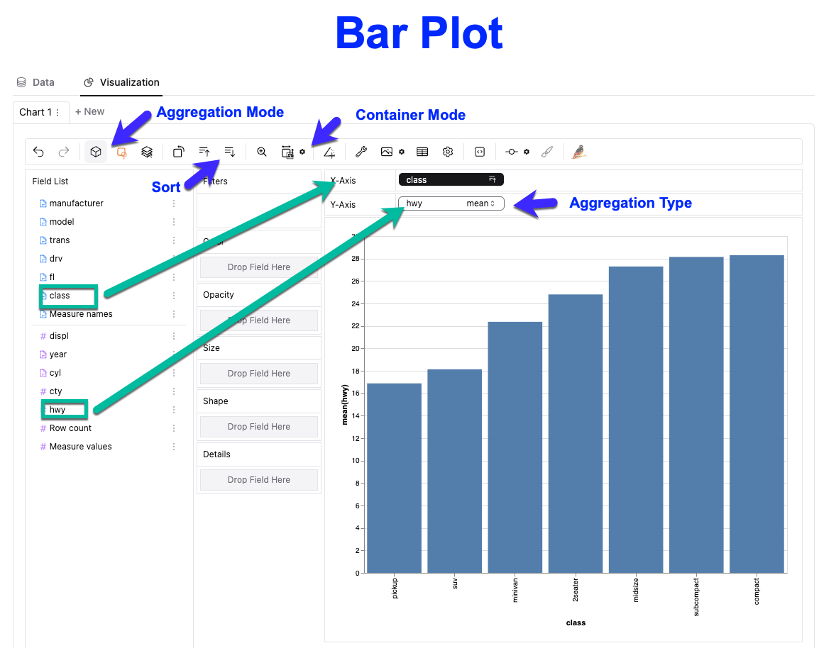
Get the Code and Data Set (In the R-Tip 083 Folder)
To make a bar plot, we need to:
- Drag and drop “class” a categorical feature to the X-axis, and “hwy” a numeric feature to the Y-axis.
- Make sure Aggregation Mode is On, and select aggregation type of “mean” on the hwy numeric variable
- Select Container Mode to expand the chart
- Sort the data ascending
Plot 2: Make a Scatter Plot
A scatter plot is an un-aggregated plot that will help us detect trends between 2 numeric features.
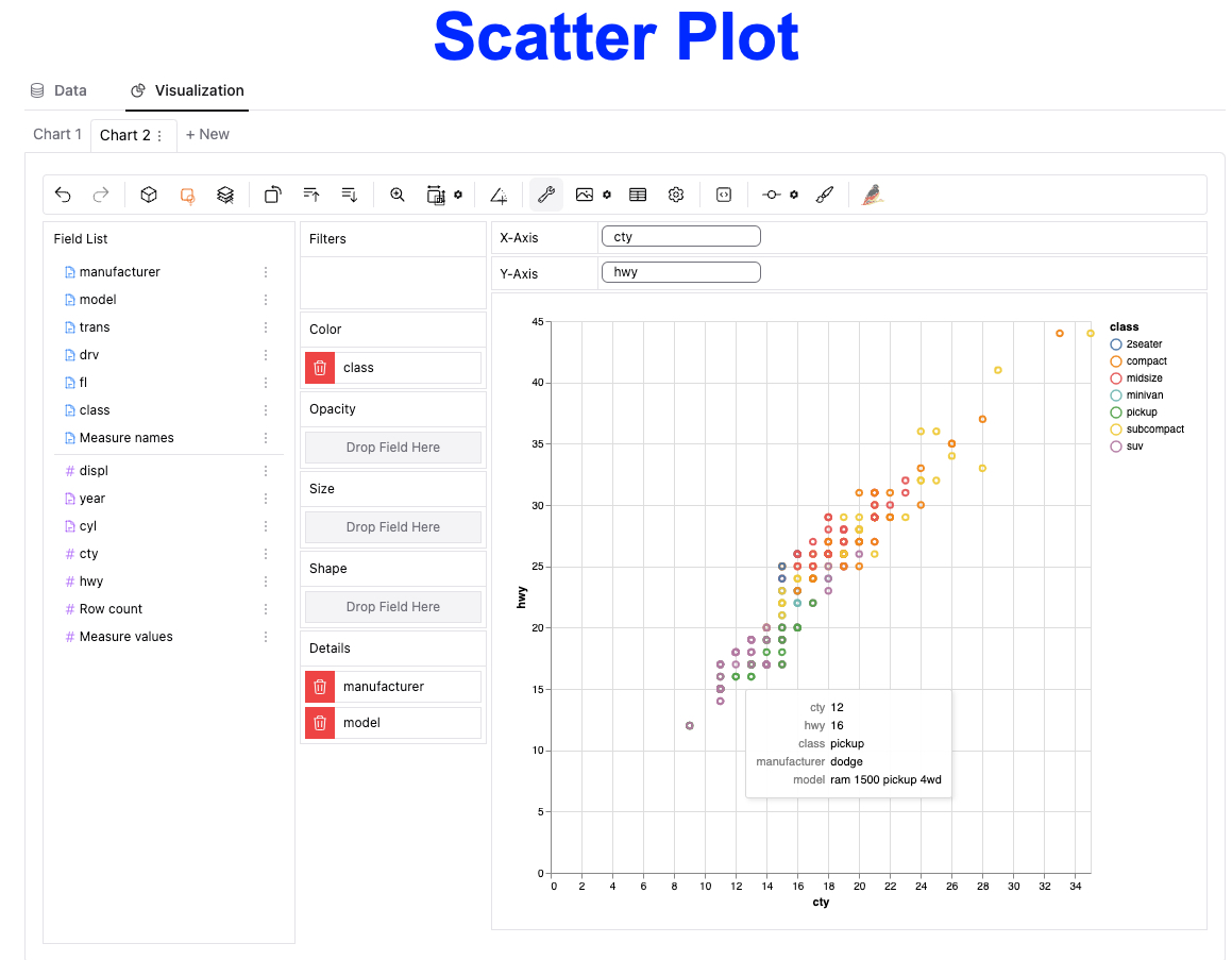
Get the Code and Data Set (In the R-Tip 083 Folder)
Now that you have a feel for how it works, creating a scatter plot is pretty easy:
- Create a new chart (Chart 2)
- Drag cty and hwy to X and Y-axis, respectively
- Add some color by vehicle class
- Add Details (hover tips) by dragging manufacturer and model to the Details section
- Hover over the data to see which vehicle has better or worse city and highway fuel economy
Plot 3: Make a Box Plot
A box plot applies Jon Tukey’s method for displaying the distribution of data using median, 1st and 3rd quartiles, and outliers. It’s great for detecting general trends and exposing outliers.
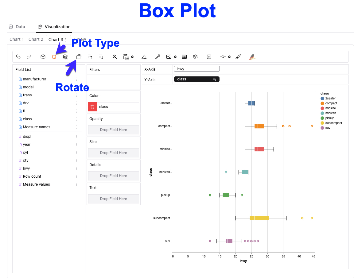
How to recreate this plot:
- Create a new plot
- Turn aggregation mode off
- Select Plot Type –> Box Plot
- Drag hwy and class to the X and Y axis, respectively
- Drag class to Color
- Rotate the Box Plot so the class is on the Y-axis
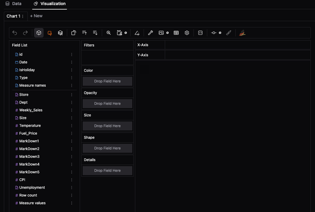
Step 3 - Time Series Data
Now let’s work with a time series dataset. Run this code:

Get the Code and Data Set (In the R-Tip 083 Folder)
That will produce this GWalkR session in the Viewer pane:
Plot 4: Make a Time Series Plot
A time series plot is a useful way to visualize trends in time series data (contains a date or time stamp).
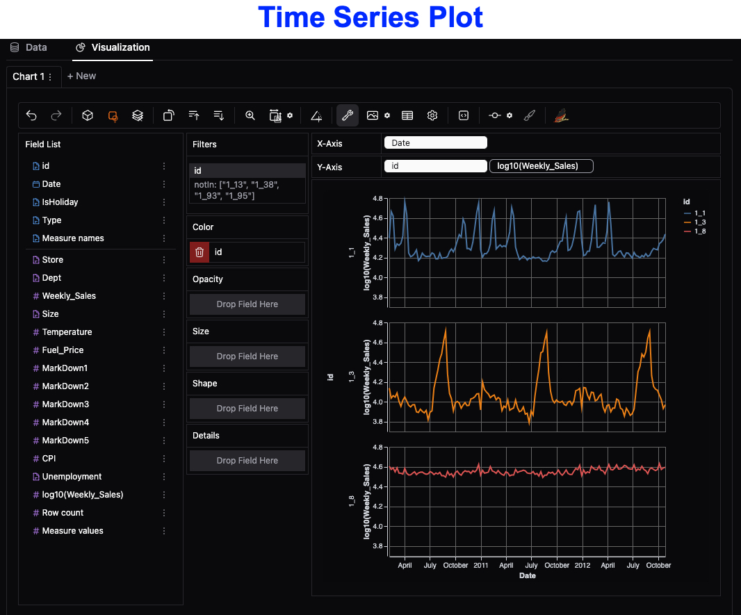
To recreate this plot:
- Turn off aggregation mode
- Create a Log10 Transformed Version of Weekly Sales (click the dots next to weekly sales)
- Drag Date to the X-Axis, and id and log10(Weekly_Sales) to the Y-axis
- Filter the id by dragging id to Filters, then select 1_1, 1_3, and 1_8 only.
- In settings (gear icon), de-select the option to include zero in the plot.
Reminder: The code and data is available free inside R-tips
All of the code you saw today is available in R-Tips Newsletter folder for R-Tip 083

Get the Code (In the R-Tip 083 Folder)
Conclusions:
The GWalkR package makes it easy to explore data. In fact, I’ve used it to replace 95% of my Tableau work. But there’s more to becoming a data scientist.
If you would like to grow your Business Data Science skills with R, then please read on…
Need to advance your business data science skills?
I’ve helped 6,107+ students learn data science for business from an elite business consultant’s perspective.
I’ve worked with Fortune 500 companies like S&P Global, Apple, MRM McCann, and more.
And I built a training program that gets my students life-changing data science careers (don’t believe me? see my testimonials here):
6-Figure Data Science Job at CVS Health ($125K)
Senior VP Of Analytics At JP Morgan ($200K)
50%+ Raises & Promotions ($150K)
Lead Data Scientist at Northwestern Mutual ($175K)
2X-ed Salary (From $60K to $120K)
2 Competing ML Job Offers ($150K)
Promotion to Lead Data Scientist ($175K)
Data Scientist Job at Verizon ($125K+)
Data Scientist Job at CitiBank ($100K + Bonus)
Whenever you are ready, here’s the system they are taking:
Here’s the system that has gotten aspiring data scientists, career transitioners, and life long learners data science jobs and promotions…
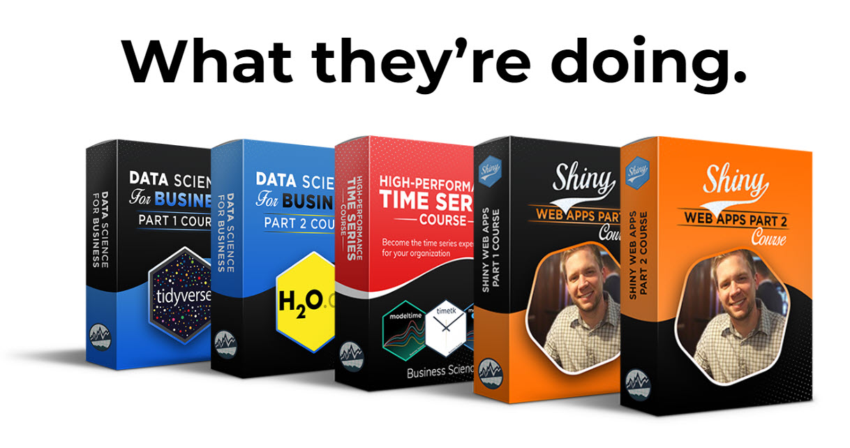
Join My 5-Course R-Track Program Now!
(And Become The Data Scientist You Were Meant To Be...)
P.S. - Samantha landed her NEW Data Science R Developer job at CVS Health (Fortune 500). This could be you.
