How to make Ridiculous Tables in R (from Excel)
Written by Matt Dancho
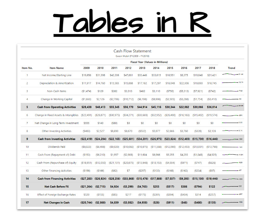
Did you know that you can make RIDICULOUS tables in R (from Excel)? You can. And in this free R-tip, I share a real case study where I made the working R code for my financial cash flow statement table. I converted it from Excel Spreadsheet into a pubilication-ready table for an Accounting Report containing financial statements.
Table of Contents
Here’s what you’re learning today:
- 2-Minute Case Study: How I made a Cash Flow Statement Table in
R.
- New R packages for making Tables: Get a full
gt and gtExtras code explanations including how to make Sparklines!
- Bonus: Free download of all the code shown today to make this table 👇
Bonus: Get the Code for this financial statement table (details below)
SPECIAL ANNOUNCEMENT: AI for Data Scientists Workshop on December 18th
Inside the workshop I’ll share how I built a SQL-Writing Business Intelligence Agent with Generative AI:
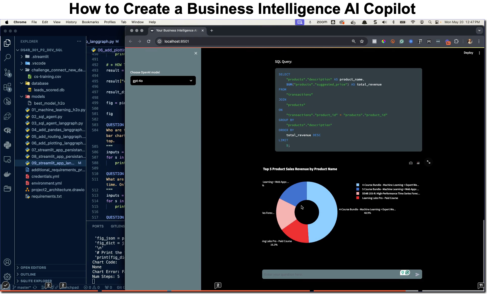
What: GenAI for Data Scientists
When: Wednesday December 18th, 2pm EST
How It Will Help You: Whether you are new to data science or are an expert, Generative AI is changing the game. There’s a ton of hype. But how can Generative AI actually help you become a better data scientist and help you stand out in your career? I’ll show you inside my free Generative AI for Data Scientists workshop.
Price: Does Free sound good?
How To Join: 👉 Register Here
R-Tips Weekly
This article is part of R-Tips Weekly, a weekly video tutorial that shows you step-by-step how to do common R coding tasks. Pretty cool, right?
Here are the links to get set up. 👇
This Tutorial is Available in Video
I have a companion video tutorial that walks you through how to use gt and gtExtras for this analysis. 👇
❌ Excel is killing your analysis
Listen, if you are still doing analysis, modeling and reporting in Excel, then did you know:
- 90% of Excel spreadsheets contain errors
- R can be used to automate the reporting process saving you tons of time every month
- **Your boss won’t care how you do it, as long as it’s done right the first time **
So if you’re sending your boss an analysis that’s Excel…
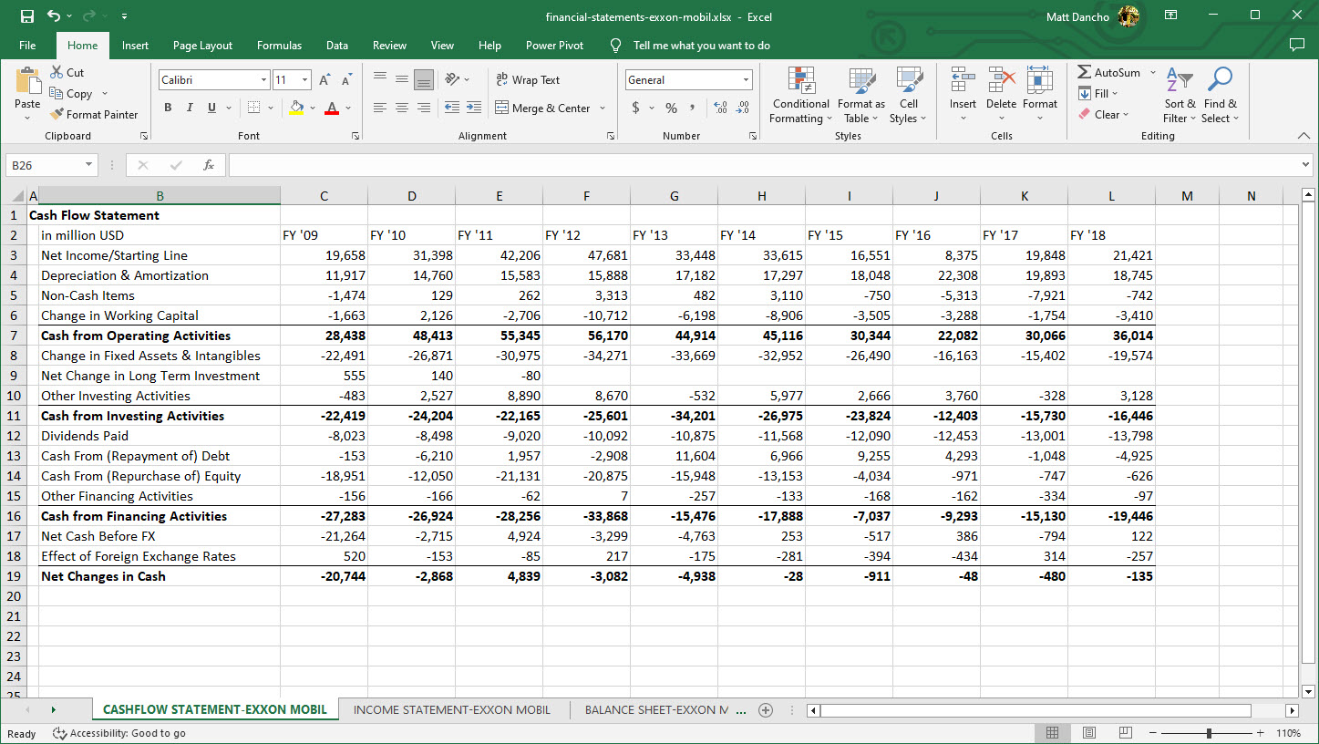
…And, if one small error throws off your analysis by $20,000,000,000 (yes, that’s $20 Billion with a “B”), then your boss isn’t going to be too happy when their shareholders dump billions in stock (because something was mis-reported).
✅ R can make awesome tables
What if you could make a better looking table in R, and virtually guarantee your analysis models were error free?
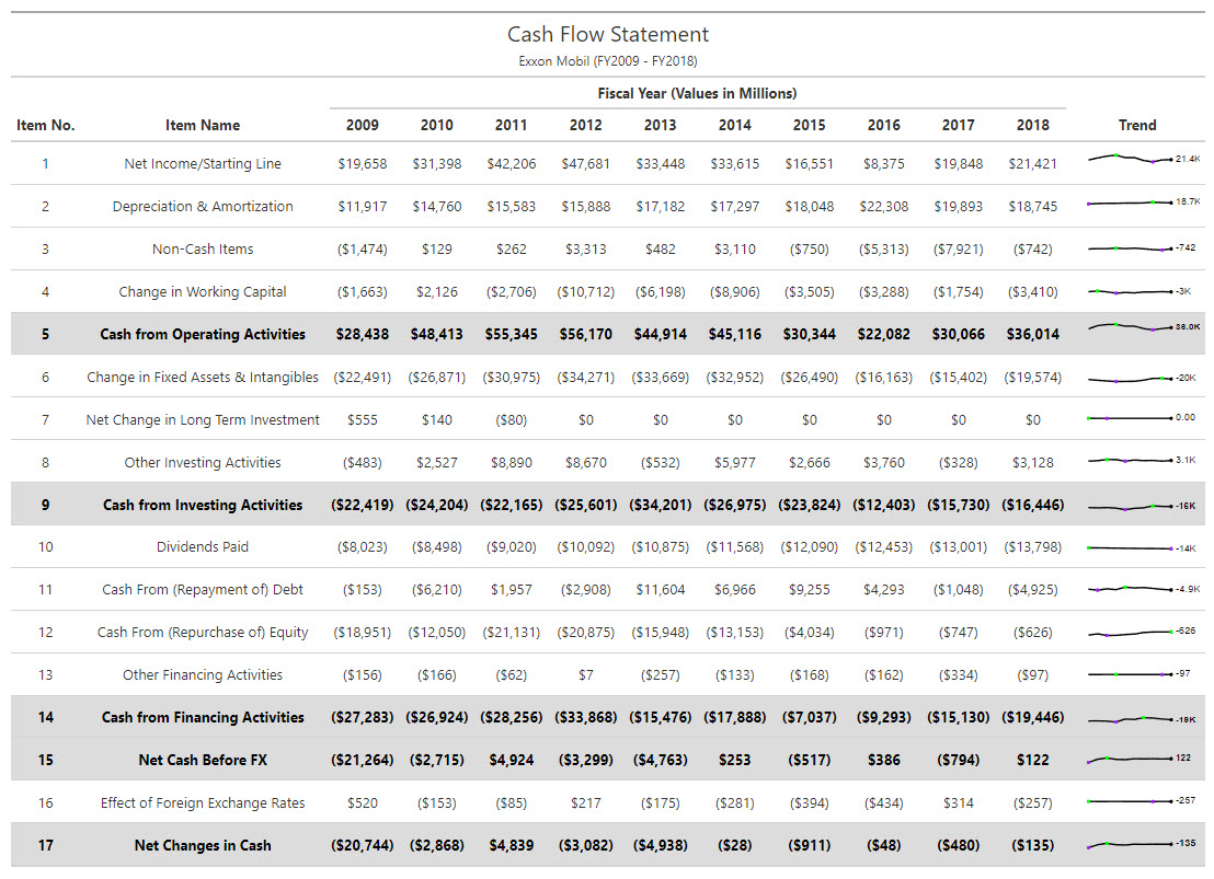
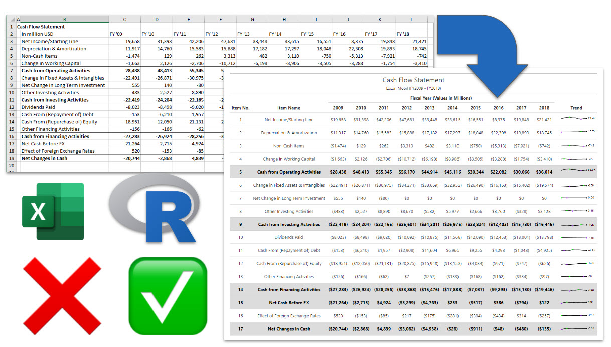
You can with R! And here’s the same Cash Flow Statement table in R to prove it:

This table can be popped into a PDF or Word document straight from R. And more importantly, the analysis that made the table can be automated from R, virtually eliminating Spreadsheet errors.
So today, I’m going to share how to convert this Cash Flow Statement from Excel to R.
Free Gift: Cheat Sheet for my Top 100 R Packages (Special Data Analysis Topics Included)
Before we dive in…
You’re going to need R packages to complete the data analysis that helps your company. So why not speed up the process?
To help, I’m going to share my secret weapon…
Even I forget which R packages to use from time to time. And this cheat sheet saves me so much time. Instead of googling to filter through 20,000 R packages to find a needle in a haystack. I keep my cheat sheet handy so I know which to use and when to use them. Seriously. This cheat sheet is my bible.
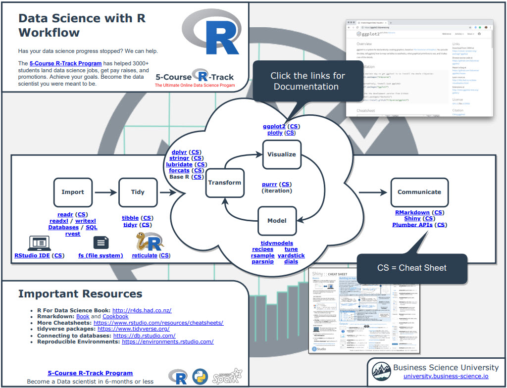
Once you download it, head over to page 3 and you’ll see several R packages I use frequently just for Data Analysis.
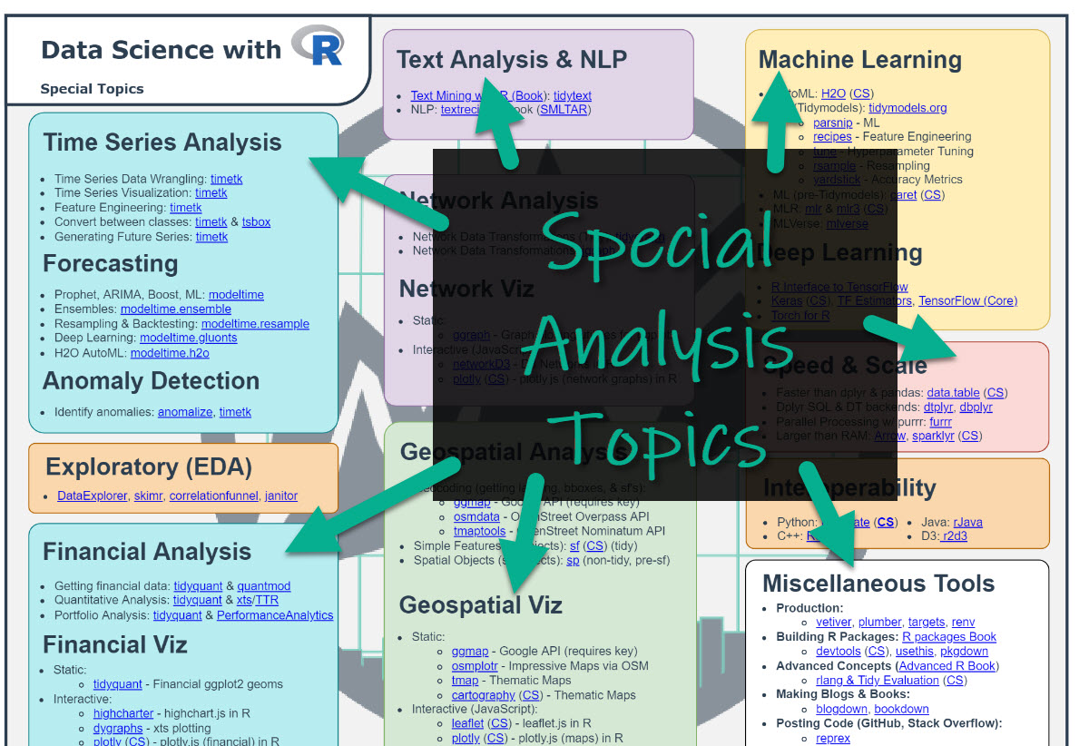
Which is important when you want to work in these fields:
- Machine Learning
- Time Series
- Financial Analysis
- Geospatial Analysis
- Text Analysis and NLP
- Shiny Web App Development
So steal my cheat sheet. It will save you a ton of time.
Tutorial: How to make Ridiculous Tables in R
This tutorial is awesome. You’ll learn 2 amazing R packages for creating ridiculous tables in R: gt and gtExtras. And through this free R-tip, you’ll improve your ability to make professional tables in R. Let’s go.
Step 1: Load the Libraries
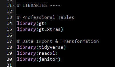
First, load these libraries.
Get my code.
Step 2: Get the Excel File
Next, get this Excel file. To do so, join the R-Tips Newsletter. This gets you access to the code for all of my R-Tips.

Get the Excel File.
The Excel file is located in 065_gt_financial_tables\data\ folder.
Step 3: Load the Excel File into R
Next, load the excel file.
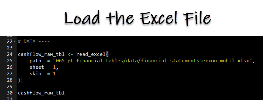
Get my code.
This reads in the Cash Flow Statement data from the Excel spreadsheet into R.
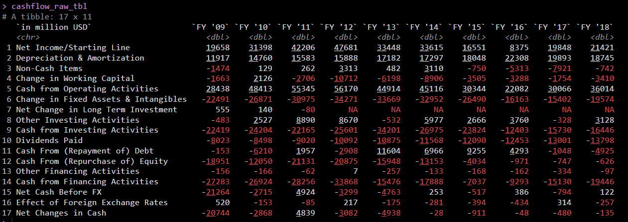
Get the Excel Data.
Step 4: Data Manipulation
We need to get the raw cash flow data into the right format for the Cash Flow Table. Run this code to get the data prepared:
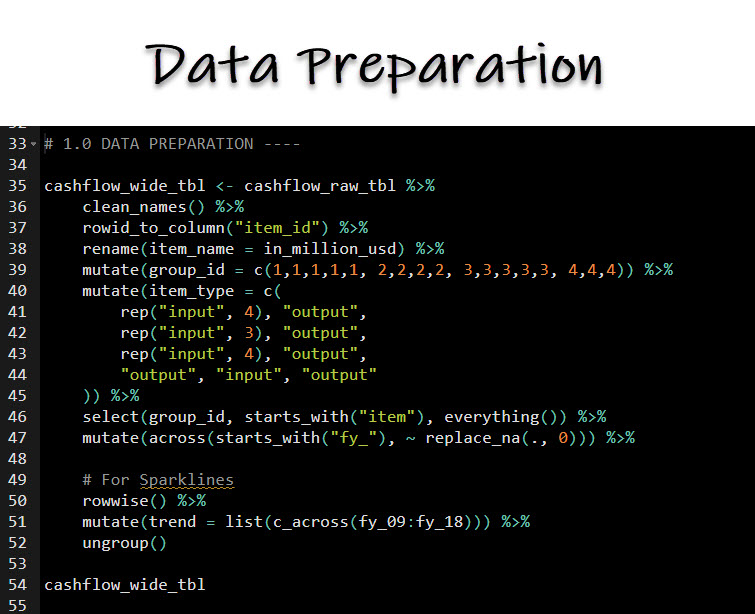
Get the Code.
Code explanation:
The code performs a series of transformations and manipulations on a data frame called cashflow_raw_tbl to create a new data frame cashflow_wide_tbl:
-
cashflow_wide_tbl <- cashflow_raw_tbl %>%:
This initializes a pipeline with the %>% operator, where cashflow_raw_tbl is the input data frame. The output of the entire pipeline operation will be assigned to cashflow_wide_tbl.
-
clean_names() %>%:
This function from the janitor package cleans up column names by converting them to lower case and replacing spaces with underscores, among other things. This makes it easier to refer to column names in the code later.
-
rowid_to_column("item_id") %>%:
This function adds a new column named “item_id” to the data frame, which contains the row numbers.
-
rename(item_name = in_million_usd) %>%:
This renames the column “in_million_usd” to “item_name”.
-
mutate(group_id = c(1,1,1,1,1, 2,2,2,2, 3,3,3,3,3, 4,4,4)) %>%:
This creates a new column “group_id” by assigning a group ID to each row in a specified sequence.
-
mutate(item_type = c(...)) %>%:
This creates a new column “item_type” with the specified sequence of “input” and “output”.
-
select(group_id, starts_with("item"), everything()) %>%:
This rearranges the columns to start with “group_id”, followed by columns starting with “item”, and then all other columns.
-
mutate(across(starts_with("fy_"), ~ replace_na(., 0))) %>%:
This replaces all NA values in the columns starting with “fy_” with 0.
-
rowwise() %>%:
This changes the data frame to a row-wise format, which is useful when applying functions that should operate on rows rather than columns.
-
mutate(trend = list(c_across(fy_09:fy_18))) %>%:
In this row-wise format, this line creates a new “trend” column by collating the values from the columns “fy_09” to “fy_18” into a list for each row.
-
ungroup():
Finally, this undoes the previous grouping operation, returning the data frame to a normal (non row-wise) format.
The resulting cashflow_wide_tbl data frame contains cleaned and organized data, ready for further analysis or visualization.
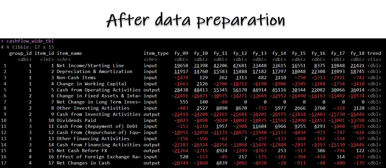
Get the Excel Data.
Step 5: Make the Table in R
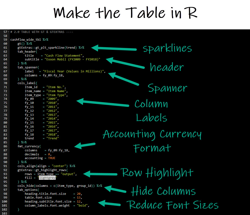
Finally, we are ready to make the table in R. Run this code:
Get the Code.
Code Explanation:
-
cashflow_wide_tbl %>%:
This line initializes a pipeline using the %>% operator from the magrittr package. cashflow_wide_tbl is the input data frame (presumably in wide format) that will be passed through the subsequent functions.
-
gt() %>%:
Calls the gt function to create a gt table object from the input data. The gt package is used for rendering tables in HTML, which can be viewed in various output formats like Markdown, HTML, and others.
-
gtExtras::gt_plt_sparkline(trend) %>%:
Utilizes the gtExtras package to add a sparkline plot to the table for the “trend” column. Sparklines are small, simple line graphs typically used to represent a trend over time.
-
tab_header(title = "Cash Flow Statement", subtitle = "Exxon Mobil (FY2009 - FY2018)") %>%:
Sets the table header with the title “Cash Flow Statement” and subtitle “Exxon Mobil (FY2009 - FY2018).”
-
tab_spanner(label = "Fiscal Year (Values in Millions)", columns = fy_09:fy_18,) %>%:
Adds a spanner header across columns fy_09 to fy_18 with the label “Fiscal Year (Values in Millions).”
-
cols_label(...):
This function is used to set custom labels for columns in the table. For instance, the item_id column is renamed to “Item No.”, and the fiscal year columns are renamed to their corresponding years.
-
fmt_currency(columns = fy_09:fy_18, decimals = 0, accounting = TRUE) %>%:
Formats the fiscal year columns as currency with no decimals and in accounting format (e.g., using parentheses for negative numbers).
-
cols_align(align = "center") %>%:
Aligns all columns in the center.
-
gtExtras::gt_highlight_rows(rows = item_type == "output", fill = "lightgrey") %>%:
Highlights rows where the item_type column equals “output” with a light grey background.
-
cols_hide(columns = c(item_type, group_id)) %>%:
Hides the item_type and group_id columns from the final table display.
-
tab_options(...):
Sets various table options like font sizes and weights. Here, it customizes the size of the title, subtitle, table font, and makes column labels bold.
The final table looks amazing and is ready to add in to your financial report:

BONUS: Steal My Code for the R Tables (it’s legal)
Want all the code I just showed you? Steal my R-tip library.
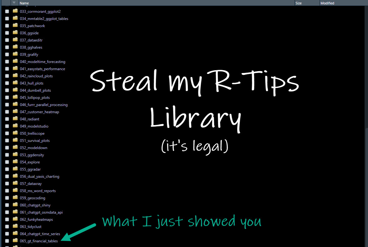
The code for the Tables in R PLUS the Excel Data Set are inside of R-Tip 065_gt_financial_tables folder.
Get my R-tips code library.
Need to advance your business data science skills?
I’ve helped 6,107+ students learn data science for business from an elite business consultant’s perspective.
I’ve worked with Fortune 500 companies like S&P Global, Apple, MRM McCann, and more.
And I built a training program that gets my students life-changing data science careers (don’t believe me? see my testimonials here):
6-Figure Data Science Job at CVS Health ($125K)
Senior VP Of Analytics At JP Morgan ($200K)
50%+ Raises & Promotions ($150K)
Lead Data Scientist at Northwestern Mutual ($175K)
2X-ed Salary (From $60K to $120K)
2 Competing ML Job Offers ($150K)
Promotion to Lead Data Scientist ($175K)
Data Scientist Job at Verizon ($125K+)
Data Scientist Job at CitiBank ($100K + Bonus)
Whenever you are ready, here’s the system they are taking:
Here’s the system that has gotten aspiring data scientists, career transitioners, and life long learners data science jobs and promotions…

Join My 5-Course R-Track Program Now!
(And Become The Data Scientist You Were Meant To Be...)
P.S. - Samantha landed her NEW Data Science R Developer job at CVS Health (Fortune 500). This could be you.
