How to improve your storytelling with R
Written by Matt Dancho
Your success as a Data Scientist isn’t because of your coding skills. Your success is determined by how well you can persuade decision-makers to take action. And that’s a powerful skill that I’m going to help you with today: It’s called Storytelling.
Table of Contents
Today you’re going to become better at storytelling. Here’s what you’re learning today:
- What storytelling is (and why it’s absolutely essential to your data science career)
- How to use a sneaky-good R package to make funky-looking heat maps (that insantly improve your storytelling)
- Bonus: Steal my brand NEW data visualization customization code (for the crazy cool heatmap we make today)
SPECIAL ANNOUNCEMENT: AI for Data Scientists Workshop on December 18th
Inside the workshop I’ll share how I built a SQL-Writing Business Intelligence Agent with Generative AI:
What: GenAI for Data Scientists
When: Wednesday December 18th, 2pm EST
How It Will Help You: Whether you are new to data science or are an expert, Generative AI is changing the game. There’s a ton of hype. But how can Generative AI actually help you become a better data scientist and help you stand out in your career? I’ll show you inside my free Generative AI for Data Scientists workshop.
Price: Does Free sound good?
How To Join: 👉 Register Here
R-Tips Weekly
This article is part of R-Tips Weekly, a weekly video tutorial that shows you step-by-step how to do common R coding tasks. Pretty cool, right?
Here are the links to get set up. 👇
This Tutorial is Available in Video
I have a companion video tutorial that walks you through how to do the full analysis and storytelling plot. And, I’m finding that a lot of my students prefer the dialogue that goes along with video-based coding. So check out this video to see me running the R code in this tutorial. 👇
Storytelling: Your Data Science Career Depends On It
One of the biggest mistakes I made in my early years was misunderstanding the impact of persuasive story telling.
I spent 95% of my time on my code and writing up my findings.
But I stunk at putting a slide deck together that excited management.
And my results? Well, they weren’t that great in the beginning.
But I learned that simple tweaks, can make story telling better
One such mistake that I made initially was making things, well, confusing.
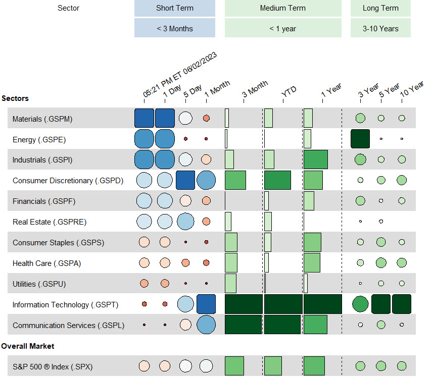
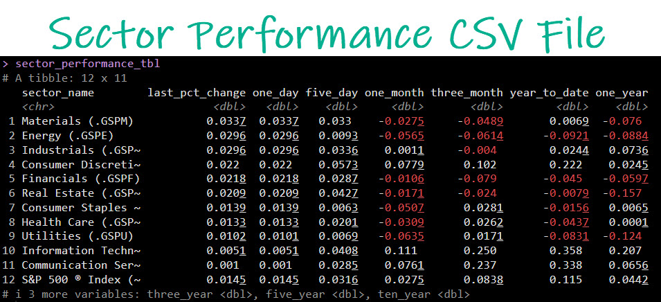
Here’s a case in point of something I would have done early on. And I caught a “big financial company” red handed… Let’s take a look at this table and why it’s confusing.
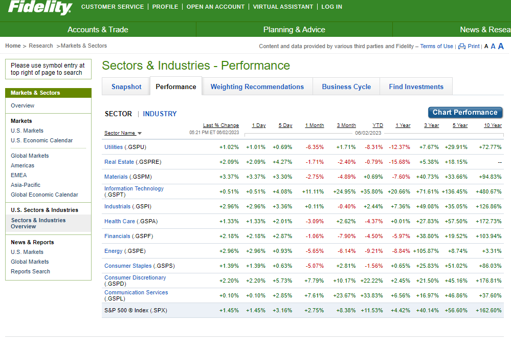
A confusing financial table
The table above contains a list of Sector ETFs that people like you and me can invest in. But there’s a problem…
The problem is that the financial table is confusing
If I can’t tell in 2 seconds what this table is telling me. Then it’s not persuasive. It’s just confusing.
And that’s a BIG problem. Here’s why:
Confused decision-makers don’t make decisions
Ever been in a room full of executives and they are confused about something you’ve just presented.
And every “complicated explaination” you give them further digs you into a hole that you can’t get out of.
Well, that’s because they are confused. And the fact is, confused decision makers DON’T MAKE DECISIONS.
Instead, they complain, some yell, and they tell you to “redo your analysis”.
Instead, we need to make the answer obvious
Obvious answers virtually jump out of the page. And here’s an easy way to make something obvious… Make it bigger.
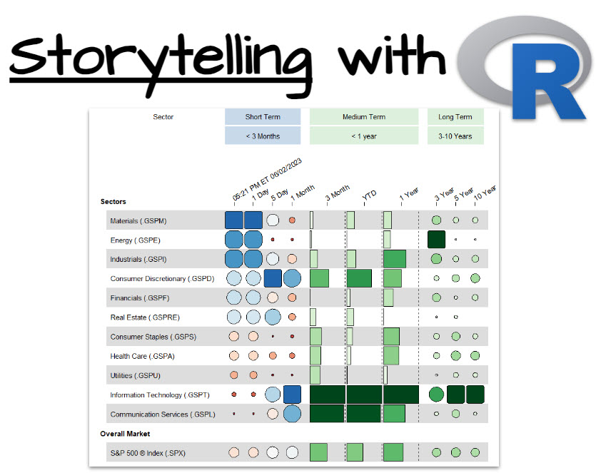
Don’t get it? Here’s the table reconfigured so you can see the size of boxes and circles, and bigger is better.
An easier to understand financial table
Why does this weird version of the table work?
It’s takes exactly 2 seconds to see which Sectors had the best returns.
Imagine you had this on a slide deck. Everyone in the room can see that over 3 month, year to date, 1 year, 3 year, 5 year, and 10 year that Information Technology was where to put your money.
That’s story telling 101…
Make it obvious. And to help I’m going to give you a short tutorial using a new R package I just stumbled on.
It’s called funkyheatmap. It’s great for converting messy tables into story-telling allstars.
Free Gift: Cheat Sheet for my Top 100 R Packages (Special Data Analysis Topics Included)
Before we dive in…
You’re going to need R packages to complete the data analysis that helps your company. So why not speed up the process?
To help, I’m going to share my secret weapon…
Even I forget which R packages to use from time to time. And this cheat sheet saves me so much time. Instead of googling to filter through 20,000 R packages to find a needle in a haystack. I keep my cheat sheet handy so I know which to use and when to use them. Seriously. This cheat sheet is my bible.
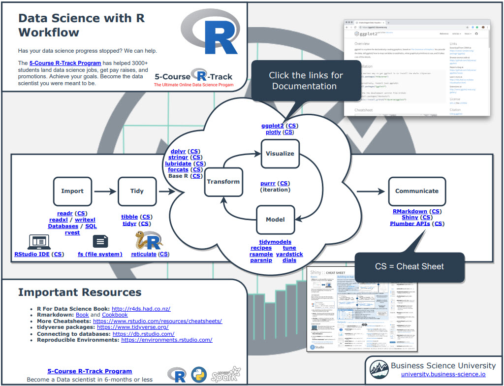
Once you download it, head over to page 3 and you’ll see several R packages I use frequently just for Data Analysis.
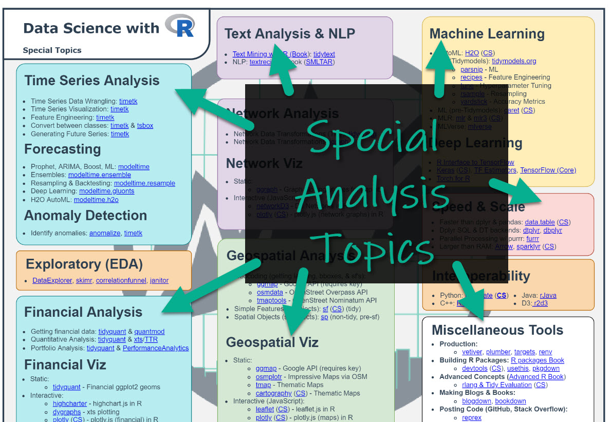
Which is important when you want to work in these fields:
- Machine Learning
- Time Series
- Financial Analysis
- Geospatial Analysis
- Text Analysis and NLP
- Shiny Web App Development
So steal my cheat sheet. It will save you a ton of time.
Tutorial: How to turn complex tables into persuasive plots with funkyheatmap
I’m going to share exactly how to make this plot that we saw was much faster to draw conclusions from.
An easier to understand financial table
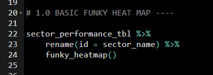
Step 1: Get the Libraries and Data
First, load in tidyverse the data analysis library and funkyheatmap the heat map library.
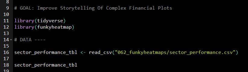
Steal my code.
The data is stored in a CSV file. We’ll read it in. It looks like this:
Sector Performance CSV File
Step 2: Convert the Table to a Funky Heatmap
Any table like this can be converted to a funkyheatmap. It’s super simple. Just run this code:
Steal my code.
And then watch as it makes a basic funky heatmap table.
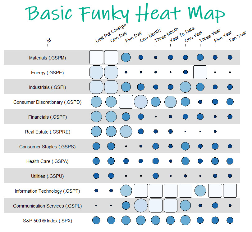
Basic Funky Heatmap Table
It’s that easy. And already you can see some insights. Information Technology was the best.
BONUS: Get My Custom Heat Map Code
Did you like the basic funky heat map table? And, would you like to take it to the next level?
Then you’re in luck:
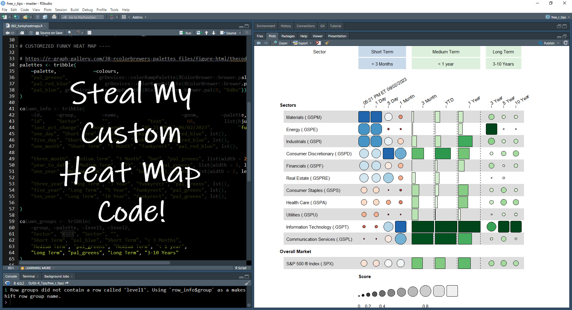
I have a special bonus for you: You can steal my custom heat map code (It’s OK). The code is in the 062_funkyheatmaps folder.
Need to advance your business data science skills?
I’ve helped 6,107+ students learn data science for business from an elite business consultant’s perspective.
I’ve worked with Fortune 500 companies like S&P Global, Apple, MRM McCann, and more.
And I built a training program that gets my students life-changing data science careers (don’t believe me? see my testimonials here):
6-Figure Data Science Job at CVS Health ($125K)
Senior VP Of Analytics At JP Morgan ($200K)
50%+ Raises & Promotions ($150K)
Lead Data Scientist at Northwestern Mutual ($175K)
2X-ed Salary (From $60K to $120K)
2 Competing ML Job Offers ($150K)
Promotion to Lead Data Scientist ($175K)
Data Scientist Job at Verizon ($125K+)
Data Scientist Job at CitiBank ($100K + Bonus)
Whenever you are ready, here’s the system they are taking:
Here’s the system that has gotten aspiring data scientists, career transitioners, and life long learners data science jobs and promotions…
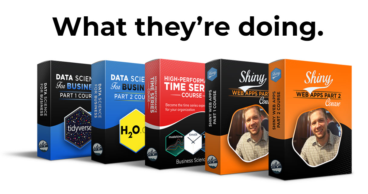
Join My 5-Course R-Track Program Now!
(And Become The Data Scientist You Were Meant To Be...)
P.S. - Samantha landed her NEW Data Science R Developer job at CVS Health (Fortune 500). This could be you.