Survival Analysis in R (in under 10-minutes)
Written by Matt Dancho
Making a survival analysis can be a challenge even for experienced R users, but the good news is I’ll help you make beautiful, publication-quality survival plots in under 10-minutes. Here’s what WE are going to do:
- Make your first
survival model and plot your survival analysis with survminer
- And I’ll give you 3 SPECIAL BONUSES! (that will take your survival plots to the next level).
You excited? I am! Let’s go!!
R-Tips Newsletter
This article is part of R-Tips Newsletter, a weekly video tutorial that shows you step-by-step how to do common R coding tasks.
Here are the links to get set up. 👇
Video Tutorial
Learn how to use the survminer package in my 8-minute YouTube video tutorial.
What you make in this R-Tip
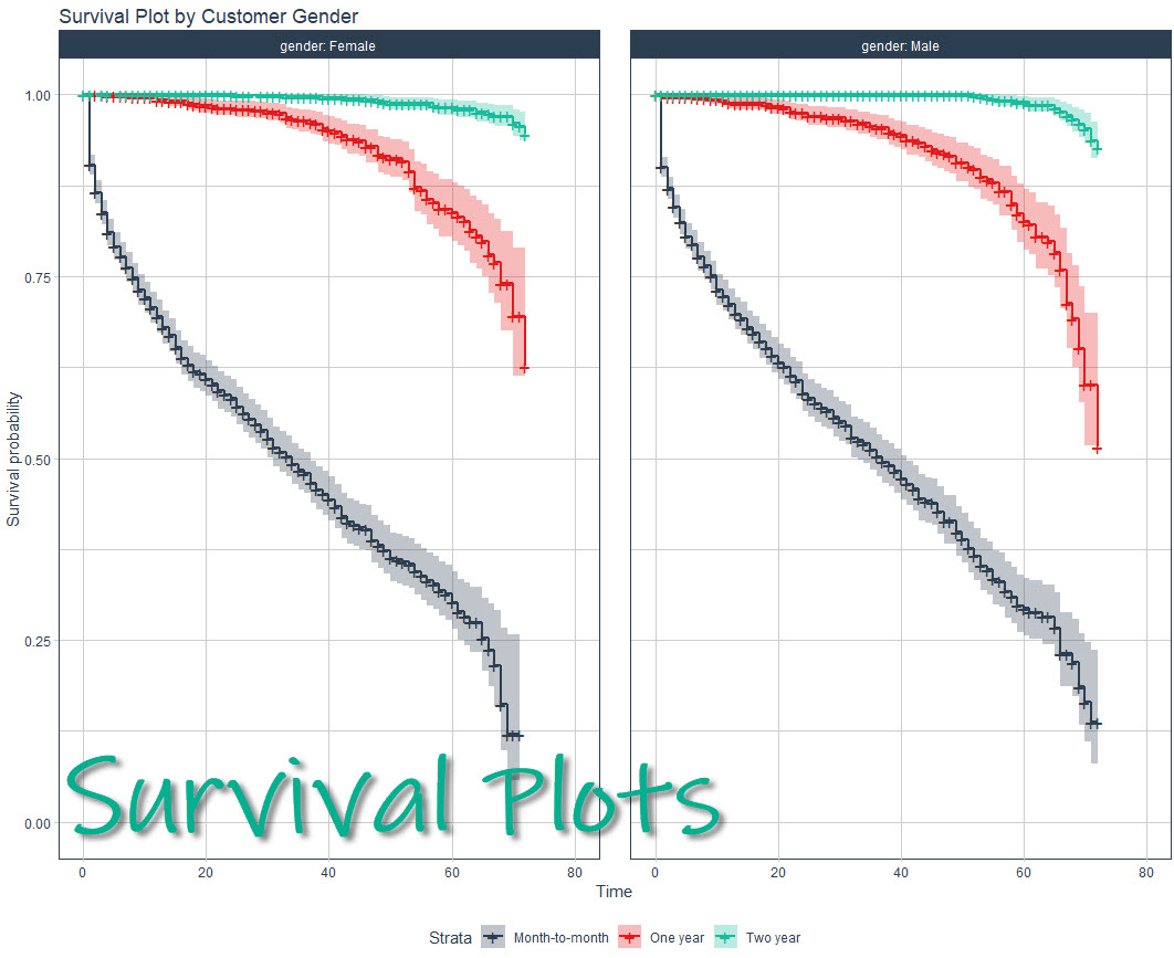
By the end of this tutorial, you’ll make this survival analysis plot! AND, you’ll see how to expose business insights from customers that a churn faster than others.

Thank You Developers.
Before we move on, please recognize that survminer was developed by Alboukadel KASSAMBARA (follow on GitHub). Thank you for everything you do!
Also, the full documentation for survminer can be accessed here.
Survival Analysis Plot Tutorial
Buckle up. You and I are about to go on an 8-minute mind-blowing journey to make boring survival plots look insane. Let’s go.
Step 1: Load the libraries and data
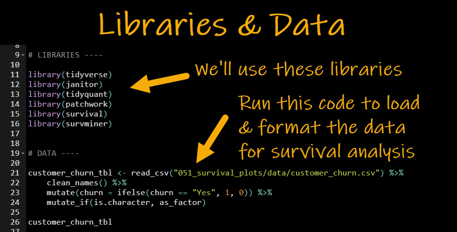
First, run this code to:
- Load Libraries: Load
tidyverse , janitor, tidyquant, patchwork, survival, and survminer
- Import Data: We have a custom dataset that has churn data. Sign up for R-Tips to get the dataset.
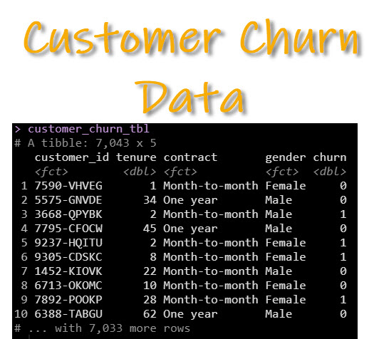
Here’s what the formatted customer churn data looks like.
Key concept about survival analysis!
For survival analysis, we want to understand how long it takes for an event to occur.
- How long: Tenure. This is how many months a customer has been subscribed.
- Survival Event: Churn = 1. This the event that connects the time to the death of a subscriber (they didn’t really die, but just unsubscribed).
With this knowledge, we can make our first survival model and plot.
Step 2: Make your 1st survival model and plot
Alright, we’re going to take care of 2 things in this step. They go hand-in-hand.
- Survival Model: We’ll use the
survfit() and Surv() functions to specify a survival model. We select the Surv(tenure, churn) to model the time and event. Then we use ~ contract to model as a function of contract type.
- Survival Plot: We use
ggsurvplot() to create our first survival plot.
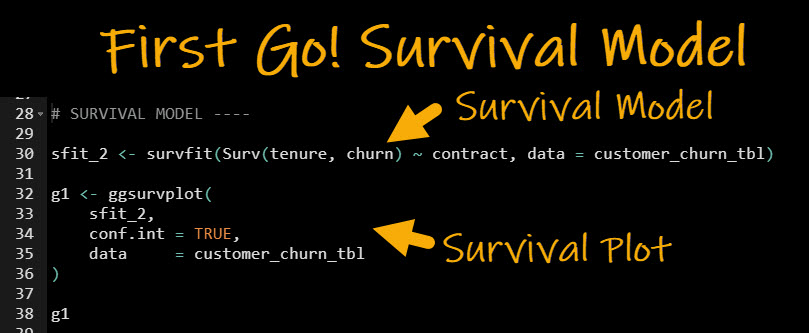
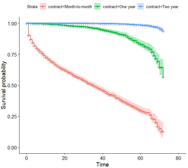
This makes the plot shown below. It’s a very powerful plot for business insights!
How to explain the survival plot (business insights)
Newer data scientists can get tripped up interpreting and explaining the survival plot. So let me take a minute to explain in terms of the business insights.
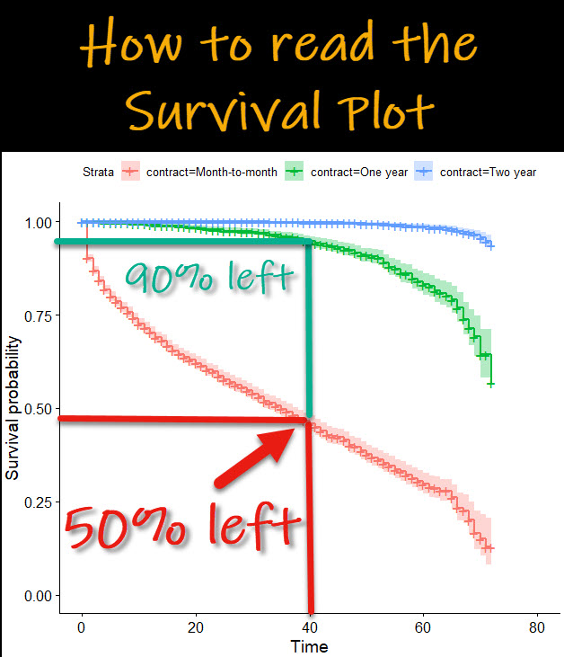
The goal is to understand what’s happening. We can quickly see that:
- Month-to-Month Contracts are hurting the business. After 40-months, only 50% have survived (meaning that 50% have churned).
- Conversely, long-term contracts are really beneficial to the business. At 40-months, 90% of 1-year contracts have survived. These customers are more loyal! And 2-year customers are the most loyal!!
3 MASSIVE BONUSES!!! To take your survival plots to the NEXT LEVEL.
Don’t just willy-nilly slap the survival plot in your business report.

Avoid THIS big mistake
Here’s why you MUST AVOID just slapping the last plot in your business reports:
- Remember, stakeholders are human and they won’t trust you or your report if you don’t dress it up!
- You are measured by your ability to provide actionable insights. SO you need to be able to explore more. The techniques I will show you next will help you do just that!
So let’s earn the trust of your business leadership with these 3 MASSIVE BONUSES!!
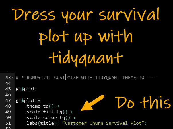
Bonus #1: Use the Tidyquant Theme
I’m the creator of tidyquant. So I may be biased for telling you to use it. But, I’m biased for a reason. It got me results (job promotions and recognition).
Tidyquant includes special “business-ready” themes that I used in my reports (yes, the ones that went to my CEO of a $500,000,000 per year business).
And, these are the same reports that helped get me 3 promotions in 2-years (effectively doubling my salary).
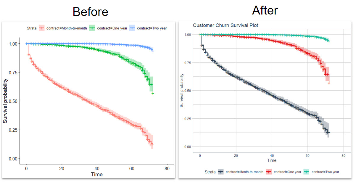
And we can immediately see a positive effect of the before and after. You gain:
- Gridlines to help estimate survival probabilities.
- Better business-ready color palettes
- Legend at bottom (more obvious legend location for people that view the plot first then want to understand what the colors mean second)
Bonus #2: Add the survival risk table
The survival risk table is a great way to include specific values of how many survived. The default returns a risk table with counts. But you can also specify risk.table = "percentage" to include percentages if that works better for your persuasive argument.
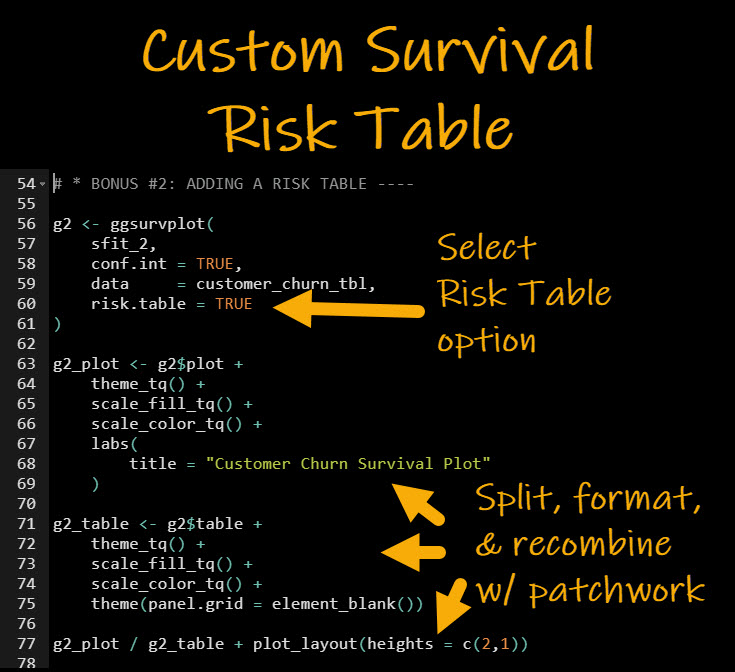
Note that in order to make this look amazing, we will split, format with tidyquant, then recombine with patchwork to make a killer visualization that will earn your boss’s respect.
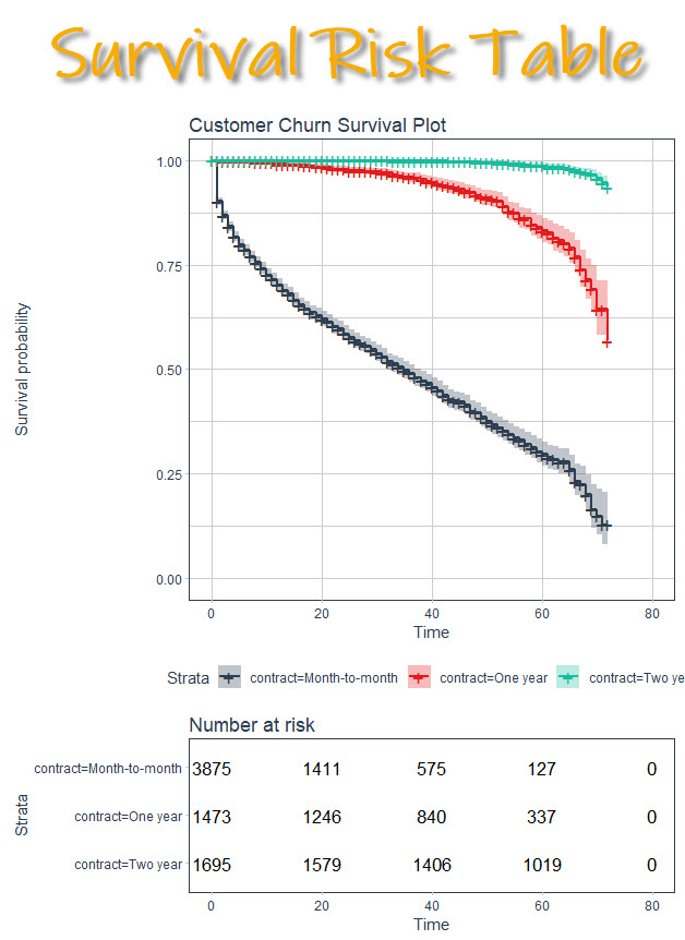
Heck yeah!! Now we’re talking. Alright, I have one more survival plot bonus hack for you.
Bonus #3: Facetted survival plots
This is an amazing hack to showcase differences in groups between survival. There’s a new function called ggsurvplot_facet() that exposes facetting options to make subplots. Let’s check it out. We’ll showcase any differences between the customer’s gender (male vs female)
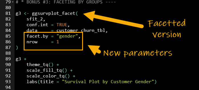
And here’s the visualization that is returned.
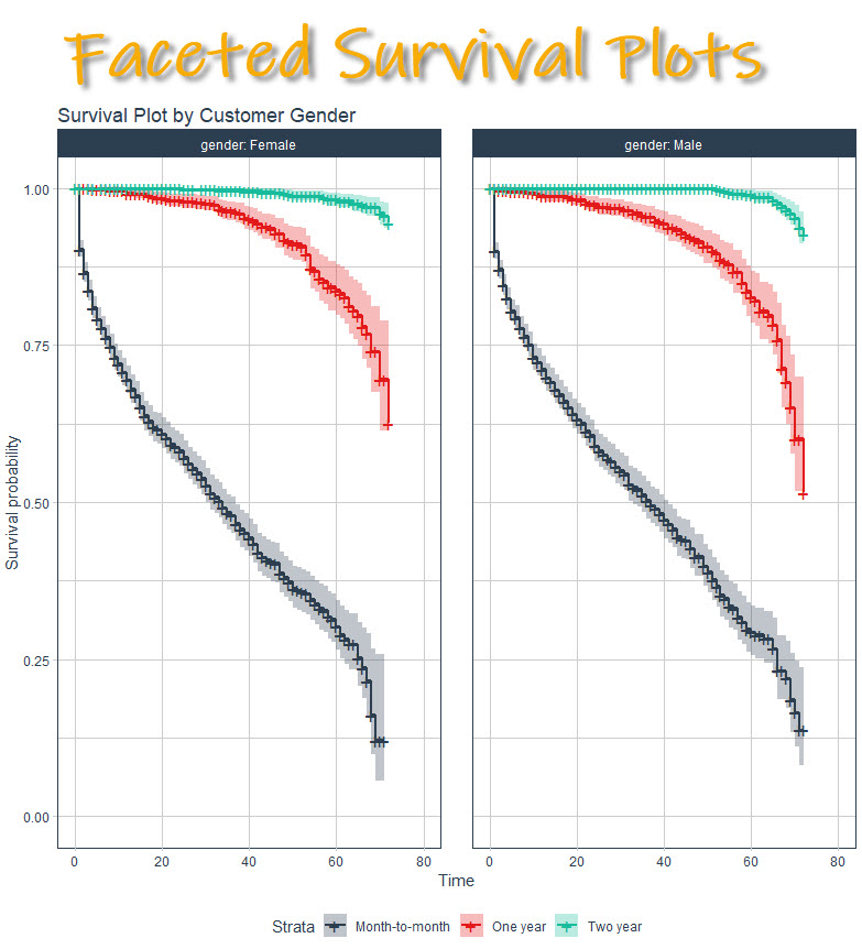
Now we can tell that both male and female seem to have the same rates. So we know that gender doesn’t seem to have a big effect on churn rates.
Conclusions
You learned how to use the survminer library to not only create awesome survival analysis plots that show off business insights and are publication-ready. Great work! But, there’s a lot more to becoming a data scientist.
If you’d like to become a data scientist (and have an awesome career, improve your quality of life, enjoy your job, and all the fun that comes along), then I can help with that.
Need to advance your business data science skills?
I’ve helped 6,107+ students learn data science for business from an elite business consultant’s perspective.
I’ve worked with Fortune 500 companies like S&P Global, Apple, MRM McCann, and more.
And I built a training program that gets my students life-changing data science careers (don’t believe me? see my testimonials here):
6-Figure Data Science Job at CVS Health ($125K)
Senior VP Of Analytics At JP Morgan ($200K)
50%+ Raises & Promotions ($150K)
Lead Data Scientist at Northwestern Mutual ($175K)
2X-ed Salary (From $60K to $120K)
2 Competing ML Job Offers ($150K)
Promotion to Lead Data Scientist ($175K)
Data Scientist Job at Verizon ($125K+)
Data Scientist Job at CitiBank ($100K + Bonus)
Whenever you are ready, here’s the system they are taking:
Here’s the system that has gotten aspiring data scientists, career transitioners, and life long learners data science jobs and promotions…
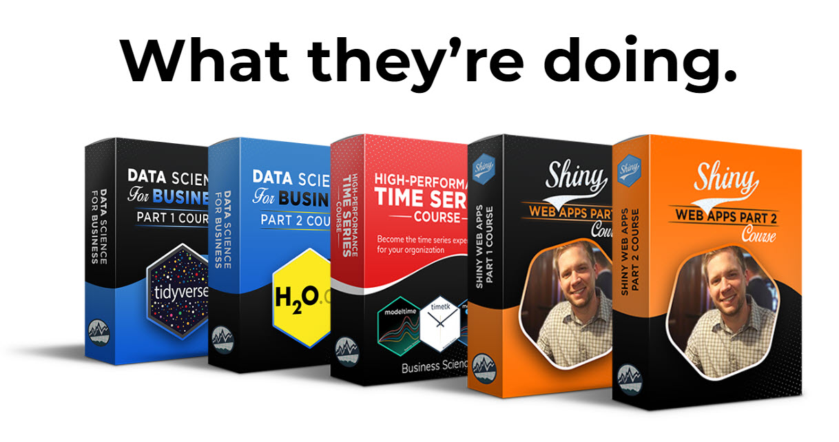
Join My 5-Course R-Track Program Now!
(And Become The Data Scientist You Were Meant To Be...)
P.S. - Samantha landed her NEW Data Science R Developer job at CVS Health (Fortune 500). This could be you.
