How I analyze 100+ ggplots at once
Written by Matt Dancho
Visualizing big data is next to impossible. As soon as I have 12 plots, that’s where my ability to use native ggplot suffers. That is until I found trelliscopejs.
trelliscopejs is like ggplot2 faceting on steroids. This may seem crazy, but the benefit is that when you have 20, 30, or even 100+ plots you need to analyze, trelliscopejs is the solution!
And, I’m going to get you up and running with trelliscopejs in under 5-minutes:
- I’ll teach you how to make 20+ ggplot facets using trelliscopejs
- BONUS: I’ll not only show you how to make static ggplots, but I’ll even show you how to use the plotly integration for interactivity
SPECIAL ANNOUNCEMENT: AI for Data Scientists Workshop on December 18th
Inside the workshop I’ll share how I built a SQL-Writing Business Intelligence Agent with Generative AI:
What: GenAI for Data Scientists
When: Wednesday December 18th, 2pm EST
How It Will Help You: Whether you are new to data science or are an expert, Generative AI is changing the game. There’s a ton of hype. But how can Generative AI actually help you become a better data scientist and help you stand out in your career? I’ll show you inside my free Generative AI for Data Scientists workshop.
Price: Does Free sound good?
How To Join: 👉 Register Here
R-Tips Weekly
This article is part of R-Tips Weekly, a weekly video tutorial that shows you step-by-step how to do common R coding tasks.
Here are the links to get set up. 👇
Video Tutorial
Learn how to use the trelliscopejs package in my 5-minute YouTube video tutorial.
What you make in this R-Tip
By the end of this tutorial, you’ll make the 20+ ggplots for exposing insights in your big data.
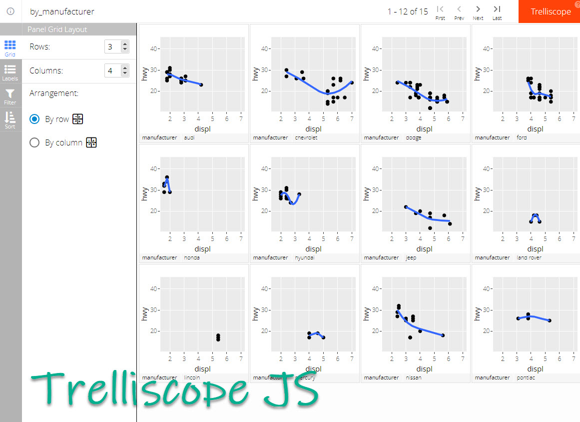
Analyzing 20+ ggplots (made with trelliscopejs)
Thank You Developers.
Before we move on, please recognize that trelliscopejs was developed by Ryan Hafen (follow Ryan on Twitter). Thank you for everything you do!
Also, the full documentation for trelliscopejs can be accessed here.
trelliscopejs Tutorial
Let’s dive into using trelliscopejs so we can analyze 100+ ggplots.
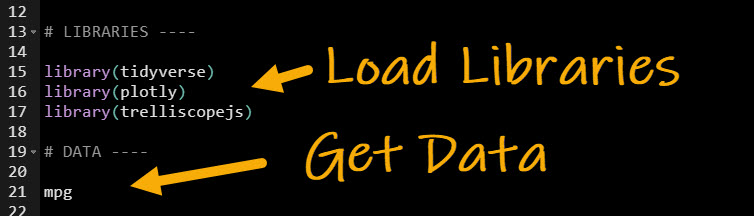
Step 1: Load the Libraries and Data
First, run this code to:
- Load Libraries: Load
tidyverse , plotly, and trelliscopejs.
- Import Data: We’re using the
mpg dataset that comes with ggplot2.
Get the code.
Our data looks like this. We want to understand how Highway Fuel Economy (hwy) varies with displ (engine size) but we want to see if there is any differences between manufacturers.
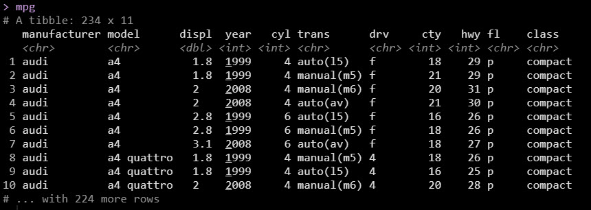
The mpg dataset
Step 2: Make a ggplot
Next, let’s make a basic ggplot of fuel economy vs engine displacement.
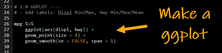
Get the code.
This produces the following plot of hwy vs displ.
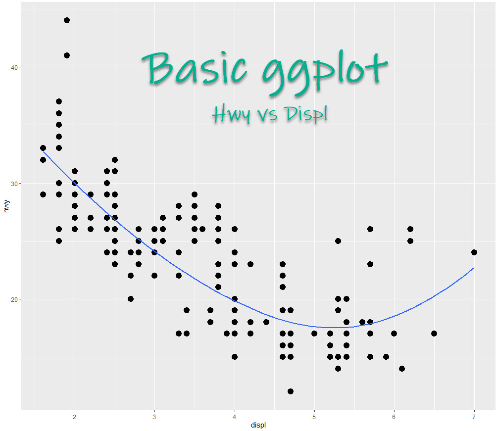
Our basic ggplot
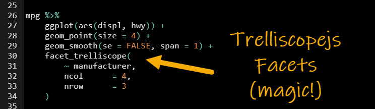
Step 3: Apply the trelliscopejs magic!
Listen, I’m telling you this next part is straight-up magic!
Seriously, I now use this simple trick to analyze 100+ ggplots at once.
- Use the
facet_trelliscope() function
- This replaces a
facet_wrap() or facetgrid()
- And makes 100’s of ggplots (as many as your heart desires)
- In this case, we facet by
manufacturer and end up with 15 plots to analyze.
Get the code.
The result is the trelliscope plot with 15 ggplots by manufacturer.
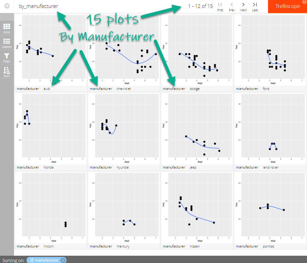
We've transformed our ggplot into a faceted trelliscope with 15 plots by manufacturer
Step 4: Customize the Trelliscopejs
This is really cool!! You can add additional labels like max/min displacement by plot.
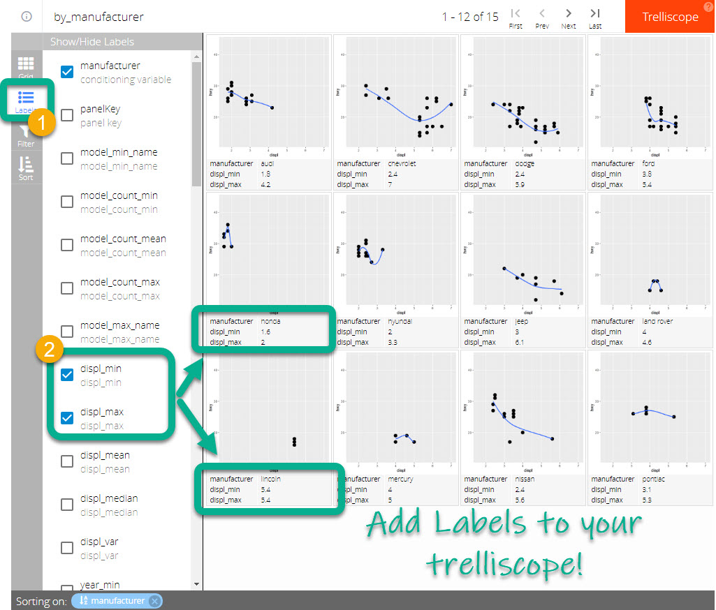
Customize the trelliscope with labels & filters
BONUS: Make your trelliscope interactive!!!
If you thought you were done…
We’re just gettin’ started!
THIS is the magic of trelliscope!!
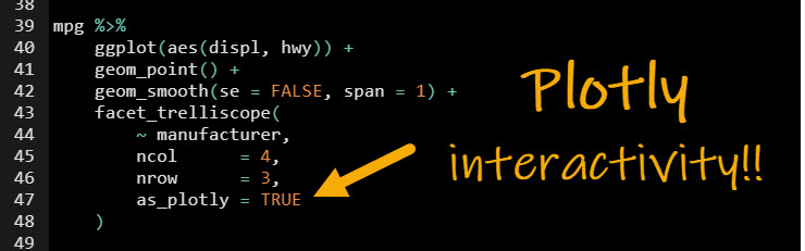
- Add interactivity with the Plotly integration inside of
facet_trelliscope().
- Simply add
as_plotly = TRUE
Get the code.
Check out the interactivity from plotly!!
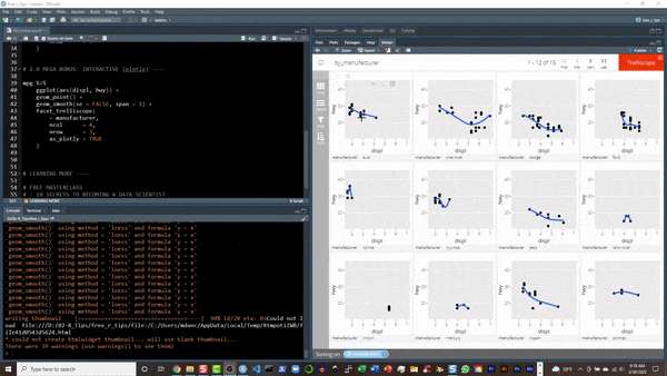
Interactivity with the plotly-trelliscopejs integration
Conclusions
You learned how to use the trelliscopejs library to not only create 100’s of static ggplots but create 100’s of interactive plotly plots. Great work! But, there’s a lot more to becoming a data scientist.
If you’d like to become a data scientist (and have an awesome career, improve your quality of life, enjoy your job, and all the fun that comes along), then I can help with that.
Need to advance your business data science skills?
I’ve helped 6,107+ students learn data science for business from an elite business consultant’s perspective.
I’ve worked with Fortune 500 companies like S&P Global, Apple, MRM McCann, and more.
And I built a training program that gets my students life-changing data science careers (don’t believe me? see my testimonials here):
6-Figure Data Science Job at CVS Health ($125K)
Senior VP Of Analytics At JP Morgan ($200K)
50%+ Raises & Promotions ($150K)
Lead Data Scientist at Northwestern Mutual ($175K)
2X-ed Salary (From $60K to $120K)
2 Competing ML Job Offers ($150K)
Promotion to Lead Data Scientist ($175K)
Data Scientist Job at Verizon ($125K+)
Data Scientist Job at CitiBank ($100K + Bonus)
Whenever you are ready, here’s the system they are taking:
Here’s the system that has gotten aspiring data scientists, career transitioners, and life long learners data science jobs and promotions…
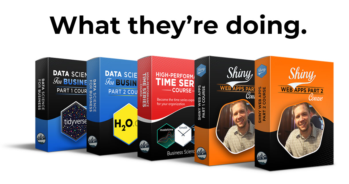
Join My 5-Course R-Track Program Now!
(And Become The Data Scientist You Were Meant To Be...)
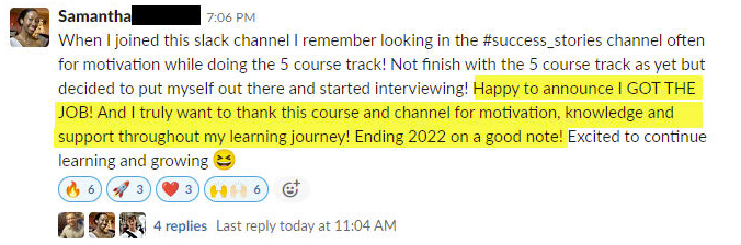
P.S. - Samantha landed her NEW Data Science R Developer job at CVS Health (Fortune 500). This could be you.