Tidy Time Series Analysis, Part 2: Rolling Functions
Written by Matt Dancho

In the second part in a series on Tidy Time Series Analysis, we’ll again use tidyquant to investigate CRAN downloads this time focusing on Rolling Functions. If you haven’t checked out the previous post on period apply functions, you may want to review it to get up to speed. Both zoo and TTR have a number of “roll” and “run” functions, respectively, that are integrated with tidyquant. In this post, we’ll focus on the rollapply function from zoo because of its flexibility with applying custom functions across rolling windows. If you like what you read, please follow us on social media to stay up on the latest Business Science news, events and information! As always, we are interested in both expanding our network of data scientists and seeking new clients interested in applying data science to business and finance.
Part of a 4 part series:
An example of the visualization we can create using the rollapply function with tq_mutate():
Libraries Needed
We’ll primarily be using two libraries today.
library(tidyquant)  # Loads tidyverse, tidyquant, financial pkgs, xts/zoo
library(cranlogs)   # For inspecting package downloads over time
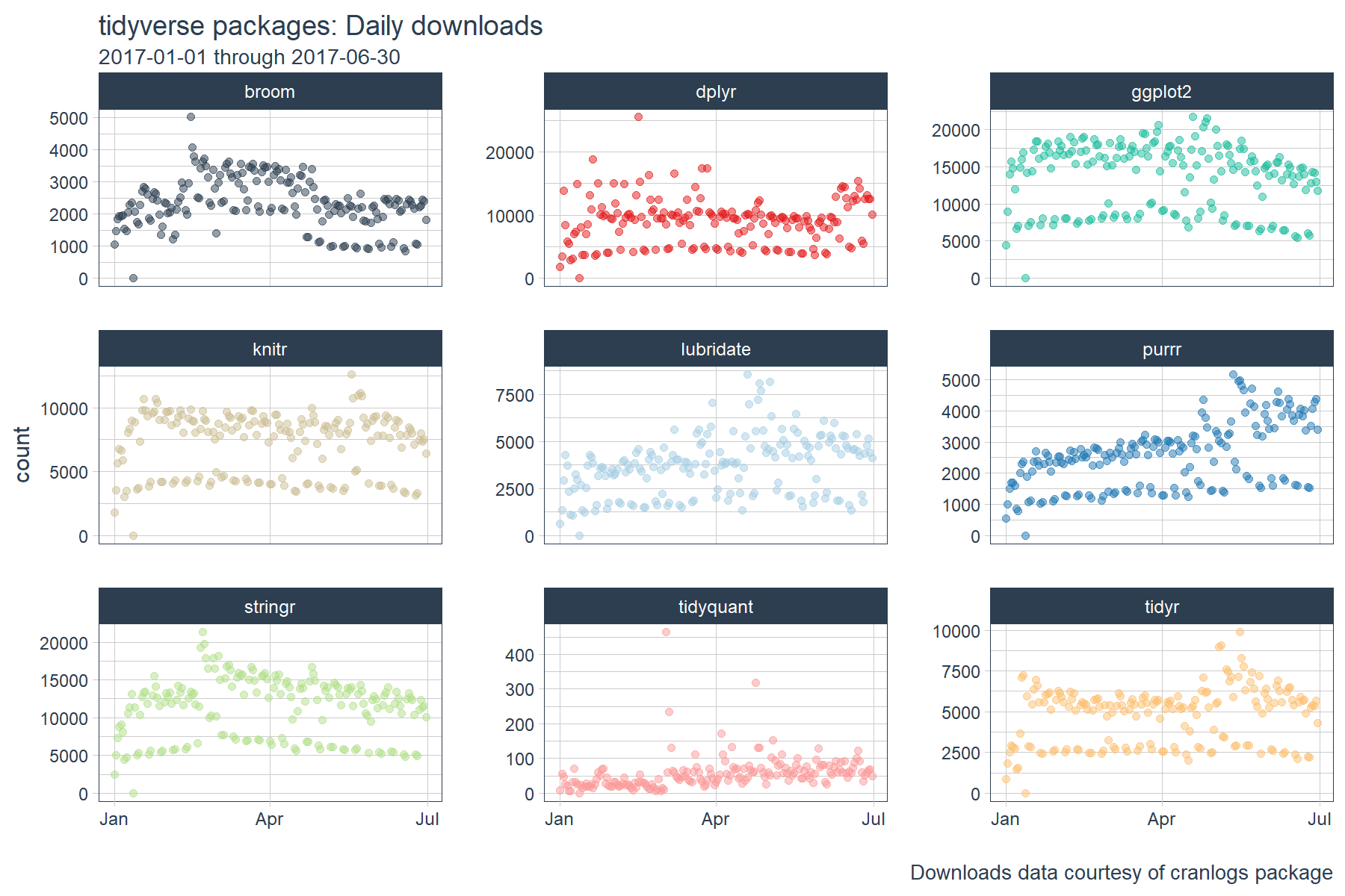
CRAN tidyverse Downloads
We’ll be using the same “tidyverse” dataset as the last post. The script below gets the package downloads for the first half of 2017. The data is very noisy, meaning it’s difficult to identify trends. We’ll see how rolling functions can help shortly.
# tidyverse packages (see my laptop stickers from last post) ;)
pkgs <- c(
    "tidyr", "lubridate", "dplyr",
    "broom", "tidyquant", "ggplot2", "purrr",
    "stringr", "knitr"
)

# Get the downloads for the individual packages
tidyverse_downloads <- cran_downloads(
    packages = pkgs,
    from     = "2017-01-01",
    to       = "2017-06-30") %>%
    tibble::as_tibble() %>%
    group_by(package)

# Visualize the package downloads
tidyverse_downloads %>%
    ggplot(aes(x = date, y = count, color = package)) +
    # Data
    geom_point(alpha = 0.5) +
    facet_wrap(~ package, ncol = 3, scale = "free_y") +
    # Aesthetics
    labs(title = "tidyverse packages: Daily downloads", x = "",
         subtitle = "2017-01-01 through 2017-06-30",
         caption = "Downloads data courtesy of cranlogs package") +
    scale_color_tq() +
    theme_tq() +
    theme(legend.position="none")
Rolling Window Calculations
What are rolling window calculations, and why do we care? In time series analysis, nothing is static. A correlation may exist for a subset of time or an average may vary from one day to the next. Rolling calculations simply apply functions to a fixed width subset of this data (aka a window), indexing one observation each calculation. There are a few common reasons you may want to use a rolling calculation in time series analysis:
- Measuring the central tendency over time (
mean, median)
- Measuring the volatility over time (
sd, var)
- Detecting changes in trend (fast vs slow moving averages)
- Measuring a relationship between two time series over time (
cor, cov)
The most common example of a rolling window calculation is a moving average. Here’s a nice illustration of a 3-month rolling window calculation from Chandoo.org.
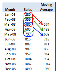
Source: Chandoo.org
A moving average allows us to visualize how an average changes over time, which is very useful in cutting through the noise to detect a trend in a time series dataset. Further, by varying the window (the number of observations included in the rolling calculation), we can vary the sensitivity of the window calculation. This is useful in comparing fast and slow moving averages (shown later).
Combining a rolling mean with a rolling standard deviation can help detect regions of abnormal volatility and consolidation. This is the concept behind Bollinger Bands in the financial industry. The bands can be useful in detecting breakouts in trend for many time series, not just financial.
Time Series Functions
The xts, zoo, and TTR packages have some great functions that enable working with time series. Today, we’ll take a look at the Rolling or Running Functions from the zoo and TTR packages. The roll apply functions are helper functions that enable the application of other functions across a rolling window. What “other functions” can be supplied? Any function that returns a numeric vector such as scalars (mean, median, sd, min, max, etc) or vectors (quantile, summary, and custom functions). The rolling (or running) functions are in the format roll[apply or fun name] for zoo or run[Fun] for TTR. You can see which functions are integrated into tidyquant package below:
# "roll" functions from zoo
tq_mutate_fun_options()$zoo %>%
    stringr::str_subset("^roll")
##  [1] "rollapply"          "rollapplyr"         "rollmax"
##  [4] "rollmax.default"    "rollmaxr"           "rollmean"
##  [7] "rollmean.default"   "rollmeanr"          "rollmedian"
## [10] "rollmedian.default" "rollmedianr"        "rollsum"
## [13] "rollsum.default"    "rollsumr"
# "run" functions from TTR
tq_mutate_fun_options()$TTR %>%
    stringr::str_subset("^run")
##  [1] "runCor"         "runCov"         "runMAD"
##  [4] "runMax"         "runMean"        "runMedian"
##  [7] "runMin"         "runPercentRank" "runSD"
## [10] "runSum"         "runVar"
We’ll investigate the rollapply function from the zoo package because it allows us to use custom functions that we create!
Tidy Implementation of Time Series Functions
We’ll be using the tq_mutate() function to apply time series functions in a “tidy” way. The tq_mutate() function always adds columns to the existing data frame (rather than returning a new data frame like tq_transmute()). It’s well suited for tasks that result in column-wise dimension changes (not row-wise such as periodicity changes, use tq_transmute for those!). It comes with a bunch of integrated financial and time series package integrations. We can see which apply functions will work by investigating the list of available functions returned by tq_mutate_fun_options().
# Condensed function options... lot's of 'em
tq_mutate_fun_options() %>%
    str()
## List of 5
##  $ zoo                 : chr [1:14] "rollapply" "rollapplyr" "rollmax" "rollmax.default" ...
##  $ xts                 : chr [1:27] "apply.daily" "apply.monthly" "apply.quarterly" "apply.weekly" ...
##  $ quantmod            : chr [1:25] "allReturns" "annualReturn" "ClCl" "dailyReturn" ...
##  $ TTR                 : chr [1:61] "adjRatios" "ADX" "ALMA" "aroon" ...
##  $ PerformanceAnalytics: chr [1:7] "Return.annualized" "Return.annualized.excess" "Return.clean" "Return.cumulative" ...
Tidy Application of Rolling Functions
As we saw in the tidyverse daily download graph above, it can be difficult to understand changes in trends just by visualizing the data. We can use rolling functions to better understand how trends are changing over time.
Rolling Mean: Inspecting Fast and Slow Moving Averages
Suppose we’d like to investigate if significant changes in trend are taking place among the package downloads such that future downloads are likely to continue to increase, decrease or stay the same. One way to do this is to use moving averages. Rather than try to sift through the noise, we can use a combination of a fast and slow moving average to detect momentum.
We’ll create a fast moving average with width = 28 days (just enough to detrend the data) and a slow moving average with width = 84 days (slow window = 3X fast window). To do this we apply two calls to tq_mutate(), the first for the 28 day (fast) and the second for the 84 day (slow) moving average. There are three groups of arguments we need to supply:
tq_mutate args: These select the column to apply the mutation to (“count”) and the mutation function (mutate_fun) to apply (rollapply from zoo).rollapply args: These set the width, align = "right" (aligns with end of data frame), and the FUN we wish to apply (mean in this case).FUN args: These are arguments that get passed to the function. In this case we want to set na.rm = TRUE so NA values are skipped if present.
I add an additional tq_mutate arg, col_rename, at the end to rename the column. This is my preference, but it can be placed with the other tq_mutate args above.
# Rolling mean
tidyverse_downloads_rollmean <- tidyverse_downloads %>%
    tq_mutate(
        # tq_mutate args
        select     = count,
        mutate_fun = rollapply,
        # rollapply args
        width      = 28,
        align      = "right",
        FUN        = mean,
        # mean args
        na.rm      = TRUE,
        # tq_mutate args
        col_rename = "mean_28"
    ) %>%
    tq_mutate(
        # tq_mutate args
        select     = count,
        mutate_fun = rollapply,
        # rollapply args
        width      = 84,
        align      = "right",
        FUN        = mean,
        # mean args
        na.rm      = TRUE,
        # tq_mutate args
        col_rename = "mean_84"
    )

# ggplot
tidyverse_downloads_rollmean %>%
    ggplot(aes(x = date, y = count, color = package)) +
    # Data
    geom_point(alpha = 0.1) +
    geom_line(aes(y = mean_28), color = palette_light()[[1]], size = 1) +
    geom_line(aes(y = mean_84), color = palette_light()[[2]], size = 1) +
    facet_wrap(~ package, ncol = 3, scale = "free_y") +
    # Aesthetics
    labs(title = "tidyverse packages: Daily Downloads", x = "",
         subtitle = "28 and 84 Day Moving Average") +
    scale_color_tq() +
    theme_tq() +
    theme(legend.position="none")
The output is a little difficult to see. We’ll need to zoom in a little more to detect momentum. Let’s drop the “count” data from the plots and inspect just the moving averages. What we are looking for are points where the fast trend is above (has momentum) or below (is slowing) the slow trend. In addition, we want to inspect for cross-over, which indicates shifts in trend.
tidyverse_downloads_rollmean %>%
    ggplot(aes(x = date, color = package)) +
    # Data
    # geom_point(alpha = 0.5) +  # Drop "count" from plots
    geom_line(aes(y = mean_28), color = palette_light()[[1]], linetype = 1, size = 1) +
    geom_line(aes(y = mean_84), color = palette_light()[[2]], linetype = 1, size = 1) +
    facet_wrap(~ package, ncol = 3, scale = "free_y") +
    # Aesthetics
    labs(title = "tidyverse packages: Daily downloads", x = "", y = "",
         subtitle = "Zoomed In: 28 and 84 Day Moving Average") +
    scale_color_tq() +
    theme_tq() +
    theme(legend.position="none")
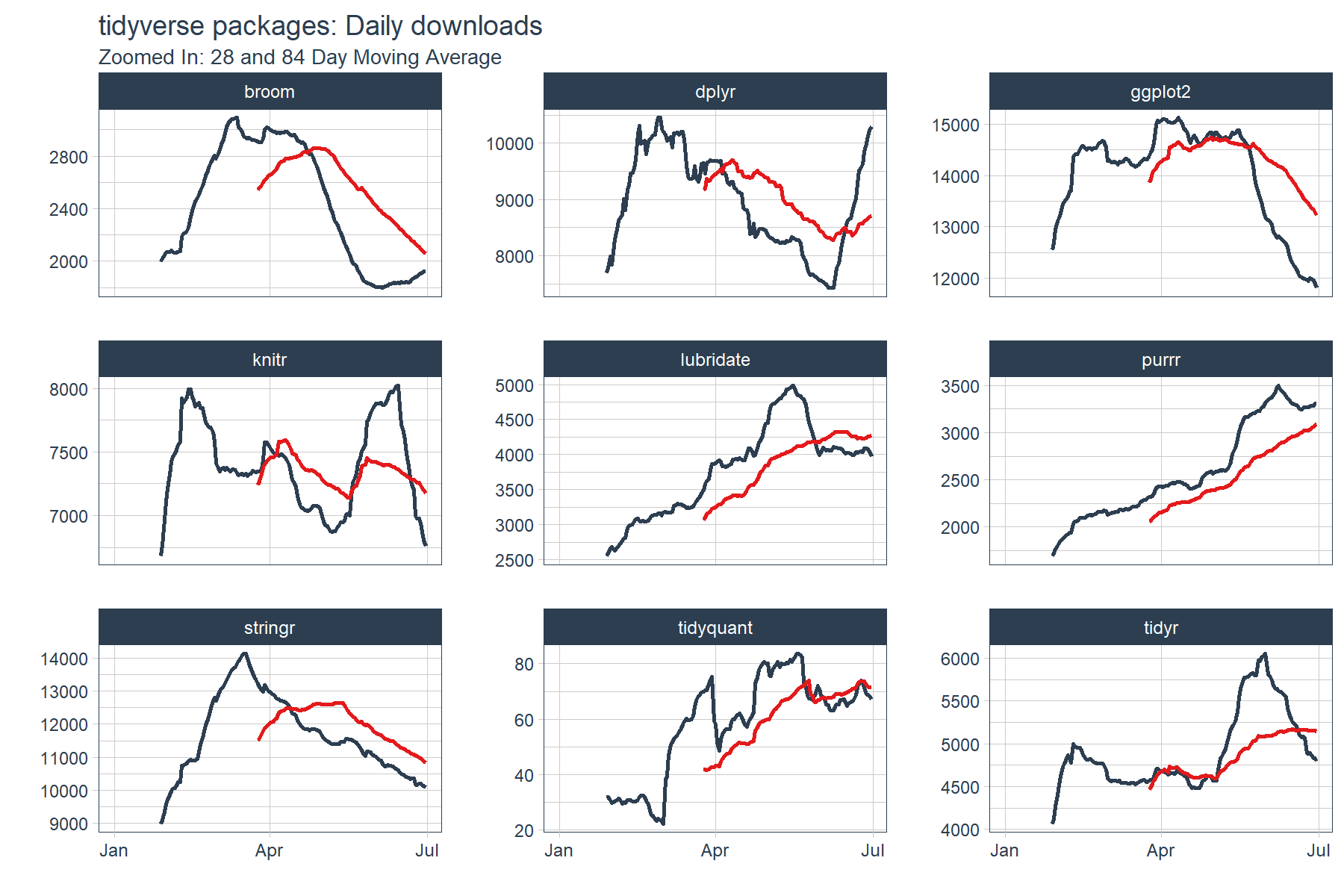
We can see that several packages have strong upward momentum (purrr and lubridate). Others such as dplyr, knitr and tidyr seem to be cycling in a range. Others such as ggplot2 and stringr have short term downward trends (keep in mind these packages are getting the most downloads of the bunch). The last point is this is only a six month window of data. The long term trends may be much different than short term, but we’ll leave that for another day.
Rolling Custom Functions: Useful for multiple statistics
You may find in your analytic endeavors that you want more than one statistic. Well you’re in luck with custom functions! In this example, we’ll create a custom function, custom_stat_fun_2(), that returns four statistics:
- mean
- standard deviation
- 95% confidence interval (mean +/- 2SD)
The custom function can then be applied in the same way that mean was applied.
# Custom function to return mean, sd, 95% conf interval
custom_stat_fun_2 <- function(x, na.rm = TRUE) {
    # x     = numeric vector
    # na.rm = boolean, whether or not to remove NA's

    m  <- mean(x, na.rm = na.rm)
    s  <- sd(x, na.rm = na.rm)
    hi <- m + 2*s
    lo <- m - 2*s

    ret <- c(mean = m, stdev = s, hi.95 = hi, lo.95 = lo)
    return(ret)
}
Now for the fun part: performing the “tidy” rollapply. Let’s apply the custom_stat_fun_2() to groups using tq_mutate() and the rolling function rollapply(). The process is almost identical to the process of applying mean() with the main exception that we need to set by.column = FALSE to prevent a “length of dimnames [2]” error. The output returned is a “tidy” data frame with each statistic in its own column.
# Roll apply using custom stat function
tidyverse_downloads_rollstats <- tidyverse_downloads %>%
    tq_mutate(
        select     = count,
        mutate_fun = rollapply,
        # rollapply args
        width      = 28,
        align      = "right",
        by.column  = FALSE,
        FUN        = custom_stat_fun_2,
        # FUN args
        na.rm      = TRUE
    )
tidyverse_downloads_rollstats
## # A tibble: 1,629 x 7
## # Groups:   package [9]
##    package       date count  mean stdev hi.95 lo.95
##      <chr>     <date> <dbl> <dbl> <dbl> <dbl> <dbl>
##  1   tidyr 2017-01-01   873    NA    NA    NA    NA
##  2   tidyr 2017-01-02  1840    NA    NA    NA    NA
##  3   tidyr 2017-01-03  2495    NA    NA    NA    NA
##  4   tidyr 2017-01-04  2906    NA    NA    NA    NA
##  5   tidyr 2017-01-05  2847    NA    NA    NA    NA
##  6   tidyr 2017-01-06  2756    NA    NA    NA    NA
##  7   tidyr 2017-01-07  1439    NA    NA    NA    NA
##  8   tidyr 2017-01-08  1556    NA    NA    NA    NA
##  9   tidyr 2017-01-09  3678    NA    NA    NA    NA
## 10   tidyr 2017-01-10  7086    NA    NA    NA    NA
## # ... with 1,619 more rows
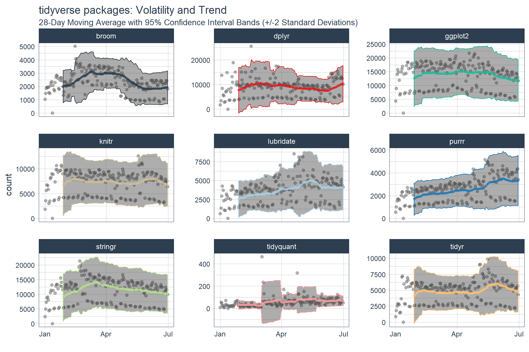
We now have the data needed to visualize the rolling average (trend) and the 95% confidence bands (volatility). If you’re familiar with finance, this is actually the concept of the Bollinger Bands. While we’re not trading stocks here, we can see some similarities. We can see periods of consolidation and periods of high variability. Many of the high variability periods are when the package downloads are rapidly increasing. For example, lubridate, purrr and tidyquant all had spikes in downloads causing the 95% Confidence Interval (CI) bands to widen.
tidyverse_downloads_rollstats %>%
    ggplot(aes(x = date, color = package)) +
    # Data
    geom_point(aes(y = count), color = "grey40", alpha = 0.5) +
    geom_ribbon(aes(ymin = lo.95, ymax = hi.95), alpha = 0.4) +
    geom_point(aes(y = mean), size = 1, alpha = 0.5) +
    facet_wrap(~ package, ncol = 3, scale = "free_y") +
    # Aesthetics
    labs(title = "tidyverse packages: Volatility and Trend", x = "",
         subtitle = "28-Day Moving Average with 95% Confidence Interval Bands (+/-2 Standard Deviations)") +
    scale_color_tq(theme = "light") +
    theme_tq() +
    theme(legend.position="none")
Conclusions
The rollapply functions from zoo and TTR can be used to apply rolling window calculations. The tq_mutate() function from tidyquant enables efficient and “tidy” application of the functions. We were able to use the rollapply functions to visualize averages and standard deviations on a rolling basis, which gave us a better perspective of the dynamic trends. Using custom functions, we are unlimited to the statistics we can apply to rolling windows. In fact, rolling correlations, regressions, and more complicated statistics can be applied, which will be the subject of the next posts. Stay tuned! ;)
Business Science University
Enjoy data science for business? We do too. This is why we created Business Science University where we teach you how to do Data Science For Busines (#DS4B) just like us!
Our first DS4B course (HR 201) is now available!
Who is this course for?
Anyone that is interested in applying data science in a business context (we call this DS4B). All you need is basic R, dplyr, and ggplot2 experience. If you understood this article, you are qualified.
What do you get it out of it?
You learn everything you need to know about how to apply data science in a business context:
-
Using ROI-driven data science taught from consulting experience!
-
Solve high-impact problems (e.g. $15M Employee Attrition Problem)
-
Use advanced, bleeding-edge machine learning algorithms (e.g. H2O, LIME)
-
Apply systematic data science frameworks (e.g. Business Science Problem Framework)
“If you’ve been looking for a program like this, I’m happy to say it’s finally here! This is what I needed when I first began data science years ago. It’s why I created Business Science University.”
Matt Dancho, Founder of Business Science