Tidy Time Series Analysis, Part 1
Written by Matt Dancho
In the first part in a series on Tidy Time Series Analysis, we’ll use tidyquant to investigate CRAN downloads. You’re probably thinking, “Why tidyquant?” Most people think of tidyquant as purely a financial package and rightfully so. However, because of its integration with xts, zoo and TTR, it’s naturally suited for “tidy” time series analysis. In this post, we’ll discuss the the “period apply” functions from the xts package, which make it easy to apply functions to time intervals in a “tidy” way using tq_transmute()!
Part of a 4-part series:
An example of the visualization we can create using the period apply functions with tq_transmute():
Libraries Needed
We’ll primarily be using two libraries today.
library(tidyquant)  # Loads tidyverse, tidquant, financial pkgs, xts/zoo
library(cranlogs)   # For inspecting package downloads over time
CRAN tidyverse Downloads
As you can tell from my laptop stickers, I’m a bit of a tidyverse fan. :) The packages are super useful so it’s no wonder why several of these packages rank in the top downloads according to RDocumenation.org’s Leaderboard by DataCamp.

We love the tidyverse!
A good way to inspect the trends in popularity with these packages is to examine the CRAN downloads. So how do we get download data? The cranlogs package has a convenient function, cran_downloads(), that allows us to retrieve daily downloads of various packages. Getting downloads is as easy as making a vector of the packages we want to analyze and using cran_downloads(). I’ve added a date range over the past six months since tidyquant has only been in existence since then.
# Various tidyverse packages corresponding to my stickers :)
pkgs <- c(
    "tidyr", "lubridate", "dplyr",
    "broom", "tidyquant", "ggplot2", "purrr",
    "stringr", "knitr"
    )

# Get the downloads for the individual packages
tidyverse_downloads <- cran_downloads(
    packages = pkgs,
    from     = "2017-01-01",
    to       = "2017-06-30") %>%
    tibble::as_tibble() %>%
    group_by(package)

tidyverse_downloads
## # A tibble: 1,629 x 3
## # Groups:   package [9]
##          date count package
##  *     <date> <dbl>   <chr>
##  1 2017-01-01   873   tidyr
##  2 2017-01-02  1840   tidyr
##  3 2017-01-03  2495   tidyr
##  4 2017-01-04  2906   tidyr
##  5 2017-01-05  2847   tidyr
##  6 2017-01-06  2756   tidyr
##  7 2017-01-07  1439   tidyr
##  8 2017-01-08  1556   tidyr
##  9 2017-01-09  3678   tidyr
## 10 2017-01-10  7086   tidyr
## # ... with 1,619 more rows
We can easily visualize the “tidyverse” downloads with ggplot2.
# Visualize the package downloads
tidyverse_downloads %>%
    ggplot(aes(x = date, y = count, color = package)) +
    geom_point() +
    labs(title = "tidyverse packages: Daily downloads", x = "") +
    facet_wrap(~ package, ncol = 3, scale = "free_y") +
    scale_color_tq() +
    theme_tq() +
    theme(legend.position="none")
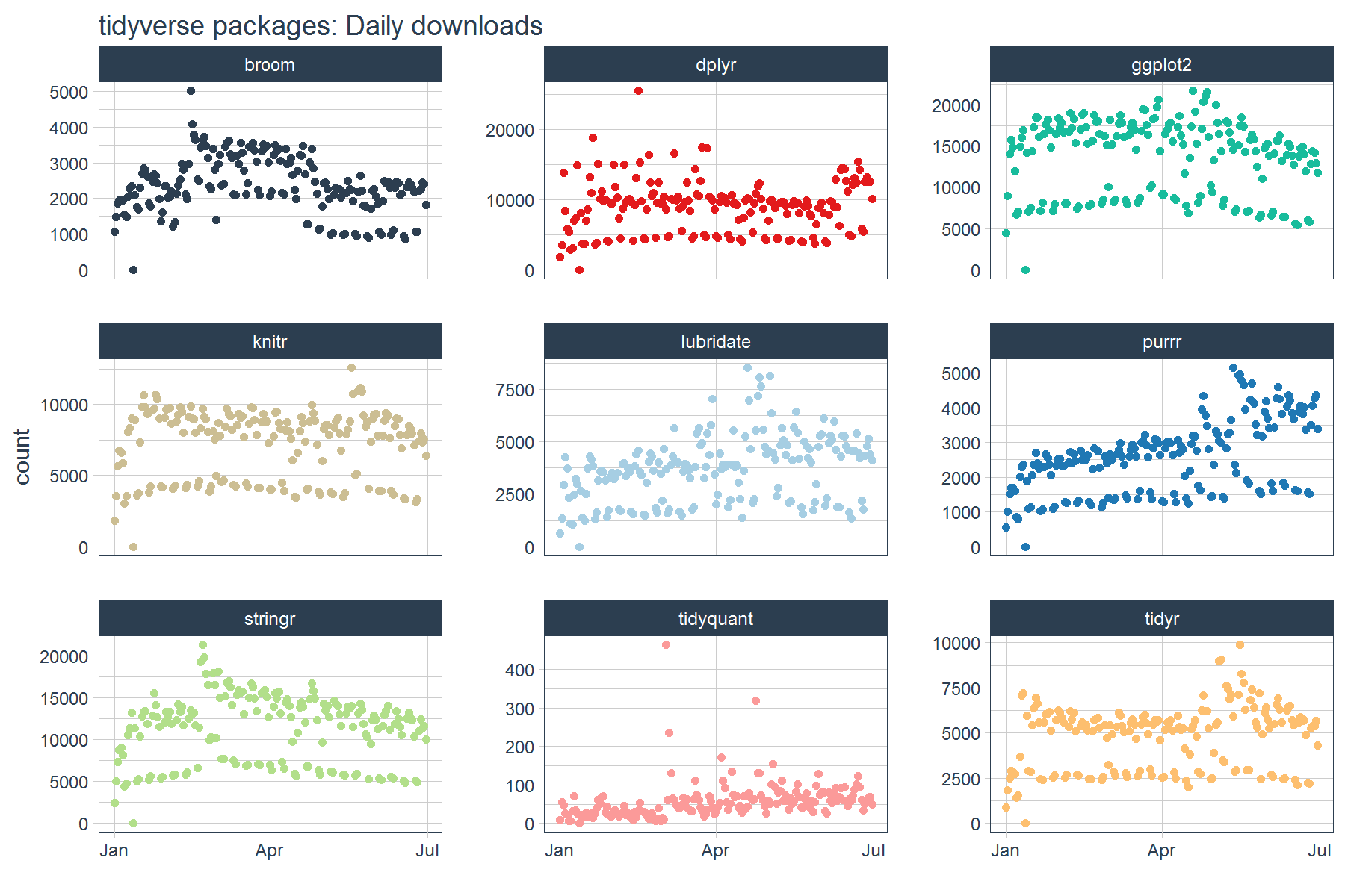
From the downloads graph, it’s difficult to see what’s going on. It looks like there is some separation in the data (this corresponds to weekends), but overall it’s difficult to separate the trend from the noise. This is the nature of daily data: it tends to be very noisy. The problem tends to get worse with the larger the data set. Fortunately, there’s a bunch of useful time series tools to help us extract trends and to make visualization easier!
Time Series Functions
The xts, zoo, and TTR packages have some great functions that enable working with time series. Today, we’ll focus in on the Period Apply Functions from the xts package. The period apply functions are helper functions that enable the application of other functions by common intervals. What “other functions” can be supplied? Any function that returns a numeric vector such as scalars (mean, median, sd, min, max, etc) or vectors (quantile, summary, and custom functions) The period apply functions are in the format apply.[interval] where [interval] can be daily, weekly, monthly, quarterly, and yearly.
Tidy Implementation of Time Series Functions
We’ll be using the tq_transmute() function to apply time series functions in a “tidy” way. The tq_transmute() function always returns a new data frame (rather than adding columns to the existing data frame). Hence it’s well suited for aggregation tasks that result in rowwise (or columnwise) dimension changes. It comes with a bunch of integrated financial and time series package integrations. We can see which apply functions will work by investigating the list of available functions returned by tq_transmute_fun_options().
# "apply" functions from xts
tq_transmute_fun_options()$xts %>%
    stringr::str_subset("^apply")
## [1] "apply.daily"     "apply.monthly"   "apply.quarterly"
## [4] "apply.weekly"    "apply.yearly"
Applying Functions By Period
As we saw in the tidyverse daily download graph above, it can be difficult to understand the trends in daily data just by visualizing the data. It’s often better to apply statistics to subsets of the time series, which can help to remove noise and make it easier to extract / visualize the underlying trends. The period apply functions from xts are the perfect answer in these cases.
A simple case: Inspecting the average daily downloads by week.
Suppose we’d like to investigate if our the package downloads are growing. One way to do this is to investigate by aggregating over an interval. Instead of viewing each day, we can view the average daily downloads of each week, which reduces the impact of outliers and reduces the number of data points in the process making it easier to visualize trend.
To perform the weekly aggregation, we will use tq_transmute() which applies the non-tidy functions in a “tidy” way. The function we want to use is apply.weekly(), which takes the argument FUN (the function to be applied weekly) and ... (additional args that get passed to the FUN function). We’ll set FUN = mean to apply mean() on a weekly interval. Last, we’ll pass the argument na.rm = TRUE to remove NA values during the calculation.
mean_tidyverse_downloads_w <- tidyverse_downloads %>%
    tq_transmute(
        select     = count,
        mutate_fun = apply.weekly,
        FUN        = mean,
        na.rm      = TRUE,
        col_rename = "mean_count"
    )
mean_tidyverse_downloads_w
## # A tibble: 243 x 3
## # Groups:   package [9]
##    package       date mean_count
##      <chr>     <date>      <dbl>
##  1   tidyr 2017-01-01    873.000
##  2   tidyr 2017-01-08   2262.714
##  3   tidyr 2017-01-15   4243.000
##  4   tidyr 2017-01-22   5118.714
##  5   tidyr 2017-01-29   4884.143
##  6   tidyr 2017-02-05   4974.286
##  7   tidyr 2017-02-12   4849.000
##  8   tidyr 2017-02-19   4570.857
##  9   tidyr 2017-02-26   4674.714
## 10   tidyr 2017-03-05   4179.429
## # ... with 233 more rows
By graphing the mean daily downloads each week instead of each of the daily download counts, we can visualize the trends a bit easier.
mean_tidyverse_downloads_w %>%
    ggplot(aes(x = date, y = mean_count, color = package)) +
    geom_point() +
    geom_smooth(method = "loess") +
    labs(title = "tidyverse packages: Average daily downloads by week", x = "",
         y = "Mean Daily Downloads by Week") +
    facet_wrap(~ package, ncol = 3, scale = "free_y") +
    expand_limits(y = 0) +
    scale_color_tq() +
    theme_tq() +
    theme(legend.position="none")
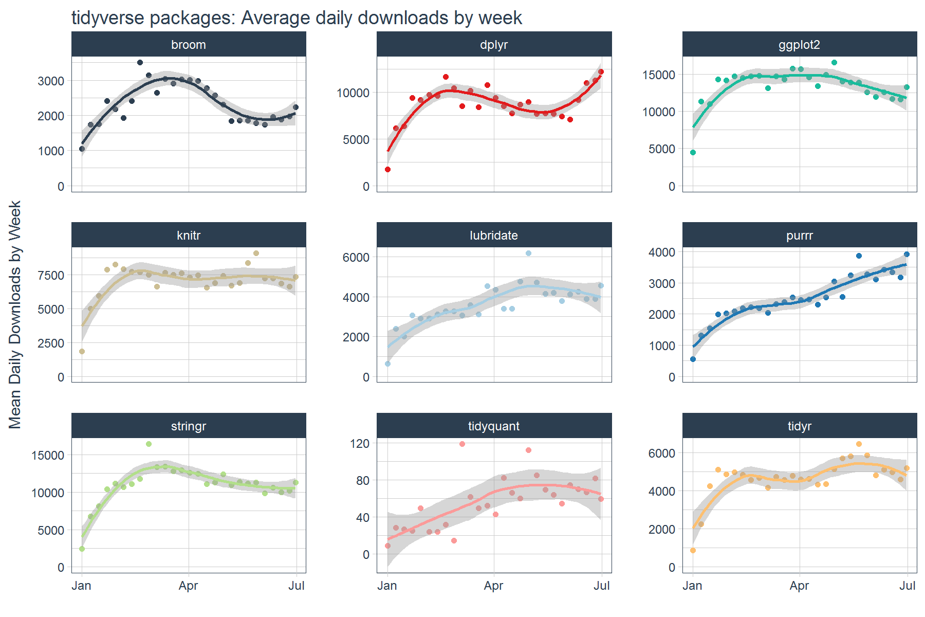
There’s one problem though, graphing the mean alone doesn’t tell the full story. There’s variability (or volatility) that can also influence trends especially the average, which is highly susceptible to outliers. Next, we’ll see how to go beyond a single statistic.
Custom functions: Weekly aggregation beyond a single statistic
As statisticians, we typically care about more than simply getting the mean. We might be interested in standard deviation, quantiles, and other elements that help to characterize the underlying data. The good news is that we can implement custom functions that return numeric values that describe the data more fully. Let’s test it out by creating a function that returns the following:
- mean
- standard deviation
- min & max
- range for middle 95% (2.5% and 97.5%)
- range for middle 50% (25% and 75%, or Q1 and Q3)
- median
This is actually really easy to do. Our custom function, custom_stat_fun(), will only need three functions: mean, sd and quantile. We’ll setup the function to take the arguments x (the numeric vector), na.rm (arg to remove NA values from the statistic calculation), and ... to pass additional arguments to the quantile() function. Here it is:
# Custom function to return mean, sd, quantiles
custom_stat_fun <- function(x, na.rm = TRUE, ...) {
    # x     = numeric vector
    # na.rm = boolean, whether or not to remove NA's
    # ...   = additional args passed to quantile
    c(mean    = mean(x, na.rm = na.rm),
      stdev   = sd(x, na.rm = na.rm),
      quantile(x, na.rm = na.rm, ...))
}
Let’s test out the custom stat function. Note the format of the return is a named numeric vector. As long as the return is a numeric vector, we can use in the “tidy” aggregation (shown next).
# Testing custom_stat_fun
options(digits = 4)
set.seed(3366)
nums  <- c(10 + 1.5*rnorm(10), NA)
probs <- c(0, 0.025, 0.25, 0.5, 0.75, 0.975, 1)
custom_stat_fun(nums, na.rm = TRUE, probs = probs)
##   mean  stdev     0%   2.5%    25%    50%    75%  97.5%   100%
##  8.824  1.752  5.316  5.616  8.285  9.189 10.118 10.746 10.877
Now for the fun part: “tidy” aggregation. Let’s apply the custom_stat_fun() to groups using tq_transmute() and the weekly aggregation function apply.weekly(). The process is almost identical to the process of applying mean() on weekly intervals. The only difference is we also supply the probabilities (probs), which gets sent to the quantile() function internal to our custom stat function. The output returned is a tidy data frame with each statistic that relates to the data spread.
# Applying the custom function by week
stats_tidyverse_downloads_w <- tidyverse_downloads %>%
    tq_transmute(
        select = count,
        mutate_fun = apply.weekly,
        FUN = custom_stat_fun,
        na.rm = TRUE,
        probs = probs
    )
stats_tidyverse_downloads_w
## # A tibble: 243 x 11
## # Groups:   package [9]
##    package       date  mean  stdev  `0%` `2.5%` `25%` `50%` `75%`
##      <chr>     <date> <dbl>  <dbl> <dbl>  <dbl> <dbl> <dbl> <dbl>
##  1   tidyr 2017-01-01   873     NA   873  873.0   873   873   873
##  2   tidyr 2017-01-08  2263  633.7  1439 1456.5  1698  2495  2802
##  3   tidyr 2017-01-15  4243 2643.6     0  428.1  2879  3678  6523
##  4   tidyr 2017-01-22  5119 1908.6  2432 2434.7  3939  5575  6486
##  5   tidyr 2017-01-29  4884 1600.8  2549 2564.1  3890  5588  6056
##  6   tidyr 2017-02-05  4974 1633.1  2522 2547.9  4146  5715  6016
##  7   tidyr 2017-02-12  4849 1530.8  2670 2675.6  3898  5331  5960
##  8   tidyr 2017-02-19  4571 1445.7  2463 2463.2  3804  5406  5472
##  9   tidyr 2017-02-26  4675 1508.1  2418 2443.9  3837  5297  5753
## 10   tidyr 2017-03-05  4179 1211.4  2679 2705.8  3048  4715  5172
## # ... with 233 more rows, and 2 more variables: `97.5%` <dbl>,
## #   `100%` <dbl>
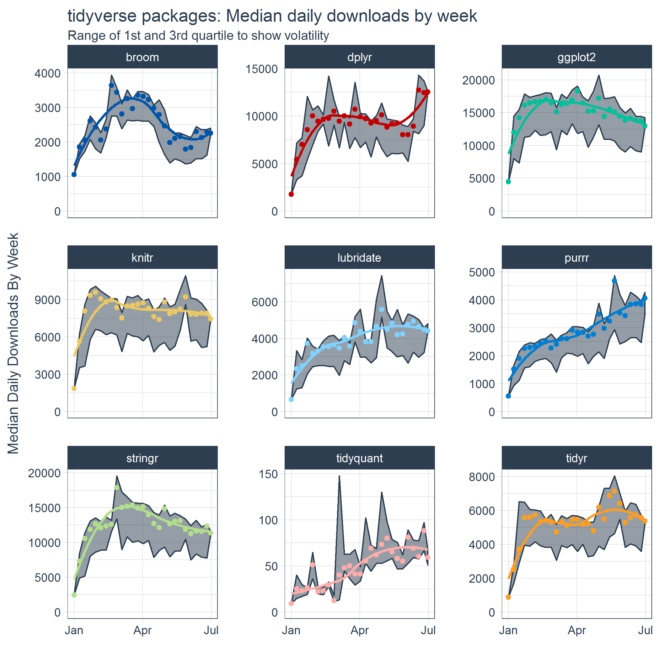
Like before, the data was sectioned by week, but now we have a number of additional features that can be used to visualize volatility in addition to trend. The trend is visualized by the median and the volatility by the first and third quartile. We can also visually recognize the skew caused by the weekends by the space between the 1st Quartile line and the median points on several of the facets. This is an indicator that there may be a separate group to estimate.
stats_tidyverse_downloads_w %>%
    ggplot(aes(x = date, y = `50%`, color = package)) +
    # Ribbon
    geom_ribbon(aes(ymin = `25%`, ymax = `75%`),
                color = palette_light()[[1]], fill = palette_light()[[1]], alpha = 0.5) +
    # Points
    geom_point() +
    geom_smooth(method = "loess", se = FALSE) +
    # Aesthetics
    labs(title = "tidyverse packages: Median daily downloads by week", x = "",
         subtitle = "Range of 1st and 3rd quartile to show volatility",
         y = "Median Daily Downloads By Week") +
    facet_wrap(~ package, ncol = 3, scale = "free_y") +
    expand_limits(y = 0) +
    scale_color_tq(theme = "dark") +
    theme_tq() +
    theme(legend.position="none")
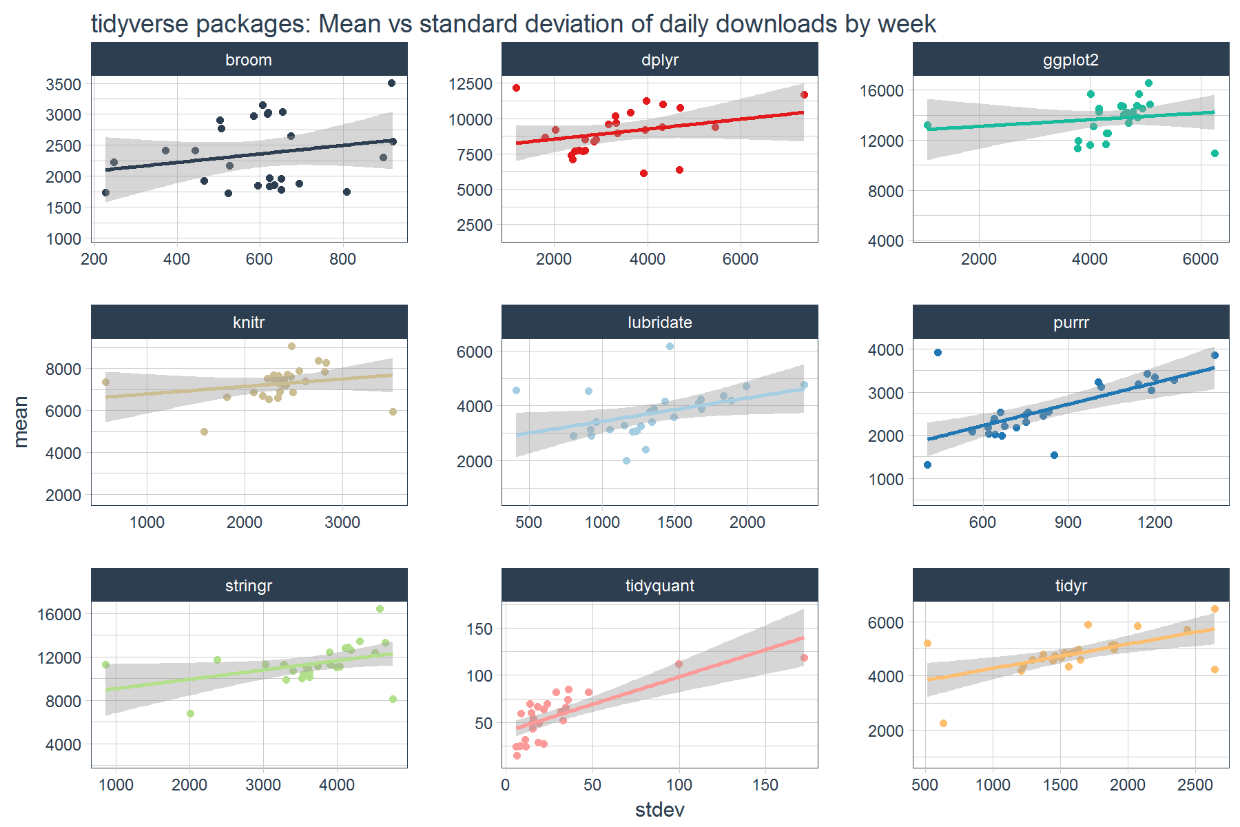
We can also investigate how the mean and standard deviation relate to each other. In general it appears that higher volatility in daily downloads tends to coincide with higher mean daily downloads.
stats_tidyverse_downloads_w %>%
    ggplot(aes(x = stdev, y = mean, color = package)) +
    geom_point() +
    geom_smooth(method = "lm") +
    labs(title = "tidyverse packages: Mean vs standard deviation of daily downloads by week") +
    facet_wrap(~ package, ncol = 3, scale = "free") +
    scale_color_tq() +
    theme_tq() +
    theme(legend.position="none")
Conclusions
The period apply functions from xts can be used to apply aggregations using common time series intervals such as weekly, monthly, quarterly, and yearly. The tq_transmute() function from tidyquant enables efficient and “tidy” application of the functions. We were able to use the period apply functions to visualize trends and volatility and to expose relationships between statistical measures.
Business Science University
Enjoy data science for business? We do too. This is why we created Business Science University where we teach you how to do Data Science For Busines (#DS4B) just like us!
Our first DS4B course (HR 201) is now available!
Who is this course for?
Anyone that is interested in applying data science in a business context (we call this DS4B). All you need is basic R, dplyr, and ggplot2 experience. If you understood this article, you are qualified.
What do you get it out of it?
You learn everything you need to know about how to apply data science in a business context:
-
Using ROI-driven data science taught from consulting experience!
-
Solve high-impact problems (e.g. $15M Employee Attrition Problem)
-
Use advanced, bleeding-edge machine learning algorithms (e.g. H2O, LIME)
-
Apply systematic data science frameworks (e.g. Business Science Problem Framework)
“If you’ve been looking for a program like this, I’m happy to say it’s finally here! This is what I needed when I first began data science years ago. It’s why I created Business Science University.”
Matt Dancho, Founder of Business Science