R and Python: How to Integrate the Best of Both into Your Data Science Workflow
Written by Matt Dancho
R and Python for Data Science
From Executive Business Leadership to Data Scientists, we all agree on one thing: A data-driven transformation is happening. Artificial Intelligence (AI) and more specifically, Data Science, are redefining how organizations extract insights from their core business(es). We’re experiencing a fundamental shift in organizations in which “approximately 90% of large global organizations with have a Chief Data Officer by 2019”. Why? Because, when the ingredients of a “high performance data science team” are present (refer to this Case Study), organizations are able to generate massive return on investment (ROI). However, data science teams tend to get hung up on a “battle” waged between the two leading programming languages for data science: R vs Python.
In our recent article, “Case Study: How To Build A High Performance Data Science Team”, we exposed how a real company (Amadeus Investment Partners) is utilizing a structured workflow that combines talented business experts, data science education, and a communication between subject matter experts and data scientists to achieve best-in-class results in the one of the most competitive industries: investing.
One of the key points from this article was the use of data science languages as tools in a toolkit. R, Python… Use them both. Leverage their strengths. Don’t build an “R Shop” or a “Python Shop”. Build a High Performance Data Science Team that capitalizes on the unique strengths of both languages.
Don’t build an “R Shop” or a “Python Shop”. Build a High Performance Data Science Team that capitalizes on the unique strengths of both languages.
This idea of using multiple languages may seem crazy. In the short term, it requires more education. But, in the long term it pays dividends in:
-
Increased efficiency - How quickly can your data science team iterate through its workflow?
-
Increased productivity - How much can your data science team produce that adds value and generates ROI?
-
Increased capability - How limited (or unlimited) is your data science team’s output?
UPDATE
Use feature engineering with timetk to forecast
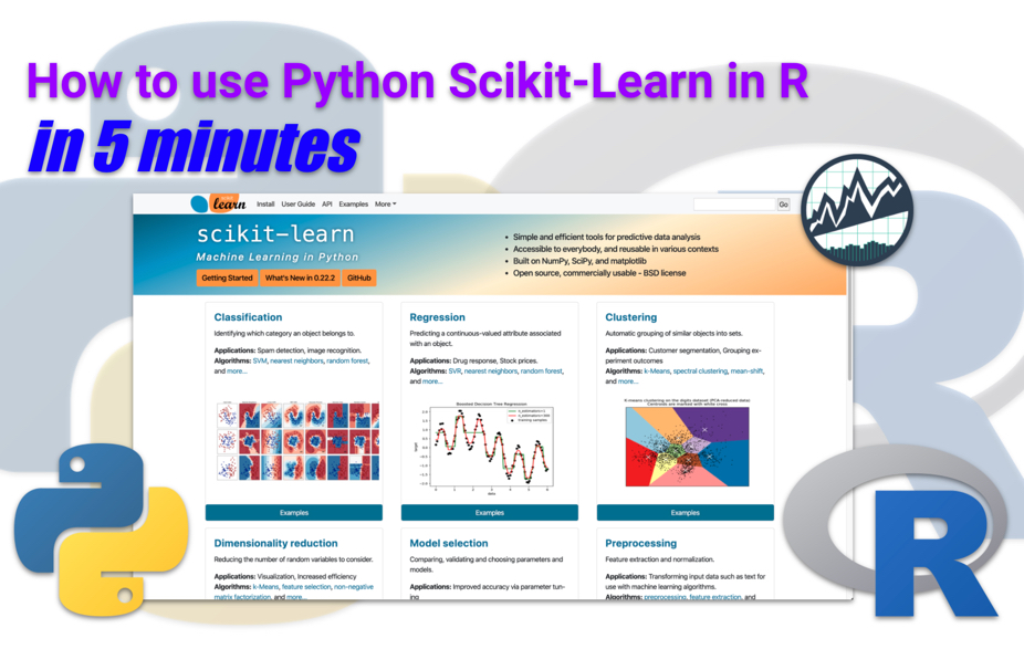
I have a NEW Python + R Tutorial using Python 3.8 and setting up an Anaconda Environment for Scikit Learn, Pandas, Numpy and Matplotlib in 5 minutes!
The new tutorial goes through the essential setup tips of the PRO’s - those that use Python from R via reticulate.
-
Install the Anaconda Distribution
-
Get Python Scikit Learn Setup in R
-
Do a Cluster Analysis with Affinity Propagation Algorithm to make sure Scikit Learn is running.
Summary
This article is split into two parts:
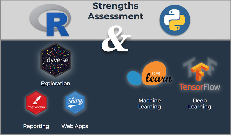
The strengths assessment concludes that both R and Python have amazing features that can interplay together. The visualization below summarizes the strengths.
Strengths Assessment, R and Python
The ML Tutorial is particularly powerful showcasing the interplay between Python and R. You’ll end with a nice segment on model quality showing how to detect weaknesses in your model with ggplot2.
Model Evaluation
In this article, we’ll show a quick machine learning (ML) tutorial that integrates both R and Python, showcasing the strengths of the two dominant programming languages. But, before we get into the ML tutorial, let’s examine the strengths of each language.
Part 1: R + Python, Examination of Key Strengths
Both data science languages are great for business analysis. Both R and Python can be used in similar capacities when viewed from a pure machine learning perspective. Both have packages or libraries that are dedicated to wrangling, preprocessing, and applying machine learning to data. Both are excellent choices for reproducibile research, a requirement for many industries to validate research methodologies and experiments. Where things get interesting is their differences, which is the source of beauty and power of combining languages to work together in harmony.
Strengths Assessment, R and Python
R Strengths
Let’s start with R. Well, actually, let’s start with S. The S language was a precursor to R developed by John Chambers (statistician) at Bell Labs in 1976 as a programming language designed to implement statistics. The R statistical programming language was developed by professors at the University of Auckland, New Zealand, to extend S beyond its initial implementation. The key point is that S and R developers were not software engineers or computer scientists. Rather, they were researchers and scientists that developed tools to more effectively design and perform experiments and communicate results.
In it’s essence, R is a language with roots in statistics, data analysis, data exploration, and data visualization. R has excellent utilities for reporting and communication including RMarkdown (a method for integrating code, graphical output, and text into a journal-quality report) and Shiny (a tool for building prototype web applications, think minimum viable products, MVP).
R is growing quickly with the emergence of the tidyverse (tidyverse.org), a set of tools with a common programming-interface that use functional verbs (functions like mutate() and summarize()) to perform intuitive operations connected by the pipe (%>%), which mimics how people read. The tidyverse is a big advantage because it makes exploring data highly efficient. Iterating through your exploratory analysis is as easy as writing a paragraph describing what you want to do to the data. Here’s a tidyverse flow chart from storybench.org.
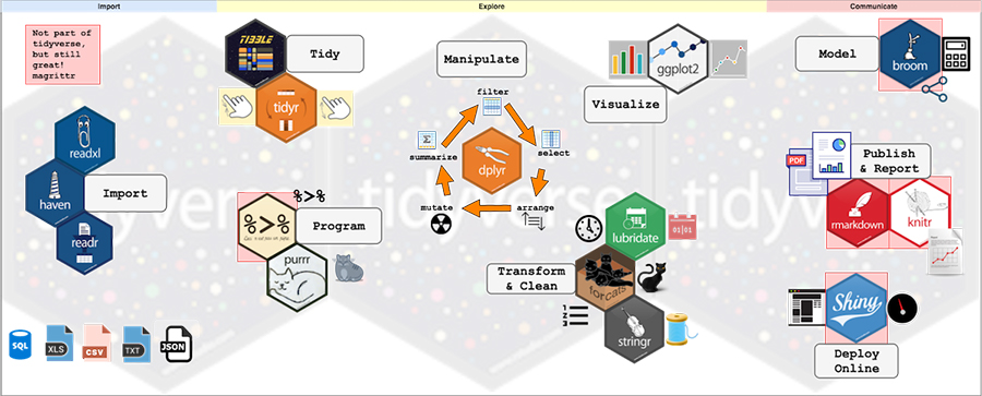
Getting Started with tidyverse in R, storybench.org
The strengths of R relate very well to business wherein organizations need to test theories, explain cause-and-effect relationships, iterate quickly, and make decisions. Further, communication utilities including business reporting, presentation slide decks, and web applications can be built using a reproducible workflow all within R.
Python Strengths
The Python language is a general-purpose programming language that was created by Guido van Rossum (Computer Scientist) in 1991. The language was developed to be easy to read and cover multiple programming paradigms. One of it’s greatest strengths is Python’s versatility which includes web frameworks, data base connectivity, networking, web scraping, scientific computing, text and image processing, many of which features lend themselves to various tasks in machine learning including image recognition, natural language processing, and machine learning.
In essence, Python’s roots are in computer science and mathematics. The language was designed for programmers that require versatility into many different fields. With over 100,000 open source libraries, Python has the largest ecosystem of any programming language, making it uniquely positioned as a choice for those that want versatility.
Python has excellent data science libraries including Scikit Learn, the most popular machine learning library, and TensorFlow, a library developed by software engineers at Google to perform deep learning, commonly used for image recognition and natural language processing tasks. The Scikit Learn machine learning flow chart is shown below, which illustrates its reach for many types of machine learning problems.
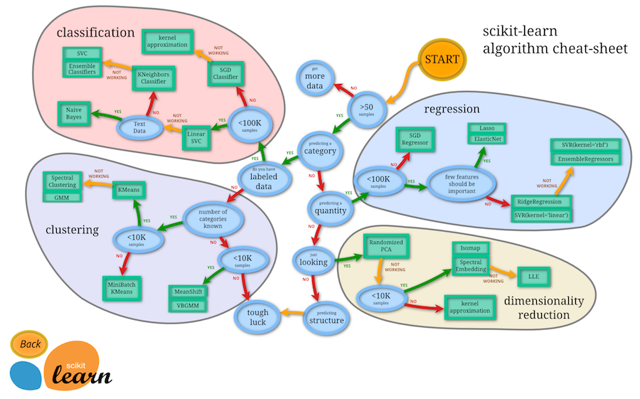
Scikit Learn Machine Learning Flow Chart, scikit-learn.org
In a business context, the key strength of Python rests in the powerful machine learning libraries including Scikit Learn and TensorFlow (and the Keras implementation, which is designed for efficiently building neural networks). The Scikit Learn library is easy to pick up, includes support for pipelines to simplify the machine learning workflow, and has almost all of the algorithms one needs in one place.
Designing A Data Science Workflow
When you learn multiple languages, you gain the ability to select the best tool for the job. The result is a language harmony that increases the data science team’s efficiency, capability, and productivity.
When you learn multiple languages, you gain the ability to select the best tool for the job.
The general idea is to be as flexible as possible so we can leverage the best of both languages within our full-stack data science workflow, which includes:
-
Efficiently exploring data
-
Modeling, Cross Validating, and Evaluating Model Quality
-
Communicating data science to make better decisions via traditional reports (Word, PowerPoint, Excel, PDF), web-based reports (HTML), and interactive web-applications (Shiny, Django)
We can make a slight modification to the R and Python Strengths visualization to organize it in a logical sequence that leverages the strengths:
-
R is selected for exploration because of the tidyverse readability and efficiency
-
Python is selected for machine learning because of Scikit Learn machine learning pipeline capability
-
R is selected for communication because of the advanced reporting utilities including RMarkdown and Shiny (interactive web apps) and the wonderful ggplot2 visualization package
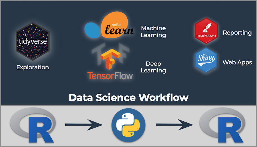
Data Science Workflow Integrating R + Python
Now that we have identified the tools we want to use, let’s go through a short tutorial that brings this idea of language harmony together.
Part 2: R + Python, Integrated Machine Learning Tutorial
The project we are performing comes from the “Wine Snob Machine Learning Tutorial” by Elite Data Science. We’ll perform the following:
-
(Python) Replicate the Machine Learning tutorial using Scikit Learn
-
(R) Use ggplot2 to visualize the results for model performance
-
(R) Build the report using RMarkdown and the new radix framework for scientific reporting
These are the same steps that were used to create the “R + Python with reticulate” report contained in this Machine Learning Tutorial on YouTube:
R + Python with Reticulate, YouTube Video
The report built in the video looks like this:
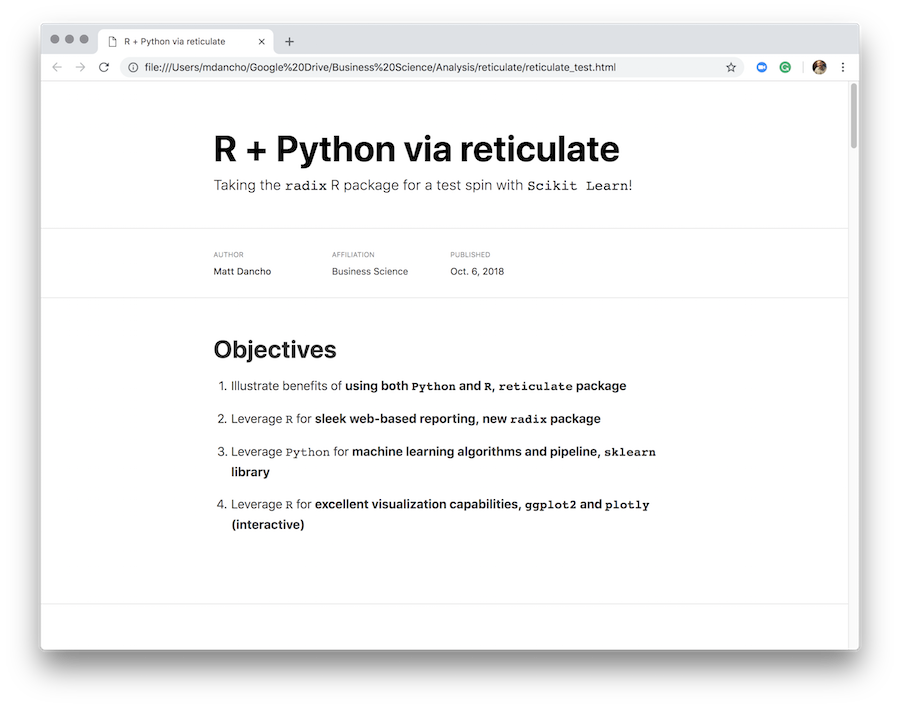
Report with R and Python via reticulate and radix
We’ll go through the basic steps used to build this “R + Python with reticulate” report in an RMarkdown document using both Python and R.
Step 1: Setup R + Python Environments
We’re going to do everything from the RStudio IDE: Preview Version, which includes Python integration and interoperability.
RStudio IDE Preview Version (Required for Python Interoperability)
We’ll be using both R and Python Environments, which we’ll setup next.
R Environment
You’ll want to have the following libraries installed:
-
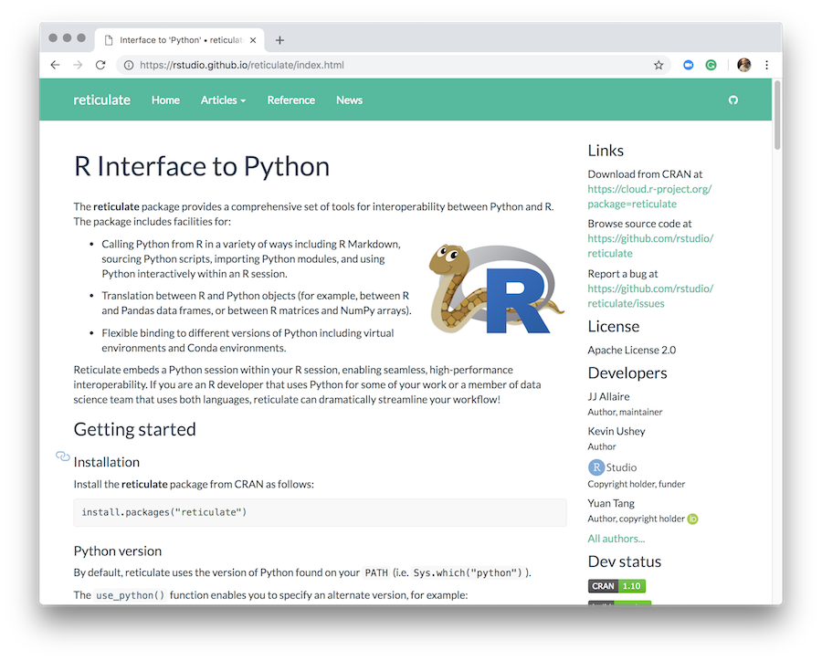
reticulate: Used to connect R and Python. See the reticulate documentation which is an invaluable resource.
-
radix: A new R package for making clean web-based reports. The radix documentation was built using radix.
-
tidyverse: The fundamental set of R packages that makes data exploration and visualization easy. It includes dplyr, ggplot2, tidyr and more.
-
plotly: Used to make a quick interactive plot with the ggplotly() function.
-
tidyquant: Used for the theme_tq() ggplot theme for business-ready visualizations.
Python Environment
You will need to have Python installed with the following libraries:
-
numpy: A numerical computing library that supports sklearn
-
pandas: Data analysis library enabling wrangling of data
-
sklearn: Workhorse library with a suite of machine learning algorithms
The easiest way to get set up is to download the Anaconda distribution of python, which comes with many of the data science packages already set up. If you install the Python 3 version of Anaconda, you should end up with a “conda environment” named anaconda3. We’ll use this in the next step.
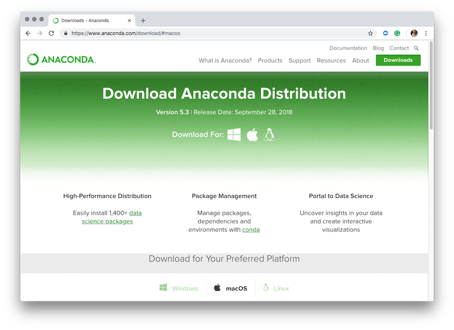
Install Anaconda Distribution
Step 2: Setup RMarkdown Document
Open an RMarkdown document in the RStudio IDE.
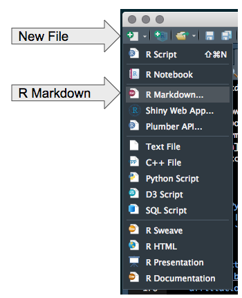
Open a new RMarkdown document
Clear the contents, and add the following YAML header information including the --- at the top and bottom. This sets up the radix document, which is a special format of RMarkdown. You can visit the radix documentation to learn more about it’s excellent features for web-based reports.
---
title: "R + Python via reticulate"
description: |
  Taking the `radix` R package for a test spin with `Scikit Learn`!
author:
  - name: Matt Dancho
    url: www.business-science.io
    affiliation: Business Science
    affiliation_url: www.business-science.io
date: "2018-10-08"
output: radix::radix_article
---
Next, add an R-code chunk.
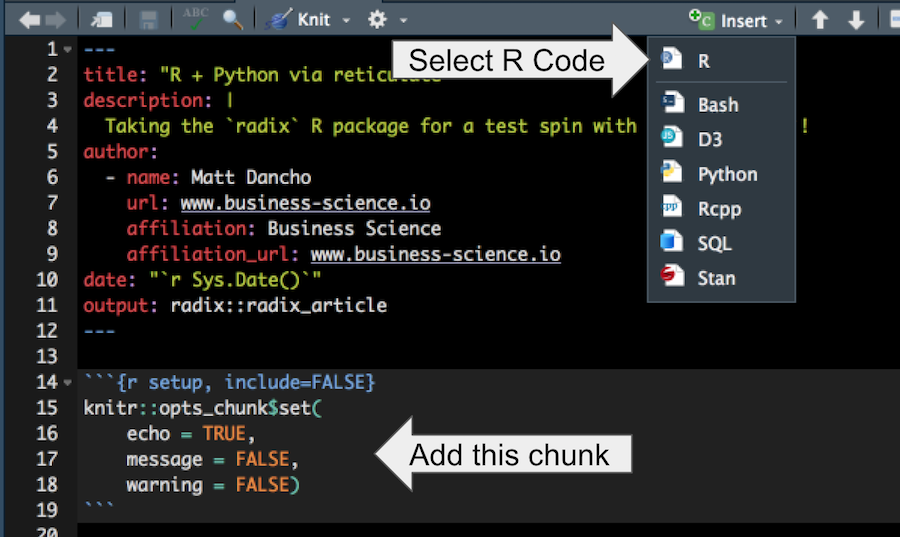
Adding an R-Code Chunk to an RMarkdown document
This will setup the defaults to output code chunks and toggle off messages and warnings.
{r setup, include=FALSE}
knitr::opts_chunk$set(
    echo = TRUE,      # Output code chunks
    message = FALSE,  # Toggle off message output
    warning = FALSE)  # Toggle off warning output
Next, if you hit the “Knit” button, the Radix report will generate. It should look something like this.
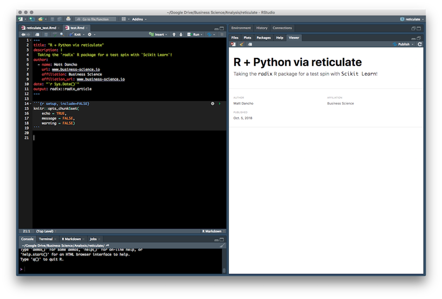
Step 2, Radix Report
Step 3: Setup Reticulate
Reticulate connects R and Python Environments so both languages can be used in the RMarkdown document. For the purposes of keeping the languages straight, each code chunk (code that runs inline in an RMarkdown document) will have the language as a comment.
The code chunks won’t be shown in full but the contents will. When going through the tutorial use the #R and #Python comments to indicate which type of code chunk to use (i.e. {r} for R and {python} for Python).
Create an R-code chunk to load reticulate using the library() function.
# R
library(reticulate)
Use the conda_list() function to list each of the environments on your machine. There are four present for my setup. I’ll be using the anaconda3 environment.
# R
conda_list()
##           name                                  python
## 1    anaconda3                   /anaconda3/bin/python
## 2       pandas       /anaconda3/envs/pandas/bin/python
## 3 r-tensorflow /anaconda3/envs/r-tensorflow/bin/python
## 4    untitled1    /anaconda3/envs/untitled1/bin/python
Tell reticulate to use the “anaconda3” environment using the use_condaenv() function.
# R
use_condaenv("anaconda3")
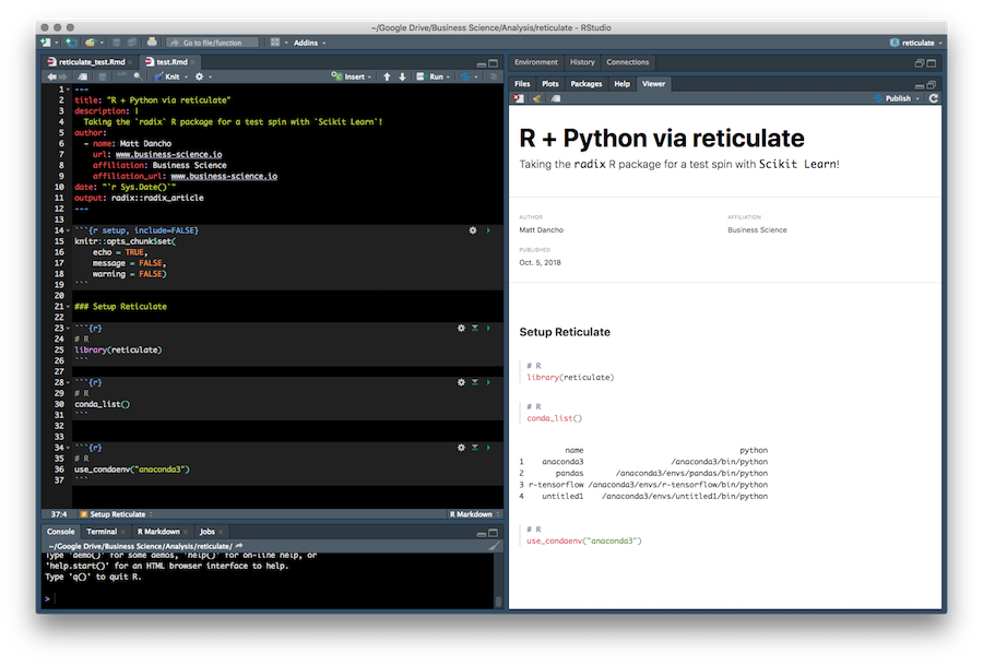
Step 3, Radix Report
Step 4: Machine Learning With Scikit Learn
This step comes straight from the “Wine Snob Machine Learning Tutorial” by Elite Data Science. We’ll implement Scikit Learn to build a random forest model on that predicts the Wine Quality of the dataset.
First, create a Python code chunk and add the libraries.
# Python
import numpy as np
import pandas as pd
from sklearn.model_selection import train_test_split
from sklearn import preprocessing
from sklearn.ensemble import RandomForestRegressor
from sklearn.pipeline import make_pipeline
from sklearn.model_selection import GridSearchCV
from sklearn.metrics import mean_squared_error, r2_score
from sklearn.externals import joblib
Next, import the data using read_csv() from pandas. Note that the separator is a semicolon (not a comma which is what most data sets are stored as in CSV format). The data is stored as a Python object named data.
# Python
dataset_url = 'http://mlr.cs.umass.edu/ml/machine-learning-databases/wine-quality/winequality-red.csv'
data = pd.read_csv(dataset_url, sep = ";")
We can use the print() function to output Python objects.
# Python
print(data.head())
##    fixed acidity  volatile acidity   ...     alcohol  quality
## 0            7.4              0.70   ...         9.4        5
## 1            7.8              0.88   ...         9.8        5
## 2            7.8              0.76   ...         9.8        5
## 3           11.2              0.28   ...         9.8        6
## 4            7.4              0.70   ...         9.4        5
##
## [5 rows x 12 columns]
Note that it’s a little tough to see what’s going on with the data. It’s a perfect opportunity to leverage R and specifically the glimpse() function. We can retrieve the data object, which is stored in our R environment in a list named py. We’ll access data in R using py$data.
Load the tidyverse library. Then access the data object using py$data. The data is stored as a data frame, so we’ll convert to the tibble (tidy data frame) and then glimpse() the data.
# R
library(tidyverse)

py$data %>%
    as.tibble() %>%
    glimpse()
## Observations: 1,599
## Variables: 12
## $ `fixed acidity`        <dbl> 7.4, 7.8, 7.8, 11.2, 7.4, 7.4, 7.9...
## $ `volatile acidity`     <dbl> 0.700, 0.880, 0.760, 0.280, 0.700,...
## $ `citric acid`          <dbl> 0.00, 0.00, 0.04, 0.56, 0.00, 0.00...
## $ `residual sugar`       <dbl> 1.9, 2.6, 2.3, 1.9, 1.9, 1.8, 1.6,...
## $ chlorides              <dbl> 0.076, 0.098, 0.092, 0.075, 0.076,...
## $ `free sulfur dioxide`  <dbl> 11, 25, 15, 17, 11, 13, 15, 15, 9,...
## $ `total sulfur dioxide` <dbl> 34, 67, 54, 60, 34, 40, 59, 21, 18...
## $ density                <dbl> 0.9978, 0.9968, 0.9970, 0.9980, 0....
## $ pH                     <dbl> 3.51, 3.20, 3.26, 3.16, 3.51, 3.51...
## $ sulphates              <dbl> 0.56, 0.68, 0.65, 0.58, 0.56, 0.56...
## $ alcohol                <dbl> 9.4, 9.8, 9.8, 9.8, 9.4, 9.4, 9.4,...
## $ quality                <dbl> 5, 5, 5, 6, 5, 5, 5, 7, 7, 5, 5, 5...
Much better. We can see the contents of every column in the data. A few key points:
- All features are numeric (
dbl)
- The target (what we are trying to predict) is “quality”
- The predictors are features such as “fixed acidity”, “chlorides”, “pH”, etc that can all be measured in a laboratory
Setup data into X (features) and y (target) variables.
# Python
y = data.quality
X = data.drop("quality", axis=1)
Split features into training and testing sets.
# Python
X_train, X_test, y_train, y_test = train_test_split(
  X, y,
  test_size    = 0.2,
  random_state = 123,
  stratify     = y
)
Preprocess by calculating the scale from X_train with StandardScalar().
# Python
scaler = preprocessing.StandardScaler().fit(X_train)
Apply transformation to X_test with the transform() method.
# Python
X_test_scaled = scaler.transform(X_test)
Setup an ML pipeline using make_pipeline(). The pipeline consists of two steps. First, numeric values are scaled, then a random forest regression model is created.
# Python
pipeline = make_pipeline(
    preprocessing.StandardScaler(),
    RandomForestRegressor(n_estimators = 100)
)
We’ll perform Grid Search to get the optimal combination of parameters. First, set up a hyperparameters object that has the combination of attributes we want to change.
# Python
hyperparameters = {
    "randomforestregressor__max_features" : ["auto", "sqrt", "log2"],
    "randomforestregressor__max_depth"    : [None, 5, 3, 1]
}
Apply grid search with cross validation using GridSearchCV().
# Python
clf = GridSearchCV(pipeline, hyperparameters, cv = 10)
clf.fit(X_train, y_train)
Print the best parameters.
# Python
print(clf.best_params_)
## {'randomforestregressor__max_depth': None, 'randomforestregressor__max_features': 'log2'}
Step 5: Make Wine Predictions and Get Error Metrics
We’re not finished yet. We need to make predictions and compare them to the test set. Since we treated this as a regression problem, the standard method is to compute r-squared and mean absolute error.
# Python
y_pred = clf.predict(X_test)
# Python
print(r2_score(y_test, y_pred))
## 0.4829226950783947
# Python
print(mean_squared_error(y_test, y_pred))
## 0.33365625
But is this model good???
This is another good opportunity to leverage the visualization capabilities of R.
Step 6: Visualizing Model Quality With R
R has excellent visualization capabilities (as does python). One of the best packages for data visualization is ggplot2, which enables flexibility that is difficult for other packages to match.
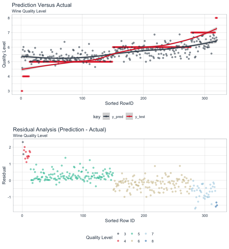
First, we can examine the predictions versus the actual values. The trick here is to format the data in tidy fashion (long form) using arrange() to the sort values by the quality level and then the gather() function to shift from wide to long. When done, we plot the manipulated data using ggplot().
#R
library(tidyverse)
library(tidyquant) # for theme_tq()

# Manipulate data for ggplot
results_tbl <- tibble(
    y_test = py$y_test,
    y_pred = py$y_pred
) %>%
    rowid_to_column() %>%
    arrange(y_test) %>%
    mutate(rowid = as_factor(as.character(rowid))) %>%
    rowid_to_column("sorted_rowid") %>%
    gather(key = "key", value = "value", -c(rowid, sorted_rowid))

# Make ggplot
results_tbl %>%
    ggplot(aes(sorted_rowid, value, color = key)) +
    geom_point(alpha = 0.5) +
    geom_smooth() +
    theme_tq() +
    scale_color_tq() +
    labs(
        title = "Prediction Versus Actual",
        subtitle = "Wine Quality Level",
        x = "Sorted RowID", y = "Quality Level"
    )
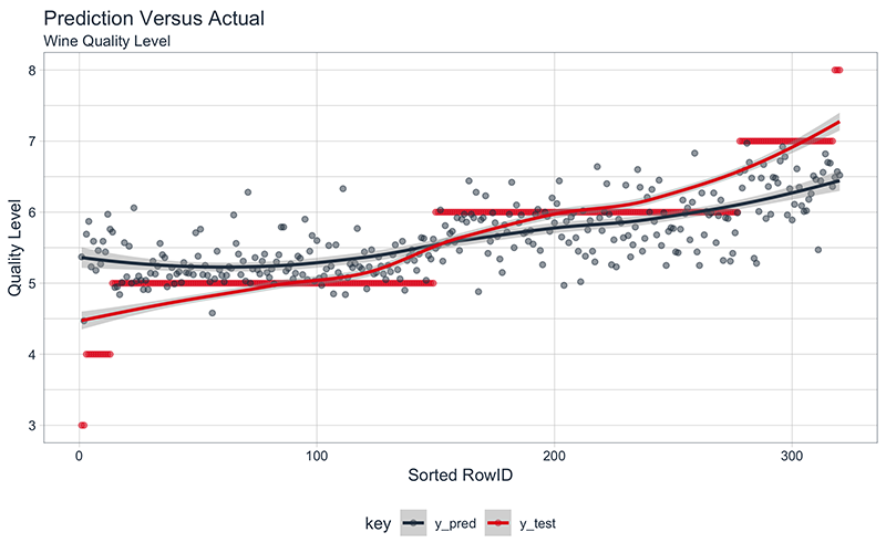
Prediction Versus Actual, Model Quality
The actual and predicted trend lines (created with geom_smooth()) have a similar trend, but we can see that there is clearly an issue with the extreme quality levels based on a widening gap at the ends of the data.
We can verify our model quality assessment by evaluating the residuals. We can use a combination of data wrangling and ggplot() for visualization. The residuals clearly show that the model is predicting low quality levels higher than they should be and high quality levels lower than they should be. Through visual analysis we can see that other modeling approaches should be tried to improve the predictions at the extremes.
results_tbl %>%
  # Manipulation
  spread(key, value) %>%
  mutate(resid = y_pred - y_test) %>%
  # Plot
  ggplot(aes(sorted_rowid, resid, color = as.character(y_test))) +
    geom_point(alpha = 0.5) +
    theme_tq() +
    scale_color_tq() +
    labs(
        title = "Residual Analysis (Prediction - Actual)",
        subtitle = "Wine Quality Level",
        x = "Sorted Row ID", y = "Residual",
        color = "Quality Level"
    )
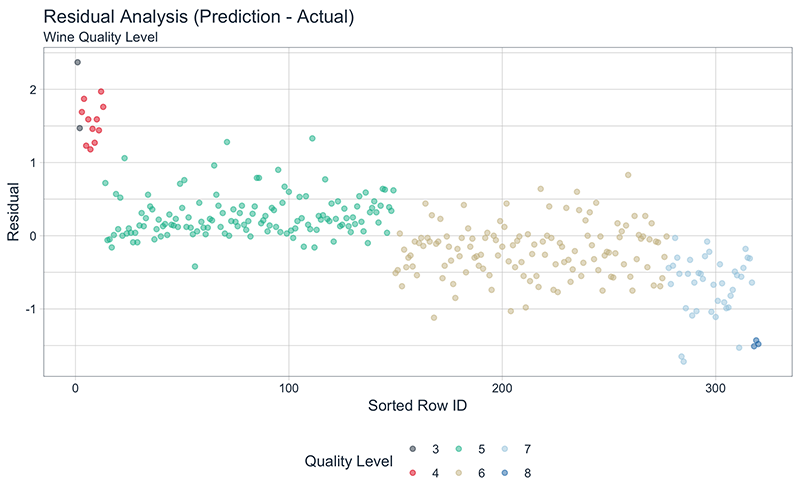
Residual Analysis, Model Quality
Step 7: Generate the Final Report
Once you are satisfied with your analysis, you can make a nice report just by clicking the “Knit” button. Our final report had an interactive plot in it using ggplotly() from the plotly library. This not only adds interactivity but it enables zooming in and getting information by clicking on specific points.
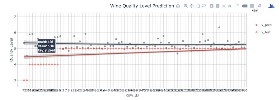
Adding Interactivity with Plotly
When you “Knit” the final report, it will build a web-based HTML report that can include interactive components, business-ready visualizations, in a format that is easy to consume. Here’s what the first few lines of our final report looks like.
Report with R and Python via reticulate and radix
Conclusion
Both R and Python are powerful languages. Much of the talk about R vs Python pits these languages as competitors when actually they are allies. We’ve discussed and put to use this idea of leveraging the strengths of each language in a harmony.
When data science teams go beyond being “R Shops” and “Python Shops”, and start thinking in terms of being “High Performance Data Science Teams”, they begin a transition that improves efficiency, productivity, and capability. The challenge is learning multiple languages. But here’s the secret - it’s not that difficult with Business Science University.
The challenge is learning multiple languages. But here’s the secret - it’s not difficult with Business Science University.