Time Series Demand Forecasting
Written by Luciano Oliveira Batista

R Tutorials Update
Interested in more time series tutorials? Learn more R tips:
👉 Register for our blog to get new articles as we release them.
Time Series Demand Forecasting of Brazilian Commodities
Demand Forecasting is a technique for estimation of probable demand for a product or services. It is based on the analysis of past demand for that product or service in the present market condition. Demand forecasting should be done on a scientific basis and facts and events related to forecasting should be considered.
After gathering information about various aspects of the market and demand based on the past, is possible to estimate future demand. What we call forecasting of demand.
For example, suppose we sold 200, 250, 300 units of product X in January, February, and March respectively. Now we can say that there will be a demand for Y units approximately of product X in April.
Demand forecasting key advantages:
- More effective production scheduling
- Inventory management and reduction
- Cost reduction
- Optimized transport logistics
- Increased customer satisfaction
Those are just some benefits in forecasting demand. As this is a task applicable in almost any business area, the concepts and approaches used here can be extrapolate for your problem too, with specific adjustments.
This project has the aim of forecast the next 3 years of exports of top 3 Brazilian commodities: soybean, corn and sugar. But not just that, I’ll cover also the following steps of a Data Science project: exploratory data analysis, data preparation, data cleaning, feature engineering and modeling.
The dataset used here came from a public source available by clicking here .
Software Requirement
If you want to reproduce the project in your environment, I suggest you to install the following packages first, before load them.
# Data Exploration
library(tidyverse)
library(skimr)
library(lubridate)
library(tidytext)
library(timetk)
library(gt)

# color pallete
library(tidyquant)

# modeling
library(tidymodels)
library(modeltime)

Exploratory Data Analysis
As mentioned before, the dataset came from a public source called COMEX STAT. This website provides free access to Brazilian foreign trade statistics.
# reading the data and converting categorical features to factor
exp_imp_tbl <- read_csv("data/data_comexstat.csv") %>% mutate_if(is.character, as_factor)
As usual, I always create a dictionary of the dataset I’m working just to keep in mind the meaning of each variable, see the following list:
- date: date where occurred the transaction of export or import (our time series information).
- product: commodities (sugar, soybean meal, soybean oil, soybean, corn and wheat).
- state: State responsible for the production.
- country: Country responsible for the transaction.
- type: if there is export or import.
- route: route used to transport the commodity.
- tons: quantity export/import.
- usd: commercial currency.
Overview
The data contains all tracking information of monthly imports and exports of a range of products, by brazilian states, by routes (air, sea, ground, etc) and from/to which country.
At the beginning of the process is a good idea to take a general overview of the data, and for that I love the skimr::skim() function, very handy to understand a big picture of your data.
skim(exp_imp_tbl)
── Data Summary ────────────────────────
                           Values
Name                       exp_imp_tbl
Number of rows             117965
Number of columns          8
_______________________
Column type frequency:
  Date                     1
  factor                   5
  numeric                  2
________________________
Group variables            None

── Variable type: Date ──────────────────────────
  skim_variable n_missing complete_rate min        max        median     n_unique
1 date                  0             1 1997-01-01 2019-12-01 2012-10-01      276

── Variable type: factor ──────────────────────────
  skim_variable n_missing complete_rate ordered n_unique top_counts
1 product               0             1 FALSE          6 sug: 35202, soy: 22914, cor: 21872, soy: 18215
2 state                 0             1 FALSE         27 SP: 28713, PR: 17155, MT: 16837, GO: 10981
3 country               0             1 FALSE        212 Chi: 7437, Par: 7160, Net: 7158, Arg: 4842
4 type                  0             1 FALSE          2 Exp: 105861, Imp: 12104
5 route                 0             1 FALSE          5 Sea: 93870, Gro: 13038, Oth: 6374, Air: 2918

── Variable type: numeric ──────────────────────────
  skim_variable n_missing complete_rate     mean        sd    p0    p25    p50      p75       p100 hist
1 tons                  0             1   14537.    49779.     0   125.   2000   13534.   1798446. ▇▁▁▁▁
2 usd                   0             1 4813150. 19494116.     0 71552  725000 3895943  903930411  ▇▁▁▁▁
As we can see, our dataset have:
- 1 date variable
- 5 categorical variables
- 2 numerical variables
For our luck there is no missing data in any of these columns. Two things pop up when we look at type and route variables.
type: Brazil is a country that export more than import (more than 100k of observations on export category).route: The route that Brazil less use (considering exports and imports) is air. And the route more used is sea.
Production over time
We also saw the date range of this date feature, and it’s from 1997/01/01 to 2019/01/12. Looking more closely at this feature we can investigate how was the exports from Brazil, considering all states and to everywhere, throughout the time.
# data wrangling before plot
# adding two columns: year and month
exp_imp_year_month_tbl <- exp_imp_tbl %>%
  mutate(year = year(date),
         month = month(date, abbr = FALSE, label = TRUE, locale = Sys.setlocale("LC_COLLATE", "C")))

# total of tons by year (considering just exports)
expt_year_total_tbl <- exp_imp_year_month_tbl %>%
  filter(type == "Export") %>%
  group_by(year) %>%
  summarise(total_tons = sum(tons)) %>%
  ungroup()

# total of tons for each month of the year (considering just exports)
expt_year_month_total_tbl <- exp_imp_year_month_tbl %>%
  filter(type == "Export") %>%
  group_by(year, month) %>%
  summarise(total_tons = sum(tons)) %>%
  ungroup()

# vizualizing the monthly total of tons (1997 - 2020)
expt_year_month_total_tbl %>%
  mutate(month = month %>% str_to_title() %>% as_factor()) %>%
  ggplot(aes(x = year,
             y = total_tons)) +
  geom_point(size = .8) +
  geom_line() +
  facet_wrap(~month) +
  theme_tq() +
  scale_y_continuous(labels = scales::number_format(scale = 1e-6, suffix = "M")) +
  scale_x_continuous(breaks = c(1997, 2000, 2005, 2010, 2015, 2019)) +
  labs(
    title = "Total of Tons for the Monthly Exports Between 1997 and 2020",
    subtitle = "Considering all Brazilian States, and Soybean, Soybeans Meal, Soybean Oil, Sugar, Corn and Wheat commodities",
    x = "",
    y = "Millions of Tons",
    caption = "linkedin.com/in/lucianobatistads/"
  ) +
  theme(axis.text.x = element_text(size = 7))
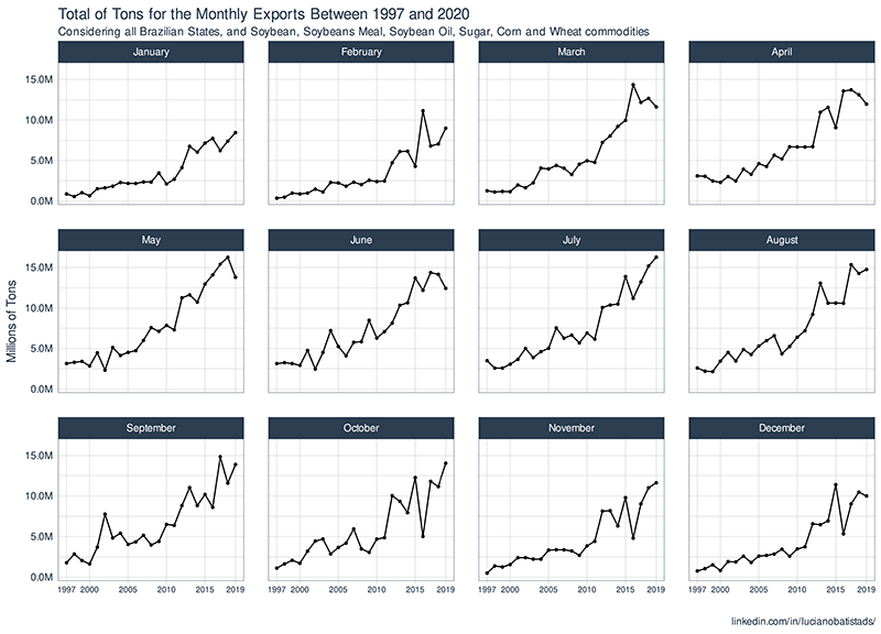
On this monthly chart, we see that there is a higher pronounced growth trend in exports during the months from March to August.
# building vizualizations
# vizualizing the annual total of tons export (1997 - 2020)
expt_year_total_tbl %>%
  ggplot(aes(x = year,
             y = total_tons)) +
  geom_point() +
  geom_line() +
  theme_tq() +
  scale_y_continuous(labels = scales::number_format(scale = 1e-6, suffix = "M")) +
  scale_x_continuous(breaks = c(1997, 2000, 2005, 2010, 2015, 2019)) +
  labs(
    title = "Total of Tons for the Annual Exports Between 1997 and 2020",
    subtitle = "Considering all Brazilian States, and Soybean, Soybeans Meal, Soybean Oil, Sugar, Corn and Wheat commodities",
    x = "",
    y = "Millions of Tons",
    caption = "linkedin.com/in/lucianobatistads/"
  ) +
  theme(axis.text.x = element_text(size = 10))
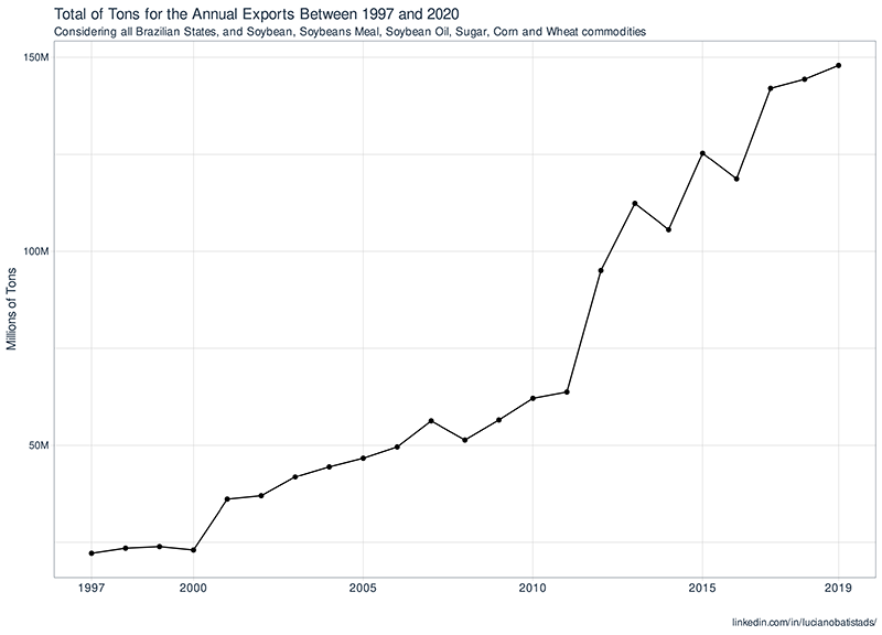
As expected, over the years, the brazilian exports follow a growing trend, even if 2020 bring us a terrible result because of COVID-19, it is likely to go back to the initial trend in the next year.
Most Important Commodities
We saw before our data have 6 different commodities: Soybean, Sugar, Soybeans Meal, Corn, Soybean Oil and Wheat. Let’s look at them and see which have been more export in the last 5 years.
# data wrangling before plot
# filtering for recent years and type == "Export"
# total of tons for these groups
top_3_product_exp_tbl <- exp_imp_year_month_tbl %>%
filter(year %in% c(2019:2015)) %>%
filter(type == "Export") %>%
group_by(product) %>%
summarise(total_tons_exp = sum(tons)) %>%
ungroup() %>%
slice_max(total_tons_exp, n = 3)
top_3_product_exp_tbl %>%
mutate(product_str = case_when(
product == "soybeans" ~ "Soybean",
product == "corn" ~ "Corn",
TRUE ~ "Sugar"
)) %>%
ggplot(aes(x = total_tons_exp,
y = fct_reorder(product_str, total_tons_exp),
fill = product_str)) +
geom_col() +
scale_fill_manual(values = c("#7EBEF7", "#2595F5", "#BBD7F0")) +
scale_x_continuous(labels = scales::number_format(scale = 1e-6, suffix = "M")) +
guides(fill = FALSE) +
theme_tq() +
labs(
title = "Top 3 - Brazilian Commodities Exports",
subtitle = "Considering the Last 5 Years",
caption = "linkedin.com/in/lucianobatistads/",
x = "Millions of Tons",
y = "Commodities"
)
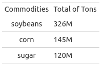
# good table to plot
top_3_product_exp_tbl %>%
rename(Commodities = product, `Total of Tons` = total_tons_exp) %>%
mutate(`Total of Tons` = `Total of Tons` %>% scales::number(scale = 1e-6, suffix = "M")) %>%
gt()

The plot above is showing the top 3 commodities exported in Brazil by the last 5 years: soybean, corn and sugar. With the more important being soybean. If we compare with the others, soybeans have 55.5% more than the second (Corn) and 63.2% more than the third (Sugar), it is an enormous difference.
Routes
These commodities we are seeing until now are exported by different routes: sea, ground, air, river and others. Let’s investigate if there is some preference to choose the route and product.
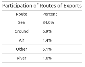
Before building those visualizations, sounds a good idea to keep in mind the most chosen routes, considering all products, to establish a big picture of the situation. Look at the table below:
# data wrangling before plot
# top exports routes on recent years
tops_routes_exp <- exp_imp_year_month_tbl %>%
  filter(type == "Export") %>%
  filter(year > 2000) %>% # selecting most recent years
  count(route) %>%
  mutate(prop = n / sum(n))

# table
tops_routes_exp %>%
  rename(Route = route, Percent = prop) %>%
  mutate(Percent = Percent %>% scales::number(scale = 100, suffix = "%", accuracy = .1)) %>%
  select(-n) %>%
  gt() %>%
  tab_header(
    title = "Participation of Routes of Exports"
  )
Now let’s see by product and routes what it’s happening:
# data wrangling before plot
exp_by_route_product_tbl <- exp_imp_year_month_tbl %>%
  mutate(product = case_when(
    product == "corn" ~ "Corn",
    product == "soybean_meal" ~ "Soybeans Meal",
    product == "soybean_oil" ~ "Soybean Oil",
    product == "sugar" ~ "Sugar",
    product == "soybeans" ~ "Soybean",
    TRUE ~ "Wheat"
  )) %>%
  filter(type == "Export") %>%
  group_by(route, product) %>%
  summarise(n = n()) %>%
  mutate(prop_by_route = n / sum(n)) %>%
  ungroup()

exp_by_route_product_tbl %>%
  ggplot(aes(x = tidytext::reorder_within(product, prop_by_route, route),
             y = prop_by_route)) +
  geom_col(aes(fill = prop_by_route)) +
  tidytext::scale_x_reordered() +
  coord_flip() +
  facet_wrap(~route, scales = "free") +
  scale_fill_gradient(high = "#144582", low = "#D4E8FF") +
  scale_y_continuous(labels = scales::percent_format(scale = 100, suffix = "%")) +
  labs(
    title = "Proportion of Commodities Exports for all Different Routes",
    caption = "linkedin.com/in/lucianobatistads/",
    y = "",
    x = "Commodities"
  ) +
  theme_tq() +
  labs(fill = "Proportion by Routes")

Although most products are transported by sea (table above), we observe that depending on the route there is a preference for the product that will be exported.
Considering three major products exported in each route, we have:
- Sea: sugar, soybean and soybeans meal.
- Ground: soybean oil, sugar and corn.
- Air: corn (much more), soybean and sugar.
- Other: sugar, soybean oil and corn.
- River: soybean, corn and sugar.
And a closer look at soybean, give us the following chart:
# data wrangling before plot
tops_routes_sugar_exp <- exp_imp_year_month_tbl %>%
  filter(product == "soybeans") %>%
  filter(type == "Export") %>%
  filter(year > 2000) %>% # selecting most recent years
  count(route) %>%
  mutate(prop = n / sum(n))

tops_routes_sugar_exp %>%
  ggplot(aes(x = prop,
             y = fct_reorder(route, prop),
             fill = route)) +
  geom_col() +
  scale_x_continuous(labels = scales::percent_format(scale = 100, suffix = "%")) +
  scale_fill_manual(values = c( "#2595F5", "#BBD7F0", "#BBD7F0","#BBD7F0","#7EBEF7")) +
  theme_tq() +
  labs(
    title = "Participation in Each Route of Brazilian Soybean Exports (1997 - 2020)",
    caption = "linkedin.com/in/lucianobatistads/",
    x = "Proportions",
    y = "Exportation Routes"
  ) +
  guides(fill = F)

Yeah, a very high concentration in sea transportation route.
Trade Partners
Let’s look at our data by another perspective, trade partners. Brazil has a lot of trade partners, these are countries which with Brazil export and import more, and sounds a good idea to know which countries Brazil has been doing business.
# data wrangling before plot
# filtering by the last 5 years
# first look on the exportation
exp_trade_partners_corn_sugar_tbl <- exp_imp_tbl %>%
  mutate(year = year(date)) %>%
  filter(year %in% c(2019:2014)) %>%
  filter(type == "Export") %>%
  # removing special characters
  mutate(country2 = country %>% str_replace_all("[[:punct:]]", "") %>% str_trim(side = "both")) %>%
  group_by(year, country2) %>%
  summarise(total_usd = sum(usd)) %>%
  ungroup() %>%
  mutate(year_fc = as.factor(year),
         name = reorder_within(country2, total_usd, year_fc))

exp_trade_partners_corn_sugar_tbl %>%
  # threshold to selecting some countries
  filter(total_usd > 100000000) %>%
  ggplot(aes(x = name,
             y = total_usd,
             fill = year)) +
  geom_col(show.legend = FALSE) +
  coord_flip() +
  scale_x_reordered() +
  scale_y_continuous(labels = scales::dollar_format(scale = 1e-6, suffix = "M")) +
  facet_wrap(~year, scales = "free", nrow = 3) +
  labs(
    title = "Trade Partners Evaluation for the last 5 years of Exportation",
    subtitle = "Considering all Brazilian States, and Soybean, Soybeans Meal, Soybean Oil, Sugar, Corn and Wheat Commodities",
    x = "",
    y = "Millions of U.S. Dollars",
    caption = "linkedin.com/in/lucianobatistads/"
  ) +
  theme_tq()

It’s clear that China is our most important export trade partner. The others positions have been rotating between Netherlands, Spain and Iran.
Now, by imports perspective:
# this is the same code, but filtering by importation
imp_trade_partners_corn_sugar_tbl <- exp_imp_tbl %>%
  mutate(year = year(date)) %>%
  filter(year %in% c(2019:2014)) %>%
  filter(type == "Import") %>%
  mutate(country2 = country %>% str_replace_all("[[:punct:]]", "") %>% str_trim(side = "both")) %>%
  group_by(year, country2) %>%
  summarise(total_usd = sum(usd)) %>%
  ungroup() %>%
  mutate(year_fc = as.factor(year),
         name = reorder_within(country2, total_usd, year_fc))


imp_trade_partners_corn_sugar_tbl %>%
  group_by(year) %>%
  slice_max(total_usd, n = 3) %>%
  ungroup() %>%
  ggplot(aes(x = name,
             y = total_usd,
             fill = year)) +
  geom_col(show.legend = FALSE) +
  coord_flip() +
  scale_x_reordered() +
  scale_y_continuous(labels = scales::dollar_format(scale = 1e-6, suffix = "M")) +
  facet_wrap(~year, scales = "free") +
  labs(
    title = "Top 3 - Trade Partners Evaluation for the last 5 years of Imports",
    subtitle = "Considering Soybean, Soybeans Meal, Soybean Oil, Sugar, Corn and Wheat Commodities",
    caption = "linkedin.com/in/lucianobatistads/",
    y = "Millions of U.S. Dollars",
    x = ""
  ) +
  theme_tq()

Brazil’s major import trade partners alternate between Argentina, Paraguay, and USA. Curiously, seems that the participation of USA has been decreasing through the time, as opposed to Argentina.
States and Commodities
Brazil is a huge country, the five largest country in the world, and this gives us different temperature ranges depends on each area you’re looking at. This geographical aspect lead to cultures of food been produce in specific regions them others.
Let’s see from which region comes the production of ours commodities, in terms of exports:
quest_5_tbl <- exp_imp_tbl %>%
  filter(type == "Export") %>%
  group_by(state, product) %>%
  summarise(total_usd = sum(usd)) %>%
  ungroup() %>%
  group_by(product) %>%
  top_n(5)

quest_5_tbl %>%
  mutate(product = case_when(
    product == "corn" ~ "Corn",
    product == "soybean_meal" ~ "Soybeans Meal",
    product == "soybean_oil" ~ "Soybean Oil",
    product == "sugar" ~ "Sugar",
    product == "soybeans" ~ "Soybeans",
    TRUE ~ "Wheat"
  ))  %>%
  ggplot(aes(x = total_usd,
             y = reorder_within(state, total_usd, product),
             fill = product)) +
  geom_col() +
  facet_wrap(~product, scales = "free") +
    scale_fill_manual(values = c( "#1B8BB5", "#695905", "#1B60B5", "#B55C24", "#B59C12","#69381A" )) +
  scale_y_reordered() +
  scale_x_continuous(labels = scales::number_format(scale = 1e-9, suffix = "Bi", prefix = "$")) +
  guides(fill = F) +
  theme_tq() +
  labs(
    x = "Billions of U.S. Dollars",
    y = "",
    title = "Top 5 - Most Important Brazilian States by Commodities",
    subtitle = "Considering Exports",
    caption = "linkedin.com/in/lucianobatistads/"
  )

Mato Grosso concentrates most of the exports of soybean oil, soybeans and soybean meal, along with Rio Grande do Sul and Paraná. São Paulo, on the other hand, takes part strongly in sugar exports. And very few states export wheat, the most expressive values comes from Rio Grande do Sul, Paraná and Santa Catarina.

Data Modeling
As we know, there is 3 time-series to predict the next 3 years of demand in tons: soybean, corn and sugar. I’ll model each separately, because by this way is better to understand the underlying rationale behind the data.
Something important to say is that I already tried different approaches of feature engineering and here I’ll show you what had the better performance. Another point to clarify is I’ll be using a modeltime framework workflow, integrated with tidymodels principles (quick review down below).
As this is a first part of this project, we’ll be using just ARIMA family of models, be aware that more advanced topics on modeling and feature engineering will covered in the second part.
A quick review of modeltime
For those that aren’t familiar with modeltime framework, it’s a R package that set up a time series analysis workflow in a very optimized way. The package works as an extension of tidymodels but applied to time series problems.
I’ll summarize here the principals verbs used:
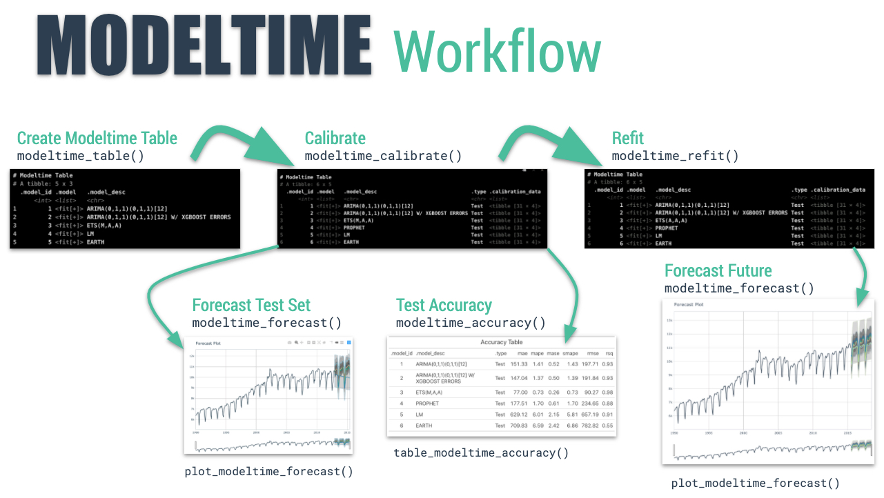
- Collect data and split into training and test sets
- Create & Fit Multiple Models
- Add fitted models to a Model Table
- Calibrate the models to a testing set.
- Perform Testing Set Forecast & Accuracy Evaluation
- Refit the models to Full Dataset & Forecast Forward
To get more details you can access the documantation here.
Soybean
The first thing to do is set up our tibble with the right timestamp. And as we already know, the dataset has a monthly periodicity equally spaced (regular time series).
# data wrangling
ts_soybean_tbl <- exp_imp_tbl %>%
  select(date, product, tons) %>%
  filter(product == "soybeans") %>%
  group_by(date, product) %>%
  summarise(total_tons = sum(tons)) %>%
  ungroup()

# visualizing
ts_soybean_tbl %>%
  plot_time_series(.date_var = date,
                   .value = total_tons,
                   .interactive = F,
                   .smooth = F) +
  scale_y_continuous(labels = scales::number_format(scale = 1e-6, suffix = "M")) +
  labs(
    y = "Millions of Tons",
    title = "Soybean Time Series",
    caption = "linkedin.com/in/lucianobatistads/"
  )

Just by analyzing this visualization, we’re seeing that there is a clear annual seasonality with a multiplicative behavior (values are growing throughout the time). We can verify these assumptions with ACF/PACF charts.
# High annual correlation
ts_soybean_tbl %>%
  plot_acf_diagnostics(.date_var = date, total_tons,
                       .interactive = F,
                       .show_white_noise_bars = T) +
  labs(
    title = "Soybean Lag Diagnostics",
    caption = "linkedin.com/in/lucianobatistads/"
  )

Here we’re confirm the high correlation with annual lags and also one high partial correlation considering 9, 10 and 11 lags. Is possible to use those features to improve performance, but here we’ll be working with the forecast::auto_arima model that automatic look for lags during the training.
ts_soybean_tbl %>%
  plot_seasonal_diagnostics(.date_var = date, log(total_tons),
                            .interactive = F) +
  labs(
    title = "Soybean Seasonal Diagnostics",
    y = "Log scale",
    caption = "linkedin.com/in/lucianobatistads/"
  )

Here we’re seeing that there is quarterly seasonality, every second and third quarters occur an increase in exports.
ts_soybean_tbl %>%
   mutate(year = year(date) %>% as_factor(),
         month = month(date, label = TRUE, locale = Sys.setlocale("LC_COLLATE", "C")) %>% as_factor()) %>%
  ggplot(aes(x = year,
             y = fct_rev(month),
             fill = total_tons)) +
  scale_fill_distiller(labels = scales::number_format(scale = 1e-6, suffix = "M"), direction = 1) +
  geom_tile(color = "grey40") +
  labs(
    title = "Totals of Exports of Soybeans Across the Years and Months",
    y = "Months",
    x = "",
    fill = "Millions of\nTons",
    caption = "linkedin.com/in/lucianobatistads/"
  )

Now we have a big picture of what is happening. The second and third quarters of practically all months are darker, indicating a higher amount of exports in those periods.
Modeling soybean time series
First thing will be standardize our data, applying a box-cox transformation. This is a method used to variance reduction applying a power transformation. As we’ll be using ARIMA family, is interesting work that way.
We also will keep track of the lambda value, important to back-transform our data after modeling phase.
ts_boxcox_soybean_tbl <- ts_soybean_tbl %>%
  select(-product) %>%
  mutate(total_tons = box_cox_vec(total_tons))
boxcox_soybean_lambda <- 0.382376781152543
So, we don’t have so much data to work, actually our time series has 265 observations. That way, I split the data in 5 years of assessment and choose the rest to training.
soybean_boxcox_splits <- time_series_split(ts_boxcox_soybean_tbl, assess = "5 years", cumulative = TRUE)
train_soybean_boxcox_tbl <- training(soybean_boxcox_splits)
test_soybean_boxcox_tbl <- testing(soybean_boxcox_splits)

soybean_boxcox_splits %>%
  tk_time_series_cv_plan() %>%
  plot_time_series_cv_plan(date, total_tons, .interactive = F) +
  labs(
    title = "Soybean Training and Testing Splits",
    y = "BoxCox transformed values"
  )

Now, we can start work with the modeltime workflow showed before.
auto_arima_formula <- formula(total_tons ~ .)

# training
auto_arima_boxcox_fit <- arima_reg() %>%
  set_engine("auto_arima") %>%
  fit(auto_arima_formula, train_soybean_boxcox_tbl)

# testing
calibration_boxcox_tbl <- modeltime_table(
  auto_arima_boxcox_fit
) %>%
  modeltime_calibrate(
    new_data = test_soybean_boxcox_tbl)

# accuracy on testing data
soybean_boxcox_accuracy <- calibration_boxcox_tbl %>%
  modeltime_accuracy()
Brief explanation about the auto-arima implementation: The auto-arima algo use the AIC metric to optimize the p, q, d and P, Q, D params, looking for the best values. These metrics works like a R-Squared in order to point you to a correct direction.
You can see in .model_desc column discription or as a legend on the following pictures the best parmans choosed by the model.
We get a good R-Squared (0.792), but is a good idea to visualize how was the fit of the model:
# vizualing forecasting
calibration_boxcox_tbl %>%
  modeltime_forecast(new_data = test_soybean_boxcox_tbl,
                     actual_data = ts_boxcox_soybean_tbl) %>%
  plot_modeltime_forecast(.interactive = F) +
  labs(
    title = "Soybean - Model Performance on Assessment Data",
    y = "BoxCox transformed values",
    caption = "linkedin.com/in/lucianobatistads/"

  )

I really liked of this fit, and we’ll stick with this model, seems to get the correct seasonality and trend. The next step is refit the model on all data and see how it works. If needed, the algorithm will update the coefficients to capture the general pattern.
refit_boxcox_tbl <- calibration_boxcox_tbl %>%
  modeltime_refit(data = ts_boxcox_soybean_tbl)

refit_boxcox_tbl %>%
  modeltime_forecast(h = "3 years", actual_data = ts_boxcox_soybean_tbl) %>%
  plot_modeltime_forecast(.interactive = F) +
  labs(
    title = "Soybean - Demand Forecast",
    subtitle = "Prediction for the next 3 years of Soybean Exports",
    y = "BoxCox transformed values",
    caption = "linkedin.com/in/lucianobatistads/"
  )

refit_boxcox_tbl %>%
  modeltime_accuracy()

Look, every time that you see the “UPDATE” as a prefix of model description, meaning that the model found better coefficients to explain the data.
Pos-Processing step
We need back-transform our data because of box-cox transformation at the beginning, and the values don’t represent exports quantities.
forecast_boxcox_soybean_tbl <- refit_boxcox_tbl %>%
  modeltime_forecast(h = "3 years", actual_data = ts_boxcox_soybean_tbl)

forecast_soybean_tbl <- forecast_boxcox_soybean_tbl %>%
  mutate(.value = box_cox_inv_vec(.value, lambda = boxcox_soybean_lambda),
         .conf_lo = box_cox_inv_vec(.conf_lo, lambda = boxcox_soybean_lambda),
         .conf_hi = box_cox_inv_vec(.conf_hi, lambda = boxcox_soybean_lambda))

forecast_soybean_tbl %>%
  plot_modeltime_forecast(.interactive = F) +
  scale_y_continuous(labels = scales::number_format(scale = 1e-6, suffix = "M")) +
  labs(
    title = "Soybean - Demand Forecast",
    subtitle = "Prediction for the next 3 years of Soybean Exports",
    y = "Millions of Tons",
    caption = "linkedin.com/in/lucianobatistads/"
  )

That is our final result for the demand forecast of the next 3 years of soybean production, with 95% of confidence interval.
Corn
Here we’ll follow the same workflow as soybean demand forecast showed before.
ts_corn_tbl <- exp_imp_tbl %>%
  select(date, product, tons) %>%
  filter(product == "corn") %>%
  group_by(date, product) %>%
  summarise(total_tons = sum(tons)) %>%
  ungroup()

ts_corn_tbl %>%
  plot_time_series(.date_var = date,
                   .value = total_tons,
                   .interactive = F,
                   .smooth = F) +
  scale_y_continuous(labels = scales::number_format(scale = 1e-6, suffix = "M")) +
  labs(
    y = "Millions of Tons",
    title = "Corn Time Series",
    caption = "linkedin.com/in/lucianobatistads/"
  )

We also have annual seasonality with a multiplicative behavior. Let’s look the lag diagnostic.
# High annual correlation
ts_corn_tbl %>%
  plot_acf_diagnostics(.date_var = date, total_tons,
                       .interactive = F,
                       .show_white_noise_bars = T) +
  labs(
    title = "Corn Lag Diagnostics",
    caption = "linkedin.com/in/lucianobatistads/"
  )

Confirm our assumption of annual seasonality.
ts_corn_tbl %>%
  plot_seasonal_diagnostics(.date_var = date, total_tons,
                            .interactive = F) +
  labs(
    title = "Corn Seasonal Diagnostics",
    y = "Log scale",
    caption = "linkedin.com/in/lucianobatistads/"
  )

The interesting of this chart is that we can see a quarterly seasonality too (similiar to soybean seasonal diagnostics), this time with third and fourth quarters.
ts_corn_tbl %>%
  mutate(year = year(date) %>% as_factor(),
         month = month(date, label = TRUE, locale = Sys.setlocale("LC_COLLATE", "C")) %>% as_factor()) %>%
  ggplot(aes(x = year,
             y = fct_rev(month),
             fill = total_tons)) +
  scale_fill_distiller(labels = scales::number_format(scale = 1e-6, suffix = "M"), direction = 1) +
  geom_tile(color = "grey40") +
  labs(
    title = "Totals of Corn Exports Across the Years and Months",
    y = "Months",
    x = "",
    fill = "Millions of\nTons",
    caption = "linkedin.com/in/lucianobatistads/"
  )

Looking at this heatmap is visible that through the years the exports are growing and the period of the year that has more exports (3rd and 4rd quarters).
Modeling corn time series
# transforming target ----
# boxcox
ts_boxcox_corn_tbl <- ts_corn_tbl %>%
  select(-product) %>%
  mutate(total_tons = box_cox_vec(total_tons))
boxcox_corn_lambda <- 0.0676121372845911

# visualizing the transformations ----
ts_boxcox_corn_tbl %>% plot_time_series(date, total_tons)

# splits ----
# boxcox
corn_boxcox_splits <- time_series_split(ts_boxcox_corn_tbl, assess = "5 years", cumulative = TRUE)
train_corn_boxcox_tbl <- training(corn_boxcox_splits)
test_corn_boxcox_tbl <- testing(corn_boxcox_splits)

corn_boxcox_splits %>%
  tk_time_series_cv_plan() %>%
  plot_time_series_cv_plan(date, total_tons, .interactive = F) +
  labs(
    title = "Corn Training and Testing Splits",
    y = "BoxCox transformed values",
    caption = "linkedin.com/in/lucianobatistads/"
  )

Our formula here will be different, by including this features our model could better capture the seasonality.
# modeling with modeltime ----
# formula
auto_arima_formula <- formula(total_tons ~ . +
                                year(date) +
                                month(date, label = TRUE))

# training
auto_arima_fit <- arima_reg() %>%
  set_engine("auto_arima") %>%
  fit(auto_arima_formula, train_corn_boxcox_tbl)

# testing
calibration_boxcox_tbl <- modeltime_table(
  auto_arima_fit
) %>%
  modeltime_calibrate(
    new_data = test_corn_boxcox_tbl
  )

# accuracy on testing data
corn_accuracy <- calibration_boxcox_tbl %>%
  modeltime_accuracy()

# vizualing forecasting
calibration_boxcox_tbl %>%
  modeltime_forecast(new_data = test_corn_boxcox_tbl,
                     actual_data = ts_boxcox_corn_tbl) %>%
  plot_modeltime_forecast(.interactive = F) +
  labs(
    title = "Corn - Model Performance on Assessment Data",
    y = "BoxCox transformed values",
    caption = "linkedin.com/in/lucianobatistads/"

  )

The R-Squared here is about 0.643 with good understanding of the seasonality, but the model could not capture the depressions of the time series data. We’ll stick with this model for now.
Now let’s refit the data:
# refiting ----
# boxcox
refit_boxcox_tbl <- calibration_boxcox_tbl %>%
  modeltime_refit(data = ts_boxcox_corn_tbl)

refit_boxcox_tbl %>%
  modeltime_forecast(h = "3 years", actual_data = ts_boxcox_corn_tbl) %>%
  plot_modeltime_forecast(.interactive = F) +
  labs(
    title = "Corn - Demand Forecast",
    subtitle = "Prediction for the next 3 years of Soybean Exports",
    y = "BoxCox transformed values",
    caption = "linkedin.com/in/lucianobatistads/"
  )

This was our final model.
Pos-Processing step
# inverting transformation
forecast_boxcox_corn_tbl <- refit_boxcox_tbl %>%
  modeltime_forecast(h = "3 years", actual_data = ts_boxcox_corn_tbl)

forecast_corn_tbl <- forecast_boxcox_corn_tbl %>%
  mutate(.value = box_cox_inv_vec(.value, lambda = boxcox_corn_lambda),
         .conf_lo = box_cox_inv_vec(.conf_lo, lambda = boxcox_corn_lambda),
         .conf_hi = box_cox_inv_vec(.conf_hi, lambda = boxcox_corn_lambda))

forecast_corn_tbl %>%
  plot_modeltime_forecast(.interactive = F) +
  scale_y_continuous(labels = scales::number_format(scale = 1e-6, suffix = "M")) +
  labs(
    title = "Corn - Demand Forecast",
    subtitle = "Prediction for the next 3 years of Corn Exports",
    y = "Millions of Tons",
    caption = "linkedin.com/in/lucianobatistads/"
  )

Besides our 95% confidence intervals been so high, our series capture a similar trend and seasonality of previous years.
Sugar
Let’s investigate the final one.
ts_sugar_tbl <- exp_imp_tbl %>%
  select(date, product, tons) %>%
  filter(product == "sugar") %>%
  group_by(date, product) %>%
  summarise(total_tons = sum(tons)) %>%
  ungroup()

ts_sugar_tbl %>%
  tk_summary_diagnostics()

ts_sugar_tbl %>%
  plot_time_series(.date_var = date,
                   .value = total_tons,
                   .interactive = F,
                   .smooth = F) +
  scale_y_continuous(labels = scales::number_format(scale = 1e-6, suffix = "M")) +
  labs(
    y = "Millions of Tons",
    title = "Sugar Time Series",
    caption = "linkedin.com/in/lucianobatistads/"
  )

This time series seems to have a change in behavior after the year of 2012, with a high spike and a significant increase in quantity of exports.
What ACF and PACF tell us?
# High annual correlation
# lag 11 and 23 also have good indicate of correlation
ts_sugar_tbl %>%
  plot_acf_diagnostics(.date_var = date, total_tons,
                       .interactive = F,
                       .show_white_noise_bars = T) +
  labs(
    title = "Sugar Lag Diagnostics",
    caption = "linkedin.com/in/lucianobatistads/"
  )

Here we’re seeing a high correlation mostly with recent 70 lags, and negative correlation with older lags. Then in PACF plot, lag 2 and 9 seems important to our model.
ts_sugar_tbl %>%
  plot_seasonal_diagnostics(.date_var = date, log(total_tons),
                            .interactive = F) +
  labs(
    title = "Sugar Seasonal Diagnostics",
    y = "Log scale",
    caption = "linkedin.com/in/lucianobatistads/"
  )

As we confirmed, since 2012 we have higher exports. But looking at this plot, we don’t see any seasonality throughout the time.
So let filter the data and analyse the seasonality after 2012.
ts_sugar_tbl %>%
  filter_by_time(date, .start_date = "2012-01-01") %>%
  plot_seasonal_diagnostics(.date_var = date, total_tons,
                            .interactive = F) +
  scale_y_continuous(labels = scales::number_format(scale = 1e-6, suffix = "M")) +
  labs(
    title = "Sugar Seasonal Diagnostics",
    subtitle = "Seasonal diagnostics considering data since 2012",
    y = "Millions of Tons",
    caption = "linkedin.com/in/lucianobatistads/"
  )

Now we can capture an interesting bahavior, seems that the third and first quarter have an increase in exports.
Searching the why of happened this change in 2012, I found some events that probably are correlated to our problem.
- 2012 was the year that Brazil increases the production of ethanol.
- To produce more ethanol was needed to plant more sugar cane (the base of ethanol production).
- Sugar also came from sugar cane, so, with more sugar cane cultivation, we saw an increase of sugar production, hence reflected on its exports.
So, there is a huge probability of our time series have really changed its behavior. Another point is that there is a quarterly seasonality that matches exactly with the period of sugar production: 90 days in the summer and 100 days in the winter.
With this context in mind, I’ll use just the data after 2012 for now.
ts_sugar_tbl %>%
  mutate(year = year(date) %>% as_factor(),
         month = month(date, label = TRUE, locale = Sys.setlocale("LC_COLLATE", "C")) %>% as_factor()) %>%
  ggplot(aes(x = year,
             y = fct_rev(month),
             fill = total_tons)) +
  scale_fill_distiller(labels = scales::number_format(scale = 1e-6, suffix = "M"), direction = 1) +
  geom_tile(color = "grey40") +
  labs(
    title = "Totals of Sugar Exports Across the Years and Months",
    y = "Months",
    x = "",
    fill = "Millions of\nTons",
    caption = "linkedin.com/in/lucianobatistads/"
  )

Looking at this heatmap, it’s visible that through the years the exports intensified by a huge quantity since 2012.
I’ll choose look just for the years after 2012 to modeling our time series.
Modeling sugar time series
# transforming target ----
# log
ts_boxcox_sugar_tbl <- ts_sugar_tbl %>%
  select(-product) %>%
  filter_by_time(date, .start_date = "2012-01-01") %>%
  mutate(total_tons = box_cox_vec(total_tons))
boxcox_sugar_lambda <- 0.645806609678906

# visualizing the transformations ----
ts_boxcox_sugar_tbl %>% plot_time_series(date, total_tons)


# splits ----
# boxcox
sugar_boxcox_splits <- time_series_split(ts_boxcox_sugar_tbl, assess = "4 years", cumulative = TRUE)
train_sugar_boxcox_tbl <- training(sugar_boxcox_splits)
test_sugar_boxcox_tbl <- testing(sugar_boxcox_splits)

sugar_boxcox_splits %>%
  tk_time_series_cv_plan() %>%
  plot_time_series_cv_plan(date, total_tons, .interactive = F) +
  labs(
    title = "Sugar Training and Testing Splits",
    y = "BoxCox transformed values",
    caption = "linkedin.com/in/lucianobatistads/"
  )

Here I needed to change the amount of data used as assessment data to 4 years instead of 5.
# modeling with modeltime ----
# Modeling log transformed data
# formula
auto_arima_formula <- formula(total_tons ~ . +
                                month(date, label = TRUE))

# add trimestres

# training
# modeling with modeltime ----
# Modeling boxcox transformed data

# training
auto_arima_boxcox_fit <- arima_reg() %>%
  set_engine("auto_arima") %>%
  fit(auto_arima_formula, train_sugar_boxcox_tbl)

# testing
calibration_boxcox_tbl <- modeltime_table(
  auto_arima_boxcox_fit
) %>%
  modeltime_calibrate(
    new_data = test_sugar_boxcox_tbl)

# accuracy on testing data
sugar_boxcox_accuracy <- calibration_boxcox_tbl %>%
  modeltime_accuracy()

# vizualing forecasting
calibration_boxcox_tbl %>%
  modeltime_forecast(new_data = test_sugar_boxcox_tbl,
                     actual_data = ts_boxcox_sugar_tbl) %>%
  plot_modeltime_forecast(.interactive = F) +
  labs(
    title = "Sugar - Model Performance on Assessment Data",
    y = "BoxCox transformed values",
    caption = "linkedin.com/in/lucianobatistads/"
  )

Besides the fit was a little off of the real values, the model could capture a general seasonality and trend. We’ll stick with this model for now.
# refiting ----
# boxcox
refit_boxcox_tbl <- calibration_boxcox_tbl %>%
  modeltime_refit(data = ts_boxcox_sugar_tbl)

refit_boxcox_tbl %>%
  modeltime_forecast(h = "3 years", actual_data = ts_boxcox_sugar_tbl) %>%
    plot_modeltime_forecast(.interactive = F) +
  labs(
    title = "Sugar - Demand Forecast",
    subtitle = "Prediction for the next 3 years of Soybean Exports",
    y = "BoxCox transformed values",
    caption = "linkedin.com/in/lucianobatistads/"
  )

Post-Processing step
# inverting transformation
forecast_boxcox_sugar_tbl <- refit_boxcox_tbl %>%
  modeltime_forecast(h = "3 years", actual_data = ts_boxcox_sugar_tbl)

forecast_sugar_model2_tbl <- forecast_boxcox_sugar_tbl %>%
  mutate(.value = box_cox_inv_vec(.value, lambda = boxcox_sugar_lambda),
         .conf_lo = box_cox_inv_vec(.conf_lo, lambda = boxcox_sugar_lambda),
         .conf_hi = box_cox_inv_vec(.conf_hi, lambda = boxcox_sugar_lambda))

forecast_sugar_model2_tbl %>%
  plot_modeltime_forecast(.interactive = F) +
  scale_y_continuous(labels = scales::number_format(scale = 1e-6, suffix = "M")) +
  labs(
    title = "Sugar - Demand Forecast",
    subtitle = "Prediction for the next 3 years of Corn Exports",
    y = "Millions of Tons",
    caption = "linkedin.com/in/lucianobatistads/"
  )

So, this is our final model to predict the next 3 years of sugar exports, and also the end of this first phase of the project.

Next Steps! (Important)
Throughout the project, we could see that ARIMA family of models is a very powerfull method. But, there is so much machine learning and deep learning algorithms available to work with time series forecasting that this article would be too big if I putt all that here.
Now, that we have a great understanding about our dataset and also we have a really nice baseline model for all three commodities (soybean, corn and sugar), we can go deeper in modeling and cover advanced topics.
As a spoiler to the next part of this project, check this list:
- Much more different models (
modeltime)
- Lot more feature engineering (
recipes)
- Hyperparameter Tunning (
tune)
- Resampling tecniques (
modeltime.resample)
- Stacking and ensembles models (
modeltime.ensemble)
Author: Luciano Oliveira Batista
Luciano is a chemical engineer and data scientist in training. Learn more on his blog at lobdata.com.