How to Visualize Time Series Data: Tidy Forecasting in R
Written by Joon Im
R Tutorials Update
Interested in more time series tutorials? Learn more R tips:
👉 Register for our blog to get new articles as we release them.
Plot time series data using the fpp2, fpp3, and timetk forecasting frameworks.
1. Set Up
1.1. Introduction
There are a number of forecasting packages written in R to choose from, each with their own pros and cons.
For almost a decade, the forecast package has been a rock-solid framework for time series forecasting. However, within the last year or so an official updated version has been released named fable which now follows tidy methods as opposed to base R.
More recently, modeltime has been released and this also follows tidy methods. However, it is strictly used for modeling. For data manipulation and visualization, the timetk package will be used which is written by the same author as modeltime.
The following is a code comparison of various time series visualizations between these frameworks: fpp2, fpp3 and timetk.
A few things to keep in mind:
- Only the essential code has been provided
- Non-essential code such as plot titles and themes has been excluded
- All plots utilize the Business Science ggplot theme
1.2 Load Libraries
# Load libraries
library(fpp2)         # An older forecasting framework
library(fpp3)         # A newer tidy forecasting framework
library(timetk)       # An even newer tidy forecasting framework
library(tidyverse)    # Collection of data manipulation tools
library(tidyquant)    # Business Science ggplot theme
library(cowplot)      # A ggplot add-on for arranging plots
2. TS vs tsibble
- The base ts object is used by
forecast & fpp2
- The special tsibble object is used by
fable & fpp3
- The standard tibble object is used by
timetk & modeltime
2.1 Load Time Series Data
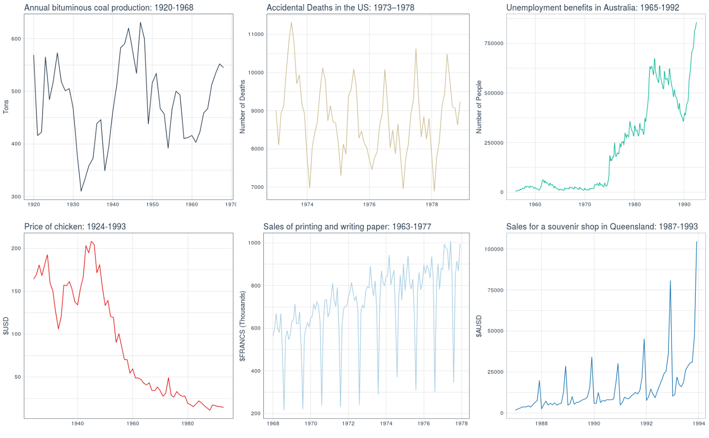
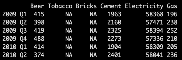
For the next few visualizations, we will utilize a dataset containing quarterly production values of certain commodities in Australia.
# Quarterly Australian production data as tibble
aus <- tsibbledata::aus_production %>% as_tibble()
# Check structure
aus %>% str()
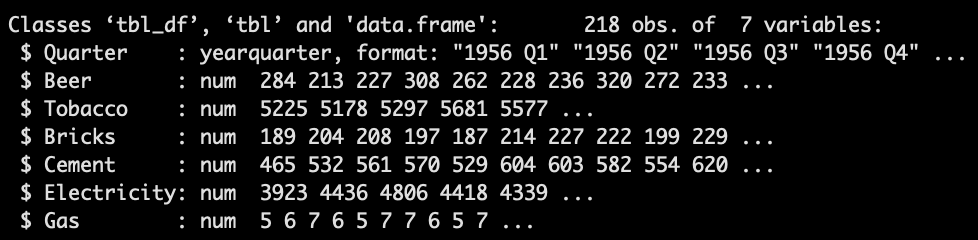
Always check the class of your time series data.
2.2 fpp2 Method: From tibble to ts
# Convert tibble to time series object
aus_prod_ts <- ts(aus[, 2:7],  # Choose columns
                    start = c(1956, 1),  # Choose start date
                    end = c(2010, 2),    # Choose end date
                    frequency = 4)       # Choose frequency per yr
# Check it out
aus_prod_ts %>% tail()
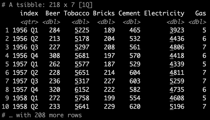
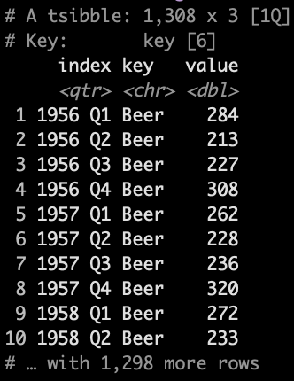
2.3 fpp3 Method: From ts to tsibble
2.3.1 Pivot Wide
# Convert ts to tsibble and keep wide format
aus_prod_tbl_wide <- aus_prod_ts %>%    # TS object
  as_tsibble(index = "index",           # Set index column
             pivot_longer = FALSE)      # Wide format
2.3.2 Pivot Long
# Convert ts to tsibble and pivot to long format
aus_prod_tbl_long <- aus_prod_ts %>%    # TS object
  as_tsibble(index = "index",           # Set index column
             pivot_longer = TRUE)       # Long format
2.4 timetk Method: From tsibble/ts to tibble
2.4.1 Pivot Wide
# Convert tsibble to tibble, keep wide format
aus <- tsibbledata::aus_production %>%
    tk_tbl() %>%
    mutate(Quarter = as_date(as.POSIXct.Date(Quarter)))
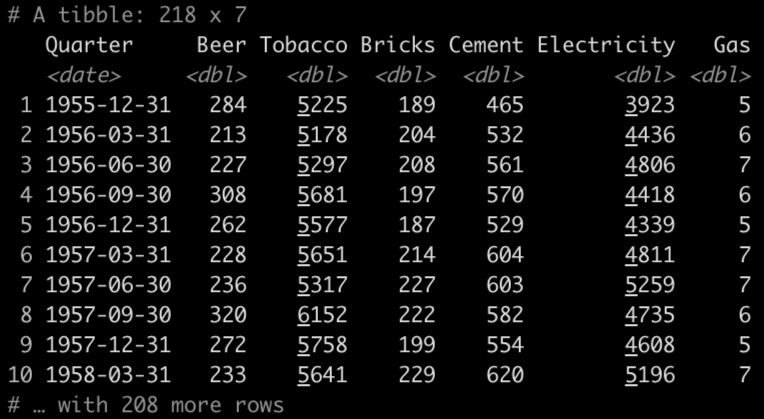
Workaround for indexing issue with tsibble and R 4.0 and up.
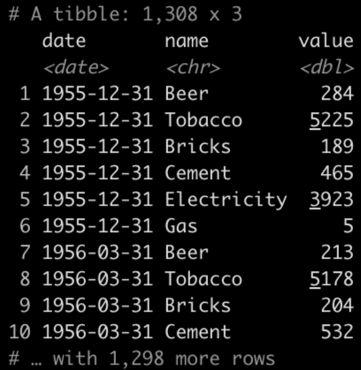
2.4.2 Pivot Long
# Quarterly Australian production data to long format
aus_long <- aus %>%
    rename(date = Quarter) %>%
    pivot_longer(
        cols = c("Beer","Tobacco","Bricks",
                 "Cement","Electricity","Gas"))
3. Time Series Plots
When analyzing time series plots, look for the following patterns:
-
Trend: A long-term increase or decrease in the data; a “changing direction”.
-
Seasonality: A seasonal pattern of a fixed and known period. If the frequency is unchanging and associated with some aspect of the calendar, then the pattern is seasonal.
-
Cycle: A rise and fall pattern not of a fixed frequency. If the fluctuations are not of a fixed frequency then they are cyclic.
-
Seasonal vs Cyclic: Cyclic patterns are longer and more variable than seasonal patterns in general.
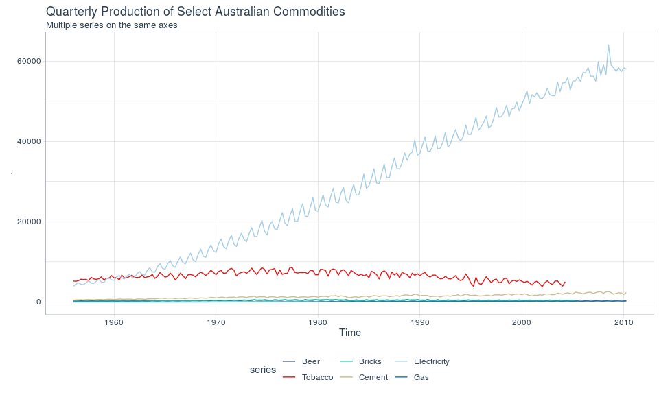
3.1 fpp2 Method: Plot Multiple Series On Same Axes
# Using fpp2
aus_prod_ts %>%               # TS object
  autoplot(facets=FALSE)      # No facetting
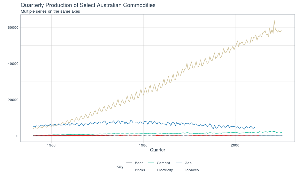
3.2 fpp3 Method: Plot Multiple Series On Same Axes
# Using fpp3
aus_prod_tbl_long %>%    # Data in long format
  autoplot(value)
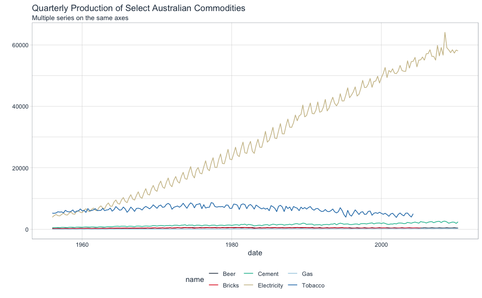
3.3 ggplot Method: Plot Multiple Series On Same Axes
Note that plotting multiple plots on the same axes has not been implemented into timetk. Use ggplot.
# Using ggplot
aus_long %>%
    ggplot(aes(date, value, group = name, color = name)) +
    geom_line()
3.4 fpp2 Method: Plot Multiple Series On Separate Axes
# Using fpp2
aus_prod_ts %>%
  autoplot(facets=TRUE)   # With facetting
Facetted plot with fpp2
3.5 fpp3 Method: Plot Multiple Series On Separate Axes
# Using fpp3
aus_prod_tbl_long %>%
  ggplot(aes(x = index, y = value, group = key)) +
  geom_line() +
  facet_grid(vars(key), scales = "free_y")   # With facetting
Facetted plot with fpp3
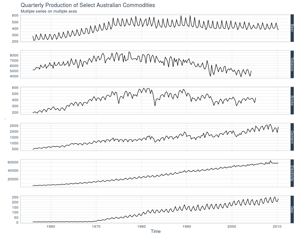
3.6 timetk Method: Plot Multiple Series On Separate Axes
# Using timetk
aus_long %>%
    plot_time_series(
        .date_var = date,
        .value = value,
        .facet_vars = c(name), # Group by these columns
        .color_var = name,
        .interactive = FALSE,
        .legend_show = FALSE
    )
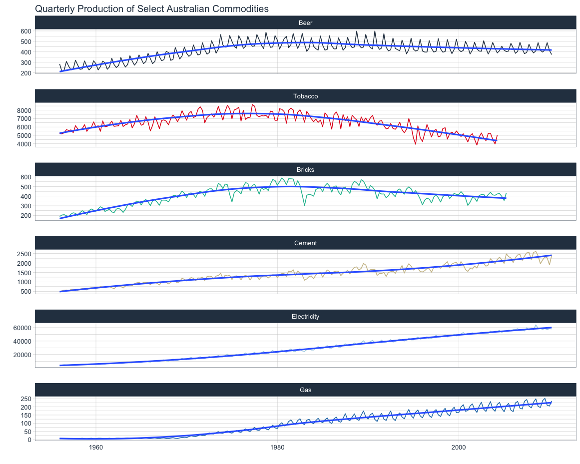
Facetted plot with timetk
4. Seasonal Plots
Use seasonal plots for identifying time periods in which the patterns change.
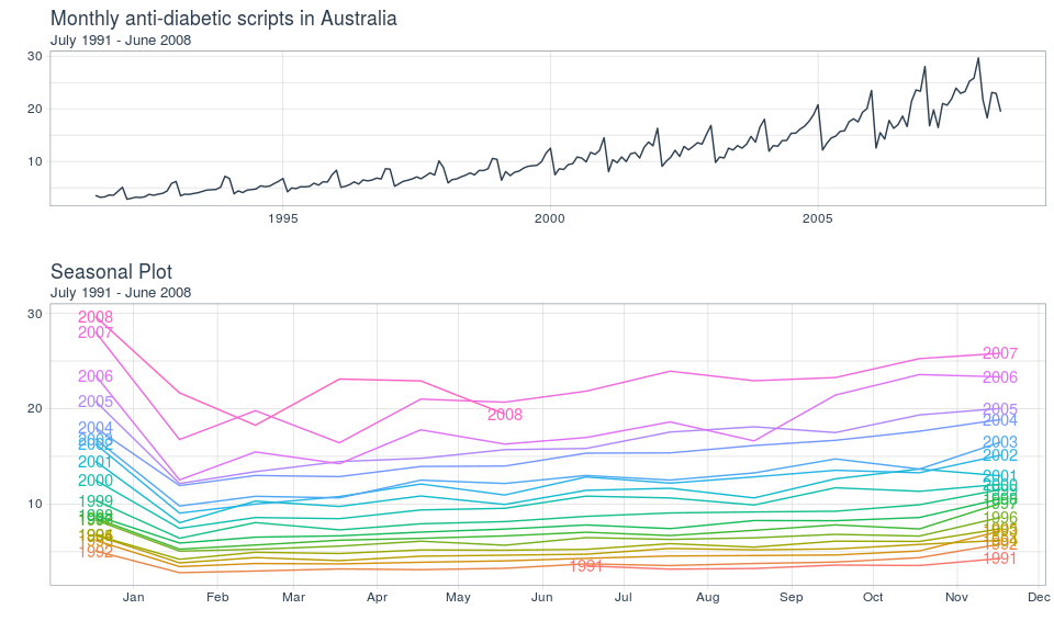
4.1 fpp2 Method: Plot Individual Seasons
# Monthly plot of anti-diabetic scripts in Australia
a1 <- a10 %>%
  autoplot()
# Seasonal plot
a2 <- a10 %>%
  ggseasonplot(year.labels.left = TRUE,   # Add labels
               year.labels = TRUE)
# Arrangement of plots
plot_grid(a1, a2, ncol=1, rel_heights = c(1, 1.5))
Seasonal plot with fpp2
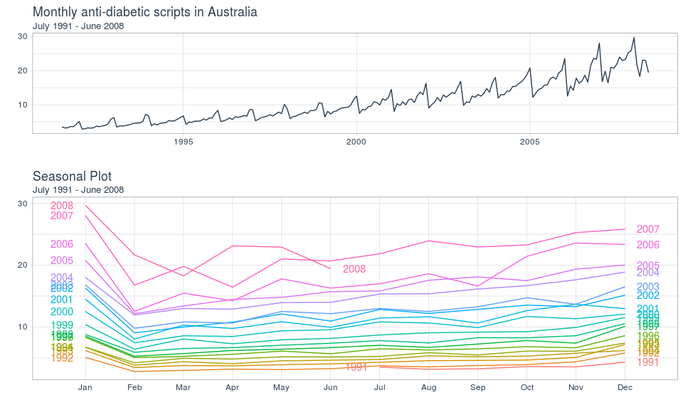
4.2 fpp3 Method: Plot Individual Seasons
# Monthly plot of anti-diabetic scripts in Australia
a1 <- a10 %>%
  as_tsibble() %>%
  autoplot(value)
# Seasonal plot
a2 <- a10 %>%
  as_tsibble() %>%
  gg_season(value, labels="both")   # Add labels
# Arrangement of plots
plot_grid(a1, a2, ncol=1, rel_heights = c(1, 1.5))
Seasonal plot with fpp3
4.3 ggplot Method: Plot Individual Seasons
Note that seasonal plots have not been implemented into timetk. Use ggplot to write:
# Convert ts to tibble
a10_tbl <- fpp2::a10 %>%
    tk_tbl()
# Monthly plot of anti-diabetic scripts in Australia
a1 <- a10_tbl %>%
    plot_time_series(
        .date_var = index,
        .value    = value,
        .smooth   = TRUE,
        .interactive = FALSE,
        .title = "Monthly anti-diabetic scripts in Australia"
    )
# New time-based features to group by
a10_tbl_add <- a10_tbl %>%
    mutate(
        month = factor(month(index, label = TRUE)),  # Plot this
        year = factor(year(index))  # Grouped on y-axis
    )
# Seasonal plot
a2 <- a10_tbl_add %>%
    ggplot(aes(x = month, y = value,
               group = year, color = year)) +
    geom_line() +
    geom_text(
        data = a10_tbl_add %>% filter(month == min(month)),
        aes(label = year, x = month, y = value),
        nudge_x = -0.3) +
    geom_text(
        data = a10_tbl_add %>% filter(month == max(month)),
        aes(label = year, x = month, y = value),
        nudge_x = 0.3) +
    guides(color = FALSE)
# Arrangement of plots
plot_grid(a1, a2, ncol=1, rel_heights = c(1, 1.5))
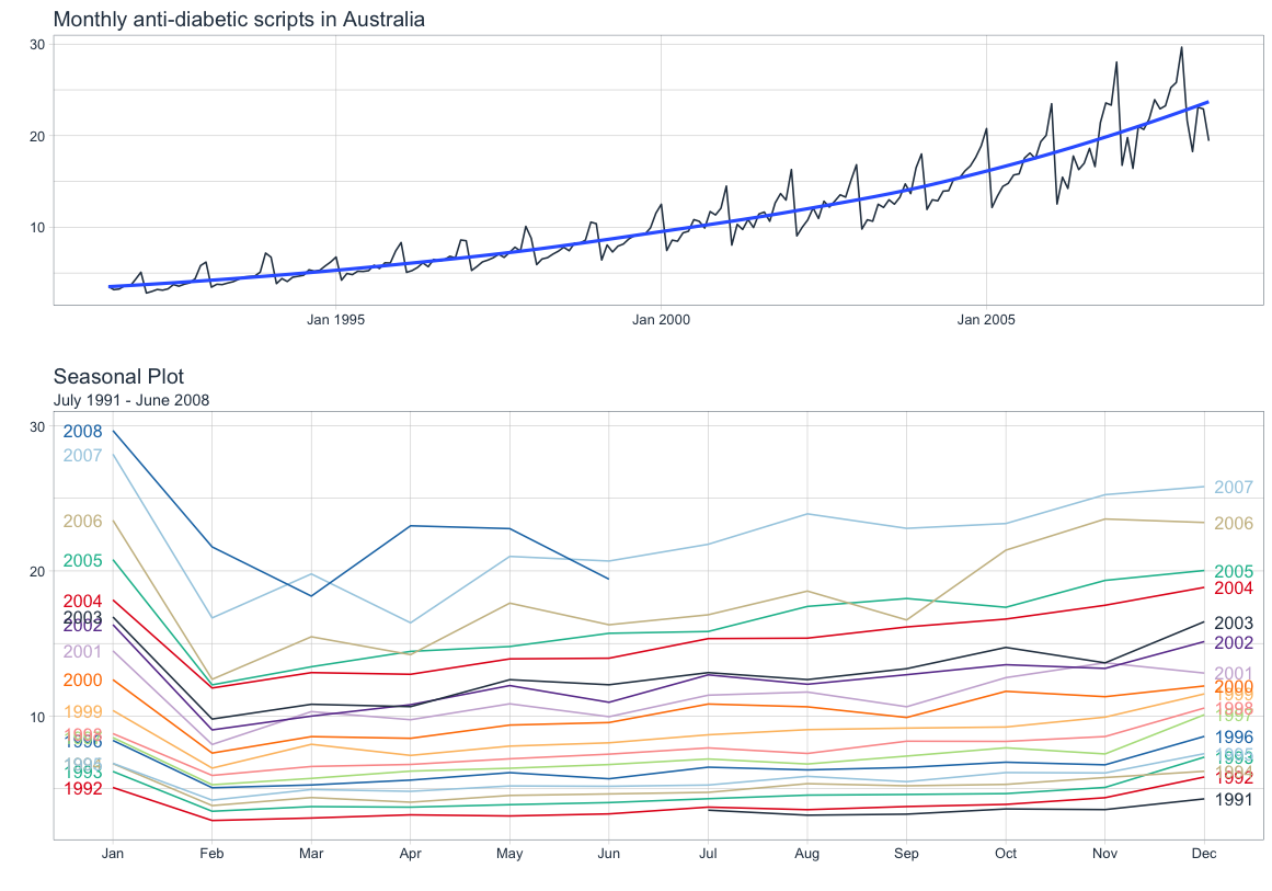
Seasonal plot with ggplot
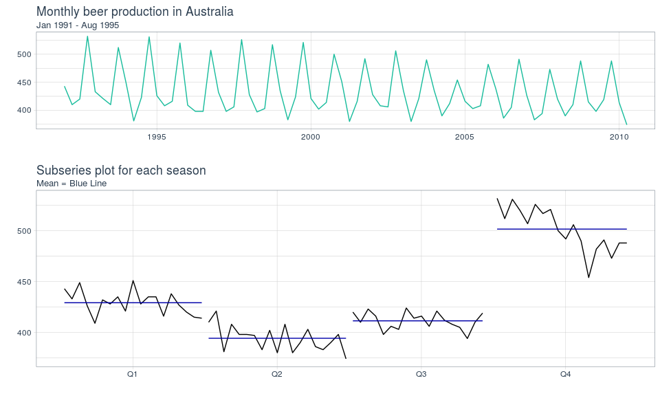
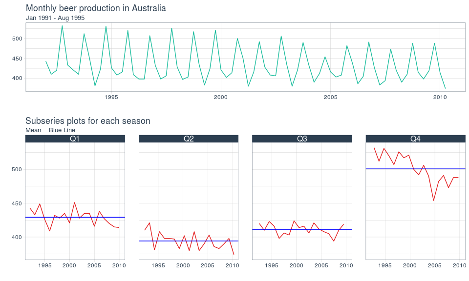
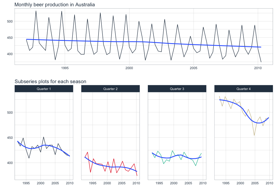
5. Subseries Plots
Use subseries plots to view seasonal changes over time.
5.1 fpp2 Method: Plot Subseries on Same Axes
# Monthly beer production in Australia 1992 and after
beer_fpp2 <- fpp2::ausbeer %>%
  window(start = 1992)
# Time series plot
b1 <- beer_fpp2 %>%
  autoplot()
# Subseries plot
b2 <- beer_fpp2 %>%
  ggsubseriesplot()
# Plot it
plot_grid(b1, b2, ncol=1, rel_heights = c(1, 1.5))
Subseries plots on the same axes using fpp2
5.2 fpp3 Method: Plot Subseries on Separate Axes
# Monthly beer production in Australia 1992 and after
beer_fpp3 <- fpp2::ausbeer %>%
  as_tsibble() %>%
  filter(lubridate::year(index) >= 1992)
# Time series plot
b3 <- beer_fpp3 %>%
  autoplot(value)
# Subseries plot
b4 <- beer_fpp3 %>%
  gg_subseries(value)
# Plot it
plot_grid(b3, b4, ncol=1, rel_heights = c(1, 1.5))
Subseries plots on the same axes using fpp3
5.3 timetk Method: Plot Subseries on Separate Axes
# Monthly beer production in Australia 1992 and after
ausbeer_tbl <- fpp2::ausbeer %>%
    tk_tbl() %>%
    filter(year(index) >= 1992) %>%
    mutate(index = as_date(index))
# Time series plot
b1 <- ausbeer_tbl %>%
    plot_time_series(
        .date_var = index,
        .value    = value,
        .interactive = FALSE
    )
# Subseries plot
b2 <- ausbeer_tbl %>%
    mutate(
        quarter = str_c("Quarter ", as.character(quarter(index)))
    ) %>%
    plot_time_series(
        .date_var = index,
        .value = value,
        .facet_vars = quarter,
        .facet_ncol = 4,
        .color_var = quarter,
        .facet_scales = "fixed",
        .interactive = FALSE,
        .legend_show = FALSE
    )
# Plot it
plot_grid(b1, b2, ncol=1, rel_heights = c(1, 1.5))
Subseries plots on the same axes using timetk
6. Lag Plots
Use lag plots to check for randomness.
6.1 fpp2 Method: Plot Multiple Lags
# Plot of non-seasonal oil production in Saudi Arabia
o1 <- fpp2::oil %>%
  autoplot()
# Lag plot of non-seasonal oil production
o2 <- gglagplot(oil, do.lines = FALSE)
# Plot both
plot_grid(o1, o2, ncol=1, rel_heights = c(1,2))
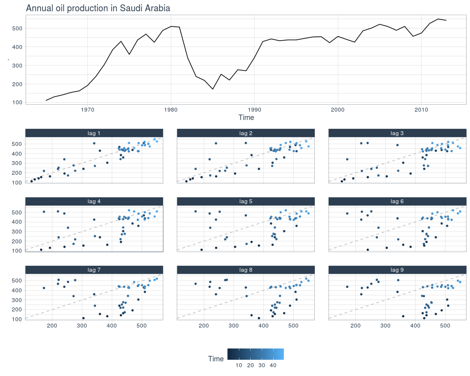
Lag plots using fpp2
6.2 fpp3 Method: Plot Multiple Lags
# Plot of non-seasonal oil production
o1 <- oil %>%
  as_tsibble() %>%
  autoplot(value)
# Lag plot of non-seasonal oil production
o2 <- oil %>%
  as_tsibble() %>%
  gg_lag(y=value, geom = "point")
# Plot it
plot_grid(o1, o2, ncol=1, rel_heights = c(1,2))
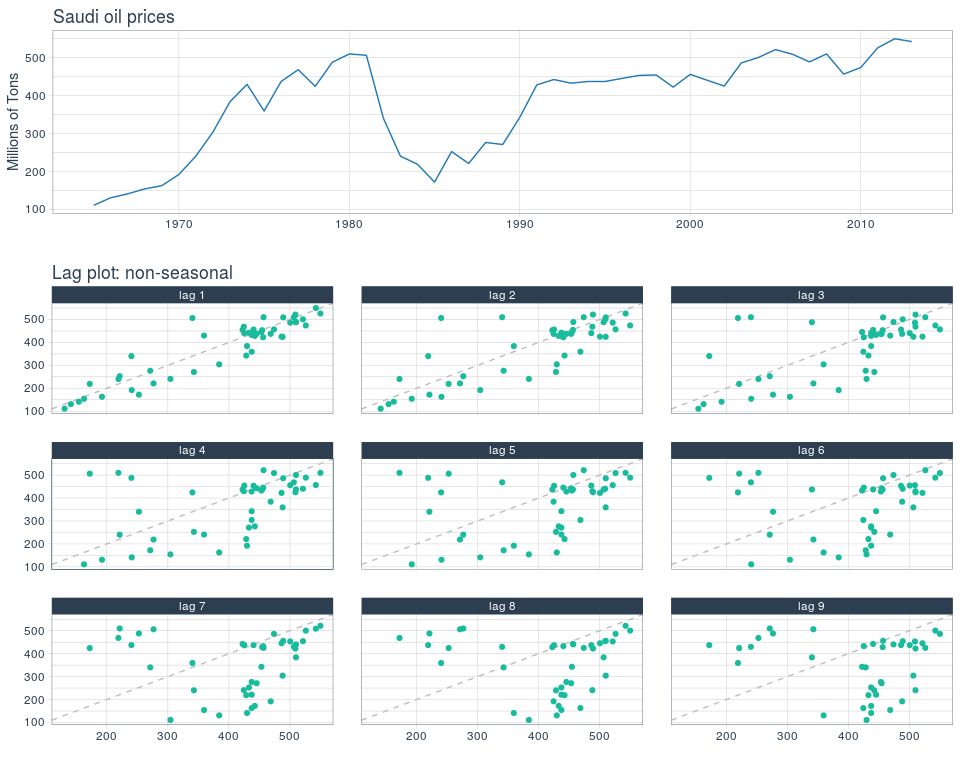
Lag plots using fpp3
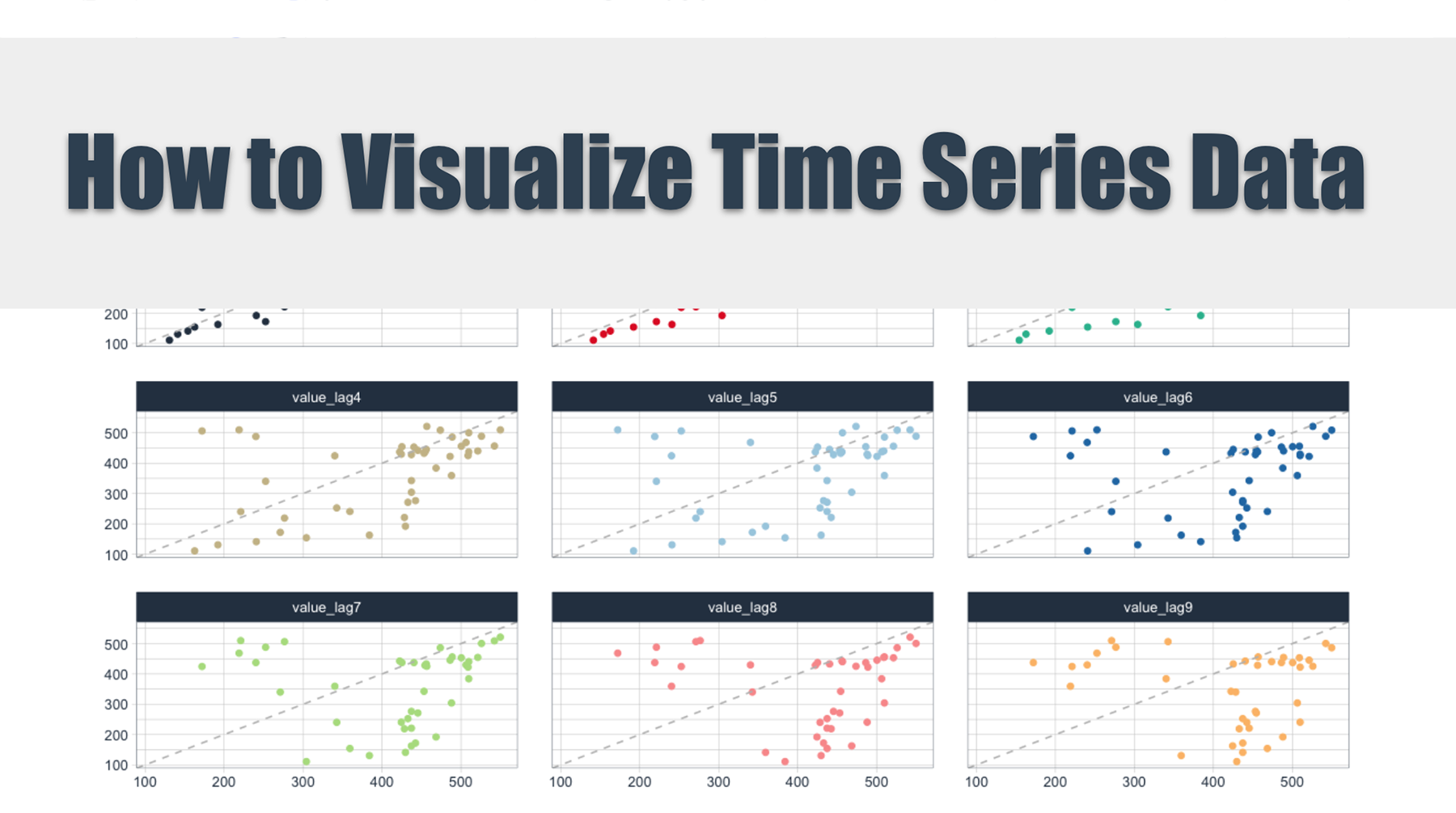
6.3 timetk Method (Hack?) : Plot Multiple Lags
# Convert to tibble and create lag columns
oil_lag_long <- oil %>%
    tk_tbl(rename_index = "year") %>%
    tk_augment_lags(      # Add 9 lag columns of data
        .value = value,
        .names = "auto",
        .lags = 1:9) %>%
    pivot_longer(         # Pivot from wide to long
        names_to = "lag_id",
        values_to = "lag_value",
        cols = value_lag1:value_lag9)  # Exclude year & value
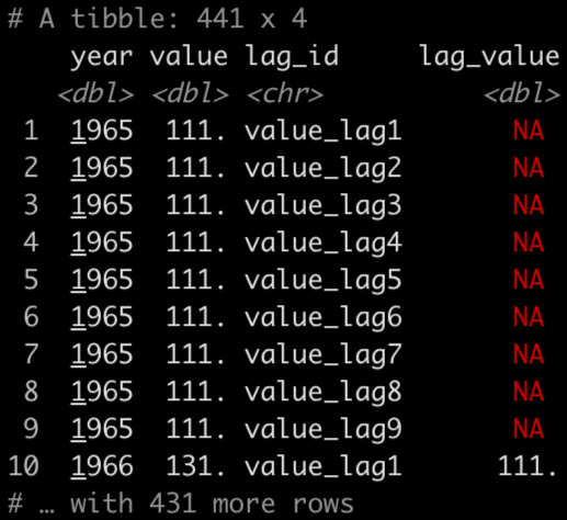
Now you can plot value vs lag_value
# Time series plot
o1 <- oil %>%
    tk_tbl(rename_index = "year") %>%
    mutate(year = ymd(year, truncated = 2L)) %>%
    plot_time_series(
        .date_var = year,
        .value = value,
        .interactive = FALSE)
# timetk Method: Plot Multiple Lags
o2 <- oil_lag_long %>%
    plot_time_series(
        .date_var = value,     # Use value instead of date
        .value = lag_value,    # Use lag value to plot against
        .facet_vars = lag_id,  # Facet by lag number
        .facet_ncol = 3,
        .interactive = FALSE,
        .smooth = FALSE,
        .line_alpha = 0,
        .legend_show = FALSE,
        .facet_scales = "fixed"
        ) +
    geom_point(aes(colour = lag_id)) +
    geom_abline(colour = "gray", linetype = "dashed")
# Plot it
plot_grid(o1, o2, ncol=1, rel_heights = c(1,2))
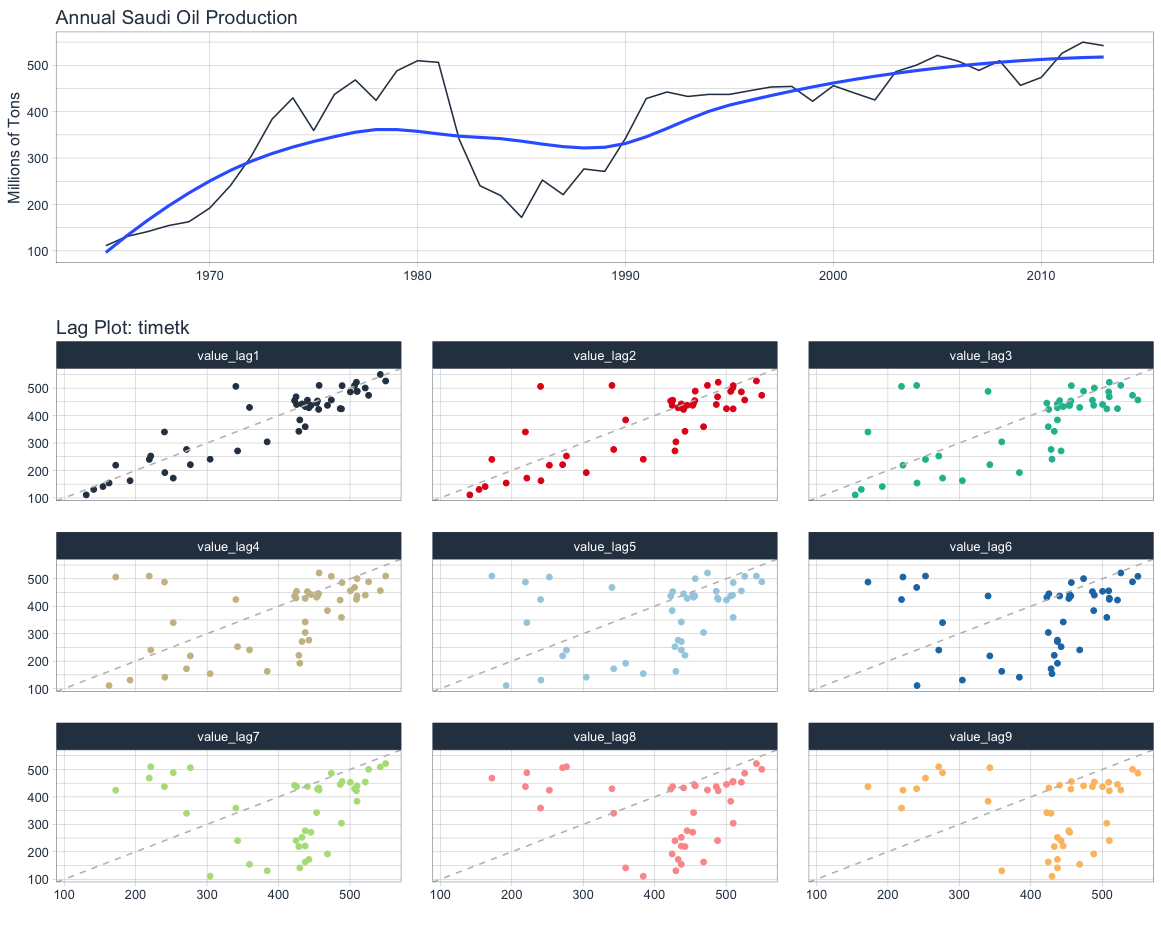
Lag plots using timetk
7. Autocorrelation Function Plots
The autocorrelation function measures the linear relationship between lagged values of a time series. The partial autocorrelation function measures the linear relationship between the correlations of the residuals.
ACF
- Visualizes how much the most recent value of the series is correlated with past values of the series (lags)
- If the data has a trend, then the autocorrelations for small lags tend to be positive and large because observations nearby in time are also nearby in size
- If the data are seasonal, then the autocorrelations will be larger for seasonal lags at multiples of seasonal frequency than other lags
PACF
- Visualizes whether certain lags are good for modeling or not; useful for data with a seasonal pattern
- Removes dependence of lags on other lags by using the correlations of the residuals
7.1 fpp2 Method: Plot ACF + PACF
# ACF plot
o1 <- ggAcf(oil, lag.max = 20)
# PACF plot
o2 <- ggPacf(oil, lag.max = 20)
# Plot both
plot_grid(o1, o2, ncol = 1)
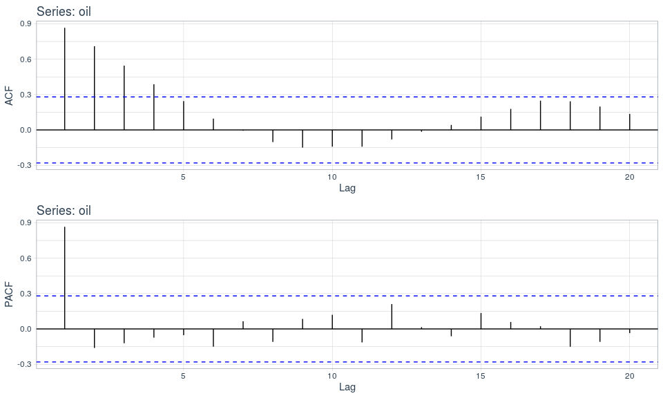
Are autocorrelations large at seasonal lags? Are the most recent lags above the white noise threshold?
7.2 fpp3 Method: Plot ACF + PACF
# Convert to tsibble
oil_tsbl <- oil %>% as_tsibble()
# ACF Plot
o1 <- oil_tsbl %>%
  ACF(lag_max = 20) %>%
  autoplot()
# PACF Plot
o2 <- oil_tsbl %>%
  PACF(lag_max = 20) %>%
  autoplot()
# Plot both
plot_grid(o1, o2, ncol = 1)
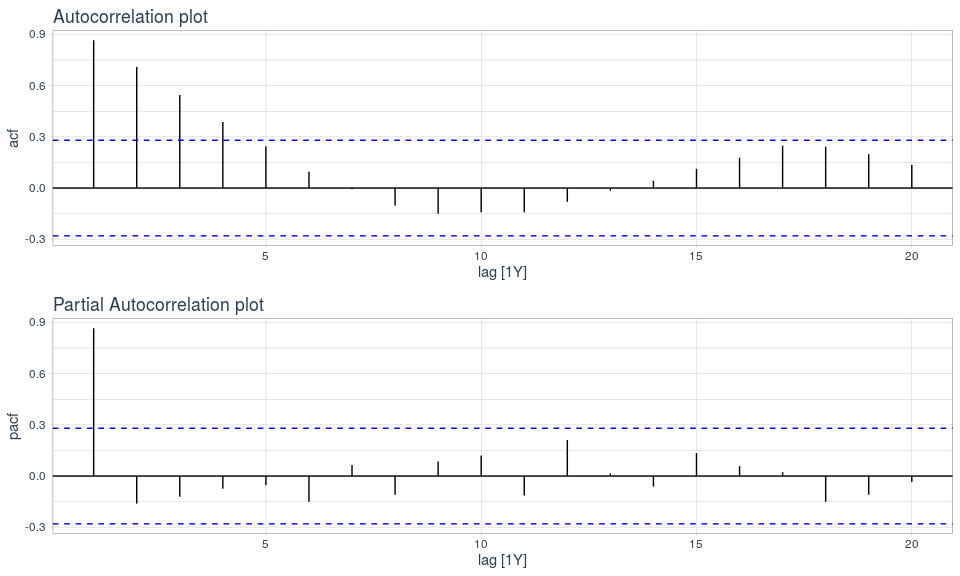
The autocorrelations are not large at seasonal lags so this series is non-seasonal. The most recent lags show that there is a trend.
7.3 timetk Method: Plot ACF & PACF
# Using timetk
oil %>%
    tk_tbl(rename_index = "year") %>%
    plot_acf_diagnostics(
        .date_var = year,
        .value    = value,
        .lags     = 20,
        .show_white_noise_bars = TRUE,
        .interactive = FALSE
    )
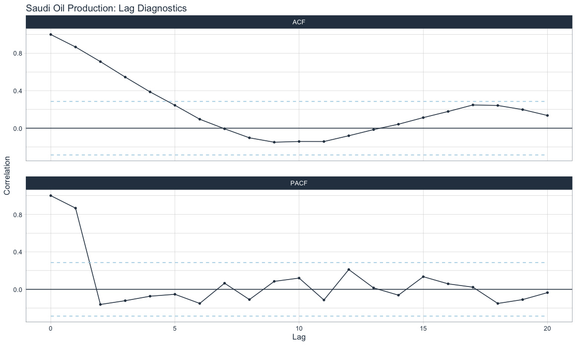
ACF shows more recent lags are above the white noise significance bars denoting a trend. PACF shows that including lag 1 would be good for modeling purposes.
8. Summary
As with all things in life, there are good and bad sides to using any of these three forecasting frameworks for visualizing time series. All three have similar functionality as it relates to visualizations.
8.1 fpp2
- Code requires minimal parameters
- Uses basets format
- Uses ggplot for visualizations
- Mostly incompatible with tidyverse for data manipulation
- No longer maintained except for bug fixes
8.2 fpp3
- Code requires minimal parameters
- Uses proprietary tsibble format with special indexing tools
- Uses ggplot for visualizations
- Mostly compatible with tidyverse for data manipulation; tsibble may cause issues
- Currently maintained
8.3 timetk
- Code requires multiple parameters but provides more granularity
- Uses standard tibble format
- Uses ggplot and plotly for visualizations
- Fully compatible with tidyverse for data manipulation
- Currently maintained
Author: Joon Im
Joon is a data scientist with both R and Python with an emphasis on forecasting techniques - LinkedIn.