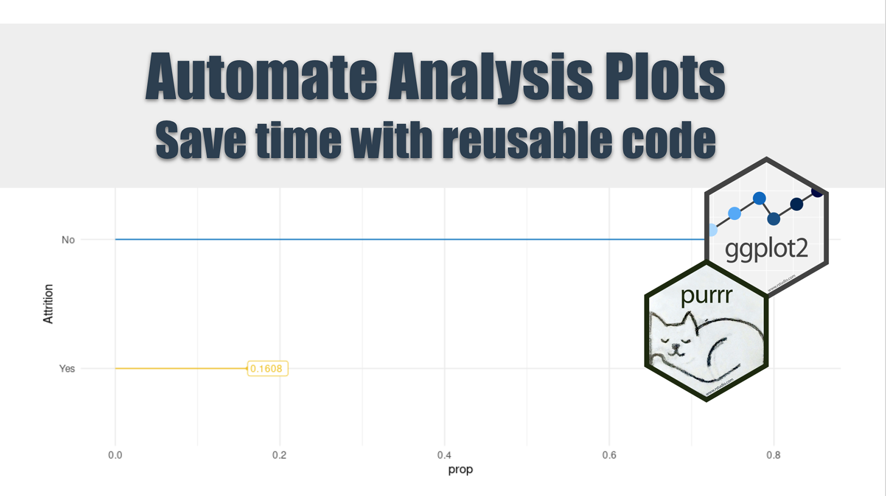
How to Automate Exploratory Analysis Plots
Written by Luciano Oliveira Batista
Updates
Interested in automating code? Learn more R automation tips with How to Automate Excel with R and How to Automate PowerPoint with R.
Getting Started
When plotting different charts during your exploratory data analysis, you sometimes end up doing a lot of repetitive coding. What we’ll show here is a better way to do your EDA, and with less unnecessary coding and more flexibility. So, let me introduce you to the powerful package combo ggplot2 and purrr.
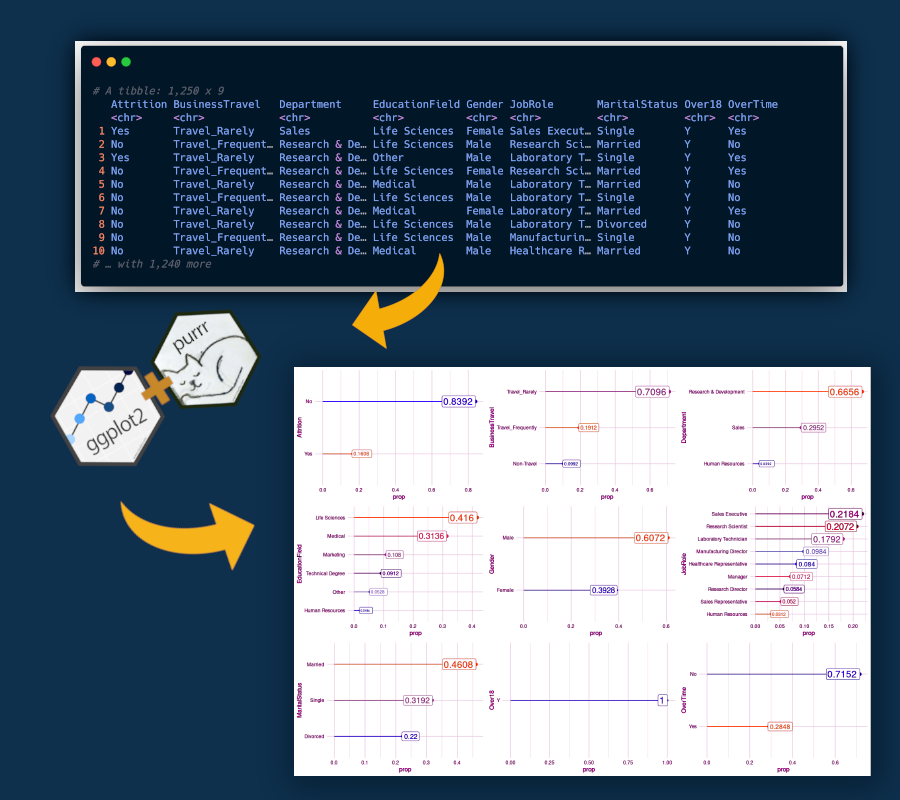
ggplot2 is an awesome package for data visualization very well know in the Data Science community and probably the library that you use to build your charts during the EDA. And, purrr package enhances R’s functional programming (FP) toolkit by providing a complete and consistent set of tools for working with functions and vectors.
Here will use an implementation similar to loops, but written in a more efficient way and easier to read, purrr::map() function.
Data
The dataset is an imaginary HR dataset made by data scientists of IBM Company. In our analysis, we’ll look just at categorical variables, and plotting the proportion of each class within the categorical variable.
The dataset has a total of 35 features, being 9 of them categorical, and also which we will use.
# libraries
library(tidyverse) # include ggplot2, purrr and some others usefull packages
library(cowplot)
library(readxl)
library(ggsci) # nice palletes =)

# data
hr_people_analytics_tbl <- read_xlsx("00_Data/telco_train.xlsx")
Requirements
Before we start to build our plot, we need to specify which variable will be used in the analysis.
We’ll use just look at categorical features, in order to see the proportion between different classes, we’ll write a named vector with this information.
# selecting character variables
hr_people_analytics_char_tbl <- hr_people_analytics_tbl %>%
    select_if(is.character)

# setting a named vector
names <- names(hr_people_analytics_char_tbl)
names <- set_names(names)
The set_names function is super handy for naming character vectors since it can use the values of the vector as names.
Create a plot
My approach to this problem is, first plot the chart that you want, and second, replace the variable with an input of a function. This part is where you need to put more effort into coding.
In the code chunk below you’ll find a plot for a specific variable, “Attrition”.
scale_color <- pal_jco()(10)

hr_people_analytics_char_tbl %>%
    count(Attrition) %>%
    mutate(prop = n/sum(n)) %>%
    ggplot(aes(x = fct_reorder(Attrition, prop),
               y = prop,
               color = Attrition)) +
    scale_color_manual(values = scale_color) +
    geom_segment(aes(xend = Attrition, yend = 0),
                 show.legend = F) +
    geom_point(aes(size = prop),
               show.legend = F) +
    geom_label(aes(label = prop, size = prop*10),
               fill = "white",
               hjust = "inward",
               show.legend = F) +
    labs(
        x = "Attrition"
    ) +
    coord_flip() +
    theme_minimal()
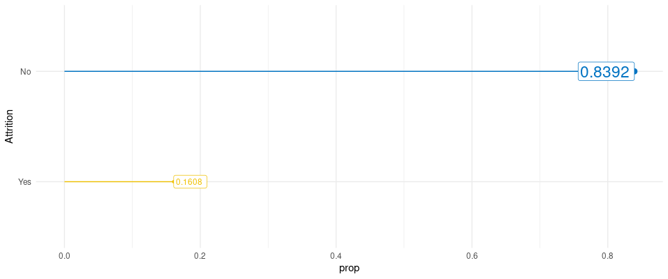
I like to use this kind of plot when we have many different plots together, instead of using bar charts. The columns of bar charts can throw to the user too much information when just the end of the bar is important.
One tip to really grasp the steps for building this kind of chart (lollipop chart) is to thinking plots like layers (grammar of graphics) and put one on top of the other.
There are three core layers that need to be built in sequence:
geom_segment()geom_point()geom_label()
The rest of the plot is trivial to any ggplot chart that you already build.
Now we need to replace the variable used before as input in a function.
Creating our plotting function
To do this replacement we will use the pronoun .data from rlang package, this pronoun allows you to be explicit about where to find objects when programming with data masked functions.
Using this strategy we will have the following function:
# second: plot_function
plot_frequency <- function(x) {

    scale_color <- pal_jco()(10)

    hr_people_analytics_char_tbl %>%
        count(.data[[x]]) %>%
        mutate(prop = n/sum(n)) %>%
        ggplot(aes(x = fct_reorder(.data[[x]], prop),
                   y = prop,
                   color = .data[[x]])) +
        scale_color_manual(values = scale_color) +
        geom_segment(aes(xend = .data[[x]], yend = 0),
                     show.legend = F) +
        geom_point(aes(size = prop),
                   show.legend = F) +
        geom_label(aes(label = prop, size = prop*10),
                   fill = "white",
                   hjust = "inward",
                   show.legend = F) +
        labs(
            x = x
        ) +
        coord_flip() +
        theme_minimal()
}
Using purrr
Here is the important step where we apply the function that we create to all character features in the dataset. And also, we’ll apply the cowplot::plot_grid() that put together all ggplot2 objects in all_plots list.
all_plots <- map(names, plot_frequency)
cowplot::plot_grid(plotlist = all_plots)
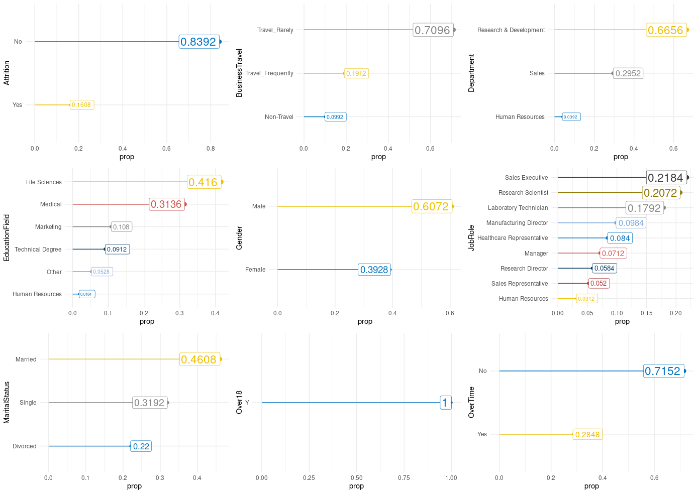
Conclusion
In this tutorial, you learned how to save time when was needed to plot a chart a lot of times. I hope that was useful for you.
Author: Luciano Oliveira Batista
Luciano is a chemical engineer and data scientist in training. Learn more on his blog at lobdata.com.