IML: Machine Learning Model Interpretability And Feature Explanation with IML and H2O
Written by Brad Boehmke

Model interpretability is critical to businesses. If you want to use high performance models (GLM, RF, GBM, Deep Learning, H2O, Keras, xgboost, etc), you need to learn how to explain them. With machine learning interpretability growing in importance, several R packages designed to provide this capability are gaining in popularity. We analyze the IML package in this article.
In recent blog posts we assessed LIME for model agnostic local interpretability functionality and DALEX for both local and global machine learning explanation plots. This post examines the iml package (short for Interpretable Machine Learning) to assess its functionality in providing machine learning interpretability to help you determine if it should become part of your preferred machine learning toolbox.
We again utilize the high performance machine learning library, h2o, implementing three popular black-box modeling algorithms: GLM (generalized linear models), RF (random forest), and GBM (gradient boosted machines). For those that want a deep dive into model interpretability, the creator of the iml package, Christoph Molnar, has put together a free book: Interpretable Machine Learning. Check it out.
Articles In The Model Interpretability Series
Articles related to machine learning and black-box model interpretability:
Awesome Data Science Tutorials with LIME for black-box model explanation in business:
FREE BOOK: Interpretable Machine Learning
The creator of the IML (Interpretable Machine Learning) package has a great FREE resource for those interested in applying model interpretability techniques to complex, black-box models (high performance models). Check out the book: Interpretable Machine Learning by Christoph Molnar.
Interpretable Machine Learning Book by Christoph Molnar
Learning Trajectory
We’ll cover the following topics on iml, combining with the h2o high performance machine learning package:
IML and H2O: Machine Learning Model Interpretability And Feature Explanation
By Brad Boehmke, Director of Data Science at 84.51°
Advantages & disadvantages
The iml package is probably the most robust ML interpretability package available. It provides both global and local model-agnostic interpretation methods. Although the interaction functions are notably slow, the other functions are faster or comparable to existing packages we use or have tested. I definitely recommend adding iml to your preferred ML toolkit. The following provides a quick list of some of its pros and cons:
Advantages
- ML model and package agnostic: can be used for any supervised ML model (many features are only relevant to regression and binary classification problems).
- Variable importance: uses a permutation-based approach for variable importance, which is model agnostic, and accepts any loss function to assess importance.
- Partial dependence plots: Fast PDP implementation and allows for ICE curves.
- H-statistic: one of only a few implementations to allow for assessing interactions.
- Local interpretation: provides both LIME and Shapley implementations.
- Plots: built with
ggplot2 which allows for easy customization
Disadvantages
- Does not allow for easy comparisons across models like
DALEX.
- The H-statistic interaction functions do not scale well to wide data (may predictor variables).
- Only provides permutation-based variable importance scores (which become slow as number of features increase).
- LIME implementation has less flexibilty and features than
lime.
Replication Requirements
Libraries
I leverage the following packages:
# load required packages
library(rsample)   # data splitting
library(ggplot2)   # allows extension of visualizations
library(dplyr)     # basic data transformation
library(h2o)       # machine learning modeling
library(iml)       # ML interprtation

# initialize h2o session
h2o.no_progress()
h2o.init()
##
## H2O is not running yet, starting it now...
##
## Note:  In case of errors look at the following log files:
##     C:\Users\mdanc\AppData\Local\Temp\RtmpotQxdq/h2o_mdanc_started_from_r.out
##     C:\Users\mdanc\AppData\Local\Temp\RtmpotQxdq/h2o_mdanc_started_from_r.err
##
##
## Starting H2O JVM and connecting: . Connection successful!
##
## R is connected to the H2O cluster:
##     H2O cluster uptime:         3 seconds 250 milliseconds
##     H2O cluster version:        3.16.0.2
##     H2O cluster version age:    8 months and 13 days !!!
##     H2O cluster name:           H2O_started_from_R_mdanc_rkf359
##     H2O cluster total nodes:    1
##     H2O cluster total memory:   3.53 GB
##     H2O cluster total cores:    8
##     H2O cluster allowed cores:  8
##     H2O cluster healthy:        TRUE
##     H2O Connection ip:          localhost
##     H2O Connection port:        54321
##     H2O Connection proxy:       NA
##     H2O Internal Security:      FALSE
##     H2O API Extensions:         Algos, AutoML, Core V3, Core V4
##     R Version:                  R version 3.4.4 (2018-03-15)
Data
To demonstrate iml’s capabilities we’ll use the employee attrition data that has been included in the rsample package. This demonstrates a binary classification problem (“Yes” vs. “No”) but the same process that you’ll observe can be used for a regression problem.
I perform a few house cleaning tasks on the data prior to converting to an h2o object and splitting.
NOTE: The surrogate tree function uses partykit::cpart, which requires all predictors to be numeric or factors. Consequently, we need to coerce any character predictors to factors (or ordinal encode).
# classification data
df <- rsample::attrition %>%
  mutate_if(is.ordered, factor, ordered = FALSE) %>%
  mutate(Attrition = recode(Attrition, "Yes" = "1", "No" = "0") %>% factor(levels = c("1", "0")))

# convert to h2o object
df.h2o <- as.h2o(df)

# create train, validation, and test splits
set.seed(123)
splits <- h2o.splitFrame(df.h2o, ratios = c(.7, .15), destination_frames = c("train","valid","test"))
names(splits) <- c("train","valid","test")

# variable names for resonse & features
y <- "Attrition"
x <- setdiff(names(df), y)
H2O Models
We will explore how to visualize a few of the more common machine learning algorithms implemented with h2o. For brevity I train default models and do not emphasize hyperparameter tuning. The following produces a regularized logistic regression, random forest, and gradient boosting machine models.
# elastic net model
glm <- h2o.glm(
  x = x,
  y = y,
  training_frame = splits$train,
  validation_frame = splits$valid,
  family = "binomial",
  seed = 123
  )

# random forest model
rf <- h2o.randomForest(
  x = x,
  y = y,
  training_frame = splits$train,
  validation_frame = splits$valid,
  ntrees = 1000,
  stopping_metric = "AUC",
  stopping_rounds = 10,
  stopping_tolerance = 0.005,
  seed = 123
  )

# gradient boosting machine model
gbm <-  h2o.gbm(
  x = x,
  y = y,
  training_frame = splits$train,
  validation_frame = splits$valid,
  ntrees = 1000,
  stopping_metric = "AUC",
  stopping_rounds = 10,
  stopping_tolerance = 0.005,
  seed = 123
  )
All of the models provide AUCs ranging between 0.75 to 0.79. Although these models have distinct AUC scores, our objective is to understand how these models come to this conclusion in similar or different ways based on underlying logic and data structure.
# model performance
h2o.auc(glm, valid = TRUE)
## [1] 0.7870935
h2o.auc(rf, valid = TRUE)
## [1] 0.7681021
h2o.auc(gbm, valid = TRUE)
## [1] 0.7468242
Although these models have distinct AUC scores, our objective is to understand how these models come to this conclusion in similar or different ways based on underlying logic and data structure.
IML procedures
In order to work with iml, we need to adapt our data a bit so that we have the following three components:
-
Create a data frame with just the features (must be of class data.frame, cannot be an H2OFrame or other class).
-
Create a vector with the actual responses (must be numeric - 0/1 for binary classification problems).
-
iml has internal support for some machine learning packages (i.e. mlr, caret, randomForest). However, to use iml with several of the more popular packages being used today (i.e. h2o, ranger, xgboost) we need to create a custom function that will take a data set (again must be of class data.frame) and provide the predicted values as a vector.
# 1. create a data frame with just the features
features <- as.data.frame(splits$valid) %>% select(-Attrition)

# 2. Create a vector with the actual responses
response <- as.numeric(as.vector(splits$valid$Attrition))

# 3. Create custom predict function that returns the predicted values as a
#    vector (probability of purchasing in our example)
pred <- function(model, newdata)  {
  results <- as.data.frame(h2o.predict(model, as.h2o(newdata)))
  return(results[[3L]])
}

# example of prediction output
pred(rf, features) %>% head()
## [1] 0.18181818 0.27272727 0.06060606 0.54545455 0.03030303 0.42424242
Once we have these three components we can create a predictor object. Similar to DALEX and lime, the predictor object holds the model, the data, and the class labels to be applied to downstream functions. A unique characteristic of the iml package is that it uses R6 classes, which is rather rare. To main differences between R6 classes and the normal S3 and S4 classes we typically work with are:
- Methods belong to objects, not generics (we’ll see this in the next code chunk).
- Objects are mutable: the usual copy-on-modify semantics do not apply (we’ll see this later in this tutorial).
These properties make R6 objects behave more like objects in programming languages such as Python. So to construct a new Predictor object, you call the new() method which belongs to the R6 Predictor object and you use $ to access new():
# create predictor object to pass to explainer functions
predictor.glm <- Predictor$new(
  model = glm,
  data = features,
  y = response,
  predict.fun = pred,
  class = "classification"
  )

predictor.rf <- Predictor$new(
  model = rf,
  data = features,
  y = response,
  predict.fun = pred,
  class = "classification"
  )

predictor.gbm <- Predictor$new(
  model = gbm,
  data = features,
  y = response,
  predict.fun = pred,
  class = "classification"
  )
# structure of predictor object
str(predictor.gbm)
## Classes 'Predictor', 'R6' <Predictor>
##   Public:
##     class: classification
##     clone: function (deep = FALSE)
##     data: Data, R6
##     initialize: function (model = NULL, data, predict.fun = NULL, y = NULL, class = NULL)
##     model: H2OBinomialModel
##     predict: function (newdata)
##     prediction.colnames: NULL
##     prediction.function: function (newdata)
##     print: function ()
##     task: unknown
##   Private:
##     predictionChecked: FALSE
Global interpretation
iml provides a variety of ways to understand our models from a global perspective:
- Feature Importance
- Partial Dependence
- Measuring Interactions
- Surrogate Model
We’ll go through each.
1. Feature importance
We can measure how important each feature is for the predictions with FeatureImp. The feature importance measure works by calculating the increase of the model’s prediction error after permuting the feature. A feature is “important” if permuting its values increases the model error, because the model relied on the feature for the prediction. A feature is “unimportant” if permuting its values keeps the model error unchanged, because the model ignored the feature for the prediction. This model agnostic approach is based on (Breiman, 2001; Fisher et al, 2018) and follows the given steps:
For any given loss function do
1: compute loss function for original model
2: for variable i in {1,...,p} do
     | randomize values
     | apply given ML model
     | estimate loss function
     | compute feature importance (permuted loss / original loss)
   end
3. Sort variables by descending feature importance
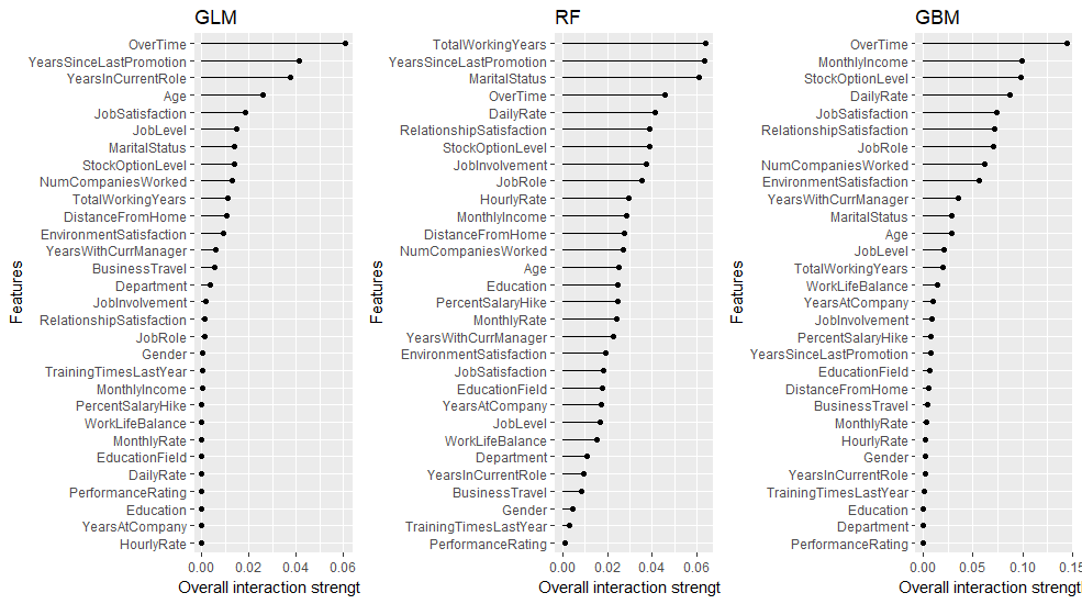
We see that all three models find OverTime as the most influential variable; however, after that each model finds unique structure and signals within the data. Note: you can extract the results with imp.rf$results.
# compute feature importance with specified loss metric
imp.glm <- FeatureImp$new(predictor.glm, loss = "mse")
imp.rf <- FeatureImp$new(predictor.rf, loss = "mse")
imp.gbm <- FeatureImp$new(predictor.gbm, loss = "mse")

# plot output
p1 <- plot(imp.glm) + ggtitle("GLM")
p2 <- plot(imp.rf) + ggtitle("RF")
p3 <- plot(imp.gbm) + ggtitle("GBM")

gridExtra::grid.arrange(p1, p2, p3, nrow = 1)
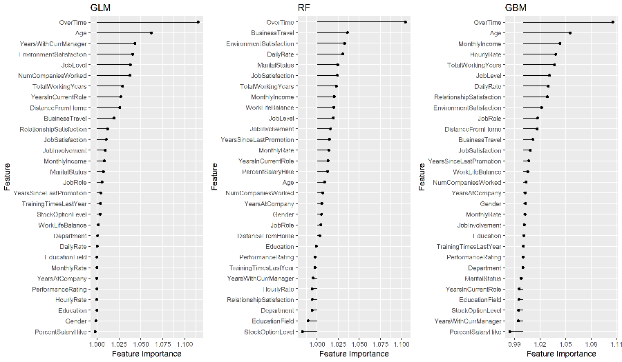
Permutation-based approaches can become slow as your number of predictors grows. To assess variable importance for all 3 models in this example takes only 8 seconds. However, performing the same procedure on a data set with 80 predictors (AmesHousing::make_ames()) takes roughly 3 minutes. Although this is slower, it is comparable to other permutation-based implementations (i.e. DALEX, ranger).
system.time({
  imp.glm <- FeatureImp$new(predictor.glm, loss = "mse")
  imp.rf <- FeatureImp$new(predictor.rf, loss = "mse")
  imp.gbm <- FeatureImp$new(predictor.gbm, loss = "mse")
})
##  user  system elapsed
## 2.982   0.112   8.164
The following lists some advantages and disadvantages to iml’s feature importance procedure.
Advantages:
- Model agnostic
- Simple interpretation that’s comparable across models
- Can apply any loss function (accepts custom loss functions as well)
- Plot output uses
ggplot2; we can add to or use our internal branding packages with it
Disadvantages:
- Permutation-based methods are slow
- Default plot contains all predictors; however, we can subset
$results data frame if desired
2. Partial dependence
The Partial class implements partial dependence plots (PDPs) and individual conditional expectation (ICE) curves. The procedure follows the traditional methodology documented in Friedman (2001) and Goldstein et al. (2014) where the ICE curve for a certain feature illustrates the predicted value for each observation when we force each observation to take on the unique values of that feature. The PDP curve represents the average prediction across all observations.
For a selected predictor (x)
1. Determine grid space of j evenly spaced values across distribution of x
2: for value i in {1,...,j} of grid space do
     | set x to i for all observations
     | apply given ML model
     | estimate predicted value
     | if PDP: average predicted values across all observations
   end
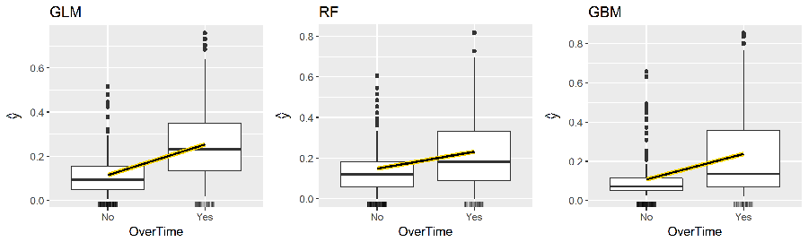
The following produces “ICE boxplots” and a PDP line (connects the averages of all observations for each response class) for the most important variable in all three models (OverTime). All three model show a sizable increase in the probability of employees attriting when working overtime. However, you will notice the random forest model experiences less of an increase in probability compared to the other two models.
glm.ot <- Partial$new(predictor.glm, "OverTime") %>% plot() + ggtitle("GLM")
rf.ot <- Partial$new(predictor.rf, "OverTime") %>% plot() + ggtitle("RF")
gbm.ot <- Partial$new(predictor.gbm, "OverTime") %>% plot() + ggtitle("GBM")

gridExtra::grid.arrange(glm.ot, rf.ot, gbm.ot, nrow = 1)
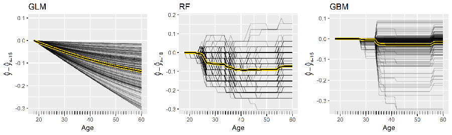
For continuous predictors you can reduce the grid space to make computation time more efficient and center the ICE curves. Note: to produce the centered ICE curves (right plot) you use ice$center and provide it the value to center on. This will modify the existing object in place (recall this is a unique characteristic of R6 –> objects are mutable). The following compares the marginal impact of age on the probability of attriting. The regularized regression model shows a monotonic decrease in the probability (the log-odds probability is linear) while the two tree-based approaches capture the non-linear, non-monotonic relationship.
# GLM model
glm.age <- Partial$new(predictor.glm, "Age", ice = TRUE, grid.size = 50)
glm.age$center(min(features$Age))
p1 <- plot(glm.age) + ggtitle("GLM")

# RF model
rf.age <- Partial$new(predictor.rf, "Age", ice = TRUE, grid.size = 50)
rf.age$center(min(features$Age))
p2 <- plot(rf.age) + ggtitle("RF")

# GBM model
gbm.age <- Partial$new(predictor.gbm, "Age", ice = TRUE, grid.size = 50)
gbm.age$center(min(features$Age))
p3 <- plot(gbm.age) + ggtitle("GBM")

gridExtra::grid.arrange(p1, p2, p3, nrow = 1)
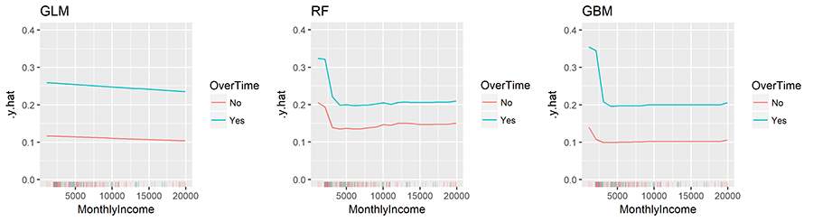
Similar to pdp you can also compute and plot 2-way interactions. Here we assess how the interaction of MonthlyIncome and OverTime influences the predicted probability of attrition for all three models.
p1 <- Partial$new(predictor.glm, c("MonthlyIncome", "OverTime")) %>%
    plot() + ggtitle("GLM") + ylim(c(0, .4))
p2 <- Partial$new(predictor.rf, c("MonthlyIncome", "OverTime")) %>%
    plot() + ggtitle("RF") + ylim(c(0, .4))
p3 <- Partial$new(predictor.gbm, c("MonthlyIncome", "OverTime")) %>% plot() +
    ggtitle("GBM") + ylim(c(0, .4))

gridExtra::grid.arrange(p1, p2, p3, nrow = 1)
The following lists some advantages and disadvantages to iml’s PDP and ICE procedures.
Advantages:
- Provides PDPs & ICE curves (unlike
DALEX)
- Allows you to center ICE curves
- Computationally efficient
grid.size allows you to increase/reduce grid space of xi values- Rug option illustrates distribution of all xi values
- Provides convenient plot outputs for categorical predictors
Disadvantages:
- Only provides heatmap plot of 2-way interaction plots
- Does not allow for easy comparison across models like
DALEX
3. Measuring Interactions
A wonderful feature provided by iml is to measure how strongly features interact with each other. To measure interaction, iml uses the H-statistic proposed by Friedman and Popescu (2008). The H-statistic measures how much of the variation of the predicted outcome depends on the interaction of the features. There are two approaches to measure this. The first measures if a feature (xi) interacts with any other feature. The algorithm performs the following steps:
1: for variable i in {1,...,p} do
     | f(x) = estimate predicted values with original model
     | pd(x) = partial dependence of variable i
     | pd(!x) = partial dependence of all features excluding i
     | upper = sum(f(x) - pd(x) - pd(!x))
     | lower = variance(f(x))
     | rho = upper / lower
   end
2. Sort variables by descending rho (interaction strength)
The intereaction strength (rho) will be between 0 when there is no interaction at all and 1 if all of variation of the predicted outcome depends on a given interaction. All three models capture different interaction structures although some commonalities exist for different models (i.e. OverTime, Age, JobRole). The interaction effects are stronger in the tree based models versus the GLM model, with the GBM model having the strongest interaction effect of 0.4.
# identify variables with largest interactions in each model
interact.glm <- Interaction$new(predictor.glm) %>%
    plot() + ggtitle("GLM")
interact.rf  <- Interaction$new(predictor.rf) %>%
    plot() + ggtitle("RF")
interact.gbm <- Interaction$new(predictor.gbm) %>%
    plot() + ggtitle("GBM")

# plot
gridExtra::grid.arrange(interact.glm, interact.rf, interact.gbm, nrow = 1)
Considering OverTime exhibits the strongest interaction signal, the next question is which other variable is this interaction the strongest. The second interaction approach measures the 2-way interaction strength of feature xi and xj and performs the following steps:
1: i = a selected variable of interest
2: for remaining variables j in {1,...,p} do
     | pd(ij) = interaction partial dependence of variables i and j
     | pd(i) = partial dependence of variable i
     | pd(j) = partial dependence of variable j
     | upper = sum(pd(ij) - pd(i) - pd(j))
     | lower = variance(pd(ij))
     | rho = upper / lower
   end
3. Sort interaction relationship by descending rho (interaction strength)
The following measures the two-way interactions of all variables with the OverTime variable. The two tree-based models show MonthlyIncome having the strongest interaction (although it is a week interaction since rho < 0.13). Identifying these interactions can be useful to understand which variables create co-denpendencies in our models behavior. It also helps us identify interactions to visualize with PDPs (which is why I showed the example of the OverTime and MonthlyIncome interaction PDP earlier).
# identify variables with largest interactions w/OverTime
interact.glm <- Interaction$new(predictor.glm, feature = "OverTime") %>% plot()
interact.rf  <- Interaction$new(predictor.rf, feature = "OverTime") %>% plot()
interact.gbm <- Interaction$new(predictor.gbm, feature = "OverTime") %>% plot()

# plot
gridExtra::grid.arrange(interact.glm, interact.rf, interact.gbm, nrow = 1)
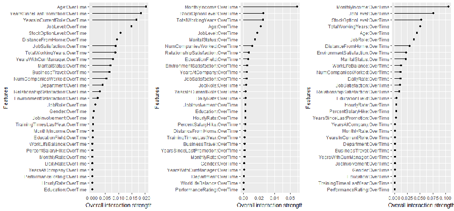
The H-statistic is not widely implemented so having this feature in iml is beneficial. However, its important to note that as your feature set grows, the H-statistic becomes computationally slow. For this data set, measuring the interactions across all three models only took 45 seconds and 68 seconds for the two-way interactions. However, for a wider data set such as AmesHousing::make_ames() where there are 80 predictors, this will up towards an hour to compute.
4. Surrogate model
Another way to make the models more interpretable is to replace the “black box” model with a simpler model (aka “white box” model) such as a decision tree. This is known as a surrogate model in which we
1. apply original model and get predictions
2. choose an interpretable "white box" model (linear model, decision tree)
3. Train the interpretable model on the original dataset and its predictions
4. Measure how well the surrogate model replicates the prediction of the black box model
5. Interpret / visualize the surrogate model
iml provides a simple decision tree surrogate approach, which leverages partykit::cpart. In this example we train a CART decision tree with max depth of 3 on our GBM model. You can see that the white box model does not do a good job of explaining the black box predictions (R^2 = 0.438).
# fit surrogate decision tree model
tree <- TreeSurrogate$new(predictor.gbm, maxdepth = 3)

# how well does this model fit the original results
tree$r.squared
## [1] 0.4384319
The plot illustrates the distribution of the probability of attrition for each terminal node. We see an employee with JobLevel > 1 and DistanceFromHome <= 12 has a very low probability of attriting.
# Visualize tree
plot(tree)
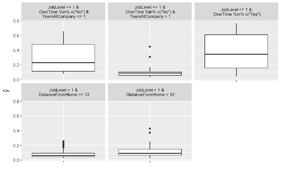
When trying to explain a complicated machine learning model to decision makers, surrogate models can help simplify the process. However, its important to only use surrogate models for simplified explanations when they are actually good representatives of the black box model (in this example it is not).
Local interpretation
In addition to providing global explanations of ML models, iml also provides two newer, but well accepted methods for local interpretation.
Local interpretation techniques provide methods to explain why an individual prediction was made for a given observation.
To illustrate, lets get two observations. The first represents the observation that our random forest model produces the highest probability of a attrition (observation 154 has a 0.666 probability of attrition) and the second represents the observation with the lowest probability (observation 28 has a 0 probability of attrition).
# identify obs with highest and lowest probabilities
(high <- predict(rf, splits$valid) %>% .[, 3] %>% as.vector() %>% which.max())
## [1] 154
(low <- predict(rf, splits$valid) %>% .[, 3] %>% as.vector() %>% which.min())
## [1] 28
# get these observations
high_prob_ob <- features[high, ]
low_prob_ob  <- features[low, ]
1. Lime
iml implements its own version of local interpretable model-agnostic explanations (Ribeiro et al., 2016). Although it does not use the lime package directly, it does implement the same procedures (see lime tutorial).
A few notable items about iml implementation (see referenced tutorial above for these details within lime):
- like
lime, can change distance metric (default is gower but accepts all distance functions provided by ?dist),
- like
lime, can change kernel (neighborhood size),
- like
lime, computationally efficient –> takes about 5 seconds to compute,
- like
lime, can be applied to multinomial responses,
- like
lime, uses the glmnet package to fit the local model; however…
- unlike
lime, only implements a ridge model (lime allows ridge, lasso, and more),
- unlike
lime, can only do one observation at a time (lime can do multiple),
- unlike
lime, does not provide fit metric such as (R^2) for the local model.
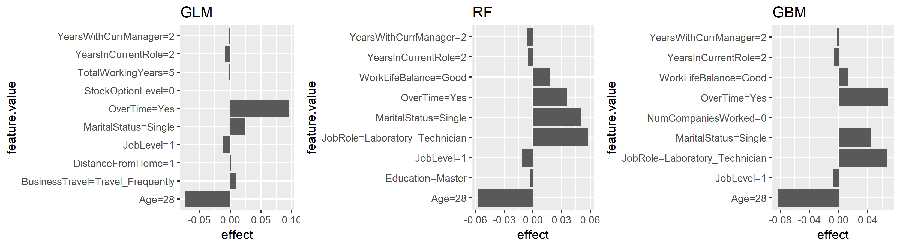
The following fits a local model for the observation with the highest probability of attrition. In this example I look for the 10 variables in each model that are most influential in this observations predicted value (k = 10). The results show that the Age of the employee reduces the probability of attrition within all three models. Morever, all three models show that since this employee works OverTime, this is having a sizable increase in the probability of attrition. However, the tree-based models also identify the MaritalStatus and JobRole of this employee contributing to his/her increased probability of attrition.
# fit local model
lime.glm <- LocalModel$new(predictor.glm, k = 10, x.interest = high_prob_ob) %>%
    plot() + ggtitle("GLM")
lime.rf  <- LocalModel$new(predictor.rf, k = 10, x.interest = high_prob_ob) %>%
    plot() + ggtitle("RF")
lime.gbm <- LocalModel$new(predictor.gbm, k = 10, x.interest = high_prob_ob) %>%
    plot() + ggtitle("GBM")

gridExtra::grid.arrange(lime.glm, lime.rf, lime.gbm, nrow = 1)
Here, I reapply the same model to low_prob_ob. Here, we see Age, JobLevel, and OverTime all having sizable influence on this employees very low predicted probability of attrition (zero).
# fit local model
lime.glm <- LocalModel$new(predictor.glm, k = 10, x.interest = low_prob_ob) %>%
    plot() + ggtitle("GLM")
lime.rf  <- LocalModel$new(predictor.rf, k = 10, x.interest = low_prob_ob) %>%
    plot() + ggtitle("RF")
lime.gbm <- LocalModel$new(predictor.gbm, k = 10, x.interest = low_prob_ob) %>%
    plot() + ggtitle("GBM")

gridExtra::grid.arrange(lime.glm, lime.rf, lime.gbm, nrow = 1)
Although, LocalModel does not provide the fit metrics (i.e. R^2) for our local model, we can compare the local models predicted probability to the global (full) model’s predicted probability.
For the high probability employee, the local model only predicts a 0.34 probability of attrition whereas the local model predicts a more accurate 0.12 probability of attrition for the low probability employee. This can help you guage the trustworthiness of the local model.
High Probability:
# high probability observation
predict(rf, splits$valid) %>%
  .[high, 3] # actual probability
## [1] 0.6666667
lime_high <- LocalModel$new(predictor.rf, k = 10, x.interest = high_prob_ob)
lime_high$predict(high_prob_ob) # predicted probability
##   prediction
## 1  0.3371567
Low Probability:
# low probability observation
predict(rf, splits$valid) %>%
  .[low, 3] # actual probability
## [1] 0
lime_low <- LocalModel$new(predictor.rf, k = 10, x.interest = low_prob_ob)
lime_low$predict(low_prob_ob) # predicted probability
##   prediction
## 1  0.1224224
2. Shapley values
An alternative for explaining individual predictions is a method from coalitional game theory that produces whats called Shapley values (Lundberg & Lee, 2016). The idea behind Shapley values is to assess every combination of predictors to determine each predictors impact. Focusing on feature xj, the approach will test the accuracy of every combination of features not including xj and then test how adding xj to each combination improves the accuracy. Unfortunately, computing Shapley values is very computationally expensive. Consequently, iml implements an approximate Shapley estimation algorithm that follows the following steps:
ob = single observation of interest
1: for variables j in {1,...,p} do
     | m = random sample from data set
     | t = rbind(m, ob)
     | f(all) = compute predictions for t
     | f(!j) = compute predictions for t with feature j values randomized
     | diff = sum(f(all) - f(!j))
     | phi = mean(diff)
   end
2. sort phi in decreasing order
The Shapley value ($\phi$) represents the contribution of each respective variable towards the predicted valued compared to the average prediction for the data set.
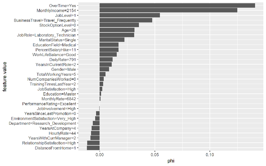
We use Shapley$new to create a new Shapley object. For this data set it takes about 9 seconds to compute. The time to compute is largely driven by the number of predictors but you can also control the sample size drawn (see sample.size argument) to help reduce compute time. If you look at the results, you will see that the predicted value of 0.667 is 0.496 larger than the average prediction of 0.17. The plot displays the contribution each predictor played in this difference of 0.496.
# compute Shapley values
shapley.rf <- Shapley$new(predictor.rf, x.interest = high_prob_ob)

# look at summary of results
shapley.rf
shapley.rf <- readRDS("2018-08-13-iml/shapley_rf.rds")
shapley.rf
## Interpretation method:  Shapley
## Predicted value: 0.666667, Average prediction: 0.170373 (diff = 0.496293)
##
## Analysed predictor:
## Prediction task: unknown
##
##
## Analysed data:
## Sampling from data.frame with 233 rows and 30 columns.
##
## Head of results:
##            feature          phi      phi.var
## 1              Age  0.031515152 0.0027626123
## 2   BusinessTravel  0.047575758 0.0031212956
## 3        DailyRate  0.011515152 0.0015170994
## 4       Department -0.006363636 0.0003579412
## 5 DistanceFromHome -0.011818182 0.0009256013
## 6        Education  0.001212121 0.0007220042
##                      feature.value
## 1                           Age=28
## 2 BusinessTravel=Travel_Frequently
## 3                    DailyRate=791
## 4  Department=Research_Development
## 5               DistanceFromHome=1
## 6                 Education=Master
#plot results
plot(shapley.rf)
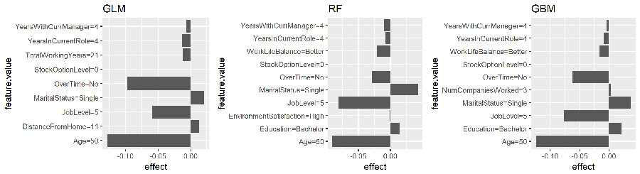
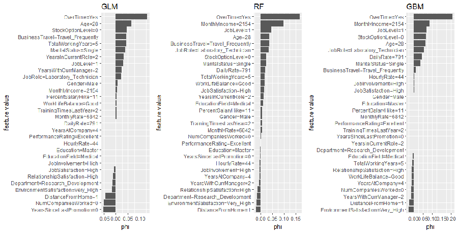
We can compare the Shapley values across each model to see if common themes appear. Again, OverTime is a common theme across all three models. We also see MonthlyIncome influential for the tree-based methods and there are other commonalities for the mildly influential variables across all three models (i.e. StockOptionLevel, JobLevel, Age, MaritalStatus).
shapley.glm <- Shapley$new(predictor.glm, x.interest = high_prob_ob) %>%
    plot() + ggtitle("GLM")
shapley.rf  <- plot(shapley.rf) + ggtitle("RF")
shapley.gbm <- Shapley$new(predictor.gbm, x.interest = high_prob_ob) %>%
    plot() + ggtitle("GBM")

gridExtra::grid.arrange(shapley.glm, shapley.rf, shapley.gbm, nrow = 1)
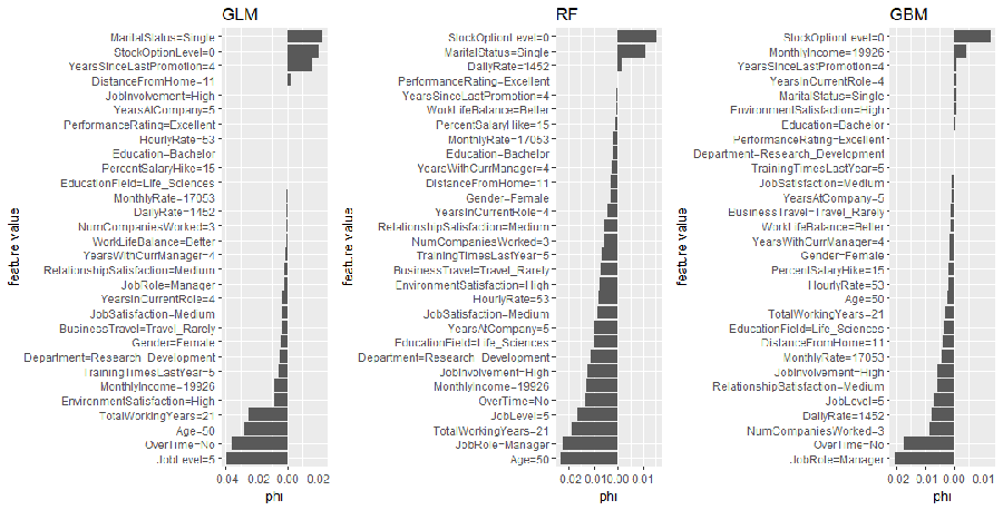
Similarly, we can apply for the low probability employee. Some common themes pop out for this employee as well. It appears that the age, total number of working years, and the senior position (JobLevel, JobRole) play a large part in the low predicted probability of attrition for this employee.
shapley.glm <- Shapley$new(predictor.glm, x.interest = low_prob_ob) %>%
    plot() + ggtitle("GLM")
shapley.rf  <- Shapley$new(predictor.rf, x.interest = low_prob_ob) %>%
    plot() + ggtitle("RF")
shapley.gbm <- Shapley$new(predictor.gbm, x.interest = low_prob_ob) %>%
    plot() + ggtitle("GBM")

gridExtra::grid.arrange(shapley.glm, shapley.rf, shapley.gbm, nrow = 1)
Shapley values are considered more robust than the results you will get from LIME. However, similar to the different ways you can compute variable importance, although you will see differences between the two methods often you will see common variables being identified as highly influential in both approaches. Consequently, we should use these approaches to help indicate influential variables but not to definitively label a variables as the most influential.